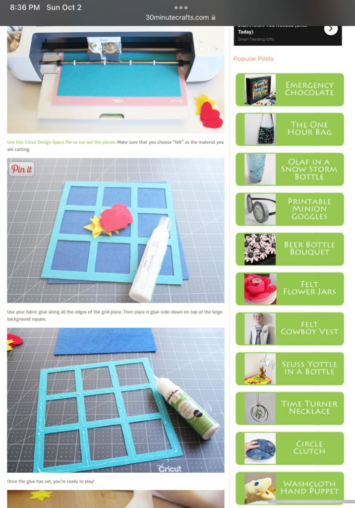
INDIVIDUAL ASSIGNMENT 2: HEURISTIC EVALUATION

Introduction

The website I would like to analyze for my heuristic evaluation is SarahMaker.com( https://sarahmaker.com/). SarahMaker.com is an educational website that features classes, articles, patterns, and premium video to help you learn a craft of your choice. Their scope of subject is large and includes, fabric crafts, needle arts, sewing, sculpting, and more. The website includes both free and premium paid content. I say that this is a great website for a beginner crafter in any medium. Crafting, or creating in general, can seem daunting and easily susceptible to information overload, but I Sarah has done her best to create a clean and professional appearance for her website.

Scenario               

My scenario features a young woman enamored with the Pinterest articles, Tik Toks, Facebook Reels and Instagram-worthy photos she sees of her friends and family showcasing their latest needlework creations. She’s been saying she would eventually teach herself to crochet for years, but other priorities have hindered her from starting. She now has the free time to dedicate learning to crochet. With the low financial commitment and abundance of accessibility to resources on how to crochet, the barrier of entry was very low. A friend recommended YouTube to learn basic stitches and SarahMaker.com for pattern ideas. YouTube is great, but she prefers the mental freedom of written instructions.

Heuristic Analysis       

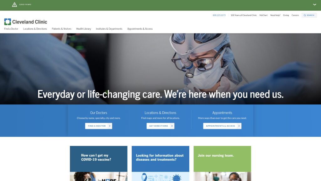
With my scenario and persona in mind, I took to Sarahmaker.com to see what they offer in the realm of crochet. I personally, keep the Ad Blocker plugin enabled on Google Chrome, and one think I did notice was the unusual amount of empty space the site had. This is usually a tell-tale sign that this site might have many ads going on. I took the chance, and temporarily turned off Ad Blocker for the website and I was right. There were ads all along the bottom portion of the screen. I know many are divided on the necessity of ads on websites, but strictly speaking from a user’s point of view, ads are the worst. I would place this in violation of rule number 8: Aesthetic and minimalist design. Sarah has, mostly, static content on her website. The only things I see moving are the carousel stuck to the bottom of the screen and the video of ads playing right above it. It’s extremely distracting from an otherwise attractive website.

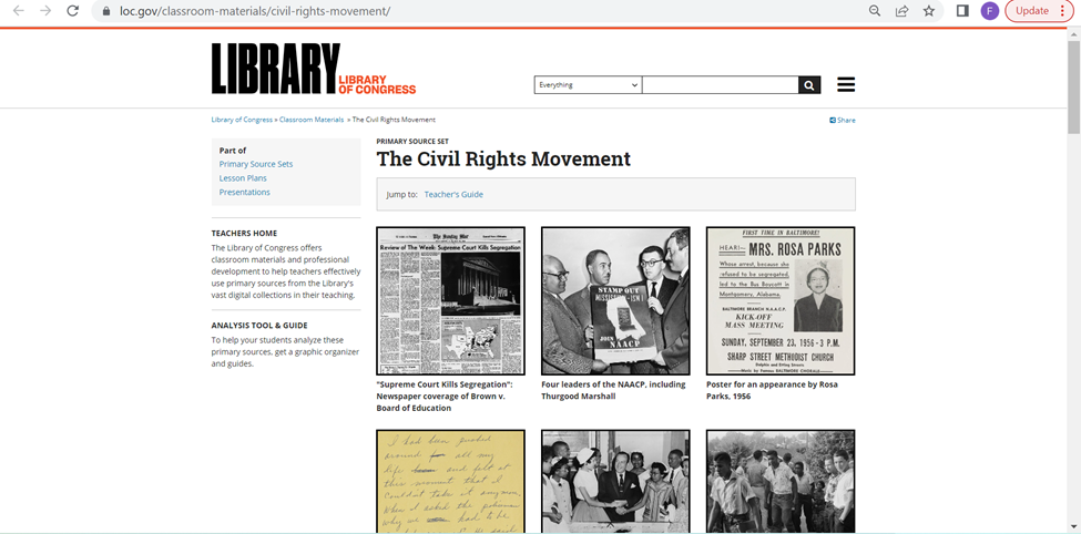
                I’ve been to Sarah’s website once or twice before at the recommendation of a Google search for some Cricut help. She always gave me very good advice in her articles. I have never gone to the homepage in search of a specific subject. Following my scenario though, I noticed locating the crochet section was very easy to find right at the top navigation of the page. However, the main crochet page opens to a wall of text, that I immediately skip, to go to what I believe are the lessons or beginner content separated into sections (or cards) below. These are all sponsored ads for crochet pattern packs. That’s not going to be very beneficial to someone who is a complete beginner. The stitch tutorials for beginners are found in a link in the middle of the wall of text I’ve already skipped over. The links are also a muted shade of green that is very similar to the color of the basic text. I think this is a violation of rule number 7: Flexibility and efficiency of use.

Proposed Solutions            

A few adjustments I propose to combat these issues are, trying to find a different way to monetize the website without distracting ads.  Offering other paid content or place some premium content behind a subscription wall. I see Sara has hundreds of patterns. Having the patterns available to purchase at a very low price is something to consider. Considering the placement of the ads, they are even breaking the flow of the page with the video ads toward the bottom stretching into the footer content. As for making beginner content easier to locate, I would recommend placing links to the beginner’s content much closer to the top. I would even go as far as adding sub-menus to the top navigation menus. I’d also like to see a greater contrast in the color of general text and text that are links. I see, Sarah is trying to stay within a certain color scheme, but links are vital to the navigation of the site. They need to be more noticeable than they are now. If the user is utilizing breadcrumbs, they need to display more than two locations for every page a user visits. As the site stands now, the main page “Home”, leads to “Blog” on every page. This is confusing for a user and does not give a concrete path back to where they’ve already been. Overall, I feel someone that is well-versed in using the internet would be able to use this website with few problems, but frustrations can appear with some of the questionable navigation choices and advertisement placement.

Individual Assignment 2: Heuristic Evaluation

Website

For this assignment, I chose to evaluate the website for the Library of Congress (https://www.loc.gov/) website, which according to its website is “the largest library in the world” and has a collection of more than 173 million items, and it “receives some 15,000 items and adds more than 10,000 items to its collections” each working day. The library not only contains a variety of special collections, with everything from rare books and manuscripts to international collections to photographs and comics.

The Library is not just a place to preserve history (and, indeed, history itself: “it is the oldest federal cultural institution in the nation”), but an active repository that anyone can access for any purpose. With so much to access and so many types of users (from expert researchers and historians to students at every level to a casual reader looking to learn something new), the Library of Congress necessarily must serve as a model for all other libraries to learn from in terms of usability and navigation.

Scenario

The user that I am imagining for this evaluation is an AP US History teacher who wants to assign an essay for students to investigate the Civil Rights Movement, and specifically first-person accounts of the Civil Rights Movement and what it was like to be alive during that time. The teacher plans to require that students use the LoC website to find at least one primary and one secondary source. In order to confidently create this assignment, the teacher wants to create a few sample topics with specific sources for each one, so that during class she can go through the website and take the students through the research process. Tangentially, the teacher is hoping to find resources for teachers and how to use the site in the classroom and/or lesson plans.

Analysis

For the first part of my analysis, I started with trying to find resources for teaching the subject in the classroom. Since the teacher wants the essay to be about the topic they are covering, the Civil Rights Movement, they start with searching “civil rights movement” in the search box at the top of the page. This is very easy, and is located in the same place most websites would show a search box, and it quickly returned results. I think the results, however, violate heuristic #8, Aesthetic and minimalist design, because while the page is thankfully sparse in terms of the colors chosen…but the amount of text for each result is overwhelming, especially with the text to the left showing ways to refine the results. I think if this included some kind of corresponding image with each result, so that it is easier to see the delineation between each result, and making the “Refine your results” pane collapsible. It’s not a major faux pas, as far as database search results go, but especially as the largest library in the world, one might expect innovative design for helping increase navigability of their resources.

The violation of minimalist design is particularly problematic for this user, since they know that they will have to figure out how to keep 150+ students from immediately giving up due to being overwhelmed. The teacher wants to find ways to minimize the student’s panic, and notices off to the side that they can refine down to only seeing Photos from a specific time period, so the user decides to make the assignment such that the students will choose a relevant photograph to include with their essay, since the results found in this refined search is less visually overwhelming:

Satisfied with that decision, the teacher decides to try the search bar again to find primary sources. The search is a little better this time around, since it lists specific types of collections at the top of the page of results. The top result is exactly what the teacher is looking for, “Classroom Materials” for the Civil Rights Movement. The teacher hopes this will be a repository of lesson plans, and immediately decides to open it.

However, while the initial impression seems positive, it quickly becomes clear that this part violates two other heuristics. The first is #7, Flexibility and efficiency of use. The resource is just a collection of images, which while helpful, provide no context for the teacher and requires each one to be opened up individually to review what each resources shows. Additionally, for the background information and Teacher Suggestions are at the bottom, and there is no real indication that you can expect that information beneath all of the photos.

The second issue is a violation of #6, Recognition rather than recall. This is because the user has to open up each resource page to access it, so they have to remember how to return to the landing page in order to continue going through the resources that are collected together. This ends up either being an untenable number of tabs, or a need to make sure not to fall too far down the rabbit hole of hyperlinks and searching, so that you can back out to the landing page after reviewing each source.

While the teacher likes this resource, they want to find an actual lesson plan, because this seemed like a promising resource that did not deliver. So after backing out to try to return to the search page that originally prompted them to find the above resource page. They scroll down and are fortunate to immediately find a Learning Activity Secondary Level – Historical Narrative: The Civil Rights Movement, which is thankfully an easy to use PDF that the teacher decides to print out and peruse later.

Since they were able to find an actual lesson plan, the user decides to go back to the home page to see if they have dedicated Teacher’s Resources. On the main page’s navigation pane, there is a Teacher tab, although I would argue that this moderately violates the heuristic #4, Consistency and standards, in that the header bar is underneath the carousel image header, which hides it away when most navigation panes would be seen up in the header of the page, and remain consistent throughout the website. The hamburger menu remains static, but does not match up with the header from the main landing page, so finding what you want once you’re within the site is difficult and basically requires backtracking (which violates #7 again).

The user is excited to find the resources page, and begins looking at the “Getting Started with Primary Sources” page, and then hopes to partake in the Professional Development options, but struggles to find how to sign up (violating #10: Help and documentation) and decides to try again another time.

Recommendations

Overall, for the world’s largest library website, it does a good job of trying to bracket the information in logical ways. However, for a layperson with a very specific goal (especially one who has to consider a variety of various other users and how they may interact with the site to meet a specific goal), this site is note overly navigable. The biggest issue is how overwhelming it becomes. The violations of minimalist design and efficiency of use are the biggest violations, as users are almost immediately overwhelmed by too much text and having to click to new pages all the time. I think one of the best things they could do is make the search feature more image/collections focused. The Refine Results pane is very helpful, but I think making it collapsible would help a lot in reducing visual clutter and creating more space for better explanations for each material.

Individual Assignment #2 – Heuristic Evaluation

The Website

The website I selected for this assignment was atlasobscura.com. The website’s tagline is “The definitive guide to the world’s hidden wonders.” and users can search for destinations, experiences, food to try, and read stories about different places. The website features destinations that are popular as well as some out-of-the-box destinations/experiences.

Home page of atlasobscura.com

The Scenario

The scenario I chose to evaluate for this website is that I am visiting New Orleans and I want to plan out what attractions to go to. For the scenario, I do not have any food restrictions/allergies and everyone is over 21 years old. Nielsen’s 10 heuristics will be used in the evaluation of this website.

To begin the scenario I decided to search New Orleans in the search bar located on the home page. As I was typing, the search was continuously updated as I typed. For instance, when I had typed out “new” before “Orleans” it recommended destination guides for New York State, New York City, etc., it recommended places such as The New Orleans Treehouse and the New Yorker Hotel, and even a story about New Zealand.

A partial search of “new”

As I finished typing out “new orleans” the search results pulled together the results for information related to New Orleans. The results were broken down into different categories including “Destination Guides”, “Trips”, “Places”, “Food & Drink”, and “Stories”.

A search of “New Orleans”

Instead of clicking any result listed in the search I just hit the enter button which led to “The Atlas Obscura Guide to New Orleans” which I believe is the same page as the “New Orleans, Louisiana” result that showed up under “Destination Guides”. This page had been recently updated in July of 2022 and featured quick links (“Attractions”, “Food & Drink”, “Map”, “Leaderboards”, “Stories”, and “Lists”) that would take you to that part of the page when clicked.

The Atlas Obscura Guide to New Orleans front page

The first task was to pick out 2-3 attractions to visit while in the city. I was able to click a button under the “Unusual Attractions in New Orleans” section that led to another webpage which listed all the places in New Orleans that were added to the website. From that webpage I browsed the different options and settled on three different places to visit (Marie Laveau’s House of Voodoo, Lafitte’s Blacksmith Shop, and New Orleans Pharmacy Museum).

All places in New Orleans webpage

I clicked on one of the attractions I wanted to visit and it took me to a webpage dedicated to that attraction. On this webpage it gave a quick description of what the attraction was, a map of the location and the address, as well as a link to the website and nearby attractions.

Lafitte’s Blacksmith Shop webpage

Usability Flaws

While working through this scenario the overall process was relatively easy but some issues were present. When searching for “New Orleans” in the search bar it was constantly updating to try to find the best match based off each individual key stroke. This led to an overload of information that was constantly changing which is a violation of Nielsen’s 8th heuristic. Another violation occured when I clicked on “Lafitte’s Blacksmith Shop”. This led me to a new webpage dedicated to this attraction but did not provide a back button (which can be seen in the “All places in New Orleans” screenshot). This violates Nielsen’s 3rd heuristic.

Recommendations

Overall, this website was easy to use and was formatted and designed in a way that made sense as a user. I also acknowledge that I am not a novice when it comes to using computers, the internet, and searching webpages. One of the first recommendations I have is to not have the search automatically update results with every keystroke. I know that this is what is used in most search engines but I think for this specific site it makes sense to wait until the user is done typing their search term so they do not get overwhelmed with unrelated results. Another recommendation I have is to create a back link that would take you from an attractions webpage back to the webpage with all of the attractions. This could be a link just like the one seen on the “All places in New Orelans” webpage that is in the left hand corner of the screen (“BACK TO NEW ORLEANS”) but with the wording “BACK TO ALL PLACES IN NEW ORLEANS”. This would provide the user with an easier way to get back to the previous page.

Individual Assignment 2: Heuristic Evaluation

The Website

The website that I chose was True Achievements.

Screenshot of the True Achievements homepage

True Achievements is a website that markets itself as presenting Xbox related gaming updates and reviews. It also features a community forum where users can participate in discussions and find themselves on leaderboards.

The Scenario

Recently, over 90 videos of what was then considered “suspected” user gameplay of the newest installment of the Grand Theft Auto game series was leaked to the internet. Rockstar Games then came out and confirmed that these videos were real and reassured users that it would not affect the development timeline of the game. In this case, I wanted the user to be heading to True Achievements to see what information they could find on the leak. This task would ideally be accomplished by the user searching the website using the search bar; even though there is an article featured on the home screen.

Usability Flaws

Upon searching the website for anything related to the GTA leak, I was met with the following screen.

A screen capture of a search for “GTA leak” returning the error message stating there aren’t any matching search results

I knew this information was incorrect because I had just seen an article featured on the Home Screen. Another thing I noticed while on the home screen was that each image has a small descriptor box that seemed to put the listing into a category. Naturally, I looked at the search parameters to see if I could change them to match the descriptors. I couldn’t. They were two completely different sets of information. This violated the Consistency and standards design heuristic. Since the categories do not match the descriptors the user is left wondering how to search the correct parameters and how, if at all possible, to search and retrieve a relevant article.

I ended up going back to the home screen and clicking on the article I saw that was related to the leak. I went into the article and read it. I saw that it did contain some of the information that I was looking for but I wanted to know more than a teenager from the United Kingdom was arrested for it. I went through a rabbit hole of related articles until I was well informed about the leak and then wasted to go back to the home screen to see what other featured articles are there. Because I am an avid internet user, I know that the quickest way to get back to a website’s home page is to click on their logo in the header, however this is not always the case. This has to be coded into a website and it is not common knowledge which violates the design heuristic of Visibility of System Status. My current location was not clear nor was I able to navigate back to the Home Screen but I had accomplished what I initially visited the website to do.

Design Recommendations

In conclusion, TrueAcheivements could use an entire revamp. I’d suggest they start with the overall layout o the site. From the screenshot of the homepage, you can see tat headers and other information tend to blend into other elements on the page. This will help the website better appeal to the Aesthetic and minimal design design heuristic. Revisiting the tagging that the website uses to identify their content. They also should revisit the coding of the website because in this case it is interfering with the usability of the website. When I used the provided search bar to look for information on GTA, the returned screen indicated that there was no information on the website that related to GTA. A quick scroll of the Home Screen led me to determine that that was not the case. Also when I clicked on the article that initially grabbed my attention, there were many more articles linked under the article that were also about the game. Lastly, I’d suggest adding some sort of navigational aids to the website. The current header’s navigation options do not support all the different paths you can take on the website. This also leads to the user not being able to return to a page they may have visited previously because it isn’t recognized or listed I the current menu options. A home button would be a great starting point.

Individual Assignment #2: Heuristic Evaluation

Website Being Evaluated

The website I will be evaluating is 30minutecrafts.com, a collection of quick craft tutorials and ideas for craft enthusiasts whom may be short on time or energy. It was founded by Carolina Moore as a resource for fast crafting. She is still actively posting to the site, as the last tutorial was made in 2022.

Scenario

The scenario I chose to guide my evaluation is a young hip female crafter with moderate technology experience (avid social media user and grew up using the internet, but does not have formal schooling or training with computers) has decided to save money and make her friends and family’s Christmas gifts this year. She has limited time between working and taking courses at her local community college (where she studies art history) and through a quick google search stumbled upon 30 Minute Crafts. She wants to find 1 or 2 crafts she can make that will be gender neutral, doesn’t involve sewing, and will take no more than 15 minutes each. 

Analysis

Immediately from the homepage there are issues in regards to Heuristic #1: Visibility of system status. It is extremely hard to tell where the user is (homepage) and where to go next. Poorly designed homepage, that does not follow the standards expected by users – violating Heuristic #4: Consistency and standards. By default it is throwing the user in a mobile layout with no working way to switch to desktop view. This causes the branding and message of the website to be lost. There is a tiny logo on top, cluttered hard to read banner, messy unorganized lists of posts with no clear categories or labeling, and navigation is hidden under a tiny hamburger menu on the side. 

The user scrolls down the homepage, clicks Desktop, and realizes it will not work. Getting overwhelmed by the list of crafts and lack of clear insight on materials, categories, or time, the user clicks the Hamburger menu. From there she sees a “Home” button. It leads to the URL https://30minutecrafts.com/whats-new. This page kicks the user out of a mobile view and into a slightly prettier desktop template. The copy and writing style of this tutorial matches the vibe of the user. This aligns well with Heuristic #2: Match between system and the real world. 

At this page the user sees a much better navigation (as opposed to the page linked from google – the one that the user thought was the homepage https://30minutecrafts.com/). She selects “15 minute crafts” and is immediately thrown back into a mobile template, with no thumbnails and no clear insight into what the craft tutorials are. She gives up and decides she wants to try a different category, but now the clear navigation is gone and she can not easily return to where she was (breaking Heuristic rule #3: User control and freedom). After clicking the back button, she clicks “10 minute crafts” where she quickly glances over the thumbnails and decides to go with the “Felt Tic Tac Toe Board” tutorial for her gifts, even though she is not sure all of her friends will like it, without realizing there is a small “Next Page” button on the bottom where many more tutorials are.

Other Heuristic violations noticed through user task: Heuristic #7: Flexibility and efficiency of use. While there is a search bar, it is very small and hard to see. I originally did not see it until I specifically went searching for it. It would have been easier and more intuitive for the novice user if this was more visible. A first time user may be more likely to notice it and use it to go straight to the tutorials they are looking for. For example my user could have searched “No Sew” and seen all relevant tutorials. One thing to note in addition to it not being noticeable is that it is not very advanced either. If user were to search “15 minute No Sew” many tutorials will pop up that are 30 minutes and require sewing. 

As far as Heuristic #8 goes, this website could adopt a more aesthetic and minimalist design in places. The column on the right that follows user through most pages can be distracting and that information could be better served elsewhere. 

One thing I think this website does well is Heuristic #10: Help and documentation. The steps are clearly presented with great visuals making the tutorials easy to follow.

Recommendations

  • Redesign the homepage to fit commonly used standards expected by users. Clear branding, header banners, navigation, clear CTAs, contact information, and footer.
  • Better organize navigations – reevaluate the navigation given on the “mobile” homepage compared to the navigation on the desktop page (pages are missing and hard to find unless on the confusing “mobile” homepage and vice versa). 
  • Redesign how the tutorials are presented on the category paged. Make sure every tutorial is given a thumbnail and description that will let the user know what the tutorial is about without having to click through individually to choose a craft. Remove need for the “Next page” button that is extremely hard to see.
  • Create a design and flow that is more conducive to the main user task of finding a craft tutorial to try by fixing the heuristic violations mentioned in the analysis. The tutorials are great once the user actually gets to one, but finding the full catalog of tutorials is nearly impossible with how the website currently is.

Individual Assignment 2 – Heuristic Analysis

Gaming group

The Site:

Gamesradar+ (https://gamesradar.com)

   Gamesradar+ is a gaming site that covers games from all platforms, from PC to all the various video game consoles on the market. The plus is the additional coverage of topics many gamers also enjoy, such as movies and the world of comic books.

The Scenario:

   The review of this site is done through the eyes of the fellow gamer that needs to find a gift for a friend’s child. As video gaming has been around for decades, this group covers a large range of potential ages. In this evaluation, we will be looking at finding a gift for a pre-teen boy that his parents will not object to. In this case, that means nothing with foul language, shooting games, or other conduct they may consider inappropriate for his age. This task will be considered a success if it results in a game recommendation, and if it points to a good deal on the game, that would be a bonus.

The Analysis:

   In the search for information about games, I selected the Reviews tab:

Since I am looking for a game, the Latest Game Reviews tab makes sense. At this point, the site navigation makes sense. What did not make sense was the word Tech under the BROWSE BY PLATFORM section. Curiosity drives you to look at that one, which takes you off to reviews of televisions, personal tech, and streaming hardware. This fails as a Match Between System and Real World.

   In navigating the site, I notice that the Reviews tab does not stay colored in black, which would keep the Visibility of the System Status if implemented. Since the friend’s kid only has a Nintendo Switch, an Android tablet, and an Android phone, I select Android looking for game reviews and again get let down as that section takes me to a page full of phones and Android game controllers. There isn’t a review of an Android game until you get to the second page. As I look further, I realize that the newest review on an actual Android game is from March 1st, 2019.  This once again fails at the Match Between System and Real World and the idea of Consistency and Standards. A game review section should only have reviews of games, and reviews of physical devices should be kept separately, and a website about gaming should be kept current. The idea of not having a review of games during the entire pandemic (when people were stuck at home with little else to do) is just unheard of.

   In a pleasant surprise, returning to the Reviews section and going to the Switch section showed reviews as recently as 12 days ago. There were plenty of options to choose from for games, but it also had hardware reviews for platforms not related to the Switch such as the Steam Deck. Once again, another Consistency letdown.

   A user can understand the need for a website to be supported by advertising dollars, but this site crosses into the ‘annoying’ category with the excessive screen real estate devoted to unrelated ads. The following screenshot is what happens when you full screen the site on a widescreen monitor:

In this violation of Aesthetic and Minimalist design, the idea of a gaming site is lost in a flurry of advertisements about London. Less than a third of the page is the actual site content.

The Recommendations:

The adjustments to the site would be straightforward:

  • Adjust the header at the top of the site to keep the current location highlighted to keep the user informed of their location in the site (Visibility of System Status). The header is a good method to show this, but it needs to be fixed. The header also had some other flaws, such as the “About Us” section being hidden under the “Magazines” section:

  • Game reviews should be nothing but game reviews. Either put reviews of hardware in their own section or combine the hardware and games into sections by platform and label them as such. This would give the user the Consistency and Standards as well as a Match Between System and Real World.
  • There is this one little icon that floats on the page, and when you hover over it, it reveals itself to be a “Subscribe to Notifications” option. This needs to be moved into the header with a label. While it could be a highlight for Flexibility and Efficiency of Use, as a shortcut that more experienced users would rely on, I fell that not knowing what it was shows a fault in Visibility of System Status.  
  • Advertising must be limited to less than a third of the site, and ideally should be something remotely linked to gaming. The current layout is pulling from the focus of the site, which is to promote and discuss gaming. Limiting the percentages of screen real estate to advertising will allow users to stay focused on the task at hand.

Individual Assignment 2: Heuristic Evaluation

The Website

I chose to do a heuristic evaluation on one of our travel sites, Hotels.com. As an avid traveler, finding a place to stay in is a hard part of a vacation with many different new sites coming up such as Airbnb, Trivago, Expedia, etc. The website specializes in booking hotels, rental cars, and vacation rentals.

Method

In evaluating this website, I took the approach of navigating through the site first and looking at how it works as I have used it before but it is not a regular site I use to book trips. I used the 10 principles of Jakob Nielson’s approach for usability analysis and checked off each one to see which ones had flaws. I went step by step as if I were booking a trip to view the different outcomes of the prices and how the page gets set up when you input a new travel date. I decided to choose the travel destination as New York City and the dates will be during Thanksgiving week, November 22-27.

Usability Flaws

So on the homepage of Hotels.com, it seems very easy to navigate and has a lot of information on the main page. At the top of the screen, you can effortlessly search different locations and dates. Once you scroll down it has some information on different ways to travel and stays. So on the homepage, I input the travel stays I will be looking into which is New York City from November 22 – 27.

So once I searched up the travel plan, it showed me a list of different hotels with the price showing next to the hotel and a small description of the hotel. You can choose different filters and assortment to your liking. In the image below, I scrolled down a bit and you see some good deals labeled as “Secret Price available”.

I clicked on the Westin New York Grand Central hotel to see how it worked since it was such a big price jump. When clicked on, it sent me to a different tab which violates the 6th heuristic of recognition rather than recall. This means that a user should not have to remember dates and there should also be a back button to correct any mistake if made. If the user was one that does not understand different tabs then this would be a big problem for them. I can see how if you end up on a new tab, you are going to start a whole new search and it is just repeating all the steps. I went on my phone as well to see if it opened a new tab or not and it did. This means that the user will have to keep switching between tabs to view each and every hotel.

Another violation was number 7, Flexibility and efficiency of use. An expert at tabs and the internet know they can switch between tabs and if need be they can close the tab. However, a newer user may not know that information and since each time you click on a hotel it opens up a new tab. A user may not know that they can either close the tab or navigate to the original tab. They might start the same search again which lose the efficiency of the website. Rather than it being a quick and easy task, it might take a while to view each hotel and its amenities.

Design Recommendations

I recommend that this website has more flexibility for more novice users but also for anybody that travels which is a majority of the population. Hotels.com does have great options and outcomes, but the design of opening a new tab every time you press on a new hotel can get exhaustive and causes a slower performance. There should be a way that a person can review the hotel they want and see it with the option of going back but also having that hotel in a recently viewed box if you want to keep browsing different hotels. This recommendation will solve both heuristic flaws, 6 and 7, which have to do with remembering what was searched and which hotels were viewed, as well as, navigating through the different tabs that allow you to know what information you viewed beforehand.

The Norman Rockwell Museum | Shut Up and Take My Money

(1467 Words)

The Website

The Norman Rockwell Museum teaches and maintains the legacy of Norman Rockwell. Its website, nrm.org, is used by the museum for outreach, education and advertising. The site is heavily saturated with information regarding Rockwell art collections, related events, ways to visit the museum, and how to financially support the museum.

This is the top portion of nrm.org’s homepage.

The Scenario

To best evaluate the usability heuristics of nrm.org, one should examine the site through the lens of a potential patron. Hypothetically, this patron has enjoyed the work of Rockwell and has finally decided to reciprocate. This patron has found nrm.org and discovered many avenues in which to financially support the museum and maintain Rockwell’s legacy. However, the patron has come across several violations of usability heuristics while exploring the best and most satisfying way to support the Norman Rockwell Museum (NRM). Several avenues of financial support were tested and conclusions were drawn regarding the most ideal way of patronizing the NRM.

First, there’s the standard philanthropic route of providing a simple donation. Second, the patron can simply purchase a tour and act as a standard consumer of the NRM services. This way, they are contributing to the profits of the NRM. Not only does this help to maintain the legacy, but presumably expand the NRM’s outreach capabilities.

By exploring these pathways of patronization, one can detect and analyze nrm.org’s violations of the usability heuristics as described by Jakob Nielsen in 10 Usability Heuristics for User Interface Design.

Analysis of Usability Flaws

Nrm.org excels at being a source of information. However, in violation of heuristic #8, it overwhelms its homepage and secondary webpages with said information. It’s trying to balance executing its prime directive of being an abundant source of scholarly information with being a marketing tool. As a patron, this made it time-consuming to make a donation because the donation functions were not obvious. The most obvious way to support the NRM via standard donation is to click the “support” tab in the header’s menu on the homepage. However, this violates heuristic #2, as the term “support” is not necessarily synonyms with “donate”. To elaborate, “support” commonly implies technical assistance, and is not an intuitive way to imply patronization. This experienced difficulty is compounded by the fact that there are two main menus on the homepage. The one on top does in fact say “donate”. Nrm.org has chosen to display two main menus, both containing similar options while also using different names for those options. This further violates heuristic #8 but also violates heuristic #4. While both menu tabs will take the patron to the same place, it is inconsistent and may further encourage the user to see “support” as meaning technical assistance.

There is a menu in the top-right and the center of the homepage.

Once in the donations page, I am able to input my desired amount of donation. However, instead of simply being able to type my desired amount, I have to select a number under 1001 from a drop-down menu. So if the patron wants to donate $1000, they would have to scroll down for a very long time. This is a violation of heuristic #7, as it costs the user more time to donate. While this is not an egregious violation, it stands to reason that this also a violation of heuristic #3. Being restricted to this drop-down function limits the user’s freedom by making them use their mouse instead of their keyboard, thus potentially denying the user their preferred peripheral.

This drop-down menu makes the user select an amount instead of typing it in.

After participating in this less than efficient process, the user will eventually have a donation sitting in their cart. However, if the user decides to make another donation or purchase, they can click a “Keep Shopping” button to add more items to their cart.

The “Keep shopping” button is at the top-right of the window.

Unfortunately, this button takes them back to the beginning of the purchase process for their donation. It does not present any different items that can be added to the user’s cart. This is a violation of heuristic #5 as it creates an error prone condition that can result in the user hitting refresh or hitting the back button, which can bring the user back to the check out window.

The second way to patronize the NRM is to simply indulge in their services. The profits gained should not only maintain the NRM, but grow it as well. The best way to do this is to purchase a ticket for a tour and physically visit the NRM. This means that the patron will need information regarding directions and business hours. In violation of heuristic #10, NRM provides users with a crude .pdf containing rudimentary text-based instructions on how to get to the museum. The document also supplied a low-resolution and simplified map. For further context, these instructions exist because “many GPS and online maps do not accurately place Norman Rockwell Museum” as noted in the arbitrarily placed “Directions” section of the Visit tab.

The directions on nrm.org.

They go on to encourage patrons to “inform the mapping service companies that incorrectly locate the Museum; let your GPS or online provider know and/or advise our Visitor Services office which source provided faulty directions.” This puts an undue burden on the user and does not provide a suitable solution, resulting in a light violation of heuristic #9.

Design Solutions

The most effective thing that nrm.org can do is triage their information and data, while slimming down to one main menu. This is information deemed tertiary, duplicated across multiple webpages or possibly information that might exhibit diminishing returns like over-advertising. This includes, but is not limited to, redundant information on the same Rockwell collections found across several webpages like “current exhibitions”, collections, events, newsletter sign-up prompts, and menu items that can be consolidated into one. Menu items recommended for consolidation include “About” and “Visit”, “Learn” and “Research”, and “Events” and “Calendar”.

Second, nrm.org should institute a proprietary purchasing feature instead of relying on Trip Advisor’s third-party widget. This would allow them more control, while also maintaining a consistent aesthetic instead of incorporating Trip Advisor’s branding.

Trip Advisor’s branding is inconsistent with the NRM’s.

Third, instead of text-based mediums, using video to explain travel directions would not only demonstrate a tech-savvy aptitude, but allow the user broader perspective and context. This is also keeping in line with heuristic #2 as most people rely on GPS with its emphasis on audiovisual communication.

Last, while the following aren’t hindering patronization, they are worth mentioning in order to improve the overall quality of nrm.org:

  1. The “Shop” hyperlink in the body of several web pages is unresponsive. This is violating heuristic #1. It is recommended that this be remedied in the back-end.
  2. When clicking “Shop” in the main menu, it takes the user to a different URL and opens up a new tab. However, when clicking “Annual Report” it does take the user to a new URL, but it does not open a new tab. It is recommended that this is fixed in the backend.
  3. Before purchasing a ticket, the Trip Advisor widget makes you agree to the policy before it shows the policy to you. It’s recommended that this is fixed in the backend.
  4. The NRM has a lot of video content. However, it is buried at the bottom of several web pages. It is recommended that there be a main tab for it in the homepage menu. This content can also replace some of the text-based content of the same subject matter.
  5. There are some instances where nrm.org uses an embedded YouTube player, but some where it uses another third-party player with limited user controls.
  6. The ad for the NRM newsletter should be at the top, not the middle of webpages. 
  7. There is no separation of sections on all the pages. Each webpage has sections of information haphazardly stacked on top of one another. At the least, these should be separated with different colored backgrounds.
  8. The events on the “Events” page should be reoriented. Instead of a top-down order, scrolling left to right should be considered.
  9. If a patron wants to donate to the virtual museum only, the option to do so is buried all the way at the bottom of the home page. There is no option to do so in the “Support” page. It is recommended that the option be included in the Support page.
  10. It is inconsistent that one can buy tickets on nrm.org, but is taken to a different URL, store.nrm.org, if one wants to make a purchase from the online gift shop. The page nrm.org/shop should be created.
  11. The “Visit” page says that Rockwell’s studio opens at 10:40am. Everywhere else on nrm.org it says it opens at 11am. One time should be displayed.
This video player only has pause and play controls.

Individual Assignment 2 – Healthcare and my.clevelandclinic.org

Website

The website selected for this Heuristics Evaluation intended for the Healthcare Group is the Cleveland Clinic Healthcare System at https://my.clevelandclinic.org/. The website represents a medium-to-large services and resource oriented healthcare organization situated nationally with locations primarily in Ohio and Florida. The site serves as an integrated public-facing portal for individuals seeking health form a trusted source – learning further about Cleveland Clinic’s services, access to patient-specific info, and navigating conceptual medical or pharmaceutical info.

Figure 1. Cleveland Clinic Homepage (Cleveland Clinic, 2020)

User Scenario

Prefaced in our group interest, our user seeks a central destination to fulfill information needs in terms of their healthcare, fulfillment either to gain more knowledge or to further take action with a medical professional. With this in mind, the ideal scenario is to connect all those needs with a user that is a new patient seeking to alleviate a medical condition by discovering more about the condition itself, related symptoms, and concluding the search by making an appointment with a healthcare provider.

Defining the scenario with helpful attributes, our situated user seeks to find more about the treatment solutions for his or her chest pain. With Heart Disease as the highest in mortality and common care, it is most appropriate symptom to simulate (Centers for Disease Control and Prevention, 2022). Our user has already decided to seek an appointment with a medical professional, understanding the intent of visiting Cleveland Clinic as a point of care in addition to a knowledge center as intuitively defined by the organization’s name.

In emulating this scenario, the following steps were accomplished with the current UI:

  1. Select “Looking for information about diseases and treatments?” in body.
  2. Search “Chest Pain” in the search box and select the first result.
  3. Select “Appointments & Locations” as the orange primary button.

Flaws and Heuristics Analysis

In this analysis, Jakob Nielsen’s 10 Usability Heuristics were used as the most universally applicable in testing Cleveland Clinic’s site usability with the specified scenario. With each flaw, inadequate heuristics were identified for improvements. Overall, the flaws identified center around Cleveland Clinic’s lack of contextualizing user needs upon entering the website.

The first flaw, in site navigation, is the lack of context for our user to identify where they can navigate to cardiology specific information. On the homepage in Figure 1, the site only provides two links to enter the “Health Library” to make a search for conditions and symptoms or to select the link stating “Looking for information about diseases and treatments?” in the middle of the page. In terms of heuristics, this issue primarily violates Flexibility and Efficiency of Use, where the site needs to tailor to expert users but also quickly prompt accelerative actions for new users (Nielsen, 2020). The site accomplishes this well with COVID-19 and monkeypox specific links, but fails to address even considering the more common CDC Diseases. Likewise, Recognition Rather Than Recall is lacking for the same reasons and Help and Documentation is initially lacking with

The second flaw, back to navigation, is the over-redundancy of the generic links. While this can aid on other heuristics, it is against Aesthetic and Minimalist Design with more distracting text. Use of light text in primary headers and bold texts in secondary links clash in aiding where to select on conditions or seeking a medical professional. Non-actionable text hidden in headers like “100 Years of Cleveland Clinic” are also present. Dual use of the same links for “Find a Doctor,” “Locations & Directions,” and “Appointments” add to the confusion, only separated by a large middle picture heading. All three links eventually conclude with the ability to make an appointment, but add extraneous details to specialize more on the action steps rather than the care needs.

When selecting “Health Library” the user ideally would enter “chest pain” into the search box centrally located as seen in Figure 2, which delivers an article that has the ideal step highlighted with an orange button to make an appointment, superseded by the 800-number. At this concluding task, this setup, especially when considering “chest pain,” fails the heuristic of Match between System and Real World with the context of the site content (Nielsen, 2020). The knowledge article mentions in paragraph multiple times to reach a medical professional immediately for this symptom due to high concerns of more serious heart disease. However, the buttons remain static in all knowledge articles. With multiple pathways, all steps encourage calling the main number even though there are other options that are buried in the body.

Concluding the scenario, as shown in Figure 3, the user is given an extensive standard operating procedure to make an appointment to visit the Main Ohio Campus, with repetitive calling options and buried action links. This extensive text once again violates Aesthetic and Minimalist Design but also violates Error Prevention and Diagnosis to Recover from Errors (Nielsen, 2020). By expanding contact options less clearly and branching multiple hyperlinks for the purpose of making an appointment, the site risks making the user more lost and reverting back and forward between pages.

Figure 2. Chest Pain Result in Health Library Search (Cleveland Clinic, 2022).
Figure 3. SOP to Make an Appointment (Cleveland Clinic, 2022).

Design Recommendations

To address the homepage, the simplest step is to reduce redundancy of main navigation links in the header to aid in Aesthetic and Minimalist Design. By removing duplicated links, making the remaining ones more bold or accented, and reducing the length of the picture heading, the site is more visible to body content below the heading.

In place of the secondary redundant links, using icons and titles for different specialty areas such as “Heart,” “Cancer,” “Respiratory” and “Infections” can contextualize the user’s search in the Health Library for more information about their condition. By using more generic terms for the specialties, the user understands the topics better to drill down.

When presented the knowledge article for “Chest Pain” like in Figure 2, there should be more more call to action buttons with the common one to “Call to Make an Appointment.” Primarily for this article, flagging certain ones as high risk can have a button to “Call 911 for Emergency” in red to highlight if the user is experiencing the symptom. These can hyperlink to a phone call in-browser or on the mobile device. More importantly, the semantics of the buttons apply intent more in line with real world and the system.

Lastly, to avoid errors and provide clarity with less clutter with the end page shown in Figure 3, content can be reduced with the inclusion of action buttons mentioned previously and simplifying the step-by-step article only about what the user expects after they make the appointment. Selecting the action button can also prompt the user with a new load page saying “thank you for reaching out” and then provide the guide below. This facilitates feedback and lets the user diagnose what occurred when they placed the call.

Future Considerations and Conclusion

Architecturally, it is apparent that the initial design elements of Cleveland Clinic’s site are mainly to alleviate a less sophisticated appointment management platform. The requirement to be a MyChart account holder as a current patient or use a 1-2 day delayed web form are poor substitutes compared to a direct phone number. With the careful design of a linear oriented new patient appointment system on-site, many of the flaws listed can be alleviated. Likewise, approaching linearly aids in successful steps in the scenario by curating actionable steps from condition to appointment scheduling.

Word Count: 1,198

References

Access anytime anywhere. Cleveland Clinic. (2022). Retrieved September 26, 2022, from https://my.clevelandclinic.org/

Centers for Disease Control and Prevention. (2022, September 6). FASTSTATS – leading causes of death. Centers for Disease Control and Prevention. Retrieved September 27, 2022, from https://www.cdc.gov/nchs/fastats/leading-causes-of-death.htm

Nielsen, J. (2020, November 15). 10 usability heuristics for user interface design. Nielsen Norman Group. Retrieved September 19, 2022, from https://www.nngroup.com/articles/ten-usability-heuristics/

Backlinks

Group Assignment 1 – Healthcare

Individual Assignment 2

Website

The website I selected for this analysis was the West Florida Public Libraries website, https://mywfpl.com/. This website and library system encompasses the libraries in Escambia County, Florida. The library system has seven libraries and they utilize library e-services like Libby and Hoopla to expand their catalog. The website shows a lot of information for these libraries and services ranging from the library catalog, events, and other activities.

West Florida Public Libraries Website Homepage

Scenario

For my scenario, I wanted to act like I was new in town and wanted to get a library card. However, before I did that I wanted to see if they had a copy of the book I wanted and I wanted to find the locations of the libraries to see which was the best one for me. I also wanted to look at the events and see if there was anything interesting going on or if there was anything I would want to attend. For most new users, I think this line of searching would be a common start for those with a new library card or those thinking about applying for a card.

Analysis

The first thing that I wanted to do on the website was to search and see if they have the book I want. The home page is where the heuristic analysis starts with heuristic #8, aesthetic and minimal design. There is already a lot to click on and look at and it is a bit overwhelming seeing all of the links and tabs on the home page. There are eight different tabs right at the top of the page and they all have multiple drop-down box options to click on. There are also a lot of articles to click on and “read more” as well as an upcoming events section. Even further down the page, there are more items to click on like new book lists and DVD lists.

For the first part of my scenario, I want to search for a book. The search button is clear at the top, and it does feature different search options like; catalog, kids’ catalog, and the entire website. When you search a book, the website loads into a different website that has a different interface with a bigger search bar and advanced search options. During my first attempt to locate Daisy Jones and the Six, I typed “sixth” instead, and I got a message that said “no results found.” I believe that is a heuristic #9: help users recognize, diagnose, and recover from errors, issue. I work in a library and know that a lot of times people don’t know what the book they are looking for is called or one of the words they have is wrong. The catalog website did not show any other options for that book and I feel that could be an issue for patrons, as it did not help the patron find the book and fix the error in the title. I also wanted to see if it would fix a misspelled word, but it gave me the same error message.

WFPL Catalog Search Bar with error

When I typed in the correct title, the book does pop up but the first item in the search is the book on CD, not the actual book. The book is the second in the list and shows not available, but there is an option to place a hold. There is a third option which is the large print option, which will be fine so I will click on that. On my usual library website, if you scroll to the bottom it shows what locations have that book, but this library you have to click on the “all copies” on the side. One of the copies of the book is at the Southwest Branch and I think that is the one I will decide to go to so my next step is to find the location. I also found that there was a heuristic #7: flexibility and efficiency of use error with the catalog. There is not a way to browse the catalog where you do not have to search.

Book Search Item Results, Large Print with Locations

I had to click back to the home page to find the location, and then the locations page was easy to find. There is a section on the home page to find a location and then there is a “visit” tab right at the top of the page. Then the locations page makes it very clear which library you are looking at and has a “get directions” option that takes you to google maps.

The next thing I wanted to do was check to see if there were any events going on that I would be interested in, specifically at the Southwest branch. The events tab was easy to find at the top of the page and I clicked “full calendar” to see what events were going on. The events page could also fall into the heuristic #8: aesthetic and minimalist design. The page opens and shows two random dates in October and then goes to the current day. This page also has a “tweets from @mywfpl” that does not need to be there.

Events Page

It was really easy to filter the calendar by location and it was interesting to see what events they offer. I think it could be laid out better and maybe should not show random October dates at the start. Or, if they do that make sure it says “special event” or something like that so patrons will know why it is at the top.

Recommendations

I believe that the website overall is nice and mostly easy to use for first time users. I think that taking some of the information off the homepage would be beneficial as there is a lot of information all at once and definitely is a heuristic #8: aesthetic and minimal design issue. That can also be said for the events page with the unnecessary tweets and dates at the top out of order. I also think their catalog should have a better interface so that when you make a typo or do not know exactly what the title is you can still find the book. There catalog could also benefit from some kind of genre browsing, this would help the website with heuristic #7, flexibility and efficiency of use. In their catalog you can only search books there is not a way to browse if you were looking for books in a specific genre. If you search “mystery” in the search box, instead of books in that genre you just get books with the word “mystery” in the title. There catalog also does not show what books they have available in their e-services, until you select “e-resource” in their format filter.