The Website
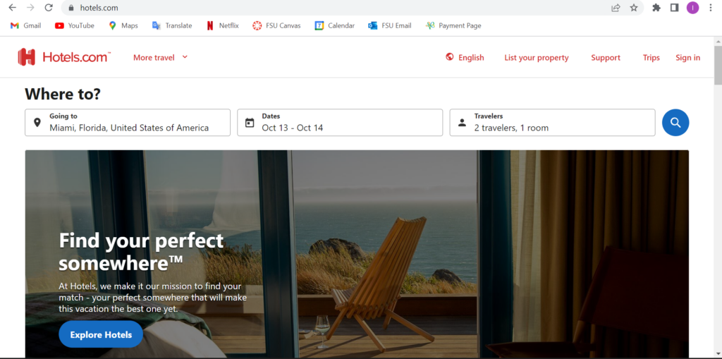
I chose to do a heuristic evaluation on one of our travel sites, Hotels.com. As an avid traveler, finding a place to stay in is a hard part of a vacation with many different new sites coming up such as Airbnb, Trivago, Expedia, etc. The website specializes in booking hotels, rental cars, and vacation rentals.
Method
In evaluating this website, I took the approach of navigating through the site first and looking at how it works as I have used it before but it is not a regular site I use to book trips. I used the 10 principles of Jakob Nielson’s approach for usability analysis and checked off each one to see which ones had flaws. I went step by step as if I were booking a trip to view the different outcomes of the prices and how the page gets set up when you input a new travel date. I decided to choose the travel destination as New York City and the dates will be during Thanksgiving week, November 22-27.
Usability Flaws
So on the homepage of Hotels.com, it seems very easy to navigate and has a lot of information on the main page. At the top of the screen, you can effortlessly search different locations and dates. Once you scroll down it has some information on different ways to travel and stays. So on the homepage, I input the travel stays I will be looking into which is New York City from November 22 – 27.
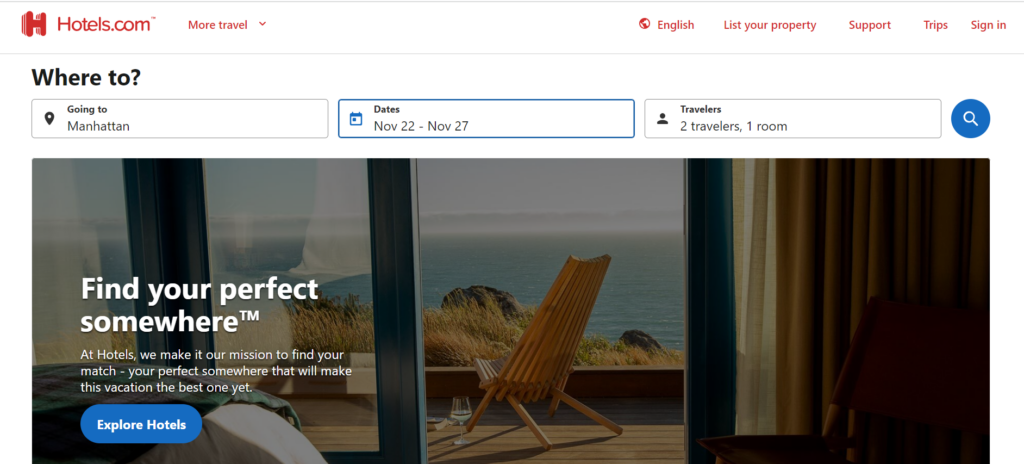
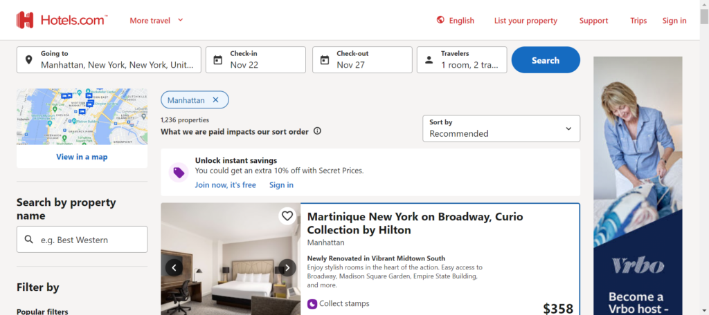
So once I searched up the travel plan, it showed me a list of different hotels with the price showing next to the hotel and a small description of the hotel. You can choose different filters and assortment to your liking. In the image below, I scrolled down a bit and you see some good deals labeled as “Secret Price available”.
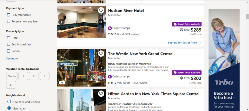
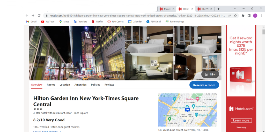
I clicked on the Westin New York Grand Central hotel to see how it worked since it was such a big price jump. When clicked on, it sent me to a different tab which violates the 6th heuristic of recognition rather than recall. This means that a user should not have to remember dates and there should also be a back button to correct any mistake if made. If the user was one that does not understand different tabs then this would be a big problem for them. I can see how if you end up on a new tab, you are going to start a whole new search and it is just repeating all the steps. I went on my phone as well to see if it opened a new tab or not and it did. This means that the user will have to keep switching between tabs to view each and every hotel.
Another violation was number 7, Flexibility and efficiency of use. An expert at tabs and the internet know they can switch between tabs and if need be they can close the tab. However, a newer user may not know that information and since each time you click on a hotel it opens up a new tab. A user may not know that they can either close the tab or navigate to the original tab. They might start the same search again which lose the efficiency of the website. Rather than it being a quick and easy task, it might take a while to view each hotel and its amenities.
Design Recommendations
I recommend that this website has more flexibility for more novice users but also for anybody that travels which is a majority of the population. Hotels.com does have great options and outcomes, but the design of opening a new tab every time you press on a new hotel can get exhaustive and causes a slower performance. There should be a way that a person can review the hotel they want and see it with the option of going back but also having that hotel in a recently viewed box if you want to keep browsing different hotels. This recommendation will solve both heuristic flaws, 6 and 7, which have to do with remembering what was searched and which hotels were viewed, as well as, navigating through the different tabs that allow you to know what information you viewed beforehand.