Introduction
Target Website: https://www.jeffdavishospital.org/
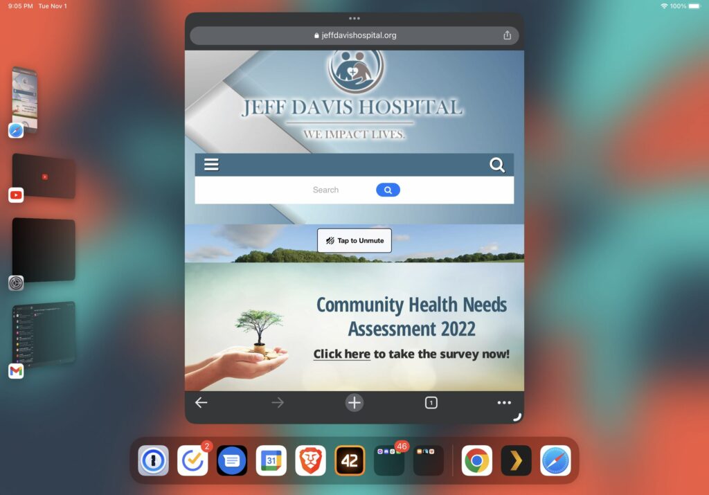
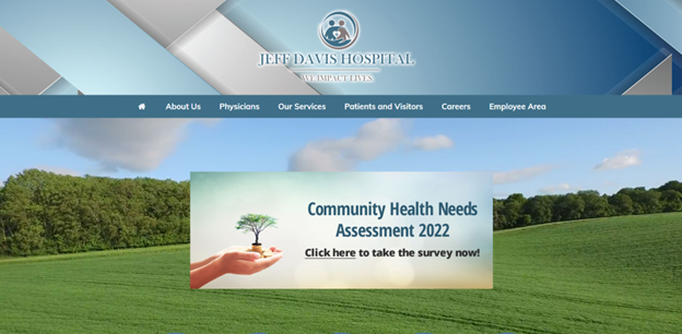
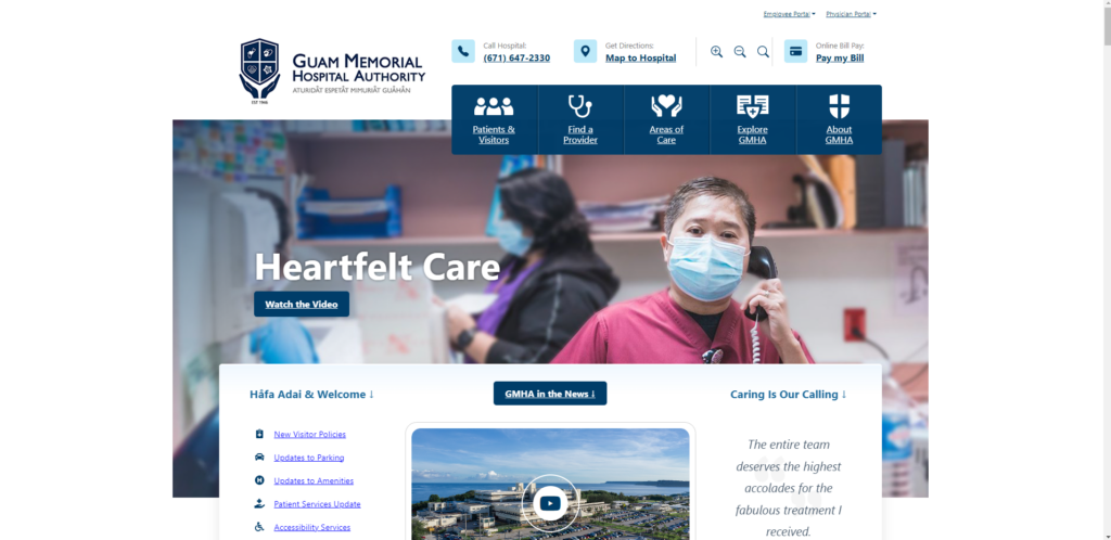
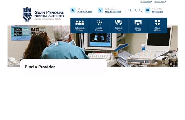
The Healthcare Group user tested the Jeff Davis Hospital (JDH) website, shown in Figure 1, through a comprehensive scenario of an individual seeking healthcare services for their family member. Violating major heuristics issues around consistency, standards, error prevention, efficiency and minimalist design, this site needed major redesign in content organization to merge its disjointed brand or legacy sites (Nielsen, 2020). In our group’s first redesign, we approached the site’s navigation by restructuring the site map, reimplementing search, and visualizing a native implementation of their Health Research Center. Wireframes were assembled in Figma Design and Figjam using Estefanía Montaña’s (n.d.) Easy-Peasy Wireframe Kit and colors matching JDH’s theme.
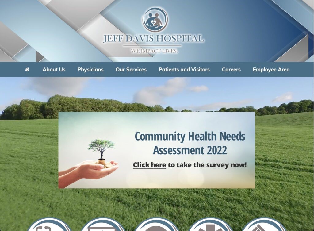
Figure 1. Production Homepage (Jeff Davis Hospital, 2022)
Proposed Re-design#1: Sitemap, Homepage, and Persistent Search
- Logo is home page link.
- Sitemap is reorganized to focus on logical pathways to complete the user tasks. Sections like About Uss, Employees, and Policies were moved to the footer to deprioritize them.
- Note that we will perform card sorting internally or with the class in the second iteration to improve the navigation.
- Search bar is persistent and references Services, Health Research Articles, and External Links as separate sections in results
- Homepage – Static interface because users didn’t like moving images or menus
- Homepage – Partnership links to brands so that they are visible but separate from the Navigation terminology
- See Nielsen’s Menu Design Article by Whitenton in References as a citation use.
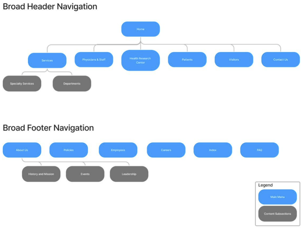
Figure 2. Sitemap
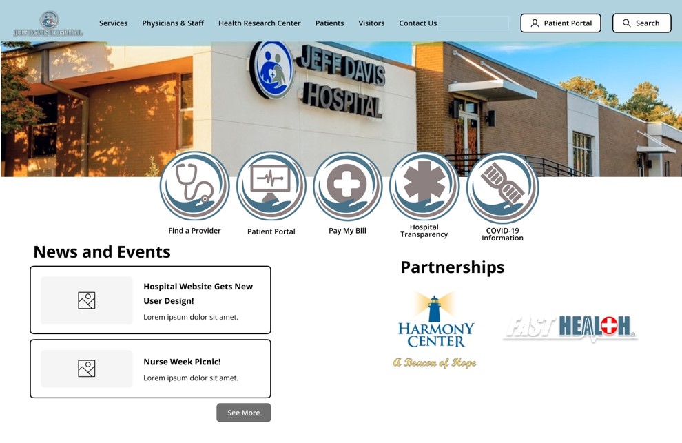
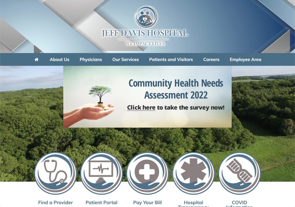
Figure 3. Homepage
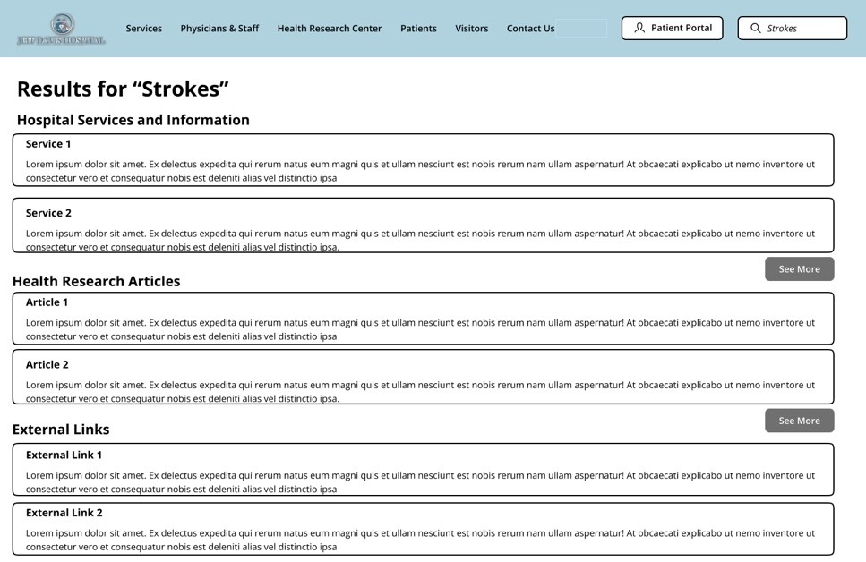
Figure 4. Search Results Page
Design Rationale
Sitemap
As a crucial part of our group’s iterative redesign of the JDH website, our focus immediately began with the landing page of the site to address numerous navigational and content organization issues that plagued our users during testing. As stated previously, the current website design violates numerous usability heuristics, and the landing page contains more than its fair share. Our group completely re-hauled the design through embracing a more minimalist aesthetic by eliminating unnecessary duplications of navigational options for content that presented no descriptive text and nonstandard language, while maintaining highly visible navigational links to the most used features of the website. We removed unnecessary imagery, the motion sickness-inducing video background, and outdated and unorganized content links.
Homepage
Additionally, our group made significant modifications to how the menu options and content are organized. We split the patient and visitor options, while combining physicians and employees. We moved some content and options to a separate footer option bar. Our group also removed the drop-down menu options and replaced them with subpages that allow for an improved navigational and information seeking experience by presenting options with supplemental descriptive text and images to avoid confusion over terminology or naming conventions by providing the user with the context they need to understand the option before they select it. By implementing a logical sitemap navigational architecture with meaningfully organized options and content, many of the design failures of the current website that we identified during testing can be corrected.
Persistent Search
Another major redesign element we introduced is the persistent search bar in the top right corner of every page on the website. Currently, a search bar is available on the site, but only if you scale the page just right; even then, selecting the magnifying glass icon only opens another search bar with another icon next to it. We have resolved this glaring issue by anchoring the search bar in a fixed location regardless of scale. What’s more, our group optimized the search results page by removing advertisements and externally promoted content and presented results in an organized precedence that will greatly improve the user experience of this feature
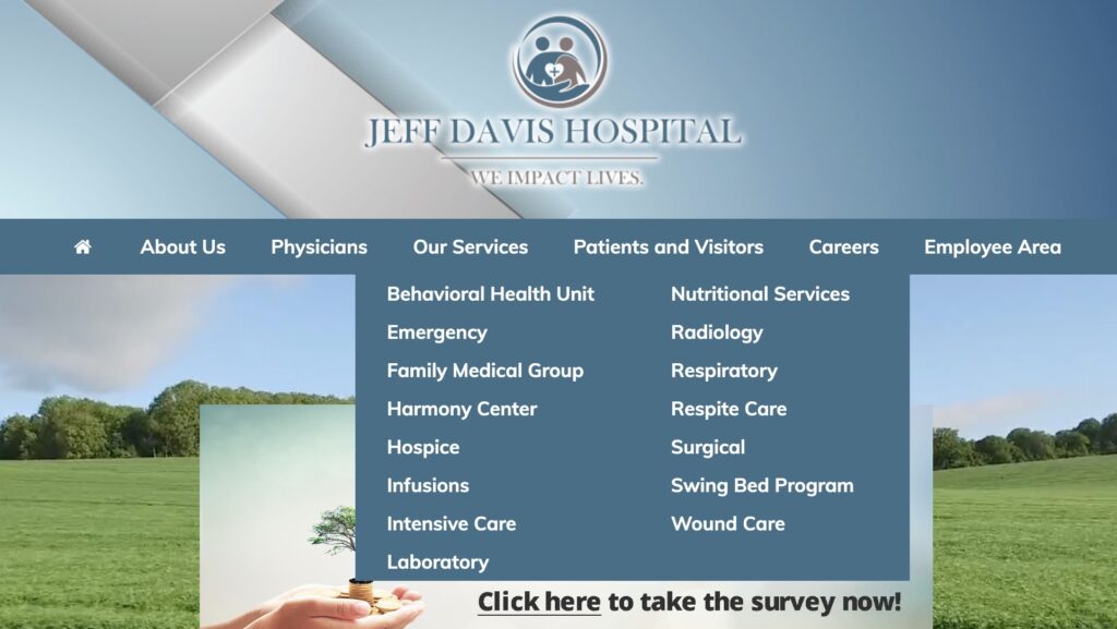
Proposed Re-design#2: Services Page
- Reorganized into respective Special Services (involving more than one department) and Department Sections as their own separate tabs instead of dropdown submenus. This helps with User responsive design too.
- Services named by their function rather than by brands like Swing-Bed and Harmony Center
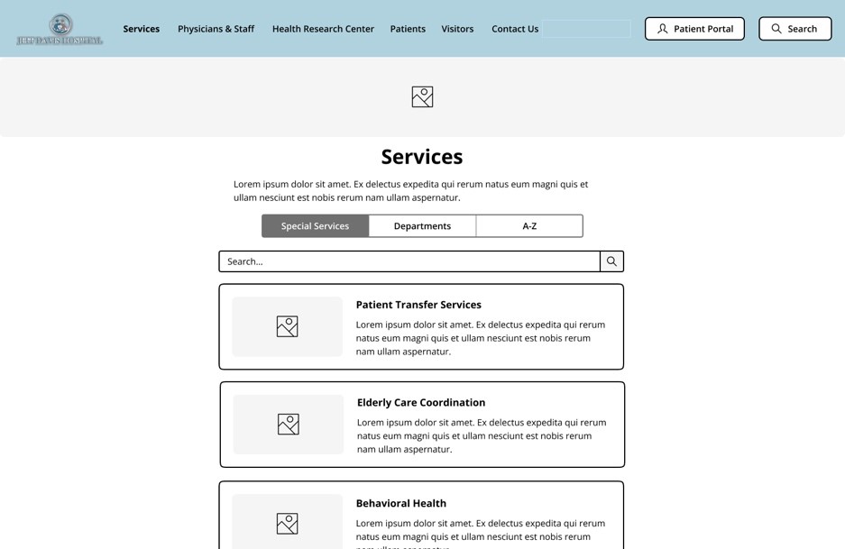
Figure 5. Services Webpage
Design Rationale
The original design of the Jeff Davis Hospital site displays a conjunction of listed services under the “Our services” widget. The services listed under “Our services” displays all the care teams and departments offered by the Jeff Davis Hospital, the issue found with this interface design includes the inaccessibility of design for users. When users are attempting to select a service on the site the pop up of the widget does not withstand longer than a few seconds which presents a design that is not as simple or efficient to use for users which thus inhibits the goals of effective user design. To experiment with improving the JDH site’s current design we removed the service list from the main page drop down menu, footer options, and on the main page tiles. We replaced the service list drop down with a subpage directory for all services provided available with search bar, department organizational listing, and listed them alphabetically by service name. On the iterative design we are recommending, the services are listed with descriptive text and imagery to avoid confusion over terminology or naming conventions while also aiming to make finding Patient Transfer Services and Elderly Care Coordination simpler and more efficient. The information shown on each respective services page would be transferred to the respected services that they currently fall under on the JDH site as it is because the information listed helps in remaining informed on the services, but the formatting if the information presented would list the contact personnel first and at the end of the page. The information would be formatted in the middle of the page.
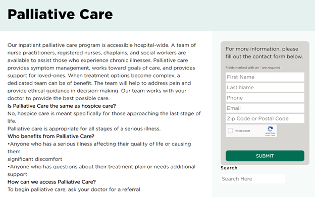
Proposed Re-design#3: Incorporated Health Research Center Knowledgebase
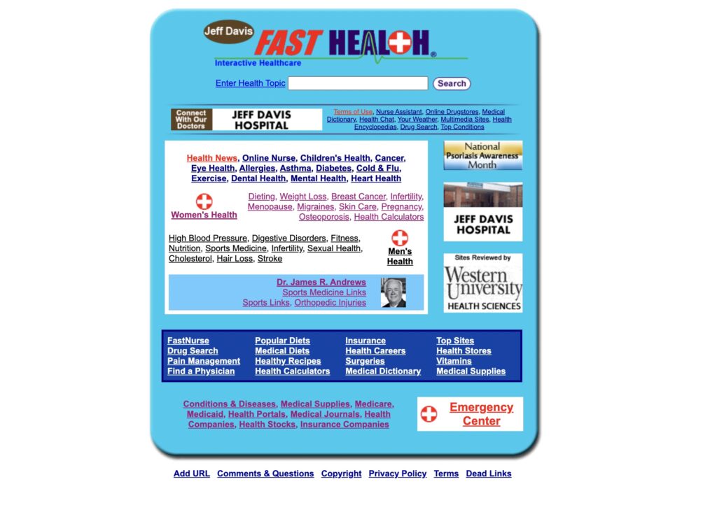
- User Observation – Unappealing and Confusing FastHealth Site
- User Observation – Confusing Linkage to External Sites and FastNurse Branding
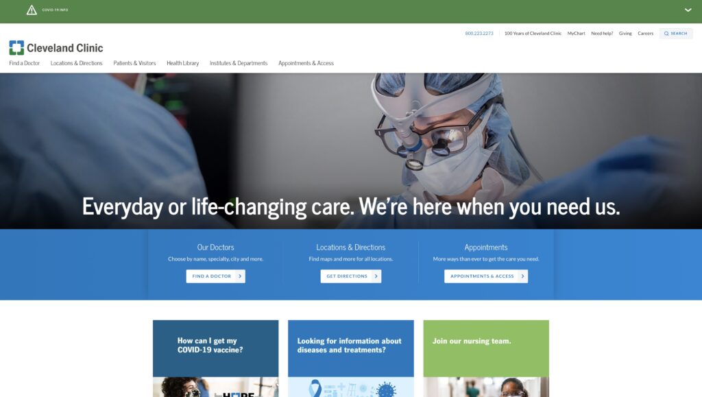
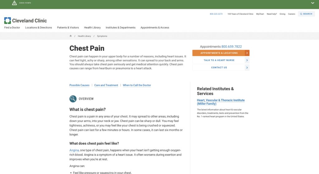
- Cite Cleveland Clinic as a derived example of the knowledgebase – See their Health Library
- Content stays on the website and stays consistent with the Jeff Davis Theme
- Adding external links to the bottom keeps the reputable resources from FastHealth
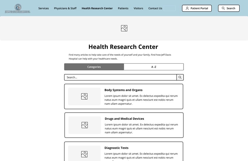
Figure 6. Health Research Center
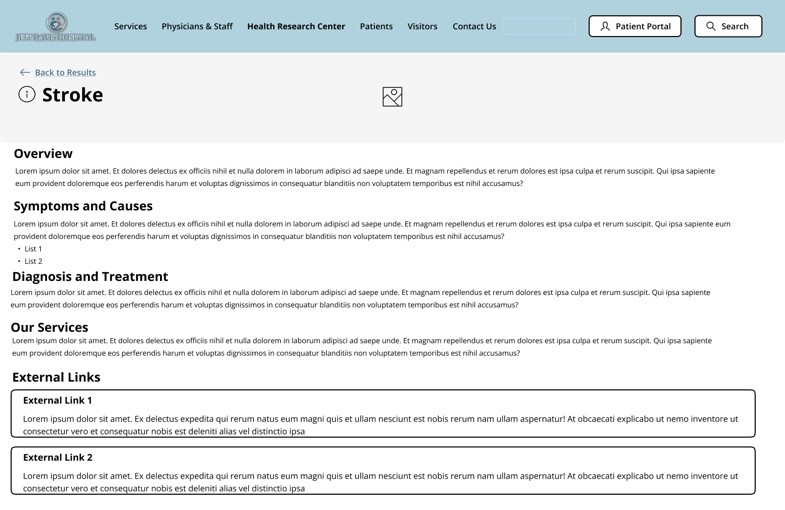
Figure 7. Health Research Article – Stroke
Design Rationale
Health Research Center
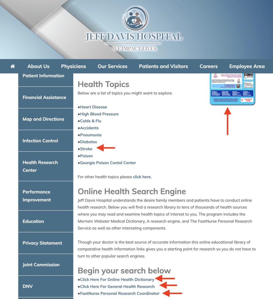
As referenced in our group’s representative user tasks, FastHealth stroke-related information proved a difficult endeavor for our users to successfully navigate. Therefore, we are proposing incorporating FastHealth’s interface into the JDH ‘Health Research Center’ webpage like Figure 6. We conducted benchmark tests and found that Cleveland Clinic is suitable to emulate a portion of its health center knowledgebase interface for this re-designed webpage. Namely, sectioning the webpage’s ‘Search‘ and “Browse A-Z‘ components. However, our re-design will swap “Search” for “Categories” since the naming convention and its presented components in Figure 6 will make searching for relevant health information better structured. This re-design will include a search bar to address additional users’ preferences for information searches. These solutions make it easier for users to quickly retrieve relevant health information.
Health Research Article
Additionally, our representative user tests identified usability flaws with efficiently researching stroke-related information concerning FastHealth’s presentation of its links. To address these flaws, JDH health research articles (as shown in Figure 7) will be re-designed so that content can remain on the JDH website without disorienting users, staying consistent with the JDH minimalistic aesthetic. The articles will provide key sections that efficiently address our user’s health information needs. Relevant external links found on FastHealth regarding chosen health-related information will be included on this webpage as well. These proposed changes will reduce usability flaws related to the current site’s lack of consistency, confusing navigation, and abundance of information noise.
References
Health Library. Cleveland Clinic. (n.d.). Retrieved November 15, 2022, from https://my.clevelandclinic.org/health
Jeff Davis Hospital. (2022). Jeff Davis Hospital. https://www.jeffdavishospital.org/
Jeff Davis Hospital/fasthealth corporation (Hazlehurst, Georgia – jeff davis county). (2022). Jeff Davis Hospital/FastHealth Corporation. http://www.jeffdavisfasthealth.com/
Montaña, E. (n.d.). Easy-Peasy Wireframe Kit. Figma. https://www.figma.com/community/file/989274600796773962
Nielsen, J. (2020, November 15). 10 usability heuristics for user interface design. Nielsen Norman Group. https://www.nngroup.com/articles/ten-usability-heuristics/
Whitenton, K. (2015, November 29). Menu design: Checklist of 15 UX Guidelines to Help Users. Nielsen Norman Group. https://www.nngroup.com/articles/menu-design/
External Links
Group Assignment 2 – User Scenarios and Representative Tasks
Group Assignment 1 – Group Topic Selection
Total Word Count: 1245