We incorporated the feedback we received during the in-class review of our redesigned vision of the Sarah Maker website and made the following changes to make navigating even easier for the beginning crocheter (and knitter!):
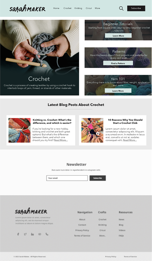
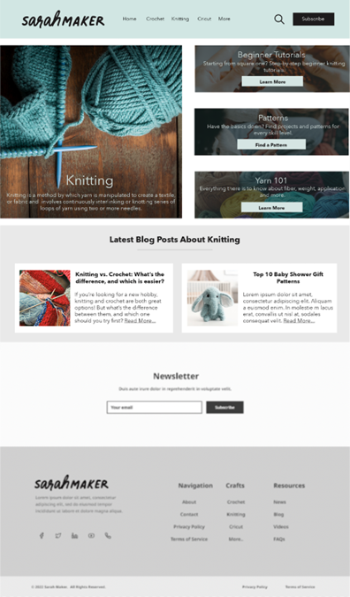
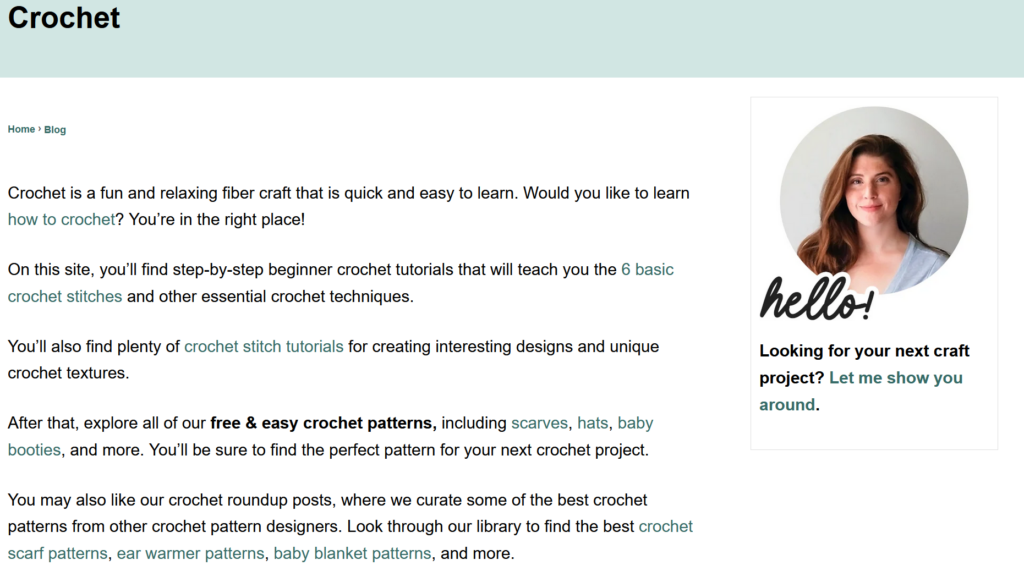
In our first iteration of the redesigned crochet landing page, we had links to both a “get started” page and a “beginner tutorials” page. A beginner might not know where to go first, so the page has been redesigned with a large crochet image (not linked to anything) to establish the page identity and all the beginner information is combined into one link.
Redesigned Crochet Landing Page
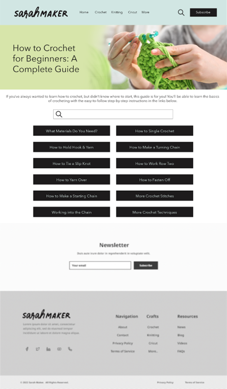
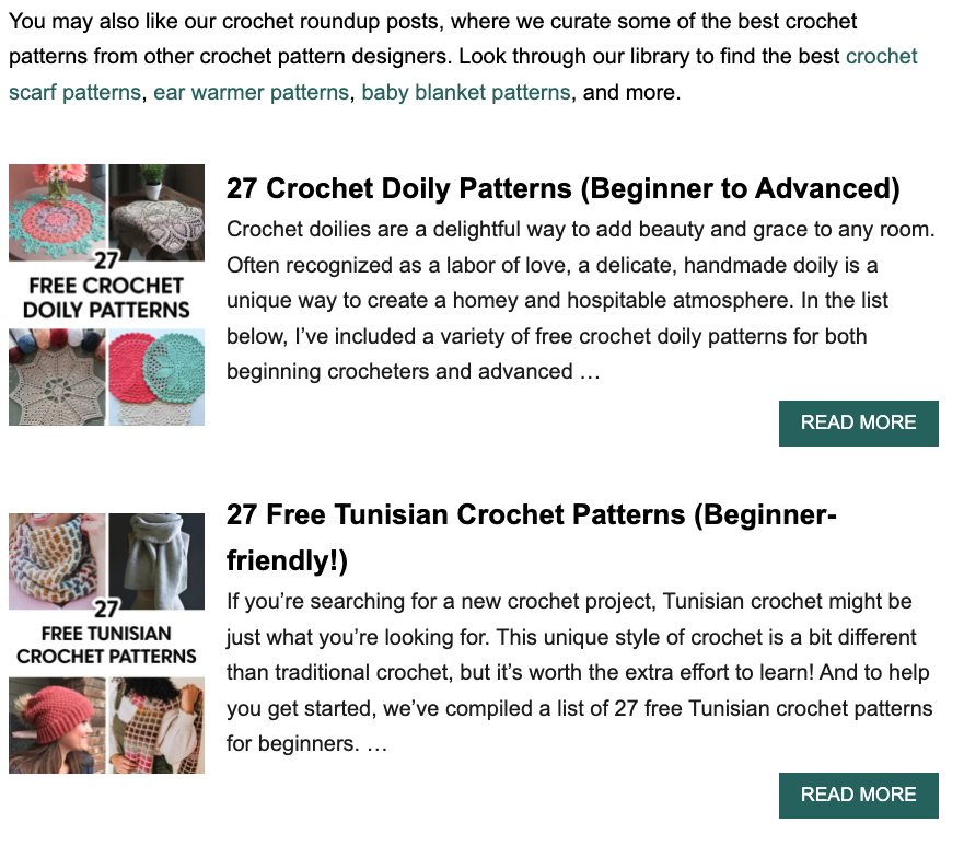
We have included a version of what this new all-in-one beginner crochet page might look like. Instead of a mishmash of hyperlinks hidden among paragraphs of text on one very long page (as is currently found at https://sarahmaker.com/how-to-crochet/, the different instructions have been divided into different pages with highly visible buttons. In addition to the very first lessons about materials and how to hold your hook and yarn, there are links to each of the basic stitches a beginner needs to learn. We have also included a search bar for the crochet section so that a user can find what they are looking for even if they are not familiar with the terminology they see in the buttons.
Crochet Beginner’s Guide Page
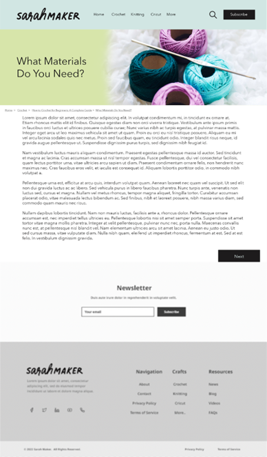
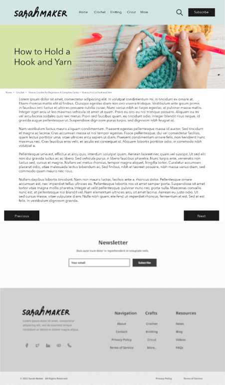
If a user uses the buttons and starts from the beginning, they will be taken to a new page that shows the instructions for each section. These pages also have “previous” and “next” buttons at the bottom (as appropriate) so that the user can easily navigate from one set of instructions to the next, as they are laid out in the order that a complete beginner should go through them. The pages for the first two links (“what materials do you need” and “how to hold a hook and yarn”) are shown below.
Materials Guide Page — First Page of New TutorialsHow to Hold a Hook and Yarn — Second Page of New Tutorials
Since Sarah Maker also includes knitting patterns (and her original layout is just as confusing as it is for crochet) we also redesigned the knitting landing page to match the crochet page. This will add a level of consistency for the user as they navigate through the site. The rest of the knitting section would be structured similarly to the redesigned crochet section.
New Knitting Landing Page — Matches Crochet Landing Page
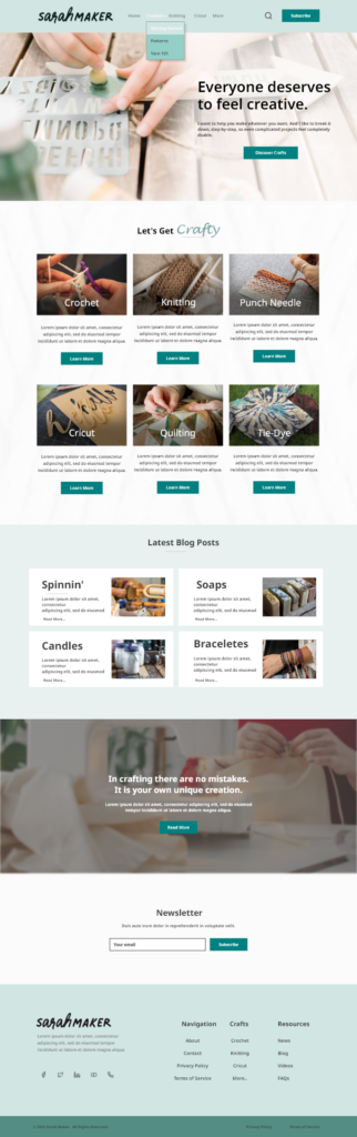
Finally, in our previous post, we had the layout of the redesigned homepage, but we hadn’t had a chance to add pictures and colors to make it mesh with the new craft-specific landing pages. The new iteration includes images of each craft as well as inspiring words to get the user excited to discover new crafty activities.
New Homepage
We hope that our redesigned version of the Sarah Maker website will encourage visitors to spend more time on the site, not because they are frustrated by trying to find the information they want, but because they find it a welcoming and easy-to-navigate resource that they can come back to again and again. The new organization and functionalities should impress both current users and those who are coming to the site for the first time!
The website I will be testing with my user is SarahMaker.com( https://sarahmaker.com/). SarahMaker.com is an educational website that features classes, articles, patterns, and premium video to help you learn a craft of your choice. Their scope of subject is large and includes, fabric crafts, needle arts, sewing, sculpting, and more. The website includes both free and premium paid content. I say that this is a great website for a beginner crafter in any medium. Crafting, or creating in general, can seem daunting and easily susceptible to information overload, but Sarah has done her best to create a clean and professional appearance for her website.
USERS
My first user is a 29-year-old man, and a coworker of mine. I’ll call him Cam for this analysis. We both work in IT. He is crafty in his own way, but he’s definitely more of a tinkerer and woodworker. He is very well-versed on the internet and is also an avid gamer, and youtuber. So, I will be running with the assumption that he knows how a website is supposed to flow, so he may be a much harsher critic. But he is also internet savvy enough to get himself out a of situation fairly easily. My second user is a 28-year-old woman, who is also a coworker of mine. I’ll call her Fae for this analysis. She is a very competent user and far more interested in “craftier” crafts such as needle arts mentioned on the website. She’s also well-versed in browsing websites, so she also has an expected flow of information architecture.
TESTING METHOD: THINK ALOUD
The user testing method I chose was the Think Aloud method. I chose this method because, most of my user “test subjects” are often my friends, and they are usually not ones to mince words. They are not afraid to tell you what they are thinking and many times you can get a good laugh from their commentary. I usually like to do my user testing in person, but with flu-season rampant and the sickness hitting my household hard, we’re going to use Facebook Messenger to run the test. My user will share their screen with me and have their microphone on as they complete the required tasks.
USER TASKS
I gave my users five tasks to complete:
Find the beginner crochet section.
Find information about Sarah Maker
Find Polymer clay project ideas.
Find how to use Cricut Infusible Ink for Cricut Machine.
Find How to make a quilt.
The tasks did not differ greatly from the tasks included in our group. I added more tasks in different areas to see if the problems faced in the crochet section of the website extended to other sections.
Task 1: Find the beginner crochet section.
In this task, both Cam and Fae were tasked with finding a section dedicated to the basics of learning crochet. In Cam’s test he utilized the top menu option for, “Crochet”. The proceeding page is the page we are familiar with. I mentioned this issue in my previous post:
“However, the main crochet page opens to a wall of text, that I immediately skip, to go to what I believe are the lessons or beginner content separated into sections (or cards) below. These are all sponsored ads for crochet pattern packs. That’s not going to be very beneficial to someone who is a complete beginner. The stitch tutorials for beginners are found in a link in the middle of the wall of text I’ve already skipped over. The links are also a muted shade of green that is very similar to the color of the basic text. I think this is a violation of rule number 7: Flexibility and efficiency of use. “
Both Cam and Fae did the exact same thing coming to this page, skipping over the entry text, and thus the link that takes the user to the beginner crochet section. They eventually did scroll back to the top and find the link. Fae did mention that learning to do something is a vital reason someone would visit this site. The link to that information should be large, visible, and available to reach from several different sections of the site. A separate section in the header navigation for sub-navigation items that showcase big pieces of user journeys would combat a lot of frustration on the users’ part.
Task 2: Find information about Sarah Maker herself.
I neglected to mention that both Cam and Fae were doing these tasks on mobile devices, so their difficulties were ramped up a little. While on desktop view, this task is extremely easy. The answer is on the same page right next to the information the user was just looking for. On mobile view, that information is removed. Both Cam and Fae knew that at the top of most websites, there is an “About” section. They went to the hamburger menu expecting an About section to be there, but there wasn’t. Cam being the slightly more advanced user voiced that the information is also in the footer sometimes. He was correct and found the About section. Fae took a few moments longer to scroll all the way down to the page and find the link in the footer information. Both agreed that if you’re marketing your website based on yourself, information about yourself should not be difficult to find. In revisions of this website, I would include an About section in the top menu, so the information is readily available for users on all screen sizes.
Task 3: Find Polymer clay project ideas.
This task was general in its wording. I did have to do some prompting that I wanted them to find an article containing “Polymer Clay Project Ideas”, specifically. That’s something I will have to watch for in the future. This is where the users took different paths to find this information. Cam actually went back to the front page, because he recalled seeing information about clay projects. The article is right on the front page, “21 Polymer Clay Ideas and Projects”. Fae first looked for clay or polymer clay in the topmost menu. She did not see the option at first, so she scrolled down on the front page to where the six categories were, and still did not see it. She tried the topmost hamburger menu again, but this time she saw that “Crafts” had a dropdown section. She clicked and saw the option for Polymer Clay. When she was brought to the polymer clay craft collections, she scrolled down, and the fourth article was the “21 Polymer Clay Ideas and Projects”.
While both completed the task, both were unhappy with the lack of organization of the polymer clay page. Instead of there being a table of contents or some head navigation, the page is presented as a list of articles. So, they have no idea how long this list will be until they find the correct article.
Task 4: Find how to use Cricut Infusible Ink for Cricut Machine.
By this task, both users had begun to understand the odd flow of this website. They’d seen Cricut showcased on several sections of the website. Cam utilized the “Cricut” option in the top menu and scrolled down until he saw something that mentioned Infusible Ink. Fae took the same route. Fae did mention, again, how this section had pages of articles and they don’t seem to be in any type of order. While the information we were currently looking for was easy to find because it was on the first page, what if the information was on the 4th page? The user has no way of knowing where in the list of articles the information they’re seeking will come up. As mentioned before, this section and the other sections would benefit from a table of contents or category list of some sort to help with sorting and filtering information.
Task 5: Find How to make a quilt.
The final task was probably the most challenging task for them. This information is hidden. Cam began by retreating back to the front page and choosing the large “Quilting” option under “Knitting”. This page only has 2 pages of articles. After looking at all of the articles and seeing that they all have to do with quilting patterns, he chose the last article, “50+ Free Easy Quilt Patterns for Beginners”. After a short bit of scrolling the title, “How to make a Quilt” titled one of the sections. Fae decided to try out the search function on the website. The search was not as definitive as she’d hoped. She also wondered why when she searched, “How to Quilt” options for circuit were coming up. But, searching the results brought her to the same article, “50+ Free Easy Quilt Patterns for Beginners, and within that article she found, “How to Quilt”.
Again, Fae had the right questions for this task. If you already don’t know how to make a quilt, why would you look into a section about free quilting patterns to learn? And again, this section would benefit from a table of contents or categories to help navigate your learning around the craft.
CONCLUSIONS
SarahMaker.com is packed full of amazing information about crafting, but the disorganization of the site could put off potential users from staying very long to see all that information. For this website, search crafting subject should be broken down into at least three different sections: A “Getting Started” guide for absolute beginners, A “Materials and Techniques” type of section and a “Patterns” section. That way a crafter can see the core aspects of each craft: the process, the materials, and the projects. Then the user can choose which aspect they would like to learn more about.
Also, Sarah makes use of articles for the bulk of her website. If she is going to do that, she absolutely must utilize the tags, and categorize her articles correctly so the search function on her website is more robust and accurate. This also allows users the freedom to learn more about a specific topic that may not be covered by the core aspects of the craft. This website can become a fantastic resource if the organizational issues are addressed.
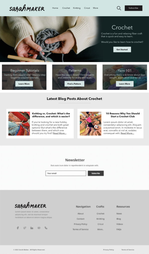
As a continuation from the homepage – our group also thought it would be useful to make redesign suggestions for the Crochet landing page. This page can be accessed from clicking “Crochet” in the top navigation or from the “Crochet” category button on the homepage beneath the header.
Our proposed redesign:
This redesign would make it much easier for users to quickly find the section/information they need in one glance, instead of having to read through lengthy paragraphs to find hard-to-see hyperlinks within. (see current crochet page below).
Our redesign would maintain the same branded top navigation as the redesigned homepage, as well as the same redesigned footer. This would provide consistency for users as well as maintain an easy site map for links that are accessed often.
We kept the newsletter section large but near the bottom to remove the need for a distracting shaded effect the current site has, while still maintaining the accessibility/importance for the newsletter sign up.
Additional things to note about our crochet page redesign:
Separate hyperlinks and put them in more contrasting colors by creating obvious/clearly labeled buttons
Tag beginner-friendly posts and/or tag all posts with appropriate levels – within the sub pages (for example patterns), all patterns/tutorials will be organized by skill level.
Our group chose to user test and redesign the website Sarah Maker, which is focused on teaching people how to create many different arts and crafts. The persona we chose for our user test was a young woman who wanted to learn to crochet, so for our first iteration of our website redesign, we focused on making the home page easier to use for both beginner crocheters and for any user of the website.
Original Homepage
Homepage Redesign
The first of the main changes to the homepage came in the form of adding drop down menus to each of the menu bar options at the top of the page. On the existing site, these are single-click options (except for the “Crafts” menu). This change will allow users to find more specific topics within the broader topic that they are exploring, as well as make overall site navigation much more simple and easy to use, and cause the users less frustration when they are looking for something specific.
Redesigned Homepage
Additionally, in the menu bar, a “Home” button has been added and the “Crafts” button has been replaced with a “More” button. While more savvy users may know that a majority of websites allow you to navigate back to the home menu of a page by clicking on the site’s logo or title at the top of the page, those who are not aware may have difficulties navigating easily back to the homepage. The addition of the “Home” button will easily remedy this issue. The adding of the “More” button serves to clear up a bit of confusion that may be caused by the “Crafts” button. The “Crafts” button comes off as relatively redundant, given that each of the other tabs actually contain crafts as well. By changing this button to “More,” some of this confusion may be eliminated. Finally, short descriptions have been added to each of the different craft options further down the home page. This will provide users with some more information about each of their given options without them having to go back and forth between the different links.
Right under the redesigned menu options, there is a new tagline and brief introduction to the site – on the original design, you have to scroll all the way down to the bottom of the page to find the “About” section or click on another menu (such as “Crochet” and then click on her information from the side). The new design immediately tells users what the purpose of the site is, rather than just having a bunch of miscellaneous menus.
At the bottom of the page, in addition to the existing “Navigation” section, we have changed the Social Media links to their respective icons and added “Crafts” and “Resources” section, mirroring what users can find at the top of the page so they don’t have to scroll all the way back up after exploring the home page. In the “Resources” section, we have also added an FAQ as a catch-all for users looking to find basic information about the site as well as about specific crafts. This will increase the ways that users can find the information they need depending on their preferred way of moving around the website.
We will be submitting an additional post to this one soon with a new wireframe depicting modifications made to the crochet page.
The website being evaluated is Sarah Maker. It is a crafting tutorial site for multiple mediums including crochet, knitting, punch needle, cricut, quilting, tie dye, and more. The website is organized by medium, and the tutorials are given in blog post format with photo examples vs. video.
The Users
The users of the site will be people interested in crafting and be of various skill level. I can see anyone from beginners to advanced crafters using this site for their crafting needs. The users will be creative with artistic tastes/interests and will most likely respond well to visuals.
Our group persona is a social-media savvy young woman who is just starting her journey in crochet.
I did not have someone available who would fit this persona, so my user is a highly advanced tech male in his mid 30’s. He has a computer science degree and works in cyber security. While he is interested in creating – he dabbles in 3D printing and painting vs. the more fiber/yarn-based crafts on this website. I think this effected his choice of Christmas gift tutorial – he is way more practical minded and less “cutesy” when it comes to tastes, which may not be accurate for above persona.
The User Test Method
The user test method utilized was the Think Aloud method. He sat at a computer while I sat at a chair next to him. I asked him to narrate his process as much as possible and took notes while he completed them. I chose this method because it was a great option as far as tools available went as well as created a relaxed environment for the user to narrate and complete the tasks. I was able to sit and closely observe their process.
The Tasks
I stuck to the original tasks which were as follows:
Task 1: Find instructions for a complete crochet beginner who has no idea where to even start with the craft.
Task 2: Learn what different types of yarn and thread are good for different types of crafting.
Task 3: Find a beginning crochet project that would make a good holiday gift for friends or family.
Analysis
Task 1
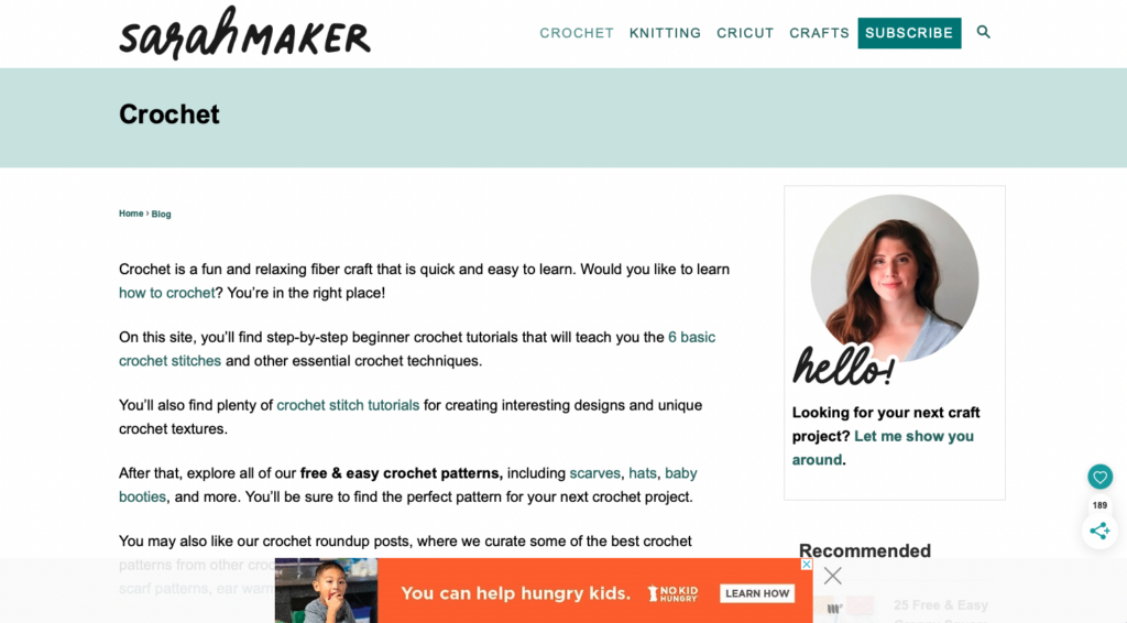
For Task 1 he started at the home page. First instinct was to click Crochet from navigation. This landing page is very wordy and he did not spend time reading it carefully and instead scanned the text, completely missing the paragraph about beginning to learn crochet. He noted that the links are way too close in color to the body text and were hard to see. He also noted that the visuals on this page were hard to differentiate from the advertisements. This caused him to glaze over the first few visuals/links at first:
When he got to the bottom of the page he exclaimed quite exasperatedly “THERE ARE 15 PAGES?!”
Once he realized that the images above are links and not ads he scrolled up and clicked “27 Free Tunisian Crochet Patterns”. I asked why he went with this one and he said it was because it mentioned “Beginner friendly” in the title whereas the others said “Beginner to Advanced” so he thought that would be the better option for him.
Here he scrolled down a bit and made note on how much text there was, while not reading any of it.
Clicked Tunisian hooks link under supplies and led him to Amazon. Said would buy this if starting.
Went back to site and saw the first pattern – liked the look of it so he read the details. Noted he liked how clear this part is. Large image, brief description, suggested yarn, and clear link.
It leads to a tutorial on another site.
At this point I slightly led, because I think he was a little confused on task and getting away from himself. So, I said “if you didn’t even have a clue on how to read a pattern and were just looking for the extreme basics, like stitches and casting on. Where would you go?”
Went back to the crochet landing page from navigation and read the top content more closely. Finally found the small link to the Crochet for Beginners Guide mentioned in very first sentence.
On this page he mentions he likes the photos but would probably go to YouTube later for video tutorials.
Task 2
Starting again on the homepage, went to Crafts from navigation. Read list and decided that was not where he needed to be. Then clicked Knitting from navigation. Sat for a bit lost on where to go, then noticed the Search bar.
Using the search bar, he searched “Types of Yarn”. Made note that he had no idea what any of the terms meant, for example “Worsted”, “Yarn Weight”, etc. Because of this he decided not to click on any of the links and instead adjusted his search to “Best Types of Yarn” – this produced the same results. He clicked out of search and exclaimed that at this point he would give up and use google to find a different website.
Task 3
Again, started from the homepage and then went to the Crochet landing page from the top navigation. Scrolled down the long page and passed over the Christmas themed patterns and went to page 2 instead. When asked why he didn’t click those he said he thought they were a lame gift idea and wanted to go with something more practical, that people could use year-round.
Instead chose “25 Gift Ideas” link because the visual spoke to him.
On this page he started to scroll down and stopped at the holiday list. He noted that he didn’t like that only Christmas and Valentine’s Day were links:
Kept scrolling and started reading a bit. Got annoyed when his reading was interrupted by the shadow effect that happens when you scroll over the email forms.
He also made note that it is annoying to have to scroll through each pattern one at a time instead of seeing them all at once to determine more quickly which one you would like to learn.
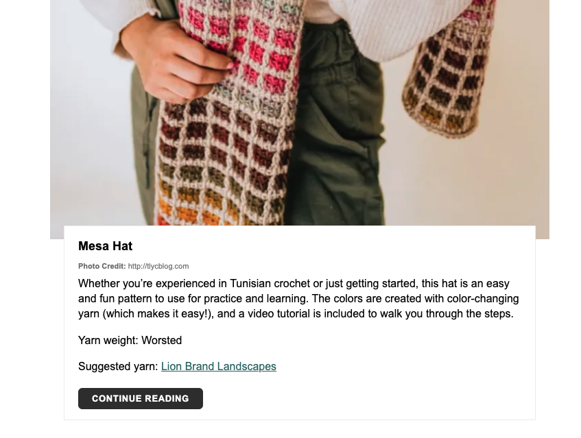
Had to scroll for a bit until he came to a project he liked: “Easy Crochet Can Cozy”
Clicked “Continue Reading” to learn this pattern. Started reading the pattern a bit and missed the links up top that would teach the 6 Basic Crochet Stitches for Beginners. Saw lower that he needed the Moss Stitch for this pattern, but that there wasn’t a clearly labeled link or tutorial for this stitch. Scrolled back up and clicked the stitch link. Used “Command F” to search “Moss Stitch” on this page. Then had to click another link to finally get to the moss stitch tutorial. Needed to navigate 3 pages just to find the stitch tutorial needed for this pattern.
Design Suggestions
My design recommendations for this website would have the goal of reducing search time for the users. Each task in the analysis took quite a long time to complete. To do this I would do the following:
Reducing scrolling needed by revaluating the architecture of the pages – this can be done by creating clear categories that can be seen before the fold of the homepage. Instead of placing important links in content blocks, move them out into clear CTA buttons and lastly placing the tutorials in a gallery format vs. one on top of the other.
Navigation: the navigation can be organized more successfully by matching the categories linked on homepage: Crochet, Knitting, Punch Needle, Cricut, Quilting, Tie-Dye
Vs. having quite a few of the crafts hidden under the “Crafts” category
I would also place dropdowns underneath each of the top navigation links and would have a clear link for beginners guides underneath the navigation.
Other suggestions: remove shading effect over email forms and create videos for users (to keep them on this site instead of competitors on youtube)
The Arts and Crafts group has chosen to evaluate sarahmaker.com, a website run by a woman named Sarah who describes herself as “collecting hobbies” – that is, she loves crafts and wants to share ideas, patterns, and instruction with the world. The main menu headings at the top of the page are Crochet, Knitting, Cricut, and Crafts (this last one has a drop-down menu leading to several other categories, including friendship bracelets, jewelry making, and tie dye). Since crochet is the first menu heading and the first craft she mentions in her bio, it is the craft our group chose to focus on most heavily for our user testing.
Sarah Maker Home Page
The User
Our persona is that of a social-media savvy young woman who wants to learn to crochet after being inspired on Pinterest. She has been wanting to start crocheting for years, but finally has the free time to begin the hobby. My actual user mirrors our chosen persona surprisingly well – when I described it to her, she said, “that’s practically me.” She is woman in her twenties who wants to explore many different crafts (including crochet!) but hasn’t found the time yet to do it. After going through the user tests on Sarah Maker, she felt even more inspired (but probably still doesn’t have time).
User Testing Method
I used the Think Aloud method to conduct my user test. Since I only had one user tester and no fancy monitoring equipment, I sat next to her while she was on her laptop and asked her to narrate her thoughts as she moved through the tasks and took notes as she did so, asking clarifying questions if she clicked on something without explaining why she did so. She was very good about walking me through her process and required very little prompting.
User Tasks – Overview
Our original tasks were as follows:
Task 1: Find instructions for a complete crochet beginner who has no idea where to even start with the craft.
Task 2: Learn what different types of yarn and thread are good for different types of crafting.
Task 3: Find a beginning crochet project that would make a good holiday gift for friends or family.
I presented the tasks to my user one at a time, using the same wording from the previous assignment. However, I ended up giving them to her in a different order due to how she was exploring the site. As she was completing Task 1, she naturally flowed into Task 3 (with a brief comment that was related to Task 2). I let her continue exploring Task 3 before redirecting her back into Task 2.
User Tasks – Detailed Analysis
Task 1
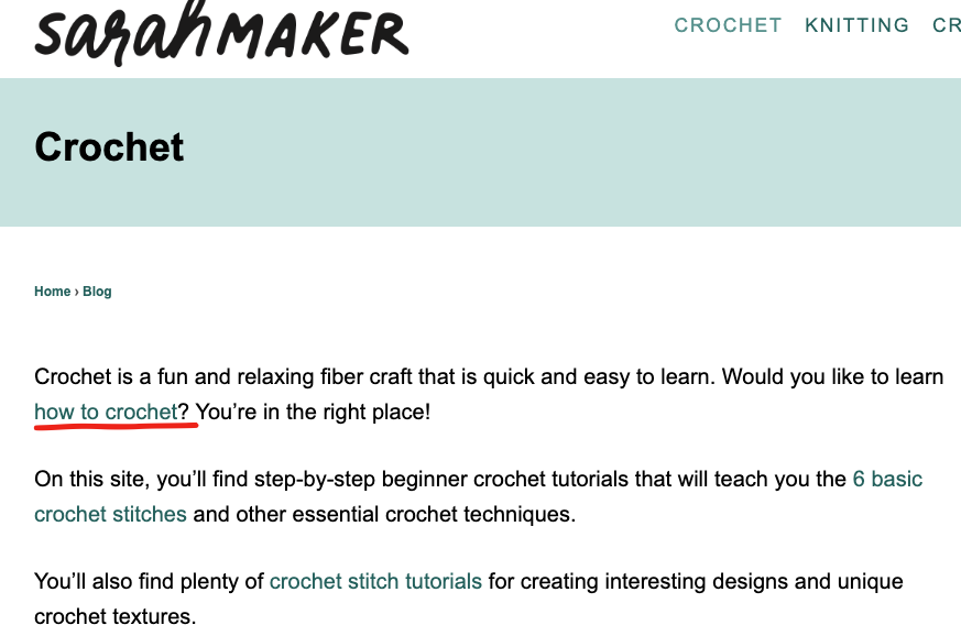
For Task 1, I asked my user to find instructions for a complete beginner to learn to crochet. She immediately clicked on the Crochet menu at the top of the page. She started reading the descriptive text and missed the “how to crochet” link that was embedded in the first paragraph but noticed the “6 basic crochet stitches” link in the second paragraph and clicked on that (many of the embedded links on the site are difficult to see, as they are not in a highly contrasting color and don’t show an underline until you mouse over them). She scrolled down and noticed the bullet points of the different kinds of stitches (she either didn’t notice or didn’t mention that only four of the six stitches in the list had hyperlinks). However, just after that, she saw the embedded link for How to Crochet: A Complete Guide for Beginners, and clicked on that (she opened it in a new tab so that she would still have access to the stitch page). This took her to the same page that she would have gone to if she had clicked that first hidden “how to crochet” link.
Main Crochet Page on Sarah Maker
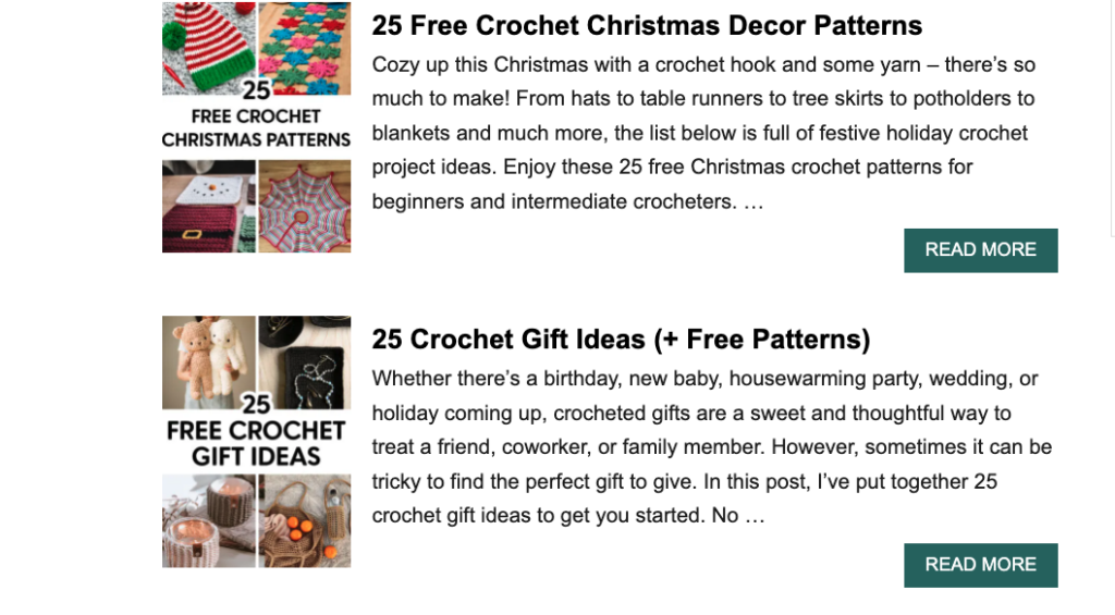
My user mentioned that she liked seeing the photos on the page as she continued to scroll down. She commented on each section as she read and clicked on the links that caught her interest, opening them in new tabs. The two she clicked on were the “crochet supplies for beginners,” where she appreciated the division of tools into “need to haves” and “nice to haves,” and the “worsted weight yarn” link because she was curious about what that was. (That was her brief foray into Task 2 before I introduced it to her.) When she got to the bottom of the supply list page, she noticed that she had already read two of the three related articles that were linked (the “how to crochet” guide and the “6 stitches” guide). The third one was a pattern for a beginner crochet scarf, but she didn’t click on that yet because she didn’t want to confuse herself.
Even while saying that, she went back to the main Crochet page to find more information about basic crocheting and scrolled down, and was immediately drawn to the “27 Free Tunisian Crochet Patterns (Beginner-friendly!)” link. She said she was curious about them because the title drew her attention. She kept scrolling down the Crochet page to see if there was more beginner information, but only saw collections of different types of patterns. She wanted to see if there was any kind of FAQ at the bottom of the page, but there was not. (She didn’t click on the About link to see if that had anything.) She went back and clicked through the different pages of the crochet links, looking to see if anything was tagged as being appropriate for beginners, even before I introduced Task 3, which was to find a beginner project that she could make.
Task 3
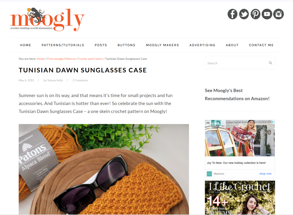
Since she on her way toward Task 3 already, I formally introduced it by asking my user to find a beginner-friendly project that she could give as a holiday gift to friends or family. She remembered seeing a link for 25 Crochet Gift Ideas on page two of the crochet patterns, so she navigated there but realized that it didn’t have a beginner tag, so she returned to the Tunisian crochet patterns she had seen earlier. As she scrolled through them, she didn’t necessarily think they looked like beginner patterns, but she clicked on the instructions for the sunglasses case to see if it looked doable. The first thing she noticed was that she was taken to an external site. She scrolled down past the introduction and noticed that it provided a materials list, as well as links for tutorials to the different kinds of stitches and techniques that are required. When she read through the instructions, she knew she would have to refer back to not only these tutorials, but general crochet instructions so that she could follow all the abbreviations in the pattern. She decided she probably could create the project if she followed the instructions carefully.
Sunglasses Pattern on an External Site
Task 2
I then redirected my user back to Task 2, which asked her to learn about different kinds of yarn and thread for different kinds of crafting. Remembering the link about worsted weight yarn that she found in one of the crochet guides, she went back to the main Crochet page one more time and navigated to all the pages in hopes of finding an informational article about yarn. She only found links to collections of patterns, so she used the search function at the top of the page to search for “yarn.” That yielded 22 pages of results, including a general guide to yarn. (Interestingly, when I just searched for it now on my computer to recreate her journey for this blog, that article did not show up in the search results, but it did when I searched on my phone.) The article she found had a lot of good information, including a yarn weight chart and tips for determining yarn weight. It also had links to other yarn crafts at the end.
User Difficulties and Design Recommendations
Overall, my user moved smoothly through the tasks without too many difficulties, but there were a few areas where tweaks to the site could make it easier to navigate. In Task 1, where she had to learn the basics of crochet, she missed the first link to the crochet guide, but saw the next one about crochet stitches – which eventually gave her another way to link to the main crochet guide. It’s good that that guide is linked in so many different articles, but it should be more prominently displayed on the main Crochet page. If the hyperlinks were underlined or at least highlighted in a more contrasting color, they would be much easier to spot. The text could also be rewritten so it’s less like a conversational blog – bullet points would be easier to follow.
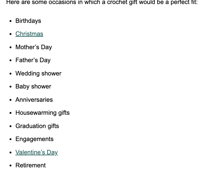
Similarly, the very long pages of text involve a lot of scrolling, and it’s easy to miss important information. Shorter pages and/or clearer section differentiation would make information easier to find. For example, when my user was trying to learn about different types of yarn, she wanted to have specific recommendations for each project, because she knew that using the wrong weight of yarn can make your project turn out very strangely. On one of the links she clicked, the 25 Gift Ideas, there is a whole section about choosing yarn for gifts, but because there is so much text, she scrolled right past it. Having a separate page or expandable/collapsible sections could alleviate that problem.
Searching for beginner-friendly projects was possible, but could also be streamlined for ease of use. My user kept referring to posts that were tagged as beginner, but there was no actual tag there, only a parenthetical note after the title of the post. Adding an actual tag, or adding a drop-down menu from the main crochet menu, could make different levels of projects easier to find. The drop-down menu could also include links to the yarn articles, since the only other way to find those appears to be through the search function. And since the search function seems to be inconsistent (an article that showed up on my friend’s computer and my phone did not show up on my computer), it doesn’t give me confidence that it will show me all the resources a user could need. An FAQ at the footer of the site with links to basic instructional and informational posts (which my user looked for at one point) would also be helpful.
My last main recommendation doesn’t strictly address usability, but I always prefer a site to tell me when I’m about to be redirected to an external site. My user was surprised when the pattern she clicked on took her to another site. If you are trying to learn a new craft, consistency in directions and style is important, and being taken to an entirely new set of instructions can be disconcerting. Linking to an external site is fine – it should just be noted in the link to the post so the user is prepared.
Sarah Maker contains an amazing amount of information for beginning crocheters and other crafters. It is functional and navigable, but a few tweaks in format could make it an even better resource for beginners and advanced crafters alike.
The website that I will be using for this assignment is Sarah Maker, a crafts website with a large selection of instructional articles that my group and I decided on for our overall group project. This site consists primarily of instructions relating to knitting, crocheting, and related techniques. Despite its large array of options, there are still many issues with this website, which I hope to gain some insight on through this assignment.
User
My user is a younger male with a college level education. He is very tech savvy and uses various forms of technology on a regular basis. He has a very basic knowledge of arts and crafts and has not recently used a website like the one being evaluated.
Method
The user testing method I employed is the think aloud protocol, in which the user interacting with the website describes their actions, thoughts, and what they’re seeing. I chose this method in order to get a better understanding of how the user perceived the website being evaluated. Through the think aloud method it is easy for the user to just say what they are thinking while in the process, and for me, the evaluator, to understand their process while they are doing it. This also allowed me to take easy notes on what the user was doing and why, which then allowed me to go back and analyze those notes afterwards.
Tasks
The first task that I had the user accomplish was finding instructions for someone who was completely new to crocheting to the point where they wouldn’t even know where to start. The second task that I had the user accomplish was learning what different kinds of yarn and thread are best for different kinds of crafts. The third and final task that I had the user accomplish was finding a beginner level crochet project that would make a good holiday gift for a friend or family member.
Analysis
For all three of the presented tasks, my user had little to no challenge completing the specified end goals. Each task was completed in a manner befit for someone who is regularly on the internet and technologically savvy. The first task was completed by clicking on the “Crochet” tab, and then selecting the “how to crochet” hyperlink. Because the first task required the user to find something crochet related, my user almost instantly turned to the “Crochet” tab, as he believed it most likely held what he was looking for. From there it was pretty straight forward, with the most obvious route being the aforementioned hyperlink, which was highlighted in blue, positioned toward the top of the page, and stated almost exactly what the user was looking for. For the second and third tasks, the user easily found what they needed to find with the use of the search bar. The second task found the user clicking through a few different articles before eventually finding the one they were looking for, though this did not take all that long nor did it deter or frustrate the user at all. The third task was much quicker, with the user simply looking through the different article thumbnails until they found a craft that was holiday related. Overall, I believe it to be relatively easy for the user to find specific things across the website, especially when using the search bar, when the user can quite literally search for exactly what they are looking for.
Recommendations
While there are plenty of flaws in the Sarah Maker website, none of them seemed to be an issue for my user, or even came up in the process of completing the provided tasks. With that being said, there is very little in the way of improvements that I can offer based off of this evaluation. What I can say though, is that those who are not as technologically savvy may have a bit of a harder time finding more specific things. To those less inclined individuals, it may not be so obvious to use the search bar. One suggestion I can offer is to implement a system that would allow you to apply a filter to the list of postings you are viewing. This could be implemented on the home page, on each separate page of postings, and even on the list generated by using the search bar. Such an implementation would allow for users to narrow down the list of posts to almost exactly what they want, while cutting out any unnecessary clutter in the process.
Julia Bomalaski, Logan Davis, Amy Feinstein, Deborah Turner, Evan Wilson
The Chosen Website
Our group has decided to analyze the website: Sarah Maker. We chose this website because it is a great example of a crafting/instructional site that has a lot of potential for improvement. We are interested in testing the usability of the catalog of posts as it pertains to navigation and searchability.
The Chosen Persona
We’ve decided to focus on a social media savvy young woman who was inspired by Pinterest to pick up crocheting. She’s been saying she would eventually teach herself to crochet for years, but other priorities have hindered her from starting. She now has the free time to dedicate learning to crochet. With the low financial commitment and abundance of accessibility to resources on how to crochet, the barrier of entry was very low.
The Scenario
Inspired by social media, our persona would like to learn how to crochet, so she can start her own crocheting Instagram account. She’s looking to find clear instructions on how to start crocheting and easy but interesting-looking projects that she could post to her own social media profiles.
The Tasks
Task 1: Find instructions for a complete crochet beginner who has no idea how to even start the craft.
Task 2: Learn what different types of yarn and thread are good for different kinds of crafting.
Task 3: Find a beginning crochet project that would make a good holiday gift for friends/family
With these tasks we hope to find out how easy it is to navigate when looking for a specific craft or tutorial as opposed to general browsing, how easy it is to switch between tasks (for example, if you can have the pattern instructions up but easily switch to the basic crochet instructions because you are still learning the stitches), and how easy the instructions are to follow (video vs picture tutorials, etc.)
The website I would like to analyze for my heuristic evaluation is SarahMaker.com( https://sarahmaker.com/). SarahMaker.com is an educational website that features classes, articles, patterns, and premium video to help you learn a craft of your choice. Their scope of subject is large and includes, fabric crafts, needle arts, sewing, sculpting, and more. The website includes both free and premium paid content. I say that this is a great website for a beginner crafter in any medium. Crafting, or creating in general, can seem daunting and easily susceptible to information overload, but I Sarah has done her best to create a clean and professional appearance for her website.
Scenario
My scenario features a young woman enamored with the Pinterest articles, Tik Toks, Facebook Reels and Instagram-worthy photos she sees of her friends and family showcasing their latest needlework creations. She’s been saying she would eventually teach herself to crochet for years, but other priorities have hindered her from starting. She now has the free time to dedicate learning to crochet. With the low financial commitment and abundance of accessibility to resources on how to crochet, the barrier of entry was very low. A friend recommended YouTube to learn basic stitches and SarahMaker.com for pattern ideas. YouTube is great, but she prefers the mental freedom of written instructions.
Heuristic Analysis
With my scenario and persona in mind, I took to Sarahmaker.com to see what they offer in the realm of crochet. I personally, keep the Ad Blocker plugin enabled on Google Chrome, and one think I did notice was the unusual amount of empty space the site had. This is usually a tell-tale sign that this site might have many ads going on. I took the chance, and temporarily turned off Ad Blocker for the website and I was right. There were ads all along the bottom portion of the screen. I know many are divided on the necessity of ads on websites, but strictly speaking from a user’s point of view, ads are the worst. I would place this in violation of rule number 8: Aesthetic and minimalist design. Sarah has, mostly, static content on her website. The only things I see moving are the carousel stuck to the bottom of the screen and the video of ads playing right above it. It’s extremely distracting from an otherwise attractive website.
I’ve been to Sarah’s website once or twice before at the recommendation of a Google search for some Cricut help. She always gave me very good advice in her articles. I have never gone to the homepage in search of a specific subject. Following my scenario though, I noticed locating the crochet section was very easy to find right at the top navigation of the page. However, the main crochet page opens to a wall of text, that I immediately skip, to go to what I believe are the lessons or beginner content separated into sections (or cards) below. These are all sponsored ads for crochet pattern packs. That’s not going to be very beneficial to someone who is a complete beginner. The stitch tutorials for beginners are found in a link in the middle of the wall of text I’ve already skipped over. The links are also a muted shade of green that is very similar to the color of the basic text. I think this is a violation of rule number 7: Flexibility and efficiency of use.
Proposed Solutions
A few adjustments I propose to combat these issues are, trying to find a different way to monetize the website without distracting ads. Offering other paid content or place some premium content behind a subscription wall. I see Sara has hundreds of patterns. Having the patterns available to purchase at a very low price is something to consider. Considering the placement of the ads, they are even breaking the flow of the page with the video ads toward the bottom stretching into the footer content. As for making beginner content easier to locate, I would recommend placing links to the beginner’s content much closer to the top. I would even go as far as adding sub-menus to the top navigation menus. I’d also like to see a greater contrast in the color of general text and text that are links. I see, Sarah is trying to stay within a certain color scheme, but links are vital to the navigation of the site. They need to be more noticeable than they are now. If the user is utilizing breadcrumbs, they need to display more than two locations for every page a user visits. As the site stands now, the main page “Home”, leads to “Blog” on every page. This is confusing for a user and does not give a concrete path back to where they’ve already been. Overall, I feel someone that is well-versed in using the internet would be able to use this website with few problems, but frustrations can appear with some of the questionable navigation choices and advertisement placement.
The website I will be evaluating is 30minutecrafts.com, a collection of quick craft tutorials and ideas for craft enthusiasts whom may be short on time or energy. It was founded by Carolina Moore as a resource for fast crafting. She is still actively posting to the site, as the last tutorial was made in 2022.
Scenario
The scenario I chose to guide my evaluation is a young hip female crafter with moderate technology experience (avid social media user and grew up using the internet, but does not have formal schooling or training with computers) has decided to save money and make her friends and family’s Christmas gifts this year. She has limited time between working and taking courses at her local community college (where she studies art history) and through a quick google search stumbled upon 30 Minute Crafts. She wants to find 1 or 2 crafts she can make that will be gender neutral, doesn’t involve sewing, and will take no more than 15 minutes each.
Analysis
Immediately from the homepage there are issues in regards to Heuristic #1: Visibility of system status. It is extremely hard to tell where the user is (homepage) and where to go next. Poorly designed homepage, that does not follow the standards expected by users – violating Heuristic #4: Consistency and standards. By default it is throwing the user in a mobile layout with no working way to switch to desktop view. This causes the branding and message of the website to be lost. There is a tiny logo on top, cluttered hard to read banner, messy unorganized lists of posts with no clear categories or labeling, and navigation is hidden under a tiny hamburger menu on the side.
The user scrolls down the homepage, clicks Desktop, and realizes it will not work. Getting overwhelmed by the list of crafts and lack of clear insight on materials, categories, or time, the user clicks the Hamburger menu. From there she sees a “Home” button. It leads to the URL https://30minutecrafts.com/whats-new. This page kicks the user out of a mobile view and into a slightly prettier desktop template. The copy and writing style of this tutorial matches the vibe of the user. This aligns well with Heuristic #2: Match between system and the real world.
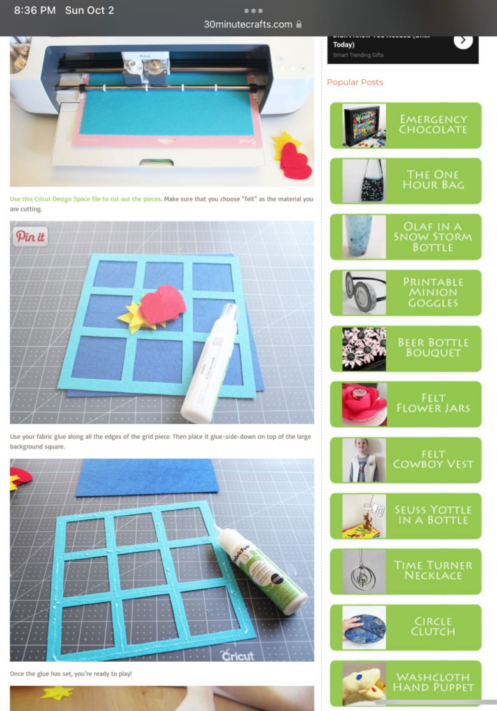
At this page the user sees a much better navigation (as opposed to the page linked from google – the one that the user thought was the homepage https://30minutecrafts.com/). She selects “15 minute crafts” and is immediately thrown back into a mobile template, with no thumbnails and no clear insight into what the craft tutorials are. She gives up and decides she wants to try a different category, but now the clear navigation is gone and she can not easily return to where she was (breaking Heuristic rule #3: User control and freedom). After clicking the back button, she clicks “10 minute crafts” where she quickly glances over the thumbnails and decides to go with the “Felt Tic Tac Toe Board” tutorial for her gifts, even though she is not sure all of her friends will like it, without realizing there is a small “Next Page” button on the bottom where many more tutorials are.
Other Heuristic violations noticed through user task: Heuristic #7: Flexibility and efficiency of use. While there is a search bar, it is very small and hard to see. I originally did not see it until I specifically went searching for it. It would have been easier and more intuitive for the novice user if this was more visible. A first time user may be more likely to notice it and use it to go straight to the tutorials they are looking for. For example my user could have searched “No Sew” and seen all relevant tutorials. One thing to note in addition to it not being noticeable is that it is not very advanced either. If user were to search “15 minute No Sew” many tutorials will pop up that are 30 minutes and require sewing.
As far as Heuristic #8 goes, this website could adopt a more aesthetic and minimalist design in places. The column on the right that follows user through most pages can be distracting and that information could be better served elsewhere.
One thing I think this website does well is Heuristic #10: Help and documentation. The steps are clearly presented with great visuals making the tutorials easy to follow.
Recommendations
Redesign the homepage to fit commonly used standards expected by users. Clear branding, header banners, navigation, clear CTAs, contact information, and footer.
Better organize navigations – reevaluate the navigation given on the “mobile” homepage compared to the navigation on the desktop page (pages are missing and hard to find unless on the confusing “mobile” homepage and vice versa).
Redesign how the tutorials are presented on the category paged. Make sure every tutorial is given a thumbnail and description that will let the user know what the tutorial is about without having to click through individually to choose a craft. Remove need for the “Next page” button that is extremely hard to see.
Create a design and flow that is more conducive to the main user task of finding a craft tutorial to try by fixing the heuristic violations mentioned in the analysis. The tutorials are great once the user actually gets to one, but finding the full catalog of tutorials is nearly impossible with how the website currently is.