Website Being Evaluated
The website I will be evaluating is 30minutecrafts.com, a collection of quick craft tutorials and ideas for craft enthusiasts whom may be short on time or energy. It was founded by Carolina Moore as a resource for fast crafting. She is still actively posting to the site, as the last tutorial was made in 2022.
Scenario
The scenario I chose to guide my evaluation is a young hip female crafter with moderate technology experience (avid social media user and grew up using the internet, but does not have formal schooling or training with computers) has decided to save money and make her friends and family’s Christmas gifts this year. She has limited time between working and taking courses at her local community college (where she studies art history) and through a quick google search stumbled upon 30 Minute Crafts. She wants to find 1 or 2 crafts she can make that will be gender neutral, doesn’t involve sewing, and will take no more than 15 minutes each.
Analysis
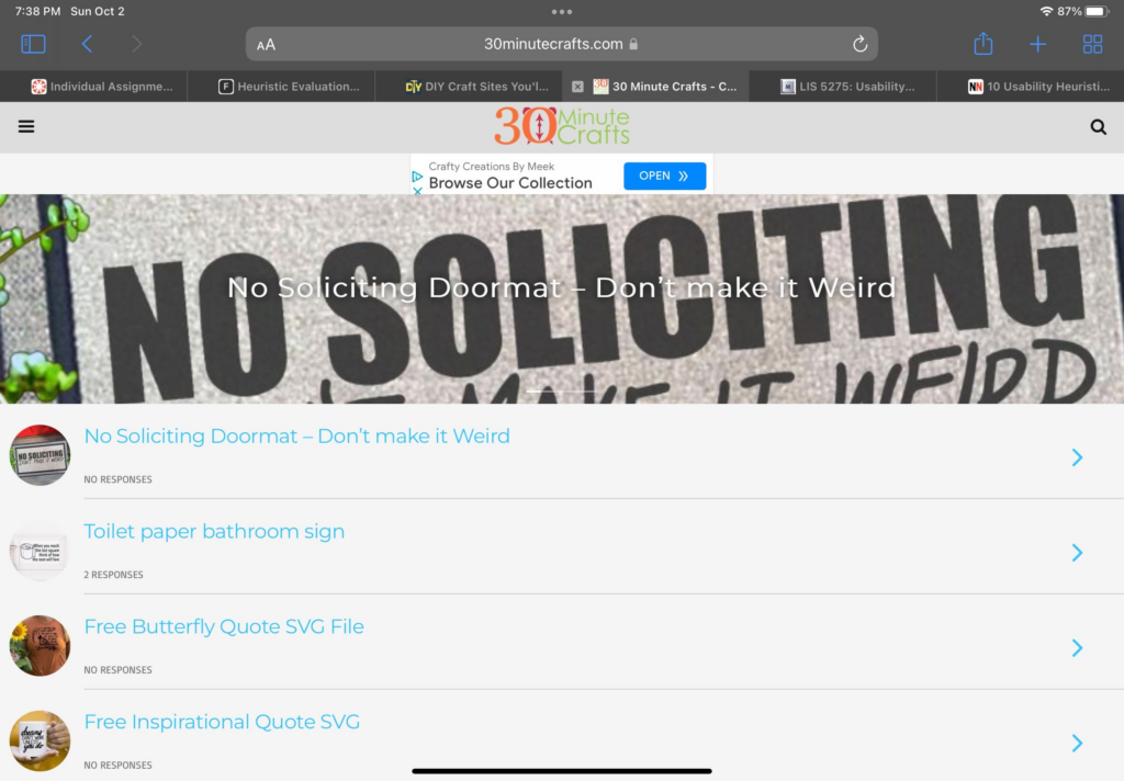
Immediately from the homepage there are issues in regards to Heuristic #1: Visibility of system status. It is extremely hard to tell where the user is (homepage) and where to go next. Poorly designed homepage, that does not follow the standards expected by users – violating Heuristic #4: Consistency and standards. By default it is throwing the user in a mobile layout with no working way to switch to desktop view. This causes the branding and message of the website to be lost. There is a tiny logo on top, cluttered hard to read banner, messy unorganized lists of posts with no clear categories or labeling, and navigation is hidden under a tiny hamburger menu on the side.
The user scrolls down the homepage, clicks Desktop, and realizes it will not work. Getting overwhelmed by the list of crafts and lack of clear insight on materials, categories, or time, the user clicks the Hamburger menu. From there she sees a “Home” button. It leads to the URL https://30minutecrafts.com/whats-new. This page kicks the user out of a mobile view and into a slightly prettier desktop template. The copy and writing style of this tutorial matches the vibe of the user. This aligns well with Heuristic #2: Match between system and the real world.
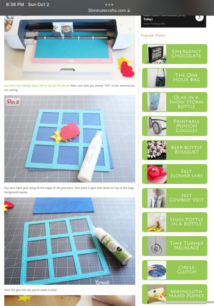
At this page the user sees a much better navigation (as opposed to the page linked from google – the one that the user thought was the homepage https://30minutecrafts.com/). She selects “15 minute crafts” and is immediately thrown back into a mobile template, with no thumbnails and no clear insight into what the craft tutorials are. She gives up and decides she wants to try a different category, but now the clear navigation is gone and she can not easily return to where she was (breaking Heuristic rule #3: User control and freedom). After clicking the back button, she clicks “10 minute crafts” where she quickly glances over the thumbnails and decides to go with the “Felt Tic Tac Toe Board” tutorial for her gifts, even though she is not sure all of her friends will like it, without realizing there is a small “Next Page” button on the bottom where many more tutorials are.
Other Heuristic violations noticed through user task: Heuristic #7: Flexibility and efficiency of use. While there is a search bar, it is very small and hard to see. I originally did not see it until I specifically went searching for it. It would have been easier and more intuitive for the novice user if this was more visible. A first time user may be more likely to notice it and use it to go straight to the tutorials they are looking for. For example my user could have searched “No Sew” and seen all relevant tutorials. One thing to note in addition to it not being noticeable is that it is not very advanced either. If user were to search “15 minute No Sew” many tutorials will pop up that are 30 minutes and require sewing.
As far as Heuristic #8 goes, this website could adopt a more aesthetic and minimalist design in places. The column on the right that follows user through most pages can be distracting and that information could be better served elsewhere.
One thing I think this website does well is Heuristic #10: Help and documentation. The steps are clearly presented with great visuals making the tutorials easy to follow.
Recommendations
- Redesign the homepage to fit commonly used standards expected by users. Clear branding, header banners, navigation, clear CTAs, contact information, and footer.
- Better organize navigations – reevaluate the navigation given on the “mobile” homepage compared to the navigation on the desktop page (pages are missing and hard to find unless on the confusing “mobile” homepage and vice versa).
- Redesign how the tutorials are presented on the category paged. Make sure every tutorial is given a thumbnail and description that will let the user know what the tutorial is about without having to click through individually to choose a craft. Remove need for the “Next page” button that is extremely hard to see.
- Create a design and flow that is more conducive to the main user task of finding a craft tutorial to try by fixing the heuristic violations mentioned in the analysis. The tutorials are great once the user actually gets to one, but finding the full catalog of tutorials is nearly impossible with how the website currently is.