The Website
The website that I chose was True Achievements.
True Achievements is a website that markets itself as presenting Xbox related gaming updates and reviews. It also features a community forum where users can participate in discussions and find themselves on leaderboards.
The Scenario
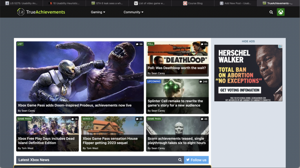
Recently, over 90 videos of what was then considered “suspected” user gameplay of the newest installment of the Grand Theft Auto game series was leaked to the internet. Rockstar Games then came out and confirmed that these videos were real and reassured users that it would not affect the development timeline of the game. In this case, I wanted the user to be heading to True Achievements to see what information they could find on the leak. This task would ideally be accomplished by the user searching the website using the search bar; even though there is an article featured on the home screen.
Usability Flaws
Upon searching the website for anything related to the GTA leak, I was met with the following screen.
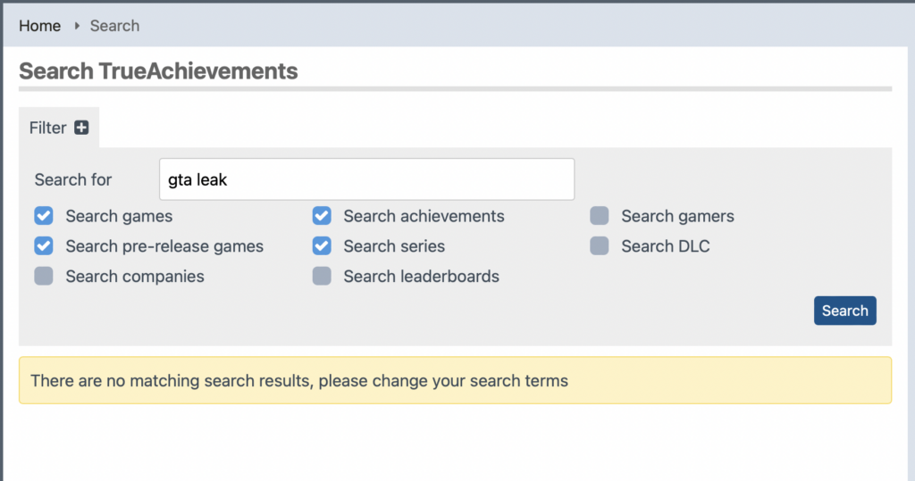
I knew this information was incorrect because I had just seen an article featured on the Home Screen. Another thing I noticed while on the home screen was that each image has a small descriptor box that seemed to put the listing into a category. Naturally, I looked at the search parameters to see if I could change them to match the descriptors. I couldn’t. They were two completely different sets of information. This violated the Consistency and standards design heuristic. Since the categories do not match the descriptors the user is left wondering how to search the correct parameters and how, if at all possible, to search and retrieve a relevant article.
I ended up going back to the home screen and clicking on the article I saw that was related to the leak. I went into the article and read it. I saw that it did contain some of the information that I was looking for but I wanted to know more than a teenager from the United Kingdom was arrested for it. I went through a rabbit hole of related articles until I was well informed about the leak and then wasted to go back to the home screen to see what other featured articles are there. Because I am an avid internet user, I know that the quickest way to get back to a website’s home page is to click on their logo in the header, however this is not always the case. This has to be coded into a website and it is not common knowledge which violates the design heuristic of Visibility of System Status. My current location was not clear nor was I able to navigate back to the Home Screen but I had accomplished what I initially visited the website to do.
Design Recommendations
In conclusion, TrueAcheivements could use an entire revamp. I’d suggest they start with the overall layout o the site. From the screenshot of the homepage, you can see tat headers and other information tend to blend into other elements on the page. This will help the website better appeal to the Aesthetic and minimal design design heuristic. Revisiting the tagging that the website uses to identify their content. They also should revisit the coding of the website because in this case it is interfering with the usability of the website. When I used the provided search bar to look for information on GTA, the returned screen indicated that there was no information on the website that related to GTA. A quick scroll of the Home Screen led me to determine that that was not the case. Also when I clicked on the article that initially grabbed my attention, there were many more articles linked under the article that were also about the game. Lastly, I’d suggest adding some sort of navigational aids to the website. The current header’s navigation options do not support all the different paths you can take on the website. This also leads to the user not being able to return to a page they may have visited previously because it isn’t recognized or listed I the current menu options. A home button would be a great starting point.