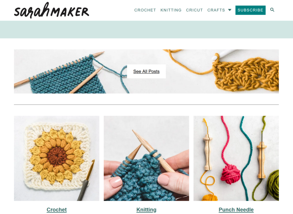
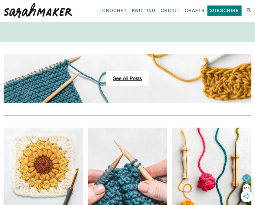
INDIVIDUAL ASSIGNMENT 3: REPRESENTATIVE USER TEST

SARAHMAKER.COM

The website I will be testing with my user is SarahMaker.com( https://sarahmaker.com/). SarahMaker.com is an educational website that features classes, articles, patterns, and premium video to help you learn a craft of your choice. Their scope of subject is large and includes, fabric crafts, needle arts, sewing, sculpting, and more. The website includes both free and premium paid content. I say that this is a great website for a beginner crafter in any medium. Crafting, or creating in general, can seem daunting and easily susceptible to information overload, but Sarah has done her best to create a clean and professional appearance for her website.

USERS

My first user is a 29-year-old man, and a coworker of mine. I’ll call him Cam for this analysis. We both work in IT. He is crafty in his own way, but he’s definitely more of a tinkerer and woodworker. He is very well-versed on the internet and is also an avid gamer, and youtuber. So, I will be running with the assumption that he knows how a website is supposed to flow, so he may be a much harsher critic. But he is also internet savvy enough to get himself out a of situation fairly easily. My second user is a 28-year-old woman, who is also a coworker of mine. I’ll call her Fae for this analysis. She is a very competent user and far more interested in “craftier” crafts such as needle arts mentioned on the website. She’s also well-versed in browsing websites, so she also has an expected flow of information architecture.

TESTING METHOD: THINK ALOUD

The user testing method I chose was the Think Aloud method. I chose this method because, most of my user “test subjects” are often my friends, and they are usually not ones to mince words. They are not afraid to tell you what they are thinking and many times you can get a good laugh from their commentary. I usually like to do my user testing in person, but with flu-season rampant and the sickness hitting my household hard, we’re going to use Facebook Messenger to run the test. My user will share their screen with me and have their microphone on as they complete the required tasks.

USER TASKS

I gave my users five tasks to complete:

  1. Find the beginner crochet section.
  2. Find information about Sarah Maker
  3. Find Polymer clay project ideas.
  4. Find how to use Cricut Infusible Ink for Cricut Machine.
  5. Find How to make a quilt.

The tasks did not differ greatly from the tasks included in our group. I added more tasks in different areas to see if the problems faced in the crochet section of the website extended to other sections.

Task 1: Find the beginner crochet section.

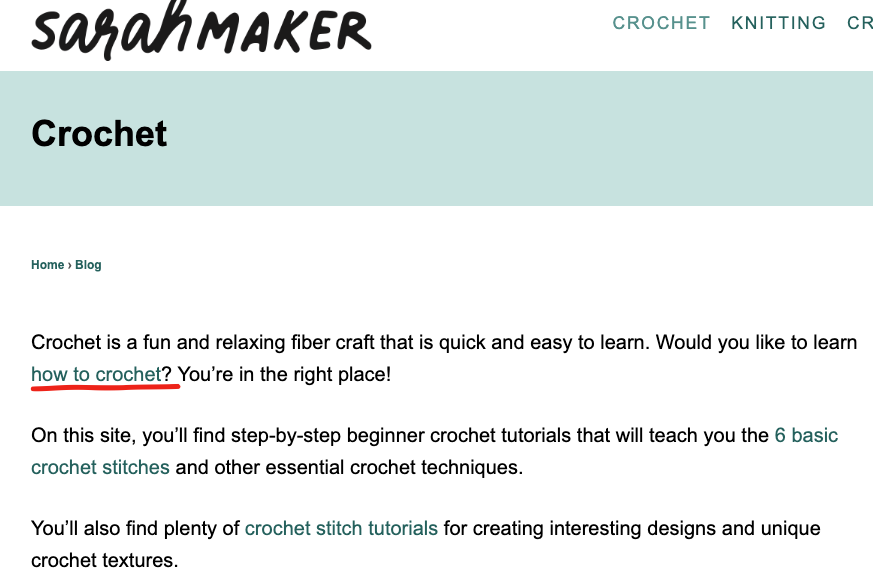
In this task, both Cam and Fae were tasked with finding a section dedicated to the basics of learning crochet. In Cam’s test he utilized the top menu option for, “Crochet”. The proceeding page is the page we are familiar with. I mentioned this issue in my previous post:

“However, the main crochet page opens to a wall of text, that I immediately skip, to go to what I believe are the lessons or beginner content separated into sections (or cards) below. These are all sponsored ads for crochet pattern packs. That’s not going to be very beneficial to someone who is a complete beginner. The stitch tutorials for beginners are found in a link in the middle of the wall of text I’ve already skipped over. The links are also a muted shade of green that is very similar to the color of the basic text. I think this is a violation of rule number 7: Flexibility and efficiency of use. “

Both Cam and Fae did the exact same thing coming to this page, skipping over the entry text, and thus the link that takes the user to the beginner crochet section. They eventually did scroll back to the top and find the link. Fae did mention that learning to do something is a vital reason someone would visit this site. The link to that information should be large, visible, and available to reach from several different sections of the site. A separate section in the header navigation for sub-navigation items that showcase big pieces of user journeys would combat a lot of frustration on the users’ part.

Task 2: Find information about Sarah Maker herself.

I neglected to mention that both Cam and Fae were doing these tasks on mobile devices, so their difficulties were ramped up a little. While on desktop view, this task is extremely easy. The answer is on the same page right next to the information the user was just looking for. On mobile view, that information is removed. Both Cam and Fae knew that at the top of most websites, there is an “About” section. They went to the hamburger menu expecting an About section to be there, but there wasn’t. Cam being the slightly more advanced user voiced that the information is also in the footer sometimes. He was correct and found the About section. Fae took a few moments longer to scroll all the way down to the page and find the link in the footer information. Both agreed that if you’re marketing your website based on yourself, information about yourself should not be difficult to find. In revisions of this website, I would include an About section in the top menu, so the information is readily available for users on all screen sizes.

Task 3: Find Polymer clay project ideas.

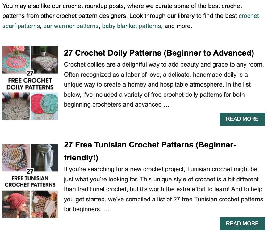
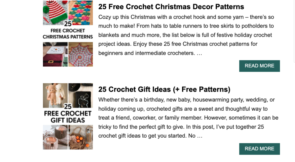
This task was general in its wording. I did have to do some prompting that I wanted them to find an article containing “Polymer Clay Project Ideas”, specifically. That’s something I will have to watch for in the future. This is where the users took different paths to find this information. Cam actually went back to the front page, because he recalled seeing information about clay projects. The article is right on the front page, “21 Polymer Clay Ideas and Projects”. Fae first looked for clay or polymer clay in the topmost menu. She did not see the option at first, so she scrolled down on the front page to where the six categories were, and still did not see it. She tried the topmost hamburger menu again, but this time she saw that “Crafts” had a dropdown section. She clicked and saw the option for Polymer Clay. When she was brought to the polymer clay craft collections, she scrolled down, and the fourth article was the “21 Polymer Clay Ideas and Projects”.

While both completed the task, both were unhappy with the lack of organization of the polymer clay page. Instead of there being a table of contents or some head navigation, the page is presented as a list of articles. So, they have no idea how long this list will be until they find the correct article.

Task 4: Find how to use Cricut Infusible Ink for Cricut Machine.

By this task, both users had begun to understand the odd flow of this website. They’d seen Cricut showcased on several sections of the website. Cam utilized the “Cricut” option in the top menu and scrolled down until he saw something that mentioned Infusible Ink. Fae took the same route. Fae did mention, again, how this section had pages of articles and they don’t seem to be in any type of order. While the information we were currently looking for was easy to find because it was on the first page, what if the information was on the 4th page? The user has no way of knowing where in the list of articles the information they’re seeking will come up. As mentioned before, this section and the other sections would benefit from a table of contents or category list of some sort to help with sorting and filtering information.

Task 5: Find How to make a quilt.

The final task was probably the most challenging task for them. This information is hidden. Cam began by retreating back to the front page and choosing the large “Quilting” option under “Knitting”. This page only has 2 pages of articles. After looking at all of the articles and seeing that they all have to do with quilting patterns, he chose the last article, “50+ Free Easy Quilt Patterns for Beginners”. After a short bit of scrolling the title, “How to make a Quilt” titled one of the sections.  Fae decided to try out the search function on the website. The search was not as definitive as she’d hoped. She also wondered why when she searched, “How to Quilt” options for circuit were coming up. But, searching the results brought her to the same article, “50+ Free Easy Quilt Patterns for Beginners, and within that article she found, “How to Quilt”.

Again, Fae had the right questions for this task. If you already don’t know how to make a quilt, why would you look into a section about free quilting patterns to learn? And again, this section would benefit from a table of contents or categories to help navigate your learning around the craft.

CONCLUSIONS

SarahMaker.com is packed full of amazing information about crafting, but the disorganization of the site could put off potential users from staying very long to see all that information. For this website, search crafting subject should be broken down into at least three different sections: A “Getting Started” guide for absolute beginners, A “Materials and Techniques” type of section and a “Patterns” section. That way a crafter can see the core aspects of each craft: the process, the materials, and the projects. Then the user can choose which aspect they would like to learn more about.

Also, Sarah makes use of articles for the bulk of her website. If she is going to do that, she absolutely must utilize the tags, and categorize her articles correctly so the search function on her website is more robust and accurate. This also allows users the freedom to learn more about a specific topic that may not be covered by the core aspects of the craft. This website can become a fantastic resource if the organizational issues are addressed.

Individual Assignment #3 – Representative User Test

The Website

The website our group chose to use in our testing is Tripadvisor. Tripadvisor is a travel website where users can plan out their trip(s) and book all travel-related services. Users can search for hotels, vacation rentals, restaurants, cruises, flights, and more. The website also acts as a travel blog and posts different articles related to travel and specific destinations. Tripadvisor is a unique travel website because it allows users to look at different activities, restaurants, places, etc. and it links to the booking sites so you can accomplish all travel tasks from one website.

The User

When searching for a user for this test I tried to stick as closely to our group tester’s characteristics as possible. Our group had created a user who was 42 years old, female, with three children under the age of twelve living in the Miami metropolitan area.

The user I chose to test in this scenario was a 51-year-old female with three adult children in their mid-twenties. This user lives in South Florida and has lived there her entire life. The user has worked in retail for the past 15 years and does not have the strongest computer literacy. This user has been on a few cruises but has not used Tripadvisor to book or plan any trip before.

For this testing scenario, the user will be booking a cruise for four (herself and her three children) for the week of Thanksgiving since they all will be off work. The budget for the trip is a maximum of $500 per person and for a medium length trip (3-5 days). The destination is flexible as long as it is somewhere in the Carribean. The user would also like to part take in one excursion at one of the ports.

The User Testing Method

The testing method I chose to use was the “Think Aloud” approach. I was unable to accomplish this testing in person so I completed this assignment via FaceTime. Since I was unable to be physically present in the same room as the user it created some obstacles that would not be present if this testing took place in person. For instance, I was unable to see how the user tracked their mouse across the webpage which could be useful in how the user interacts with the website. For the tasks, I had the user talk aloud about what she was was doing and any thoughts or opinions she had while she completed each task.

The Tasks

The user was relatively similar to the group user we had created so only one of the tasks had to be modified. The original tasks were as followed:

Original Task 1: Find a cruise when the kids are on break from school and taking in consideration of hurricane season and to stay within the vacation budget.  

Original Task 2: Pick a cruise that stops in multiple ports.

Original Task 3: Find activities offered in each port stop.

The tasks I chose to test for this user are very similar but there are slight modifications.

Task 1: Find a cruise during Thanksgiving break that goes to the Carribean and stay within the vacation budget of a maximum of $500 per person.

For this task I had my user start on the Tripadvisor homepage. I had the user say out loud what she was doing and I copied exactly what she did so I could provide the screenshots below. The first thing the user did was to type “Caribean cruise” into the search bar located on the homepage. This returned a result of cruises, sailing, and water tours that take place in the Caribean but not a cruise to the Carribean. The user was confused about this result when it popped up.

Cruises, Sailing & Water Tours in Caribbean results webpage

The next thing the user did was to search this results page to see if there was a link anywhere that would take her to the ‘cruise’ page she was expecting. After, exploring the page the user noticed a link to ‘Cruises’ in the navigation bar and she clicked on that to take her to that webpage.

Navigation bar
Caribbean Cruises webpage

The user clicked search on the above webpage which returned a bunch of cruise results for the Caribbean during the month of November. The user explored the page by scrolling up and down the page. That is where she found she could put in her maximum budget to filter the results for the cruises.

Price filter

After she filtered the result I told her to pause what she was doing and told her we would be moving onto the second task.

Task 2: Find a midlength cruise that is around 3-5 days (this length of cruise will stop in at least one port).

I had the user complete this task on the webpage she was already on since that seemed to be the logical way to filter down the results instead of starting from scratch. The user had explored the webpage previously so she found the ‘Cruise length’ filter rather quickly and without any problems.

Cruise length filter

Task 3: Find an excursion or activity to participate in at one of the ports

For the third task the user had to find an excursion/activity to participate in. The first thing the user did was to scroll down the page to see if there was an option regarding any excursions or activites. The user did not find anything this way so she continued back to the top of the page. From there she noticed the ‘Things to do’ link at the top of the webpage. She decided to click on that so she could explore that page. From there it took her to the wbpage with different things to do in the Caribbean. She then compared the attractions to the cruise ports.

Things to Do in Caribbean

Recommendations

I asked my user at the end of the testing what she would change about the website if she could. The first thing she recommended was that when searching “cruise Caribbean” that it returned more options that just cruises you can take from the Caribbean. For instance, return those results and also a section for regular cruises to the Caribbean. The second recommendation the user had was when searching for a cruise it would be nice to search by week instead of being forced to search for the whole month. Another recommendation would be to have an option for the excursions/activities located on the same page or highlighted that it exists somewhere on the cruise results page.

INDIVIDUAL ASSIGNMENT 3: REPRESENTATIVE USER TEST

• The Website

The website for this test is IGN (https://www.ign.com). The site hosts a wide variety of content related to video games and entertainment. The layout of the site is designed around a sidebar style menu setup that can be condensed to the far left of the screen to have more room for main page content.

The User

The user for this test is a mid-30’s black male that enjoys gaming on his days off. Raised by an Army father, and with a bachelor’s degree, he is very well spoken, well-mannered, and respected by his peers and his customers. He almost exclusively games on a PlayStation 4. He is in the IT field, with over 15 years of experience, so there should be no issues with “normal” website navigation.

The Testing Method

In the test, the “think aloud” method was used, simply due to it’s cost effectiveness. In a conference room setting, the user was provided a printed list of the three tasks to accomplish and a laptop that was open to the IGN website. The user was read the following script to help set the “motivations” behind the provide tasking:

You are just out of high school and have your first job. You enjoy gaming and are looking to purchase a game with your hard-earned money, but you want to get a good game that you can use to pass the time. The idea of spending $60 on a game that you will complete in a few hours seems like a waste of money. With this in mind, you will visit the IGN website on the laptop and perform the three tasks listed on the provided list.

The Tasks

Task #1:
Since you are looking for a good game to buy, start by finding the site’s “best games” from 2021.


Task #2:
You are looking for a game that will take some time to play through, so tale a look at Zelda: Breath of the Wild and see how long it would take to complete.


Task # 3:
Look through the 2021 best games list and check out the reviews to pick out a game that you would want to play.

How the test went

Task #1


The testing was in line with what was found during the original group discussion about the website. The first words out of his mouth were “I’m looking for a search bar.”


Some of the following conversation:


I see a magnifying glass, so I am clicking that to see if I can use that to search the site.”


This points to the real-world expectation of using the magnifying glass icon for searching.


“When I click on it, it shows games and playlists, and since I’m not trying to find a specific game, I’m checking the only other option which is Playlists. Since it shows stuff other that games, I’ll search for 2021 and see what comes up.”


This leans more to a lack of other options instead of having a choice that makes sense to the user.


“There’s a lot of stuff just called 2021, so I’ll keep scrolling. I see different ‘Favorites of 2021’ and various writers’ best of 2021, but no “IGN best of” list. Nothing shows up for ‘2021 Game of the Year’. I’m going back to the home page now.”


Already some frustration from the user, as the closest thing to a search doesn’t give him anything usable for this task.


“I’m looking under Reviews, Game Reviews…. Why does it have Movies, TV, and other stuff under Game reviews?”


Looking at what he was talking about shows that there are issues with the Reviews section. Selecting Game Reviews in the left navigation pane highlights the words ‘Game Review’ which shows an attempt to keep the user informed of where they are, but in reality, all reviews are on the same page. They filter by type by using the side navigation buttons, or the bar in the middle of the page that shows the same subjects. Oddly enough the Comics reviews option is not shown in the left-hand navigation.

Task #2


“The Playlist let me search for games, so I’ll try that. Zelda shows up on the list and I click there and go to the page and there’s the How Long to Beat on the page.”


Lessons learned from the first task were applied but may have been a more natural flow with a simple search option as well.

Task #3


“Since I couldn’t find a IGN 2021 Games of the year list, I’ll just try to find a game I might like.”


He clicks Discover and finds a IGN Best Picks section and starts there. For the sake of time, he picks Call of Duty: Modern Warfare 2. As he looks through all the reviews, he comments on the lack of pictures by each.

The Recommendations

The absolute first change that the website needs is a well-defined search function that the user cannot miss. In the testing, an uncomfortable amount of time passed as the test user scrolled and clicked through various menu options, until he finally gave up and clicked on the only thing with a magnifying glass by it. This shows that the symbol of a magnifying glass is universally understood to be associated with some form of search functionality. Having a search bar with the magnifying glass icon by it would create the match between system and real-world expectations.


A second change would be in the best Games list. It should have had a small picture by each review, just for consistency. Some reviews did, but they were in the minority. That may just have been the author’s poor layout, not indicative of the entire site.


Another note is the Login/Register buttons at the bottom left of the page. There should be some addition call to action for these, such as “Click here to subscribe to our weekly email with the latest reviews and special content”. If this is connected to some website metric, it would generate additional interest form site visitors.

Individual Assignment 3: User Test

Website

We chose the Wilderness Coast Library system’s website, and chose to follow up our analysis with an emphasis on one of the 3 different library websites that are affiliated with the Wilderness Coast system, the Jefferson County Public Library website. This website is particularly interesting because it not only includes the main webpage detailing all of the info regarding the different member libraries and links to each one’s individual website (which provides a user, but it also includes a link to the main Catalog that all 4 member libraries utilize.

Persona/User

Our persona was intended to be a high school aged student who had to write an essay about Julius Caesar. Although I could not find a high school student to perform our user test, I was able to ask a college freshman to go through the website and think aloud while they navigated the page. My user had already taken college-level English and research courses, so that is a significant deviation from not only our developed user persona, but also likely from the average user of these websites in general. However, because a college-level research education is based on using a system that is (theoretically) well-made for research at a variety of levels, these sites present enough unique challenges that their intuition would not necessarily work out well for them anyway. My user claims that they are pretty comfortable looking things up on difficult to use websites, since they do that often for their job, but that they aren’t super comfortable with technology in general.

Testing Method

I chose to utilize the Think Aloud protocol, because I knew that my particular user would be comfortable giving immediate feedback as they went through, and that they would happily verbalize them. I think that it is helpful to see what they are doing in the moment and why they think they are doing it/what they think the interface wants them to do. I find it particularly interesting the way that, whilst doing a Think Aloud, people tend to anthropomorphize the interface and ascribe sentience to it (i.e. “it wants me to do XYZ”), which they then verbally react to. I have noticed that this does not happen as much with other types such as Retrospective Probing, and I think this helps us to better understand not just what a user does and why, but also how it makes them feel and why.

User Tasks

I wanted to utilize the tasks as we wrote them, since I felt like it would provide the best flow for a potential user. However, we did also have a short conversation before the test about their experiences with libraries, and spoke about the Library of Things and Seed Libraries that they’ve utilized at their own library, which influenced their user test toward the end. I did not comment on that, since I thought it was a fun addition that a student may likely need to try to find when completing a research paper.

Our tasks were as follows:

              Task 1: Using the Library system, the student will locate a relevant book for their research on the death of Julius Caesar, and which library that book is located at.

              Task 2 Now knowing what book to look for and what library it is at, the student will look for the available hours of that library that does not overlap with their high school schedule.

              Task 3: Find information on the use of computers at the local library to complete their research paper on Julius Caesar’s death. The student will also find out how to print from the library.

User Navigation

I gave my user a list of the three tasks to complete the project, and then set them up with the main Wilderness Coast Library System website, since that is the first result that comes up on Google. She immediately hovered over each of the three options and could not decide between the Member Libraries option or the About Us option (but immediately said that the Survey seemed pointless). She decided to start with About Us, but as soon as she opened that page she said that it did not seem to be what she was looking for, so switched to the Member Libraries option from the Nav bar. She found the JCPL option and clicked on that tab, and found the carousel image header both unhelpful and nauseating. However, after she was done being annoyed about the carousel, she noted that she was excited to have found the address for the actual library she was looking for.

However, even though she knew where to physically go to find books, at this point she knew she needed to find the catalogue so she could actually look for books. Yet again, she was not sure which button to choose between Get Books & Materials and Discover Library Services, but “Get Books” seemed more promising so she went with that. When that page opened, she was looking for a search bar and was confused when she did not see it after scrolling up and down the page. Assuming she had landed on an “About our Services”-style page (since it was so text heavy), so went back to the Home page to get to the Services page. Realizing that it was essentially the same style of info, she clicked the “Get Books & Materials” button on the bottom right of the Services page. She skimmed the bolded headings of this page, seeing the different ways to get a book and noting that there is a way to borrow tech, which she wanted to explore (since she knew that was the third task) but decided not to because she hadn’t found the actual materials she needed to write the paper in the first place. Tucking that info away for later, she continued to search for the search bar that would allow her to find books.

After much clicking around this limited website and growing frustration, she decided to return to the Wilderness Coast landing page to see if she could find a Catalog there. She decided that the Resources item on the Nav Bar felt promising, and selected that. The first two items, WILD Catalog and WILD E-Books, called to her, and she could not decide between the two so she opened them up at new tabs. She immediately got excited by the search bar on the Catalog page, but wanted to check on the E-Books just in case; however, when she saw that they page was basically just a link to a different resource, she closed it out and continued forward with the search bar.

She searched for “Julius Ceasar” and was shocked to only see three results displayed. She decided to expand her search to “Rome” and decided that the 21383 results was too much. She switched to “Roman leaders” and felt that between the three Julius Ceasar books and the 550 Roman leaders resources, she could probably begin crafting a decent essay. She then went back to her search for “Julius Cesaer” and noticed that there were now 31 results instead of 3. She Googled how to spell “Caesar” and came back to the search bar and entered the name in properly, which interestingly enough still yields the 31 results.

Now that she was able to locate that they had books/videos related to the topic, she checked to see where they were offered. She just went to the first result at the top of her current search page, which was for the Videorecording/DVD study guide. She noted that it showed green at the bottom of the listed that it was available at the JCPL branch, which she was excited about. When she clicked the title to look more into the resource, she saw the menu on the right side of the page and chose Add to Cart…and was confused when nothing appeared to happen. She scrolled up to find the Cart and saw the Log In option, but never located the cart. She clicked the Log In and promptly backed out since she did not have a library card and could not log in. She tried to choose the Place Hold option and also realized that she could not since she did not have a library card.

At this point, the user noted that she needed to find out when the library was open so she could go get the resource (and sign up for a library card). She had thankfully already found the address on the JCPL site, but did not remember seeing anything about the time. She started backing out of the catalog page and ended up backing up until she was stuck on the home page and could not back up anymore. She quickly perused the site and was thankfully able to quickly find the hours for the branch closest to her, but noted that she would not have guessed to look there if she hadn’t been dumped there during her frantic backing out.

She finally decided to go back to the JCPL webpage, and thankfully noticed the hyperlink to the left of the library hours to find the JCPL link. From there she navigated back to where she remembered seeing the Borrow Technology heading, and ended up back on the Catalog by following the Tech2Go link. She realized that she would probably need a library card for that, as well, and figured that was where she should stop.

Design Recommendations

There were a number of issues that my user ran into when navigating this site, which in many ways echoed my own navigation woes and the frustration my group has identified as we’ve worked with this website. These are the biggest stand out issues to me, though, that I think would help navigability immensely.

Main Home Page

For the Wilderness Coast main page, they should forgo the About Us/Survey/Member Libraries buttons and instead have the Member Library websites (with their addresses and hours) as the main landing page. Additionally, either above or below the different member libraries, they should have the Catalog search bar. From there, the Nav Bar can help users find more About Us and Survey info on separate pages (or honestly it could all be one continuous scroll page with clearly defined sections of descending import). Doing this would save so many clicks and so much unnecessary searching.

JCPL Webpage

The JCPL website is simultaneously too much and not enough. The information it does have is overbearing and redundant, with big blocks of text with minimal contrast to help a reader skim through and quickly find what they need. At the same time, the page is incredibly sparse and does not do a good job of guiding the user to the resources they undoubtedly want to access. Again, I think making this one continuous page could be beneficial, but mostly I think the home page should have a clearly labeled link that takes the user straight to the catalog website. Additionally, it would make sense for the home page to include things like their hours and contact information. Finally, since users cannot utilize resources without a library card, the home page should have a clear space defining the procedure of signing up for a library card.

Individual Assignment 3: Representative User Test

Website

The website my team has selected to do our user testing on is TripAdvisor, which is a travel information site that offers information and booking assistance on transportation, lodging, and entertainment for vacations.

Homepage of TripAdvisor

User Characteristics

The user is a man in his 70’s with a wife and three children, all over the age of 30. He is savvy when it comes to electronics but takes longer to navigate websites. He spends less time intuitively navigating sites and more reading all the text on the page.

Testing Method

We used the think aloud testing method as we had to do the test through Zoom. My user was able to share their screen with me and verbalize their thought process as they navigated the site. By thinking out loud I was also able to note what they paid attention to on the page even if they didn’t select certain buttons.

Tasks

I provided context for the user and relayed the scenario my team drafted up where their goal is to select a cruise that fits the budget of $400 per person for their family of five that departs from Florida.

The three tasks my group drafted were:

  1. Find a cruise when the kids are on break from school and taking in consideration of hurricane season and to stay within the vacation budget.
  2. Pick a cruise that stops in multiple ports.
  3. Figure out what activities are offered at the different cruise stops.

My user was able to address the first and third. However, the user couldn’t explore the second task because they already found a cruise that fit their budget and schedule. By default, the cruise was already going to stop in multiple ports. I omitted this task as most of the time spent was on the first task and we had a time limit.

Task 1 

For the first task, the user went straight to the ‘Where to?’ search bar. They started to type in ‘cruise’ and was given a list of suggestions to autofill the search. They selected the first option ‘cruises & sailing’. They got a pop up about sharing their location, but they ignored it and typed in ‘cruises & sailing near Miami’. 

This only provided results for local activities in Miami, so the user refined the search to ‘Sailing & Cruises Caribbean’. The user made three other attempts at nomenclature to get any search results of cruises including: ‘cruises & sailing port’, ‘cruises & sailing Fort Lauderdale’, and finally just plain ‘cruises’. 

Recommended searches

For this last search the user was finally brought to the official cruise information page. On this page, they had difficulty finding information on the ports and where to depart from. They browsed through the destination options, which still did not provide information on departure locations.  

Content on the main page for cruises

The user then selected the 6-9 days option and was happy to see their first detailed list of cruise lines. This page had a list of cruises and, in small font, information of length, destination, and departure port.  

The user selected a Norwegian Cruise that had a price per person within the budget and departed from Port Canaveral. When they selected the ‘book now’ button they were brought to the official Norwegian Cruises site. Here, they were first presented with a calendar to select the departure date. This is when they realized that the price for the specific date they wanted (that was on TripAdvisor) went up and the rest of the options on the calendar were too pricey. They then went back to TripAdvisor to look at other options and ended up selecting a cruise that was $200 per person, which is significantly lower than the $400 per person budget.  

Just as before, they were brought to the Norwegian Cruise line site. Again, they were given a variety of pricing that didn’t match what they originally saw. They looked at the calendar and decided to click into a cruise that was around Thanksgiving for $441 per person. It turned out that this cruise came with terms and conditions where the third and fourth guests are free. Therefore, the user will pay for three guests at $441 per person (Guest one, two and five) which means their family of five would cost approximately $264 per person.  

Norwegian Cruise Website User was redirected to

The user then remembered that the cruise would need to accommodate their three kids, so they went back to TripAdvisor and in the search, bar typed in the Norwegian Cruise ship, Norwegian Bliss. Even though the results showed different dates and destinations from the one they chose, the user assumed that the Norwegian Bliss was the same across the board. They then scrolled down to where the amenities are listed. They found that the cruise offers a kid’s aqua park, splash academy, game shows, laser tag, a video arcade, and a movie theatre. This is enough information for the user and they were sold.  

Task 3 

For the third task, the user was asked to figure out what activities were offered at the different cruise stops. For this they searched for each destination in the search bar. The results had a list of activities and a price point for each. The user scrolled through the list and rationalized that they could probably do the more expensive activities since they are saving a significant amount of money on the actual cruise tickets.  

Analysis 

What I learned from this process is that the user didn’t select the filters. They depended more on the search bar and liked scrolling through the results and weighing their options there. They were given the most useful information when they searched for the broadest term ‘cruises’. Because of this, I can see why they wouldn’t want to mess with filters since they know it could point them in the wrong direction just as the autofill ‘cruises & sailing’ did.  

The most frustrating thing the user faced was finding out the information on TripAdvisor was false or came with terms and conditions and they only found this out by going to the actual Norwegian Cruise website. They became less trusting of information from TripAdvisor. I think this is because TripAdvisor’s results behaved more like advertisements and less of an information tool. The search results only provided the most appealing cruises but somehow were least accommodating to the user. It was obvious that TripAdvisors’ goal was to get users to go to the Norwegian Cruise website from TripAdvisor and sort out the details there.  

Design Improvement 

I discovered that you could view different prices and cruise dates if you click on the date of a search result. From there, you can scroll through the different date options and when a new date is selected the price is updated. This means that TripAdvisor has information on how pricing changes based on dates and should offer this upfront. They can show it in a calendar view, like Norwegian Cruise, for users to better visualize their options. They shouldn’t have users jump back and forth between TripAdvisor and the actual booking site to compare different dates, prices, and availability. 

Useful information that TripAdvisor doesn’t showcase

The most frustrating obstacle was starting a search for ‘cruises’ and being recommended to search ‘cruises & sailing’ which according to TripAdvisor is a category for aquatic-related activities. To improve this, they may need to reconsider the jargon and categorization of activities that users would search by.  

Could be replaced with more useful information to book a cruise

My last design recommendation is to replace the information near the top of the cruise page with more vital details of trip planning. In the above example, the ‘Explore Ship-itinerary pages’ only brings the user to the bottom of the page to a drop-down list of cruises. I don’t think a user would want to write a cruise review first-thing when they are looking to plan a trip. Lastly, ‘The lowest cruise prices’ isn’t hyper-linked. These are the first things you see on the cruise page, yet these points take up a lot of space without helping much. These parts can be replaced with starting points of a user’s search such as departure ports, specific dates, and pricing options. It should allow the user to be more in control of their search instead of a target for advertisements.  

Individual Assignment 3: Representative User Test

Selected website description

The Wilderness Coast Library System website homepage

The Wilderness Coast Public Libraries (WCPL) system offers its patrons various services through four libraries in three Florida counties. The particular library website within the system I was interested in seeing my user navigate was the Jefferson County R.J. Bailar Public Library (JCPL).

The Jefferson County R.J. Bailar Public Library website homepage

User characteristics

My user is a mom to three children, two in middle school and one in high school. She works as a co-teacher for special education students at an intermediate school. She says she is not the best at technology, adding her kids would be better at this test than she would, and has never accessed or used library websites.

Testing method

When my user told me she did not have experience navigating library websites, I decided to use the Retrospective Probing testing method. This method is typically combined with other methods, so while I asked her to think aloud as she was using the website, this method would give me the chance at the end to ask questions if she did anything I noted as interesting or unexpected. I did not believe just utilizing the Concurrent Think Aloud method would allow me to ask questions; unless I completely misunderstood, it appeared the only prompts I could give were to remind her to keep talking if she got quiet. 

User tasks

I did not make any changes to the scenarios or tasks. When I told my user that the persona was a high school student, she said she did not mind and wanted to try getting into that perspective.

Task 1: Using the Library system, the student will locate a relevant book for their research on the death of Julius Caesar, and which library that book is located at.

I kept this task as is because I wanted to see how my user would find and access the library’s catalog.

Task 2: Now knowing what book to look for and what library it is located, the student will look for the available hours of that library that does not overlap with their high school schedule.

I kept this task as is because I was curious what my user would do to find the hours of the library, since from the site itself, they are not located in a logical location.

Task 3: Find information on the use of computers at the local library to complete their research paper on Julius Caesar’s death. The student will also find out how to print from the library.

I kept this task as is because the use of computer information is not very clear or detailed and I wondered how my user would interpret them.

Detailed analysis

Task 1

Using the Library system, the student will locate a relevant book for their research on the death of Julius Caesar, and which library that book is located at.

I read the persona and first task to the user and pulled up the Wilderness Coast Public Libraries system homepage for her to begin. She clicked on Member Libraries and clicked on the Jefferson County picture since she is a student at a high school there. On the JCPL site, she clicked on the button labeled More under the header “Get books & materials.” She did not attempt to read the page when on it, instead scrolling down immediately. She noticed the faint words of Post Navigation at the bottom, asking what it meant.

The faint post navigation at the bottom of the page

She said she was looking for a search function so she can type what she needed and continue. She then clicked on the hamburger menu at the top right of the page, but not seeing what she needed, she closed it and started to skim over the Get books & materials page. She pondered over borrowing an eBook before deciding to click the link to do so. When the next page was a notification that the WCPL had merged with another network, she wondered if she would be able to access it since she does not live in Florida. 

On the Panhandle Library Access Network website, she eagerly exclaimed over the search bar, and began typing Julius before realizing she was not sure of the correct spelling. Remembering that she was acting as a teen, she ditched the search bar and clicked on the Teens tab on the top navigation. Again, she clicked on the search bar on this page and typed “Ceasar,” the incorrect spelling, rather than Julius this time. The auto-complete function gave her the suggestion of “Ceasar and Cleopatra,” so she clicked on it, but the resulting page claimed it could not find any matches for this title.

Incorrect spelling and resulting suggestion
No matches for the suggestion

She tried the search bar again, sounding out Julius as she typed it and found a match from the auto-suggestion. She clicked it, but there was only one book, which did not look as though it pertained to Julius Caesar, so she scrolled down and told me she would use one of the books at the bottom, under “Didn’t find what you were looking for?” She did not click on any of them, but those particular titles were all labeled “Not owned,” which I do not believe she noticed. Two were audiobooks of the play Julius Caesar by Shakespeare, one was an eBook of the SparkNotes for the Shakespeare play, and one was an eBook about Julius Caesar. She said she nailed this task, and I did not want to push any further and decided that could be the end. She said she could have found it faster if she had known how to spell Julius Caesar.

I asked her to go back to the Get books & materials page on the JCPL site, and once there, I asked why she had clicked on the ebooks link. She said it was the only one she had seen on the page.

Part of the Get books & materials page

Task 2

Now knowing what book to look for and what library it is at, the student will look for the available hours of that library that does not overlap with their high school schedule.

When I read this task to her, she said she would probably just call the library to ask when it is open. From the JCPL homepage, she clicked on Discover library services and immediately scrolled down. She saw the sentence that says patrons can call the library during business hours, but she wondered when the hours were. She then gave up on this task, saying she would just call the library since the phone number is at the top and it says to call them on the Discover library services page.

I asked her where she would expect to see the library hours, and she said either on the homepage, at the top navigation where the address and phone number are, or on the Discover library services page.

JCPL top navigation

Task 3

Find information on the use of computers at the local library to complete their research paper on Julius Caesar’s death. The student will also find out how to print from the library.

Starting back on the homepage, she clicked on the Get books & materials because it mentions technology. She clicked on the Tech2Go link, which directs her to the catalog, and said it didn’t look helpful, then asked what Tech2Go even meant. On the catalog for Tech2Go, the first option is a Chromebook.

She said she’s not good with technology and goes back to the Wilderness Coast Public Libraries tab. Curious, she clicked on Resources, wondering what it meant and skimmed it. She then navigated back to the JCPL website and went to Discover library services. She noted the printing information, then went to the Get books & materials page, back to Tech2Go, and said she knows she can check out a Chromebook from the library.

I took this as her suggesting she completed the task and asked why she had clicked on Tech2Go for computer information, and she explained that it sounded like technology and she was curious what was on it.

Possible design recommendations

Catalog search bar

During the first task, my user missed the link to the catalog on the Get books & materials page, which was understandable since it was in the middle of a paragraph. Because she said she had been looking for a search bar, I think a possible redesign choice would be adding a search bar for the catalog on the navigation panel of the JCPL website. Most people are accustomed to seeing a search bar on the homepage of a library’s site, so not having one violates the consistency heuristic.

There is also the option of making the link to the catalog more obvious instead of or in addition to including a catalog search bar. Having it in the middle of a paragraph like it currently is makes it easier to overlook.

Color scheme

The color scheme also proved to be somewhat of a hindrance to my user. She said she missed the link to the catalog because it blended in with the black font color and gray background. To prevent this from happening to other patrons, they could change the link color to something that stands out better against the gray background.

Library hours

My user gave up on the second task, finding the library hours, pretty quickly. While on the JCPL site, it notes where it is located and the days it is open, telling patrons to visit or call during business hours, but nowhere on the site does it list those hours. Because the phone number was visible, my user said she would just call and ask for the hours. A possible redesign here would be to include the hours in the top navigation, or, if the information would not fit there, to include them on the Discover library services page where it mentions to call the library during its open hours.

While the hours of the library can be found on the Wilderness Coast Library System website and by navigating to the catalog from the JCPL website, my user missed the link to the catalog and said this location would not be where she would expect to find the library hours. This violates the match between the real world and system heuristic.

Individual Assignment 3: Representative User Test

  1. Website Being Evaluated

The website being evaluated is Sarah Maker. It is a crafting tutorial site for multiple mediums including crochet, knitting, punch needle, cricut, quilting, tie dye, and more. The website is organized by medium, and the tutorials are given in blog post format with photo examples vs. video. 

  • The Users

The users of the site will be people interested in crafting and be of various skill level. I can see anyone from beginners to advanced crafters using this site for their crafting needs. The users will be creative with artistic tastes/interests and will most likely respond well to visuals. 

Our group persona is a social-media savvy young woman who is just starting her journey in crochet. 

I did not have someone available who would fit this persona, so my user is a highly advanced tech male in his mid 30’s. He has a computer science degree and works in cyber security. While he is interested in creating – he dabbles in 3D printing and painting vs. the more fiber/yarn-based crafts on this website. I think this effected his choice of Christmas gift tutorial – he is way more practical minded and less “cutesy” when it comes to tastes, which may not be accurate for above persona. 

  • The User Test Method

The user test method utilized was the Think Aloud method. He sat at a computer while I sat at a chair next to him. I asked him to narrate his process as much as possible and took notes while he completed them. I chose this method because it was a great option as far as tools available went as well as created a relaxed environment for the user to narrate and complete the tasks. I was able to sit and closely observe their process.

  • The Tasks

I stuck to the original tasks which were as follows:

Task 1: Find instructions for a complete crochet beginner who has no idea where to even start with the craft.

Task 2: Learn what different types of yarn and thread are good for different types of crafting.

Task 3: Find a beginning crochet project that would make a good holiday gift for friends or family.

  • Analysis

Task 1

For Task 1 he started at the home page. First instinct was to click Crochet from navigation. This landing page is very wordy and he did not spend time reading it carefully and instead scanned the text, completely missing the paragraph about beginning to learn crochet. He noted that the links are way too close in color to the body text and were hard to see. He also noted that the visuals on this page were hard to differentiate from the advertisements. This caused him to glaze over the first few visuals/links at first:

When he got to the bottom of the page he exclaimed quite exasperatedly “THERE ARE 15 PAGES?!”

Once he realized that the images above are links and not ads he scrolled up and clicked “27 Free Tunisian Crochet Patterns”. I asked why he went with this one and he said it was because it mentioned “Beginner friendly” in the title whereas the others said “Beginner to Advanced” so he thought that would be the better option for him. 

Here he scrolled down a bit and made note on how much text there was, while not reading any of it. 

Clicked Tunisian hooks link under supplies and led him to Amazon. Said would buy this if starting. 

Went back to site and saw the first pattern – liked the look of it so he read the details. Noted he liked how clear this part is. Large image, brief description, suggested yarn, and clear link.

It leads to a tutorial on another site.

At this point I slightly led, because I think he was a little confused on task and getting away from himself. So, I said “if you didn’t even have a clue on how to read a pattern and were just looking for the extreme basics, like stitches and casting on. Where would you go?”

Went back to the crochet landing page from navigation and read the top content more closely. Finally found the small link to the Crochet for Beginners Guide mentioned in very first sentence. 

On this page he mentions he likes the photos but would probably go to YouTube later for video tutorials. 

Task 2

Starting again on the homepage, went to Crafts from navigation. Read list and decided that was not where he needed to be. Then clicked Knitting from navigation. Sat for a bit lost on where to go, then noticed the Search bar. 

Using the search bar, he searched “Types of Yarn”. Made note that he had no idea what any of the terms meant, for example “Worsted”, “Yarn Weight”, etc. Because of this he decided not to click on any of the links and instead adjusted his search to “Best Types of Yarn” – this produced the same results. He clicked out of search and exclaimed that at this point he would give up and use google to find a different website.

Task 3

Again, started from the homepage and then went to the Crochet landing page from the top navigation. Scrolled down the long page and passed over the Christmas themed patterns and went to page 2 instead. When asked why he didn’t click those he said he thought they were a lame gift idea and wanted to go with something more practical, that people could use year-round. 

Instead chose “25 Gift Ideas” link because the visual spoke to him. 

On this page he started to scroll down and stopped at the holiday list. He noted that he didn’t like that only Christmas and Valentine’s Day were links:

Kept scrolling and started reading a bit. Got annoyed when his reading was interrupted by the shadow effect that happens when you scroll over the email forms. 

He also made note that it is annoying to have to scroll through each pattern one at a time instead of seeing them all at once to determine more quickly which one you would like to learn.

Had to scroll for a bit until he came to a project he liked: “Easy Crochet Can Cozy”

Clicked “Continue Reading” to learn this pattern. Started reading the pattern a bit and missed the links up top that would teach the 6 Basic Crochet Stitches for Beginners. Saw lower that he needed the Moss Stitch for this pattern, but that there wasn’t a clearly labeled link or tutorial for this stitch. Scrolled back up and clicked the stitch link. Used “Command F” to search “Moss Stitch” on this page. Then had to click another link to finally get to the moss stitch tutorial. Needed to navigate 3 pages just to find the stitch tutorial needed for this pattern.

  • Design Suggestions

My design recommendations for this website would have the goal of reducing search time for the users. Each task in the analysis took quite a long time to complete. To do this I would do the following:

  • Reducing scrolling needed by revaluating the architecture of the pages – this can be done by creating clear categories that can be seen before the fold of the homepage. Instead of placing important links in content blocks, move them out into clear CTA buttons and lastly placing the tutorials in a gallery format vs. one on top of the other.
  • Navigation: the navigation can be organized more successfully by matching the categories linked on homepage: Crochet, Knitting, Punch Needle, Cricut, Quilting, Tie-Dye

Vs. having quite a few of the crafts hidden under the “Crafts” category

I would also place dropdowns underneath each of the top navigation links and would have a clear link for beginners guides underneath the navigation. 

  • Other suggestions: remove shading effect over email forms and create videos for users (to keep them on this site instead of competitors on youtube) 

Individual Assignment #3: Representative User Test

The Website

Norman Rockwell Museum homepage

The Norman Rockwell Museum is located in Stockbridge, Massachusetts. The website contains resources about the materials contained within the collection, information on visiting the museum, an ecommerce shop, a method to purchase tickets to visit the museum, and additional resources regarding the institution itself and ways in which a user can donate or contribute to the museum.

The User

The user I utilized for my representative user testing is female, aged 27-35, with moderate to advanced computer skills. They are employed as a graphic designer, and are familiar with concepts surrounding images such as dimensions, formats, and copyright licensing. They were also previously employed in a library so they are vaguely familiar with cataloging and organizational concepts surrounding large collections.

The Method

The method utilized for this representative user testing was the concurrent think-aloud (CTA) protocol. The user was instructed to perform their given task while stating their thoughts and reactions to the website with which they were interacting. Care was taken to ensure the tasks were not leading, while eliciting interaction with the elements of the website that required further examination.

This method was chosen based on available resources and time. It provides a cost-effective means of user testing requiring little more than a computer, a user, and a notepad. Despite its relative simplicity, CTA provides ample insight into issues users might encounter on a given website. While the verbal dialogue may be disruptive to the task being performed, it allows for greater insight into the users mindset and thinking when navigating to and using features on a given website.

The Tasks

Three tasks were given to the user to perform. They are as follows:

  1. The user was instructed to purchase tickets to visit the museum. This represents arguably the most important task for the website, which is to facilitate paid visits to the museum. The user was informed that they would qualify for a college student discount, and were attempting to purchase a ticket one week away from the day they were participating in testing.
  2. The user was instructed to find out more information about internships at the Norman Rockwell Museum, and if available, apply to one. This task is representative of the student persona created in our previous group assignment. 
  3. The user was instructed to obtain a high quality scan of a painting for use in a project. This task again represents our group persona, a college student. This task was refined from the initial task (to look up a painting) to better induce navigation to less visited areas of the site and interaction with more complicated information present on the site.

The Analysis

Task 1: Purchasing Tickets

The user is initially tasked with purchasing tickets for one week from the current day to visit the museum. She is initially drawn to the ‘Buy Tickets’ call to action in the main navigation menu beneath the title of the page. She is temporarily distracted by another “Buy Tickets” button on the carousel image in the center of the page, but as this is set on a timer to rotate, the link to buy tickets on the carousel image disappeared before she was able to click the link. She resorts to clicking the main “Buy Tickets” button on the navigational menu. It is worth noting that on the mobile version of the website, this menu and button becomes hidden, requiring the user to click the menu toggle in the top right to access the ticketing interface.

The user then selects the museum visit option from the pop-up booking window, after some time spent determining the proper link to click. The user notes that this interface is very resource intensive for her laptop, causing it to slow down her computer and web browser.

The date selection page in the ticketing system

On the date and time selection page for the museum visit the user selects her date but is confused by where to proceed. There is not a clear button highlighted to proceed to purchasing, instead the user scrolls the page looking for a “purchase tickets” option. Eventually she realizes that the only clickable element (besides Covid-19 guidelines and images) is the box beneath the calendar. She clicks the box, and proceeds to the next page.

The ticket type and discount type page in the ticketing system

On this page, the user easily selects one ticket for a college student in the initial ticket options, but she is confused momentarily by an additional drop down for discounts after selecting her initial ticket type. This likely stems from having two separate places to define your discounts, both initially in the top ticket type menu, and a secondary menu for other discounts (such as EBT or local resident discounts). Additionally, on this page she notices a required zip code box and fills it out, stating that “its weird they ask for a zip code when they will get my address”.

She then proceeds to bypass the donation and comments section of the page as they are unnecessary for her purposes. She then states that she is surprised by the addition of a $1 fee for the ticket, and wonders why that isn’t just included in the initial ticket price. She then clicks the add to cart button and proceeds to the checkout page. Upon reaching the checkout page, which contains a relatively standard form for credit card information, she concludes her first task.

Task 2: Researching Internships

The user is now tasked with researching information about internships at the Norman Rockwell Museum, and applying to one if applicable. Her initial response is to quickly scroll to the footer of the home page looking for a link to “careers” or similar. Upon finding nothing along these lines, she returns to the main navigation menu above the banner image. Here she attempts to hover over the menu items looking for something similar to “careers” as before. She then attempts the same process on the secondary menu on the very top of the page. Upon discovering there are no drop-down or hover menus here either she proceeds to choose another location, the “Learn” link in the menu. She reviews this page and determines it does not contain the information she is looking for. She now clicks the “About” menu item, which is the page that contains her desired information.

The main about page

On this page she quickly locates the link to more information on internships in the table of contents. This link brings her to a new page that retains the table of contents from the main “About” page. On this page, she scrolls down past other available positions (including full job descriptions) to find the internship section of the page.

The internships section

She notes that this section doesn’t have any anchor links like the full employment section above does. After scrolling through descriptions of all possible internships (some of which are closed) she finds a short “how to apply” section that applies to all internships.

The how to apply section for internships

At this point she clicks the first bullet point, only to realize that it is an anchor link to where she is already located on the website. She proceeds to read the instructions and download the linked pdf from the button in this section. With an application form secured, and process understood, she has completed this task.

Task 3: Obtaining a Scan

For the third and final task, our user must start the process for obtaining a high-quality scan or print of a piece of art in the Norman Rockwell Museum collection. She is provided with a specific piece, “Santa’s Lap” and told to disregard cost. She correctly navigates to the “research” menu item in the secondary menu at the very top of the page. On this new page she finds “image resources” in the table contents, which is the correct section for image licensing and purchasing information, and clicks the link taking her to a new page.

At this point she reads the paragraphs at the top of the page and begins to scroll down to find more information. Here she discovers a button that takes her to the “online image order form” that is an anchor link to further down the page, as shown below.

She begins to read the form section in preparation for completing her task, but notices that they do not mention any prices for obtaining a scan. She begins to scroll back up the page to look for the pricing information in a linked pdf, located just above the anchor link. Upon viewing the pdf she continues to inspect the form for additional elements she might need to provide.

In the shipping section she notes that “it’s weird” that they ask for an account number. Upon further inspection she determines she simply needs to select an option lower in the shipping area to receive standard shipping. She also notes that there is no section for payment information, or to add anything to a cart. This form acts as a “request” form more than an “order” form, necessitating further interaction with museum staff to obtain a print or scan. After determining that she has the information and links required to obtain a scan of a painting, she has completed her third task.

The Recommendations

Upon completion, and reflection on, this representative user test, I can offer XXXX main recommendations to improve the usability of the Norman Rockwell Museum website.

#1 – Consolidate Menus

The museum website has at minimum two navigation menus at all times (up to three if you are on a page with a table of contents). The links often do not match each other in content, despite being titled the same in the menu. The two main menus should be combined to create a unified navigational menu that reduces overlap and increases information scent for the user. Additionally and related, elements of the menu that are more related the organization itself (such as “careers” and “staff directory”) should be placed in the footer of the website, to allow for quick navigation by users actively seeking that specialized information.

#2 – Add Anchor Links

Many pages on the site contain large amounts of information on a page, necessitating a large amount of scrolling by the user, leading them to become lost and fatigued. While creating dynamic pages that display the information requests (such as drop downs for the type of employment you are looking for) would be the optimal solution, a much more cost effective solution would be to enrich informational pages with anchor links. This would allow users to quickly navigate to their desired information, without having to scroll through information they do not need. A list of these anchor links should replace the “Table of Contents” present on many of the pages as that is the standard location for them.

#3 – Better Integrate Image Scanning

The system to request and purchase scans or prints of images is not integrated well into the rest of the website. If one were to find a painting they would like a scan of, they would need to manually copy the information for the painting, navigate to the image order form, and then manually enter the information themselves. This could be made markedly more efficient by creating a link on a link on a painting’s information page to purchase a scan or print that leads to a pre-populated form with the painting’s information. This would allow the website to remove multiple tasks for a user requesting a print, while not necessitating creation of  a secondary purchasing system. 

#4 – Simplify Ticket Purchasing

The ticket purchasing system and process offers ample opportunity for improvement. As many ticket purchasing systems exist for quick implementation, this section of the site can be streamlined with minimal associated cost. Some specific recommendations for this section are to reduce the process to two pages, one where users select their tickets, dates, and additions, and a second page where they checkout and pay. Beyond being more efficient, reducing the pages removes the issues with the forward/backward navigation in the purchasing system. Additionally, the removal of low frequency ticket options (such as “memberships” and “donation” and specific events) will streamline the process for users, directing them to the two most common ticket types “Museum Visit” and “Museum Visit + Tour”.

###

Individual Assignment #3: Representative User Test

The Website

The website that we chose for our usual tasks was IGN.com. as you hang.com is a website where users can go online to find various pieces of information and even ratings on different types of video games and entertainment media.

The website even allows users to create an account so that they can earn rewards. There are guides on how to complete your favorite games and tips and tricks for gameplay. This website is considered one of the more recognizble of its kind and has been around for decades.

User Characteristics and Tasks

The user persona we had developed was for an 18-23 year old gamer that enjoys various genres of games but does not have a “make or break” genre. They are a student, ideally working part-time to afford video games. The user is looking for a new game to play and is familiar with IGN having a rating system for games and hosting their own awards to recognize high-ranking games.

Our user would be assigned with three tasks:

  • Accessing the Game of the Year awards for 2021. The user doesn’t actually know which video they are interested in purchasing yet. They know that they are looking to see what’s trending in the gaming community before making a purchase.
  • Find a walkthrough for Legend of Zelda: Breath of the Wild. The user wants to be sure that gameplay is actually engaging. They have familiarity with the Legend of Zelda brand but wants to know what to expect.
  • View the reviews for the other games that were being considered for Game of the Year. The user isn’t completely insistent on having Legend of Zelda: Breath of the Wild. They are open to seeing what other games have been trending to see if there is something else to pique their interest.

The actual user that I used to carry out these tasks is a 24-year old who doesn’t regularly play video games. This user has described themselves as a “social” gamer, a person who plays when they are in environment where there is a game. They are very familiar with the internet and are familiar with websites that serve this same purpose just not tailored to video games. During this test I asked the user to speak aloud. This user is a very vocal person and I knew that while the speak aloud method may be intimidating for others, it’d be prefect for me to find out what they were thinking.

The Test

The first task I asked the user to complete was to access the Game of the Year awards for 2021. As soon as I assigned the task, the user encountered their first challenge, website navigation. The website had it main content showing as it was in the first screenshot but then the sidebar had collapsed.

The user expressed confusion over the structure of the navigation bar and then decided to resize the page. Luckily, this made the menu bar expand. At this point, the user expressed that they were looking for a search bar. The user scrolled all the way to the bottom of the website and then scroll all the way back to the top and stated that there isn’t a search bar present. While they were scrolling, they indicated they were also looking for an article or a hyperlink that would take them directly to the Game of the Year awards and they couldn’t find one. The user then decided to expand the menu bar one more time to see if they have missed a search bar. They saw a search icon, but when they clicked it, it only allowed them to search through playlists that have been created on the website. At this point the user turned around and looked at me because they thought that I was playing a joke on them. I didn’t do anything except remind the user of the task to accomplish. They decided to expand the menu bar one more time and click on the Reviews tab, which only separated the reviews by what they were reviewing (e.g., video games, television, etc.). After reviewing all the options present in the navigation by the other determined that there wasn’t a way to get to the game of the year awards from the IGN homepage. The user resorted to conducting a search on a search engine. From the users initial search on the homepage they had concluded that they were unable to execute a search on the website so they decided to continue using their knowledge of Google to help them search the IGN website. There they located the Game of the Year article and was then able to find reviews on the other games listed in the article. The article featured videos it appeared to be trailers for each of the Game of the Year contenders but didn’t necessarily take you to any extra reviews for the games. The user had already accomplished two of the three tasks that I had assigned to them, and the only thing left was to find the walkthrough of Legend of Zelda: Breath of the Wild. The user decided to head back to the IGN homepage and give it one more try to help him complete the last task. The user headed to the menu tab, clicked on the reviews tab and selected video game reviews. The user scrolled down a while and without a search bar, they decided to Ctrl+F the webpage and turned up nothing. After a deep sigh, the user then went back to Google and searched for this information just as they had searched for everything else.

Design Recommendations

Throughout the user test, one thing I noticed is that my user was extremely frustrated at the lack of navigational aids to guide them through the website. I know that the Internet largely functions on ads now, but I think that IGN could benefit from reducing the size of their advertisements. When they reduce the size of advertisements, it will allow them to incorporate certain elements into their webpages such as search bars and other hints to let the user know where they are in the website. The overall structure and layout of the homepage also could use work. Similar to how we format our blog posts, IGN could utilize headings to make certain parts of the website stand out and define structure. The website does have well functioning responsive design which is hard to find sometimes with content heavy websites. Because most of my user problems centered around finding information on the website I feel that would be the space that the most changes should take place.

INDIVIDUAL ASSIGNMENT 3: REPRESENTATIVE USER TEST

Individual Assignment #3

The website I’ve decided to analyze is IGN.com and my goal is to see if the end user can efficiently navigate the website as well as take note of any flaws or design errors in the site. IGN, like most websites in its genre, is a gaming website designed to give gamers a place to get information on all things gaming, entertainment, and comic related. Whether it’s an insider review on the highly anticipated Modern Warfare 2, an article on why Henry Cavill is leaving the Witcher series, or even a leak/gameplay of the newest God of War installment, this website is made with a specific user group in mind and tries to cater to their needs.

The chosen user is a 25-year-old male who has an intermediate to advanced skill level when it comes to computers. This user recently graduated college and is a full-time engineer and a hardcore gamer who regularly plays games such as Rocket League and prefers PC gaming. He has general knowledge of web browsers and uses it frequently to work and for personal use. Due to the user working in the tech industry, they have means of indulging in video games and plays during or after work each day.

The user testing method I’ve decided to go with was the Think Aloud method since it provides easier access to the user’s thoughts and gives me an idea of where they’re at mentally. This method allowed me to provide instructions as well as ask questions whenever the user was confused or stuck at a specific task. Because it’s impossible to read minds and predict what the user is thinking or going to do, this method was the best option to get the results that would be the most useful. The concurrent think aloud method is generally used when an instructor wants an end user to talk through a process or provide audible feedback to let the instructor know their thoughts. Because of this, the Think Aloud method made the most sense when examining our website.

The user was given three tasks to complete during our evaluation/analyzation of the IGN website. Each task served a purpose, and the main goal was to see if each task could be done without too much effort.

  • Task 1: Locate and analyze the Game of the Year (2021) contestants and winners.
    • The goal here is to get an idea of the games that were well received by the community and potential grabs for the end user
  • Task 2: Look for any Demos or Walkthroughs for Legend of Zelda: Breath of the Wild
    • The goal of this task is to see if this game is any good or would interest the end user. This gives the user an idea of what to look forward to and if the game will be a good investment
  • Task 3: Find any reviews or news on the Game of the Year titles to see if they’re worth buying
    • Like the tasks implies the goal for this scenario is to allow the user to assess all his options and see if any games are good or if any might’ve gone under the radar.

There wasn’t much change from the group’s original task and each assignment served a specific purpose in our analysis.

Because my user was very tech savvy and an avid gamer, we didn’t really have many issues regarding errors, but our experience was filled with a lot of frustration. The first task I had the user complete was locating the Game of the Year for 2021. We both went through the site and one of the first issues we encountered was the lack of a search bar. The user mentioned that while IGN seemed to have everything, it was missing an essential feature. He went to the side panel and looked through Discover, News, and Reviews but to no luck. After about 10 min and a lot of sighs from his end, he eventually just searched for the answer in his browser, and it was relatively easy to locate. After we found the list, he then tried to use the web URL to find the Game of the Year list from the home page but was still unable to and decided the list was almost impossible to find without a home search bar.

During our second task is where we found our breakthrough for the website. The task was to locate a Demo or gameplay for the Zelda game and thanks to his extensive exploration of the site during our first task, he was able to look up reviews for games using the Review tab. While looking at the reviews, he noticed a search icon next to a Playlist button and out of curiosity used it for our target game. He was a bit confused as to the placement of the icon but, it still managed to get the job done.

After completing the first two tasks, the last one was relatively straightforward due to them using the same tools/method. To find reviews on the Game of the Year titles, the user utilized the same page from task one and entered the titles found on that list to get reviews on all the titles listed.

Most of my users’ problems surfaced due to the placement of tools/icons on the website and the layout of the homepage. In terms of design, the website leaves a lot to be desired and could use a restructure to allow new users to be able to find what they’re looking for. My user had a hard time locating the search functions and had to resort to a 3rd party search engine to find resources on a separate site. Another problem I noticed is the confusion when the search icon was eventually located. The placement of tools is also something that could be changed so that users aren’t puzzled as to what different items are meant to do.

After analyzing this site, one of my first recommendations for IGN would be a redesigned homepage. When I first visited the site, one of the first things that caught my attention was the huge ads that took up a large portion of the dashboard. It doesn’t add much to the website and depending on the ad you get, won’t have anything to do with gaming or entertainment. I’d recommend shifting the middle section of the homepage to the top to give users a familiar feeling as far as navigation goes and to get more relevant information to them more effectively. Another suggestion I’d give would be to make searching for games or content more accessible to the end user. Currently, if a user wanted to search for a specific game, they’d have to jump through a few hoops to even find the search bar or button. My suggestions would be to add a search option to either the side menu or at the top of the page with our newly adjusted home menu. Another recommendation would be to move the news articles below the menu bar so that stories are less distracting to the user. During our initial test, the user didn’t know what some of the news articles were referring to or what gaming platform they addressed. Moving these News articles below the Menu bar would give more context as to what their telling as well as providing a smoother feel to the information flow. This also leads to the overall simplicity aspect of the website and the need to change the layout. Based on the user comments and their experience, they explained how the site had a lot of news and information to go through. This alone is why I’d suggest removing some of the panels of content to ease the user into the site. My recommendation would be to provide a simple design that would make navigation digestible and more straight forward. The user shouldn’t have to go above and beyond just to search for something or even find a game. My final recommendation would be to include a more interactive menu guide to give end users an easier time navigating the homepage. During our scenarios, the end user had a slightly difficult time hovering over the different options and understanding what the different symbols meant. What I’m suggesting is a feature that would make the icons or menu sections fly out when users hover over them giving more context to the page.