Website
The website I selected for this analysis was the West Florida Public Libraries website, https://mywfpl.com/. This website and library system encompasses the libraries in Escambia County, Florida. The library system has seven libraries and they utilize library e-services like Libby and Hoopla to expand their catalog. The website shows a lot of information for these libraries and services ranging from the library catalog, events, and other activities.
Scenario
For my scenario, I wanted to act like I was new in town and wanted to get a library card. However, before I did that I wanted to see if they had a copy of the book I wanted and I wanted to find the locations of the libraries to see which was the best one for me. I also wanted to look at the events and see if there was anything interesting going on or if there was anything I would want to attend. For most new users, I think this line of searching would be a common start for those with a new library card or those thinking about applying for a card.
Analysis
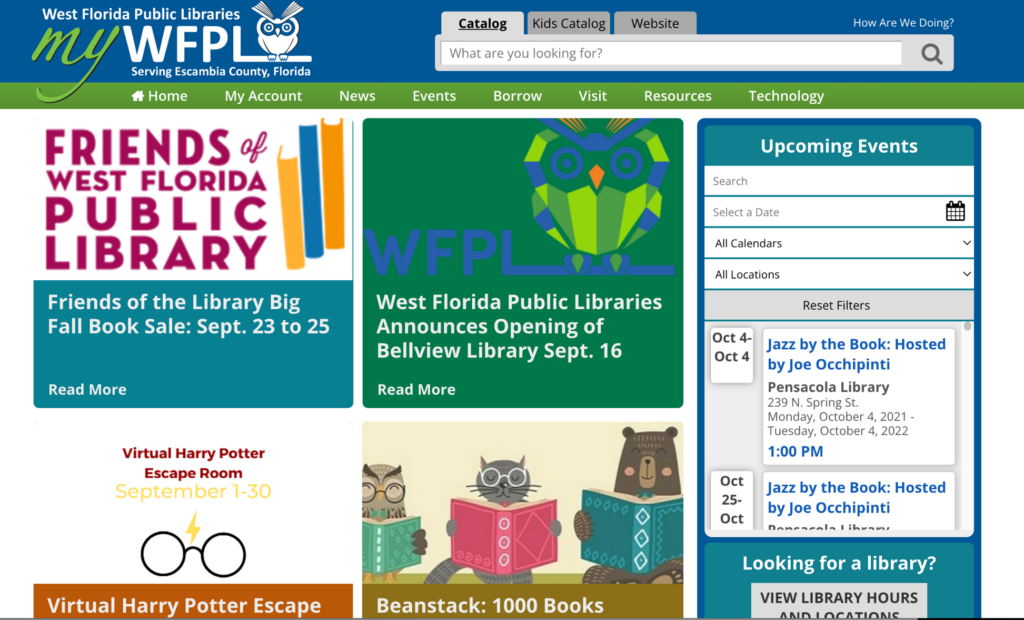
The first thing that I wanted to do on the website was to search and see if they have the book I want. The home page is where the heuristic analysis starts with heuristic #8, aesthetic and minimal design. There is already a lot to click on and look at and it is a bit overwhelming seeing all of the links and tabs on the home page. There are eight different tabs right at the top of the page and they all have multiple drop-down box options to click on. There are also a lot of articles to click on and “read more” as well as an upcoming events section. Even further down the page, there are more items to click on like new book lists and DVD lists.
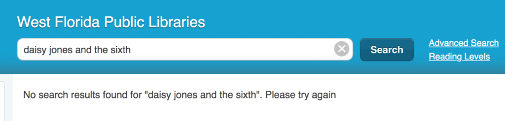
For the first part of my scenario, I want to search for a book. The search button is clear at the top, and it does feature different search options like; catalog, kids’ catalog, and the entire website. When you search a book, the website loads into a different website that has a different interface with a bigger search bar and advanced search options. During my first attempt to locate Daisy Jones and the Six, I typed “sixth” instead, and I got a message that said “no results found.” I believe that is a heuristic #9: help users recognize, diagnose, and recover from errors, issue. I work in a library and know that a lot of times people don’t know what the book they are looking for is called or one of the words they have is wrong. The catalog website did not show any other options for that book and I feel that could be an issue for patrons, as it did not help the patron find the book and fix the error in the title. I also wanted to see if it would fix a misspelled word, but it gave me the same error message.
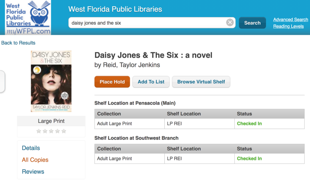
When I typed in the correct title, the book does pop up but the first item in the search is the book on CD, not the actual book. The book is the second in the list and shows not available, but there is an option to place a hold. There is a third option which is the large print option, which will be fine so I will click on that. On my usual library website, if you scroll to the bottom it shows what locations have that book, but this library you have to click on the “all copies” on the side. One of the copies of the book is at the Southwest Branch and I think that is the one I will decide to go to so my next step is to find the location. I also found that there was a heuristic #7: flexibility and efficiency of use error with the catalog. There is not a way to browse the catalog where you do not have to search.
I had to click back to the home page to find the location, and then the locations page was easy to find. There is a section on the home page to find a location and then there is a “visit” tab right at the top of the page. Then the locations page makes it very clear which library you are looking at and has a “get directions” option that takes you to google maps.
The next thing I wanted to do was check to see if there were any events going on that I would be interested in, specifically at the Southwest branch. The events tab was easy to find at the top of the page and I clicked “full calendar” to see what events were going on. The events page could also fall into the heuristic #8: aesthetic and minimalist design. The page opens and shows two random dates in October and then goes to the current day. This page also has a “tweets from @mywfpl” that does not need to be there.
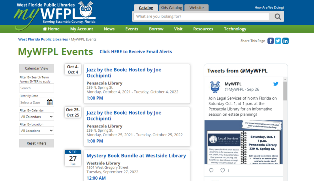
It was really easy to filter the calendar by location and it was interesting to see what events they offer. I think it could be laid out better and maybe should not show random October dates at the start. Or, if they do that make sure it says “special event” or something like that so patrons will know why it is at the top.
Recommendations
I believe that the website overall is nice and mostly easy to use for first time users. I think that taking some of the information off the homepage would be beneficial as there is a lot of information all at once and definitely is a heuristic #8: aesthetic and minimal design issue. That can also be said for the events page with the unnecessary tweets and dates at the top out of order. I also think their catalog should have a better interface so that when you make a typo or do not know exactly what the title is you can still find the book. There catalog could also benefit from some kind of genre browsing, this would help the website with heuristic #7, flexibility and efficiency of use. In their catalog you can only search books there is not a way to browse if you were looking for books in a specific genre. If you search “mystery” in the search box, instead of books in that genre you just get books with the word “mystery” in the title. There catalog also does not show what books they have available in their e-services, until you select “e-resource” in their format filter.