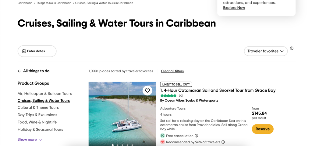
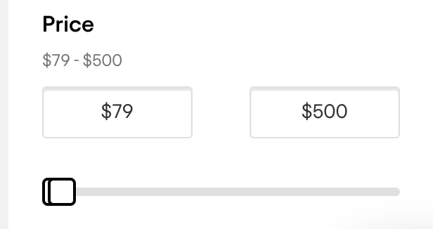
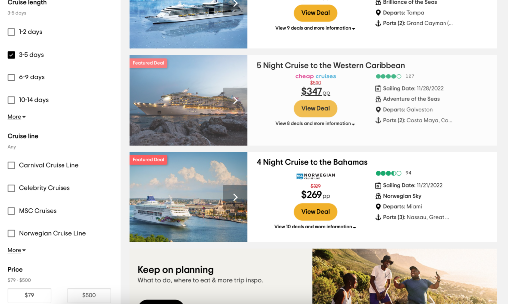
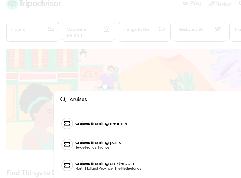
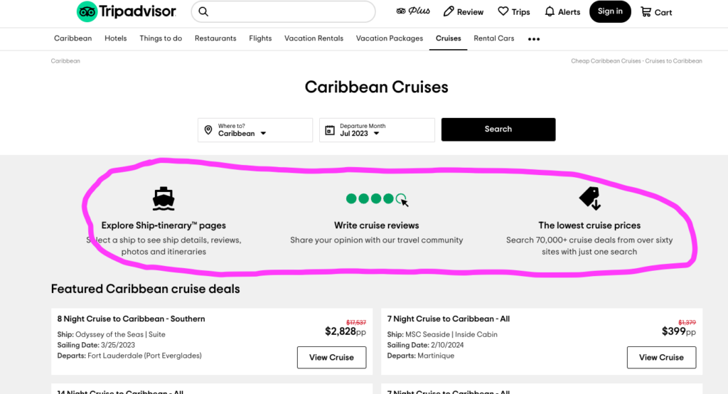
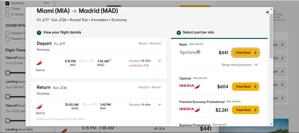
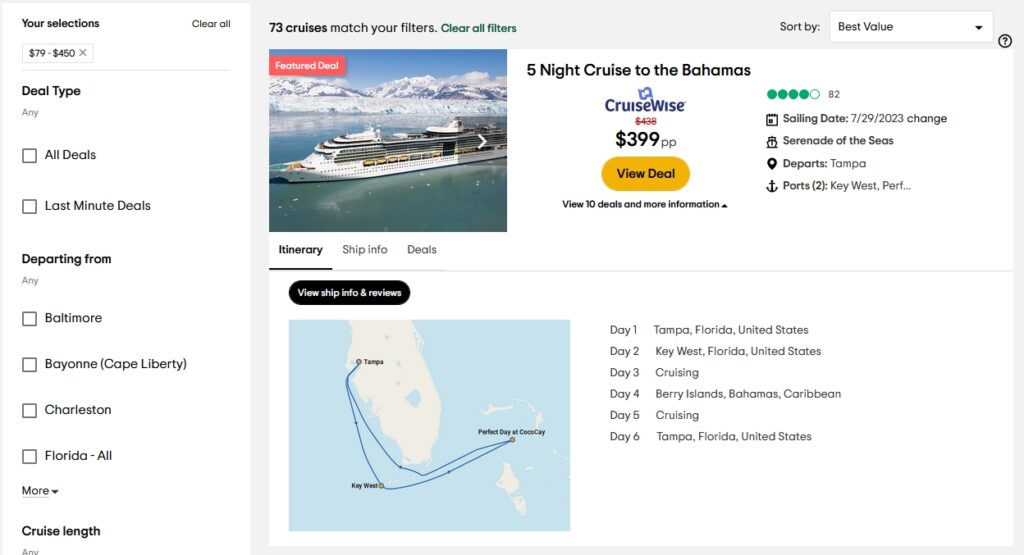
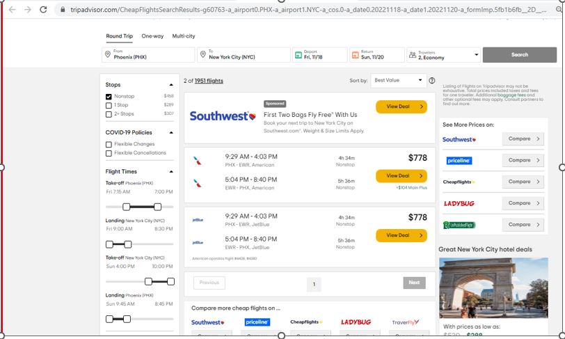
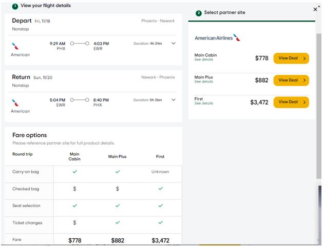
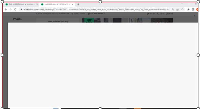
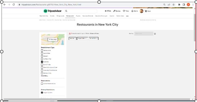
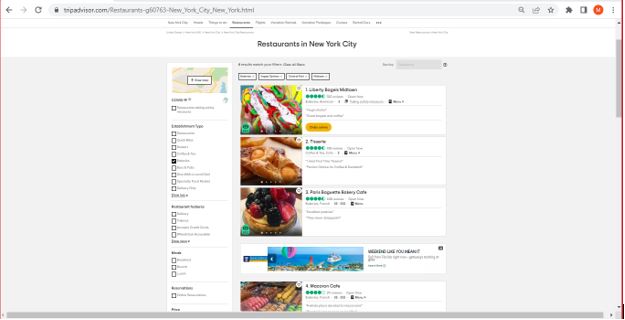
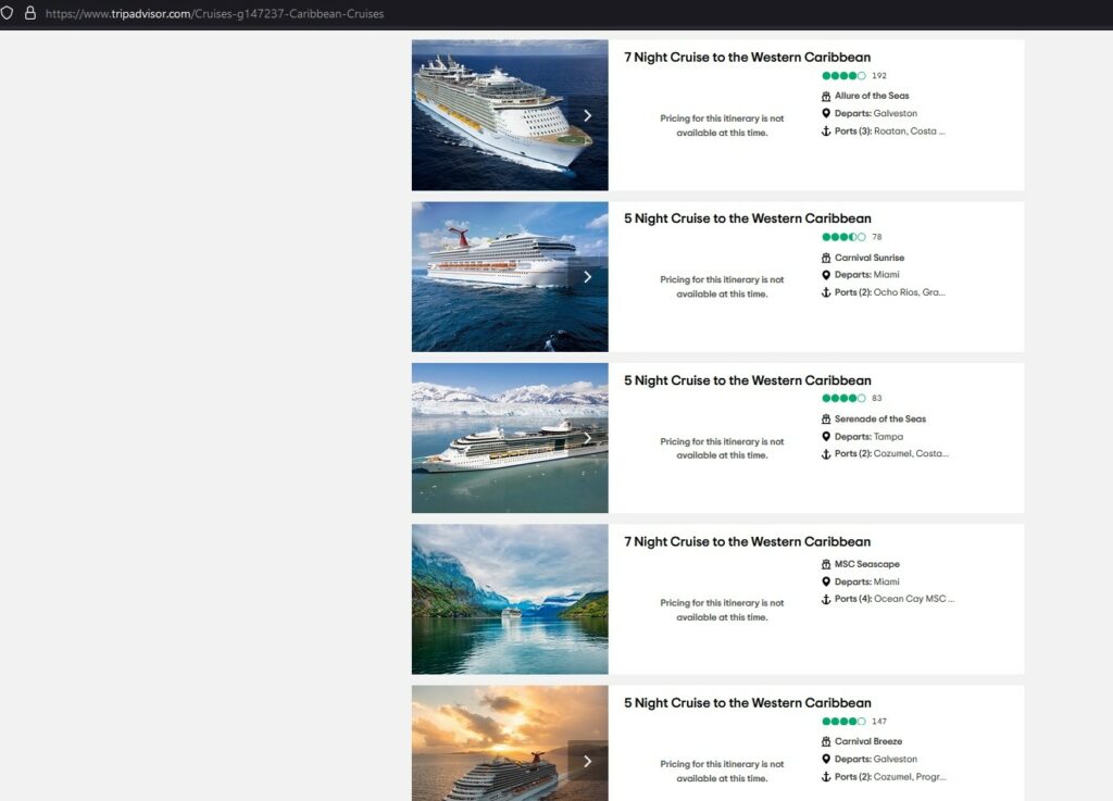
Issue #1: The first issue that our users encountered when doing the task of searching for a cruise within the $400 price range was that the search result included a lot of “pricing for this itinerary is not available at this time” entries. It showed up in the search results after the “price range filter” was applied. We found that the issue was caused by how the sorting was set; it was defaulted to “best value”. This is a violation of Neilsen’s principle of consistency and standards because the term “best value” is subjective, unlike “best price,” which is universally understood. The results with the “best value” included unavailable cruises that weren’t aligned with what users wanted to see. As such, this violates Neilsen’s aesthetic and minimalistic design principles, which provided irrelevant information on cruises that were not available. This feature also violates Neilsen’s visibility of system status principle because even when the user adds a new filter, the search results are still sorted by the “best value” deals, which continue to show the unavailable cruises. This negatively impacted the user’s experience because it added no value to their search results. The default sorting made the results unclear to the user.
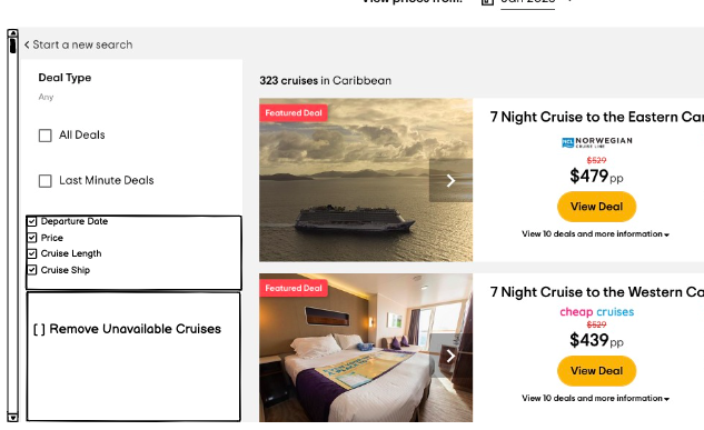
Recommendation: The first proposed solution is to provide the ability for end users to remove cruises that are unavailable. This can be accomplished by including a filter option to remove any cruises that are not available. The filter will be added on the left side of the page with a box that can be checked or unchecked. The filter gives the user control over the search results, allowing them to remove or keep cruises with “pricing for this itinerary is unavailable”.
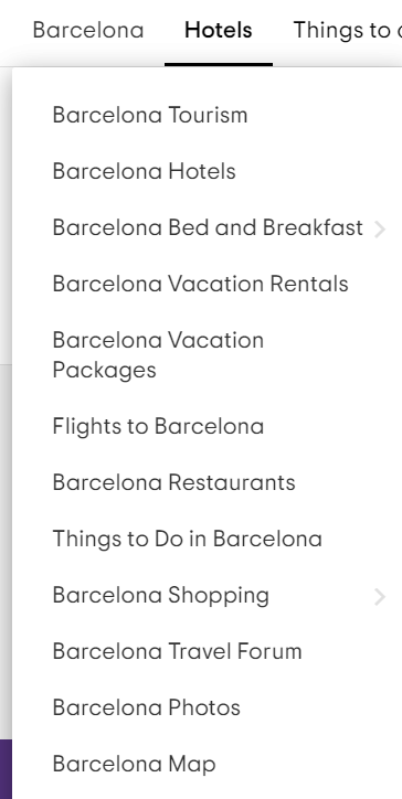
Secondly, the default sorting by “best value” is hard to understand and should be removed. The default sorting should be logical and clearly related to the filter applied to the user’s search. If they are searching by price range, it should be sorted logically by price from the lowest to the highest value, or vice versa. It makes it easy for the user to understand what is going on if the sorting reflects the filter being applied. The criteria used for sorting should be transparent and allow the user to have more control over their results. To easily find the “sort by” option, it should be moved to the left side of the result page. For added benefit, this option should remain in place as the user scrolls through the results.
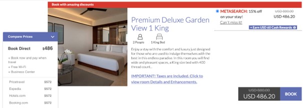
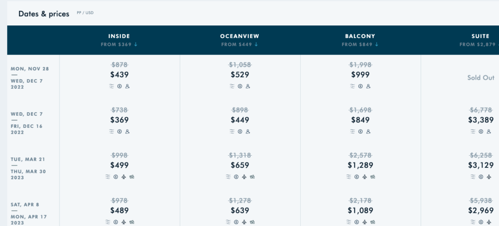
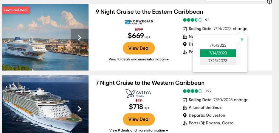
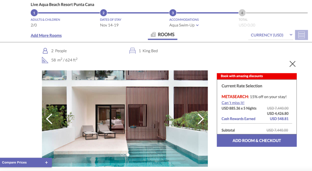
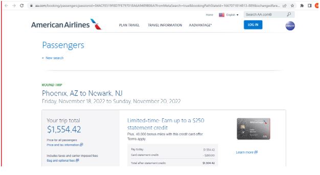
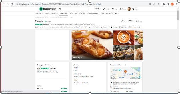
Issue # 2: Secondly, transparency of pricing was an issue noted by many of the users that we evaluated. The price originally presented was significantly less than the final price of the resort, activity, etc. This was frustrating for many of the users, who thought they had found a steal of a deal and wasted their time going through the booking process only to find the final price significantly higher than the initial quote. This violates Neilsen’s principle of visibility of system status because the actual price of the hotel is not what it is visible to the user. This also violates Neilsen’s principle of consistency and standards because the price shown in one page is different when transferred to the provider’s webpage.


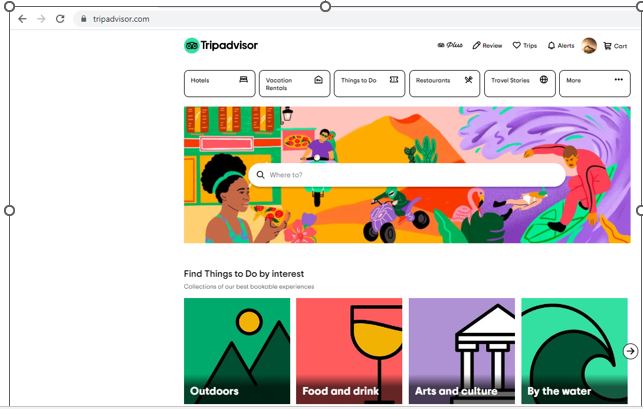
After our design workshop in class, we decided to prioritize highlighting why TripAdvisor is a better website than its competitors from a different angle. Instead of changing the algorithm to better display other entities pricing, we shifted our focus to the following:
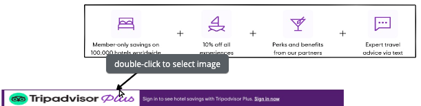
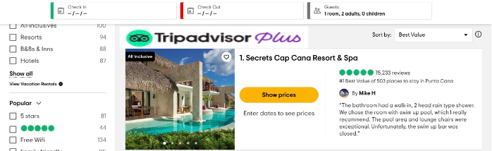
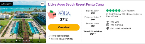
- TripAdvisor Plus, a premium subscription service where users can save on hotels, entertainment, and get exclusive travel assistance. We are highlighting the financial advantages of using TripAdvisor plus.
- TripAdvisor’s reviews are provided by other people who have been on these trips and are a prominent feature of the website. We decided to highlight that feature in all the booking applications/ features.
Issue # 3: With many competitors, TripAdvisor sets itself apart from them by offering better deals and providing context through user reviews. TripAdvisor’s value to its users over other sites like Expedia is TripAdvisor Plus.
Our proposed solutions include the following:
- Highlight reviews of search results throughout the user’s entire booking process.
- Make TripAdvisor Plus benefits visually available for users as they are planning their trip.
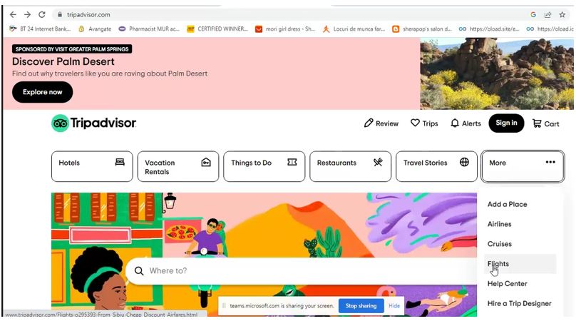
- The differences between TripAdvisor Plus and TripAdvisor should be distinct, codified, and easily recognizable by the user. This can be done by replacing The TripAdvisor Plus icon at the top of the page with a logo that draws the end users’ attention.
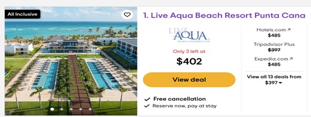
- Secondly, the TripAdvisor Plus prices should be presented in the search results with an icon that symbolizes discounts, a Piggy Bank with sunglasses. This will help users associate TripAdvisor Plus with deals and savings.
- The TripAdvisor+ logo should be available in the search results to be promoted more. This logo should also replace the TripAdvisor Plus icon on the ribbon that is on the bottom of the page. This will have a more visual impact and maximize its exposure on the page.

- Lastly, when a user hovers over the TripAdvisor Plus icons, a small box should pop-up with information on what TripAdvisor Plus offers, highlighting the benefits of the subscription. This will also include a blurb about a trial period of 90 days to encourage users to try it out.