Gaming group
The Site:
Gamesradar+ (https://gamesradar.com)
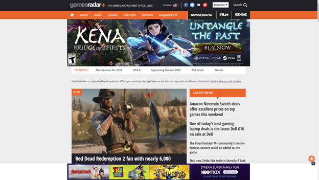
Gamesradar+ is a gaming site that covers games from all platforms, from PC to all the various video game consoles on the market. The plus is the additional coverage of topics many gamers also enjoy, such as movies and the world of comic books.
The Scenario:
The review of this site is done through the eyes of the fellow gamer that needs to find a gift for a friend’s child. As video gaming has been around for decades, this group covers a large range of potential ages. In this evaluation, we will be looking at finding a gift for a pre-teen boy that his parents will not object to. In this case, that means nothing with foul language, shooting games, or other conduct they may consider inappropriate for his age. This task will be considered a success if it results in a game recommendation, and if it points to a good deal on the game, that would be a bonus.
The Analysis:
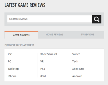
In the search for information about games, I selected the Reviews tab:

Since I am looking for a game, the Latest Game Reviews tab makes sense. At this point, the site navigation makes sense. What did not make sense was the word Tech under the BROWSE BY PLATFORM section. Curiosity drives you to look at that one, which takes you off to reviews of televisions, personal tech, and streaming hardware. This fails as a Match Between System and Real World.
In navigating the site, I notice that the Reviews tab does not stay colored in black, which would keep the Visibility of the System Status if implemented. Since the friend’s kid only has a Nintendo Switch, an Android tablet, and an Android phone, I select Android looking for game reviews and again get let down as that section takes me to a page full of phones and Android game controllers. There isn’t a review of an Android game until you get to the second page. As I look further, I realize that the newest review on an actual Android game is from March 1st, 2019. This once again fails at the Match Between System and Real World and the idea of Consistency and Standards. A game review section should only have reviews of games, and reviews of physical devices should be kept separately, and a website about gaming should be kept current. The idea of not having a review of games during the entire pandemic (when people were stuck at home with little else to do) is just unheard of.
In a pleasant surprise, returning to the Reviews section and going to the Switch section showed reviews as recently as 12 days ago. There were plenty of options to choose from for games, but it also had hardware reviews for platforms not related to the Switch such as the Steam Deck. Once again, another Consistency letdown.
A user can understand the need for a website to be supported by advertising dollars, but this site crosses into the ‘annoying’ category with the excessive screen real estate devoted to unrelated ads. The following screenshot is what happens when you full screen the site on a widescreen monitor:

In this violation of Aesthetic and Minimalist design, the idea of a gaming site is lost in a flurry of advertisements about London. Less than a third of the page is the actual site content.
The Recommendations:
The adjustments to the site would be straightforward:
- Adjust the header at the top of the site to keep the current location highlighted to keep the user informed of their location in the site (Visibility of System Status). The header is a good method to show this, but it needs to be fixed. The header also had some other flaws, such as the “About Us” section being hidden under the “Magazines” section:

- Game reviews should be nothing but game reviews. Either put reviews of hardware in their own section or combine the hardware and games into sections by platform and label them as such. This would give the user the Consistency and Standards as well as a Match Between System and Real World.
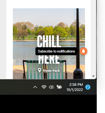
- There is this one little icon that floats on the page, and when you hover over it, it reveals itself to be a “Subscribe to Notifications” option. This needs to be moved into the header with a label. While it could be a highlight for Flexibility and Efficiency of Use, as a shortcut that more experienced users would rely on, I fell that not knowing what it was shows a fault in Visibility of System Status.
- Advertising must be limited to less than a third of the site, and ideally should be something remotely linked to gaming. The current layout is pulling from the focus of the site, which is to promote and discuss gaming. Limiting the percentages of screen real estate to advertising will allow users to stay focused on the task at hand.