Group Assignment 3B

Group Libraries – Jasmine Philips, Caitlin Hattaway, Christopher Gregor, Colin Webb, Erin Seaman

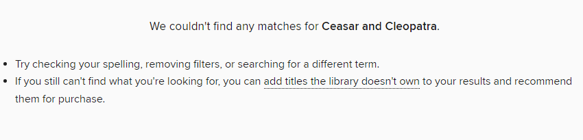
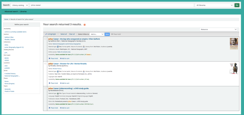
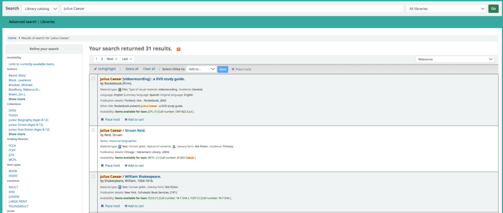
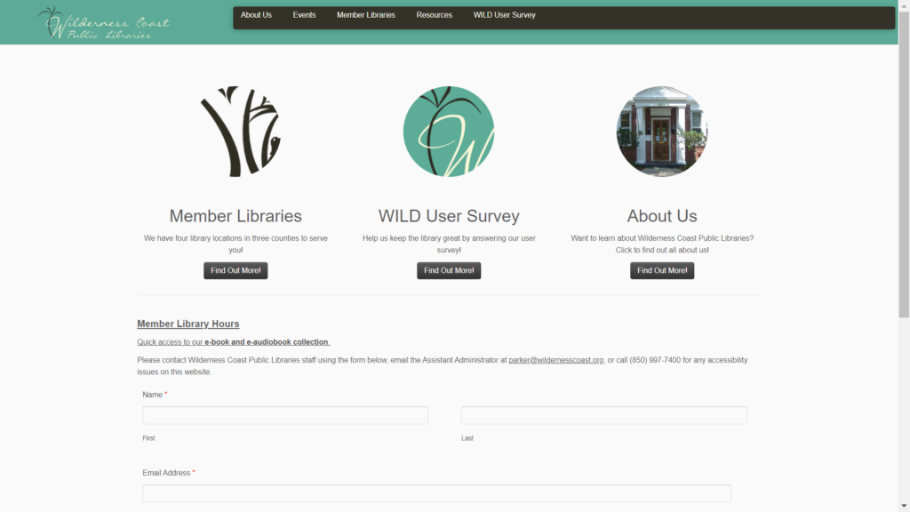
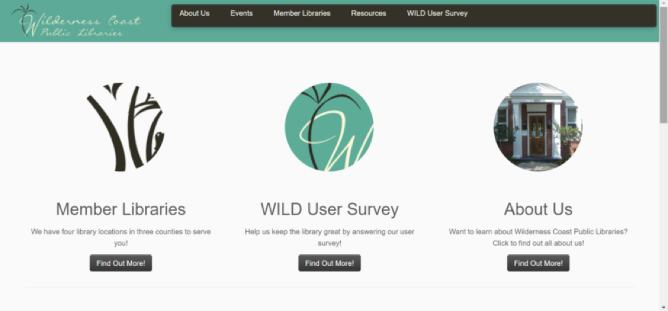
The focus of our redesign iterations have predominantly concentrated on the homepage of the Wilderness Coast Public Library website. During user testing, we found that the design and the layout of the homepage was confusing and not very user friendly. When doing our user testing, our users thought that the design of the website was not cohesive throughout, the majority of pertinent information was written in bulk text, and locating the catalog to search for books was difficult. 

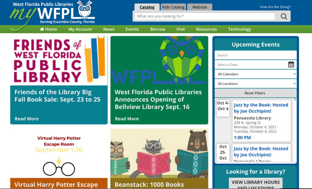
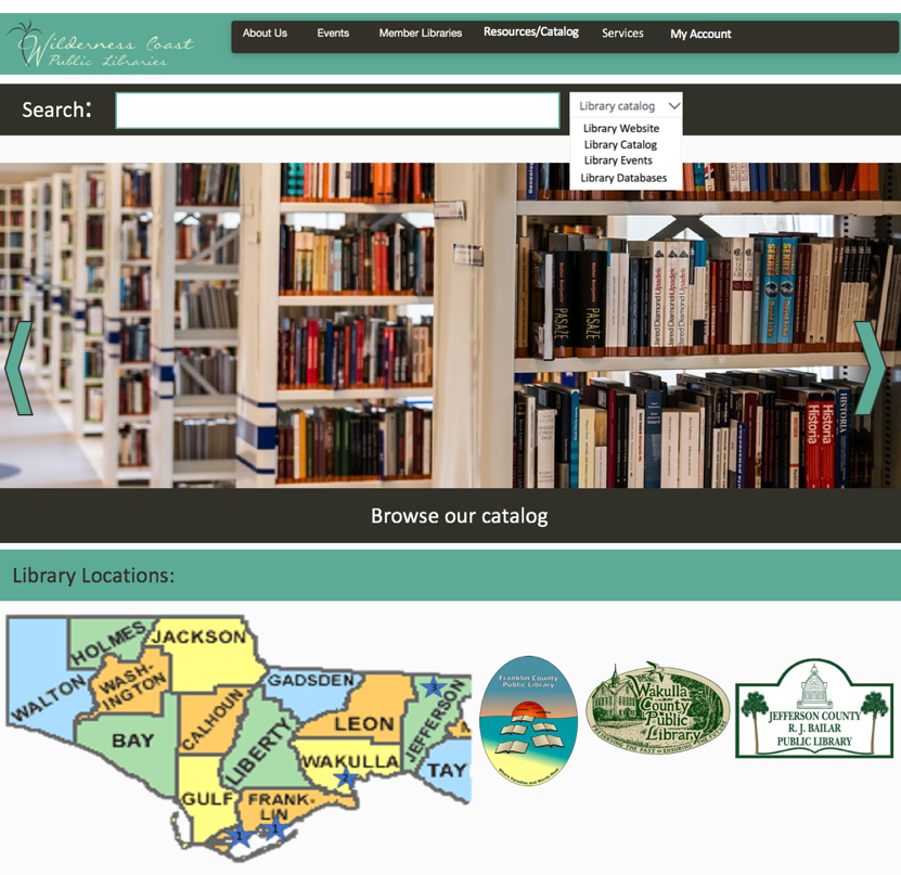
In our first iteration we added a search bar on the main page as well as a drop down box that users could use to specify what part of the website they wanted to search. We also added a few more options onto the main menu, including a tab for services and a tab for users to log in. We also wanted to make the four library locations a major part of the home page and easy to find. We thought that was best so that users could find the link for whichever library website they needed. 

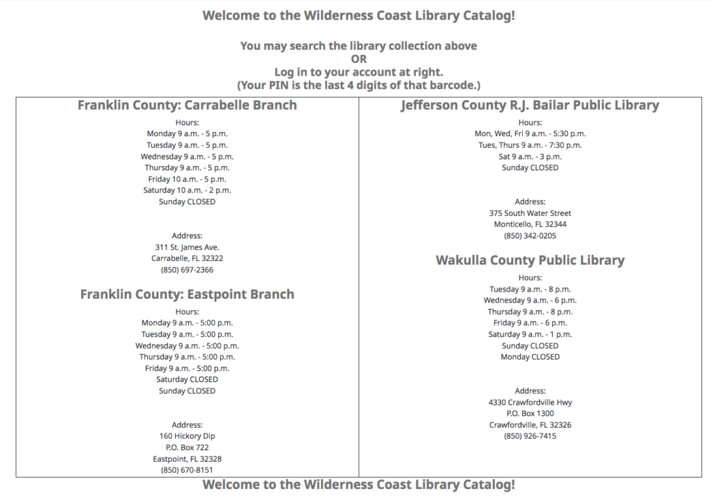
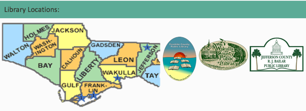
       Feedback on our first assignment gave us ideas on how to further edit the homepage of the website. The main feedback we received was to make the search bar more visible and locatable for users. Edits to the main menu were also suggested, like changing the “login” tab to “my account,” making it clearer to the user what that tab was for. There were also suggestions made to clarify the four library branches and the three county libraries. Since the libraries are located far apart, besides the two Franklin County branches, adding the map makes it easy for users to locate and access which library they needed. 

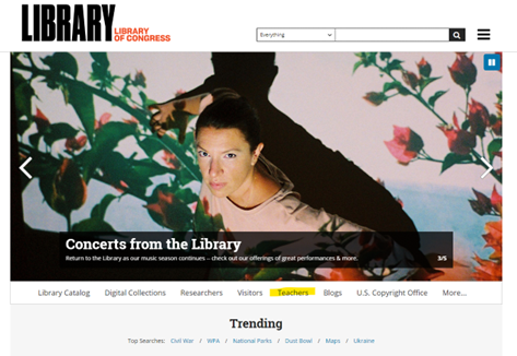
Our previous user testing also showed that the events page for the Wilderness Coast Library was not cohesive between all the libraries. Combining the events pages for all the libraries in the system would make the websites more unified and easier for patrons and users to find the events they are looking for. Events could also be highlighted on the scrolling banner we have created and added to the homepage of the site. Clicking on the banner would take them to the events page, giving them options for which library, and what dates the events are held on.

Original Library Website
3A Iteration
Updated Iteration for 3B

Menu/Search Bar Design

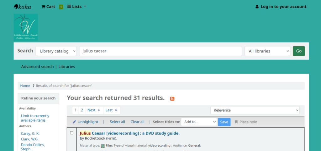
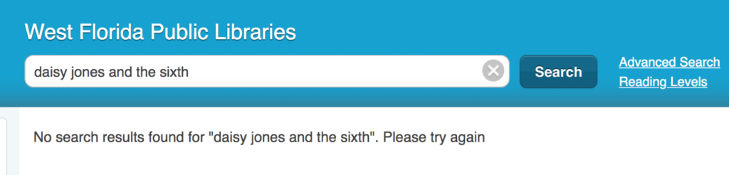
Our redesign for the Library system search bar would be an increase in size since it was very small to begin with. This will make the search bar more accessible to different users. Also, we would filter the search results shown to our users depending on the page the user is on. So if the user were on a particular library’s page, it would show results only of that library. The two exceptions to this would be if A) the user was searching from the main catalog or main page of the system, or B) if the user selected an option on the search bar to search a specific filter such as Library Website, Catalog, Events, or Databases which would bypass the page filter to search the specified location.

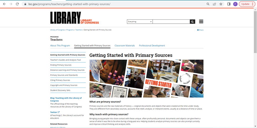
For the Menu Bar, we decided to increase its size as well for the same reasons as the search bar size increase and adjust its options. Now it would include a link to the Events page which will show all events for the system, the same About Us as before, Member Libraries which would be a drop-down menu to navigate to a specific library or to view the map, which will show where the libraries are, a link to the full catalog on the menu bar so that it is accessible from any page, services for each library to find specific tools for the user’s needs, and a link to the user account for logging in and tracking rented books, services, and other library tools and services.

Rotating Information Banner

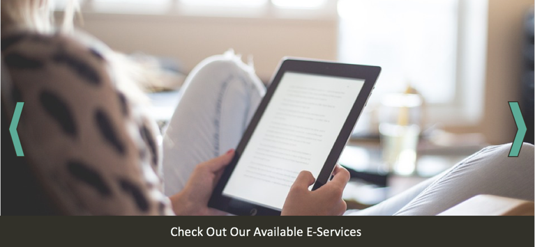
For this new iteration we also thought that adding a rotating banner would be a great way for the library to promote their services as well as make it easy for users to locate information. Since the catalog on the original site was hard to locate we thought that adding that as one of the banners would be beneficial. The library can also use this rotating banner to highlight upcoming events so users visiting the site can see what is going on at the library. Another banner they can add is a services banner highlighting e-services that users can access through the library. A “New Releases” banner would also be a good way to show what new materials the library is offering, ranging from books to audiobooks and ebooks.

Additional Rotating Information Banner

Library Locations Map

Since the Wilderness Coast Public Library system has multiple library buildings, people will need to know where each building is located. We decided that the website map should feature the three libraries. If people move their cursor to the library building names, the stars in which the building is located will expand to show the users where the library is. This will give users information they need on where to go. Since the Franklin County Public Library has two buildings, both stars will expand and will give titles of the branches: Carrabelle and Eastpoint.

Library Map

Events Page

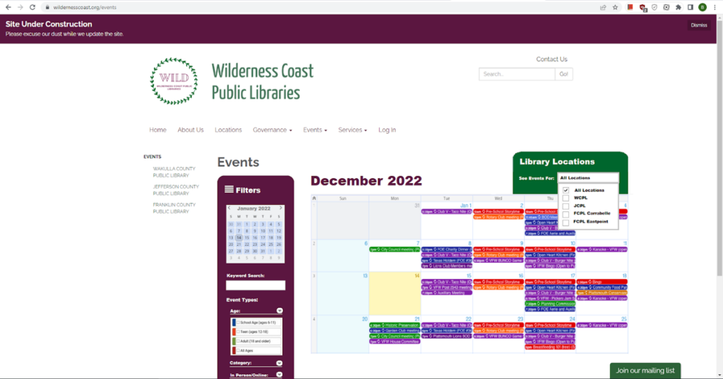
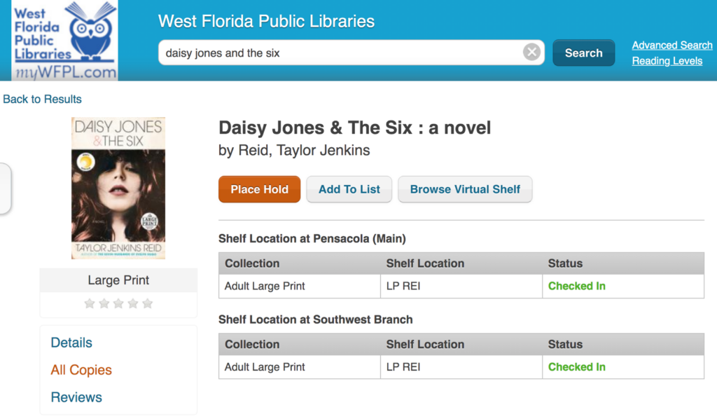
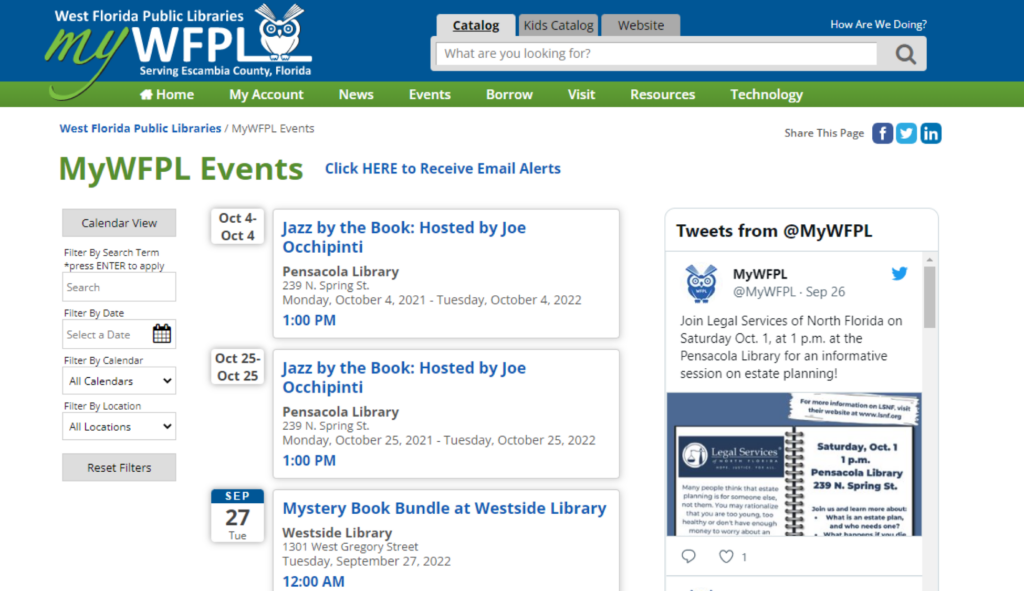
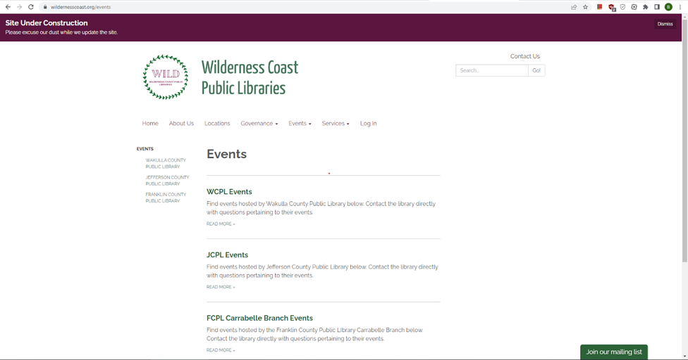
One idea we had for helping the Wilderness Coast Public Libraries website create a more unified identity, while preserving the functionality of the individual branches for users, is to adjust the Events page to include an events Calendar on the main Events page, and then include the individual library calendars on each of the sub-menus. At present, the events landing page looks like the image below, which is clunky because of all of the extra clicks a user has to make in order to actually find a calendar (presuming the library has a calendar linked….JCPL does not currently have anything listed on their events page).

Current Events Page

Initially, we discussed simply embedding a widget that links to each library’s social media page on this webpage so that users could quickly see what the most recent news for each location was regarding events. While we like this idea, and think it would be a helpful addition to each of the individual libraries Events pages (accessible via the sub-menus and on the left-hand side of the main events webpage), we ultimately acknowledged that this would not give users the most control and quickest way to access event information, not least of all because some of the locations don’t have very active social media and others have overly-active socials. To avoid this issue, we determined that an interactive calendar would be the best way to update this particular aspect of the website’s design. 

After reviewing the WCPL events redirect, which is the only branch of the four that has any kind of calendar system, we took inspiration from the categorization system they already have in place. Our proposed change would not only be to have the landing page include a visible calendar showing all upcoming events at all of the different branches, but we feel that the best user experience would be to have the calendar include a drop-down menu to filter either “All Libraries” or each individual branch. It would also include a Filters section that allows the user to filter for specific calendar dates, keywords in the event titles, or to filter by Event Types categories such as Age (Audience) and whether the event will be In Person or Online, as seen in the mock-up below. This update would be possible using a shared Google Calendar where each library maintained their own branches’ calendar, but all branches would need to use the same color-coding system so that a filter for event type could function.

Recommended Updates to Events Page

Group Assignment 3a: Iterative Design

Users’ thoughts

After completing their tasks, our users gave their input on the Wilderness Coast Public Libraries (WCPL) website design, and from their comments, we gathered the following: The look of the site is jumbled and confusing, and the changes in the background from place to place make it seem like each part of the site was made by someone else. Across all the website’s pages, it is clear that the site was improved from a previous WordPress design to look more appealing with pictures and color, but the information itself is still presented in a poor fashion with large blocks of text, tight bullet point lists, and inappropriate links. There is a massive reliance on bullet point lists too close together, images with no links or explanation, a lack of basic information like hours of operation, and the jarring change of designs between each section of the public library system website. Overall, these smaller issues add up to a larger appearance that leaves the user either dreading large amounts of condensed information or confused about where to search.

Some of the pages should be broken up into separate subsections and incorporate either more graphical designs like pictures of the library or simply a more appealing and larger font. A quote from one of our users on this matter was, “Aerial is the most basic of fonts, and everything is so closely spaced.” The links used in the site should be placed in order of most use. Currently, they place the link to the individual library pages on the home screen off to the left and the survey on the library system at the center of the page even though they should prioritize the needs of the users, not the survey.

Improvement suggestions

The WCPL website is confusing and disorganized, as it is a maze of incomplete web pages for each of the different member libraries. When users enter the website, they should be able to get a basic understanding of how to navigate it. The library website would do much better if the links to the library branches were placed on the main page. This would make it easier for users to know which branch they would like to visit. If users want to find a book, the first thing they should consider is a branch of the library they are using.

WCPL site update

The Wilderness Coast Library System’s shared catalog web page allows a user to view materials offered by the libraries, but the design makes it difficult for users to find the page they want. In each of our individual user tests, our users struggled immediately with how to navigate using the main library system’s landing page, and even when we first chose this site for our project, we knew it left a lot to be desired. In fact, it appears that even the WCPL team noted how frustrating it is for users to navigate through and have thus chosen to begin the process of updating all of the websites. The difference between the two websites can be seen in the images below:

Fig 1. The original landing page for the Wilderness Coast Public Libraries System
Fig 2. The updated landing page as of 11/13/2022

As of right now, that overhaul reflects a more modern design approach, utilizing icons below the scrolling header image to provide context for orienting the viewer and assisting with quick navigation. Interestingly, the color palette has also been updated, changing from the teal blue to a green and pink/purple motif. One of the major changes is one our group has complained about from the start of this project: the inclusion of a Search Bar on the landing page (although it is not quite as optimal as we planned to propose). The other major change that they have made thus far is an updated navigation bar that includes actually useful and descriptive titles (with drop down menus for more specificity).

While the decision for the library to begin making updates in the middle of our examination of their site presents some challenges for us as we move forward in this assignment, it also provides a very exciting opportunity as well—as we go through the iterative design process and propose fixes to the site, we can also check in and see the iterative design process that this specific webpage will undergo in the next few weeks as they make their own changes. We will be able to critique not only our own design choices, but also compare them against what the actual library system chooses to do and from there make new proposals for optimizing navigation. This will enrich our experience as we create our proposed designs, and also help give us some direction/parameters as we reflect on the changes that are pushed out by the library. Not only that, but it will be a fertile opportunity to really emphasize the dialogic nature of the iterative design process, as we provide critique of the changes made and offer solutions that we feel would be more optimal, while also giving us a chance to acknowledge areas that may be updated that we hadn’t thought about or considered in our own perusal of the site.

Group redesign

With all of that said, before Wilderness Coast Public Libraries began actually publishing changes to their website, we came up with some design recommendations focusing specifically on the main landing page of the site. As I mentioned, some of the biggest concerns we flagged as a team were that: 1) the main page should immediately show a user the different libraries and pertinent information regarding each of them, 2) the main page needs an easy-to-find and easy-to-use catalog search bar, 3) the navigation bar needs to be more descriptive, and 4) the user needs to be able to access this information without having to make so many clicks to new pages.

Group proposed redesign of the WCPL home page

When users first land on the main page of the WCPL system, there is not much to look at. When doing our research up to this point, we all thought the main page could use much work. Mainly, we thought that since the Wilderness County system has multiple branches, and the branches are far apart, the best thing to do would be to have clickable links to each separate library website. Adding the contact information and address under the link would be extra helpful to users to make sure the library they select is the best one for them.

The next biggest issue for the library site is that there was no way to search on the main page. Adding a search bar would be extremely helpful and quicker for users just trying to search the website or the catalog. We added a catalog search bar to the top of the page so that it could be an immediate source of information for library users. The website also had clickable information at the top. Our group thought that adding extra links such as “log in,” “services,” and changing “Resources” to “Resources/Catalog” would be useful.

The search bar that is currently on the catalog page has options to narrow your search to the author, ISBN, subject, title, and more, which is good when searching the catalog. Having more options in regard to the search bar on the main library page would be great for patrons. The edited search bar created gives patrons the option to search the library website, the library catalog, library events, and library databases. Those options give patrons a narrow starting point that they can use to get good use out of the website.

Search function with more options

Individual Assignment 3: User Test

Website

We chose the Wilderness Coast Library system’s website, and chose to follow up our analysis with an emphasis on one of the 3 different library websites that are affiliated with the Wilderness Coast system, the Jefferson County Public Library website. This website is particularly interesting because it not only includes the main webpage detailing all of the info regarding the different member libraries and links to each one’s individual website (which provides a user, but it also includes a link to the main Catalog that all 4 member libraries utilize.

Persona/User

Our persona was intended to be a high school aged student who had to write an essay about Julius Caesar. Although I could not find a high school student to perform our user test, I was able to ask a college freshman to go through the website and think aloud while they navigated the page. My user had already taken college-level English and research courses, so that is a significant deviation from not only our developed user persona, but also likely from the average user of these websites in general. However, because a college-level research education is based on using a system that is (theoretically) well-made for research at a variety of levels, these sites present enough unique challenges that their intuition would not necessarily work out well for them anyway. My user claims that they are pretty comfortable looking things up on difficult to use websites, since they do that often for their job, but that they aren’t super comfortable with technology in general.

Testing Method

I chose to utilize the Think Aloud protocol, because I knew that my particular user would be comfortable giving immediate feedback as they went through, and that they would happily verbalize them. I think that it is helpful to see what they are doing in the moment and why they think they are doing it/what they think the interface wants them to do. I find it particularly interesting the way that, whilst doing a Think Aloud, people tend to anthropomorphize the interface and ascribe sentience to it (i.e. “it wants me to do XYZ”), which they then verbally react to. I have noticed that this does not happen as much with other types such as Retrospective Probing, and I think this helps us to better understand not just what a user does and why, but also how it makes them feel and why.

User Tasks

I wanted to utilize the tasks as we wrote them, since I felt like it would provide the best flow for a potential user. However, we did also have a short conversation before the test about their experiences with libraries, and spoke about the Library of Things and Seed Libraries that they’ve utilized at their own library, which influenced their user test toward the end. I did not comment on that, since I thought it was a fun addition that a student may likely need to try to find when completing a research paper.

Our tasks were as follows:

              Task 1: Using the Library system, the student will locate a relevant book for their research on the death of Julius Caesar, and which library that book is located at.

              Task 2 Now knowing what book to look for and what library it is at, the student will look for the available hours of that library that does not overlap with their high school schedule.

              Task 3: Find information on the use of computers at the local library to complete their research paper on Julius Caesar’s death. The student will also find out how to print from the library.

User Navigation

I gave my user a list of the three tasks to complete the project, and then set them up with the main Wilderness Coast Library System website, since that is the first result that comes up on Google. She immediately hovered over each of the three options and could not decide between the Member Libraries option or the About Us option (but immediately said that the Survey seemed pointless). She decided to start with About Us, but as soon as she opened that page she said that it did not seem to be what she was looking for, so switched to the Member Libraries option from the Nav bar. She found the JCPL option and clicked on that tab, and found the carousel image header both unhelpful and nauseating. However, after she was done being annoyed about the carousel, she noted that she was excited to have found the address for the actual library she was looking for.

However, even though she knew where to physically go to find books, at this point she knew she needed to find the catalogue so she could actually look for books. Yet again, she was not sure which button to choose between Get Books & Materials and Discover Library Services, but “Get Books” seemed more promising so she went with that. When that page opened, she was looking for a search bar and was confused when she did not see it after scrolling up and down the page. Assuming she had landed on an “About our Services”-style page (since it was so text heavy), so went back to the Home page to get to the Services page. Realizing that it was essentially the same style of info, she clicked the “Get Books & Materials” button on the bottom right of the Services page. She skimmed the bolded headings of this page, seeing the different ways to get a book and noting that there is a way to borrow tech, which she wanted to explore (since she knew that was the third task) but decided not to because she hadn’t found the actual materials she needed to write the paper in the first place. Tucking that info away for later, she continued to search for the search bar that would allow her to find books.

After much clicking around this limited website and growing frustration, she decided to return to the Wilderness Coast landing page to see if she could find a Catalog there. She decided that the Resources item on the Nav Bar felt promising, and selected that. The first two items, WILD Catalog and WILD E-Books, called to her, and she could not decide between the two so she opened them up at new tabs. She immediately got excited by the search bar on the Catalog page, but wanted to check on the E-Books just in case; however, when she saw that they page was basically just a link to a different resource, she closed it out and continued forward with the search bar.

She searched for “Julius Ceasar” and was shocked to only see three results displayed. She decided to expand her search to “Rome” and decided that the 21383 results was too much. She switched to “Roman leaders” and felt that between the three Julius Ceasar books and the 550 Roman leaders resources, she could probably begin crafting a decent essay. She then went back to her search for “Julius Cesaer” and noticed that there were now 31 results instead of 3. She Googled how to spell “Caesar” and came back to the search bar and entered the name in properly, which interestingly enough still yields the 31 results.

Now that she was able to locate that they had books/videos related to the topic, she checked to see where they were offered. She just went to the first result at the top of her current search page, which was for the Videorecording/DVD study guide. She noted that it showed green at the bottom of the listed that it was available at the JCPL branch, which she was excited about. When she clicked the title to look more into the resource, she saw the menu on the right side of the page and chose Add to Cart…and was confused when nothing appeared to happen. She scrolled up to find the Cart and saw the Log In option, but never located the cart. She clicked the Log In and promptly backed out since she did not have a library card and could not log in. She tried to choose the Place Hold option and also realized that she could not since she did not have a library card.

At this point, the user noted that she needed to find out when the library was open so she could go get the resource (and sign up for a library card). She had thankfully already found the address on the JCPL site, but did not remember seeing anything about the time. She started backing out of the catalog page and ended up backing up until she was stuck on the home page and could not back up anymore. She quickly perused the site and was thankfully able to quickly find the hours for the branch closest to her, but noted that she would not have guessed to look there if she hadn’t been dumped there during her frantic backing out.

She finally decided to go back to the JCPL webpage, and thankfully noticed the hyperlink to the left of the library hours to find the JCPL link. From there she navigated back to where she remembered seeing the Borrow Technology heading, and ended up back on the Catalog by following the Tech2Go link. She realized that she would probably need a library card for that, as well, and figured that was where she should stop.

Design Recommendations

There were a number of issues that my user ran into when navigating this site, which in many ways echoed my own navigation woes and the frustration my group has identified as we’ve worked with this website. These are the biggest stand out issues to me, though, that I think would help navigability immensely.

Main Home Page

For the Wilderness Coast main page, they should forgo the About Us/Survey/Member Libraries buttons and instead have the Member Library websites (with their addresses and hours) as the main landing page. Additionally, either above or below the different member libraries, they should have the Catalog search bar. From there, the Nav Bar can help users find more About Us and Survey info on separate pages (or honestly it could all be one continuous scroll page with clearly defined sections of descending import). Doing this would save so many clicks and so much unnecessary searching.

JCPL Webpage

The JCPL website is simultaneously too much and not enough. The information it does have is overbearing and redundant, with big blocks of text with minimal contrast to help a reader skim through and quickly find what they need. At the same time, the page is incredibly sparse and does not do a good job of guiding the user to the resources they undoubtedly want to access. Again, I think making this one continuous page could be beneficial, but mostly I think the home page should have a clearly labeled link that takes the user straight to the catalog website. Additionally, it would make sense for the home page to include things like their hours and contact information. Finally, since users cannot utilize resources without a library card, the home page should have a clear space defining the procedure of signing up for a library card.

Individual Assignment 3: Representative User Test

Selected website description

The Wilderness Coast Library System website homepage

The Wilderness Coast Public Libraries (WCPL) system offers its patrons various services through four libraries in three Florida counties. The particular library website within the system I was interested in seeing my user navigate was the Jefferson County R.J. Bailar Public Library (JCPL).

The Jefferson County R.J. Bailar Public Library website homepage

User characteristics

My user is a mom to three children, two in middle school and one in high school. She works as a co-teacher for special education students at an intermediate school. She says she is not the best at technology, adding her kids would be better at this test than she would, and has never accessed or used library websites.

Testing method

When my user told me she did not have experience navigating library websites, I decided to use the Retrospective Probing testing method. This method is typically combined with other methods, so while I asked her to think aloud as she was using the website, this method would give me the chance at the end to ask questions if she did anything I noted as interesting or unexpected. I did not believe just utilizing the Concurrent Think Aloud method would allow me to ask questions; unless I completely misunderstood, it appeared the only prompts I could give were to remind her to keep talking if she got quiet. 

User tasks

I did not make any changes to the scenarios or tasks. When I told my user that the persona was a high school student, she said she did not mind and wanted to try getting into that perspective.

Task 1: Using the Library system, the student will locate a relevant book for their research on the death of Julius Caesar, and which library that book is located at.

I kept this task as is because I wanted to see how my user would find and access the library’s catalog.

Task 2: Now knowing what book to look for and what library it is located, the student will look for the available hours of that library that does not overlap with their high school schedule.

I kept this task as is because I was curious what my user would do to find the hours of the library, since from the site itself, they are not located in a logical location.

Task 3: Find information on the use of computers at the local library to complete their research paper on Julius Caesar’s death. The student will also find out how to print from the library.

I kept this task as is because the use of computer information is not very clear or detailed and I wondered how my user would interpret them.

Detailed analysis

Task 1

Using the Library system, the student will locate a relevant book for their research on the death of Julius Caesar, and which library that book is located at.

I read the persona and first task to the user and pulled up the Wilderness Coast Public Libraries system homepage for her to begin. She clicked on Member Libraries and clicked on the Jefferson County picture since she is a student at a high school there. On the JCPL site, she clicked on the button labeled More under the header “Get books & materials.” She did not attempt to read the page when on it, instead scrolling down immediately. She noticed the faint words of Post Navigation at the bottom, asking what it meant.

The faint post navigation at the bottom of the page

She said she was looking for a search function so she can type what she needed and continue. She then clicked on the hamburger menu at the top right of the page, but not seeing what she needed, she closed it and started to skim over the Get books & materials page. She pondered over borrowing an eBook before deciding to click the link to do so. When the next page was a notification that the WCPL had merged with another network, she wondered if she would be able to access it since she does not live in Florida. 

On the Panhandle Library Access Network website, she eagerly exclaimed over the search bar, and began typing Julius before realizing she was not sure of the correct spelling. Remembering that she was acting as a teen, she ditched the search bar and clicked on the Teens tab on the top navigation. Again, she clicked on the search bar on this page and typed “Ceasar,” the incorrect spelling, rather than Julius this time. The auto-complete function gave her the suggestion of “Ceasar and Cleopatra,” so she clicked on it, but the resulting page claimed it could not find any matches for this title.

Incorrect spelling and resulting suggestion
No matches for the suggestion

She tried the search bar again, sounding out Julius as she typed it and found a match from the auto-suggestion. She clicked it, but there was only one book, which did not look as though it pertained to Julius Caesar, so she scrolled down and told me she would use one of the books at the bottom, under “Didn’t find what you were looking for?” She did not click on any of them, but those particular titles were all labeled “Not owned,” which I do not believe she noticed. Two were audiobooks of the play Julius Caesar by Shakespeare, one was an eBook of the SparkNotes for the Shakespeare play, and one was an eBook about Julius Caesar. She said she nailed this task, and I did not want to push any further and decided that could be the end. She said she could have found it faster if she had known how to spell Julius Caesar.

I asked her to go back to the Get books & materials page on the JCPL site, and once there, I asked why she had clicked on the ebooks link. She said it was the only one she had seen on the page.

Part of the Get books & materials page

Task 2

Now knowing what book to look for and what library it is at, the student will look for the available hours of that library that does not overlap with their high school schedule.

When I read this task to her, she said she would probably just call the library to ask when it is open. From the JCPL homepage, she clicked on Discover library services and immediately scrolled down. She saw the sentence that says patrons can call the library during business hours, but she wondered when the hours were. She then gave up on this task, saying she would just call the library since the phone number is at the top and it says to call them on the Discover library services page.

I asked her where she would expect to see the library hours, and she said either on the homepage, at the top navigation where the address and phone number are, or on the Discover library services page.

JCPL top navigation

Task 3

Find information on the use of computers at the local library to complete their research paper on Julius Caesar’s death. The student will also find out how to print from the library.

Starting back on the homepage, she clicked on the Get books & materials because it mentions technology. She clicked on the Tech2Go link, which directs her to the catalog, and said it didn’t look helpful, then asked what Tech2Go even meant. On the catalog for Tech2Go, the first option is a Chromebook.

She said she’s not good with technology and goes back to the Wilderness Coast Public Libraries tab. Curious, she clicked on Resources, wondering what it meant and skimmed it. She then navigated back to the JCPL website and went to Discover library services. She noted the printing information, then went to the Get books & materials page, back to Tech2Go, and said she knows she can check out a Chromebook from the library.

I took this as her suggesting she completed the task and asked why she had clicked on Tech2Go for computer information, and she explained that it sounded like technology and she was curious what was on it.

Possible design recommendations

Catalog search bar

During the first task, my user missed the link to the catalog on the Get books & materials page, which was understandable since it was in the middle of a paragraph. Because she said she had been looking for a search bar, I think a possible redesign choice would be adding a search bar for the catalog on the navigation panel of the JCPL website. Most people are accustomed to seeing a search bar on the homepage of a library’s site, so not having one violates the consistency heuristic.

There is also the option of making the link to the catalog more obvious instead of or in addition to including a catalog search bar. Having it in the middle of a paragraph like it currently is makes it easier to overlook.

Color scheme

The color scheme also proved to be somewhat of a hindrance to my user. She said she missed the link to the catalog because it blended in with the black font color and gray background. To prevent this from happening to other patrons, they could change the link color to something that stands out better against the gray background.

Library hours

My user gave up on the second task, finding the library hours, pretty quickly. While on the JCPL site, it notes where it is located and the days it is open, telling patrons to visit or call during business hours, but nowhere on the site does it list those hours. Because the phone number was visible, my user said she would just call and ask for the hours. A possible redesign here would be to include the hours in the top navigation, or, if the information would not fit there, to include them on the Discover library services page where it mentions to call the library during its open hours.

While the hours of the library can be found on the Wilderness Coast Library System website and by navigating to the catalog from the JCPL website, my user missed the link to the catalog and said this location would not be where she would expect to find the library hours. This violates the match between the real world and system heuristic.

Individual Assignment 3: User Test

Website

The website for this user test was the Wilderness Coast Library website and secondarily the Jefferson County R.J. Brailer Public Library website. These websites are used by library patrons for the four libraries in the Wilderness Coast Library system. The website holds links to the different websites for the libraries in the system and also houses the combined library catalog, which is features in one of the tasks performed in the user test.

Wilderness Coast Library Website
Jefferson County R.J. Bailar Public Library Website

Persona/User

The persona that our group decided on was a high school age student working on a paper about the death of Julius Caesar. Unfortunately, my user did not match that description. My user was a man in his sixties who is tech-savvy in his work environment. I thought he would be a good user to watch as I did not think he has spent a lot of time on library websites like the one we were testing. I thought this user would have a similar approach as a high school student as they tend to be tech-savvy but encountering a website they have not used before could prove to be difficult. I told him that the subject would most likely be a high school student so he took that into account during the test.

User Testing Method

I used the Thinking Aloud method while performing the user test. I thought this would be the best way to understand what the user was doing and why they were doing it. I think the user speaking aloud can also affect their approach when they are trying to accomplish the tasks. My user occasionally told me what he would normally do, which would have been to Google something rather than stick to the website. I thought that was an interesting aspect of the Thinking Aloud method and made for some interesting data while the test was occurring.

Tasks

Task 1: Using the library system, the user must locate a book about the death of Julius Caesar, and figure out which library location the book is located.

Task 2: Now that the user found the book, the user needs to see what library it is as and the hours that the library is open for business.

Task 3: The user now knows what library the book is located so now the user must find the information for computer usage in that library. The user will also find the information on printing since the user would need to print out their paper for school.

Task 1

The user pulled up the website easily to start the task. While on the homepage he did scroll down to the bottom but pretty quickly scrolled back up and clicked on the “resources” tab. From the links on the resources tab he immediately clicked on the catalog page which took him to where he needed to be to find the book. I was surprised how easily he managed to find the catalog page. On the catalog page he pretty quickly found the search bar and typed in “Julius Ceaser.” I did not immediately realize that he misspelled Caesar until I looked at the amount of results that came up in the search. Normally, the search yields 31 results, when he spelled the last name wrong it limited the search to only 3 results. The results were two books and a DVD. The user did not realize the name was spelled wrong and was surprised that only three items came up. I had told the user the research paper for our high school persona was about Julius Caesar’s death so he decided to pick the book titled Julius Caesar: Dictator for Life. Since he managed to find the books and catalog pretty easily, I tacked on a secondary task which was to see how to put the book on hold. Again, he pretty quickly found the “place hold” button and clicked it. The link took him to a log in page for the library so he went back to the catalog for the next task.

Search Results with Spelling Error
Results with No Spelling Error

Task 2

The book that the user decided to locate was the Julius Caesar: Dictator for Life book. The website lists the book at “JCPL Junior.” The user went back to the homepage to find the correct library where the book was located. Because it just used JCPL, the user had a hard time figuring out which library that was. The user was also confused about the “junior” part of the location, but realized it meant that it would be located in the children’s department of the library. The user had to go back to the page a few times to try and remember JCPL. The actual name of the library is Jefferson County R.J. Bailar Public Library so the user assumed that was the correct library. The website shows all of the library names and the hours underneath so the user was able to locate the library hours pretty easily from the homepage of the catalog.

Book Listing with JCPL Junior as Library Location
Catalog Homepage with Library Locations and Hours

Task 3

I thought the user would go back to the main library page as one of the big icons on that page is for the “Member Libraries” but he went back to the catalog page. The catalog page shows all the library names and hours like the user saw in task two. Along with that there is a bar on the side that says “Links to Our Libraries,” and the user found that pretty quickly. He clicked on the Jefferson County R.J. Bailar Public Library link and was greeted by their homepage. There are not that many options on the JCPL website but the user was torn between clicking on “Get books & materials” and the “Discover library services” links. The user decided to click on “Discover library services” button. That page just lists bullet points with library information so the user found the information pretty quickly about computer usage and printing easily. The user was confused about the information he located as computer usage is not listed but the library states that they have “circulating Chromebook and hotspots.” The website does not state if they have desktop computers for customer use but the Chromebooks says that they can be checked out or used in the library. There is also a bullet point listed for “print and document services” so the user found that information easily. The user had a question about the printing as the website says that most printing services are free. He wanted to know if his printing would fall into the free category or if it would cost something. I added another task to the user test since he did the tasks pretty quickly. I told him to find the directions to the library. What the user noticed and what I did not notice was that there was a link right at the bottom of the library services page that took the user to Google Maps and he easily found the directions. The user did tell me that he normally would have just googled the directions instead but found that the link to the directions was easy to see and use.

Discover Library Services Page with Computer and Printing Information, Directions at Bottom

Design Recommendations

Watching this user test there were some things on the website that could be adapted for easier user use. In the first task, due to a misspelling, there was only three results when the user searched for books. I also did my own test and typed in “Julius Caesar” and nothing came up. I think misspellings should not limit the search by so much. If the user did not know they spelled something incorrectly, they might think that the library system has no materials on the subject they are looking for. In task two the user had a problem finding the correct library because the catalog used an acronym, JCPL, instead of the actual library name. Using the acronym is probably fine for veteran users of the site but it could, and did, cause problems for users. I also think the JCPL website could use some updates as most of the information on the site is written in bullet points and only shows little information. In task three the user needed to see how much printing would cost, it said most print jobs were free but some were not. For this test, a research paper that is a few pages would probably fit under the free category but they should list what would not.

Individual Assignment 3

LIS 5275 – Usability Analysis

Christopher Gregor

The Wilderness Coast Library System

Main Page

The Wilderness Coast Library System website is the central access site to the Wilderness coast multiple library sites. It is used by the Franklin County, Jefferson County, and Wakulla County libraries to access their own main sites and the larger Wilderness Coast library catalog of books and assets. This site is designed to aid users in searching for information and tools related to the entire library system or to direct users to the appropriate site of the correct library.

User

The user selected for this round of testing was a 17-year-old high school student preparing to end their junior year with their final history project. They are determined to keep a high grade in their courses since next year they are applying to colleges and want to in with a high GPA. They live in a two-parent household with one younger sibling within walking distance of the school. To prepare for the history project, they are planning to do their project work with their fellow group members at one of the nearby libraries so they can be near resources and guarantee everyone has internet access and can do their part, along with communicating in person.

User Testing Method

For studying this website, I will be using the ThinkAloud method of user testing in order to be able to observe the user’s interactions and thoughts on the websites as they explore it and complete their tasks. This method will allow me a good understanding of my user’s interactions with the site, especially since the observation of the tasks will be done remotely using discord to allow me to watch my user move through the site live. This method will also allow me to record insight into the user’s plans and thinking on how to find their goals and walk through their confusion when they get stuck.

Tasks

The following three tasks were planned by the group to test the Wilderness Coast Library System’s usability and focus. For the purposes of my user, it is assumed that they are able to get to any of the libraries in the system for their tasks because their group members can drive them. The library my user will focus on will be discovered by their completion of the first task. Should they be unable to complete the task or not find a specific library, they will be instructed to select the Jefferson County Public Library.

Task 1

Using the Library system, the student will locate a relevant book for their research on the death of Julius Caesar and which library that book is located at.

Task 2

Now knowing what book to look for and what library it is at, the student will look for the available hours of that library that do not overlap with their high school schedule.

Task 3

Find information on the use of computers at the local library to complete their research paper on Julius Caesar’s death. The student will also find out how to print from the library.

User Testing

Task 1

For task 1, the user was sent the URL for the homepage and began streaming their screen to me as they read the instructions. Their first choice was to click on the Member Libraries link and select the Wakulla County Public library, seemingly at random. From there, they used the catalog link to go to the Wilderness Coast catalog and type in the upper search bar “death of Julius Caesar.” They chose the first book of “Julius Caesar/Struan Reid” and started to get confused by their options. First, they clicked the link “Place Hold” and hit a dead end when prompted to log into a library account they didn’t have. After backing up a page, they began scrolling through all the options on the left side of the page before clicking save record, which did not present them with where it was saved. The user then seemed to hesitate on “adding it to cart” but instead clicked print to try and download it, but the site didn’t provide which library it was at still. They backtracked again, and this time clicked “Add to cart,” which still didn’t provide them with the location of the book. From here, the user’s frustration began to show, and asked me to repeat the task prompt; they then returned to the catalog search page to look for more options. When they found none, they returned to the book’s link and began viewing the MARC and ISBD view links with no success. Following this, the user became very lost and frustrated before abandoning the task, declaring the library wasn’t listed on the page.

After completing all tasks, I showed the user the location of the library information, which was spelled under the book’s description as an acronym which clearly confused the user, who was unfamiliar with the libraries already to recognize an acronym. I imagine that while the catalog is designed well for library staff who know the information and acronym meanings, it is too jarring to the new user who needs some more explanation on what each link does.

Task 2

                To begin task 2, since the user was unable to find the location of the book in the previous task, the user was instructed to assume the book was located at the Jefferson County Public Library. They were also told to restart from the main page with the provided URL. They began by once again clicking on the member library and now clicking on the Jefferson County public library. From there, they navigated to the menu button on the right side of the page and read through the options before leaving the menu. They then clicked home, which took them to the same page they were already on. They then selected Discover Library Services and read through its contents before going to Get books and materials. They once again read through its contents and then moved on to the COVID-19 section, which mentioned adjusted hours but did not list the actual hours of the library. At the point the user remarks on how confusing it is that the pages have texted highlighted like links but no actual links to more pages, it once again appeared to be frustrating the user. The user then found the tiny Facebook link at the bottom of the page and clicked on it to go to the library’s Facebook page. They clicked on the About link and found the hours of the library, completing the task.

                It was very clear that for this task, the user became as confused as my group was with the difficulty of simply finding the hours on the site. However, they also became frustrated with how often the page mentioned the “standard hours” without mentioning what they were, and I can see how this could be very problematic as a design for users searching for very basic information.

Task 3

                After exploring virtually, the entire Jefferson Public Library website for task 2, task 3 was completed very quickly by the user. They began by returning to the Discover Library Services page and scrolling through the bullet points on the list to locate the printing services policy for the library. On the same page, they were able to find information on the use of the Library’s Chromebooks for research and internet uses.

                While this task was completed in the shortest number of steps, it still took my user a bit of time to review all the bullet points of the site, which they remarked felt very tedious and unhelpful for an informative website.

Design Recommendations

                After completing the tasks, I asked my user to list some problems they had with the website as if they were reviewing it. Combining their opinions along with my own gathered observations, I believe that multiple small improvements to the general look and layout of the site are needed. Across all the website’s pages, it is clear that the site was improved from a previous WordPress design to look more appealing with pictures and color, but the information itself is still presented poorly. Relying on bullet point lists to close together, images with no links or explanation, lack of basic information like hours of operation, and the jarring change of designs between each section of the public library system website. Overall, these smaller issues add up to a larger appearance that leaves the user either dreading lots of condensed information or confused about where to search.

Some of the pages should be broken up into separate subsections and incorporate either more graphical designs like pictures of the library or simply a more appealing and larger font. A quote from my user on this matter was, “Aerial is the most basic of fonts, and everything is so closely spaced.” The links used in the site should be placed in order of most use. Currently, they place the link to the individual library pages on the home screen off to the left and the survey on the library system at the center of the page even though they should prioritize its user’s needs, not the survey.

The larger recommendation would be to combine all of the sections of the library system: the main page, each of the individual libraries, and the catalog into a single site with a uniform design. It would allow users to navigate the site more consistently as the same navigation tools and patterns would be used across the site, along with specific standards being uniform to ensure all the correct information for each library and book can be found and recognized easily by each user. While this may take some time, it would allow for a smoother experience overall instead of a bunch of extra tabs being opened by links throughout the site to navigate across the Wilderness Coast Public Library System.

Individual Assignment 3 – Colin Webb

Jefferson County, located in Florida’s panhandle, is known as Florida’s Keystone County. It borders Georgia on the North and extends to the Gulf of Mexico on the South. It’s library system, the Wilderness Coast Library System, serves three different counties in North Florida and is comprised of four libraries. The libraries are: the Franklin County – Carrabelle Branch, the Franklin County – Eastpoint Branch, the Wakulla County Public Library, and the Jefferson County R.J. Bailar Public Library.

My user is a female high school senior interested in fashion design and is familiar with using websites. She is someone who does not give up easily and is persistent in finding the information she desires. A student at Pembroke Pines Charter High School, she frequently visits a large branch of the Broward County library system that is adjacent to her high school. The Broward County Library system is the largest and most expansive library system in Florida.

I chose to observe the probing test method. I decided on this method of testing because I believe it would be best for the user to explore the website by herself.  I believe by observing without any interaction or disturbance is the best way to gather information accurately from her experience.

The changes to my group’s original tasks are:

  • Task 1 – A change in researching the Ides of March to any subject in Ancient Rome. I wanted to give the user the freedom to search for something she would be interested in.
  • Task 2 – No change was made. The user will find the library’s operating hours.
  • Task 3 – In addition to my group’s request that she find the library’s computer and printing availability, I asked her to see if the book she found could be sent to a library in a different location for pick up.

My test involves the user finding a book on any subject of their choice related to Ancient Rome. Once my user chooses a book, she needs to determine which of the four locations in the Wilderness Coast Library System the book is located. She will also need to gather the library hours to see if it will coordinate with a high school student’s schedule. If she was a patron of the Wilderness Coast Library System, the library where the book is located may not be convenient. The largest distance between 2 libraries in this system, the R.J. Bailar Public Library to the Franklin County Public Library: Eastpoint Branch, is approximately 180 miles away, approximately a 3.5 hour drive. The final task will be to search for services the library may provide, including being able to have the book sent to another Wilderness Coast Library.

For Task 1, my user chose to look for information about clothing worn in Ancient Rome. When she started on the Wilderness Coast Public Library’s homepage, there were three main areas to choose from: Member Libraries, WILD User Survey, and About Us. She noticed the home page did not have a clear library catalog search bar. Looking at the tabs available on the top of the home page, she chose the Resources tab. The Resource page had certain links and the first was the “WILD Catalog”. This led her to a page with a search bar. She began her search for “Ancient Roman Clothing”, but all the book results were unrelated to Ancient Rome and/or clothing. In an effort to try again, she changed her search to “Ancient Rome” which resulted in 30 pages of book titles. However, less than 2 of the result pages contained books having “Ancient Rome” in their titles and none of them appeared to reference clothing. In addition, the results of the catalog search had no information of what is contained in each book. Clicking on a book title led her to the standard information such as the author, the publication date, ISBN, etc. and a tab labeled “Title Notes”. This tab contains additional information about the book’s subject. She found the contents of the “Title Notes” tab inconsistent since some of the books had this section missing or empty. My user had to explore each book’s “Title Notes” until she found a book called “Ancient Rome” by Richard Dargie. The title notes stated it “compares the lifestyles of the rich and poor in Ancient Rome, including, dwellings, clothing, and food”. She was also able to determine the book’s location, WCPL Junior, in the “Holding” tab on this page. However, this abbreviation was confusing to her as she did not understand what it meant. Her only choice was to return to the homepage and see what WCPL Junior referred to. At the homepage she clicked on Member Libraries and noticed one of the libraries is named the Wakulla County Public Library and realized it matched the abbreviation.

Once my test user found the book she wanted, the next task to complete was checking for the Wakulla County Public Library’s operating hours and if they coordinated with a normal high-school student’s schedule. She checked the hours and learned they were open after school and was glad to know the library is also open on Saturdays from 9:00 a.m. to 1:00 p.m.

With the hours found, her last task was to search the availability of computers and printers, and to find out whether the book could be sent to a different library in the Wilderness Coast Library System. She started back at the Wilderness County Public Library home page, followed by the WPCL library homepage and clicked on the “Services” tab at the top. This gave information, such as computer availability and printing cost. Computers at the WCPL Branch are available to residents with a library and non-residents with guest passes. Printing is available from their computer or by flash drive. It states that double-sided printing is available as well as the cost for black-and-white or colored prints. Finishing Task 3 was researching if the book could be sent to a different library within the Wilderness County Library system. She returned to the book tab, but all she could do is place it on hold. There is no information on the website regarding transporting books.

The Wilderness Coast Public Library website is confusing and disorganized, which is a disadvantage for all user levels. A major change that should be made is placing the individual library links on the main page to make it easier for users to know which library they wish to visit. Even if that were done, the current Member Libraries page states that the “Wilderness Coast has four library locations in three counties”. However, right below that statement there are only three links, instead of four, which is confusing. It seems the Franklin County Public Library has two branches and those individual library links are shown only after choosing the primary Franklin County Public Library link. The search results for books are disorganized as they show titles not related to the search. It would be clearer if the search responded with “No Results Found” instead of a list of unrelated material. Another major improvement to the book search results would be to include a brief description of the book’s subject and/or the information it contains. This way users will not have to spend time looking into each individual title. Also, the library’s homepage should be highlighting upcoming events to attract community participation. Instead, there is an “Events” tab that leads to a page with several listed events, some of which have already occurred. These are just a few improvements I would suggest for this website, I could identify many more.

The Wilderness Coast Library System may be able to assist those who walk into the library, but it needs to be able to assist all the patrons they serve electronically since this library system covers 180 miles. Its website needs major improvements in order to be beneficial to all patrons.

Group 2 Assignment: User Scenarios and Representative Tasks

Group name: Libraries

Group members: Christopher Gregor, Caitlin Hattaway, Jasmine Phillips, Erin Seaman, Colin Webb

Wilderness Coast Library System site

Our group chose The Wilderness Coast Library System website. We chose this website because it provides an opportunity to explore a shared catalog system that serves four library locations in three counties in North Florida. Additionally, as we explored the website, we were intrigued by the websites associated with each individual library (FCPL, JCPL, WCPL) in the Wilderness Coast system, as the county library web pages appear to have been created as a response to the COVID-19 pandemic. We felt this would present an interesting opportunity to see how websites that were implemented to increase accessibility to the library’s services during the shutdowns are functioning now, and what issues might have arisen as time went on from the initial implementation.

As we explored the pages, we noticed a variety of heuristic violations, particularly with the main catalog home page, so we plan to pay particular attention to the way that the home page does (and does not) assist the user with learning the website and finding what they need quickly and easily. We are also most interested in exploring The Jefferson County R.J. Bailar Public Library (JCPL) website more, as it was the most sparse and frustrating to navigate of the three Wilderness Coast library websites.

Jefferson County Public Library site

Persona

A student at Jefferson County High School unfamiliar with their local library and its services. They are preparing to apply to colleges and are working to keep a high GPA and an impressive set of extracurriculars. At home the family owns only one computer and they have multiple younger siblings, creating a need for somewhere quiet and available to work for longer hours on their final projects for classes. They have been assigned a research paper for their junior year history class and need to do research on a specific topic.

We chose this persona because for our tasks it made most sense for a student very focused on their upcoming assignments to need the services of the library. It also allowed us to explore more uses for the library beyond only finding an available book or two. Now in addition to that we can include the search for research tools like computers and printers.

Scenario

The high school student is trying to use their local library system to conduct research on a paper they have been assigned. The topic they are researching is the Ides of March and the death of Julius Caesar. The student will also look for activities and events that will help them become more engaged in their local library’s events to complete service hour requirements.

Tasks

Task 1

Using the Library system, the student will locate a relevant book for their research on the death of Julius Caesar, and which library that book is located at.

This particular task prompts our users to search for a specific set of books in the system, allowing us to observe the user refining their searches and exploring a couple of options much like our student persona would as they search for relevant materials. It also makes note of the availability of that book to the library near our persona’s county.

Task 2

Now knowing what book to look for and what library it is at, the student will look for the available hours of that library that does not overlap with their high school schedule.

This task forces our user to backtrack and return to the main page of the site to locate the hours of that library, not only refining their knowledge for the next task of additional services but also allowing us to observe how easy or difficult it is to backtrack on the website through its multiple links.

Task 3

Find information on the use of computers at the local library to complete their research paper on Julius Caesar’s death. The student will also find out how to print from the library. 

Finally, this task focuses on the persona’s need for extra services from the library and prompts our user to search for available tools on that library website, which in some cases isn’t in any familiar location to the user on the site and pushes them to search around a bit for this information. We as observers will be able to see if this additional search will stump any users now that they have gone across the site a bit already.

Individual Assignment 2: Heuristic Evaluation

Website

For this assignment, I chose to evaluate the website for the Library of Congress (https://www.loc.gov/) website, which according to its website is “the largest library in the world” and has a collection of more than 173 million items, and it “receives some 15,000 items and adds more than 10,000 items to its collections” each working day. The library not only contains a variety of special collections, with everything from rare books and manuscripts to international collections to photographs and comics.

The Library is not just a place to preserve history (and, indeed, history itself: “it is the oldest federal cultural institution in the nation”), but an active repository that anyone can access for any purpose. With so much to access and so many types of users (from expert researchers and historians to students at every level to a casual reader looking to learn something new), the Library of Congress necessarily must serve as a model for all other libraries to learn from in terms of usability and navigation.

Scenario

The user that I am imagining for this evaluation is an AP US History teacher who wants to assign an essay for students to investigate the Civil Rights Movement, and specifically first-person accounts of the Civil Rights Movement and what it was like to be alive during that time. The teacher plans to require that students use the LoC website to find at least one primary and one secondary source. In order to confidently create this assignment, the teacher wants to create a few sample topics with specific sources for each one, so that during class she can go through the website and take the students through the research process. Tangentially, the teacher is hoping to find resources for teachers and how to use the site in the classroom and/or lesson plans.

Analysis

For the first part of my analysis, I started with trying to find resources for teaching the subject in the classroom. Since the teacher wants the essay to be about the topic they are covering, the Civil Rights Movement, they start with searching “civil rights movement” in the search box at the top of the page. This is very easy, and is located in the same place most websites would show a search box, and it quickly returned results. I think the results, however, violate heuristic #8, Aesthetic and minimalist design, because while the page is thankfully sparse in terms of the colors chosen…but the amount of text for each result is overwhelming, especially with the text to the left showing ways to refine the results. I think if this included some kind of corresponding image with each result, so that it is easier to see the delineation between each result, and making the “Refine your results” pane collapsible. It’s not a major faux pas, as far as database search results go, but especially as the largest library in the world, one might expect innovative design for helping increase navigability of their resources.

The violation of minimalist design is particularly problematic for this user, since they know that they will have to figure out how to keep 150+ students from immediately giving up due to being overwhelmed. The teacher wants to find ways to minimize the student’s panic, and notices off to the side that they can refine down to only seeing Photos from a specific time period, so the user decides to make the assignment such that the students will choose a relevant photograph to include with their essay, since the results found in this refined search is less visually overwhelming:

Satisfied with that decision, the teacher decides to try the search bar again to find primary sources. The search is a little better this time around, since it lists specific types of collections at the top of the page of results. The top result is exactly what the teacher is looking for, “Classroom Materials” for the Civil Rights Movement. The teacher hopes this will be a repository of lesson plans, and immediately decides to open it.

However, while the initial impression seems positive, it quickly becomes clear that this part violates two other heuristics. The first is #7, Flexibility and efficiency of use. The resource is just a collection of images, which while helpful, provide no context for the teacher and requires each one to be opened up individually to review what each resources shows. Additionally, for the background information and Teacher Suggestions are at the bottom, and there is no real indication that you can expect that information beneath all of the photos.

The second issue is a violation of #6, Recognition rather than recall. This is because the user has to open up each resource page to access it, so they have to remember how to return to the landing page in order to continue going through the resources that are collected together. This ends up either being an untenable number of tabs, or a need to make sure not to fall too far down the rabbit hole of hyperlinks and searching, so that you can back out to the landing page after reviewing each source.

While the teacher likes this resource, they want to find an actual lesson plan, because this seemed like a promising resource that did not deliver. So after backing out to try to return to the search page that originally prompted them to find the above resource page. They scroll down and are fortunate to immediately find a Learning Activity Secondary Level – Historical Narrative: The Civil Rights Movement, which is thankfully an easy to use PDF that the teacher decides to print out and peruse later.

Since they were able to find an actual lesson plan, the user decides to go back to the home page to see if they have dedicated Teacher’s Resources. On the main page’s navigation pane, there is a Teacher tab, although I would argue that this moderately violates the heuristic #4, Consistency and standards, in that the header bar is underneath the carousel image header, which hides it away when most navigation panes would be seen up in the header of the page, and remain consistent throughout the website. The hamburger menu remains static, but does not match up with the header from the main landing page, so finding what you want once you’re within the site is difficult and basically requires backtracking (which violates #7 again).

The user is excited to find the resources page, and begins looking at the “Getting Started with Primary Sources” page, and then hopes to partake in the Professional Development options, but struggles to find how to sign up (violating #10: Help and documentation) and decides to try again another time.

Recommendations

Overall, for the world’s largest library website, it does a good job of trying to bracket the information in logical ways. However, for a layperson with a very specific goal (especially one who has to consider a variety of various other users and how they may interact with the site to meet a specific goal), this site is note overly navigable. The biggest issue is how overwhelming it becomes. The violations of minimalist design and efficiency of use are the biggest violations, as users are almost immediately overwhelmed by too much text and having to click to new pages all the time. I think one of the best things they could do is make the search feature more image/collections focused. The Refine Results pane is very helpful, but I think making it collapsible would help a lot in reducing visual clutter and creating more space for better explanations for each material.

Individual Assignment 2

Website

The website I selected for this analysis was the West Florida Public Libraries website, https://mywfpl.com/. This website and library system encompasses the libraries in Escambia County, Florida. The library system has seven libraries and they utilize library e-services like Libby and Hoopla to expand their catalog. The website shows a lot of information for these libraries and services ranging from the library catalog, events, and other activities.

West Florida Public Libraries Website Homepage

Scenario

For my scenario, I wanted to act like I was new in town and wanted to get a library card. However, before I did that I wanted to see if they had a copy of the book I wanted and I wanted to find the locations of the libraries to see which was the best one for me. I also wanted to look at the events and see if there was anything interesting going on or if there was anything I would want to attend. For most new users, I think this line of searching would be a common start for those with a new library card or those thinking about applying for a card.

Analysis

The first thing that I wanted to do on the website was to search and see if they have the book I want. The home page is where the heuristic analysis starts with heuristic #8, aesthetic and minimal design. There is already a lot to click on and look at and it is a bit overwhelming seeing all of the links and tabs on the home page. There are eight different tabs right at the top of the page and they all have multiple drop-down box options to click on. There are also a lot of articles to click on and “read more” as well as an upcoming events section. Even further down the page, there are more items to click on like new book lists and DVD lists.

For the first part of my scenario, I want to search for a book. The search button is clear at the top, and it does feature different search options like; catalog, kids’ catalog, and the entire website. When you search a book, the website loads into a different website that has a different interface with a bigger search bar and advanced search options. During my first attempt to locate Daisy Jones and the Six, I typed “sixth” instead, and I got a message that said “no results found.” I believe that is a heuristic #9: help users recognize, diagnose, and recover from errors, issue. I work in a library and know that a lot of times people don’t know what the book they are looking for is called or one of the words they have is wrong. The catalog website did not show any other options for that book and I feel that could be an issue for patrons, as it did not help the patron find the book and fix the error in the title. I also wanted to see if it would fix a misspelled word, but it gave me the same error message.

WFPL Catalog Search Bar with error

When I typed in the correct title, the book does pop up but the first item in the search is the book on CD, not the actual book. The book is the second in the list and shows not available, but there is an option to place a hold. There is a third option which is the large print option, which will be fine so I will click on that. On my usual library website, if you scroll to the bottom it shows what locations have that book, but this library you have to click on the “all copies” on the side. One of the copies of the book is at the Southwest Branch and I think that is the one I will decide to go to so my next step is to find the location. I also found that there was a heuristic #7: flexibility and efficiency of use error with the catalog. There is not a way to browse the catalog where you do not have to search.

Book Search Item Results, Large Print with Locations

I had to click back to the home page to find the location, and then the locations page was easy to find. There is a section on the home page to find a location and then there is a “visit” tab right at the top of the page. Then the locations page makes it very clear which library you are looking at and has a “get directions” option that takes you to google maps.

The next thing I wanted to do was check to see if there were any events going on that I would be interested in, specifically at the Southwest branch. The events tab was easy to find at the top of the page and I clicked “full calendar” to see what events were going on. The events page could also fall into the heuristic #8: aesthetic and minimalist design. The page opens and shows two random dates in October and then goes to the current day. This page also has a “tweets from @mywfpl” that does not need to be there.

Events Page

It was really easy to filter the calendar by location and it was interesting to see what events they offer. I think it could be laid out better and maybe should not show random October dates at the start. Or, if they do that make sure it says “special event” or something like that so patrons will know why it is at the top.

Recommendations

I believe that the website overall is nice and mostly easy to use for first time users. I think that taking some of the information off the homepage would be beneficial as there is a lot of information all at once and definitely is a heuristic #8: aesthetic and minimal design issue. That can also be said for the events page with the unnecessary tweets and dates at the top out of order. I also think their catalog should have a better interface so that when you make a typo or do not know exactly what the title is you can still find the book. There catalog could also benefit from some kind of genre browsing, this would help the website with heuristic #7, flexibility and efficiency of use. In their catalog you can only search books there is not a way to browse if you were looking for books in a specific genre. If you search “mystery” in the search box, instead of books in that genre you just get books with the word “mystery” in the title. There catalog also does not show what books they have available in their e-services, until you select “e-resource” in their format filter.