Individual Assignment 1: Designing for Users

The Website and User

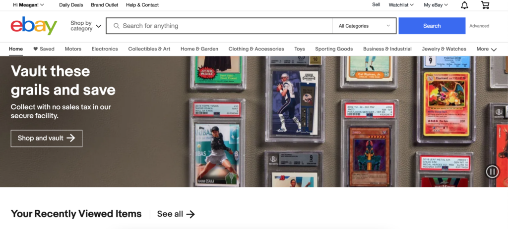
For this assignment, I decided to use eBay. As most people know, eBay is an online e-commerce business where people can buy items via an auction-based transaction or a buy-it-now transaction. Users can also sell items through the platform as well. I use this website as both a buyer and seller so I am pretty familiar with the layout and the filters. The image below shows a screengrab of the home page for my eBay account.

Image 1: eBay front page

The user/tester for this assignment is a 23-year-old female. She is a recent graduate and has plenty of experience using technology and social media websites. She has never bought or sold anything from eBay.

The User Test

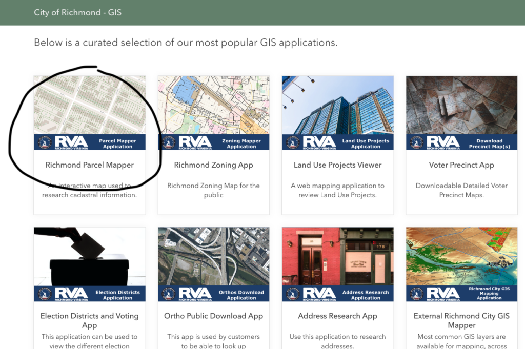
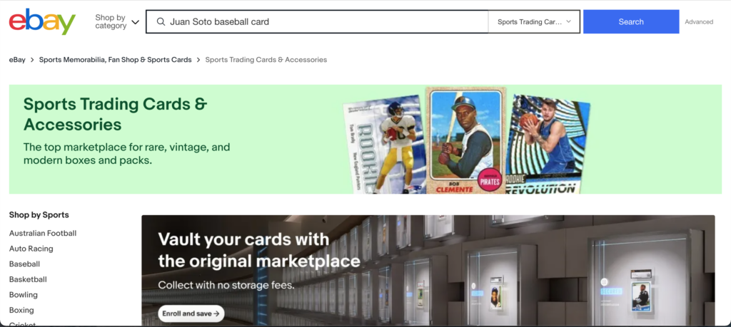
The first task I had my user perform was to search for a Juan Soto baseball card (her favorite player). I had expected her to just type in the search bar “Juan Soto baseball card” but her response surprised me a bit. Instead of using the general search bar located on the home page, she clicked the “Collectibles & Art” tab located under the search bar and then selected the “Sporting Trading Cards” link. When she arrived on the “Sporting Trading Cards” home page that is when she typed in her search (Image 2).

Image 2: Sports Trading Cards & Accessories Home Page

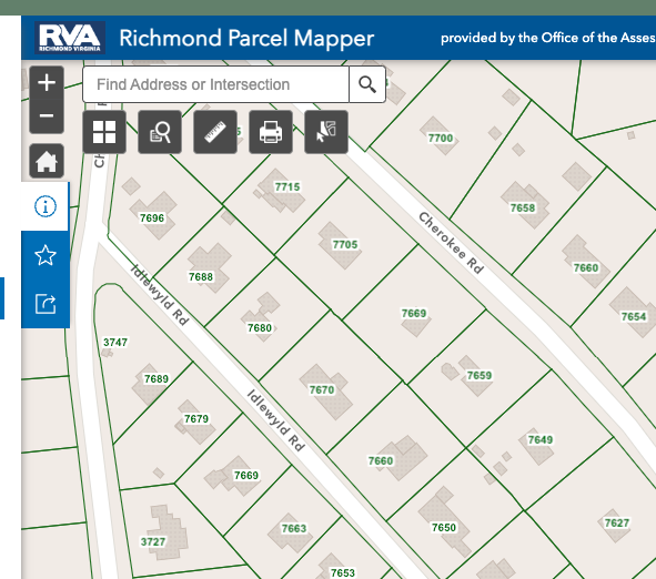
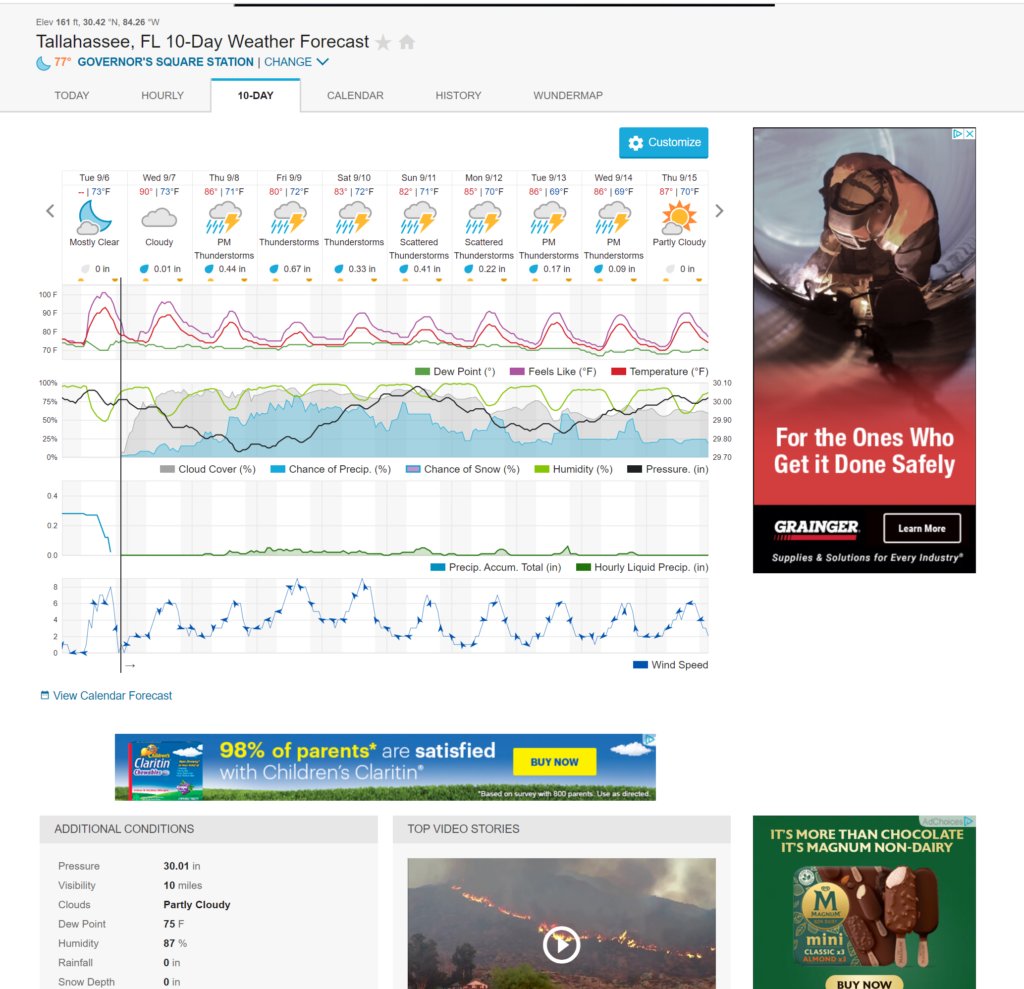
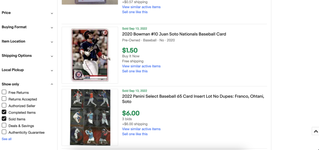
Her results pulled over 20,000 results and some of the results shown did not feature Juan Soto at all. Now that she had pulled up the results from her search the next action I tasked her with was to find out what items had previously been sold based on this search term. This is a more advanced feature that I had expected her to struggle with a bit since she had never used the site before. She explored the webpage and the filters present on the left-hand side of the results page for a while before she found the right filter to click (Image 3). This feature can be useful for a buyer but it is extremely useful for sellers to compare and check their listings. The user was able to complete both tasks but at a slower rate than someone who is familiar with the website and its advanced search filters.

Image 3: Results of sold items using the search term “Juan Soto baseball card”

Novice vs. Expert Users

Overall the website is user-friendly in the way that a person can find what they are looking for. One thing I noticed that I hadn’t thought of before was the ability to click into the categories to search for something versus just typing it into the search bar. I think that this is a good feature for someone who is doing exploratory searching/browsing. For instance, someone can click on the “Sports Trading Cards” and see what has been recently listed if they do not have a specific card in mind. I think that is a good design to have on the website. One suggestion I have to make the filters easier to use is to put the “Show only” box near the top of the filters instead of all the way at the bottom. Some of the filters located in this box include “Free Returns” and “Authenticity Guarantee” which can be important to new users but they might not know to look towards the bottom of the filters for that information. The site as a whole is set up to be easy and welcoming to a new users which is why it has been around for so long but little improvements can still be made to make it even better.

Individual Assignment 1 – Designing for Users

Site Name: Gum Road  

URL: https://gumroad.com/ 

Task 1: User must navigate to the Design Section of the site. Where would you click and why?  

The website was not very user-friendly for those who have never used the website. When asking the user to find the section labeled design, the user tried clicking on several of the navigation links. Ultimately, after five tries and a lot of frustration the user was able to locate the design section under the discover link.   

The easiest way to find the design section would be to scroll on the main page. The home page contains several sub-sections that are also found under the discover page.  

Task 2: Search Procreate Brushes and then use filter to find free brush sets.  

User search procreate brushes in the search bar from the navigation section titled design which was in the previous task. Several options popped up which confuse the user and they were just trying to search procreate and not brush sets. The user then tries to filter using the filter bar to search free. Unfortunately, user did not understand that the filter bar filters as you click on each filter. The user was searching for an enter button so this particular section confused the user more so than the previous task. 

Task 3: Find the Search Bar. Try searching for Fiction. Then search the tag Poetry. What did you find?   

Within the paste task, I ask the user to find the search bar. The user was able to locate the search bar and when asked to search for fiction she was able to find the fix in the section. User seems to be getting more of a handle on the website and searching capabilities. Unfortunately, they were still a bit frustrated. I asked the user to search poetry as a tag Which is The sub-genre under diction user was able to find several items that were useful to write fiction and poetry.  

Overall: User was unsure of how to navigate the website and extremely frustrated.   

When observing the user a simple task would’ve taken me several seconds to the user several minutes to perform. Users’ overall thoughts of this particular website is the website is not as user-friendly as it could be. The usability of this website could be better if the website wasn’t so overwhelming with information. This website is generally for creators who want to sell their work or different creative outlets. The user who is testing the usability of this website is an artist just digital artwork however they have never come across this website this is their first time using this website. When I asked if they would use this website again they simply said no. The user thinks to the website is to overstimulating and is unsure of how to navigate through the website. User also mentioned that you need to know exactly what you are looking for in order to use this site. I agree with the user that if you do not know what you are looking for on this website it would be very difficult to navigate. There is way too much information on this website for you to just press discover. 

Individual Assignment 1 – Designing for Users

               The website I’ve chosen for this assignment is a website I frequent when looking for parts in my mascot-making. It’s called DreamVision Creations and it can be found at https://dreamvisioncreations.com . I asked a friend and coworker of mine who knows nothing about my craft to see if they could complete a few tasks I had for them. They are 29 years old, and a very competent user. This type of site is a specialized ecommerce site. It is laid out similarly to other ecommerce sites for small businesses, but without any knowledge of the craft and terms, it may be overwhelming to a new user. My user frequents mainstream ecommerce sites for small businesses such as Esty, and Shopify.

                I gave my user three tasks: 1. Find a foam equine/horse head base, 2. Find the shipping information in its various locations, and 3. Find a one-inch fan powered by USB. In my observations, I did ask them to “take in the site”. I wanted to see how easily they could identify what type of site it was, and they figured it out very quickly! In their words, “Oh! This is where you get your fursuit (mascot) stuff!” That let me know the information scent of the website was very strong. For the first task, they clicked “Head Blanks” at the very top menu, and the vast megamenu of options for head bases came up. They were understandably overwhelmed, but in less than a couple moments they found the “large horse” base under “Foam” in the mega menu. For the shipping information locations, they found the shipping info in places even I did not see, and I go to the website all the time! I applauded them for that. And for the last task, went just as smoothly. They had next-to-no issues with any of my tasks and the entire test took less than three minutes from start to completion.

                While they are a novice user of this site, it has been around for over a decade. I’ve seen it in its infancy when it was just launched under Shopify after they’d moved from Etsy. I will say, they site has made extreme changes since then, and for the better. The site is much more user-friendly, responsive, and attractive in its simplicity. Though the test with my user went very quickly, the test that took them the longest was finding the foam head base. The large menu that populates the entire screen after clicking the button on the menu is very overwhelming. The header text for each category of head base in not enough to break up the wall of links a user is faced with upon clicking. However, the fact that the links are organized under headings made narrowing down the location of the specific species of base the user was looking for aided in the process. As a frequent user of this site, this is a point that I may bring to the webmasters attention at a later date, but for now, I am just happy to be able to watch this small business thrive since its creation.

DreamVision Creations home page

Individual Assignment 1

Introduction and Webpage:

The goal for this experiment is to see how efficiently a user can navigate the specified website (https://www.reddit.com) and if they can complete the given task. There will be two tasks given to the user and as the analyst, I will be observing their experiences, failures, and any successful task completed. We will also take into account the different ways the user completes specific task and how I would’ve done the same activity. The user is a retired teacher so their expertise would have to do with analysis and comprehension. I’d put their familiarity level with this site in the beginner range as they don’t have any experience with it.

Graphical user interface, application

Description automatically generated

Observation:

To complete this experiment the user and I started a meeting using the Microsoft Teams application. I had the user share their screen and walk through their settings to make sure everything was ok to run. Based on my observations, the user seemed to be initially confused. The user first scrolled through the website home page and tried clicking on the pictures posted. After reading on through the blog post the end user tried clicking on the available arrows. (Upvotes, downvotes, comments, etc.) 

Graphical user interface, application

Description automatically generated

Doing this actually brought out some interesting results as it prompted the user to either sign in or create an account. Once that failed, the user then tried to use the other buttons to get more options. From there the user clicked on the comments to see additional post and scrolled around a bit for information. Here is where I noticed the user seemed to be more confused during the assignment while also scrolling through website as most of the options, they were trying to select required them to make an account to proceed.

Graphical user interface, application

Description automatically generated

 Once done, the user navigated back to the home page by selecting the back button multiple times. This is where I instructed the user to try and find post about the different football games that happened over the weekend. The first thing the user did was click on the side panel and select the sports section. 

Graphical user interface, text, application, chat or text message

Description automatically generated

Once on the sports section the end user scrolled through the page until they found the LSU game results and looked for the comments underneath the post for details.

Graphical user interface, application, website

Description automatically generated

Analysis:

Looking at the what the end user did in what vs what I would’ve done brought some very interesting thoughts and new methods to mind as far as navigating goes. When giving the user the task of finding information on sports and college football, my user decided to use the community bar on the right side of the screen to find sports and ultimately college football. To me this required a little more steps to complete the objective as I would’ve probably used the search bar to look up a specific game or teams to get my information. While both eventually got to the same end result, I did notice that once a sport was selected, the page showed all relevant teams and events which in theory probably gave more accurate information and articles about the events that occurred. In this regard the site helps novice users by analyzing different clicks and suggesting topics that fall in that category. Another small observation I had was how the end users navigated the page. Rather than using the Reddit button/home button or sliding back on their trackpad, my end user decided to go the old fashion route and keep selecting the back button or mistakenly opening new tabs. This tells me that the user isn’t as efficient with navigating webpages which explains why some tasks might take longer than others on different sites.

Individual Assignment 1: Designing for Users

Website: https://zoom.us/

The website I selected is a video telephony software released in 2012. During the spread of Covid-19 Zoom became a popular platform to stay social virtually. My user is a 54-year-old radiology nurse. She is uncomfortable with technology and accesses the internet to pay bills, shop, and search for miscellaneous topics. My user has used the video telephony software Webex once and has never used Zoom.

During our user testing, I asked my user to join a Zoom call sent to her via text. I would like to add that my user was using an iPad and I was using a Windows-based laptop.

Once the user joined the call I had to coach her through using audio with wifi and sharing her screen. My user became frustrated when I attempted to instruct her to blur her background or select a virtual background. She managed to find a sad face emoji, raised her hand, and told me to slow down

I asked her to locate the chat feature and send a chat to keep her encouraged. The user stated she did not see the “Virtual Background” option and she never was able to blur her background or select a virtual background.

When focusing on the differences between an expert and novice user, as a frequent user of Zoom my software is updated often. My user hadn’t updated her software and admitted to ignoring all updates on her iPad. I used this opportunity to teach her how important it is to keep software updated. My user was not familiar with dropdown menus. The virtual background feature is hidden in a dropdown menu under “Start Video”. However, because her software was not updated, I believe she was missing the virtual background feature under “Start Video”

A novice user would not naturally look under “Start Video” for background features. As an expert user, I was comfortable clicking around the application until I found what I was looking for. In order to better support novice users, Zoom could have a separate “Virtual Background” icon.

Individual Assignment 1 – Designing for Users

User Profile and Site

I selected the City of Richmond’s property assessment website for the user to explore. The user does not go on the City’s website ever. They live in a household where someone else pays the utility bills and they are a tenant so there is no reason for them to go on it.  

The user is 29 years old and resourceful on the internet when it comes to online shopping, instructions on home improvement, and online forums for their interests: biking and music. They are good at researching comparable items for music gear and bike gear, but they have never had to look up the value of homes to pay real estate taxes. Their experience with the City of Richmond’s website is novice. 

User Tasks

The user’s first task was to find the assessed value of the house they currently live in. The user first went to the homepage for the City of Richmond which is rva.gov.  

They were able to quickly find the assessment of the house, accessing this is straightforward. In a sea of categories to select from on the main menu, ‘real estate’ pops out. They then had the option to select ‘property search’ and search by address. There were other fields to search under including parcel ID, property class, zoning and census tract, but address was one of the main fields to search under.

This was surprising because I thought they would get confused or tied up on the number of ways to search by. These are typical categories I search for properties based on my job as a real estate analyst. I thought that navigating those fields would confuse the user, however, searching by address is one of the main fields to select and the other fields are under ‘search by other information’.

The second task was for the user to find their property on a plat map which outlines their property lines contingent to the legal description of the property. I knew this would be confusing because all city and county websites with these maps have them under ‘GIS Mapping’. GIS records are important for many people involved with studying the layout, geography and environment of a city. Such experts include builders, facility managers, and environmentalists. This information is available in datasets compatible with GIS software so users can download that information. However, for a novice user, it is not that easy to get to a map where they can search by address.  

Under this task, the user went to the GIS Mapping page and only found brief descriptions about the data sets and not the actual maps. They then went back to the homepage thinking they went to the wrong section. I anticipated this type of confusion because GIS Mapping is a specific tool on city sites. However, it is still public information that all users should be able to access. It is only organized for experts and this is obvious by the jargon used (ex GIS Dashboards just means maps).

The user was able to get to the plat map after I gave them some hints, but we counted, and it took them four pages to navigate through before getting there and none of the pages were. 

Page 3 trying to get to the parcel map.
On the 4th page trying to find the parcel map.

Expert VS Novice Users  

The interface helped the user find their property assessment by using basic keywords in the layout of the site. It was easy to select the ‘real estate’ section because that entails buildings and maps. It was also easy to find a property by the address because that is the most recognized way to look up a building. I believe by prioritizing these keywords and making them the main selections pointed the user in the right direction.  

The GIS tool provided a lot of roadblocks and that is because it prioritized jargon for expert users. The user tried to navigate the main GIS/mapping page, but it only had descriptions of the GIS process. None of this information helped the user get to the actual map.  

The site should use common keywords as headers to help users identify which section is best for them. The current layout assumes the user wants to run through the descriptions and methodology of the GIS maps before going to the map. This isn’t straightforward and concise to the point where the user assumed they were on the wrong page. 

INDIVIDUAL ASSIGNMENT 1: DESIGNING FOR USERS

Word Count: 813

1. Introduction

The website selected for this assignment is Wunderground.com. The screenshot is below. Wunderground.com functions as an informative medium used to gauge weather in any location. The user for this test is a 31-year-old woman. Subjectively, her technical expertise is rated somewhere between novice and intermediate. Her experiences with technology are dominated by her mobile device usage. Her familiarity with Wunderground.com is none whatsoever.

2. User’s Actions

My user’s actions can be described as deliberate, yet cautious. She took the time to analyze the components of the site. She immediately formulated opinions on the website’s front-page, specifically on the advertising saturation coupled with relevant information being displayed. In addition to observing her uninfluenced interaction with the site, I also had her search for specific information so she can experience the entirety of the website.

           For her non-specific tasks, she easily found today’s temperature and weather patterns in Tallahassee, as the website automatically used geolocation privileges and displayed that information first. She appreciated this, but ultimately did not value it because it was a similar experience gained from other weather services. In contrast, she was made apprehensive by the amount of advertising. According to her, about 50% of the site was advertising, thus making her very distracted. She did concede that most of the advertising was beneath the relevant information and not too interfering.

            Following this general use, the user was asked to find specific information. The data on the front-page alone would not satiate these specific requests, so the user clicked the very apparent button that read “full forecast”. This was interesting because, as an expert user, I know to go to the famous “WunderMap” for detailed information. The user had a difficult time finding information about weather behavior occurring five days from the date of the test. She had to click on the “10 day-forecast” tab and then count the days until she figured out which day was the fifth day from today. One thing that was surprising was that she knew to hover over the line graph depicting humidity, dew point and precipitation. She also instantly noticed the color key indicating which lines represented each weather element.

10-Day Forecast

            Her next most problematic task was utilizing a weather radar to obtain information about past and future storm patterns. If she had located and used the WunderMap, she would have been able to capitalize on an exorbitant amount of data and information. However, the 10-day forecast page had a link to a simplified radar. She intuitively clicked on that, as a link to the WunderMap was hidden. The user took the time to observe the simple radar. There was a basic map, a zoom in/zoom out button and a “play” button. After hitting the play button, there were no observable weather phenomena produced or anything indicating a passage of time. The user first assumed the radar was not responding to her input, but eventually figured out that there was simply no storm activity at all in our region. This was after zooming out and seeing activity in other regions. It’s unfortunate that the user did not realize the availability of the WunderMap. To get to this map, one would move to a horizontal menu at the top of the webpage containing a tab called “Maps & Radars”. However, it is a static menu. So after the user scrolled down far enough, the menu was hidden away. Admittedly, beneath the simple radar she was using was a hyperlink to the WunderMap. However, it had a small font size and demonstrated poor placement rendering it insignificant.

Simple Radar
Maps & Radar

3. Conclusion

One of the first improvements to Wunderground would be adding some sort of clock or time indicator to the simple radar. This is so the user doesn’t accidentally assume the radar or page isn’t responding. However, there are much larger improvements to be made. In analyzing the novice user’s experience, there is a clear distinction in benefits gained between expert and novice users. With Wunderground being a weather service, there is an avalanche of dynamic data and available information. The main problem Wunderground has is how it organizes all this data. Expert users eventually learn what the best instruments to obtain data are. Novices seem to be presented with initial, basic information causing them to possibly assume that that is all Wunderground has to offer. This is because Wunderground does not prominently display its most useful assets. Perhaps it is prioritizing revenue streams from advertisements, essentially neglecting its most valuable product? Wunderground should not provide new and novice users with inferior tools and information first, but instead provide a clear path to WunderMap, even if it means deleting the inferior tools and reprioritizing advertising. If people decide not to come back due to ignorance of Wunderground’s robust weather analyzing instruments, then eventually there will be no one around to advertise to.

Oversaturated Advertising

Individual Assignment #1 – Designing for Users

The Website and User

The website chosen for this assignment was Microsoft Bookings (bookings.microsoft.com), a web-based booking system built upon Microsoft Outlook and included in the Microsoft 365 program suite. It is intended to create a seamless system to allow clients and other users to quickly select appointment times based on your Microsoft Outlook availability.

The main page for Microsoft Bookings

The user identifies as female, aged 30-35, and regards herself as technically savvy. While she is not familiar with Microsoft Bookings she is familiar with the rest of Microsoft’s 365 suite of programs, especially programs one would use in a typical office setting. She works as a professional graphic designer, so she is familiar with concepts central to graphics and media.

The User’s Actions

I gave my user a straightforward task to create a page for people to book a 30 minute appointment with them, based on their Microsoft Outlook availability. The first observation I had was that they followed the prompts included in the onscreen splash page that guides them to create a new calendar within the program. As someone who frequently uses this webapp, and related booking software, I tend to exit out of these immediately, as the nomenclature and functionality is fairly clear to me.

Additionally, the user was confused by the layout of the main bookings page, and was unable to ascertain where to go to further create or alter the 30 minute appointment page she was tasked with creating. As an experienced user who had gone through this same process, I was aware that Microsoft Bookings refers to these different types of appointments as “services”. This disconnect between the user’s broad knowledge and the specific nomenclature of the web application was a recurring theme in our testing, and a direct result of her being a novice user of the application.

The left navigation menu for Microsoft Bookings

Expert vs. Novice User

My first observation was that although Microsoft provides new user prompts to guide them through the process, these were not clearly explained and actually led to an outcome that most people would not want. After completing the new user prompts on the page, the user wound up with a counter-intuitive booking setup with business hours that we were both unable to correct during our testing.

The prompts for a new user using Microsoft Bookings

Even after the user recreated the meeting type from scratch, and seemingly set their preferred hours, and restricted the meeting to just themselves, they were still led to create the following booking page:

A Bookings page with times that the user did not select.

An easy way to improve this would be to orient these new user prompts towards the goal of the user instead of the tasks to be performed. For example, instead of “discover calendars” and “create new calendar” the prompts could be to “create a shared booking page” or “create a personal booking page”. This would help clarify the steps the user is going through, as well as lead them to an outcome that the majority of users likely desire (to create a booking page for just themselves, not a team).

Additionally, some issues were simple information architecture and web design errors. An experienced user knows that these are unusual and counterintuitive, but also has learned to utilize the correct tools and links within the program. A prime example of this (and why I wanted to test this particular web application) was the use of the “copy” icon twice on the same page, with two completely different functionalities.

The ‘copy link’ button the user is likely to use.

Copying the link to a given “service” page is arguably one of the most commonly used functions of the site, and a novice user is apt to click the copy link by the meeting title. My user was incredibly frustrated that this button inexplicably opens up a create new service dialog box and doesn’t copy a link (that copy button is “copying” the settings for that service into a new service that the user is supposed to then edit and save as a new service). The copy button for the web address is located in the information about the service on the right of the page.

The ‘correct’ button to copy the page link.

A way to improve this aspect of the user experience would be to simply use a different icon for the copy button on the left, one with a “+” perhaps, and better highlight the copy link button on the right, as it is a high use item.

###

Individual Assignment 1 – Designing for Users

Ginny Morris

Overview of Website:

Website: https://www.goodreads.com

The website I chose for this assignment is Goodreads.com. I read a lot of books and use this website primarily for reading user reviews of books. Goodreads is likely classified as a social networking site because users can view the books their friends are reading and create lists of “the books you’re reading, have read, and want to read” (Goodreads.com, 2022). The website also has an algorithm that recommends books to the user.

Figure 1

User Profile:

The person I asked to view the site is skilled with computers and technology, has a bachelor’s degree in Communication and Information from FSU, and works in the finance field. Although he has never used the Goodreads website, he is familiar with researching product reviews on online shopping websites. The user listens to audiobooks using a subscription service and occasionally reads electronic books but prefers audiobooks.

User Actions:

I asked the user to navigate to the goodreads.com website and search for something he would like to read (or listen to). The user’s first observation was that Goodreads wants you to log in, and he said he thought he would need to create an account to look at books. He scrolled down and found a way to search the website lower on the page. It is important to note that the user is viewing the Goodreads website on a laptop computer using the Google Chrome web browser. I normally use a mobile device to view the website and while the login options are still prominently displayed on the website, the search functions are easier to locate on the mobile version of the website (see Figure 2).

Figure 2

He found the search function easy to use and was able to find the specific book for which he was looking. He also found the search was only difficult to locate on the Goodreads homepage. The menu bar on all other pages includes a search bar and site navigation options (Figure 3).

Figure 3

Overall, he found the information provided about the book helpful and said he would be able to decide on whether to read the book based on the book’s profile.

Expert User vs Novice User

The user had a background in technology and because of this did not have issues utilizing the site. The primary issue he experienced was not being able to locate the search when first navigating to the site. Since I was more familiar with the mobile version of the site, I navigated to the site on a web browser on my laptop and had to zoom out to 67% to see the search when first navigating to the site. I can understand the frustration of being unable to locate the search when first navigating to the site on a computer.

Recommended Improvements:

My primary recommendation to improve the usability of the site is to include the site navigation/menu bar on the homepage. This provides options to sign in, join, browse, and search without frustrating a novice user. If this is not a possibility, I recommend adding a search bar to the right side of the home page opposite the Goodreads logo.

My second recommendation to improve the usability of the site is to remove the distracting login options on the right side of the home page in Figure 1 and prominently displayed them in the middle of Figure 2. Adding a sign-in and join button, as mentioned above, still allows users to log in using one of these options while making the site more useful to novice users.

References:

About Goodreads. (n.d.). GoodReads. Retrieved September 5, 2022, from https://www.goodreads.com/about/us.

Individual Assignment #1

User Profile

My chosen user is a 34 year old male with a bachelors in computer science and works as a Cyber Security Support Engineer for Amazon Web Services. He is extremely comfortable with computers and would be considered high expertise with technology. While he uses websites often, he rarely, if ever looks at artist websites/portfolios online. He mainly uses the web for video games, D&D, and tech news/research. I decided to give him a specific task to follow when looking at this website: https://ednahibelstudio.com

Task: Using frequently asked questions find more information on whether other artists do enhancements on Edna Hibel’s lithographs. 

Novice Actions

First inclination was to begin scrolling down the homepage. User started getting frustrated once they realized that the page was very long with difficult content to search through by glance. Used “Command+F” to search the terms “enhancements” to see if he could quickly jump to the information on the homepage. That produced no results. They reread the first task and noted it mentioned “Frequently Asked Questions”. They began to get excited because they thought they cracked it, by finding the Frequently Asked Questions page on the navigation, but quickly got frustrated again when they realized how horribly organized the information on that page is. After scrolling through the entire page, they finally found #14 “Does Edna Hibel touch up each image personally or is this done by other artists?”. They tried clicking that to find the answer, but it led to a broken page. They thought maybe that was the end of it and there was nowhere to find the answer. I told them there was ANOTHER FAQ page that they could find the information on.

Dismayed they went back to the navigation (instead of seeing that there was a small link that said, “More FAQ”, which doesn’t work anyways, but wanted to note that they didn’t use it despite it being there). After some slight scanning the long navigation list they found FAQ Page Two which leads to the page with the answer. There are only two questions on this page, so they were able to find the answer quickly.

Something I found very interesting was they did not see or utilize the Search bar to the right of every page. This would have allowed them to quickly search “enhancements” and immediately find the pages they needed. 

Recommendations

The results show that it is difficult to quickly navigate and find information on this website. An informative website’s FAQ page is meant to be a reliable source to utilize when there is a common question to be answered. It is obvious that the FAQ page is essentially useless on this website. It is hard to find (being two pages), poorly organized (users cannot quickly scan to find their question or topic), and most of the links do not work or are poorly linked (making it easy to get lost on the website).  

I find it interesting that the search bar was not noticed. Especially when there are two areas to search. The Search bar on the right navigation and the small icon near the navigation. 

My recommendations for a redesign would be to rework the navigation, making it more effective, less overwhelming, and rework the sort order to better fit a user’s expectations. 

I would also overhaul the layout of the homepage. The person I tested immediately got frustrated with how far down the homepage scrolls. They almost gave up searching before it even started, because of how overwhelming it was to take in the homepage.