Website
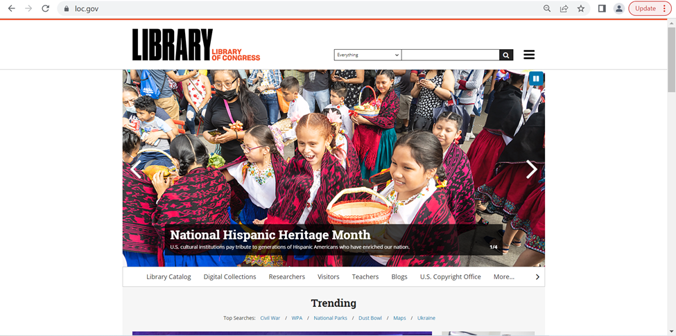
For this assignment, I chose to evaluate the website for the Library of Congress (https://www.loc.gov/) website, which according to its website is “the largest library in the world” and has a collection of more than 173 million items, and it “receives some 15,000 items and adds more than 10,000 items to its collections” each working day. The library not only contains a variety of special collections, with everything from rare books and manuscripts to international collections to photographs and comics.
The Library is not just a place to preserve history (and, indeed, history itself: “it is the oldest federal cultural institution in the nation”), but an active repository that anyone can access for any purpose. With so much to access and so many types of users (from expert researchers and historians to students at every level to a casual reader looking to learn something new), the Library of Congress necessarily must serve as a model for all other libraries to learn from in terms of usability and navigation.
Scenario
The user that I am imagining for this evaluation is an AP US History teacher who wants to assign an essay for students to investigate the Civil Rights Movement, and specifically first-person accounts of the Civil Rights Movement and what it was like to be alive during that time. The teacher plans to require that students use the LoC website to find at least one primary and one secondary source. In order to confidently create this assignment, the teacher wants to create a few sample topics with specific sources for each one, so that during class she can go through the website and take the students through the research process. Tangentially, the teacher is hoping to find resources for teachers and how to use the site in the classroom and/or lesson plans.
Analysis
For the first part of my analysis, I started with trying to find resources for teaching the subject in the classroom. Since the teacher wants the essay to be about the topic they are covering, the Civil Rights Movement, they start with searching “civil rights movement” in the search box at the top of the page. This is very easy, and is located in the same place most websites would show a search box, and it quickly returned results. I think the results, however, violate heuristic #8, Aesthetic and minimalist design, because while the page is thankfully sparse in terms of the colors chosen…but the amount of text for each result is overwhelming, especially with the text to the left showing ways to refine the results. I think if this included some kind of corresponding image with each result, so that it is easier to see the delineation between each result, and making the “Refine your results” pane collapsible. It’s not a major faux pas, as far as database search results go, but especially as the largest library in the world, one might expect innovative design for helping increase navigability of their resources.
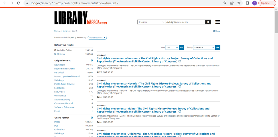
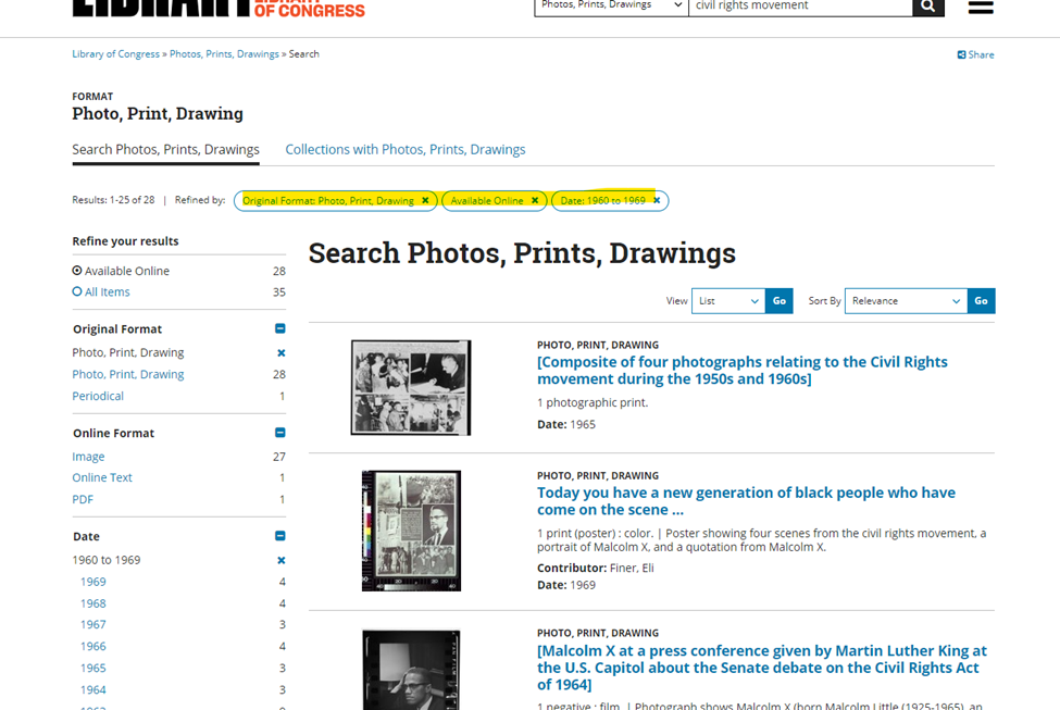
The violation of minimalist design is particularly problematic for this user, since they know that they will have to figure out how to keep 150+ students from immediately giving up due to being overwhelmed. The teacher wants to find ways to minimize the student’s panic, and notices off to the side that they can refine down to only seeing Photos from a specific time period, so the user decides to make the assignment such that the students will choose a relevant photograph to include with their essay, since the results found in this refined search is less visually overwhelming:
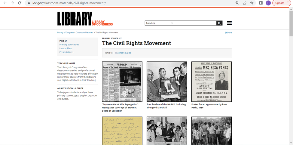
Satisfied with that decision, the teacher decides to try the search bar again to find primary sources. The search is a little better this time around, since it lists specific types of collections at the top of the page of results. The top result is exactly what the teacher is looking for, “Classroom Materials” for the Civil Rights Movement. The teacher hopes this will be a repository of lesson plans, and immediately decides to open it.
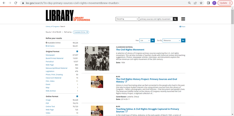
However, while the initial impression seems positive, it quickly becomes clear that this part violates two other heuristics. The first is #7, Flexibility and efficiency of use. The resource is just a collection of images, which while helpful, provide no context for the teacher and requires each one to be opened up individually to review what each resources shows. Additionally, for the background information and Teacher Suggestions are at the bottom, and there is no real indication that you can expect that information beneath all of the photos.
The second issue is a violation of #6, Recognition rather than recall. This is because the user has to open up each resource page to access it, so they have to remember how to return to the landing page in order to continue going through the resources that are collected together. This ends up either being an untenable number of tabs, or a need to make sure not to fall too far down the rabbit hole of hyperlinks and searching, so that you can back out to the landing page after reviewing each source.
While the teacher likes this resource, they want to find an actual lesson plan, because this seemed like a promising resource that did not deliver. So after backing out to try to return to the search page that originally prompted them to find the above resource page. They scroll down and are fortunate to immediately find a Learning Activity Secondary Level – Historical Narrative: The Civil Rights Movement, which is thankfully an easy to use PDF that the teacher decides to print out and peruse later.
Since they were able to find an actual lesson plan, the user decides to go back to the home page to see if they have dedicated Teacher’s Resources. On the main page’s navigation pane, there is a Teacher tab, although I would argue that this moderately violates the heuristic #4, Consistency and standards, in that the header bar is underneath the carousel image header, which hides it away when most navigation panes would be seen up in the header of the page, and remain consistent throughout the website. The hamburger menu remains static, but does not match up with the header from the main landing page, so finding what you want once you’re within the site is difficult and basically requires backtracking (which violates #7 again).
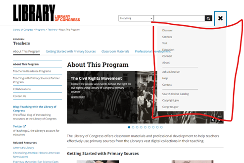
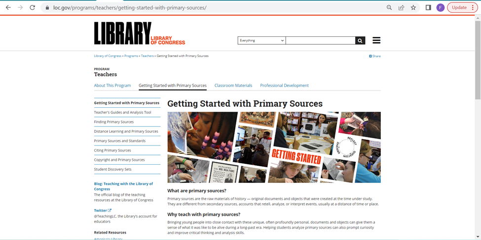
The user is excited to find the resources page, and begins looking at the “Getting Started with Primary Sources” page, and then hopes to partake in the Professional Development options, but struggles to find how to sign up (violating #10: Help and documentation) and decides to try again another time.
Recommendations
Overall, for the world’s largest library website, it does a good job of trying to bracket the information in logical ways. However, for a layperson with a very specific goal (especially one who has to consider a variety of various other users and how they may interact with the site to meet a specific goal), this site is note overly navigable. The biggest issue is how overwhelming it becomes. The violations of minimalist design and efficiency of use are the biggest violations, as users are almost immediately overwhelmed by too much text and having to click to new pages all the time. I think one of the best things they could do is make the search feature more image/collections focused. The Refine Results pane is very helpful, but I think making it collapsible would help a lot in reducing visual clutter and creating more space for better explanations for each material.