(1467 Words)
The Website
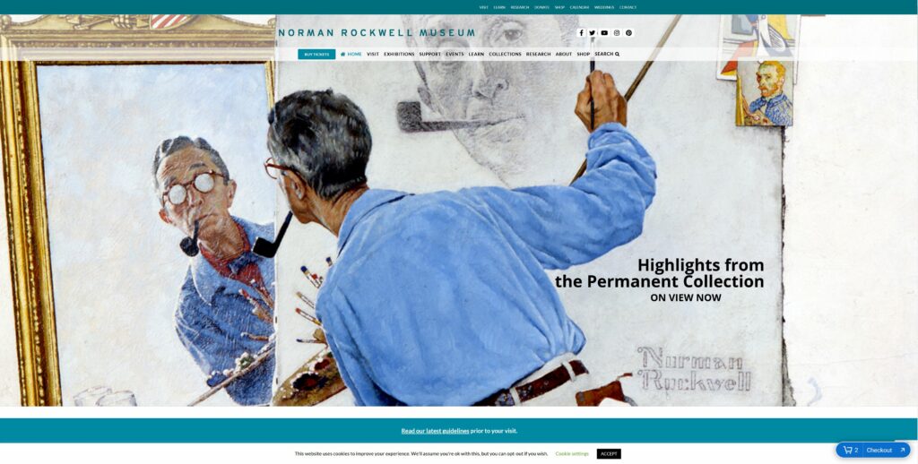
The Norman Rockwell Museum teaches and maintains the legacy of Norman Rockwell. Its website, nrm.org, is used by the museum for outreach, education and advertising. The site is heavily saturated with information regarding Rockwell art collections, related events, ways to visit the museum, and how to financially support the museum.
The Scenario
To best evaluate the usability heuristics of nrm.org, one should examine the site through the lens of a potential patron. Hypothetically, this patron has enjoyed the work of Rockwell and has finally decided to reciprocate. This patron has found nrm.org and discovered many avenues in which to financially support the museum and maintain Rockwell’s legacy. However, the patron has come across several violations of usability heuristics while exploring the best and most satisfying way to support the Norman Rockwell Museum (NRM). Several avenues of financial support were tested and conclusions were drawn regarding the most ideal way of patronizing the NRM.
First, there’s the standard philanthropic route of providing a simple donation. Second, the patron can simply purchase a tour and act as a standard consumer of the NRM services. This way, they are contributing to the profits of the NRM. Not only does this help to maintain the legacy, but presumably expand the NRM’s outreach capabilities.
By exploring these pathways of patronization, one can detect and analyze nrm.org’s violations of the usability heuristics as described by Jakob Nielsen in 10 Usability Heuristics for User Interface Design.
Analysis of Usability Flaws
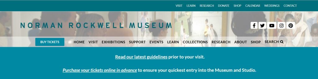
Nrm.org excels at being a source of information. However, in violation of heuristic #8, it overwhelms its homepage and secondary webpages with said information. It’s trying to balance executing its prime directive of being an abundant source of scholarly information with being a marketing tool. As a patron, this made it time-consuming to make a donation because the donation functions were not obvious. The most obvious way to support the NRM via standard donation is to click the “support” tab in the header’s menu on the homepage. However, this violates heuristic #2, as the term “support” is not necessarily synonyms with “donate”. To elaborate, “support” commonly implies technical assistance, and is not an intuitive way to imply patronization. This experienced difficulty is compounded by the fact that there are two main menus on the homepage. The one on top does in fact say “donate”. Nrm.org has chosen to display two main menus, both containing similar options while also using different names for those options. This further violates heuristic #8 but also violates heuristic #4. While both menu tabs will take the patron to the same place, it is inconsistent and may further encourage the user to see “support” as meaning technical assistance.
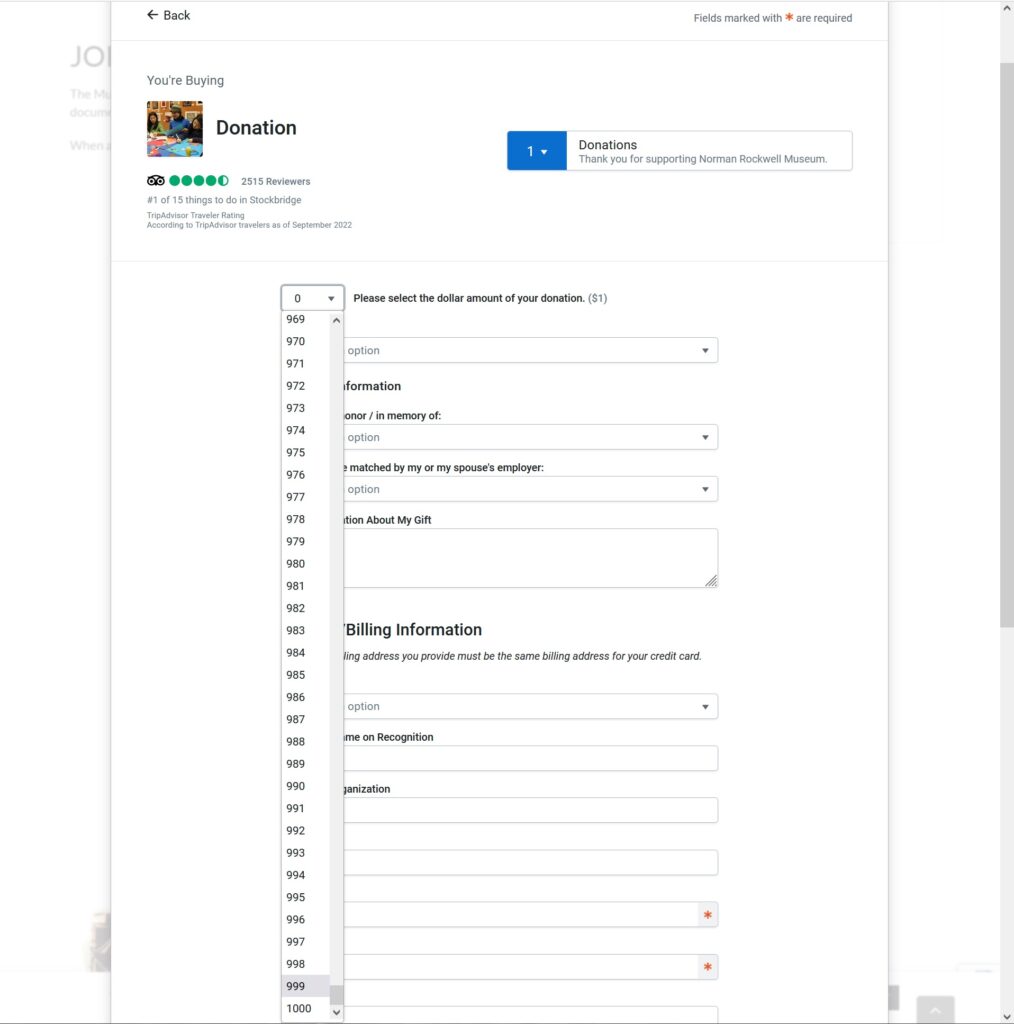
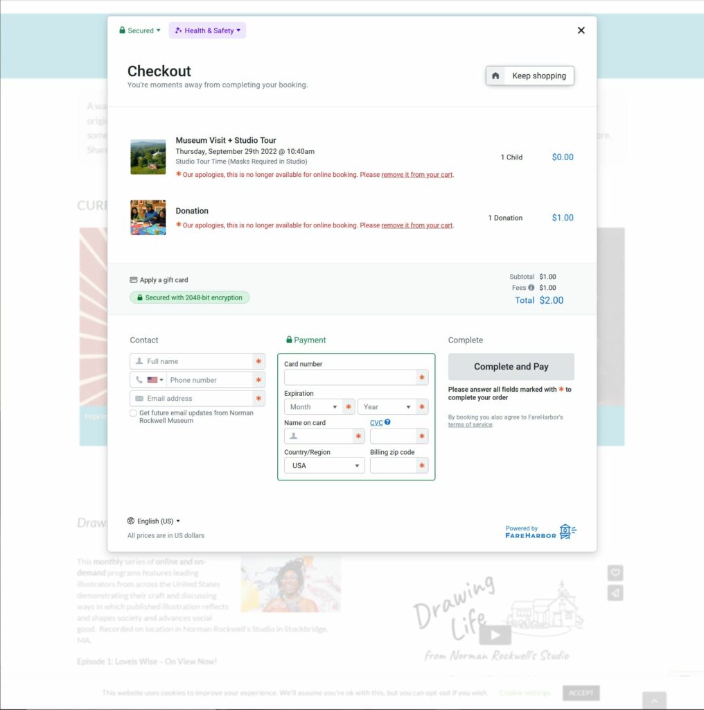
Once in the donations page, I am able to input my desired amount of donation. However, instead of simply being able to type my desired amount, I have to select a number under 1001 from a drop-down menu. So if the patron wants to donate $1000, they would have to scroll down for a very long time. This is a violation of heuristic #7, as it costs the user more time to donate. While this is not an egregious violation, it stands to reason that this also a violation of heuristic #3. Being restricted to this drop-down function limits the user’s freedom by making them use their mouse instead of their keyboard, thus potentially denying the user their preferred peripheral.
After participating in this less than efficient process, the user will eventually have a donation sitting in their cart. However, if the user decides to make another donation or purchase, they can click a “Keep Shopping” button to add more items to their cart.
Unfortunately, this button takes them back to the beginning of the purchase process for their donation. It does not present any different items that can be added to the user’s cart. This is a violation of heuristic #5 as it creates an error prone condition that can result in the user hitting refresh or hitting the back button, which can bring the user back to the check out window.
The second way to patronize the NRM is to simply indulge in their services. The profits gained should not only maintain the NRM, but grow it as well. The best way to do this is to purchase a ticket for a tour and physically visit the NRM. This means that the patron will need information regarding directions and business hours. In violation of heuristic #10, NRM provides users with a crude .pdf containing rudimentary text-based instructions on how to get to the museum. The document also supplied a low-resolution and simplified map. For further context, these instructions exist because “many GPS and online maps do not accurately place Norman Rockwell Museum” as noted in the arbitrarily placed “Directions” section of the Visit tab.
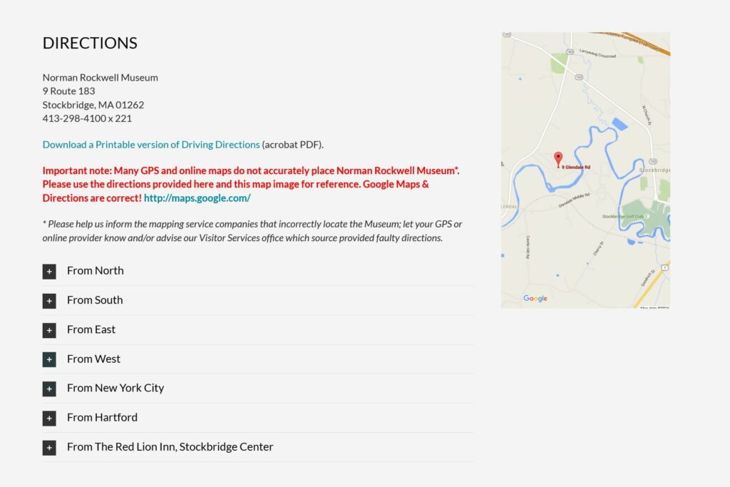
They go on to encourage patrons to “inform the mapping service companies that incorrectly locate the Museum; let your GPS or online provider know and/or advise our Visitor Services office which source provided faulty directions.” This puts an undue burden on the user and does not provide a suitable solution, resulting in a light violation of heuristic #9.
Design Solutions
The most effective thing that nrm.org can do is triage their information and data, while slimming down to one main menu. This is information deemed tertiary, duplicated across multiple webpages or possibly information that might exhibit diminishing returns like over-advertising. This includes, but is not limited to, redundant information on the same Rockwell collections found across several webpages like “current exhibitions”, collections, events, newsletter sign-up prompts, and menu items that can be consolidated into one. Menu items recommended for consolidation include “About” and “Visit”, “Learn” and “Research”, and “Events” and “Calendar”.
Second, nrm.org should institute a proprietary purchasing feature instead of relying on Trip Advisor’s third-party widget. This would allow them more control, while also maintaining a consistent aesthetic instead of incorporating Trip Advisor’s branding.
Third, instead of text-based mediums, using video to explain travel directions would not only demonstrate a tech-savvy aptitude, but allow the user broader perspective and context. This is also keeping in line with heuristic #2 as most people rely on GPS with its emphasis on audiovisual communication.
Last, while the following aren’t hindering patronization, they are worth mentioning in order to improve the overall quality of nrm.org:
- The “Shop” hyperlink in the body of several web pages is unresponsive. This is violating heuristic #1. It is recommended that this be remedied in the back-end.
- When clicking “Shop” in the main menu, it takes the user to a different URL and opens up a new tab. However, when clicking “Annual Report” it does take the user to a new URL, but it does not open a new tab. It is recommended that this is fixed in the backend.
- Before purchasing a ticket, the Trip Advisor widget makes you agree to the policy before it shows the policy to you. It’s recommended that this is fixed in the backend.
- The NRM has a lot of video content. However, it is buried at the bottom of several web pages. It is recommended that there be a main tab for it in the homepage menu. This content can also replace some of the text-based content of the same subject matter.
- There are some instances where nrm.org uses an embedded YouTube player, but some where it uses another third-party player with limited user controls.
- The ad for the NRM newsletter should be at the top, not the middle of webpages.
- There is no separation of sections on all the pages. Each webpage has sections of information haphazardly stacked on top of one another. At the least, these should be separated with different colored backgrounds.
- The events on the “Events” page should be reoriented. Instead of a top-down order, scrolling left to right should be considered.
- If a patron wants to donate to the virtual museum only, the option to do so is buried all the way at the bottom of the home page. There is no option to do so in the “Support” page. It is recommended that the option be included in the Support page.
- It is inconsistent that one can buy tickets on nrm.org, but is taken to a different URL, store.nrm.org, if one wants to make a purchase from the online gift shop. The page nrm.org/shop should be created.
- The “Visit” page says that Rockwell’s studio opens at 10:40am. Everywhere else on nrm.org it says it opens at 11am. One time should be displayed.