In the second iteration of the page design, we moved some of the information that was buried in the abstract “More” section of the left-hand navigation menu and made it part of the footer. This gives access to these functions from every page and increased visibility to these elements. As mentioned in the first iteration, the original “footer” was lost under an ever-extending page as the user scrolled down. This caused the information in the footer to be lost down the proverbial well
Figure 1: Revised footer to contain elements lost in the “More” menu.
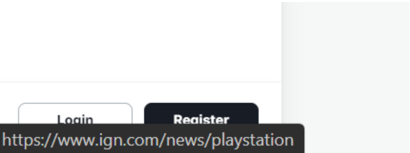
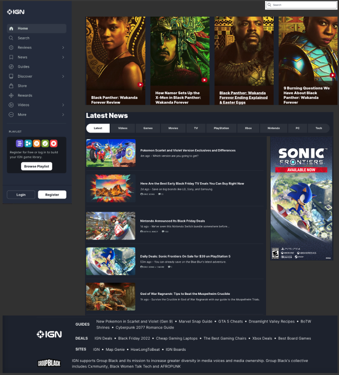
The login and register buttons were moved to the header alongside the search bar for additional visibility. The original location was the bottom left corner of the page where it tended to get lost behind the URL notifications as the user passes over a hyperlink. This change enhances the user experience by giving them a much easier time accessing or creating their IGN account.
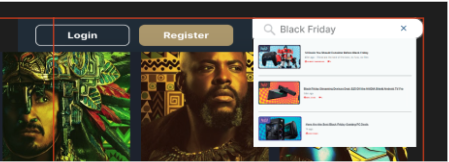
Figure 2: The old Login/Register buttons were obscured by status notifications from the browserFigure 3: New revised search and Login/Register button now have prime locations in the top right of the page
We’ve also decided to move the playlist to the user account/profile menu to free up space in the menu section giving users less to deal with. With this move, once a user creates or logs into their account, they’ll have the ability to customize and control their own playlist of games, reviews, and other preferred content.
One of our initial tasks we wanted the end users to accomplish in our earlier scenarios was finding an article that contained different titles in the Game of the Year catalog for 2021. Due to the limited search functionality of the IGN website, most tests and scenarios ended with an overall negative experience for our experimental group. While the user task differed slightly from our login/registration placement, the scenario brings to light the importance of widget placement and how a simple change could have a huge impact on usability. With this new placement, the user now has the ability to save specific games to their playlist making it easier and more efficient to locate games of interest and relevant information such as articles and game details.
In the first iteration of our proposed design, we moved the search function and added functionality to the pop-out search. In the second iteration, we removed the pop-out search and added functionality to the search bar. Users are now able to search the entire website using the search bar, instead of having to choose a filtered category to search. However, users are still able to filter the results when the search results are displayed. The search location and functionality change makes it much easier for the end user to find relevant content.
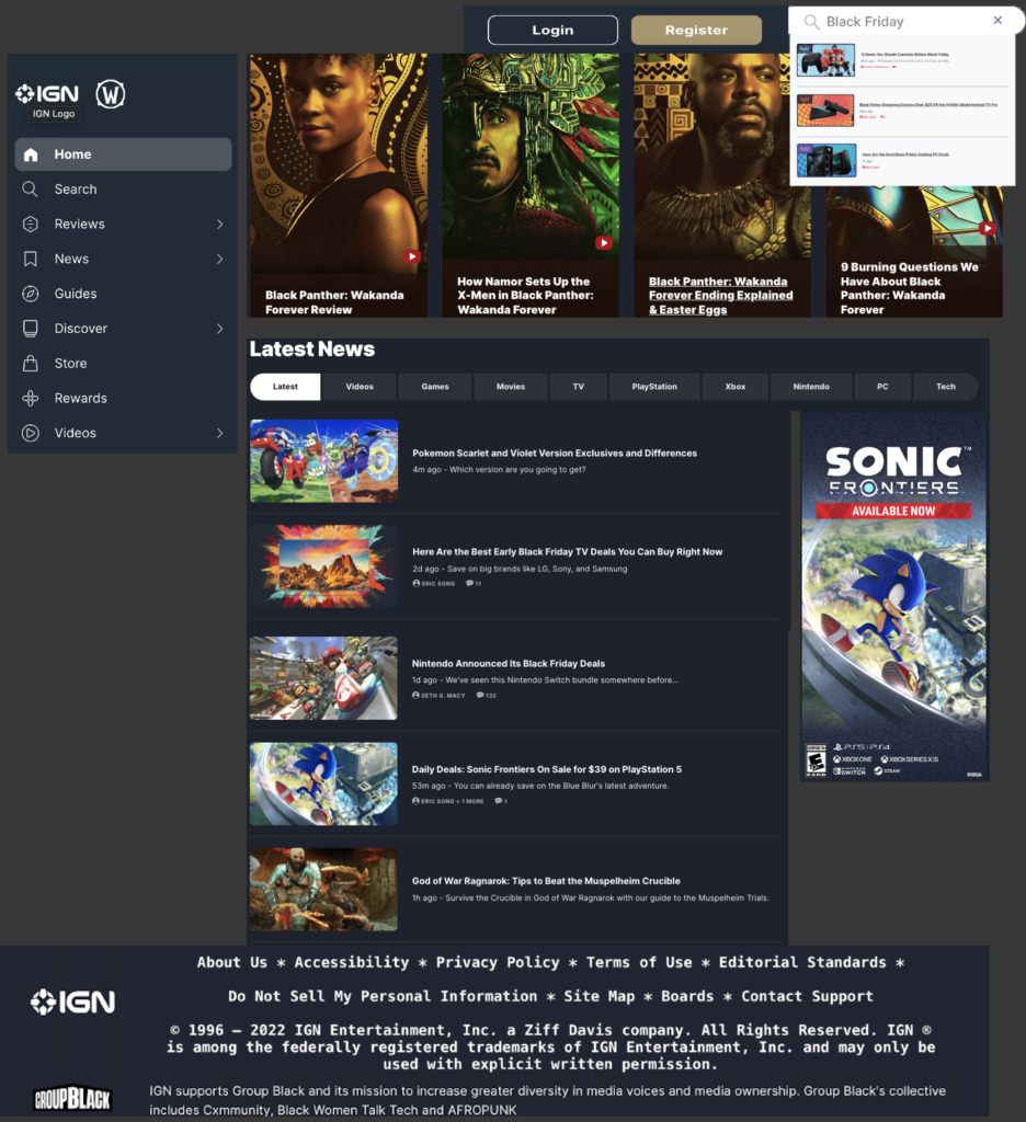
Figure 4: Gaming group’s second iteration of the IGN website
Our final revision includes a cleaner look that doesn’t bombard the end user with too much information and allows them to see the main content of the page with the option to navigate elsewhere when effortlessly. They have the ability to effortlessly search for content, log into their account, as well as save content to their personal game playlist. Our updated homepage also includes the addition of a footer that grabbed some of the contents from the “More” section and gave it more relevance by including functions that were often overlooked. Also, with the removal of the continuously loading content as the user scrolls the page, we feel the revisions will make content searching more efficient and improve overall usability.
Group Libraries – Jasmine Philips, Caitlin Hattaway, Christopher Gregor, Colin Webb, Erin Seaman
The focus of our redesign iterations have predominantly concentrated on the homepage of the Wilderness Coast Public Library website. During user testing, we found that the design and the layout of the homepage was confusing and not very user friendly. When doing our user testing, our users thought that the design of the website was not cohesive throughout, the majority of pertinent information was written in bulk text, and locating the catalog to search for books was difficult.
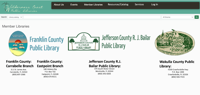
In our first iteration we added a search bar on the main page as well as a drop down box that users could use to specify what part of the website they wanted to search. We also added a few more options onto the main menu, including a tab for services and a tab for users to log in. We also wanted to make the four library locations a major part of the home page and easy to find. We thought that was best so that users could find the link for whichever library website they needed.
Feedback on our first assignment gave us ideas on how to further edit the homepage of the website. The main feedback we received was to make the search bar more visible and locatable for users. Edits to the main menu were also suggested, like changing the “login” tab to “my account,” making it clearer to the user what that tab was for. There were also suggestions made to clarify the four library branches and the three county libraries. Since the libraries are located far apart, besides the two Franklin County branches, adding the map makes it easy for users to locate and access which library they needed.
Our previous user testing also showed that the events page for the Wilderness Coast Library was not cohesive between all the libraries. Combining the events pages for all the libraries in the system would make the websites more unified and easier for patrons and users to find the events they are looking for. Events could also be highlighted on the scrolling banner we have created and added to the homepage of the site. Clicking on the banner would take them to the events page, giving them options for which library, and what dates the events are held on.
Original Library Website3A Iteration Updated Iteration for 3B
Menu/Search Bar Design
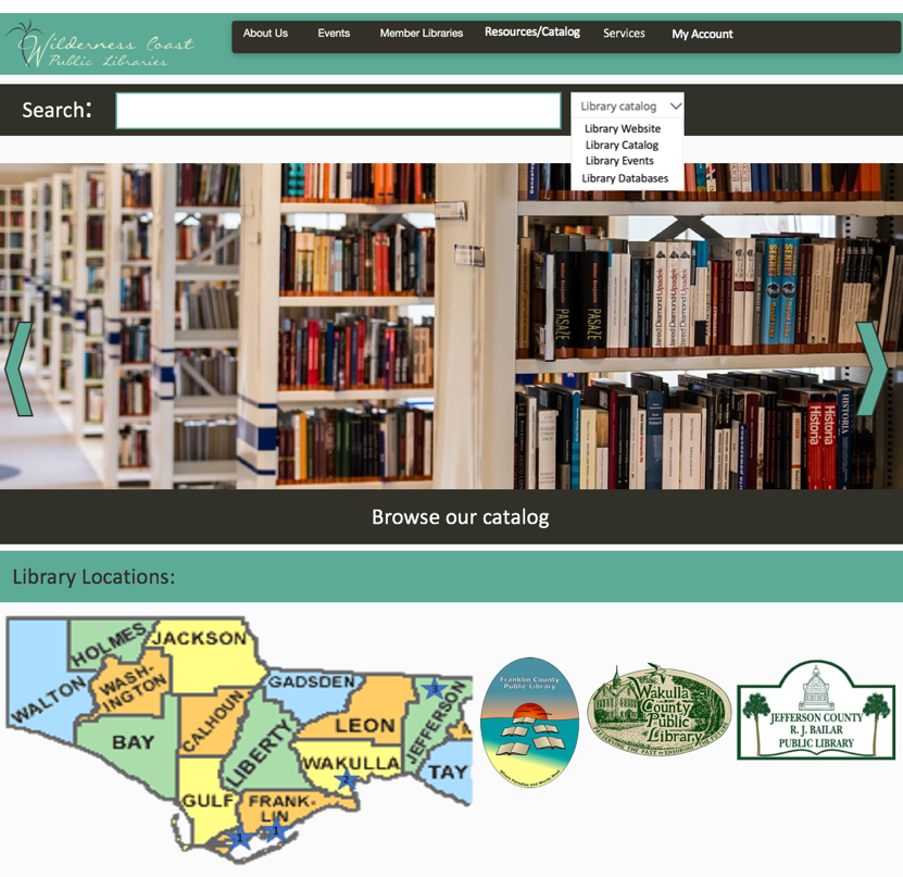
Our redesign for the Library system search bar would be an increase in size since it was very small to begin with. This will make the search bar more accessible to different users. Also, we would filter the search results shown to our users depending on the page the user is on. So if the user were on a particular library’s page, it would show results only of that library. The two exceptions to this would be if A) the user was searching from the main catalog or main page of the system, or B) if the user selected an option on the search bar to search a specific filter such as Library Website, Catalog, Events, or Databases which would bypass the page filter to search the specified location.
For the Menu Bar, we decided to increase its size as well for the same reasons as the search bar size increase and adjust its options. Now it would include a link to the Events page which will show all events for the system, the same About Us as before, Member Libraries which would be a drop-down menu to navigate to a specific library or to view the map, which will show where the libraries are, a link to the full catalog on the menu bar so that it is accessible from any page, services for each library to find specific tools for the user’s needs, and a link to the user account for logging in and tracking rented books, services, and other library tools and services.
Rotating Information Banner
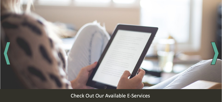
For this new iteration we also thought that adding a rotating banner would be a great way for the library to promote their services as well as make it easy for users to locate information. Since the catalog on the original site was hard to locate we thought that adding that as one of the banners would be beneficial. The library can also use this rotating banner to highlight upcoming events so users visiting the site can see what is going on at the library. Another banner they can add is a services banner highlighting e-services that users can access through the library. A “New Releases” banner would also be a good way to show what new materials the library is offering, ranging from books to audiobooks and ebooks.
Additional Rotating Information Banner
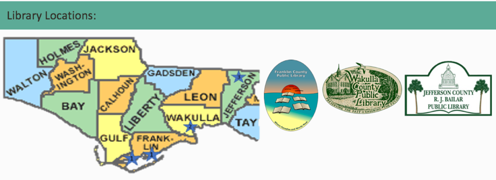
Library Locations Map
Since the Wilderness Coast Public Library system has multiple library buildings, people will need to know where each building is located. We decided that the website map should feature the three libraries. If people move their cursor to the library building names, the stars in which the building is located will expand to show the users where the library is. This will give users information they need on where to go. Since the Franklin County Public Library has two buildings, both stars will expand and will give titles of the branches: Carrabelle and Eastpoint.
Library Map
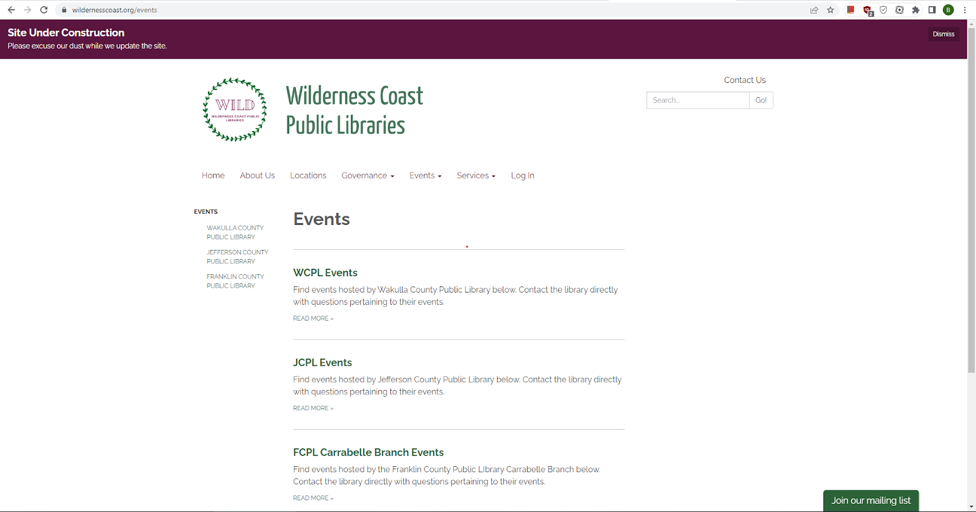
Events Page
One idea we had for helping the Wilderness Coast Public Libraries website create a more unified identity, while preserving the functionality of the individual branches for users, is to adjust the Events page to include an events Calendar on the main Events page, and then include the individual library calendars on each of the sub-menus. At present, the events landing page looks like the image below, which is clunky because of all of the extra clicks a user has to make in order to actually find a calendar (presuming the library has a calendar linked….JCPL does not currently have anything listed on their events page).
Current Events Page
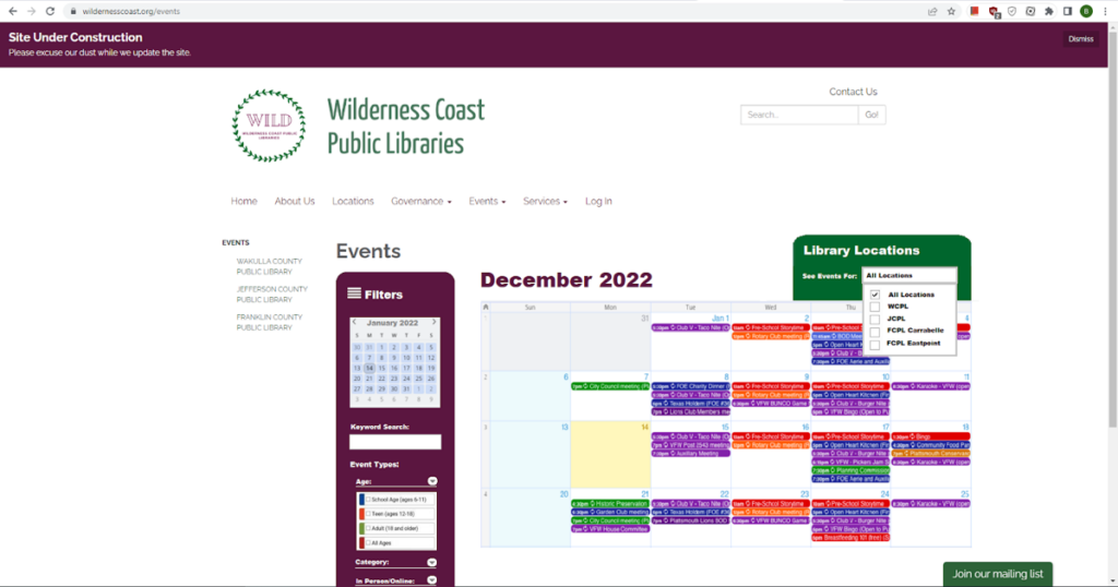
Initially, we discussed simply embedding a widget that links to each library’s social media page on this webpage so that users could quickly see what the most recent news for each location was regarding events. While we like this idea, and think it would be a helpful addition to each of the individual libraries Events pages (accessible via the sub-menus and on the left-hand side of the main events webpage), we ultimately acknowledged that this would not give users the most control and quickest way to access event information, not least of all because some of the locations don’t have very active social media and others have overly-active socials. To avoid this issue, we determined that an interactive calendar would be the best way to update this particular aspect of the website’s design.
After reviewing the WCPL events redirect, which is the only branch of the four that has any kind of calendar system, we took inspiration from the categorization system they already have in place. Our proposed change would not only be to have the landing page include a visible calendar showing all upcoming events at all of the different branches, but we feel that the best user experience would be to have the calendar include a drop-down menu to filter either “All Libraries” or each individual branch. It would also include a Filters section that allows the user to filter for specific calendar dates, keywords in the event titles, or to filter by Event Types categories such as Age (Audience) and whether the event will be In Person or Online, as seen in the mock-up below. This update would be possible using a shared Google Calendar where each library maintained their own branches’ calendar, but all branches would need to use the same color-coding system so that a filter for event type could function.
We incorporated the feedback we received during the in-class review of our redesigned vision of the Sarah Maker website and made the following changes to make navigating even easier for the beginning crocheter (and knitter!):
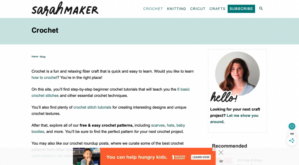
In our first iteration of the redesigned crochet landing page, we had links to both a “get started” page and a “beginner tutorials” page. A beginner might not know where to go first, so the page has been redesigned with a large crochet image (not linked to anything) to establish the page identity and all the beginner information is combined into one link.
Redesigned Crochet Landing Page
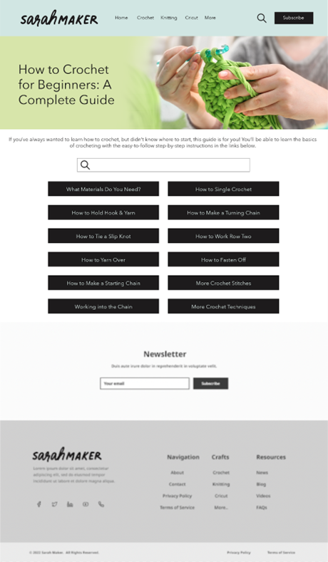
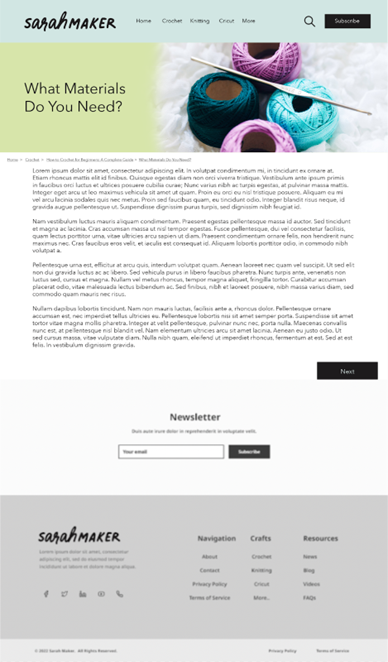
We have included a version of what this new all-in-one beginner crochet page might look like. Instead of a mishmash of hyperlinks hidden among paragraphs of text on one very long page (as is currently found at https://sarahmaker.com/how-to-crochet/, the different instructions have been divided into different pages with highly visible buttons. In addition to the very first lessons about materials and how to hold your hook and yarn, there are links to each of the basic stitches a beginner needs to learn. We have also included a search bar for the crochet section so that a user can find what they are looking for even if they are not familiar with the terminology they see in the buttons.
Crochet Beginner’s Guide Page
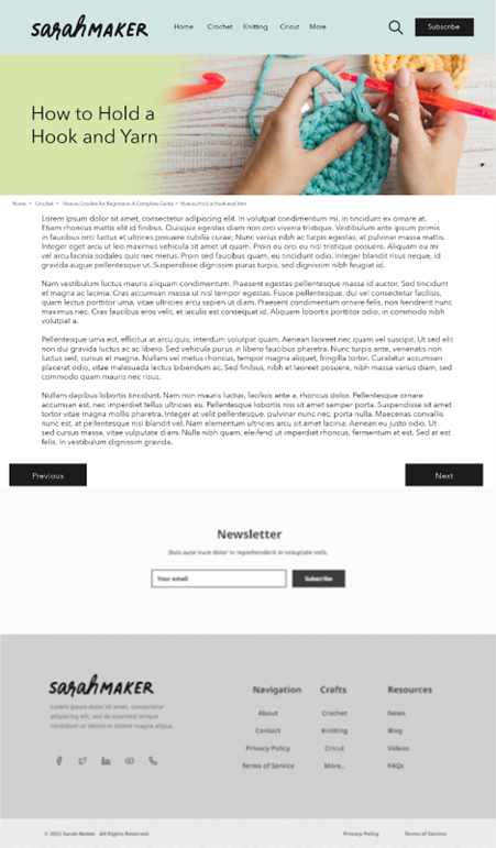
If a user uses the buttons and starts from the beginning, they will be taken to a new page that shows the instructions for each section. These pages also have “previous” and “next” buttons at the bottom (as appropriate) so that the user can easily navigate from one set of instructions to the next, as they are laid out in the order that a complete beginner should go through them. The pages for the first two links (“what materials do you need” and “how to hold a hook and yarn”) are shown below.
Materials Guide Page — First Page of New TutorialsHow to Hold a Hook and Yarn — Second Page of New Tutorials
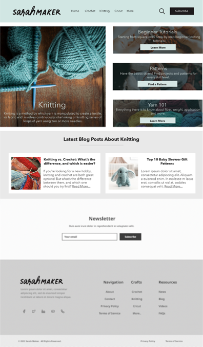
Since Sarah Maker also includes knitting patterns (and her original layout is just as confusing as it is for crochet) we also redesigned the knitting landing page to match the crochet page. This will add a level of consistency for the user as they navigate through the site. The rest of the knitting section would be structured similarly to the redesigned crochet section.
New Knitting Landing Page — Matches Crochet Landing Page
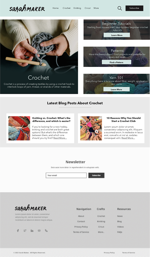
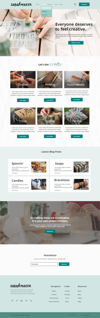
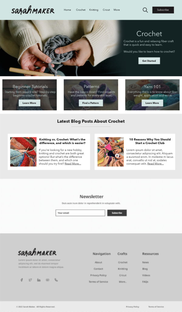
Finally, in our previous post, we had the layout of the redesigned homepage, but we hadn’t had a chance to add pictures and colors to make it mesh with the new craft-specific landing pages. The new iteration includes images of each craft as well as inspiring words to get the user excited to discover new crafty activities.
New Homepage
We hope that our redesigned version of the Sarah Maker website will encourage visitors to spend more time on the site, not because they are frustrated by trying to find the information they want, but because they find it a welcoming and easy-to-navigate resource that they can come back to again and again. The new organization and functionalities should impress both current users and those who are coming to the site for the first time!
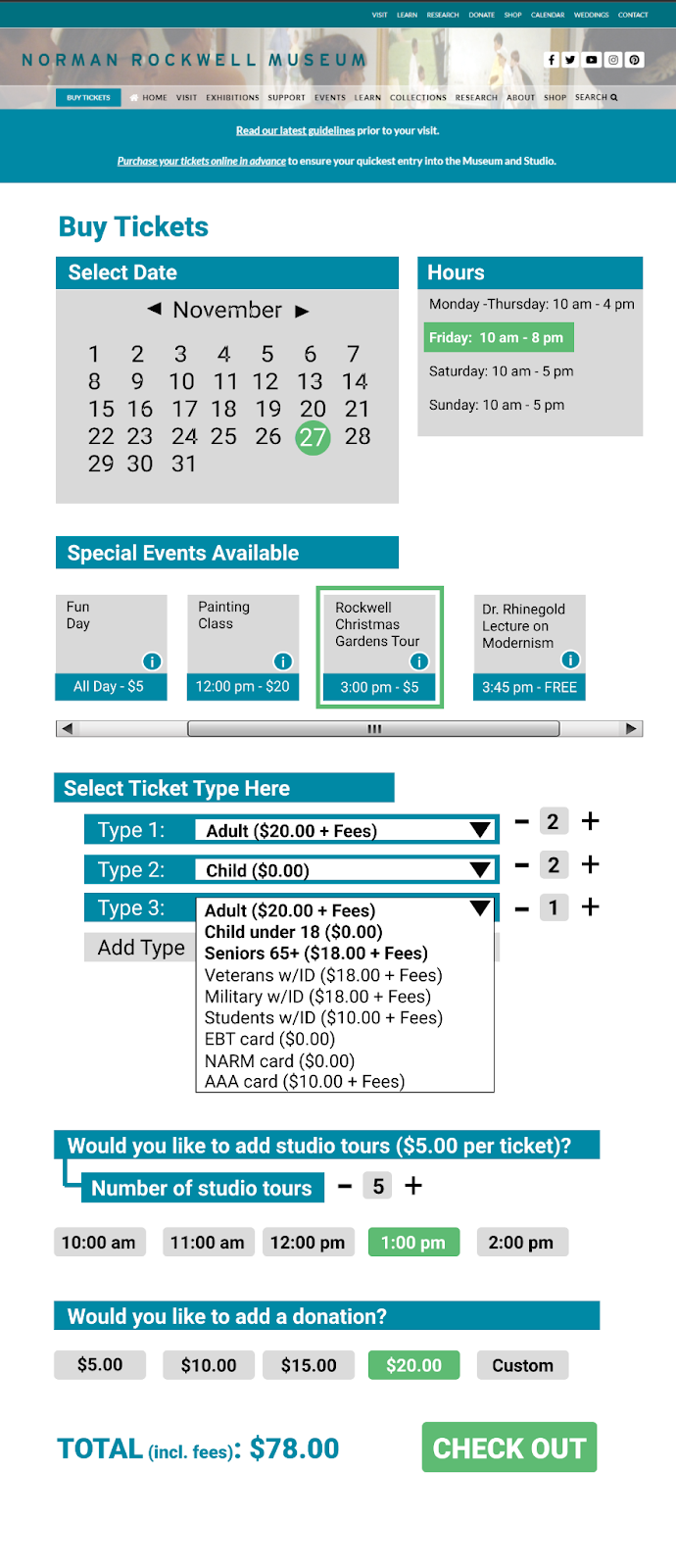
For the past two iterations of our redesign, our group has selected the ticket purchasing system. We agreed that this is one of the most important features of the site, and one that has ample room for improvement. Many users found the ticket buying process arduous and were disoriented by the pop-up window with multiple widgets that are incongruous with the rest of the website, confusing a few participants during user tests. It was not obvious to all users what they needed to do to complete their goal of buying a ticket. Each step had barriers to the participants’ understandings of what they needed to do next. Overall, this adds to the cognitive load a user may experience at a time while decisions are being made. As soon as they completed one step, the next step caused them to reorient themselves all over again.
Instead of a pop-up window, we propose that the Norman Rockwell Museum (NRM) implements a proprietary purchasing feature within its own website to maintain uniformity, control, and consistent aesthetics. By standardizing the checkout page with the rest of the website, there is a hope that the user will feel more comfortable using it. Through this, our redesign aims to decrease confusion and cognitive load on the user during the ticket buying process, making the experience more user-friendly.
After already creating one iteration of a redesign of this page, we have made changes based on user feedback. This feedback includes statements such as:
[The first iteration is] much more clear what the ticketing options are now in advance, which means less back and forth paging through the ticketing system for the users.
Explore different ways to integrate the Museum’s calendar events into the ticketing process too, perhaps building off the studio tour idea?
It needs to be clear that you can visit the museum any time that day.
The tours are for specific times only… I’d love to see your thoughts on that.
[I] liked the idea of re-shaping the Donations option to make that more positive.
[Add an option regarding] how to approach group pricing.
In order to redesign based on these statements, firstly, we added a section that shows the user the events that are occurring on the chosen date. The museum hours were also displayed next to the calendar section with the selected date highlighting the hours for that day to the left. This way, the user is able to see at a glance what they have available should they choose a specific date, allowing for greater ease of planning. A small button that the user can click on to see the information about an event was also added as well as a scroll bar underneath to demonstrate to the user how they can see more events if they scroll to the side. Selected events become surrounded by a green box to show which ones a user has chosen. Also, we have added the ability to buy multiple tickets of one kind through the input of a number on the left so that, instead of having to individually add tickets, there is a way to buy tickets in bulk. The donation/studio tours options have also been streamlined where, instead of first selecting a yes/no option then selecting a number/time, a user has only one line to look at and choose from. Below, we have included an image that shows our second iteration visually.
As a continuation from the homepage – our group also thought it would be useful to make redesign suggestions for the Crochet landing page. This page can be accessed from clicking “Crochet” in the top navigation or from the “Crochet” category button on the homepage beneath the header.
Our proposed redesign:
This redesign would make it much easier for users to quickly find the section/information they need in one glance, instead of having to read through lengthy paragraphs to find hard-to-see hyperlinks within. (see current crochet page below).
Our redesign would maintain the same branded top navigation as the redesigned homepage, as well as the same redesigned footer. This would provide consistency for users as well as maintain an easy site map for links that are accessed often.
We kept the newsletter section large but near the bottom to remove the need for a distracting shaded effect the current site has, while still maintaining the accessibility/importance for the newsletter sign up.
Additional things to note about our crochet page redesign:
Separate hyperlinks and put them in more contrasting colors by creating obvious/clearly labeled buttons
Tag beginner-friendly posts and/or tag all posts with appropriate levels – within the sub pages (for example patterns), all patterns/tutorials will be organized by skill level.
During our group’s individual heuristic analyses (and again in user testing), the most glaring shortcoming on the site was the lack of an obvious search function. There is a natural inclination to look for a search bar or a magnifying glass when trying to locate specific bits of information. At the time of our initial testing neither option existed, as shown in the screen capture below:
Figure 1 – Screen capture from October 18, 2022, prior to Search function being added
This change was to be our initial iterative change. This change would help the website create a much needed “match between system and real world” as years of using search bars has created an instinctive draw to the search bar and the magnifying glass icon. Since the time of our initial user testing, the website has added a search option. In the earlier screen capture of the website, the column on the left side only showed a magnifying glass icon beside the playlist option. This only allowed for searching of game titles and precompiled “playlists” of articles and reviews.
One of the drawbacks this has on end users is the ability to resurface older content and articles that might be of interest. One of our initial tasks we wanted the end users to complete was finding an article that contained different titles in the Game of the Year catalog for 2021. Due to the limited search functionality of the IGN website, most test and scenarios ended with an overall negative experience for our experimental group due to it being difficult to find the search features, only returning individual games, or returning irrelevant results causing the users to look elsewhere. The site did not really have a way to look through its resources and return specific entities even though we knew it was there. This is one of the main reasons we decided to change the layout and make it easier for users to find the search bar as well as navigate IGN.
Figure 2: Screen capture showing added search option in left hand column (added by website) and a search bar option in the top right (group recommended change)
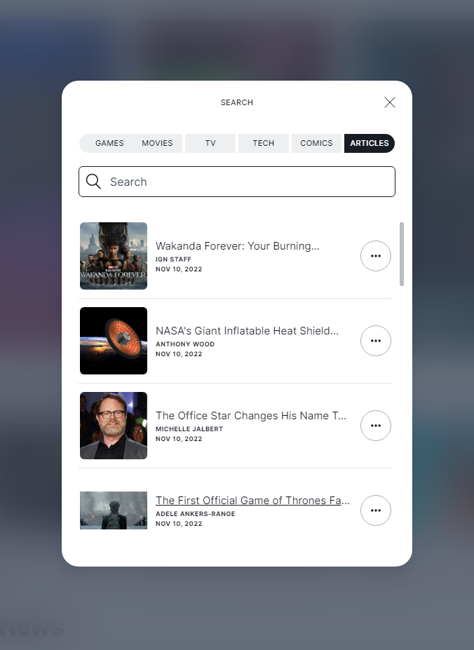
The next screen capture shows the search option after you select it from the main page menu. It offers increased flexibility by allowing the user to search for their keyword in the context of the more popular segments of the page.
Not only have we updated our navigation features, but we’ve also cleaned up the homepage and the cluttering of content. Previously the homepage contained a lot of randomly placed ads that were sometimes inconsistent with the layout of the page, those things such as large images that took up most of the screen. In our revision, we’ve decided to give the site a cleaner look that doesn’t bombard the end user with too much information and allows them to see the main content of the page with the option to navigate elsewhere when effortlessly. This cleaner look also includes the addition of a footer to the home page and the removal of the continuously loading content as the user scrolls the page. We feel the revisions help the user find content and reduces confusion caused by the current site.
Figure 3: Website’s search option, continued.
The website’s recent addition of a search capability shows that our group was on the right track and that the change was an obvious and glaring deficiency in the site’s design.
After completing their tasks, our users gave their input on the Wilderness Coast Public Libraries (WCPL) website design, and from their comments, we gathered the following: The look of the site is jumbled and confusing, and the changes in the background from place to place make it seem like each part of the site was made by someone else. Across all the website’s pages, it is clear that the site was improved from a previous WordPress design to look more appealing with pictures and color, but the information itself is still presented in a poor fashion with large blocks of text, tight bullet point lists, and inappropriate links. There is a massive reliance on bullet point lists too close together, images with no links or explanation, a lack of basic information like hours of operation, and the jarring change of designs between each section of the public library system website. Overall, these smaller issues add up to a larger appearance that leaves the user either dreading large amounts of condensed information or confused about where to search.
Some of the pages should be broken up into separate subsections and incorporate either more graphical designs like pictures of the library or simply a more appealing and larger font. A quote from one of our users on this matter was, “Aerial is the most basic of fonts, and everything is so closely spaced.” The links used in the site should be placed in order of most use. Currently, they place the link to the individual library pages on the home screen off to the left and the survey on the library system at the center of the page even though they should prioritize the needs of the users, not the survey.
Improvement suggestions
The WCPL website is confusing and disorganized, as it is a maze of incomplete web pages for each of the different member libraries. When users enter the website, they should be able to get a basic understanding of how to navigate it. The library website would do much better if the links to the library branches were placed on the main page. This would make it easier for users to know which branch they would like to visit. If users want to find a book, the first thing they should consider is a branch of the library they are using.
WCPL site update
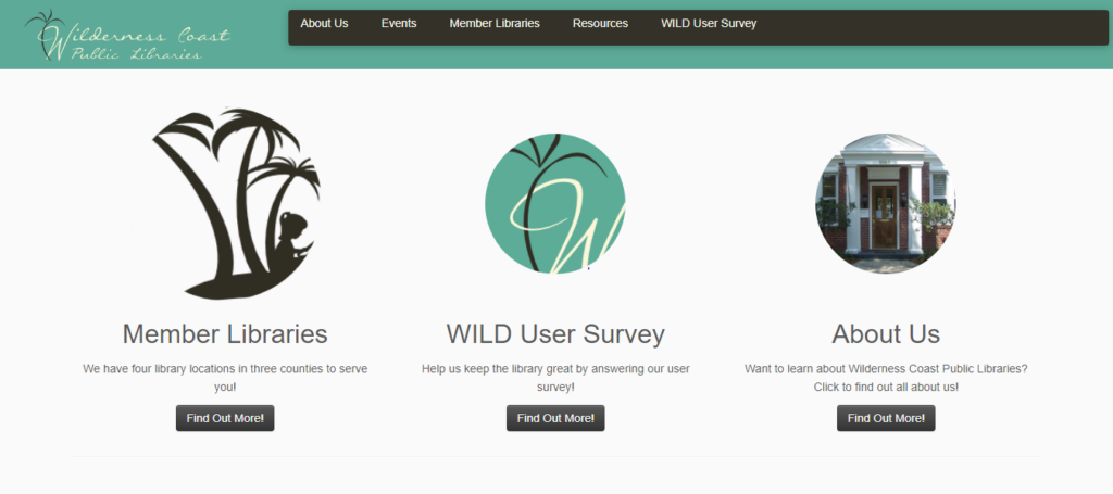
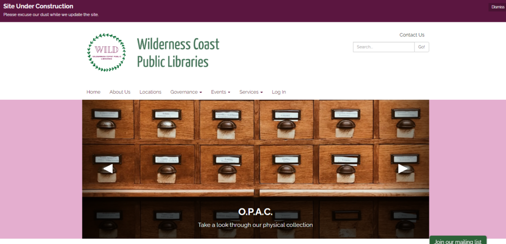
The Wilderness Coast Library System’s shared catalog web page allows a user to view materials offered by the libraries, but the design makes it difficult for users to find the page they want. In each of our individual user tests, our users struggled immediately with how to navigate using the main library system’s landing page, and even when we first chose this site for our project, we knew it left a lot to be desired. In fact, it appears that even the WCPL team noted how frustrating it is for users to navigate through and have thus chosen to begin the process of updating all of the websites. The difference between the two websites can be seen in the images below:
Fig 1. The original landing page for the Wilderness Coast Public Libraries System Fig 2. The updated landing page as of 11/13/2022
As of right now, that overhaul reflects a more modern design approach, utilizing icons below the scrolling header image to provide context for orienting the viewer and assisting with quick navigation. Interestingly, the color palette has also been updated, changing from the teal blue to a green and pink/purple motif. One of the major changes is one our group has complained about from the start of this project: the inclusion of a Search Bar on the landing page (although it is not quite as optimal as we planned to propose). The other major change that they have made thus far is an updated navigation bar that includes actually useful and descriptive titles (with drop down menus for more specificity).
While the decision for the library to begin making updates in the middle of our examination of their site presents some challenges for us as we move forward in this assignment, it also provides a very exciting opportunity as well—as we go through the iterative design process and propose fixes to the site, we can also check in and see the iterative design process that this specific webpage will undergo in the next few weeks as they make their own changes. We will be able to critique not only our own design choices, but also compare them against what the actual library system chooses to do and from there make new proposals for optimizing navigation. This will enrich our experience as we create our proposed designs, and also help give us some direction/parameters as we reflect on the changes that are pushed out by the library. Not only that, but it will be a fertile opportunity to really emphasize the dialogic nature of the iterative design process, as we provide critique of the changes made and offer solutions that we feel would be more optimal, while also giving us a chance to acknowledge areas that may be updated that we hadn’t thought about or considered in our own perusal of the site.
Group redesign
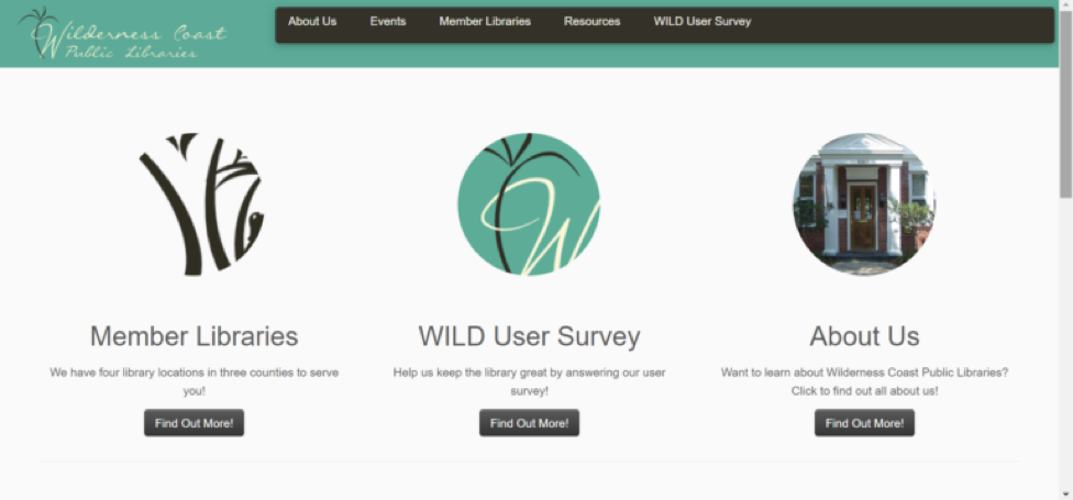
With all of that said, before Wilderness Coast Public Librariesbegan actually publishing changes to their website, we came up with some design recommendations focusing specifically on the main landing page of the site. As I mentioned, some of the biggest concerns we flagged as a team were that: 1) the main page should immediately show a user the different libraries and pertinent information regarding each of them, 2) the main page needs an easy-to-find and easy-to-use catalog search bar, 3) the navigation bar needs to be more descriptive, and 4) the user needs to be able to access this information without having to make so many clicks to new pages.
Group proposed redesign of the WCPL home page
When users first land on the main page of the WCPL system, there is not much to look at. When doing our research up to this point, we all thought the main page could use much work. Mainly, we thought that since the Wilderness County system has multiple branches, and the branches are far apart, the best thing to do would be to have clickable links to each separate library website. Adding the contact information and address under the link would be extra helpful to users to make sure the library they select is the best one for them.
The next biggest issue for the library site is that there was no way to search on the main page. Adding a search bar would be extremely helpful and quicker for users just trying to search the website or the catalog. We added a catalog search bar to the top of the page so that it could be an immediate source of information for library users. The website also had clickable information at the top. Our group thought that adding extra links such as “log in,” “services,” and changing “Resources” to “Resources/Catalog” would be useful.
The search bar that is currently on the catalog page has options to narrow your search to the author, ISBN, subject, title, and more, which is good when searching the catalog. Having more options in regard to the search bar on the main library page would be great for patrons. The edited search bar created gives patrons the option to search the library website, the library catalog, library events, and library databases. Those options give patrons a narrow starting point that they can use to get good use out of the website.
Our group chose to user test and redesign the website Sarah Maker, which is focused on teaching people how to create many different arts and crafts. The persona we chose for our user test was a young woman who wanted to learn to crochet, so for our first iteration of our website redesign, we focused on making the home page easier to use for both beginner crocheters and for any user of the website.
Original Homepage
Homepage Redesign
The first of the main changes to the homepage came in the form of adding drop down menus to each of the menu bar options at the top of the page. On the existing site, these are single-click options (except for the “Crafts” menu). This change will allow users to find more specific topics within the broader topic that they are exploring, as well as make overall site navigation much more simple and easy to use, and cause the users less frustration when they are looking for something specific.
Redesigned Homepage
Additionally, in the menu bar, a “Home” button has been added and the “Crafts” button has been replaced with a “More” button. While more savvy users may know that a majority of websites allow you to navigate back to the home menu of a page by clicking on the site’s logo or title at the top of the page, those who are not aware may have difficulties navigating easily back to the homepage. The addition of the “Home” button will easily remedy this issue. The adding of the “More” button serves to clear up a bit of confusion that may be caused by the “Crafts” button. The “Crafts” button comes off as relatively redundant, given that each of the other tabs actually contain crafts as well. By changing this button to “More,” some of this confusion may be eliminated. Finally, short descriptions have been added to each of the different craft options further down the home page. This will provide users with some more information about each of their given options without them having to go back and forth between the different links.
Right under the redesigned menu options, there is a new tagline and brief introduction to the site – on the original design, you have to scroll all the way down to the bottom of the page to find the “About” section or click on another menu (such as “Crochet” and then click on her information from the side). The new design immediately tells users what the purpose of the site is, rather than just having a bunch of miscellaneous menus.
At the bottom of the page, in addition to the existing “Navigation” section, we have changed the Social Media links to their respective icons and added “Crafts” and “Resources” section, mirroring what users can find at the top of the page so they don’t have to scroll all the way back up after exploring the home page. In the “Resources” section, we have also added an FAQ as a catch-all for users looking to find basic information about the site as well as about specific crafts. This will increase the ways that users can find the information they need depending on their preferred way of moving around the website.
We will be submitting an additional post to this one soon with a new wireframe depicting modifications made to the crochet page.
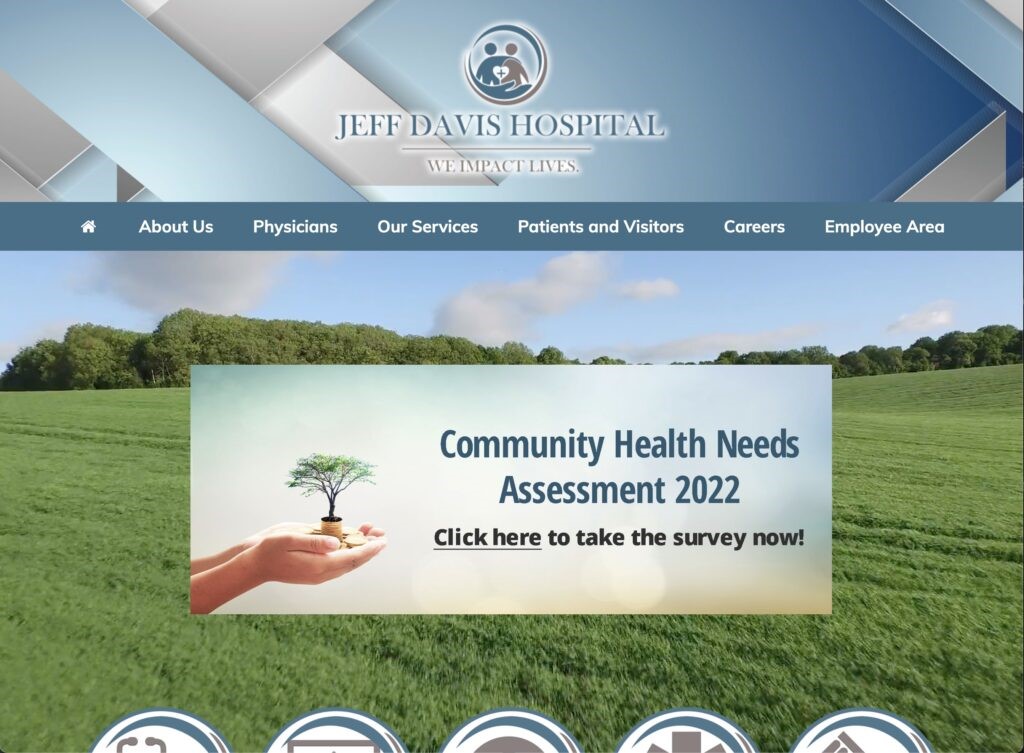
The Healthcare Group user tested the Jeff Davis Hospital (JDH) website, shown in Figure 1, through a comprehensive scenario of an individual seeking healthcare services for their family member. Violating major heuristics issues around consistency, standards, error prevention, efficiency and minimalist design, this site needed major redesign in content organization to merge its disjointed brand or legacy sites (Nielsen, 2020). In our group’s first redesign, we approached the site’s navigation by restructuring the site map, reimplementing search, and visualizing a native implementation of their Health Research Center. Wireframes were assembled in Figma Design and Figjam using Estefanía Montaña’s (n.d.) Easy-Peasy Wireframe Kit and colors matching JDH’s theme.
Figure 1. Production Homepage (Jeff Davis Hospital, 2022)
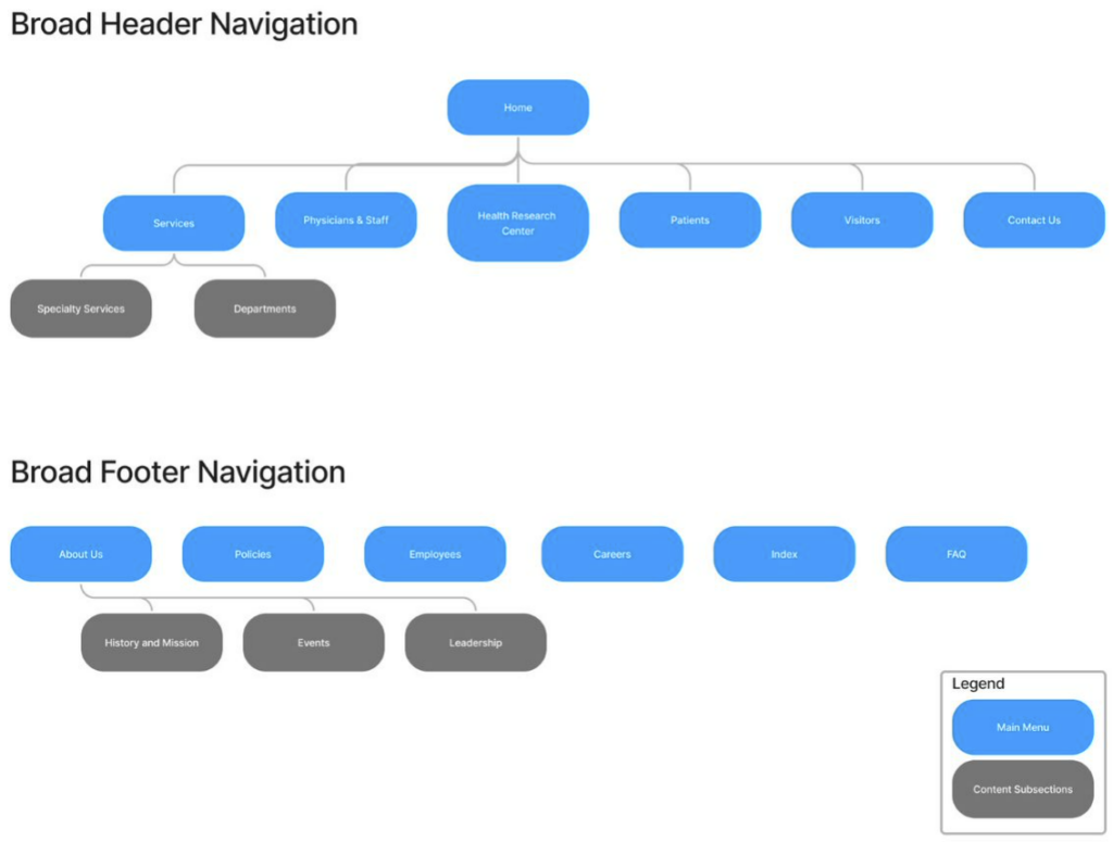
Proposed Re-design#1: Sitemap, Homepage, and Persistent Search
Logo is home page link.
Sitemap is reorganized to focus on logical pathways to complete the user tasks. Sections like About Uss, Employees, and Policies were moved to the footer to deprioritize them.
Note that we will perform card sorting internally or with the class in the second iteration to improve the navigation.
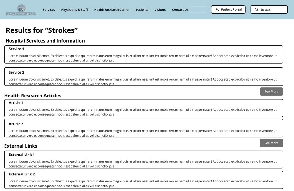
Search bar is persistent and references Services, Health Research Articles, and External Links as separate sections in results
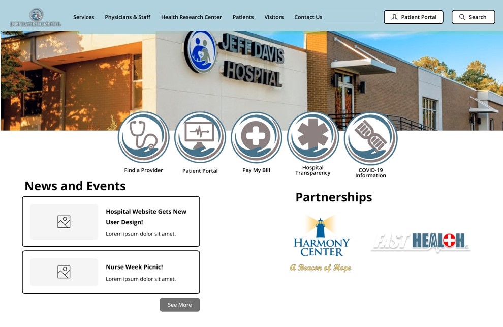
Homepage – Static interface because users didn’t like moving images or menus
Homepage – Partnership links to brands so that they are visible but separate from the Navigation terminology
See Nielsen’s Menu Design Article by Whitenton in References as a citation use.
Figure 2. Sitemap
Figure 3. Homepage
Figure 4. Search Results Page
Design Rationale
Sitemap
As a crucial part of our group’s iterative redesign of the JDH website, our focus immediately began with the landing page of the site to address numerous navigational and content organization issues that plagued our users during testing. As stated previously, the current website design violates numerous usability heuristics, and the landing page contains more than its fair share. Our group completely re-hauled the design through embracing a more minimalist aesthetic by eliminating unnecessary duplications of navigational options for content that presented no descriptive text and nonstandard language, while maintaining highly visible navigational links to the most used features of the website. We removed unnecessary imagery, the motion sickness-inducing video background, and outdated and unorganized content links.
Homepage
Additionally, our group made significant modifications to how the menu options and content are organized. We split the patient and visitor options, while combining physicians and employees. We moved some content and options to a separate footer option bar. Our group also removed the drop-down menu options and replaced them with subpages that allow for an improved navigational and information seeking experience by presenting options with supplemental descriptive text and images to avoid confusion over terminology or naming conventions by providing the user with the context they need to understand the option before they select it. By implementing a logical sitemap navigational architecture with meaningfully organized options and content, many of the design failures of the current website that we identified during testing can be corrected.
Persistent Search
Another major redesign element we introduced is the persistent search bar in the top right corner of every page on the website. Currently, a search bar is available on the site, but only if you scale the page just right; even then, selecting the magnifying glass icon only opens another search bar with another icon next to it. We have resolved this glaring issue by anchoring the search bar in a fixed location regardless of scale. What’s more, our group optimized the search results page by removing advertisements and externally promoted content and presented results in an organized precedence that will greatly improve the user experience of this feature
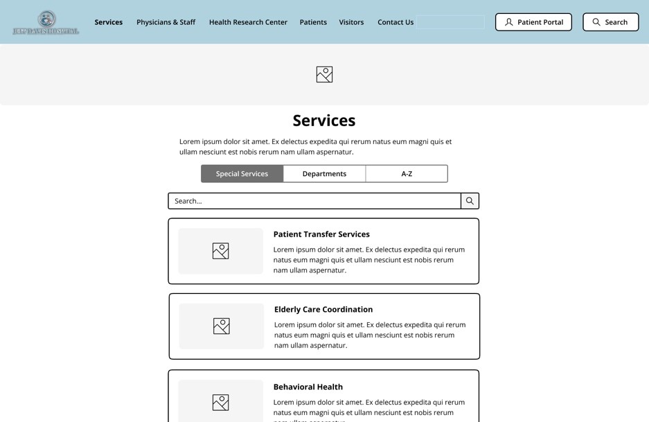
Proposed Re-design#2:Services Page
Reorganized into respective Special Services (involving more than one department) and Department Sections as their own separate tabs instead of dropdown submenus. This helps with User responsive design too.
Services named by their function rather than by brands like Swing-Bed and Harmony Center
Figure 5. Services Webpage
Design Rationale
The original design of the Jeff Davis Hospital site displays a conjunction of listed services under the “Our services” widget. The services listed under “Our services” displays all the care teams and departments offered by the Jeff Davis Hospital, the issue found with this interface design includes the inaccessibility of design for users. When users are attempting to select a service on the site the pop up of the widget does not withstand longer than a few seconds which presents a design that is not as simple or efficient to use for users which thus inhibits the goals of effective user design. To experiment with improving the JDH site’s current design we removed the service list from the main page drop down menu, footer options, and on the main page tiles. We replaced the service list drop down with a subpage directory for all services provided available with search bar, department organizational listing, and listed them alphabetically by service name. On the iterative design we are recommending, the services are listed with descriptive text and imagery to avoid confusion over terminology or naming conventions while also aiming to make finding Patient Transfer Services and Elderly Care Coordination simpler and more efficient. The information shown on each respective services page would be transferred to the respected services that they currently fall under on the JDH site as it is because the information listed helps in remaining informed on the services, but the formatting if the information presented would list the contact personnel first and at the end of the page. The information would be formatted in the middle of the page.
Proposed Re-design#3: Incorporated Health Research Center Knowledgebase
User Observation – Unappealing and Confusing FastHealth Site
User Observation – Confusing Linkage to External Sites and FastNurse Branding
Cite Cleveland Clinic as a derived example of the knowledgebase – See their Health Library
Content stays on the website and stays consistent with the Jeff Davis Theme
Adding external links to the bottom keeps the reputable resources from FastHealth
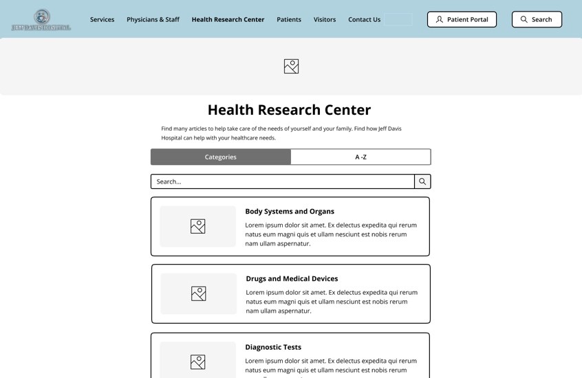
Figure 6. Health Research Center
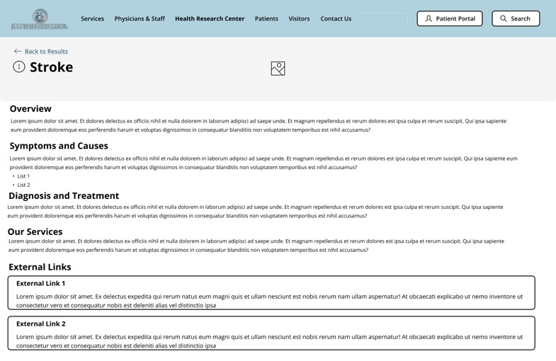
Figure 7. Health Research Article – Stroke
Design Rationale
Health Research Center
As referenced in our group’s representative user tasks, FastHealth stroke-related information proved a difficult endeavor for our users to successfully navigate. Therefore, we are proposing incorporating FastHealth’s interface into the JDH ‘Health Research Center’ webpage like Figure 6. We conducted benchmark tests and found that Cleveland Clinic is suitable to emulate a portion of its health center knowledgebase interface for this re-designed webpage. Namely, sectioning the webpage’s ‘Search‘ and “Browse A-Z‘ components. However, our re-design will swap “Search” for “Categories” since the naming convention and its presented components in Figure 6 will make searching for relevant health information better structured. This re-design will include a search bar to address additional users’ preferences for information searches. These solutions make it easier for users to quickly retrieve relevant health information.
Health Research Article
Additionally, our representative user tests identified usability flaws with efficiently researching stroke-related information concerning FastHealth’s presentation of its links. To address these flaws, JDH health research articles (as shown in Figure 7) will be re-designed so that content can remain on the JDH website without disorienting users, staying consistent with the JDH minimalistic aesthetic. The articles will provide key sections that efficiently address our user’s health information needs. Relevant external links found on FastHealth regarding chosen health-related information will be included on this webpage as well. These proposed changes will reduce usability flaws related to the current site’s lack of consistency, confusing navigation, and abundance of information noise.
References
Health Library. Cleveland Clinic. (n.d.). Retrieved November 15, 2022, from https://my.clevelandclinic.org/health
Jeff Davis Hospital/fasthealth corporation (Hazlehurst, Georgia – jeff davis county). (2022). Jeff Davis Hospital/FastHealth Corporation.http://www.jeffdavisfasthealth.com/
Montaña, E. (n.d.). Easy-Peasy Wireframe Kit. Figma. https://www.figma.com/community/file/989274600796773962
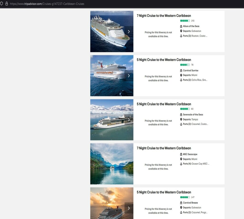
The first issue that our users encountered when doing the task of searching for a cruise within the $400 price range was that the search result included a lot of “pricing for this itinerary is not available at this time” entries. It showed up in the search results after the “price range filter” was applied. We found that the issue was caused by how the sorting was set; it was defaulted to “best value”. This is a violation of Neilsen’s principle of consistency and standards because the term “best value” is subjective, unlike “best price,” which is universally understood. The results with the “best value” included unavailable cruises that weren’t aligned with what users wanted to see. As such, this violates Neilsen’s aesthetic and minimalistic design principles, which provided irrelevant information on cruises that were not available. This feature also violates Neilsen’s visibility of system status principle because even when the user adds a new filter, the search results are still sorted by the “best value” deals, which continue to show the unavailable cruises. This negatively impacted the user’s experience because it added no value to their search results. The default sorting made the results unclear to the user.
First Issue – Unavailable Cruise Search Result
Recommendations
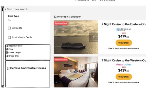
The first proposed solution is to provide the ability for end users to remove cruises that are unavailable. This can be accomplished by including a filter option to remove any cruises that are not available. The filter will be added on the left side of the page with a box that can be checked or unchecked. The filter gives the user control over the search results, allowing them to remove or keep cruises with “pricing for this itinerary is unavailable”.
Secondly, the default sorting by “best value” is hard to understand and should be removed. The default sorting should be logical and clearly related to the filter applied to the user’s search. If they are searching by price range, it should be sorted logically by price from the lowest to the highest value, or vice versa. It makes it easy for the user to understand what is going on if the sorting reflects the filter being applied. The criteria used for sorting should be transparent and allow the user to have more control over their results. To easily find the “sort by” option, it should be moved to the left side of the result page. For added benefit, this option should remain in place as the user scrolls through the results.
First Issue – Recommendation
Second Issue
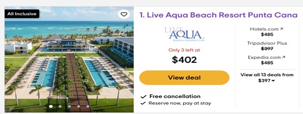
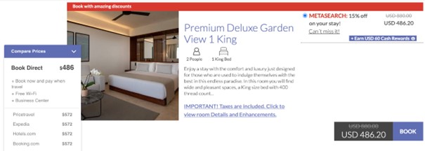
Secondly, transparency of pricing was an issue noted by many of the users that we evaluated. The price originally presented was significantly less than the final price of the resort, activity, etc. This was frustrating for many of the users, who thought they had found a steal of a deal and wasted their time going through the booking process only to find the final price significantly higher than the initial quote. This violates Neilsen’s principle of visibility of system status because the actual price of the hotel is not what it is visible to the user. This also violates Neilsen’s principle of consistency and standards because the price shown in one page is different when transferred to the provider’s webpage.
Second Issue – Deal PricingSecond Issue – Actual Pricing
Recommendations
There should be transparency regarding pricing. During browsing, it needs to show the actual price including taxes before getting to the end of the page. Our recommendation is to have a “True Price” feature that includes all fees, taxes, etc. up front. The proposed transparency enhances trust, ease of use, and a less stressful experience for the user. By reducing the stress of the booking process, we’re confident we’ll have more return customers. By adding the “True Price” to every single feature advertised on TripAdvisor, we further enhance the consistency and standards of the website design.