Website
The website selected for this Heuristics Evaluation intended for the Healthcare Group is the Cleveland Clinic Healthcare System at https://my.clevelandclinic.org/. The website represents a medium-to-large services and resource oriented healthcare organization situated nationally with locations primarily in Ohio and Florida. The site serves as an integrated public-facing portal for individuals seeking health form a trusted source – learning further about Cleveland Clinic’s services, access to patient-specific info, and navigating conceptual medical or pharmaceutical info.

User Scenario
Prefaced in our group interest, our user seeks a central destination to fulfill information needs in terms of their healthcare, fulfillment either to gain more knowledge or to further take action with a medical professional. With this in mind, the ideal scenario is to connect all those needs with a user that is a new patient seeking to alleviate a medical condition by discovering more about the condition itself, related symptoms, and concluding the search by making an appointment with a healthcare provider.
Defining the scenario with helpful attributes, our situated user seeks to find more about the treatment solutions for his or her chest pain. With Heart Disease as the highest in mortality and common care, it is most appropriate symptom to simulate (Centers for Disease Control and Prevention, 2022). Our user has already decided to seek an appointment with a medical professional, understanding the intent of visiting Cleveland Clinic as a point of care in addition to a knowledge center as intuitively defined by the organization’s name.
In emulating this scenario, the following steps were accomplished with the current UI:
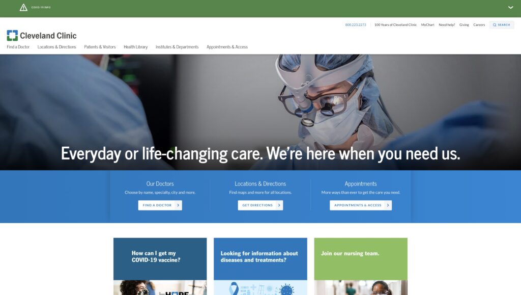
- Select “Looking for information about diseases and treatments?” in body.
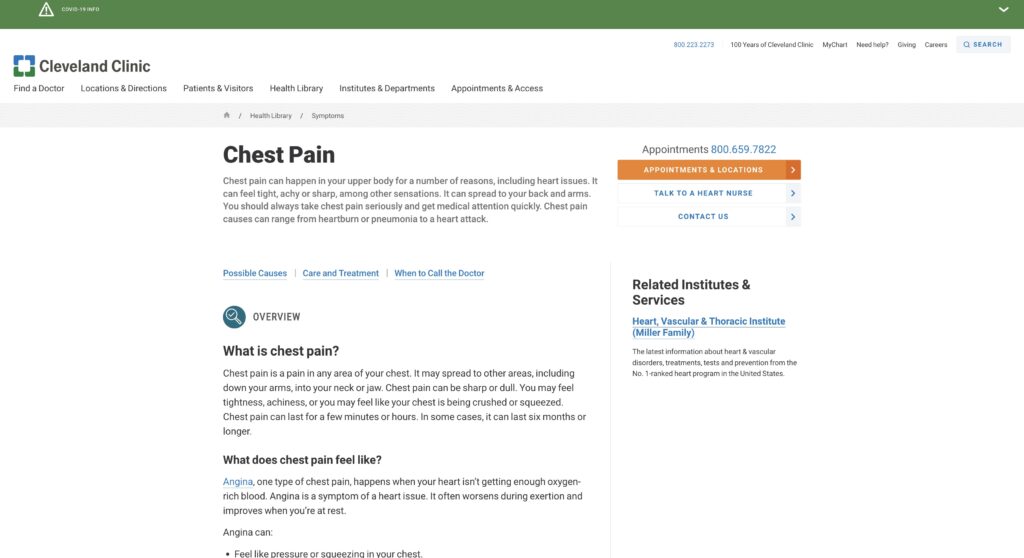
- Search “Chest Pain” in the search box and select the first result.
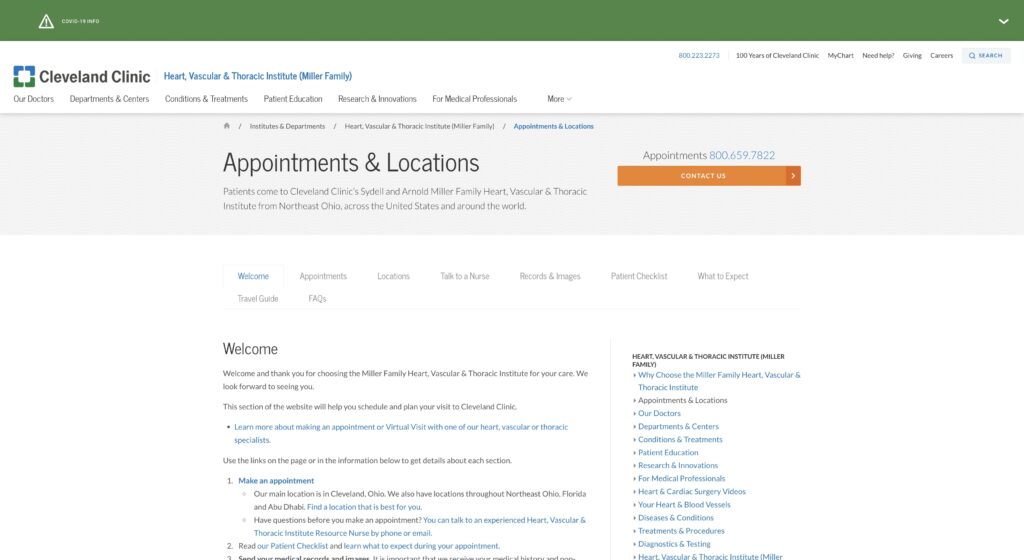
- Select “Appointments & Locations” as the orange primary button.
Flaws and Heuristics Analysis
In this analysis, Jakob Nielsen’s 10 Usability Heuristics were used as the most universally applicable in testing Cleveland Clinic’s site usability with the specified scenario. With each flaw, inadequate heuristics were identified for improvements. Overall, the flaws identified center around Cleveland Clinic’s lack of contextualizing user needs upon entering the website.
The first flaw, in site navigation, is the lack of context for our user to identify where they can navigate to cardiology specific information. On the homepage in Figure 1, the site only provides two links to enter the “Health Library” to make a search for conditions and symptoms or to select the link stating “Looking for information about diseases and treatments?” in the middle of the page. In terms of heuristics, this issue primarily violates Flexibility and Efficiency of Use, where the site needs to tailor to expert users but also quickly prompt accelerative actions for new users (Nielsen, 2020). The site accomplishes this well with COVID-19 and monkeypox specific links, but fails to address even considering the more common CDC Diseases. Likewise, Recognition Rather Than Recall is lacking for the same reasons and Help and Documentation is initially lacking with
The second flaw, back to navigation, is the over-redundancy of the generic links. While this can aid on other heuristics, it is against Aesthetic and Minimalist Design with more distracting text. Use of light text in primary headers and bold texts in secondary links clash in aiding where to select on conditions or seeking a medical professional. Non-actionable text hidden in headers like “100 Years of Cleveland Clinic” are also present. Dual use of the same links for “Find a Doctor,” “Locations & Directions,” and “Appointments” add to the confusion, only separated by a large middle picture heading. All three links eventually conclude with the ability to make an appointment, but add extraneous details to specialize more on the action steps rather than the care needs.
When selecting “Health Library” the user ideally would enter “chest pain” into the search box centrally located as seen in Figure 2, which delivers an article that has the ideal step highlighted with an orange button to make an appointment, superseded by the 800-number. At this concluding task, this setup, especially when considering “chest pain,” fails the heuristic of Match between System and Real World with the context of the site content (Nielsen, 2020). The knowledge article mentions in paragraph multiple times to reach a medical professional immediately for this symptom due to high concerns of more serious heart disease. However, the buttons remain static in all knowledge articles. With multiple pathways, all steps encourage calling the main number even though there are other options that are buried in the body.
Concluding the scenario, as shown in Figure 3, the user is given an extensive standard operating procedure to make an appointment to visit the Main Ohio Campus, with repetitive calling options and buried action links. This extensive text once again violates Aesthetic and Minimalist Design but also violates Error Prevention and Diagnosis to Recover from Errors (Nielsen, 2020). By expanding contact options less clearly and branching multiple hyperlinks for the purpose of making an appointment, the site risks making the user more lost and reverting back and forward between pages.


Design Recommendations
To address the homepage, the simplest step is to reduce redundancy of main navigation links in the header to aid in Aesthetic and Minimalist Design. By removing duplicated links, making the remaining ones more bold or accented, and reducing the length of the picture heading, the site is more visible to body content below the heading.
In place of the secondary redundant links, using icons and titles for different specialty areas such as “Heart,” “Cancer,” “Respiratory” and “Infections” can contextualize the user’s search in the Health Library for more information about their condition. By using more generic terms for the specialties, the user understands the topics better to drill down.
When presented the knowledge article for “Chest Pain” like in Figure 2, there should be more more call to action buttons with the common one to “Call to Make an Appointment.” Primarily for this article, flagging certain ones as high risk can have a button to “Call 911 for Emergency” in red to highlight if the user is experiencing the symptom. These can hyperlink to a phone call in-browser or on the mobile device. More importantly, the semantics of the buttons apply intent more in line with real world and the system.
Lastly, to avoid errors and provide clarity with less clutter with the end page shown in Figure 3, content can be reduced with the inclusion of action buttons mentioned previously and simplifying the step-by-step article only about what the user expects after they make the appointment. Selecting the action button can also prompt the user with a new load page saying “thank you for reaching out” and then provide the guide below. This facilitates feedback and lets the user diagnose what occurred when they placed the call.
Future Considerations and Conclusion
Architecturally, it is apparent that the initial design elements of Cleveland Clinic’s site are mainly to alleviate a less sophisticated appointment management platform. The requirement to be a MyChart account holder as a current patient or use a 1-2 day delayed web form are poor substitutes compared to a direct phone number. With the careful design of a linear oriented new patient appointment system on-site, many of the flaws listed can be alleviated. Likewise, approaching linearly aids in successful steps in the scenario by curating actionable steps from condition to appointment scheduling.
Word Count: 1,198
References
Access anytime anywhere. Cleveland Clinic. (2022). Retrieved September 26, 2022, from https://my.clevelandclinic.org/
Centers for Disease Control and Prevention. (2022, September 6). FASTSTATS – leading causes of death. Centers for Disease Control and Prevention. Retrieved September 27, 2022, from https://www.cdc.gov/nchs/fastats/leading-causes-of-death.htm
Nielsen, J. (2020, November 15). 10 usability heuristics for user interface design. Nielsen Norman Group. Retrieved September 19, 2022, from https://www.nngroup.com/articles/ten-usability-heuristics/