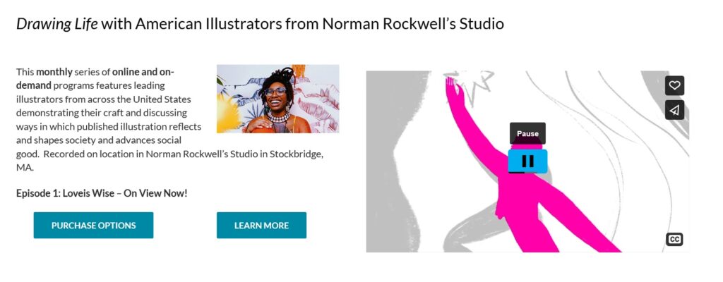
For the past two iterations of our redesign, our group has selected the ticket purchasing system. We agreed that this is one of the most important features of the site, and one that has ample room for improvement. Many users found the ticket buying process arduous and were disoriented by the pop-up window with multiple widgets that are incongruous with the rest of the website, confusing a few participants during user tests. It was not obvious to all users what they needed to do to complete their goal of buying a ticket. Each step had barriers to the participants’ understandings of what they needed to do next. Overall, this adds to the cognitive load a user may experience at a time while decisions are being made. As soon as they completed one step, the next step caused them to reorient themselves all over again.
Instead of a pop-up window, we propose that the Norman Rockwell Museum (NRM) implements a proprietary purchasing feature within its own website to maintain uniformity, control, and consistent aesthetics. By standardizing the checkout page with the rest of the website, there is a hope that the user will feel more comfortable using it. Through this, our redesign aims to decrease confusion and cognitive load on the user during the ticket buying process, making the experience more user-friendly.
After already creating one iteration of a redesign of this page, we have made changes based on user feedback. This feedback includes statements such as:
[The first iteration is] much more clear what the ticketing options are now in advance, which means less back and forth paging through the ticketing system for the users.
Explore different ways to integrate the Museum’s calendar events into the ticketing process too, perhaps building off the studio tour idea?
It needs to be clear that you can visit the museum any time that day.
The tours are for specific times only… I’d love to see your thoughts on that.
[I] liked the idea of re-shaping the Donations option to make that more positive.
[Add an option regarding] how to approach group pricing.
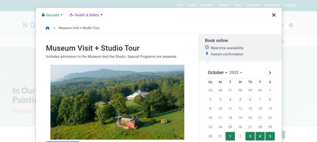
In order to redesign based on these statements, firstly, we added a section that shows the user the events that are occurring on the chosen date. The museum hours were also displayed next to the calendar section with the selected date highlighting the hours for that day to the left. This way, the user is able to see at a glance what they have available should they choose a specific date, allowing for greater ease of planning. A small button that the user can click on to see the information about an event was also added as well as a scroll bar underneath to demonstrate to the user how they can see more events if they scroll to the side. Selected events become surrounded by a green box to show which ones a user has chosen. Also, we have added the ability to buy multiple tickets of one kind through the input of a number on the left so that, instead of having to individually add tickets, there is a way to buy tickets in bulk. The donation/studio tours options have also been streamlined where, instead of first selecting a yes/no option then selecting a number/time, a user has only one line to look at and choose from. Below, we have included an image that shows our second iteration visually.
Our group selected the ticket purchasing system to redesign. We agreed that this is one of the most important features of the site, and one that has ample room for improvement. Many users found the ticket buying process arduous and were disoriented by the Trip Advisor widget, the initial pop-up ticket window that seemed to confuse a few participants during some user tests. This pop-up window takes the user to a smaller window with a lot of initial information. It was not obvious to all users what they needed to do to complete their goal of buying a ticket. Each step had barriers to the participants’ understandings of what they needed to do next. Overall, this adds to the cognitive load a user may experience at a time while decisions are being made. As soon as they completed one step, the next step caused them to reorient themselves all over again.
Instead of a pop-up window, we propose that the Norman Rockwell Museum (NRM) implements a proprietary purchasing feature within its own website to maintain uniformity, control, and consistent aesthetics. By standardizing the checkout page with the rest of the website, there is a hope that the user will feel more comfortable using it. Through this, our redesign aims to decrease confusion and cognitive load on the user during the ticket buying process, making the experience more user-friendly. Our proposed redesign will simplify the process of buying tickets through reducing the ticket selection to a single page with all discount options placed into a single drop down per ticket. We’ve also combined the general museum visit and the “visit + studio tour” options by adding a section on the ticket buying page where a user can opt in to the tour and select their desired tour time underneath this option. Below, we have included a prototype for our proposed redesign of the NRM’s ticket purchasing page. Individual elements have annotations that provide further details beneath the prototype. While creating this prototype, the following ideas guided us:
The pop-up ticket interface should be removed and replaced. This interface caused a host of problems for users. By replacing this with a set of pages that are standard across most ecommerce websites, users will be more familiar and comfortable with navigating the ticketing process.
Simplify the ticket types. The current ticketing system has multiple locations to select ticket types, whether that is just a museum visit or a “visit + studio tour”, an adult or child ticket, and then a drop down for additional ticket discounts. Streamlining how a user can purchase their desired ticket means that potential confusion regarding the next step(s) can be greatly reduced.
A standardized checkout page. The pop-up box that is currently on the NRM’s website is unique in its formatting and interface compared with the rest of the website. By replacing it with more commonly found formats, forms, layouts, and interfaces the user will feel more comfortable utilizing them.
Inclusive design. Our redesign considers that many users will need a design that enables users of all backgrounds and various ability levels. Exclusive designs create usability issues when a user does not fit a specific circumstance, but an interface is able to reduce these usability issues through inclusive designs that include a flexible display that is able to be accessed by as many users as possible.
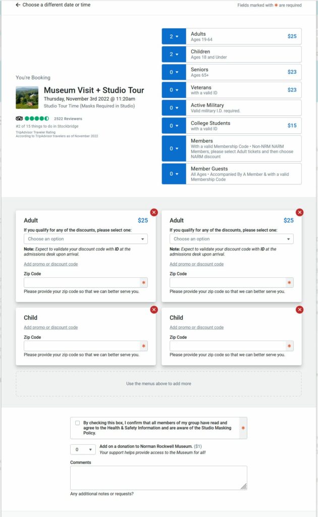
Our ticketing page brings all variables for your ticket onto a single page, where previously they existed over two or more pages. The calendar is now prominently displayed on the ticket selection page, this leads the user through a very clear process, starting with selecting the day they want to to come, the number of tickets they need, what types of tickets, and finally whether they’d like a studio tour.
This dropdown displays a list of all ticket types available and replaces the two separate sections for ticket type and ticket discount. All prices are clearly displayed next to each type so the user can quickly browse all categories and select the most affordable type that applies to them. The most common ticket types are bolded and placed on top of the list to expedite selection for the user. Additionally, these dropdowns populate as additional tickets are added in a 1:1 ratio, making it explicit to the user what discounts are being applied to which tickets.
This section makes adding a studio tour for the group of tickets very simple for the user, with two clicks to opt-in and select a time. Previously this was achieved on a different page and prompted an entirely different set of ticket prices. On top of simplifying the process, the call-to-action and clear pricing information will hopefully increase the purchase of studio tours.
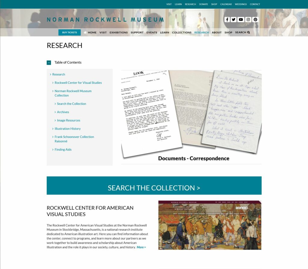
The Norman Rockwell Museum is located in Stockbridge, Massachusetts. The website contains resources about the materials contained within the collection, information on visiting the museum, an ecommerce shop, a method to purchase tickets to visit the museum, and additional resources regarding the institution itself and ways in which a user can donate or contribute to the museum.
The User
The user I utilized for my representative user testing is female, aged 27-35, with moderate to advanced computer skills. They are employed as a graphic designer, and are familiar with concepts surrounding images such as dimensions, formats, and copyright licensing. They were also previously employed in a library so they are vaguely familiar with cataloging and organizational concepts surrounding large collections.
The Method
The method utilized for this representative user testing was the concurrent think-aloud (CTA) protocol. The user was instructed to perform their given task while stating their thoughts and reactions to the website with which they were interacting. Care was taken to ensure the tasks were not leading, while eliciting interaction with the elements of the website that required further examination.
This method was chosen based on available resources and time. It provides a cost-effective means of user testing requiring little more than a computer, a user, and a notepad. Despite its relative simplicity, CTA provides ample insight into issues users might encounter on a given website. While the verbal dialogue may be disruptive to the task being performed, it allows for greater insight into the users mindset and thinking when navigating to and using features on a given website.
The Tasks
Three tasks were given to the user to perform. They are as follows:
The user was instructed to purchase tickets to visit the museum. This represents arguably the most important task for the website, which is to facilitate paid visits to the museum. The user was informed that they would qualify for a college student discount, and were attempting to purchase a ticket one week away from the day they were participating in testing.
The user was instructed to find out more information about internships at the Norman Rockwell Museum, and if available, apply to one. This task is representative of the student persona created in our previous group assignment.
The user was instructed to obtain a high quality scan of a painting for use in a project. This task again represents our group persona, a college student. This task was refined from the initial task (to look up a painting) to better induce navigation to less visited areas of the site and interaction with more complicated information present on the site.
The Analysis
Task 1: Purchasing Tickets
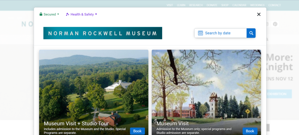
The user is initially tasked with purchasing tickets for one week from the current day to visit the museum. She is initially drawn to the ‘Buy Tickets’ call to action in the main navigation menu beneath the title of the page. She is temporarily distracted by another “Buy Tickets” button on the carousel image in the center of the page, but as this is set on a timer to rotate, the link to buy tickets on the carousel image disappeared before she was able to click the link. She resorts to clicking the main “Buy Tickets” button on the navigational menu. It is worth noting that on the mobile version of the website, this menu and button becomes hidden, requiring the user to click the menu toggle in the top right to access the ticketing interface.
The user then selects the museum visit option from the pop-up booking window, after some time spent determining the proper link to click. The user notes that this interface is very resource intensive for her laptop, causing it to slow down her computer and web browser.
The date selection page in the ticketing system
On the date and time selection page for the museum visit the user selects her date but is confused by where to proceed. There is not a clear button highlighted to proceed to purchasing, instead the user scrolls the page looking for a “purchase tickets” option. Eventually she realizes that the only clickable element (besides Covid-19 guidelines and images) is the box beneath the calendar. She clicks the box, and proceeds to the next page.
The ticket type and discount type page in the ticketing system
On this page, the user easily selects one ticket for a college student in the initial ticket options, but she is confused momentarily by an additional drop down for discounts after selecting her initial ticket type. This likely stems from having two separate places to define your discounts, both initially in the top ticket type menu, and a secondary menu for other discounts (such as EBT or local resident discounts). Additionally, on this page she notices a required zip code box and fills it out, stating that “its weird they ask for a zip code when they will get my address”.
She then proceeds to bypass the donation and comments section of the page as they are unnecessary for her purposes. She then states that she is surprised by the addition of a $1 fee for the ticket, and wonders why that isn’t just included in the initial ticket price. She then clicks the add to cart button and proceeds to the checkout page. Upon reaching the checkout page, which contains a relatively standard form for credit card information, she concludes her first task.
Task 2: Researching Internships
The user is now tasked with researching information about internships at the Norman Rockwell Museum, and applying to one if applicable. Her initial response is to quickly scroll to the footer of the home page looking for a link to “careers” or similar. Upon finding nothing along these lines, she returns to the main navigation menu above the banner image. Here she attempts to hover over the menu items looking for something similar to “careers” as before. She then attempts the same process on the secondary menu on the very top of the page. Upon discovering there are no drop-down or hover menus here either she proceeds to choose another location, the “Learn” link in the menu. She reviews this page and determines it does not contain the information she is looking for. She now clicks the “About” menu item, which is the page that contains her desired information.
The main about page
On this page she quickly locates the link to more information on internships in the table of contents. This link brings her to a new page that retains the table of contents from the main “About” page. On this page, she scrolls down past other available positions (including full job descriptions) to find the internship section of the page.
The internships section
She notes that this section doesn’t have any anchor links like the full employment section above does. After scrolling through descriptions of all possible internships (some of which are closed) she finds a short “how to apply” section that applies to all internships.
The how to apply section for internships
At this point she clicks the first bullet point, only to realize that it is an anchor link to where she is already located on the website. She proceeds to read the instructions and download the linked pdf from the button in this section. With an application form secured, and process understood, she has completed this task.
Task 3: Obtaining a Scan
For the third and final task, our user must start the process for obtaining a high-quality scan or print of a piece of art in the Norman Rockwell Museum collection. She is provided with a specific piece, “Santa’s Lap” and told to disregard cost. She correctly navigates to the “research” menu item in the secondary menu at the very top of the page. On this new page she finds “image resources” in the table contents, which is the correct section for image licensing and purchasing information, and clicks the link taking her to a new page.
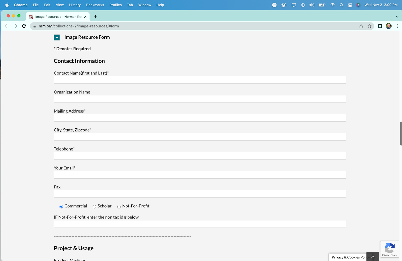
At this point she reads the paragraphs at the top of the page and begins to scroll down to find more information. Here she discovers a button that takes her to the “online image order form” that is an anchor link to further down the page, as shown below.
She begins to read the form section in preparation for completing her task, but notices that they do not mention any prices for obtaining a scan. She begins to scroll back up the page to look for the pricing information in a linked pdf, located just above the anchor link. Upon viewing the pdf she continues to inspect the form for additional elements she might need to provide.
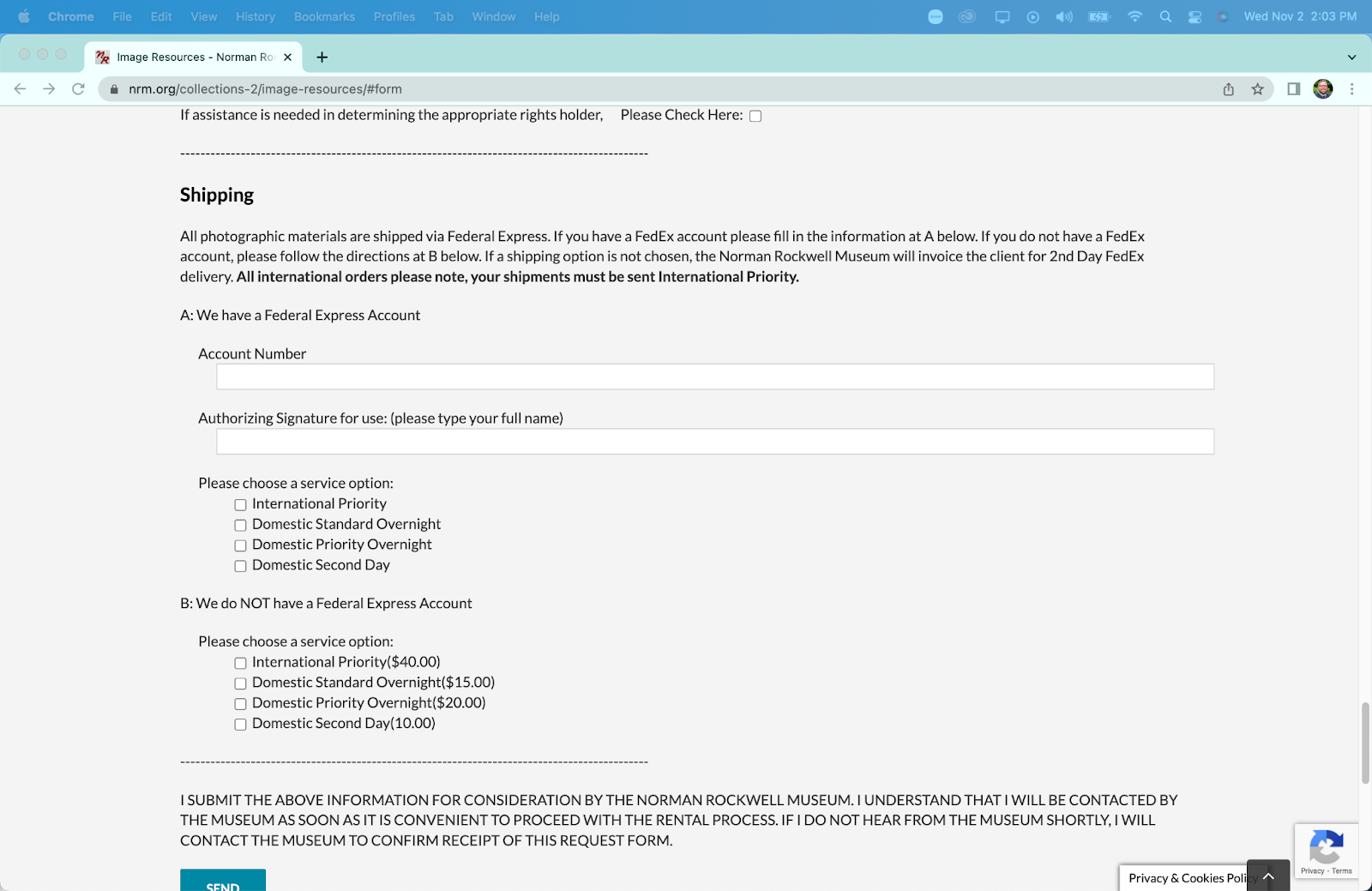
In the shipping section she notes that “it’s weird” that they ask for an account number. Upon further inspection she determines she simply needs to select an option lower in the shipping area to receive standard shipping. She also notes that there is no section for payment information, or to add anything to a cart. This form acts as a “request” form more than an “order” form, necessitating further interaction with museum staff to obtain a print or scan. After determining that she has the information and links required to obtain a scan of a painting, she has completed her third task.
The Recommendations
Upon completion, and reflection on, this representative user test, I can offer XXXX main recommendations to improve the usability of the Norman Rockwell Museum website.
#1 – Consolidate Menus
The museum website has at minimum two navigation menus at all times (up to three if you are on a page with a table of contents). The links often do not match each other in content, despite being titled the same in the menu. The two main menus should be combined to create a unified navigational menu that reduces overlap and increases information scent for the user. Additionally and related, elements of the menu that are more related the organization itself (such as “careers” and “staff directory”) should be placed in the footer of the website, to allow for quick navigation by users actively seeking that specialized information.
#2 – Add Anchor Links
Many pages on the site contain large amounts of information on a page, necessitating a large amount of scrolling by the user, leading them to become lost and fatigued. While creating dynamic pages that display the information requests (such as drop downs for the type of employment you are looking for) would be the optimal solution, a much more cost effective solution would be to enrich informational pages with anchor links. This would allow users to quickly navigate to their desired information, without having to scroll through information they do not need. A list of these anchor links should replace the “Table of Contents” present on many of the pages as that is the standard location for them.
#3 – Better Integrate Image Scanning
The system to request and purchase scans or prints of images is not integrated well into the rest of the website. If one were to find a painting they would like a scan of, they would need to manually copy the information for the painting, navigate to the image order form, and then manually enter the information themselves. This could be made markedly more efficient by creating a link on a link on a painting’s information page to purchase a scan or print that leads to a pre-populated form with the painting’s information. This would allow the website to remove multiple tasks for a user requesting a print, while not necessitating creation of a secondary purchasing system.
#4 – Simplify Ticket Purchasing
The ticket purchasing system and process offers ample opportunity for improvement. As many ticket purchasing systems exist for quick implementation, this section of the site can be streamlined with minimal associated cost. Some specific recommendations for this section are to reduce the process to two pages, one where users select their tickets, dates, and additions, and a second page where they checkout and pay. Beyond being more efficient, reducing the pages removes the issues with the forward/backward navigation in the purchasing system. Additionally, the removal of low frequency ticket options (such as “memberships” and “donation” and specific events) will streamline the process for users, directing them to the two most common ticket types “Museum Visit” and “Museum Visit + Tour”.
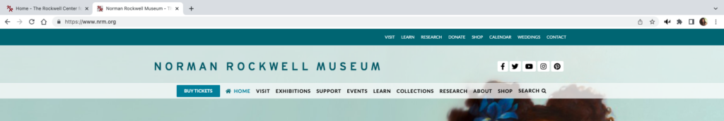
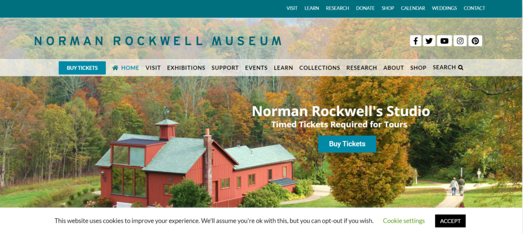
The Norman Rockwell Museum website provides information about the artist, museum exhibits and events, and hosts the museum archive. The homepage has two menu bars, each with some distinct links as well as several overlapping links. The green-blue menu bar at the very top of the page also has dropdown sub menus. The second menu bar is below the museum name banner and social media links. The remainder of the homepage features photographs on a loop.
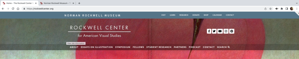
Not all pages within the website have titles or headers, several have menus on the left-hand side where two of the site’s pages have a link to the Rockwell Center for Visual Studies, URL rockwellcenter.org.
The website also has embedded YouTube videos and uses a third-party popup window for ticket sales.
Users
Persona
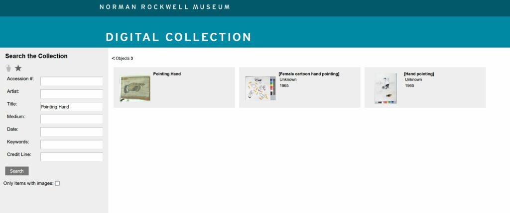
Slightly modified from group assignment so it could be read to the user-testers and to include a starting location for directions: You are an undergraduate art history student at Bay Path University in Longmeadow, Massachusetts. Your are interested in Norman Rockwell’s works since Rockwell was a fellow Massachusetts native. One of your class projects includes Rockwell’s Pointing Hand. You are going to use the NRM website as a source for your project, but you are also interested in visiting the museum over break. Also, you will need an internship before you graduate and you will seek information about opportunities at the museum.
User-testers
The individual user-tester is an 18 year old male high school graduate, June 2022. He is taking a gap year before matriculating at George Mason University, Fall 2023.
The user-tester team consists of a 16 year old female junior high school student and a 23 year old male who recently graduated from the University of Mary Washington with an art history degree and a minor in math.
Testing Methods
Concurrent Think Aloud – This method makes it easy to evaluate the experience of the user: understand participants’ thoughts and elicit real time feedback.
Paired User Testing – an interesting twist on the above that is expected to require less prompting from the moderator.
Test Plan and Tasks
Test Purpose
To determine how quickly and easily an undergraduate student can navigate the website and use it for academic purposes.
Methods
The user characteristic description will be read to user-testers. They will then be asked to describe what information they need from the website in order to confirm their understanding of the scenario.
The test moderator will provide encouragement if frustration levels become a roadblock. If all attempts of the moderator fail, the participant will be given a hint at the discretion of the moderator.
Benchmarks & Metrics
Frustration level of participant and post task user review (subjective); error rates, task completion and time will be measured (qualitative)
Tasks
Plan a visit to the museum including getting directions from the university and purchasing a ticket. This represents a high frequency task for website users since many people who visit a museum website are planning to visit the museum itself. Or conversely, many who want to visit a museum will use the website to plan their visit.
Find out if the museum has any internship opportunities for undergraduate students and details about the internship, including how to apply. This is an important community engagement activity for the museum.
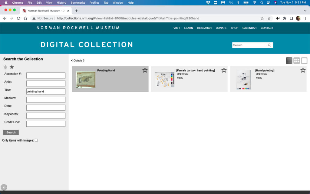
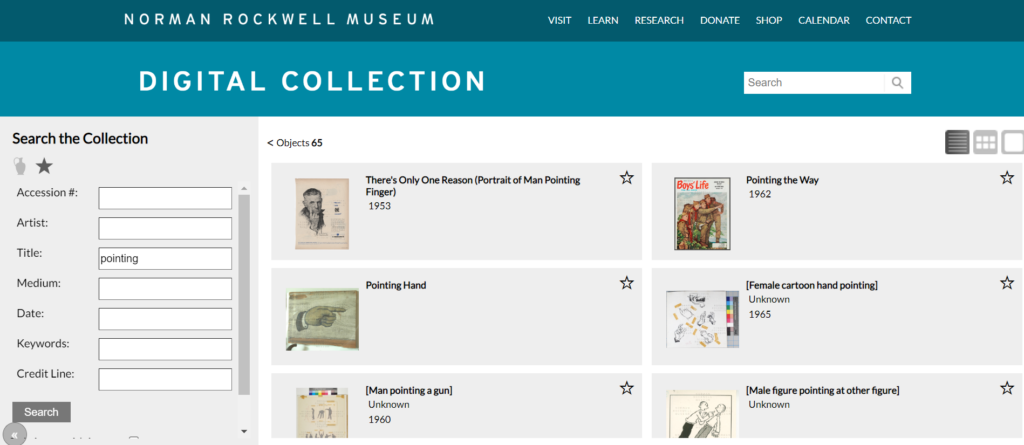
Find a specific work called Pointing Hand in the Norman Rockwell Museum’s digital collections. Finding artwork is a foundational concept for an art museum.
Addendum: Finding Pointing Hand did not present any significant navigational issues for the paired users. So for the individual user-tester, the artwork was changed to New Kids in the Neighborhood and the participant was asked to determine if the website had any narrative information about the work that might be useful in an art history project.
Test Analysis
Paired User Test (PU) – all three tasks were completed in less than ten minutes with no real navigation difficulties.
Think Aloud User Test (TA) – All tasks were completed in 11 minutes. There was difficulty in searching for information about the artwork and confusion with navigating between the NRM site and the Rockwell Center.org site (RC).
Benchmarks & Metrics
Finding Artwork
Planning Visit1
Internships
Task Completion
yes2
yes
yes
Time minute:second
Paired 2:15 Think Aloud 2:40
Paired 33 Think Aloud 5:49
Paired 4 Think Aloud 2:25
Error Rate
All testers tried the main search bar before going to “Collections”→”Search the Collection”
Paired – none; used “Visit” link TA – none
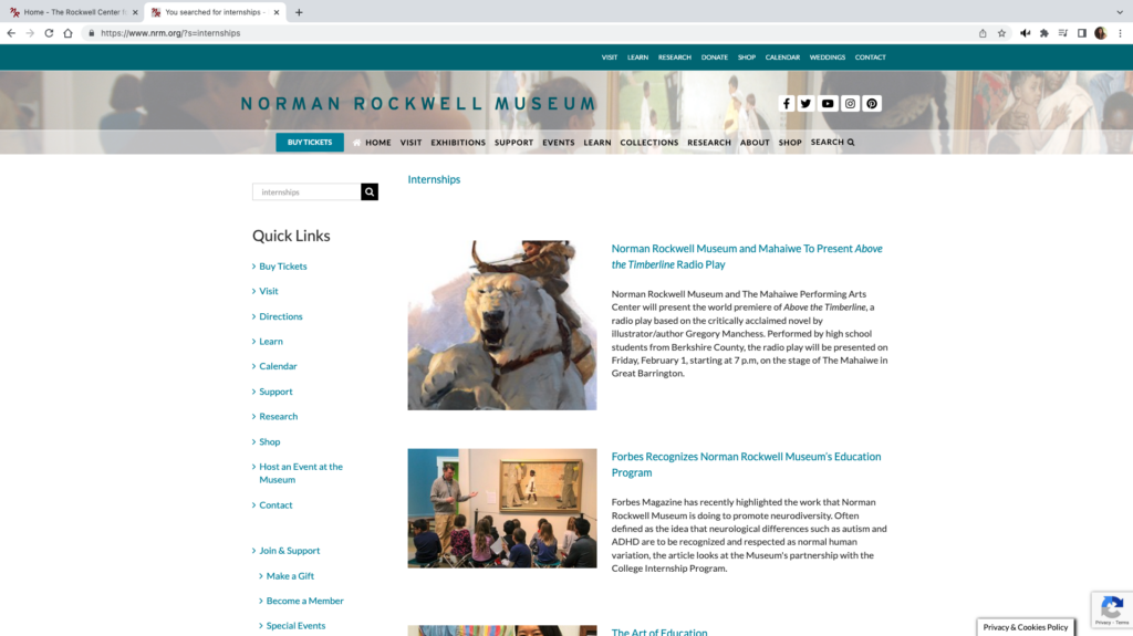
Paired – none; typed “internships” in search bar
Frustration Level
none
TA – confusion surrounding the need to choose a date before proceeding to checkout
TA – confusion between nrm.org and rockwellcenter.org
1. Both users declined to get directions from the website saying they would use google maps on their phones; they were able to display the website on their phones during the time of the test. 2. TA tester did not complete the subtask of finding narrative information about the artwork. He did not recognize a blog post which could be used in an art history project. This post was displayed when the tester searched “New Kids in the Neighborhood” in the main search bar, but the link for the post was between a grade K-5 lesson plan and two past museum events. 3. PU testers also briefly looked at the current exhibits advertised on the homepage while planning their visit.
User Review
The collection artworks are displayed in what I will describe as an archival view. None of the user-testers liked this display, nor the interactivity of the page. Works are displayed in shadowed boxes which highlight when the cursor hovers over them.
However, the cursor had to be directly over the image to display an enlarged version of the image, likewise the cursor had to be directly over the title of the work to display metadata for the work. None of the users found the metadata informative. They all expected to find narrative commentary displayed with the artwork image or for links to that information to be provided with the image.
Users also found it inconvenient that the archive page had no back function. The users expected a left pointing bracket (<) that is above the images to act as a back arrow, but it has no functionality. Both users used browser back arrows from here even though the NRM name at the top acts as a homepage return.
When TA was searching for narrative commentary about New Kids on the Block, he got led to the Rockwell Center for Visual Arts. This has a different URL, it has the RC name in place of the NRM name, and a new menu bar, however there are enough similarities that tester was unaware that he was at a different website. The browser tabs for both sites contain red “NR” and both sites have the same menu bar at the very top of the page, although there is a slight color difference from blue-green to gray-blue.
Neither set of users found the popup window used when purchasing tickets bothersome. The 23 year old in the PU group opined that it might be a more secure site to enter his credit card information. And the PU testers happily noted the Trip Advisor ratings on the popup site.
Design Recommendations
Violation
Improvement
Heuristic 1
– Use popup message when moving from nrm.org to rockwellcenter.org
Heuristic 2
– Add a breadcrumb trail to the top of each page – Enlarge the very top blue-green-gray menu bar. – Keep the top menu bar pinned throughout both websites. – Highlight the “Internships” link by adding a colored field to improve visibility and recognition that it is a button.
Heuristic 3
– Add a title or header to the top of each page
Discussion
Redesigning how images of artwork are displayed is only realistic if NRM wants to do a major overhaul of their site, however there are some smaller improvements that will improve the navigability of the site.
Based on Nielsen’s first heuristic, visibility of system status, the user should clearly know when they are moving from nrm.org to rockwellcenter.org. A simple popup message that the user is leaving the original website would work. Additionally, clear instructions should be given within the popup window that the user needs to first choose a visit date before proceeding to checkout.
User control and freedom, heuristic #3, states that links should be easily discoverable, especially back and cancel. NRM website should add a “bread crumb” trail so that users know where they are in the website, improving their ability to make decisions about which link to use next. The website has two menu bars at the top of the page, a blue-green bar at the very top, and semi-transparent one under the website name. This stays consistent between nrm.org and rockwellcenter.org with the exception of the slight color change in the top bar. Enlarging this top bar and pinning it so that it does not disappear with scrolling will also improve navigation. Also, the search for internship opportunities would be easier if the “internships” link at the top of the webpage included a colored field that changed color so that it is more obviously a link and not merely a heading.
Find the “Internship” link
Finally, in accordance with the fourth heuristic of maintaining consistency with other websites, each page should contain a header so the user understands where they have landed and what content is found on that page. This would help others from feeling like they are looking at “another page with a bunch of random articles” as the think aloud user-tester described one page.
The Norman Rockwell Museum teaches and maintains the legacy of Norman Rockwell. Its website, nrm.org, is used by the museum for outreach, education and advertising. The site is heavily saturated with information regarding Rockwell art collections, related events, ways to visit the museum, and how to financially support the museum. The museum was founded in 1969 and resides in Stockbridge, Massachusetts. It’s home to the world’s largest collection of original Rockwell art.
Nrm.org Homepage
The User
The user is a father in his early thirties with a career in digital media production. While the user’s occupation is creative in nature, the user does not typically delve into classical arts. The user desires to visit the Norman Rockwell Museum for the first time with his two children and wife in an attempt to familiarize himself with traditional art. The user lives out of state from the museum and plans on flying.
The Method
The chosen method for studying the user’s behavior is the Think Aloud method. The user has stated that he normally thinks aloud in his everyday life, thus the user should feel comfortable participating in this method. The user has been advised not to filter their statements, but instead say what comes to their mind first. The moderator will attempt to keep questions and interruptions to a minimum so as to minimize their influence on the user’s experience.
Assigned Tasks
The first task is to figure out travel logistics. Our user will be flying into the nearest airport. He will have to figure out how to drive his rental car to the museum from the airport. The second task is to purchase a ticket to the museum. The user will navigate the interface in hopes of buying a ticket to visit on their selected date. The third task is for the user to find a specific work called “Pointing Hand” in the Norman Rockwell Museum’s digital collections. The user has a friend who is a fan of Normal Rockwell’s “Pointing Hand” and has suggested the user see it in person while they’re there.
The first and second task have been refined, as it was more geared to a student. It involved research on an assignment for school, however our new user is out of school. They wouldn’t have academic motivations.
Analysis of the User’s Interactions with Nrm.org
Task 1: Determine Travel Logistics
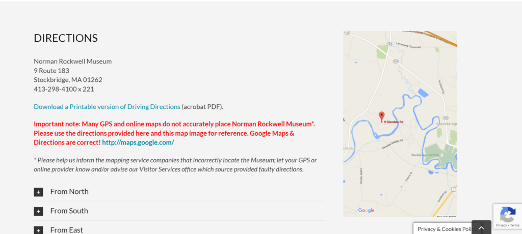
The user’s first reactions to the website were positive. The layout and quantity of content made the user feel “interested” and “confident.” For their first task, the user noticed two main menus, both containing the option “Visit”. Not sure of which one to pick, the user selected the option in the top menu, as it responded with a drop-down menu containing specific options. The user selected “Directions”. After selecting directions, the website automatically scrolled down to a section of the page. This was alarming for the user. It was unexpected that the website would exhibit this random bit of autonomy after displaying none thus far. Once in the directions section, the user chuckled. This is because the webpage advised the user to “notify their GPS provider” if the directions provided by the provider were wrong. They also provided some written instructions on how to get to the museum from the four major directions. The user typically uses Google Maps, so he eventually clicked on the displayed map.
Directions Section and Google Maps
This linked him to Google maps where he was able to input the nearest airport name (Pittsfield Municipal Airport) and obtain directions from Google. He was also able to determine that the museum has parking from Google maps, but was not able to find out if the museum charged for parking.
Task 1: Analysis
The user experienced problems on the homepage, the Visit page, and the directions section. The website displayed two menus with the same option, performed minor automatic functions after setting the different precedent, and displayed confusing information about GPS providers next to useful information. Ultimately, these flaws cost the user time and mental stamina.
Task 2: Buy a Ticket to Visit the Museum
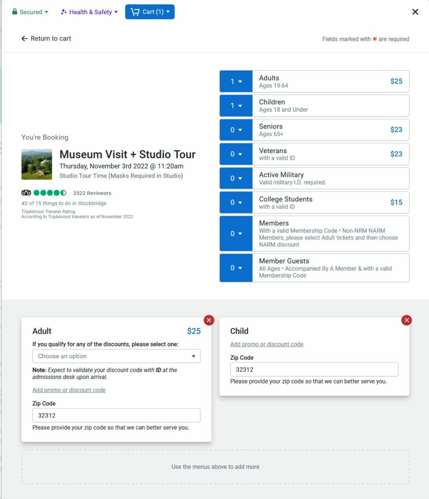
The user located the “Buy Tickets” button easily. It is the first option you see on the homepage and it is in the header of every page. After clicking, the user was met with a pop-up like window displaying a different UI then what they have become accustomed to. The user stated they felt somewhat “skeptical”. The purchasing options were plentiful. The user commented that the photos being used to advertise each option were taking up a lot of space in the window. The user did not like having to scroll to only select from six basic options. The user chose Museum + Studio Tour on a date three days from today at 11:20am. The user took more time than predicted. The user commented that he wanted to make sure he was selecting the right kind of tickets for him, his wife, and children because the drop-down fields were very nondescript. The labels of the fields weren’t as obvious.
Tripadvisor Ticket Purchasing Widget, All Tickets Selected
Beneath the drop-down ticket selection area, there is a section to input discounts for the tickets selected. The user thought that he had to click the bright red X at the top of each window to decline the discounts, as no discounts applied to his family. Unfortunately, this removed the tickets completely. It even changed the value in the drop-down menu above. The user had to repeat the process. The user was allowed to move on to the next section to complete the payment.
Discount input affecting ticket Selection
Task 2: Analysis
The inconsistent UIs created uncertainty in the user, thus increasing the risk of deterring the user from engaging with the museum at all. But perhaps the most egregious UI flaw was the overabundance of ticket amount input fields. This third-party, ticket purchasing widget from Tripadvisor increases the risk of the user purchasing the wrong number of tickets because it offers multiple, different ways of purchasing and removing tickets. Not only that, but it combines this function with other functions. Why even have the red X to remove a ticket on the discount input function? This flawed UI is possibly the result of Tripadvisor attempting to create a one-size fits all widget for their clients.
Task 3: Finding “Pointing Hand”
The users first instinct was to use the search function in the top right corner of the homepage. This yielded one unrelated result. The user went back to the homepage to start over. The user decided to visit the “Research” page stating “I considered this to be my best bet because “Research” is broad and implies information and data and it’s most likely for art information, not the museum itself. The other options are more for the museum itself or merchandise.”
Unsuccessful Search
The user scrolled around and stumbled upon a large button displaying “SEARCH THE COLLECTION”. Based on his last experience, the user was incredulous, but still clicked the new search button. This led to a more robust search page where the user can input many more search terms. This page seemed more “deliberate” to the user.
SEARCH THE COLLECTION
The user typed “Pointing Hand” into the “Title” search field and the results yielded the correct painting.
Successful Search
Task 3: Analysis
It’s concerning that the art museum’s website search function on the homepage completely failed to find a standard painting. It also makes no sense that it wouldn’t simply link to whatever search page the user found on the “Research” page. The function on the homepage seems to produce articles related to the museum and museum’s events. This is misleading and it shouldn’t neglect the users looking for information related to the actual art at the museum.
Design Recommendations
Referring to Task 1, it’s advised that the information about inaccurate GPS provider data be completely removed. It’s confusing to the user, it’s distracting from the useful information (the map), and it demonstrates a misunderstanding of the relationship between GPS and internet service providers.
Referring to Task 2, it’s advised that nrm.org institute its own ticket purchasing feature to maintain consistency and to employ something more suited to their individuality and services. It’s clear that the Tripadvisor widget is designed to be a one-size-fits-all widget. While it seemingly allows for some customization, it’s leagues away from a proprietary purchasing widget or page specifically designed for the museum. At the very least, Tripadvisor should remove the excess information from the widget. The widget doesn’t need a giant photo for each purchasable item, it doesn’t need multiple ways to remove a ticket, it should reorganize the discount input fields, and it should modernize its layout. Currently, it’s reminiscent of a health provider’s new patient information form. It’s just a long list of input fields.
Referring to Task 3, there should only be one search function or page. All search features need to be combined. At the very least, when using the search function on the home page, one of the results yielded should be the search page for art work. Alternatively, a notification about the other search functions/pages should be displayed. It was pure happenstance that the user found the correct search page.
The site that will evaluated is the one for the Norman Rockwell Museum (https://www.nrm.org/). This website hosts information about the Norman Rockwell Museum located in Stockbridge, Massachusetts. This includes information about its hours, collection, location, events, careers, etc. Also, through this website, a person is able to do many things such as buy a ticket and view their digital collections. The evaluation that will follow will be completed through the observation of an example user participant as they complete a set of tasks within this website.
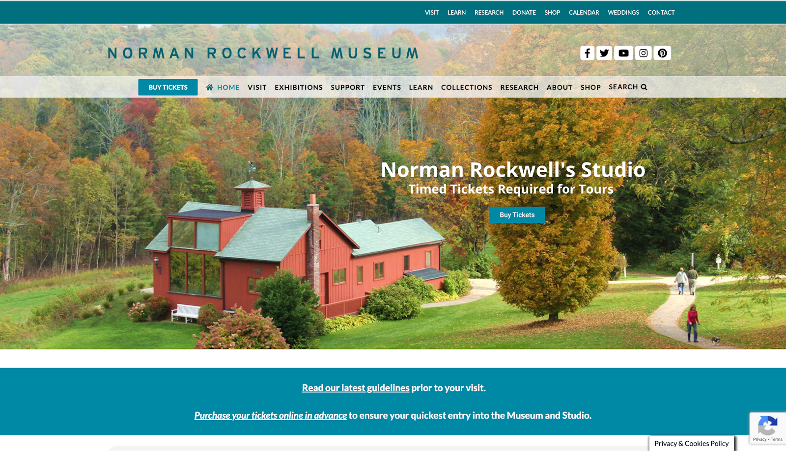
Figure 1. Screenshot of the Norman Rockwell Museum’s homepage located at https://www.nrm.org/
Participant Description
The participant that had been chosen for this evaluation is a middle-aged adult man with high education level. He does not have a background in information architecture/usability analysis, and he also does not have a background in museum studies or studies pertaining to art; however, he has a high proficiency in technology which may have proven to be a confounding variable due to his ability to easily navigate many websites and use various technologies.
User Testing Method
The method that was employed for this evaluation was the Think Aloud method. The participant was instructed to narrate his thoughts at each step while completing the tasks given for website evaluation. Notes were taken during observation to capture the results observed and to write down any notable statements that the participant said during the evaluation as quotes. This method was chosen for its insight into what a user might think while going through a website with the goal of using this information to understand what effect a flaw might have on a user’s thought process and why this thought process may have occurred, potentially causing difficulties in using this website.
Tasks Assigned
The tasks assigned to the participant were to find out how to buy a ticket for the Norman Rockwell Museum and to find directions to the museum itself, find out if there were any internship opportunities and find the description for all potential internship opportunities, and find the work, “Pointing Hand,” in the Norman Rockwell Museum’s digital collection archive. Overall, these tasks remained the same from their previous proposal conceived in a group setting. However, there were minor changes in the second part of the second task; instead of finding the description for a single internship opportunity, the task then became to find the description for all internship opportunities instead of an open one offered at the Norman Rockwell Museum. This is because there were no internships open at the time of the website evaluation.
Observations and Analysis
Task one: Find out how to buy a ticket and find directions to the museum
The participant started the first part of task one, finding out how to buy a ticket, by immediately going to the blue “Buy Tickets” button on the lower menu banner on the homepage of this website with a statement about how it was easy to find and eye-catching. This is most likely because it seems to stand out among the other buttons along that banner as the only button in a blue box.
Figure 2. Screenshot of the pop-up box when clicking on the “Buy Tickets” link in the bottom menu
After the pop-up box opened, he made a statement about wanting to know the difference in prices between a membership to the museum and a single ticket. After clicking on the “Museum Visit + Studio Tour” option, he looked through the information before finding his way back to the main page without any issue through the button shaped like a house on the top left of the pop-up. This symbol is fairly ubiquitous as the button to go to the main page of an application, so he had assumed correctly that clicking on that button would lead him back the way he came as he said. After this series of events, he made a statement about how the website is very easy to use and that he appreciated the fact that it was “actually a pretty comprehensive website” due to the ease at which he was able to go through the website and the amount of information he could find on it. He compared prices for two minutes before selecting the “Museum Visit + Studio Tour” button, scrolling down, and selecting the ticket option for 1:00PM. There was no hesitation during these last few actions, and he did not make any indication that the interface had caused him any confusion because the website was not difficult at all for him to navigate. After this part, he made a statement that the website was “user friendly” and that each option was “easy to find and stands out” with useful lists of options and pertinent information.
Figure 3. Screenshot of the “Museum Visit + Studio Tour” page within the pop-up that allows a user to buy tickets to the museum
For the second part, finding directions to the museum, he went directly to the directly to the top menu, hovered over the “Visit” option and selected “Directions” without any issue to get directly to this section (https://www.nrm.org/visit/#directions). Because the bottom menu did not have dropdowns and the top menu did, he found it easier to figure out the fastest way to get where he needed through the more specific options in the dropdowns in the top menu versus the single links in the bottom menu. Therefore, the dropdowns provided in the homepage were able to lend themselves to the participant’s ease of use regarding the website. From there, the page stated all directional information, and the task was completed. He made statements about how he was impressed with how comprehensive the website was and how user-friendly it seemed because of how easily he was able to complete this first task. Overall, this task took the participant less than four minutes to complete from start to finish due to how the participant was able to locate and understand what he was looking for quickly through a usable interface.
Figure 4. Screenshot of the “Directions” section of the “Visit” page on the Norman Rockwell Museum’s website (https://www.nrm.org/visit/#directions)
Task two: Find out if there were any internship opportunities and find the description of all internship opportunities
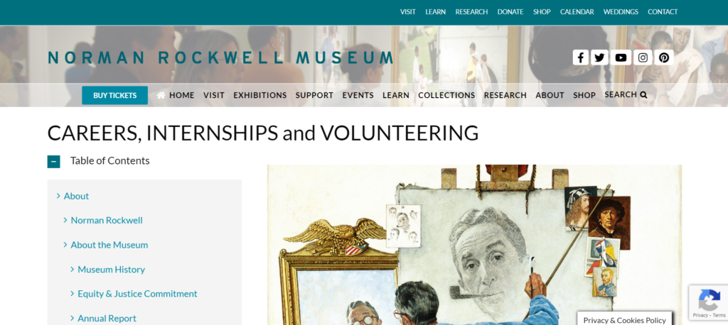
For task two, the participant, now back to the homepage, also went directly to the top menu to look through each drop-down list. Because he had already observed what was within that menu, it did not take long for him to figure out where to go. From the “Contact” drop-down menu, he went to the “Careers, Internships and Volunteering” page (https://www.nrm.org/about/employment/).
Figure 5. Screenshot of the “Careers, Internships and Volunteering” page of the Norman Rockwell Museum’s website (https://www.nrm.org/about/employment/)
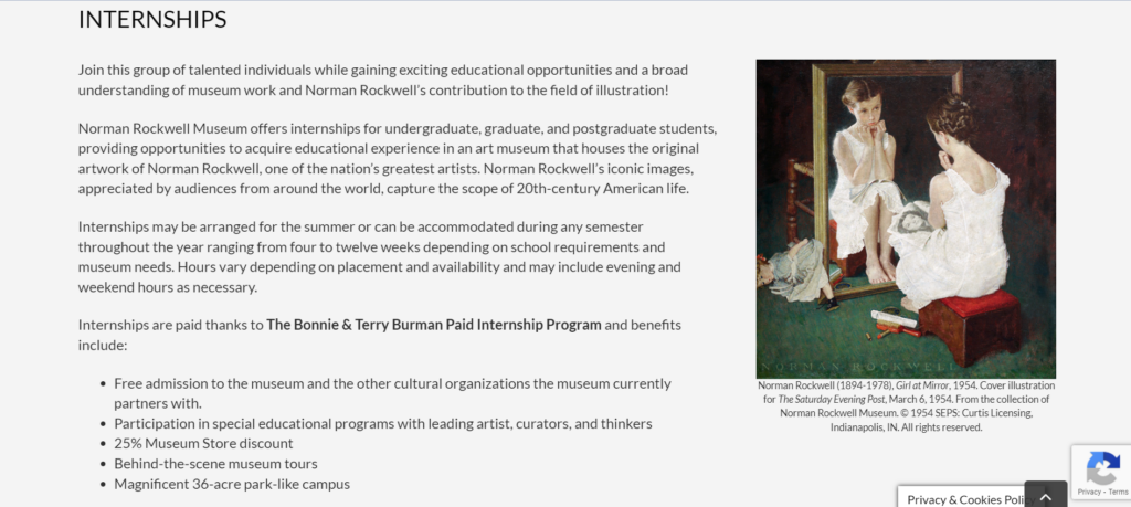
Due to the length of the page, he got confused for a moment regarding where to go next before realizing he needed to scroll down. He did not find it difficult to understand that he needed to scroll down instead of clicking on a link as he instinctively knew that he should scroll down first. Then he encountered the internships and their description, figuring out how to apply to them as well within a minute. The statements that he made were regarding a wish that there was a link on the left-hand menu that jumped down to where he needed to go, remarking that it was an “awful long way to scroll.” However, again he remarked about how the website was “very easy [to use] and user friendly.”
Figure 6. Beginning of the “Internships” section of the “Careers, Internships and Volunteering” page of the Norman Rockwell Museum’s website (https://www.nrm.org/about/employment/)
Task three: Find the work, “Pointing Hand,” in the digital collection
After going back to the homepage again, he used the search feature to locate this work. However, he only found an article from this page because the search feature on the homepage did not include the digital collection of the Norman Rockwell Museum within the pool of information that it includes in its search.
Figure 7. Results of searching for “pointing hand” in the main search box found in the bottom menu
After looking through the article for a moment because he thought that there might be a link in there, he was able to locate a link labelled “Collections” that took him to the digital collections page (http://collections.nrm.org/#browse=enarratives.1). His eyes immediately caught the search feature and was able to use it without issue. However, because the search feature did not turn up the requested work when searching for the phrase “pointing hand” in the title search field, the participant was confused for a minute, wondering whether he got the name wrong, but once he searched for the word “pointing” he was able to find it immediately. He made a statement regarding how it was odd that the search function did not turn up the work when searching for its full title, but it turned it up when searching for a portion of it.
Figure 8. Results for only searching for “pointing” in the title part of the search function within the digital collection for the Norman Rockwell Museum
Possible Design Recommendations
Overall, all of the tasks together took the participant less than ten minutes to complete in full. The participant felt that the website was a “pretty good website, easy to navigate [and] easy to figure out.” Because the website seems to be a fairly usable website, there are not many design recommendations to fix the flaws the website has, but there are still some things that can be proposed to fix aspects of its design. Firstly, making each page either less long and difficult to scroll through or adding obvious links to parts of long pages might increase the usability of the website by making it easier for a user to locate the information they are looking for. Also, it is important to consider the search function. It does not state that the general search function does not also search the digital collection, so it is recommended that a link be provided within this feature that takes the user to the digital collection instead to prevent the confusion that stems from the results not being of the nature the user may have expected. Furthermore, the search function may need to be fixed on an internal level. Because it does not always turn up what it needs to, this may be a coding issue that creates a bug in the system. Fixing this may allow for greater ease in searching by making it so that the terms the user searches for are accurately used. In all, this website is a fairly good, usable website without too many glaring issues in its construction.
We have chosen the Norman Rockwell Museum to analyze for the rest of the course (https://www.nrm.org/). We chose this site because of the many issues we noticed, hoping to figure out possible suggestions as to how to fix it. After looking at the website as a group, we decided to focus on the sections that include its collection/research resources, open careers, and exhibits. All of these sections have issues and usability violations of varying degrees, and we believe that it would be helpful to look at sections with clear usability issues to deepen our understanding about the class material as well as help us understand how to apply what we’ve learned to real life.
User Profile/Persona
The type of people who would potentially use this website are those who are interested in the museum’s collections, interested in going to visit the museum, interested in going to the museum’s events, and/or interested in donating/giving back to the museum. In order to analyze this website through the lens of someone who fits these criteria, we have developed a persona. After deliberation, we created a persona that is an art history student potentially interested in getting an internship at this museum.
Scenario
We developed a scenario to help guide us in figuring out how our persona might interact with this website. Based on both the general persona we created and the overall type of people who visit this website, the scenario we created for our persona is:
Cameron is an undergraduate art history student at a local university. They became interested in Normal Rockwell’s works after attending a class that included these works. Cameron looked online to try and find more of these works, and ended up stumbling upon the Norman Rockwell Museum’s website. After looking around, they are interested in visiting the museum and, as they need an internship before they graduate from their program, would love to also intern at this museum as well. However, they are having some trouble navigating this museum’s website.
Through the use of this scenario, we are then able to develop tasks that a person like our persona, Cameron, would complete on this website. We expect Cameron to initially make use of the common search function on the main page of the site to find out more information on a certain collection. We also expect Cameron to navigate the third-party purchasing widget in hopes of purchasing their ticket. In performing these tasks, Cameron will have to explore alternative methods of accomplishing their tasks.
Developed Tasks
For the future user tests that we will be completing individually, we have developed three tasks for our test users. The first task is to plan a visit to the museum by finding out how to buy a ticket and how to get to the museum. This is the most likely task a person going to this website might complete as many people who visit a website for a museum are looking to visit the museum itself as well. The second task is to find out if any internship opportunities are open and the details about the internship as well as someone like Cameron would look for career opportunities in this way. The third task is for the user to find a specific work called “Pointing Hand” in the Norman Rockwell Museum’s digital collections. A student like Cameron might hope to learn more about the museum, how an internship at the NRM can benefit their career, and if “Pointing Hand” would be a good candidate to do an assignment on. Therefore, using these types of tasks in our user tests might show us how someone might actually use the website.
The Norman Rockwell Museum teaches and maintains the legacy of Norman Rockwell. Its website, nrm.org, is used by the museum for outreach, education and advertising. The site is heavily saturated with information regarding Rockwell art collections, related events, ways to visit the museum, and how to financially support the museum.
This is the top portion of nrm.org’s homepage.
The Scenario
To best evaluate the usability heuristics of nrm.org, one should examine the site through the lens of a potential patron. Hypothetically, this patron has enjoyed the work of Rockwell and has finally decided to reciprocate. This patron has found nrm.org and discovered many avenues in which to financially support the museum and maintain Rockwell’s legacy. However, the patron has come across several violations of usability heuristics while exploring the best and most satisfying way to support the Norman Rockwell Museum (NRM). Several avenues of financial support were tested and conclusions were drawn regarding the most ideal way of patronizing the NRM.
First, there’s the standard philanthropic route of providing a simple donation. Second, the patron can simply purchase a tour and act as a standard consumer of the NRM services. This way, they are contributing to the profits of the NRM. Not only does this help to maintain the legacy, but presumably expand the NRM’s outreach capabilities.
By exploring these pathways of patronization, one can detect and analyze nrm.org’s violations of the usability heuristics as described by Jakob Nielsen in 10 Usability Heuristics for User Interface Design.
Analysis of Usability Flaws
Nrm.org excels at being a source of information. However, in violation of heuristic #8, it overwhelms its homepage and secondary webpages with said information. It’s trying to balance executing its prime directive of being an abundant source of scholarly information with being a marketing tool. As a patron, this made it time-consuming to make a donation because the donation functions were not obvious. The most obvious way to support the NRM via standard donation is to click the “support” tab in the header’s menu on the homepage. However, this violates heuristic #2, as the term “support” is not necessarily synonyms with “donate”. To elaborate, “support” commonly implies technical assistance, and is not an intuitive way to imply patronization. This experienced difficulty is compounded by the fact that there are two main menus on the homepage. The one on top does in fact say “donate”. Nrm.org has chosen to display two main menus, both containing similar options while also using different names for those options. This further violates heuristic #8 but also violates heuristic #4. While both menu tabs will take the patron to the same place, it is inconsistent and may further encourage the user to see “support” as meaning technical assistance.
There is a menu in the top-right and the center of the homepage.
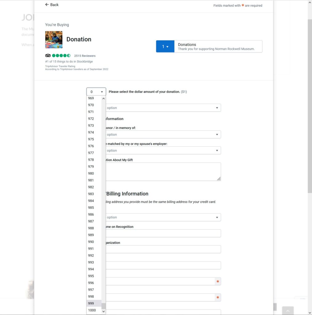
Once in the donations page, I am able to input my desired amount of donation. However, instead of simply being able to type my desired amount, I have to select a number under 1001 from a drop-down menu. So if the patron wants to donate $1000, they would have to scroll down for a very long time. This is a violation of heuristic #7, as it costs the user more time to donate. While this is not an egregious violation, it stands to reason that this also a violation of heuristic #3. Being restricted to this drop-down function limits the user’s freedom by making them use their mouse instead of their keyboard, thus potentially denying the user their preferred peripheral.
This drop-down menu makes the user select an amount instead of typing it in.
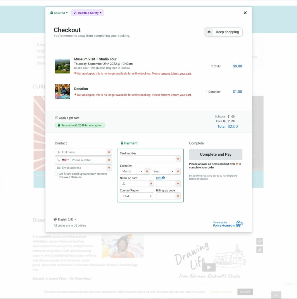
After participating in this less than efficient process, the user will eventually have a donation sitting in their cart. However, if the user decides to make another donation or purchase, they can click a “Keep Shopping” button to add more items to their cart.
The “Keep shopping” button is at the top-right of the window.
Unfortunately, this button takes them back to the beginning of the purchase process for their donation. It does not present any different items that can be added to the user’s cart. This is a violation of heuristic #5 as it creates an error prone condition that can result in the user hitting refresh or hitting the back button, which can bring the user back to the check out window.
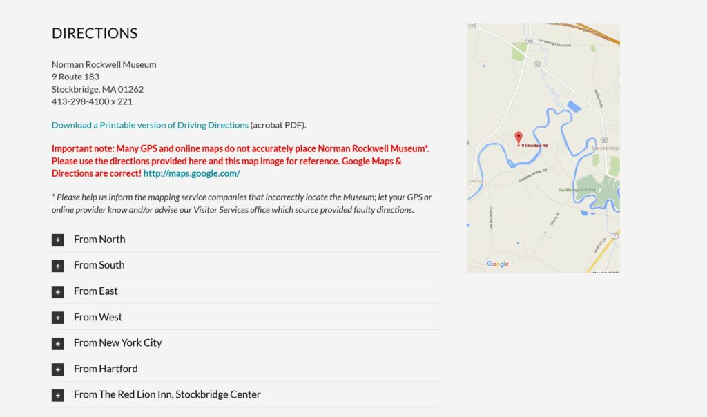
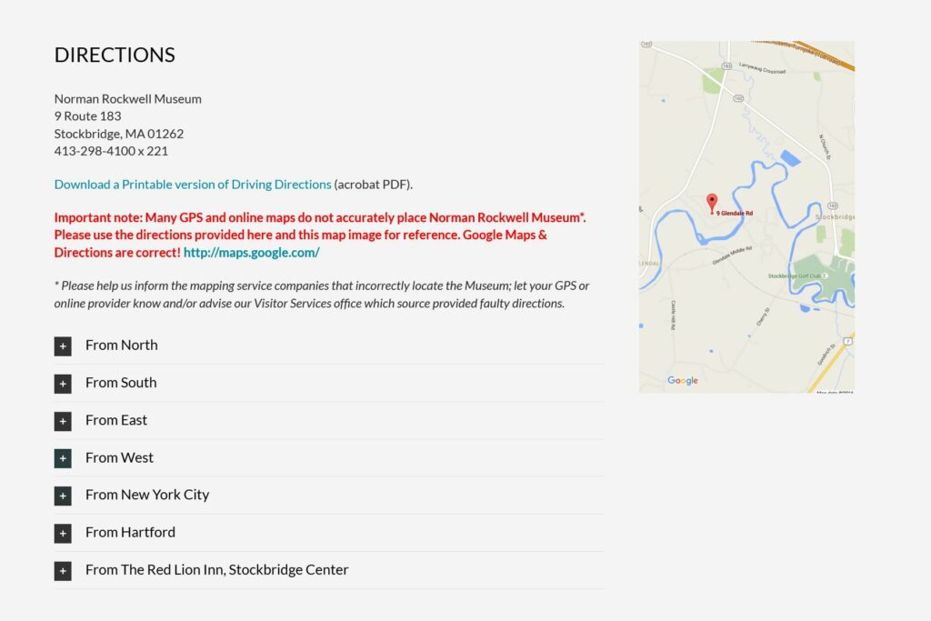
The second way to patronize the NRM is to simply indulge in their services. The profits gained should not only maintain the NRM, but grow it as well. The best way to do this is to purchase a ticket for a tour and physically visit the NRM. This means that the patron will need information regarding directions and business hours. In violation of heuristic #10, NRM provides users with a crude .pdf containing rudimentary text-based instructions on how to get to the museum. The document also supplied a low-resolution and simplified map. For further context, these instructions exist because “many GPS and online maps do not accurately place Norman Rockwell Museum” as noted in the arbitrarily placed “Directions” section of the Visit tab.
The directions on nrm.org.
They go on to encourage patrons to “inform the mapping service companies that incorrectly locate the Museum; let your GPS or online provider know and/or advise our Visitor Services office which source provided faulty directions.” This puts an undue burden on the user and does not provide a suitable solution, resulting in a light violation of heuristic #9.
Design Solutions
The most effective thing that nrm.org can do is triage their information and data, while slimming down to one main menu. This is information deemed tertiary, duplicated across multiple webpages or possibly information that might exhibit diminishing returns like over-advertising. This includes, but is not limited to, redundant information on the same Rockwell collections found across several webpages like “current exhibitions”, collections, events, newsletter sign-up prompts, and menu items that can be consolidated into one. Menu items recommended for consolidation include “About” and “Visit”, “Learn” and “Research”, and “Events” and “Calendar”.
Second, nrm.org should institute a proprietary purchasing feature instead of relying on Trip Advisor’s third-party widget. This would allow them more control, while also maintaining a consistent aesthetic instead of incorporating Trip Advisor’s branding.
Trip Advisor’s branding is inconsistent with the NRM’s.
Third, instead of text-based mediums, using video to explain travel directions would not only demonstrate a tech-savvy aptitude, but allow the user broader perspective and context. This is also keeping in line with heuristic #2 as most people rely on GPS with its emphasis on audiovisual communication.
Last, while the following aren’t hindering patronization, they are worth mentioning in order to improve the overall quality of nrm.org:
The “Shop” hyperlink in the body of several web pages is unresponsive. This is violating heuristic #1. It is recommended that this be remedied in the back-end.
When clicking “Shop” in the main menu, it takes the user to a different URL and opens up a new tab. However, when clicking “Annual Report” it does take the user to a new URL, but it does not open a new tab. It is recommended that this is fixed in the backend.
Before purchasing a ticket, the Trip Advisor widget makes you agree to the policy before it shows the policy to you. It’s recommended that this is fixed in the backend.
The NRM has a lot of video content. However, it is buried at the bottom of several web pages. It is recommended that there be a main tab for it in the homepage menu. This content can also replace some of the text-based content of the same subject matter.
There are some instances where nrm.org uses an embedded YouTube player, but some where it uses another third-party player with limited user controls.
The ad for the NRM newsletter should be at the top, not the middle of webpages.
There is no separation of sections on all the pages. Each webpage has sections of information haphazardly stacked on top of one another. At the least, these should be separated with different colored backgrounds.
The events on the “Events” page should be reoriented. Instead of a top-down order, scrolling left to right should be considered.
If a patron wants to donate to the virtual museum only, the option to do so is buried all the way at the bottom of the home page. There is no option to do so in the “Support” page. It is recommended that the option be included in the Support page.
It is inconsistent that one can buy tickets on nrm.org, but is taken to a different URL, store.nrm.org, if one wants to make a purchase from the online gift shop. The page nrm.org/shop should be created.
The “Visit” page says that Rockwell’s studio opens at 10:40am. Everywhere else on nrm.org it says it opens at 11am. One time should be displayed.
This video player only has pause and play controls.
The gallery was originally the home of Duncan Phillips, art collector and philanthropist. Several additions to the original house were required in order to accommodate the ever growing art collection, now consisting of nearly 6,000 modern and contemporary works.
Evaluation Scenario
I will be using the website to plan art history lessons and a field trip for homeschooled high school students. Generally these lessons consist of studying several works of art by one specific artist, or works created during a specific time period and in a specific place (e.g. several works by Picasso, or works from the Hudson River School). Since it is hoped that through the field trip students will be able to see in person works of arts they have studied in class, I will broaden the parameters for choosing works for this course.
Analysis
The landing page for The Phillips website has two menu bars, a search bar, a ticket link, membership information, and a promotion of a current exhibition. A red banner at the top of the page gives museum hours, ticket information, and an additional link to “Plan Your Visit.”
If you hover your cursor over the main menu bar at the top, a dropdown menu appears which obscures most of the window. (See images above)
The original screen is busy and gives the user pause while trying to digest all of the options available. When the dropdown menu appears with even more options, and at the same time significantly changes the view of the screen, it only adds to the potential for “information overload” or cognitive strain and the potential for confusion. By trying to provide too many choices in the initial view, The Phillips website violates Usability Heuristic #8, Aesthetic and minimalist design.
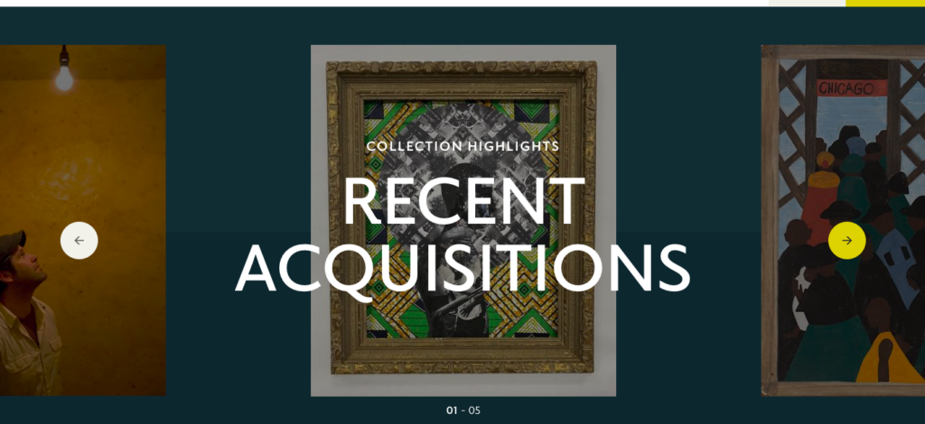
The Recent Acquisitions section found towards the bottom of the homepage is another example of where too much is done in one space, again violating heuristic #8. The work being highlighted is obscured by the text – this is true as you scroll through the entire section.
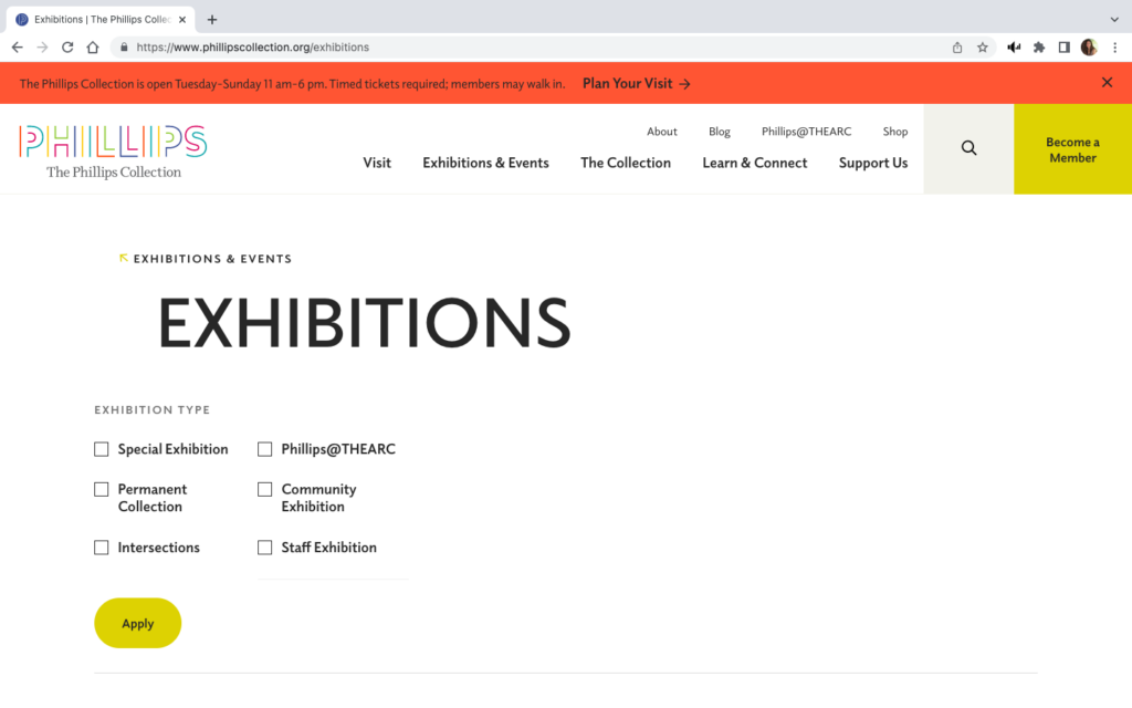
However, it is possible to take minimalism too far. The image to the right shows the landing page when “Current Exhibitions” is selected from the “Exhibitions and Events” dropdown menu on the main page. This landing view feels like the page did not fully load, or is perhaps not formatted correctly for the screen.
Scrolling down does give a view of all current exhibitions, but for a moment the user can feel lost. Also, the breadcrumb trail is barely recognizable since it consists of only the menu category and a small, lightly colored arrow. These difficulties in navigation inhibit the visibility of system status by not making it clear where the user is within the website, violating heuristic #1.
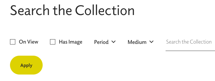
An even more egregious error in keeping users informed about what is going on occurs when trying to search the collection.
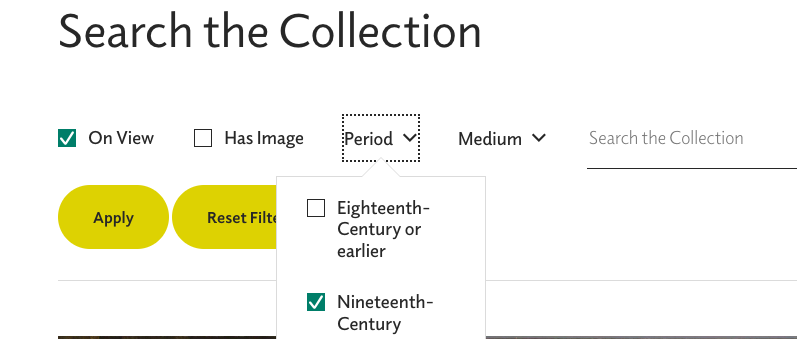
The view above shows the search page prior to any filter applications.
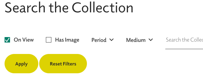
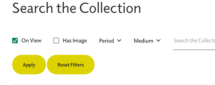
Once a search is selected, the checkbox turns blue with a white checkmark. However, using the “Apply” button only adds a “Reset Filters” button. It does not start a list of applied filters or change the color of the “Apply” button or the selected filter’s checkbox.
Have I, or haven’t I?
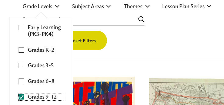
The image above, right, shows selection of the Nineteenth-Century time period and the one on the left shows the view after that filter is added to the “On View” filter. Again, once the “Apply” button is clicked, the user does not have any confirmation of which filters have been applied. (Heuristic #1) This same issue occurs when selecting grades for lesson plans, but there, the dropdown menu for grades obscures the “Apply” button making it even more confusing whether or not the grade filter is applied. (See image below)
“Reset Filters” button is present here before and filters are selected, unlike the “Search the Collection” view. “Grade Levels” obscure the “Apply” button and there no confirmation that the filter has been applied.
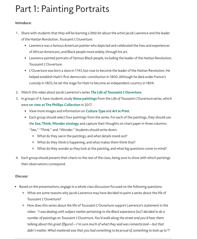
As hoped, the museum did provide robust lesson plans for their collection and special exhibition. Unfortunately, my selection of six works from Nineteenth-Century French artists is not included in the lesson plans, but I will explore the lessons for Jacob Lawrence’s works on Toussaint L’Ouverture since that exhibit’s subject is familiar to the students.
While this is an excellent lesson plan, it is not especially friendly to the user. The text which is blue-green, and may only appear bold to color blind users, are links to other resources. Besides the problem of a color blind user being able to recognize the links, many of the links take the user to outside of the Phillips website. This move is made within the same browser window and without any warning asking the user if they want to proceed to a link outside of the current webpage. At least one of the links, “these paintings” – #3 in the lesson plan, takes the user to a press release issued by another gallery. This press release does not contain any images, which is what I expected to find when I used the link. Jumping to other websites without warning, violates consistency and standards, heuristic #4. Also, since there is no warning that the user will be moved out of the museum website, and therefore away from museum navigation tools, heuristic #1 is again violated. There is not communication or transparency from the website to the user about the consequence of using the links.
Recommendations
As a whole, The Phillips Collection website is attractive, informative, and fairly easy to use. With some minor changes addressing navigation and visibility exploration of the website would be streamlined, making the site more user friendly.
Aesthetic and minimalist design, heuristic #8 improvements
Remove the red banner at the top of the homepage. All the information here is found in the “visit” dropdown menu directly below.
Change the dropdown menus to vertical view only; eliminate the large white box that takes over the entire homepage.
Remove the box insert on the lower right corner of the homepage. Again, tickets are available under the “visit” dropdown.
Move heading for “Recent Acquisitions” to the top of the field
Visibility of system status, heuristic #1 improvements
Reformat all views for filter options: the “Exhibitions” filters should be reduced so they do not take up the entire window. Display filters that have been selected and applied.
Improve the visibility of the breadcrumb trail by putting dark colored arrows, using right to left directions
Consistency and standards, heuristic #4
Changing the breadcrumb trail would also create consistency for users based on experience with other websites’ navigation tools
In the lesson plans, links should open in a separate browser window, and warn the user if the link leads to another website
The Cummer Museum of Art & Gardens is an art museum located in Jacksonville, Florida. The museum was established in the 1950’s when Ninah Cummer gave her humble art collection and home for the creation of a public art museum. Today the museum has grown exponentially to become one of the largest fine art museums in the region, encompassing over 5,000 pieces of art along with a manicured garden.
The Scenario
For my scenario I chose a very simple one, but one that is likely repeated frequently on the site: a potential visitor looking up hours, admission prices, and directions for the museum. As a public museum that is not well known outside of the region this scenario would be undertaken by potential out-of-area visitors, local residents who have heard of the museum but not visited, as well as returning visitors who need to refresh their knowledge of how to visit the museum.
Knowing this, I focused my heuristic valuation on two main aspects: the ease of navigation to necessary information for a visit and how clearly and directly relevant information is presented to the user. While this evaluation does not focus on a specific user, I kept in mind that this scenario is likely very common amongst all demographics of site users.
The Analysis
As our user is likely to do, this analysis begins on the home page where we find the first usability issues with the site. These issues center around heuristic #8: aesthetic and minimalist design. In other words, keeping the interface centered around the information users need and not cluttering the site with extraneous or little used information. If a user was going to visit the Cummer museum, where does one suppose they will click on the homepage? Let’s try the large call -to-action on top of the page…
Call-to-action button at top of Cummer Museum website
Well, it’s unlikely a new visitor would want to become a member without even visiting the museum, so let’s move on to the main navigation menu…
Cummer Museum navigation menu
Again, our scenario has hit another roadblock. While learning more “about” the museum, looking up upcoming “events”, or trying to “donate” are useful links, none are the primary goal of the user in this scenario, which is to visit the museum. Assuming the user chooses to dig further into the “about” menu item, as it is likely to contain their required information, they will discover a submenu on hover…
Cummer Museum hover menu for the “About” page
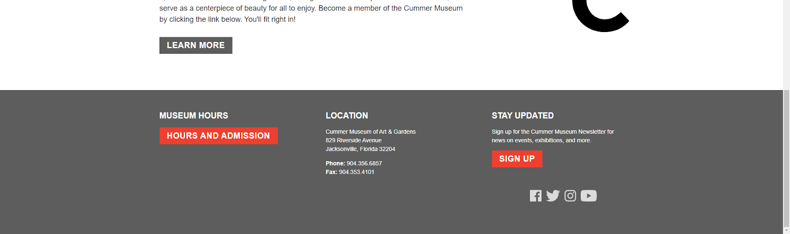
In yet another instance of ignoring heuristic #8: aesthetic and minimalist design, all options are unrelated to the actual act of exploring the museum in person (while not within the scope of this blog post, it is worth noting that nothing on the Cummer Museum website, including this hover menu, supports tab/shift+tab functionality which presents a raft of accessibility issues). After much exploration, and scrolling, the user will eventually find the link for the museum hours and admission prices. In the footer
Footer for the Cummer Museum website
This link opens an external page, unlike all other pages on the website. While this choice still provides the information the user requires in this scenario, it violates the consistency of the website, heuristic #4: consistency and standards, and the ability for the user to quickly and easily reverse their action, heuristic #3: user control and freedom.
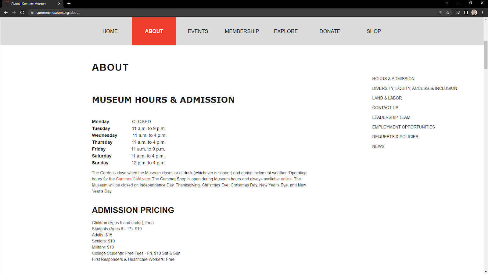
Main “about” page for the Cummer Museum website
This page further strains heuristic #4 by actually being designated the main “about” page on the site, meaning that it is labeled on the main page as both “about” and “hours and admission”. Further, the hover menu as previously referenced does not reflect the contents of the actual “about” page in any meaningful way. Exploring this page, the user will quickly find that they cannot purchase tickets online, but they may still want to know the price for tickets.
Admission pricing section for the Cummer Museum website
In this small section, there are clear issues surrounding heuristic #2: match between the system and the real world. It is operant of the designer to make sure terminology is clear and easily understandable without necessitating additional information seeking. In this section, it begs the question what age qualifies someone as a “senior”? Additionally, what about “students” who are 18-year-old seniors? While a minor infraction, the wording choices cause confusion in a prospective visitor.
At this point in our scenario, our hypothetical user has discovered the hours to the museum, and the cost to admission, as well as the fact that they cannot purchase tickets online. Assuming that they have decided to carry onward with their visit they will need the address to the museum. On this “about” page there are two locations for the address, in the “contact us” section and in the footer. Both require excessive amounts of scrolling. This is due to both the lack of jump links and corresponding menu items, a clear violation of heuristic #7: flexibility and efficiency of use. Without accelerators like jump links, the user is left to scroll through the entire page, analyzing all information until they come upon the required address.
The Recommendations
Overall, the Cummer Museum website needs additional work to improve navigation, providing a clear path to their users’ primary goals. The most direct way to do this is to redesign their navigation menu to better represent the page hierarchy while focusing on the most common user tasks on the website.
Another simple solution to improve usability would be to change the large call-to-action at the top of page from “become a member” to something like “visit us” or “buy tickets”. This way, users can more quickly and directly navigate to their desired information.
It would also pay dividends to bring the address and “hours and admissions” further up the page, instead of in the footer. Again, this will greatly aid users in navigating to their desired information.
And probably one of the most simple solutions would be to change the wording on the ticket prices page. By combining “Students (6-17)” and “College Students” to simply “Students (with valid I.D.)” the users will more easily be able to identify the admission category that reflects their reality.