Users’ thoughts
After completing their tasks, our users gave their input on the Wilderness Coast Public Libraries (WCPL) website design, and from their comments, we gathered the following: The look of the site is jumbled and confusing, and the changes in the background from place to place make it seem like each part of the site was made by someone else. Across all the website’s pages, it is clear that the site was improved from a previous WordPress design to look more appealing with pictures and color, but the information itself is still presented in a poor fashion with large blocks of text, tight bullet point lists, and inappropriate links. There is a massive reliance on bullet point lists too close together, images with no links or explanation, a lack of basic information like hours of operation, and the jarring change of designs between each section of the public library system website. Overall, these smaller issues add up to a larger appearance that leaves the user either dreading large amounts of condensed information or confused about where to search.
Some of the pages should be broken up into separate subsections and incorporate either more graphical designs like pictures of the library or simply a more appealing and larger font. A quote from one of our users on this matter was, “Aerial is the most basic of fonts, and everything is so closely spaced.” The links used in the site should be placed in order of most use. Currently, they place the link to the individual library pages on the home screen off to the left and the survey on the library system at the center of the page even though they should prioritize the needs of the users, not the survey.
Improvement suggestions
The WCPL website is confusing and disorganized, as it is a maze of incomplete web pages for each of the different member libraries. When users enter the website, they should be able to get a basic understanding of how to navigate it. The library website would do much better if the links to the library branches were placed on the main page. This would make it easier for users to know which branch they would like to visit. If users want to find a book, the first thing they should consider is a branch of the library they are using.
WCPL site update
The Wilderness Coast Library System’s shared catalog web page allows a user to view materials offered by the libraries, but the design makes it difficult for users to find the page they want. In each of our individual user tests, our users struggled immediately with how to navigate using the main library system’s landing page, and even when we first chose this site for our project, we knew it left a lot to be desired. In fact, it appears that even the WCPL team noted how frustrating it is for users to navigate through and have thus chosen to begin the process of updating all of the websites. The difference between the two websites can be seen in the images below:
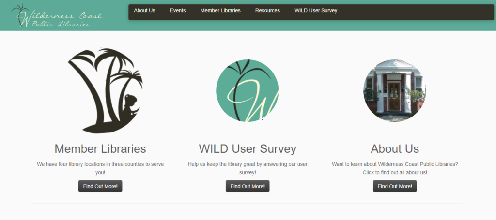
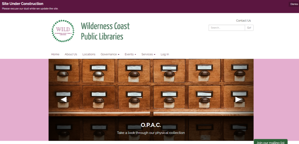
As of right now, that overhaul reflects a more modern design approach, utilizing icons below the scrolling header image to provide context for orienting the viewer and assisting with quick navigation. Interestingly, the color palette has also been updated, changing from the teal blue to a green and pink/purple motif. One of the major changes is one our group has complained about from the start of this project: the inclusion of a Search Bar on the landing page (although it is not quite as optimal as we planned to propose). The other major change that they have made thus far is an updated navigation bar that includes actually useful and descriptive titles (with drop down menus for more specificity).
While the decision for the library to begin making updates in the middle of our examination of their site presents some challenges for us as we move forward in this assignment, it also provides a very exciting opportunity as well—as we go through the iterative design process and propose fixes to the site, we can also check in and see the iterative design process that this specific webpage will undergo in the next few weeks as they make their own changes. We will be able to critique not only our own design choices, but also compare them against what the actual library system chooses to do and from there make new proposals for optimizing navigation. This will enrich our experience as we create our proposed designs, and also help give us some direction/parameters as we reflect on the changes that are pushed out by the library. Not only that, but it will be a fertile opportunity to really emphasize the dialogic nature of the iterative design process, as we provide critique of the changes made and offer solutions that we feel would be more optimal, while also giving us a chance to acknowledge areas that may be updated that we hadn’t thought about or considered in our own perusal of the site.
Group redesign
With all of that said, before Wilderness Coast Public Libraries began actually publishing changes to their website, we came up with some design recommendations focusing specifically on the main landing page of the site. As I mentioned, some of the biggest concerns we flagged as a team were that: 1) the main page should immediately show a user the different libraries and pertinent information regarding each of them, 2) the main page needs an easy-to-find and easy-to-use catalog search bar, 3) the navigation bar needs to be more descriptive, and 4) the user needs to be able to access this information without having to make so many clicks to new pages.
When users first land on the main page of the WCPL system, there is not much to look at. When doing our research up to this point, we all thought the main page could use much work. Mainly, we thought that since the Wilderness County system has multiple branches, and the branches are far apart, the best thing to do would be to have clickable links to each separate library website. Adding the contact information and address under the link would be extra helpful to users to make sure the library they select is the best one for them.
The next biggest issue for the library site is that there was no way to search on the main page. Adding a search bar would be extremely helpful and quicker for users just trying to search the website or the catalog. We added a catalog search bar to the top of the page so that it could be an immediate source of information for library users. The website also had clickable information at the top. Our group thought that adding extra links such as “log in,” “services,” and changing “Resources” to “Resources/Catalog” would be useful.
The search bar that is currently on the catalog page has options to narrow your search to the author, ISBN, subject, title, and more, which is good when searching the catalog. Having more options in regard to the search bar on the main library page would be great for patrons. The edited search bar created gives patrons the option to search the library website, the library catalog, library events, and library databases. Those options give patrons a narrow starting point that they can use to get good use out of the website.
