Website
We chose the Wilderness Coast Library system’s website, and chose to follow up our analysis with an emphasis on one of the 3 different library websites that are affiliated with the Wilderness Coast system, the Jefferson County Public Library website. This website is particularly interesting because it not only includes the main webpage detailing all of the info regarding the different member libraries and links to each one’s individual website (which provides a user, but it also includes a link to the main Catalog that all 4 member libraries utilize.

Persona/User
Our persona was intended to be a high school aged student who had to write an essay about Julius Caesar. Although I could not find a high school student to perform our user test, I was able to ask a college freshman to go through the website and think aloud while they navigated the page. My user had already taken college-level English and research courses, so that is a significant deviation from not only our developed user persona, but also likely from the average user of these websites in general. However, because a college-level research education is based on using a system that is (theoretically) well-made for research at a variety of levels, these sites present enough unique challenges that their intuition would not necessarily work out well for them anyway. My user claims that they are pretty comfortable looking things up on difficult to use websites, since they do that often for their job, but that they aren’t super comfortable with technology in general.
Testing Method
I chose to utilize the Think Aloud protocol, because I knew that my particular user would be comfortable giving immediate feedback as they went through, and that they would happily verbalize them. I think that it is helpful to see what they are doing in the moment and why they think they are doing it/what they think the interface wants them to do. I find it particularly interesting the way that, whilst doing a Think Aloud, people tend to anthropomorphize the interface and ascribe sentience to it (i.e. “it wants me to do XYZ”), which they then verbally react to. I have noticed that this does not happen as much with other types such as Retrospective Probing, and I think this helps us to better understand not just what a user does and why, but also how it makes them feel and why.
User Tasks
I wanted to utilize the tasks as we wrote them, since I felt like it would provide the best flow for a potential user. However, we did also have a short conversation before the test about their experiences with libraries, and spoke about the Library of Things and Seed Libraries that they’ve utilized at their own library, which influenced their user test toward the end. I did not comment on that, since I thought it was a fun addition that a student may likely need to try to find when completing a research paper.
Our tasks were as follows:
Task 1: Using the Library system, the student will locate a relevant book for their research on the death of Julius Caesar, and which library that book is located at.
Task 2 Now knowing what book to look for and what library it is at, the student will look for the available hours of that library that does not overlap with their high school schedule.
Task 3: Find information on the use of computers at the local library to complete their research paper on Julius Caesar’s death. The student will also find out how to print from the library.
User Navigation
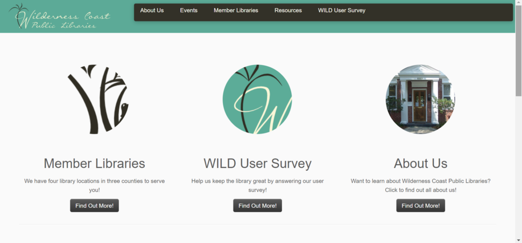
I gave my user a list of the three tasks to complete the project, and then set them up with the main Wilderness Coast Library System website, since that is the first result that comes up on Google. She immediately hovered over each of the three options and could not decide between the Member Libraries option or the About Us option (but immediately said that the Survey seemed pointless). She decided to start with About Us, but as soon as she opened that page she said that it did not seem to be what she was looking for, so switched to the Member Libraries option from the Nav bar. She found the JCPL option and clicked on that tab, and found the carousel image header both unhelpful and nauseating. However, after she was done being annoyed about the carousel, she noted that she was excited to have found the address for the actual library she was looking for.
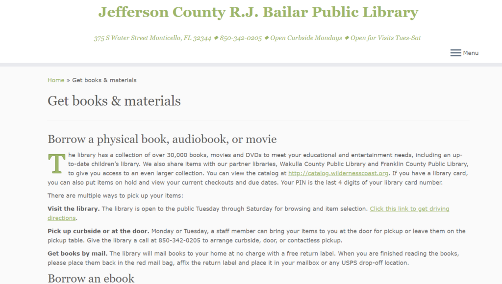
However, even though she knew where to physically go to find books, at this point she knew she needed to find the catalogue so she could actually look for books. Yet again, she was not sure which button to choose between Get Books & Materials and Discover Library Services, but “Get Books” seemed more promising so she went with that. When that page opened, she was looking for a search bar and was confused when she did not see it after scrolling up and down the page. Assuming she had landed on an “About our Services”-style page (since it was so text heavy), so went back to the Home page to get to the Services page. Realizing that it was essentially the same style of info, she clicked the “Get Books & Materials” button on the bottom right of the Services page. She skimmed the bolded headings of this page, seeing the different ways to get a book and noting that there is a way to borrow tech, which she wanted to explore (since she knew that was the third task) but decided not to because she hadn’t found the actual materials she needed to write the paper in the first place. Tucking that info away for later, she continued to search for the search bar that would allow her to find books.

After much clicking around this limited website and growing frustration, she decided to return to the Wilderness Coast landing page to see if she could find a Catalog there. She decided that the Resources item on the Nav Bar felt promising, and selected that. The first two items, WILD Catalog and WILD E-Books, called to her, and she could not decide between the two so she opened them up at new tabs. She immediately got excited by the search bar on the Catalog page, but wanted to check on the E-Books just in case; however, when she saw that they page was basically just a link to a different resource, she closed it out and continued forward with the search bar.
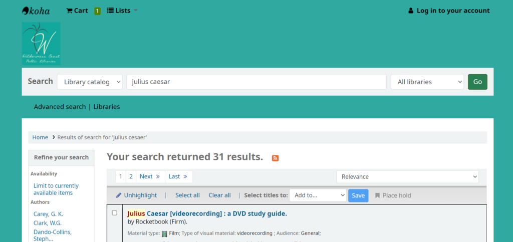
She searched for “Julius Ceasar” and was shocked to only see three results displayed. She decided to expand her search to “Rome” and decided that the 21383 results was too much. She switched to “Roman leaders” and felt that between the three Julius Ceasar books and the 550 Roman leaders resources, she could probably begin crafting a decent essay. She then went back to her search for “Julius Cesaer” and noticed that there were now 31 results instead of 3. She Googled how to spell “Caesar” and came back to the search bar and entered the name in properly, which interestingly enough still yields the 31 results.

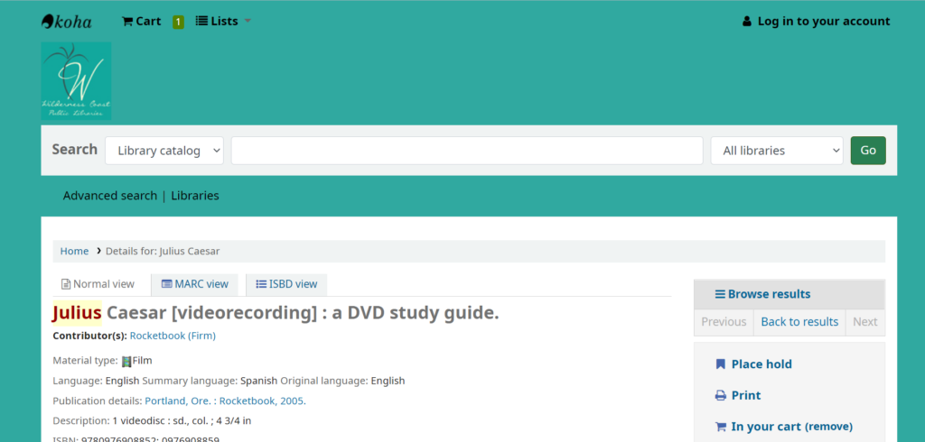
Now that she was able to locate that they had books/videos related to the topic, she checked to see where they were offered. She just went to the first result at the top of her current search page, which was for the Videorecording/DVD study guide. She noted that it showed green at the bottom of the listed that it was available at the JCPL branch, which she was excited about. When she clicked the title to look more into the resource, she saw the menu on the right side of the page and chose Add to Cart…and was confused when nothing appeared to happen. She scrolled up to find the Cart and saw the Log In option, but never located the cart. She clicked the Log In and promptly backed out since she did not have a library card and could not log in. She tried to choose the Place Hold option and also realized that she could not since she did not have a library card.

At this point, the user noted that she needed to find out when the library was open so she could go get the resource (and sign up for a library card). She had thankfully already found the address on the JCPL site, but did not remember seeing anything about the time. She started backing out of the catalog page and ended up backing up until she was stuck on the home page and could not back up anymore. She quickly perused the site and was thankfully able to quickly find the hours for the branch closest to her, but noted that she would not have guessed to look there if she hadn’t been dumped there during her frantic backing out.
She finally decided to go back to the JCPL webpage, and thankfully noticed the hyperlink to the left of the library hours to find the JCPL link. From there she navigated back to where she remembered seeing the Borrow Technology heading, and ended up back on the Catalog by following the Tech2Go link. She realized that she would probably need a library card for that, as well, and figured that was where she should stop.
Design Recommendations
There were a number of issues that my user ran into when navigating this site, which in many ways echoed my own navigation woes and the frustration my group has identified as we’ve worked with this website. These are the biggest stand out issues to me, though, that I think would help navigability immensely.
Main Home Page
For the Wilderness Coast main page, they should forgo the About Us/Survey/Member Libraries buttons and instead have the Member Library websites (with their addresses and hours) as the main landing page. Additionally, either above or below the different member libraries, they should have the Catalog search bar. From there, the Nav Bar can help users find more About Us and Survey info on separate pages (or honestly it could all be one continuous scroll page with clearly defined sections of descending import). Doing this would save so many clicks and so much unnecessary searching.
JCPL Webpage
The JCPL website is simultaneously too much and not enough. The information it does have is overbearing and redundant, with big blocks of text with minimal contrast to help a reader skim through and quickly find what they need. At the same time, the page is incredibly sparse and does not do a good job of guiding the user to the resources they undoubtedly want to access. Again, I think making this one continuous page could be beneficial, but mostly I think the home page should have a clearly labeled link that takes the user straight to the catalog website. Additionally, it would make sense for the home page to include things like their hours and contact information. Finally, since users cannot utilize resources without a library card, the home page should have a clear space defining the procedure of signing up for a library card.