Ginny Morris
Overview of Website:
Website: https://www.goodreads.com
The website I chose for this assignment is Goodreads.com. I read a lot of books and use this website primarily for reading user reviews of books. Goodreads is likely classified as a social networking site because users can view the books their friends are reading and create lists of “the books you’re reading, have read, and want to read” (Goodreads.com, 2022). The website also has an algorithm that recommends books to the user.
User Profile:
The person I asked to view the site is skilled with computers and technology, has a bachelor’s degree in Communication and Information from FSU, and works in the finance field. Although he has never used the Goodreads website, he is familiar with researching product reviews on online shopping websites. The user listens to audiobooks using a subscription service and occasionally reads electronic books but prefers audiobooks.
User Actions:
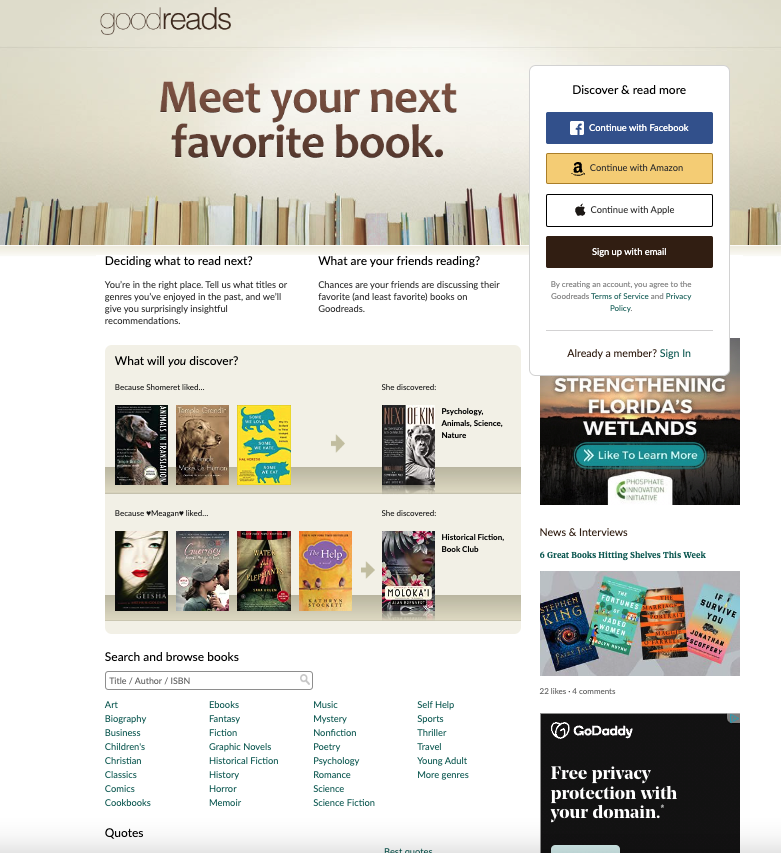
I asked the user to navigate to the goodreads.com website and search for something he would like to read (or listen to). The user’s first observation was that Goodreads wants you to log in, and he said he thought he would need to create an account to look at books. He scrolled down and found a way to search the website lower on the page. It is important to note that the user is viewing the Goodreads website on a laptop computer using the Google Chrome web browser. I normally use a mobile device to view the website and while the login options are still prominently displayed on the website, the search functions are easier to locate on the mobile version of the website (see Figure 2).
He found the search function easy to use and was able to find the specific book for which he was looking. He also found the search was only difficult to locate on the Goodreads homepage. The menu bar on all other pages includes a search bar and site navigation options (Figure 3).

Overall, he found the information provided about the book helpful and said he would be able to decide on whether to read the book based on the book’s profile.
Expert User vs Novice User
The user had a background in technology and because of this did not have issues utilizing the site. The primary issue he experienced was not being able to locate the search when first navigating to the site. Since I was more familiar with the mobile version of the site, I navigated to the site on a web browser on my laptop and had to zoom out to 67% to see the search when first navigating to the site. I can understand the frustration of being unable to locate the search when first navigating to the site on a computer.
Recommended Improvements:
My primary recommendation to improve the usability of the site is to include the site navigation/menu bar on the homepage. This provides options to sign in, join, browse, and search without frustrating a novice user. If this is not a possibility, I recommend adding a search bar to the right side of the home page opposite the Goodreads logo.
My second recommendation to improve the usability of the site is to remove the distracting login options on the right side of the home page in Figure 1 and prominently displayed them in the middle of Figure 2. Adding a sign-in and join button, as mentioned above, still allows users to log in using one of these options while making the site more useful to novice users.
References:
About Goodreads. (n.d.). GoodReads. Retrieved September 5, 2022, from https://www.goodreads.com/about/us.