Word Count: 813
1. Introduction
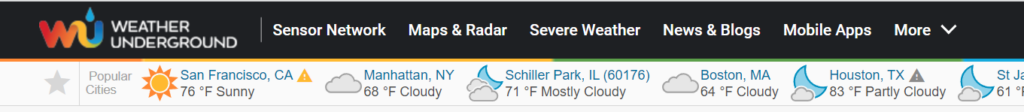
The website selected for this assignment is Wunderground.com. The screenshot is below. Wunderground.com functions as an informative medium used to gauge weather in any location. The user for this test is a 31-year-old woman. Subjectively, her technical expertise is rated somewhere between novice and intermediate. Her experiences with technology are dominated by her mobile device usage. Her familiarity with Wunderground.com is none whatsoever.
2. User’s Actions
My user’s actions can be described as deliberate, yet cautious. She took the time to analyze the components of the site. She immediately formulated opinions on the website’s front-page, specifically on the advertising saturation coupled with relevant information being displayed. In addition to observing her uninfluenced interaction with the site, I also had her search for specific information so she can experience the entirety of the website.
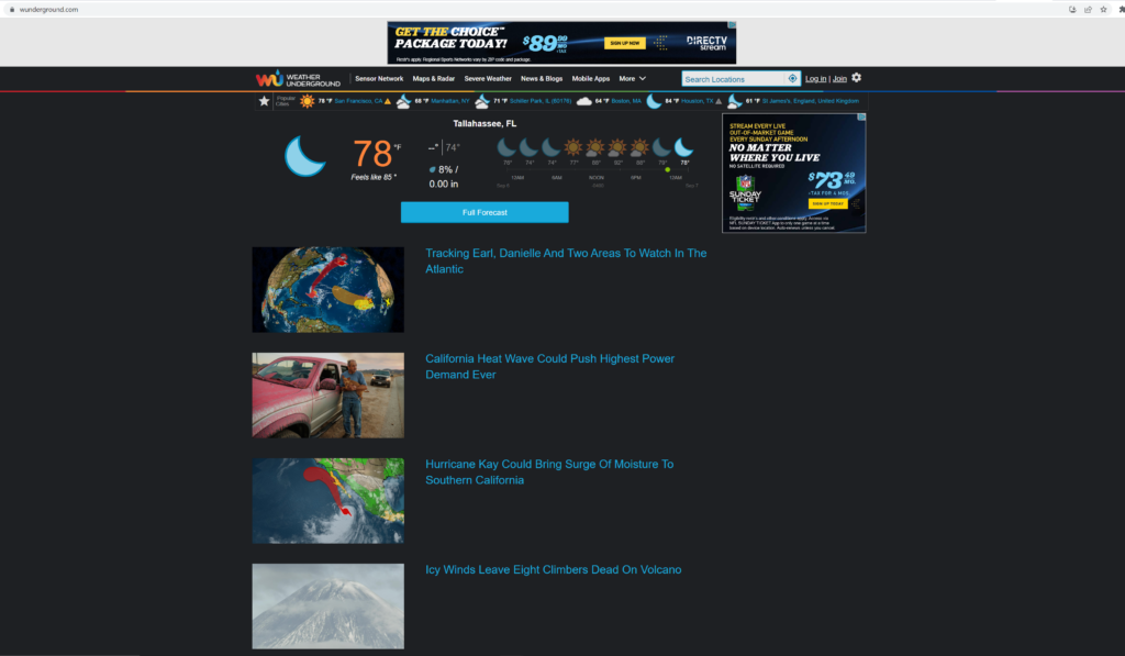
For her non-specific tasks, she easily found today’s temperature and weather patterns in Tallahassee, as the website automatically used geolocation privileges and displayed that information first. She appreciated this, but ultimately did not value it because it was a similar experience gained from other weather services. In contrast, she was made apprehensive by the amount of advertising. According to her, about 50% of the site was advertising, thus making her very distracted. She did concede that most of the advertising was beneath the relevant information and not too interfering.
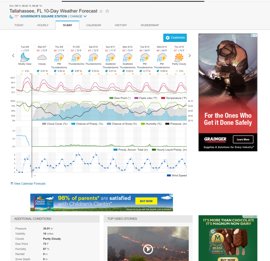
Following this general use, the user was asked to find specific information. The data on the front-page alone would not satiate these specific requests, so the user clicked the very apparent button that read “full forecast”. This was interesting because, as an expert user, I know to go to the famous “WunderMap” for detailed information. The user had a difficult time finding information about weather behavior occurring five days from the date of the test. She had to click on the “10 day-forecast” tab and then count the days until she figured out which day was the fifth day from today. One thing that was surprising was that she knew to hover over the line graph depicting humidity, dew point and precipitation. She also instantly noticed the color key indicating which lines represented each weather element.
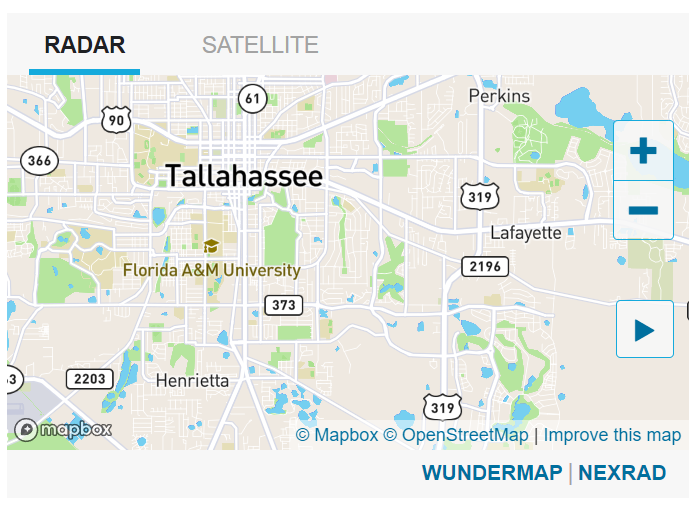
Her next most problematic task was utilizing a weather radar to obtain information about past and future storm patterns. If she had located and used the WunderMap, she would have been able to capitalize on an exorbitant amount of data and information. However, the 10-day forecast page had a link to a simplified radar. She intuitively clicked on that, as a link to the WunderMap was hidden. The user took the time to observe the simple radar. There was a basic map, a zoom in/zoom out button and a “play” button. After hitting the play button, there were no observable weather phenomena produced or anything indicating a passage of time. The user first assumed the radar was not responding to her input, but eventually figured out that there was simply no storm activity at all in our region. This was after zooming out and seeing activity in other regions. It’s unfortunate that the user did not realize the availability of the WunderMap. To get to this map, one would move to a horizontal menu at the top of the webpage containing a tab called “Maps & Radars”. However, it is a static menu. So after the user scrolled down far enough, the menu was hidden away. Admittedly, beneath the simple radar she was using was a hyperlink to the WunderMap. However, it had a small font size and demonstrated poor placement rendering it insignificant.
3. Conclusion
One of the first improvements to Wunderground would be adding some sort of clock or time indicator to the simple radar. This is so the user doesn’t accidentally assume the radar or page isn’t responding. However, there are much larger improvements to be made. In analyzing the novice user’s experience, there is a clear distinction in benefits gained between expert and novice users. With Wunderground being a weather service, there is an avalanche of dynamic data and available information. The main problem Wunderground has is how it organizes all this data. Expert users eventually learn what the best instruments to obtain data are. Novices seem to be presented with initial, basic information causing them to possibly assume that that is all Wunderground has to offer. This is because Wunderground does not prominently display its most useful assets. Perhaps it is prioritizing revenue streams from advertisements, essentially neglecting its most valuable product? Wunderground should not provide new and novice users with inferior tools and information first, but instead provide a clear path to WunderMap, even if it means deleting the inferior tools and reprioritizing advertising. If people decide not to come back due to ignorance of Wunderground’s robust weather analyzing instruments, then eventually there will be no one around to advertise to.