User Profile and Site
I selected the City of Richmond’s property assessment website for the user to explore. The user does not go on the City’s website ever. They live in a household where someone else pays the utility bills and they are a tenant so there is no reason for them to go on it.
The user is 29 years old and resourceful on the internet when it comes to online shopping, instructions on home improvement, and online forums for their interests: biking and music. They are good at researching comparable items for music gear and bike gear, but they have never had to look up the value of homes to pay real estate taxes. Their experience with the City of Richmond’s website is novice.

User Tasks
The user’s first task was to find the assessed value of the house they currently live in. The user first went to the homepage for the City of Richmond which is rva.gov.
They were able to quickly find the assessment of the house, accessing this is straightforward. In a sea of categories to select from on the main menu, ‘real estate’ pops out. They then had the option to select ‘property search’ and search by address. There were other fields to search under including parcel ID, property class, zoning and census tract, but address was one of the main fields to search under.
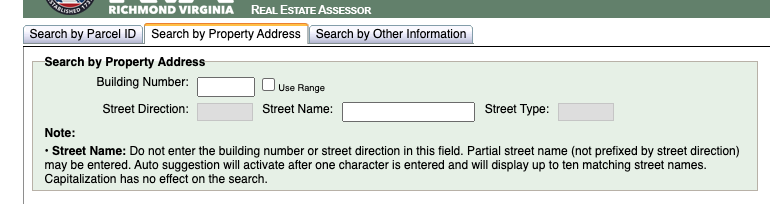
This was surprising because I thought they would get confused or tied up on the number of ways to search by. These are typical categories I search for properties based on my job as a real estate analyst. I thought that navigating those fields would confuse the user, however, searching by address is one of the main fields to select and the other fields are under ‘search by other information’.
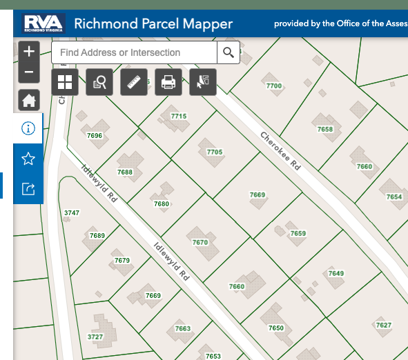
The second task was for the user to find their property on a plat map which outlines their property lines contingent to the legal description of the property. I knew this would be confusing because all city and county websites with these maps have them under ‘GIS Mapping’. GIS records are important for many people involved with studying the layout, geography and environment of a city. Such experts include builders, facility managers, and environmentalists. This information is available in datasets compatible with GIS software so users can download that information. However, for a novice user, it is not that easy to get to a map where they can search by address.
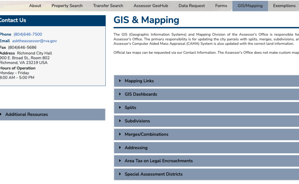
Under this task, the user went to the GIS Mapping page and only found brief descriptions about the data sets and not the actual maps. They then went back to the homepage thinking they went to the wrong section. I anticipated this type of confusion because GIS Mapping is a specific tool on city sites. However, it is still public information that all users should be able to access. It is only organized for experts and this is obvious by the jargon used (ex GIS Dashboards just means maps).
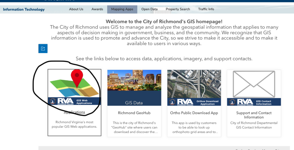
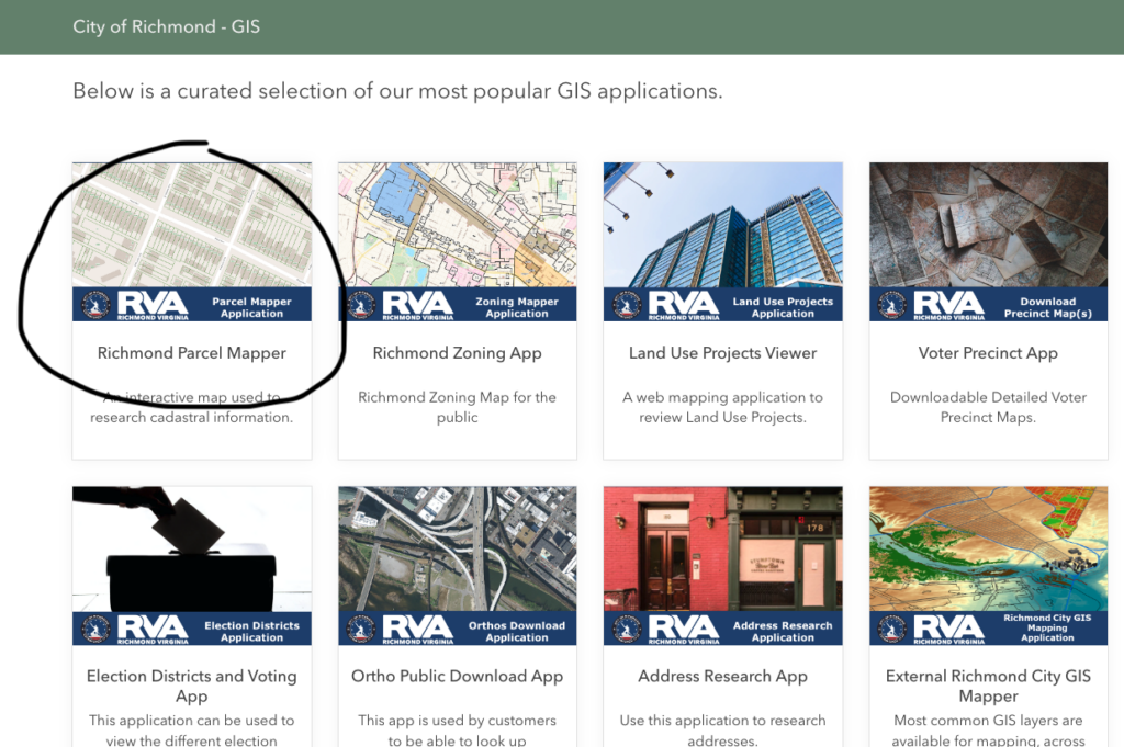
The user was able to get to the plat map after I gave them some hints, but we counted, and it took them four pages to navigate through before getting there and none of the pages were.
Expert VS Novice Users
The interface helped the user find their property assessment by using basic keywords in the layout of the site. It was easy to select the ‘real estate’ section because that entails buildings and maps. It was also easy to find a property by the address because that is the most recognized way to look up a building. I believe by prioritizing these keywords and making them the main selections pointed the user in the right direction.
The GIS tool provided a lot of roadblocks and that is because it prioritized jargon for expert users. The user tried to navigate the main GIS/mapping page, but it only had descriptions of the GIS process. None of this information helped the user get to the actual map.
The site should use common keywords as headers to help users identify which section is best for them. The current layout assumes the user wants to run through the descriptions and methodology of the GIS maps before going to the map. This isn’t straightforward and concise to the point where the user assumed they were on the wrong page.