The Website and User
The website chosen for this assignment was Microsoft Bookings (bookings.microsoft.com), a web-based booking system built upon Microsoft Outlook and included in the Microsoft 365 program suite. It is intended to create a seamless system to allow clients and other users to quickly select appointment times based on your Microsoft Outlook availability.
The user identifies as female, aged 30-35, and regards herself as technically savvy. While she is not familiar with Microsoft Bookings she is familiar with the rest of Microsoft’s 365 suite of programs, especially programs one would use in a typical office setting. She works as a professional graphic designer, so she is familiar with concepts central to graphics and media.
The User’s Actions
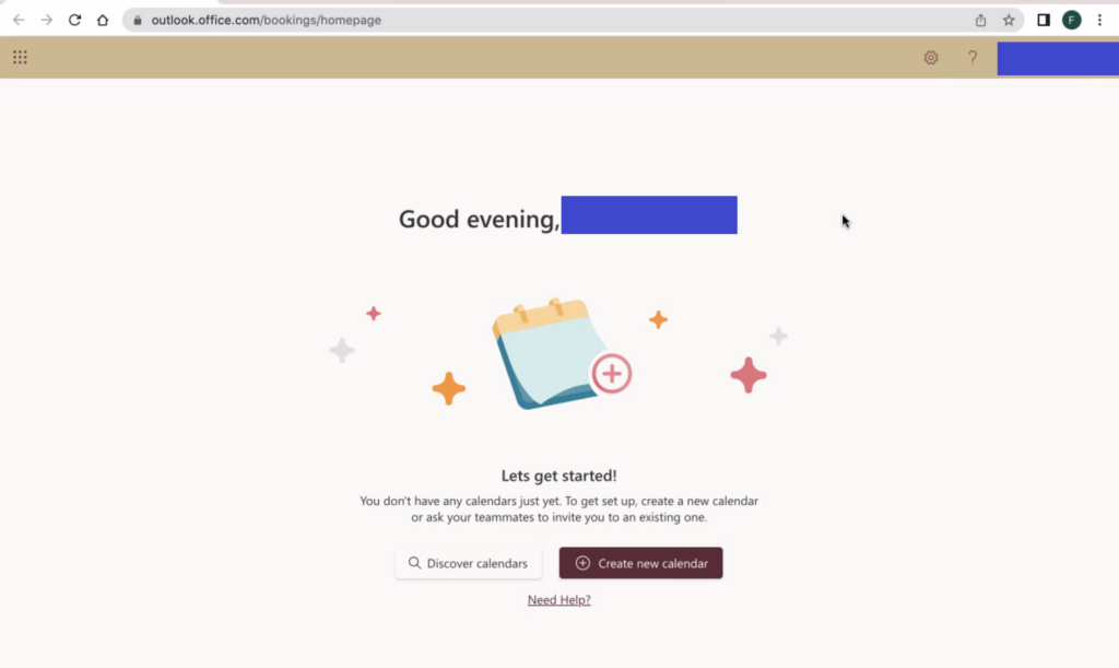
I gave my user a straightforward task to create a page for people to book a 30 minute appointment with them, based on their Microsoft Outlook availability. The first observation I had was that they followed the prompts included in the onscreen splash page that guides them to create a new calendar within the program. As someone who frequently uses this webapp, and related booking software, I tend to exit out of these immediately, as the nomenclature and functionality is fairly clear to me.
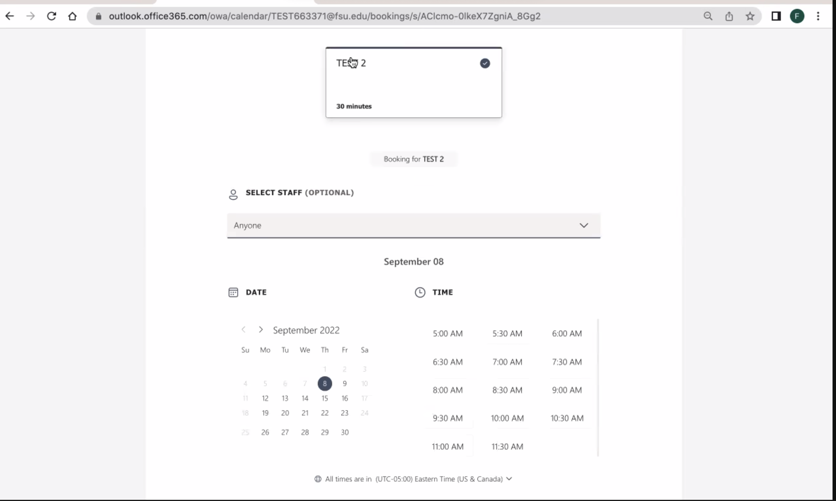
Additionally, the user was confused by the layout of the main bookings page, and was unable to ascertain where to go to further create or alter the 30 minute appointment page she was tasked with creating. As an experienced user who had gone through this same process, I was aware that Microsoft Bookings refers to these different types of appointments as “services”. This disconnect between the user’s broad knowledge and the specific nomenclature of the web application was a recurring theme in our testing, and a direct result of her being a novice user of the application.
Expert vs. Novice User
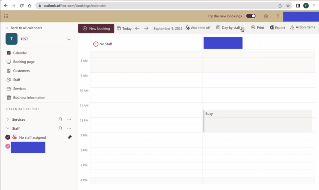
My first observation was that although Microsoft provides new user prompts to guide them through the process, these were not clearly explained and actually led to an outcome that most people would not want. After completing the new user prompts on the page, the user wound up with a counter-intuitive booking setup with business hours that we were both unable to correct during our testing.
Even after the user recreated the meeting type from scratch, and seemingly set their preferred hours, and restricted the meeting to just themselves, they were still led to create the following booking page:
An easy way to improve this would be to orient these new user prompts towards the goal of the user instead of the tasks to be performed. For example, instead of “discover calendars” and “create new calendar” the prompts could be to “create a shared booking page” or “create a personal booking page”. This would help clarify the steps the user is going through, as well as lead them to an outcome that the majority of users likely desire (to create a booking page for just themselves, not a team).
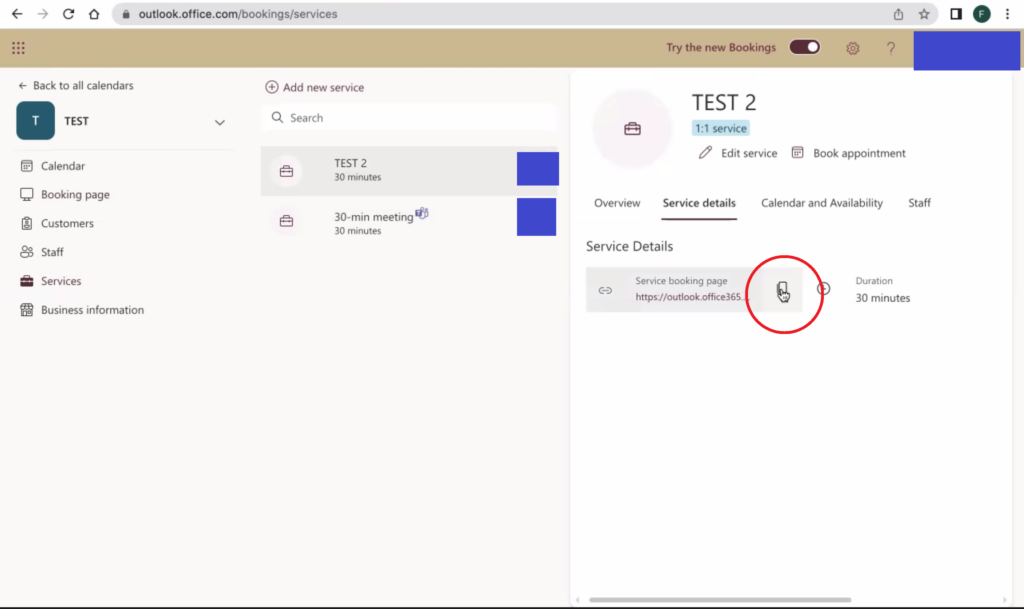
Additionally, some issues were simple information architecture and web design errors. An experienced user knows that these are unusual and counterintuitive, but also has learned to utilize the correct tools and links within the program. A prime example of this (and why I wanted to test this particular web application) was the use of the “copy” icon twice on the same page, with two completely different functionalities.
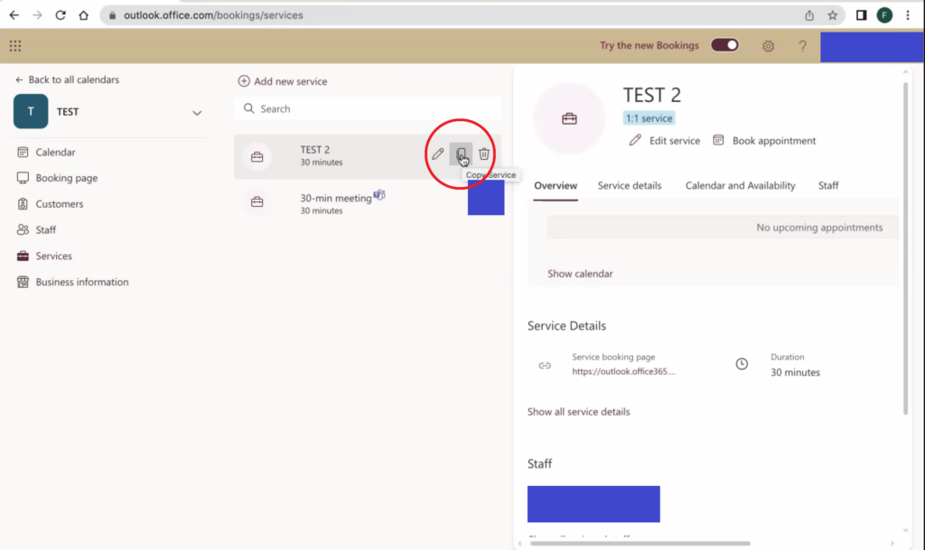
Copying the link to a given “service” page is arguably one of the most commonly used functions of the site, and a novice user is apt to click the copy link by the meeting title. My user was incredibly frustrated that this button inexplicably opens up a create new service dialog box and doesn’t copy a link (that copy button is “copying” the settings for that service into a new service that the user is supposed to then edit and save as a new service). The copy button for the web address is located in the information about the service on the right of the page.
A way to improve this aspect of the user experience would be to simply use a different icon for the copy button on the left, one with a “+” perhaps, and better highlight the copy link button on the right, as it is a high use item.
###