User Profile
My chosen user is a 34 year old male with a bachelors in computer science and works as a Cyber Security Support Engineer for Amazon Web Services. He is extremely comfortable with computers and would be considered high expertise with technology. While he uses websites often, he rarely, if ever looks at artist websites/portfolios online. He mainly uses the web for video games, D&D, and tech news/research. I decided to give him a specific task to follow when looking at this website: https://ednahibelstudio.com
Task: Using frequently asked questions find more information on whether other artists do enhancements on Edna Hibel’s lithographs.
Novice Actions
First inclination was to begin scrolling down the homepage. User started getting frustrated once they realized that the page was very long with difficult content to search through by glance. Used “Command+F” to search the terms “enhancements” to see if he could quickly jump to the information on the homepage. That produced no results. They reread the first task and noted it mentioned “Frequently Asked Questions”. They began to get excited because they thought they cracked it, by finding the Frequently Asked Questions page on the navigation, but quickly got frustrated again when they realized how horribly organized the information on that page is. After scrolling through the entire page, they finally found #14 “Does Edna Hibel touch up each image personally or is this done by other artists?”. They tried clicking that to find the answer, but it led to a broken page. They thought maybe that was the end of it and there was nowhere to find the answer. I told them there was ANOTHER FAQ page that they could find the information on.
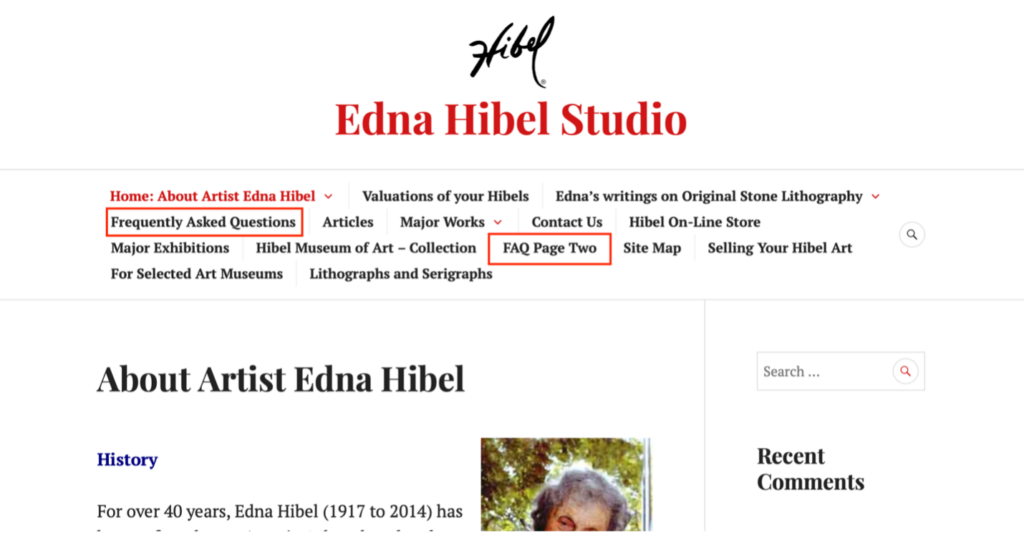
Dismayed they went back to the navigation (instead of seeing that there was a small link that said, “More FAQ”, which doesn’t work anyways, but wanted to note that they didn’t use it despite it being there). After some slight scanning the long navigation list they found FAQ Page Two which leads to the page with the answer. There are only two questions on this page, so they were able to find the answer quickly.
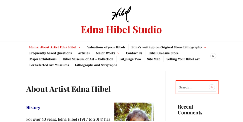
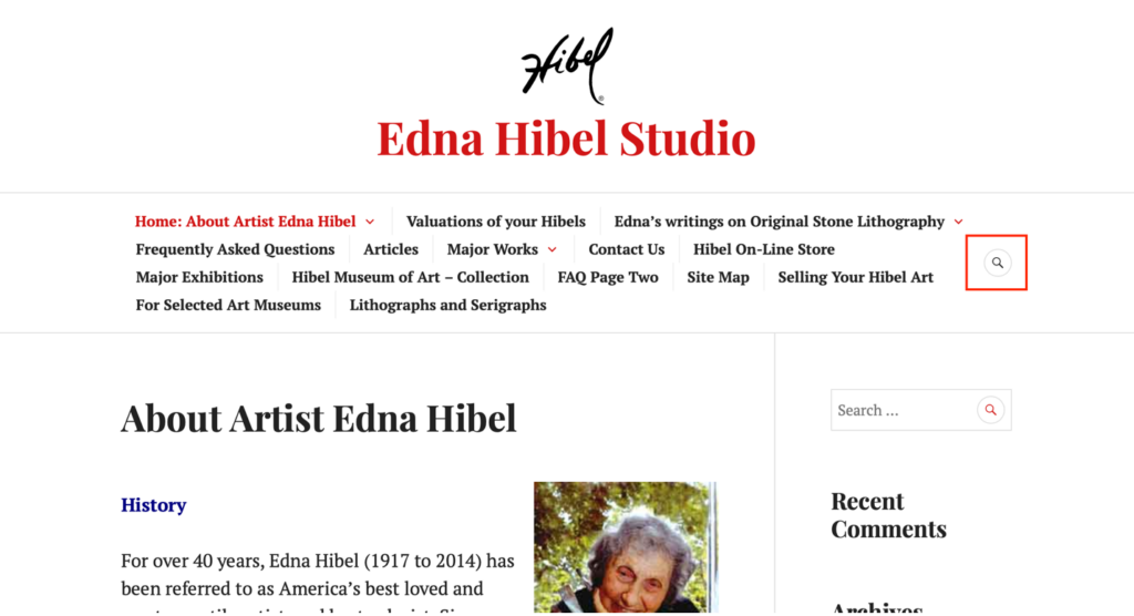
Something I found very interesting was they did not see or utilize the Search bar to the right of every page. This would have allowed them to quickly search “enhancements” and immediately find the pages they needed.
Recommendations
The results show that it is difficult to quickly navigate and find information on this website. An informative website’s FAQ page is meant to be a reliable source to utilize when there is a common question to be answered. It is obvious that the FAQ page is essentially useless on this website. It is hard to find (being two pages), poorly organized (users cannot quickly scan to find their question or topic), and most of the links do not work or are poorly linked (making it easy to get lost on the website).
I find it interesting that the search bar was not noticed. Especially when there are two areas to search. The Search bar on the right navigation and the small icon near the navigation.
My recommendations for a redesign would be to rework the navigation, making it more effective, less overwhelming, and rework the sort order to better fit a user’s expectations.
I would also overhaul the layout of the homepage. The person I tested immediately got frustrated with how far down the homepage scrolls. They almost gave up searching before it even started, because of how overwhelming it was to take in the homepage.