The Website

The Cummer Museum of Art & Gardens is an art museum located in Jacksonville, Florida. The museum was established in the 1950’s when Ninah Cummer gave her humble art collection and home for the creation of a public art museum. Today the museum has grown exponentially to become one of the largest fine art museums in the region, encompassing over 5,000 pieces of art along with a manicured garden.
The Scenario
For my scenario I chose a very simple one, but one that is likely repeated frequently on the site: a potential visitor looking up hours, admission prices, and directions for the museum. As a public museum that is not well known outside of the region this scenario would be undertaken by potential out-of-area visitors, local residents who have heard of the museum but not visited, as well as returning visitors who need to refresh their knowledge of how to visit the museum.
Knowing this, I focused my heuristic valuation on two main aspects: the ease of navigation to necessary information for a visit and how clearly and directly relevant information is presented to the user. While this evaluation does not focus on a specific user, I kept in mind that this scenario is likely very common amongst all demographics of site users.
The Analysis
As our user is likely to do, this analysis begins on the home page where we find the first usability issues with the site. These issues center around heuristic #8: aesthetic and minimalist design. In other words, keeping the interface centered around the information users need and not cluttering the site with extraneous or little used information. If a user was going to visit the Cummer museum, where does one suppose they will click on the homepage? Let’s try the large call -to-action on top of the page…

Well, it’s unlikely a new visitor would want to become a member without even visiting the museum, so let’s move on to the main navigation menu…

Again, our scenario has hit another roadblock. While learning more “about” the museum, looking up upcoming “events”, or trying to “donate” are useful links, none are the primary goal of the user in this scenario, which is to visit the museum. Assuming the user chooses to dig further into the “about” menu item, as it is likely to contain their required information, they will discover a submenu on hover…

In yet another instance of ignoring heuristic #8: aesthetic and minimalist design, all options are unrelated to the actual act of exploring the museum in person (while not within the scope of this blog post, it is worth noting that nothing on the Cummer Museum website, including this hover menu, supports tab/shift+tab functionality which presents a raft of accessibility issues). After much exploration, and scrolling, the user will eventually find the link for the museum hours and admission prices. In the footer
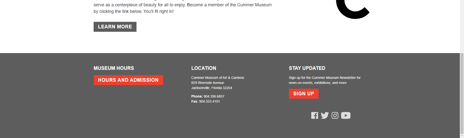
This link opens an external page, unlike all other pages on the website. While this choice still provides the information the user requires in this scenario, it violates the consistency of the website, heuristic #4: consistency and standards, and the ability for the user to quickly and easily reverse their action, heuristic #3: user control and freedom.
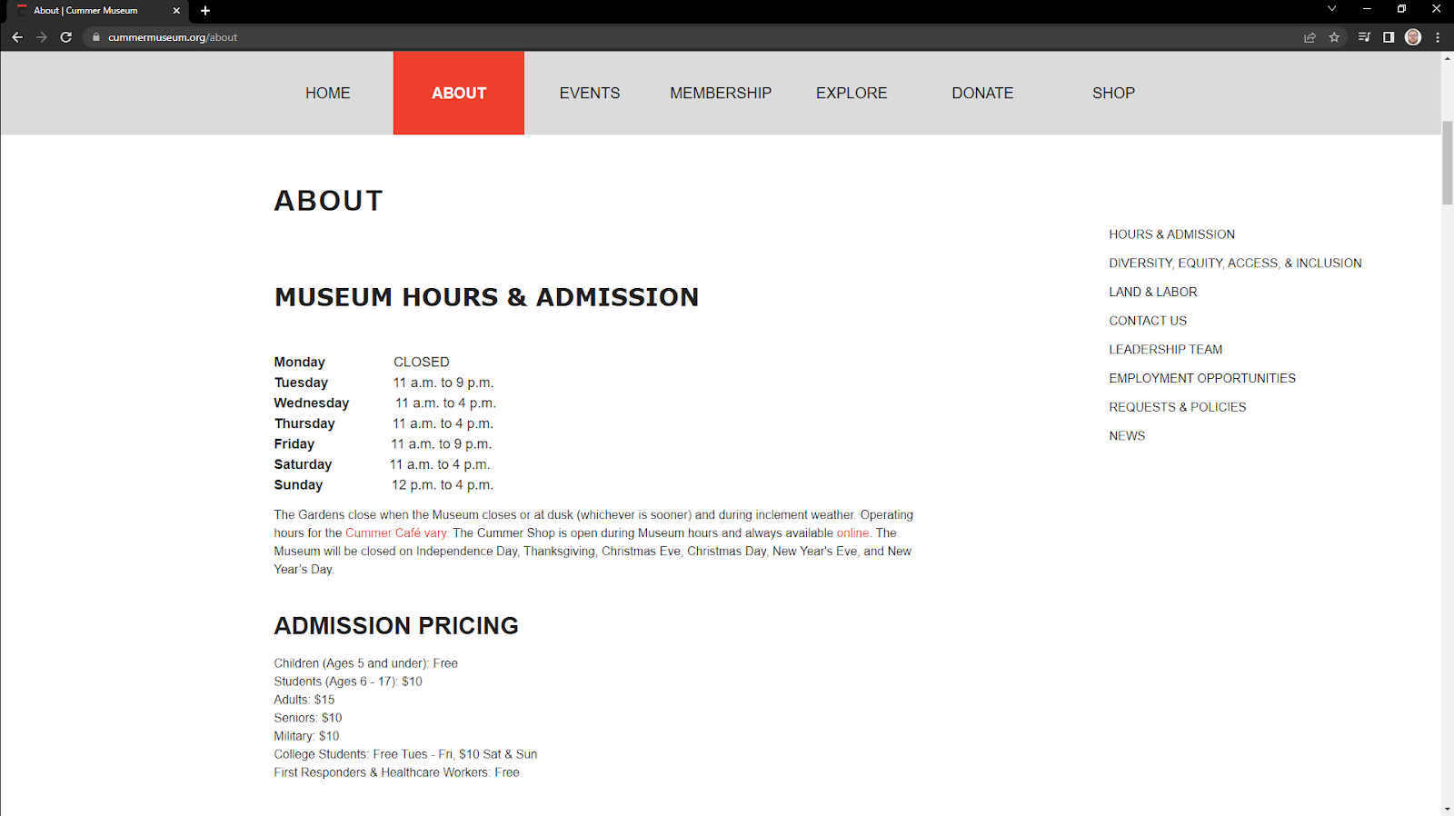
This page further strains heuristic #4 by actually being designated the main “about” page on the site, meaning that it is labeled on the main page as both “about” and “hours and admission”. Further, the hover menu as previously referenced does not reflect the contents of the actual “about” page in any meaningful way. Exploring this page, the user will quickly find that they cannot purchase tickets online, but they may still want to know the price for tickets.

In this small section, there are clear issues surrounding heuristic #2: match between the system and the real world. It is operant of the designer to make sure terminology is clear and easily understandable without necessitating additional information seeking. In this section, it begs the question what age qualifies someone as a “senior”? Additionally, what about “students” who are 18-year-old seniors? While a minor infraction, the wording choices cause confusion in a prospective visitor.
At this point in our scenario, our hypothetical user has discovered the hours to the museum, and the cost to admission, as well as the fact that they cannot purchase tickets online. Assuming that they have decided to carry onward with their visit they will need the address to the museum. On this “about” page there are two locations for the address, in the “contact us” section and in the footer. Both require excessive amounts of scrolling. This is due to both the lack of jump links and corresponding menu items, a clear violation of heuristic #7: flexibility and efficiency of use. Without accelerators like jump links, the user is left to scroll through the entire page, analyzing all information until they come upon the required address.
The Recommendations
Overall, the Cummer Museum website needs additional work to improve navigation, providing a clear path to their users’ primary goals. The most direct way to do this is to redesign their navigation menu to better represent the page hierarchy while focusing on the most common user tasks on the website.
Another simple solution to improve usability would be to change the large call-to-action at the top of page from “become a member” to something like “visit us” or “buy tickets”. This way, users can more quickly and directly navigate to their desired information.
It would also pay dividends to bring the address and “hours and admissions” further up the page, instead of in the footer. Again, this will greatly aid users in navigating to their desired information.
And probably one of the most simple solutions would be to change the wording on the ticket prices page. By combining “Students (6-17)” and “College Students” to simply “Students (with valid I.D.)” the users will more easily be able to identify the admission category that reflects their reality.
###