“America’s First Modern Art Collection” https://www.phillipscollection.org/
The gallery was originally the home of Duncan Phillips, art collector and philanthropist. Several additions to the original house were required in order to accommodate the ever growing art collection, now consisting of nearly 6,000 modern and contemporary works.
Evaluation Scenario
I will be using the website to plan art history lessons and a field trip for homeschooled high school students. Generally these lessons consist of studying several works of art by one specific artist, or works created during a specific time period and in a specific place (e.g. several works by Picasso, or works from the Hudson River School). Since it is hoped that through the field trip students will be able to see in person works of arts they have studied in class, I will broaden the parameters for choosing works for this course.
Analysis
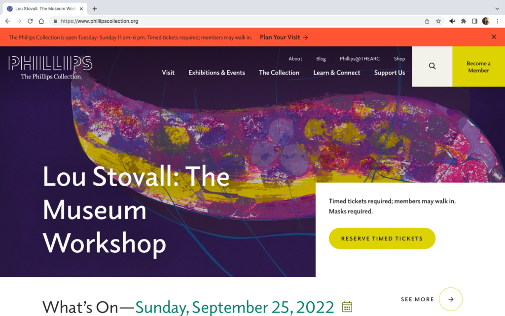
The landing page for The Phillips website has two menu bars, a search bar, a ticket link, membership information, and a promotion of a current exhibition. A red banner at the top of the page gives museum hours, ticket information, and an additional link to “Plan Your Visit.”
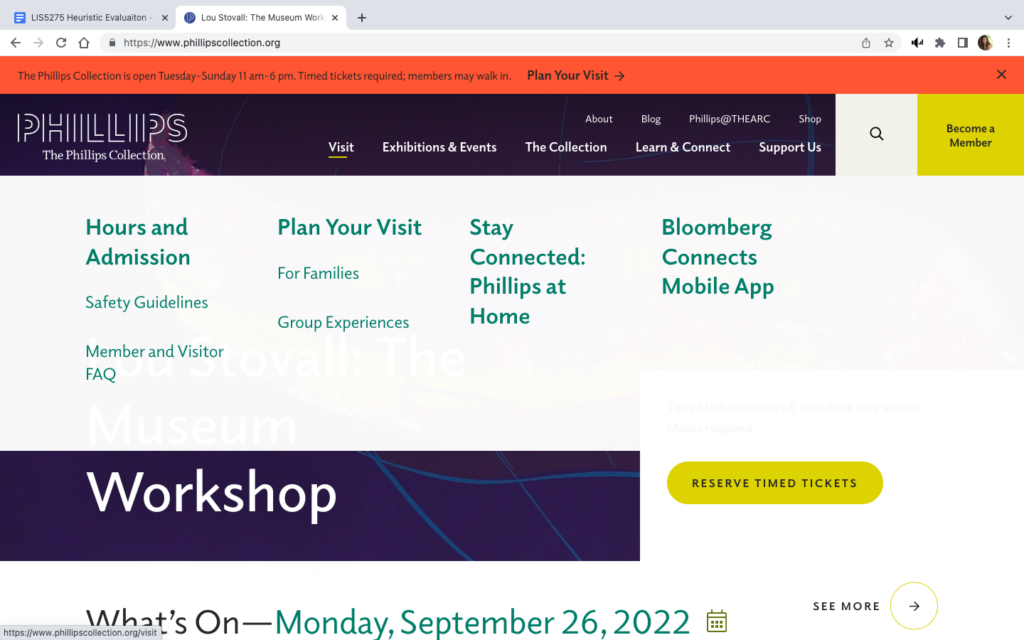
If you hover your cursor over the main menu bar at the top, a dropdown menu appears which obscures most of the window. (See images above)
The original screen is busy and gives the user pause while trying to digest all of the options available. When the dropdown menu appears with even more options, and at the same time significantly changes the view of the screen, it only adds to the potential for “information overload” or cognitive strain and the potential for confusion. By trying to provide too many choices in the initial view, The Phillips website violates Usability Heuristic #8, Aesthetic and minimalist design.
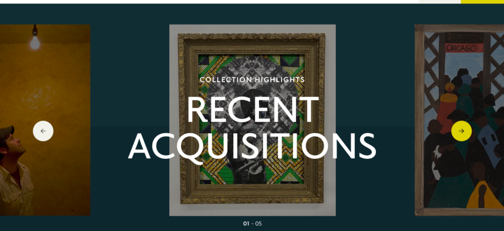
The Recent Acquisitions section found towards the bottom of the homepage is another example of where too much is done in one space, again violating heuristic #8. The work being highlighted is obscured by the text – this is true as you scroll through the entire section.
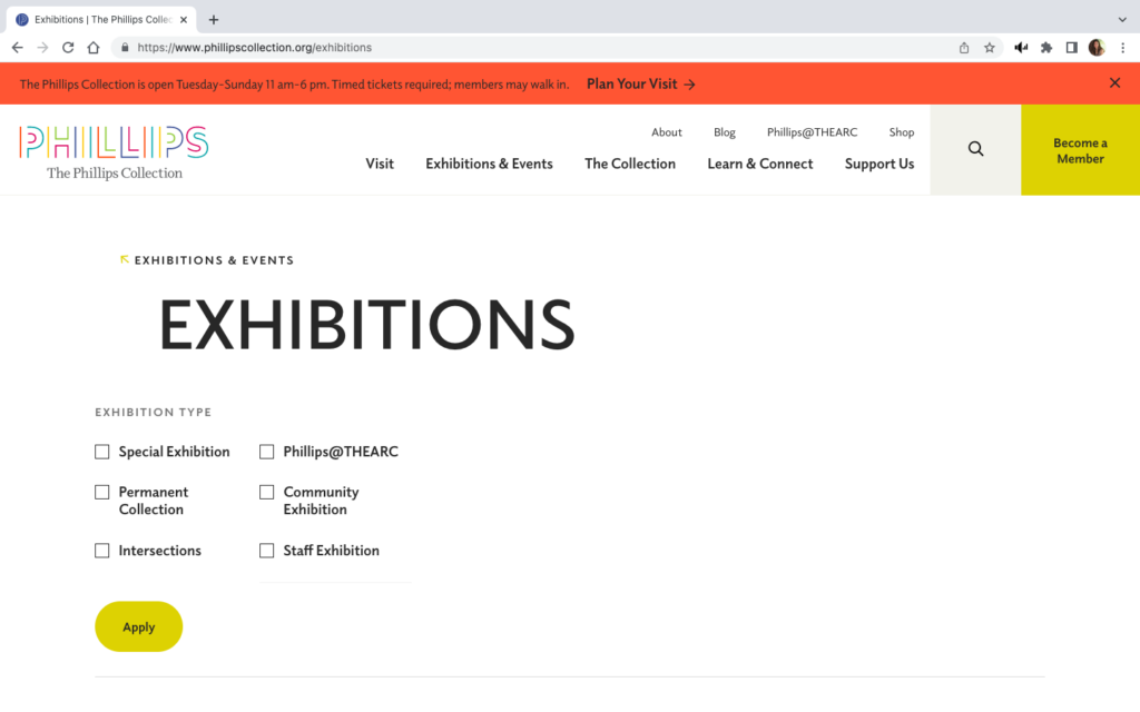
However, it is possible to take minimalism too far. The image to the right shows the landing page when “Current Exhibitions” is selected from the “Exhibitions and Events” dropdown menu on the main page. This landing view feels like the page did not fully load, or is perhaps not formatted correctly for the screen.
Scrolling down does give a view of all current exhibitions, but for a moment the user can feel lost. Also, the breadcrumb trail is barely recognizable since it consists of only the menu category and a small, lightly colored arrow. These difficulties in navigation inhibit the visibility of system status by not making it clear where the user is within the website, violating heuristic #1.
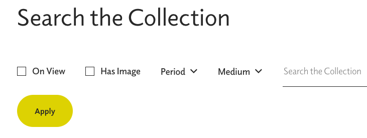
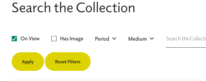
An even more egregious error in keeping users informed about what is going on occurs when trying to search the collection.
The view above shows the search page prior to any filter applications.
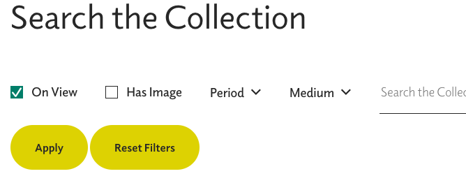
Once a search is selected, the checkbox turns blue with a white checkmark. However, using the “Apply” button only adds a “Reset Filters” button. It does not start a list of applied filters or change the color of the “Apply” button or the selected filter’s checkbox.
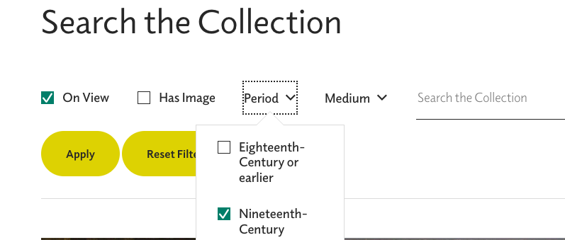
The image above, right, shows selection of the Nineteenth-Century time period and the one on the left shows the view after that filter is added to the “On View” filter. Again, once the “Apply” button is clicked, the user does not have any confirmation of which filters have been applied. (Heuristic #1) This same issue occurs when selecting grades for lesson plans, but there, the dropdown menu for grades obscures the “Apply” button making it even more confusing whether or not the grade filter is applied. (See image below)
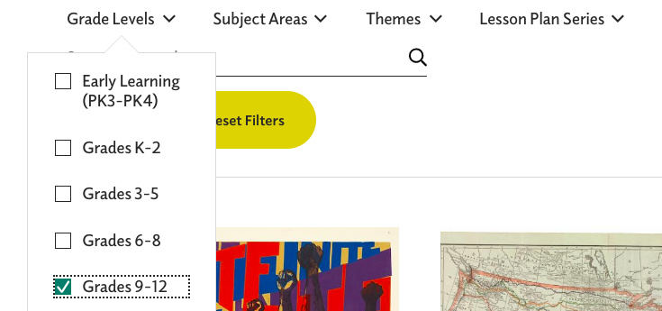
“Reset Filters” button is present here before and filters are selected, unlike the “Search the Collection” view. “Grade Levels” obscure the “Apply” button and there no confirmation that the filter has been applied.
As hoped, the museum did provide robust lesson plans for their collection and special exhibition. Unfortunately, my selection of six works from Nineteenth-Century French artists is not included in the lesson plans, but I will explore the lessons for Jacob Lawrence’s works on Toussaint L’Ouverture since that exhibit’s subject is familiar to the students.
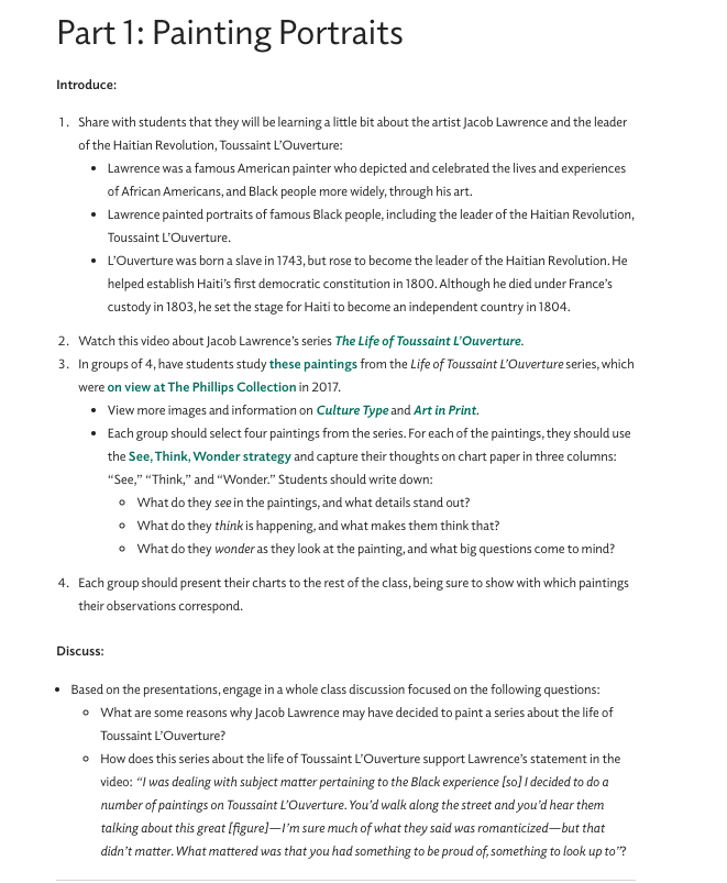
While this is an excellent lesson plan, it is not especially friendly to the user. The text which is blue-green, and may only appear bold to color blind users, are links to other resources. Besides the problem of a color blind user being able to recognize the links, many of the links take the user to outside of the Phillips website. This move is made within the same browser window and without any warning asking the user if they want to proceed to a link outside of the current webpage. At least one of the links, “these paintings” – #3 in the lesson plan, takes the user to a press release issued by another gallery. This press release does not contain any images, which is what I expected to find when I used the link. Jumping to other websites without warning, violates consistency and standards, heuristic #4. Also, since there is no warning that the user will be moved out of the museum website, and therefore away from museum navigation tools, heuristic #1 is again violated. There is not communication or transparency from the website to the user about the consequence of using the links.
Recommendations
As a whole, The Phillips Collection website is attractive, informative, and fairly easy to use. With some minor changes addressing navigation and visibility exploration of the website would be streamlined, making the site more user friendly.
- Aesthetic and minimalist design, heuristic #8 improvements
- Remove the red banner at the top of the homepage. All the information here is found in the “visit” dropdown menu directly below.
- Change the dropdown menus to vertical view only; eliminate the large white box that takes over the entire homepage.
- Remove the box insert on the lower right corner of the homepage. Again, tickets are available under the “visit” dropdown.
- Move heading for “Recent Acquisitions” to the top of the field
- Visibility of system status, heuristic #1 improvements
- Reformat all views for filter options: the “Exhibitions” filters should be reduced so they do not take up the entire window. Display filters that have been selected and applied.
- Improve the visibility of the breadcrumb trail by putting dark colored arrows, using right to left directions
- Consistency and standards, heuristic #4
- Changing the breadcrumb trail would also create consistency for users based on experience with other websites’ navigation tools
- In the lesson plans, links should open in a separate browser window, and warn the user if the link leads to another website