The site that will evaluated is the one for the Norman Rockwell Museum (https://www.nrm.org/). This website hosts information about the Norman Rockwell Museum located in Stockbridge, Massachusetts. This includes information about its hours, collection, location, events, careers, etc. Also, through this website, a person is able to do many things such as buy a ticket and view their digital collections. The evaluation that will follow will be completed through the observation of an example user participant as they complete a set of tasks within this website.
Participant Description
The participant that had been chosen for this evaluation is a middle-aged adult man with high education level. He does not have a background in information architecture/usability analysis, and he also does not have a background in museum studies or studies pertaining to art; however, he has a high proficiency in technology which may have proven to be a confounding variable due to his ability to easily navigate many websites and use various technologies.
User Testing Method
The method that was employed for this evaluation was the Think Aloud method. The participant was instructed to narrate his thoughts at each step while completing the tasks given for website evaluation. Notes were taken during observation to capture the results observed and to write down any notable statements that the participant said during the evaluation as quotes. This method was chosen for its insight into what a user might think while going through a website with the goal of using this information to understand what effect a flaw might have on a user’s thought process and why this thought process may have occurred, potentially causing difficulties in using this website.
Tasks Assigned
The tasks assigned to the participant were to find out how to buy a ticket for the Norman Rockwell Museum and to find directions to the museum itself, find out if there were any internship opportunities and find the description for all potential internship opportunities, and find the work, “Pointing Hand,” in the Norman Rockwell Museum’s digital collection archive. Overall, these tasks remained the same from their previous proposal conceived in a group setting. However, there were minor changes in the second part of the second task; instead of finding the description for a single internship opportunity, the task then became to find the description for all internship opportunities instead of an open one offered at the Norman Rockwell Museum. This is because there were no internships open at the time of the website evaluation.
Observations and Analysis
Task one: Find out how to buy a ticket and find directions to the museum
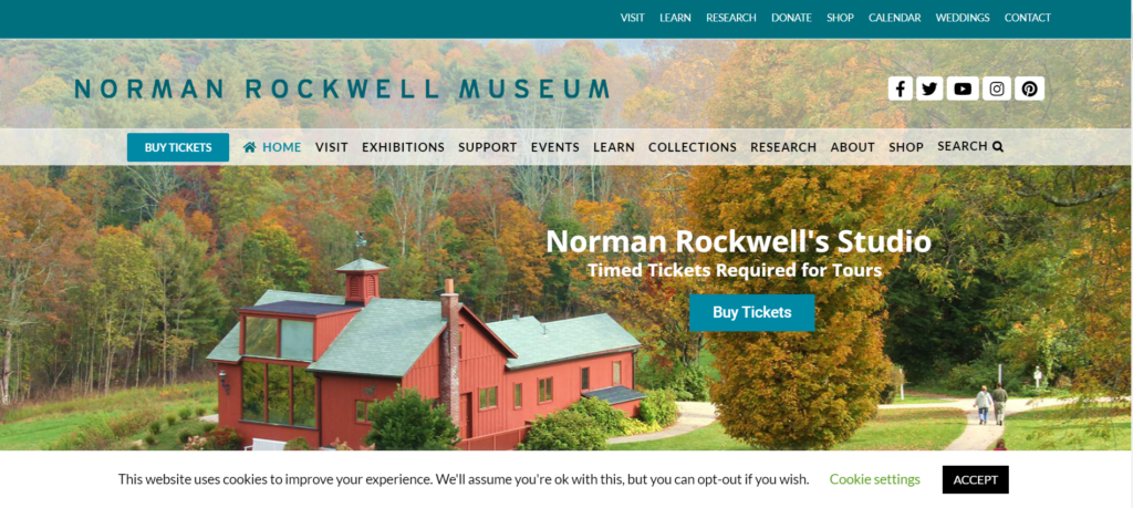
The participant started the first part of task one, finding out how to buy a ticket, by immediately going to the blue “Buy Tickets” button on the lower menu banner on the homepage of this website with a statement about how it was easy to find and eye-catching. This is most likely because it seems to stand out among the other buttons along that banner as the only button in a blue box.
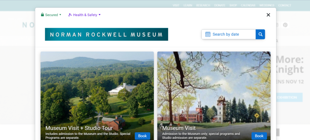
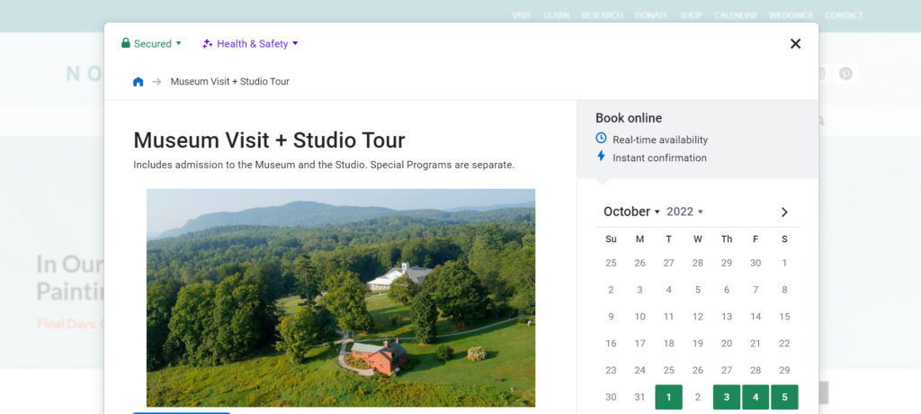
After the pop-up box opened, he made a statement about wanting to know the difference in prices between a membership to the museum and a single ticket. After clicking on the “Museum Visit + Studio Tour” option, he looked through the information before finding his way back to the main page without any issue through the button shaped like a house on the top left of the pop-up. This symbol is fairly ubiquitous as the button to go to the main page of an application, so he had assumed correctly that clicking on that button would lead him back the way he came as he said. After this series of events, he made a statement about how the website is very easy to use and that he appreciated the fact that it was “actually a pretty comprehensive website” due to the ease at which he was able to go through the website and the amount of information he could find on it. He compared prices for two minutes before selecting the “Museum Visit + Studio Tour” button, scrolling down, and selecting the ticket option for 1:00PM. There was no hesitation during these last few actions, and he did not make any indication that the interface had caused him any confusion because the website was not difficult at all for him to navigate. After this part, he made a statement that the website was “user friendly” and that each option was “easy to find and stands out” with useful lists of options and pertinent information.
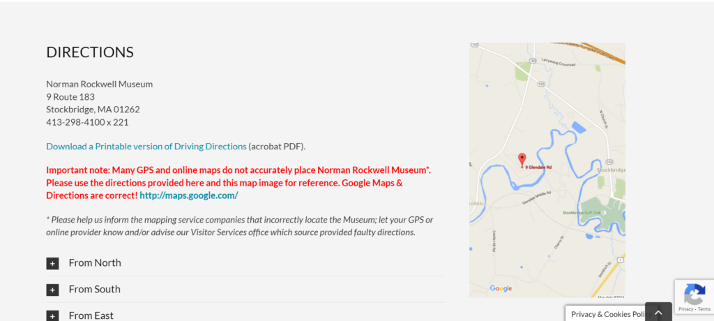
For the second part, finding directions to the museum, he went directly to the directly to the top menu, hovered over the “Visit” option and selected “Directions” without any issue to get directly to this section (https://www.nrm.org/visit/#directions). Because the bottom menu did not have dropdowns and the top menu did, he found it easier to figure out the fastest way to get where he needed through the more specific options in the dropdowns in the top menu versus the single links in the bottom menu. Therefore, the dropdowns provided in the homepage were able to lend themselves to the participant’s ease of use regarding the website. From there, the page stated all directional information, and the task was completed. He made statements about how he was impressed with how comprehensive the website was and how user-friendly it seemed because of how easily he was able to complete this first task. Overall, this task took the participant less than four minutes to complete from start to finish due to how the participant was able to locate and understand what he was looking for quickly through a usable interface.
Task two: Find out if there were any internship opportunities and find the description of all internship opportunities
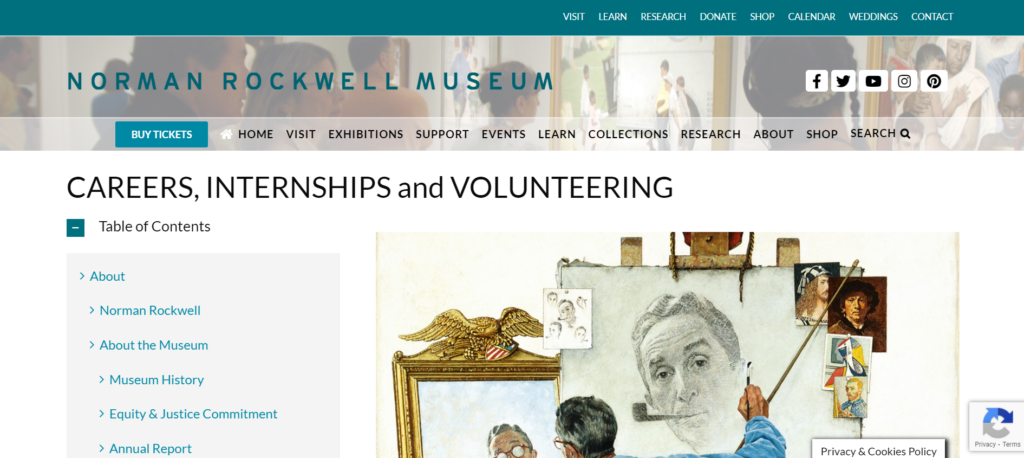
For task two, the participant, now back to the homepage, also went directly to the top menu to look through each drop-down list. Because he had already observed what was within that menu, it did not take long for him to figure out where to go. From the “Contact” drop-down menu, he went to the “Careers, Internships and Volunteering” page (https://www.nrm.org/about/employment/).
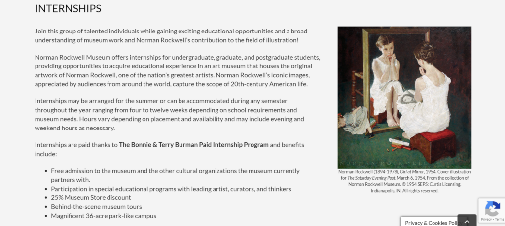
Due to the length of the page, he got confused for a moment regarding where to go next before realizing he needed to scroll down. He did not find it difficult to understand that he needed to scroll down instead of clicking on a link as he instinctively knew that he should scroll down first. Then he encountered the internships and their description, figuring out how to apply to them as well within a minute. The statements that he made were regarding a wish that there was a link on the left-hand menu that jumped down to where he needed to go, remarking that it was an “awful long way to scroll.” However, again he remarked about how the website was “very easy [to use] and user friendly.”
Task three: Find the work, “Pointing Hand,” in the digital collection
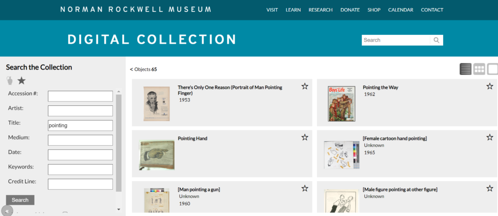
After going back to the homepage again, he used the search feature to locate this work. However, he only found an article from this page because the search feature on the homepage did not include the digital collection of the Norman Rockwell Museum within the pool of information that it includes in its search.
After looking through the article for a moment because he thought that there might be a link in there, he was able to locate a link labelled “Collections” that took him to the digital collections page (http://collections.nrm.org/#browse=enarratives.1). His eyes immediately caught the search feature and was able to use it without issue. However, because the search feature did not turn up the requested work when searching for the phrase “pointing hand” in the title search field, the participant was confused for a minute, wondering whether he got the name wrong, but once he searched for the word “pointing” he was able to find it immediately. He made a statement regarding how it was odd that the search function did not turn up the work when searching for its full title, but it turned it up when searching for a portion of it.
Possible Design Recommendations
Overall, all of the tasks together took the participant less than ten minutes to complete in full. The participant felt that the website was a “pretty good website, easy to navigate [and] easy to figure out.” Because the website seems to be a fairly usable website, there are not many design recommendations to fix the flaws the website has, but there are still some things that can be proposed to fix aspects of its design. Firstly, making each page either less long and difficult to scroll through or adding obvious links to parts of long pages might increase the usability of the website by making it easier for a user to locate the information they are looking for. Also, it is important to consider the search function. It does not state that the general search function does not also search the digital collection, so it is recommended that a link be provided within this feature that takes the user to the digital collection instead to prevent the confusion that stems from the results not being of the nature the user may have expected. Furthermore, the search function may need to be fixed on an internal level. Because it does not always turn up what it needs to, this may be a coding issue that creates a bug in the system. Fixing this may allow for greater ease in searching by making it so that the terms the user searches for are accurately used. In all, this website is a fairly good, usable website without too many glaring issues in its construction.