For the past two iterations of our redesign, our group has selected the ticket purchasing system. We agreed that this is one of the most important features of the site, and one that has ample room for improvement. Many users found the ticket buying process arduous and were disoriented by the pop-up window with multiple widgets that are incongruous with the rest of the website, confusing a few participants during user tests. It was not obvious to all users what they needed to do to complete their goal of buying a ticket. Each step had barriers to the participants’ understandings of what they needed to do next. Overall, this adds to the cognitive load a user may experience at a time while decisions are being made. As soon as they completed one step, the next step caused them to reorient themselves all over again.
Instead of a pop-up window, we propose that the Norman Rockwell Museum (NRM) implements a proprietary purchasing feature within its own website to maintain uniformity, control, and consistent aesthetics. By standardizing the checkout page with the rest of the website, there is a hope that the user will feel more comfortable using it. Through this, our redesign aims to decrease confusion and cognitive load on the user during the ticket buying process, making the experience more user-friendly.
After already creating one iteration of a redesign of this page, we have made changes based on user feedback. This feedback includes statements such as:
- [The first iteration is] much more clear what the ticketing options are now in advance, which means less back and forth paging through the ticketing system for the users.
- Explore different ways to integrate the Museum’s calendar events into the ticketing process too, perhaps building off the studio tour idea?
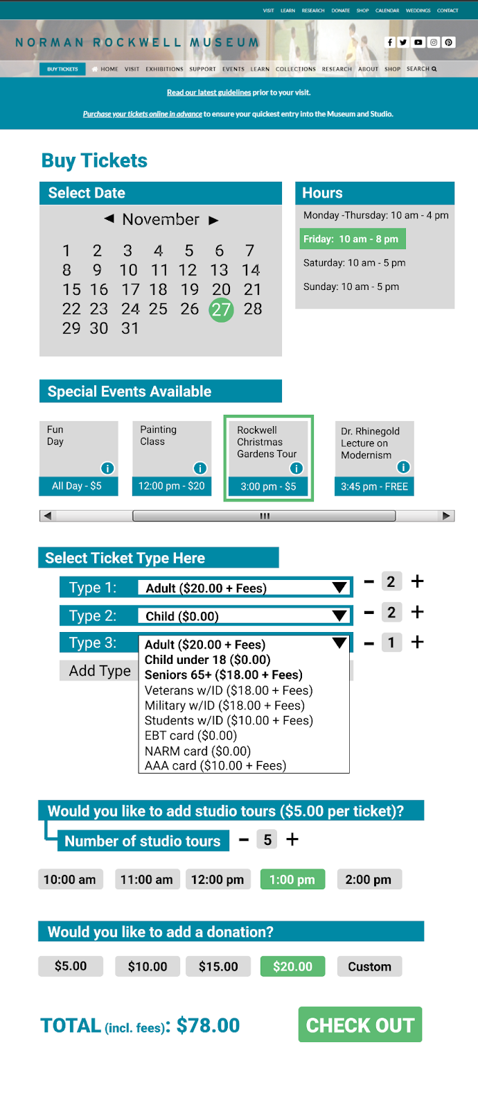
- It needs to be clear that you can visit the museum any time that day.
- The tours are for specific times only… I’d love to see your thoughts on that.
- [I] liked the idea of re-shaping the Donations option to make that more positive.
- [Add an option regarding] how to approach group pricing.
In order to redesign based on these statements, firstly, we added a section that shows the user the events that are occurring on the chosen date. The museum hours were also displayed next to the calendar section with the selected date highlighting the hours for that day to the left. This way, the user is able to see at a glance what they have available should they choose a specific date, allowing for greater ease of planning. A small button that the user can click on to see the information about an event was also added as well as a scroll bar underneath to demonstrate to the user how they can see more events if they scroll to the side. Selected events become surrounded by a green box to show which ones a user has chosen. Also, we have added the ability to buy multiple tickets of one kind through the input of a number on the left so that, instead of having to individually add tickets, there is a way to buy tickets in bulk. The donation/studio tours options have also been streamlined where, instead of first selecting a yes/no option then selecting a number/time, a user has only one line to look at and choose from. Below, we have included an image that shows our second iteration visually.