Norman Rockwell Museum, https://www.nrm.org/
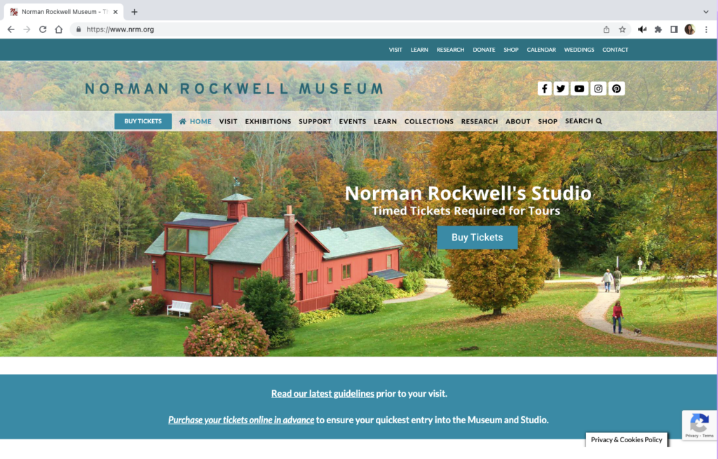
The Norman Rockwell Museum website provides information about the artist, museum exhibits and events, and hosts the museum archive. The homepage has two menu bars, each with some distinct links as well as several overlapping links. The green-blue menu bar at the very top of the page also has dropdown sub menus. The second menu bar is below the museum name banner and social media links. The remainder of the homepage features photographs on a loop.
Not all pages within the website have titles or headers, several have menus on the left-hand side where two of the site’s pages have a link to the Rockwell Center for Visual Studies, URL rockwellcenter.org.
The website also has embedded YouTube videos and uses a third-party popup window for ticket sales.
Users
Persona
Slightly modified from group assignment so it could be read to the user-testers and to include a starting location for directions: You are an undergraduate art history student at Bay Path University in Longmeadow, Massachusetts. Your are interested in Norman Rockwell’s works since Rockwell was a fellow Massachusetts native. One of your class projects includes Rockwell’s Pointing Hand. You are going to use the NRM website as a source for your project, but you are also interested in visiting the museum over break. Also, you will need an internship before you graduate and you will seek information about opportunities at the museum.
User-testers
The individual user-tester is an 18 year old male high school graduate, June 2022. He is taking a gap year before matriculating at George Mason University, Fall 2023.
The user-tester team consists of a 16 year old female junior high school student and a 23 year old male who recently graduated from the University of Mary Washington with an art history degree and a minor in math.
Testing Methods
Concurrent Think Aloud – This method makes it easy to evaluate the experience of the user: understand participants’ thoughts and elicit real time feedback.
Paired User Testing – an interesting twist on the above that is expected to require less prompting from the moderator.
Test Plan and Tasks
Test Purpose
To determine how quickly and easily an undergraduate student can navigate the website and use it for academic purposes.
Methods
The user characteristic description will be read to user-testers. They will then be asked to describe what information they need from the website in order to confirm their understanding of the scenario.
The test moderator will provide encouragement if frustration levels become a roadblock. If all attempts of the moderator fail, the participant will be given a hint at the discretion of the moderator.
Benchmarks & Metrics
Frustration level of participant and post task user review (subjective); error rates, task completion and time will be measured (qualitative)
Tasks
Plan a visit to the museum including getting directions from the university and purchasing a ticket. This represents a high frequency task for website users since many people who visit a museum website are planning to visit the museum itself. Or conversely, many who want to visit a museum will use the website to plan their visit.
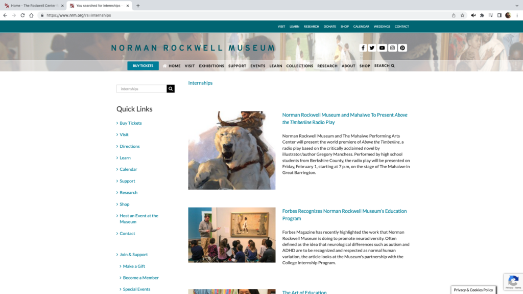
Find out if the museum has any internship opportunities for undergraduate students and details about the internship, including how to apply. This is an important community engagement activity for the museum.
Find a specific work called Pointing Hand in the Norman Rockwell Museum’s digital collections. Finding artwork is a foundational concept for an art museum.
Addendum: Finding Pointing Hand did not present any significant navigational issues for the paired users. So for the individual user-tester, the artwork was changed to New Kids in the Neighborhood and the participant was asked to determine if the website had any narrative information about the work that might be useful in an art history project.
Test Analysis
Paired User Test (PU) – all three tasks were completed in less than ten minutes with no real navigation difficulties.
Think Aloud User Test (TA) – All tasks were completed in 11 minutes. There was difficulty in searching for information about the artwork and confusion with navigating between the NRM site and the Rockwell Center.org site (RC).
| Benchmarks & Metrics | Finding Artwork | Planning Visit1 | Internships |
| Task Completion | yes2 | yes | yes |
| Time minute:second | Paired 2:15 Think Aloud 2:40 | Paired 33 Think Aloud 5:49 | Paired 4 Think Aloud 2:25 |
| Error Rate | All testers tried the main search bar before going to “Collections”→”Search the Collection” | Paired – none; used “Visit” link TA – none | Paired – none; typed “internships” in search bar |
| Frustration Level | none | TA – confusion surrounding the need to choose a date before proceeding to checkout | TA – confusion between nrm.org and rockwellcenter.org |
User Review
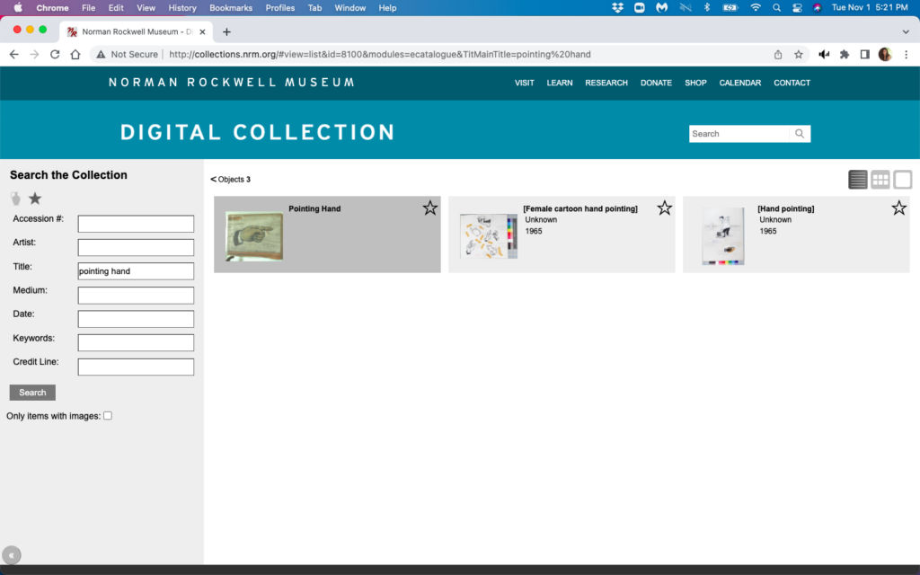
The collection artworks are displayed in what I will describe as an archival view. None of the user-testers liked this display, nor the interactivity of the page. Works are displayed in shadowed boxes which highlight when the cursor hovers over them.
However, the cursor had to be directly over the image to display an enlarged version of the image, likewise the cursor had to be directly over the title of the work to display metadata for the work. None of the users found the metadata informative. They all expected to find narrative commentary displayed with the artwork image or for links to that information to be provided with the image.
Users also found it inconvenient that the archive page had no back function. The users expected a left pointing bracket (<) that is above the images to act as a back arrow, but it has no functionality. Both users used browser back arrows from here even though the NRM name at the top acts as a homepage return.
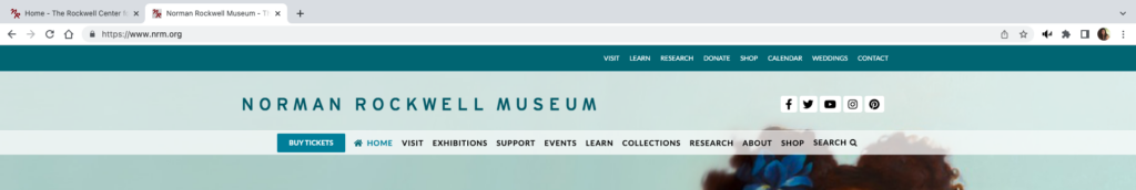
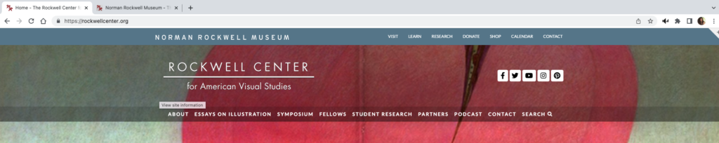
When TA was searching for narrative commentary about New Kids on the Block, he got led to the Rockwell Center for Visual Arts. This has a different URL, it has the RC name in place of the NRM name, and a new menu bar, however there are enough similarities that tester was unaware that he was at a different website. The browser tabs for both sites contain red “NR” and both sites have the same menu bar at the very top of the page, although there is a slight color difference from blue-green to gray-blue.
Neither set of users found the popup window used when purchasing tickets bothersome. The 23 year old in the PU group opined that it might be a more secure site to enter his credit card information. And the PU testers happily noted the Trip Advisor ratings on the popup site.
Design Recommendations
| Violation | Improvement |
| Heuristic 1 | – Use popup message when moving from nrm.org to rockwellcenter.org |
| Heuristic 2 | – Add a breadcrumb trail to the top of each page – Enlarge the very top blue-green-gray menu bar. – Keep the top menu bar pinned throughout both websites. – Highlight the “Internships” link by adding a colored field to improve visibility and recognition that it is a button. |
| Heuristic 3 | – Add a title or header to the top of each page |
Discussion
Redesigning how images of artwork are displayed is only realistic if NRM wants to do a major overhaul of their site, however there are some smaller improvements that will improve the navigability of the site.
Based on Nielsen’s first heuristic, visibility of system status, the user should clearly know when they are moving from nrm.org to rockwellcenter.org. A simple popup message that the user is leaving the original website would work. Additionally, clear instructions should be given within the popup window that the user needs to first choose a visit date before proceeding to checkout.
User control and freedom, heuristic #3, states that links should be easily discoverable, especially back and cancel. NRM website should add a “bread crumb” trail so that users know where they are in the website, improving their ability to make decisions about which link to use next. The website has two menu bars at the top of the page, a blue-green bar at the very top, and semi-transparent one under the website name. This stays consistent between nrm.org and rockwellcenter.org with the exception of the slight color change in the top bar. Enlarging this top bar and pinning it so that it does not disappear with scrolling will also improve navigation. Also, the search for internship opportunities would be easier if the “internships” link at the top of the webpage included a colored field that changed color so that it is more obviously a link and not merely a heading.
Finally, in accordance with the fourth heuristic of maintaining consistency with other websites, each page should contain a header so the user understands where they have landed and what content is found on that page. This would help others from feeling like they are looking at “another page with a bunch of random articles” as the think aloud user-tester described one page.