Individual Assignment 3: Representative User Test

Selected website description

The Wilderness Coast Library System website homepage

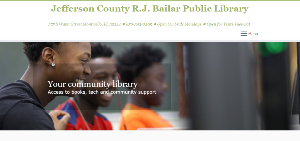
The Wilderness Coast Public Libraries (WCPL) system offers its patrons various services through four libraries in three Florida counties. The particular library website within the system I was interested in seeing my user navigate was the Jefferson County R.J. Bailar Public Library (JCPL).

The Jefferson County R.J. Bailar Public Library website homepage

User characteristics

My user is a mom to three children, two in middle school and one in high school. She works as a co-teacher for special education students at an intermediate school. She says she is not the best at technology, adding her kids would be better at this test than she would, and has never accessed or used library websites.

Testing method

When my user told me she did not have experience navigating library websites, I decided to use the Retrospective Probing testing method. This method is typically combined with other methods, so while I asked her to think aloud as she was using the website, this method would give me the chance at the end to ask questions if she did anything I noted as interesting or unexpected. I did not believe just utilizing the Concurrent Think Aloud method would allow me to ask questions; unless I completely misunderstood, it appeared the only prompts I could give were to remind her to keep talking if she got quiet. 

User tasks

I did not make any changes to the scenarios or tasks. When I told my user that the persona was a high school student, she said she did not mind and wanted to try getting into that perspective.

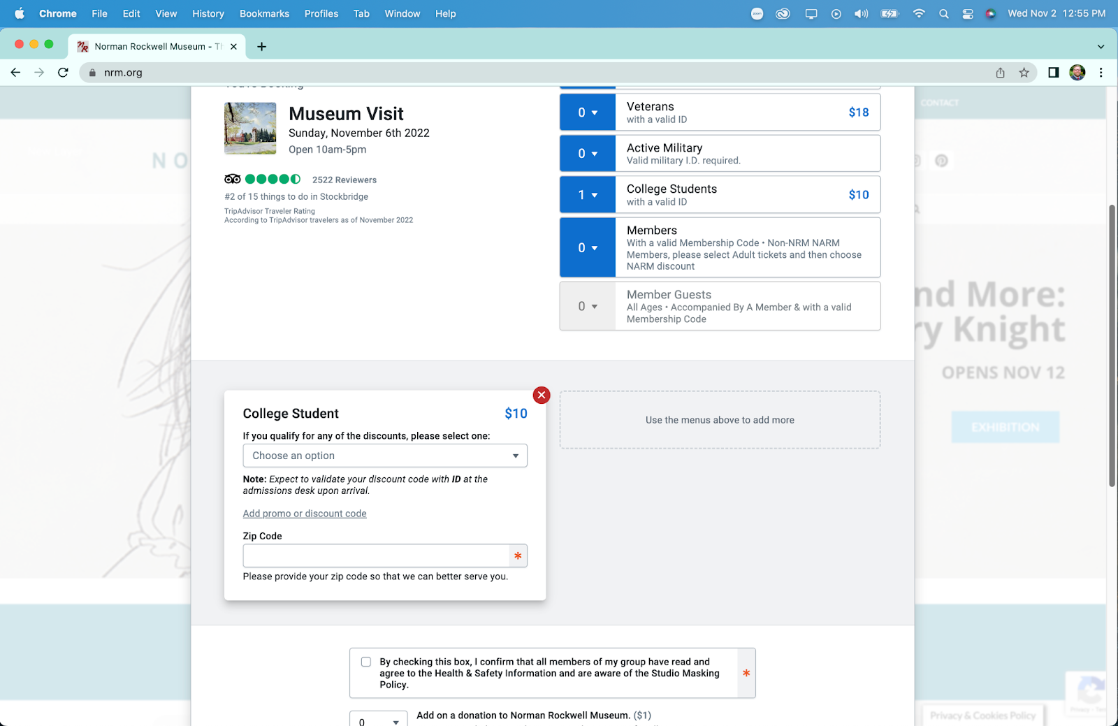
Task 1: Using the Library system, the student will locate a relevant book for their research on the death of Julius Caesar, and which library that book is located at.

I kept this task as is because I wanted to see how my user would find and access the library’s catalog.

Task 2: Now knowing what book to look for and what library it is located, the student will look for the available hours of that library that does not overlap with their high school schedule.

I kept this task as is because I was curious what my user would do to find the hours of the library, since from the site itself, they are not located in a logical location.

Task 3: Find information on the use of computers at the local library to complete their research paper on Julius Caesar’s death. The student will also find out how to print from the library.

I kept this task as is because the use of computer information is not very clear or detailed and I wondered how my user would interpret them.

Detailed analysis

Task 1

Using the Library system, the student will locate a relevant book for their research on the death of Julius Caesar, and which library that book is located at.

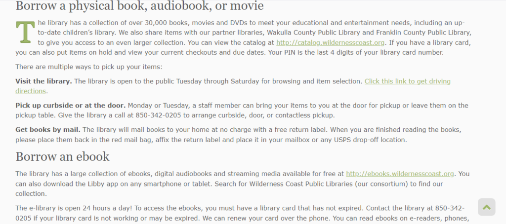
I read the persona and first task to the user and pulled up the Wilderness Coast Public Libraries system homepage for her to begin. She clicked on Member Libraries and clicked on the Jefferson County picture since she is a student at a high school there. On the JCPL site, she clicked on the button labeled More under the header “Get books & materials.” She did not attempt to read the page when on it, instead scrolling down immediately. She noticed the faint words of Post Navigation at the bottom, asking what it meant.

The faint post navigation at the bottom of the page

She said she was looking for a search function so she can type what she needed and continue. She then clicked on the hamburger menu at the top right of the page, but not seeing what she needed, she closed it and started to skim over the Get books & materials page. She pondered over borrowing an eBook before deciding to click the link to do so. When the next page was a notification that the WCPL had merged with another network, she wondered if she would be able to access it since she does not live in Florida. 

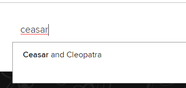
On the Panhandle Library Access Network website, she eagerly exclaimed over the search bar, and began typing Julius before realizing she was not sure of the correct spelling. Remembering that she was acting as a teen, she ditched the search bar and clicked on the Teens tab on the top navigation. Again, she clicked on the search bar on this page and typed “Ceasar,” the incorrect spelling, rather than Julius this time. The auto-complete function gave her the suggestion of “Ceasar and Cleopatra,” so she clicked on it, but the resulting page claimed it could not find any matches for this title.

Incorrect spelling and resulting suggestion
No matches for the suggestion

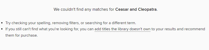
She tried the search bar again, sounding out Julius as she typed it and found a match from the auto-suggestion. She clicked it, but there was only one book, which did not look as though it pertained to Julius Caesar, so she scrolled down and told me she would use one of the books at the bottom, under “Didn’t find what you were looking for?” She did not click on any of them, but those particular titles were all labeled “Not owned,” which I do not believe she noticed. Two were audiobooks of the play Julius Caesar by Shakespeare, one was an eBook of the SparkNotes for the Shakespeare play, and one was an eBook about Julius Caesar. She said she nailed this task, and I did not want to push any further and decided that could be the end. She said she could have found it faster if she had known how to spell Julius Caesar.

I asked her to go back to the Get books & materials page on the JCPL site, and once there, I asked why she had clicked on the ebooks link. She said it was the only one she had seen on the page.

Part of the Get books & materials page

Task 2

Now knowing what book to look for and what library it is at, the student will look for the available hours of that library that does not overlap with their high school schedule.

When I read this task to her, she said she would probably just call the library to ask when it is open. From the JCPL homepage, she clicked on Discover library services and immediately scrolled down. She saw the sentence that says patrons can call the library during business hours, but she wondered when the hours were. She then gave up on this task, saying she would just call the library since the phone number is at the top and it says to call them on the Discover library services page.

I asked her where she would expect to see the library hours, and she said either on the homepage, at the top navigation where the address and phone number are, or on the Discover library services page.

JCPL top navigation

Task 3

Find information on the use of computers at the local library to complete their research paper on Julius Caesar’s death. The student will also find out how to print from the library.

Starting back on the homepage, she clicked on the Get books & materials because it mentions technology. She clicked on the Tech2Go link, which directs her to the catalog, and said it didn’t look helpful, then asked what Tech2Go even meant. On the catalog for Tech2Go, the first option is a Chromebook.

She said she’s not good with technology and goes back to the Wilderness Coast Public Libraries tab. Curious, she clicked on Resources, wondering what it meant and skimmed it. She then navigated back to the JCPL website and went to Discover library services. She noted the printing information, then went to the Get books & materials page, back to Tech2Go, and said she knows she can check out a Chromebook from the library.

I took this as her suggesting she completed the task and asked why she had clicked on Tech2Go for computer information, and she explained that it sounded like technology and she was curious what was on it.

Possible design recommendations

Catalog search bar

During the first task, my user missed the link to the catalog on the Get books & materials page, which was understandable since it was in the middle of a paragraph. Because she said she had been looking for a search bar, I think a possible redesign choice would be adding a search bar for the catalog on the navigation panel of the JCPL website. Most people are accustomed to seeing a search bar on the homepage of a library’s site, so not having one violates the consistency heuristic.

There is also the option of making the link to the catalog more obvious instead of or in addition to including a catalog search bar. Having it in the middle of a paragraph like it currently is makes it easier to overlook.

Color scheme

The color scheme also proved to be somewhat of a hindrance to my user. She said she missed the link to the catalog because it blended in with the black font color and gray background. To prevent this from happening to other patrons, they could change the link color to something that stands out better against the gray background.

Library hours

My user gave up on the second task, finding the library hours, pretty quickly. While on the JCPL site, it notes where it is located and the days it is open, telling patrons to visit or call during business hours, but nowhere on the site does it list those hours. Because the phone number was visible, my user said she would just call and ask for the hours. A possible redesign here would be to include the hours in the top navigation, or, if the information would not fit there, to include them on the Discover library services page where it mentions to call the library during its open hours.

While the hours of the library can be found on the Wilderness Coast Library System website and by navigating to the catalog from the JCPL website, my user missed the link to the catalog and said this location would not be where she would expect to find the library hours. This violates the match between the real world and system heuristic.

Individual Assignment 3: Representative User Test

  1. Website Being Evaluated

The website being evaluated is Sarah Maker. It is a crafting tutorial site for multiple mediums including crochet, knitting, punch needle, cricut, quilting, tie dye, and more. The website is organized by medium, and the tutorials are given in blog post format with photo examples vs. video. 

  • The Users

The users of the site will be people interested in crafting and be of various skill level. I can see anyone from beginners to advanced crafters using this site for their crafting needs. The users will be creative with artistic tastes/interests and will most likely respond well to visuals. 

Our group persona is a social-media savvy young woman who is just starting her journey in crochet. 

I did not have someone available who would fit this persona, so my user is a highly advanced tech male in his mid 30’s. He has a computer science degree and works in cyber security. While he is interested in creating – he dabbles in 3D printing and painting vs. the more fiber/yarn-based crafts on this website. I think this effected his choice of Christmas gift tutorial – he is way more practical minded and less “cutesy” when it comes to tastes, which may not be accurate for above persona. 

  • The User Test Method

The user test method utilized was the Think Aloud method. He sat at a computer while I sat at a chair next to him. I asked him to narrate his process as much as possible and took notes while he completed them. I chose this method because it was a great option as far as tools available went as well as created a relaxed environment for the user to narrate and complete the tasks. I was able to sit and closely observe their process.

  • The Tasks

I stuck to the original tasks which were as follows:

Task 1: Find instructions for a complete crochet beginner who has no idea where to even start with the craft.

Task 2: Learn what different types of yarn and thread are good for different types of crafting.

Task 3: Find a beginning crochet project that would make a good holiday gift for friends or family.

  • Analysis

Task 1

For Task 1 he started at the home page. First instinct was to click Crochet from navigation. This landing page is very wordy and he did not spend time reading it carefully and instead scanned the text, completely missing the paragraph about beginning to learn crochet. He noted that the links are way too close in color to the body text and were hard to see. He also noted that the visuals on this page were hard to differentiate from the advertisements. This caused him to glaze over the first few visuals/links at first:

When he got to the bottom of the page he exclaimed quite exasperatedly “THERE ARE 15 PAGES?!”

Once he realized that the images above are links and not ads he scrolled up and clicked “27 Free Tunisian Crochet Patterns”. I asked why he went with this one and he said it was because it mentioned “Beginner friendly” in the title whereas the others said “Beginner to Advanced” so he thought that would be the better option for him. 

Here he scrolled down a bit and made note on how much text there was, while not reading any of it. 

Clicked Tunisian hooks link under supplies and led him to Amazon. Said would buy this if starting. 

Went back to site and saw the first pattern – liked the look of it so he read the details. Noted he liked how clear this part is. Large image, brief description, suggested yarn, and clear link.

It leads to a tutorial on another site.

At this point I slightly led, because I think he was a little confused on task and getting away from himself. So, I said “if you didn’t even have a clue on how to read a pattern and were just looking for the extreme basics, like stitches and casting on. Where would you go?”

Went back to the crochet landing page from navigation and read the top content more closely. Finally found the small link to the Crochet for Beginners Guide mentioned in very first sentence. 

On this page he mentions he likes the photos but would probably go to YouTube later for video tutorials. 

Task 2

Starting again on the homepage, went to Crafts from navigation. Read list and decided that was not where he needed to be. Then clicked Knitting from navigation. Sat for a bit lost on where to go, then noticed the Search bar. 

Using the search bar, he searched “Types of Yarn”. Made note that he had no idea what any of the terms meant, for example “Worsted”, “Yarn Weight”, etc. Because of this he decided not to click on any of the links and instead adjusted his search to “Best Types of Yarn” – this produced the same results. He clicked out of search and exclaimed that at this point he would give up and use google to find a different website.

Task 3

Again, started from the homepage and then went to the Crochet landing page from the top navigation. Scrolled down the long page and passed over the Christmas themed patterns and went to page 2 instead. When asked why he didn’t click those he said he thought they were a lame gift idea and wanted to go with something more practical, that people could use year-round. 

Instead chose “25 Gift Ideas” link because the visual spoke to him. 

On this page he started to scroll down and stopped at the holiday list. He noted that he didn’t like that only Christmas and Valentine’s Day were links:

Kept scrolling and started reading a bit. Got annoyed when his reading was interrupted by the shadow effect that happens when you scroll over the email forms. 

He also made note that it is annoying to have to scroll through each pattern one at a time instead of seeing them all at once to determine more quickly which one you would like to learn.

Had to scroll for a bit until he came to a project he liked: “Easy Crochet Can Cozy”

Clicked “Continue Reading” to learn this pattern. Started reading the pattern a bit and missed the links up top that would teach the 6 Basic Crochet Stitches for Beginners. Saw lower that he needed the Moss Stitch for this pattern, but that there wasn’t a clearly labeled link or tutorial for this stitch. Scrolled back up and clicked the stitch link. Used “Command F” to search “Moss Stitch” on this page. Then had to click another link to finally get to the moss stitch tutorial. Needed to navigate 3 pages just to find the stitch tutorial needed for this pattern.

  • Design Suggestions

My design recommendations for this website would have the goal of reducing search time for the users. Each task in the analysis took quite a long time to complete. To do this I would do the following:

  • Reducing scrolling needed by revaluating the architecture of the pages – this can be done by creating clear categories that can be seen before the fold of the homepage. Instead of placing important links in content blocks, move them out into clear CTA buttons and lastly placing the tutorials in a gallery format vs. one on top of the other.
  • Navigation: the navigation can be organized more successfully by matching the categories linked on homepage: Crochet, Knitting, Punch Needle, Cricut, Quilting, Tie-Dye

Vs. having quite a few of the crafts hidden under the “Crafts” category

I would also place dropdowns underneath each of the top navigation links and would have a clear link for beginners guides underneath the navigation. 

  • Other suggestions: remove shading effect over email forms and create videos for users (to keep them on this site instead of competitors on youtube) 

Форекс и контракты CFD на акции, индексы, нефть и золото в XM

CapitalProf отзывы

Эти компании также зарегистрированы в Европе – в Дании и Швейцарии соответственно. Однако их аудитория примерно соответствует их регистрации. В частности, львиная доля клиентов Saxo Bank приходится именно на Европу.

CapitalProf отзывы

Всем привет, решил и я вставить свои три копейки, отзывы не читал, сразу зарегистрировался. Пришлось сделать новую карту в банке, распечатал договор и отправил им на подтверждение. Прошел верификацию, получил бонус 30 и начал торговать без вложений. Решил вывести на карту, не дали, в поддержку пишу, мол, что за … Написали, что, вывод на карту после пополнения картой.

Какие документы понадобятся для открытия счета

Подробнее вам об этом расскажут в банке или в юридической компании, если вы обратитесь за помощью к юристам, которые занимаются возвратом денег от брокеров. Трейдер также в праве запросить повышение или понижение плеча, прикрепленного к выбранному им счету. Данная функция привлекает клиентов к CapitalProf.

Брокер XM обеспечивает доступ на рынок акций. Торговля реальными акциями в компании облагается фиксированной комиссией. Она отличается, в зависимости от рынка акций, на котором вы работаете. Торговля акциями доступна только на специальном торговом аккаунте для трейдинга – Shares. Сравним географию клиентов XM.com с конкурирующими организациями – Saxo Bank и Swissquote.

  • Анализируя отзывы о XM, необходимо отметить функциональность торговли и количество доступных счетов для работы.
  • Здесь также практически нет инструментов для получения пассивного заработка – ETF, облигации, PAMM-счета на платформе недоступны.
  • У меня просто есть неудачный опыт, предыдущий брокер обрабатывал ордера долго, 3-7 секунд и это ощутимо.
  • Еще я переживаю теперь за свои документы, отправил же IronCapitalProf абсолютно все.

Он используется не только для торговли CFD и валютами, но и акциями, если вы работаете с торговым аккаунтом Shares. У XM.com минимальный депозит – один из самых низких в отрасли. Для криптовалют мы подготовили аналогичную табличку, из которой можно узнать реальную комиссию для нескольких кэпиталпроф форекс брокер популярных торговых пар и нескольких редких. Стоимость одного контракта на данном рынке меняется от 1 до нескольких сотен единиц базовой криптовалюты. Для справки, стоимость биткоина на момент расчетов (конец сентября 2020 года) – около $10400, а стоимость эфириума – $330.

Чтобы открыть счет в XM, обязательно создать учетную запись. В процессе создания аккаунта важно указать тип платформы для торговли, а также нужный вид счета. Для работы с демо счетом соответствующую функцию потребуется выбрать сразу. Мою электронную почту взломали мошенники и без всяких проблем вывели все средства со счета в ХМ на электронный кошелек. А когда клала деньги мне так рекламировали, что это очень надежный брокер, который сто раз проверит, и только потом перечислит деньги. По CFD-счетам набор торговых активов значительно шире, чем у других брокеров.

Отзывы о брокере XM

Своим клиентам брокер XM предлагает лучшие условия сотрудничества по всем параметрам. Для трейдеров – это оптимальные торговые условия и круглосуточная поддержка, для инвесторов – поддержка и рекомендации по более эффективному вложению. Достаточно сложная брокерская система торговли активами и маржинальными продуктами. Брокер CapitalProf обладает специфическим внешним видом, который многих способный отпугнуть.

Чтобы воспользоваться условиями, необходимо зарегистрироваться и пополнить счет на сумму до USD. Также вы можете принять участие в программе лояльности Executive от XM.com. Обратите внимание, что торговый счет XM.Zero и торговые счета XM Ultra Low и Shares предоставляются для разных юрисдикций. Ограничения на применение того или иного счета рекомендуем уточнить у брокера. С региональными ограничениями ситуация у XM отличается, в зависимости от компании, которая управляет брокером. XM.com управляется несколькими юридическими лицами в разных регионах мира, и у каждой из них есть свои региональные ограничения.

XM: FAQ

Эти торговые платформы отличаются оперативным исполнением заявок без реквот и отклоненных ордеров. Трейдеры могут получить доступ к этим терминалам в своем личном кабинете. Редакция сайта Рейтинг Брокеров не несет ответственности за содержание комментариев пользователей. Вся ответственность за содержание комментариев возлагается на комментаторов. Перепечатка материалов возможна только с разрешения редакции сайта.

  • Данная процедура лишает анонимности проводимые транзакции, но в большинстве случаев предотвращает мошеннические действия.
  • Трейдер также в праве запросить повышение или понижение плеча, прикрепленного к выбранному им счету.
  • Пользователи отмечают, что брокер XM — это демократичная площадка в плане дополнительных сборов.
  • При выборе брокера также уделил внимание возможности вывода без комиссии, и в нескольких случаях мне действительно удавалось вывести средства без дополнительных расходов.

Также у компании есть подробный обзор торговой платформы и возможностей сайта XM.com. На сайте опубликованы подробные видеообзоры терминалов. Здесь вы узнаете, как открыть торговый аккаунт, как просмотреть котировки, как настроить торговые платформы MetaTrader 4 и MetaTrader 5. По количеству способов ввода и вывода денежных средств, брокер XM.com превосходит брокеров Saxo Bank и Swissquote. Эти организации предлагают клиентам пополнение и вывод денежных средств только с использованием банковских методов – кредитных карт и банковских переводов.

Forex4free.net

Автоматизированные торговые системы — это возможность создания пассивного заработка на финансовых рынках для всех пользователей. Инвестиционная компания Xemarkets была создана в 2009 году. Торговые условия по стандартным счетам классические — минимальный лот 0,01, спред зависит от типа актива — от 0,6-1 пункта. Допускается расширение спреда в момент волатильности, но брокер утверждает, что увеличение незначительно. Стоит похвалить образовательные услуги XM, например бесплатные еженедельные вебинары на популярные темы — свидетельство того, что брокер вкладывается в обучение пользователей. Мы глубоко уверены, что торговать на Форекс может любой желающий человек.

Комиссии на CFD

Рекомендуется проанализировать и подсчитать предполагаемые риски в ходе торговли активами. Следует неоднократно ознакомиться с обучающими материалами и тематической литературой, нивелируя риски полной потери капитала. Создается также опция получать партнерскую комиссию, привлекая сторонних пользователей. Создана система рефералов 2-го уровня, а за каждую сделку начисляется до 25 долларов.

CapitalProf проходит ежегодный независимый аудит, подтверждающий соблюдение требований регуляторов. Результаты аудита Вы можете запросить у службы поддержки брокера. Предусмотрены программы лояльности, которые помогают начинающим трейдерам при минимуме затрат удачно начать карьеру трейдера. Также есть вспомогательные калькуляторы трейдера для расчета стоимости пункта, свопов, объемов сделки и т.д. Торговые платформы брокера — МТ4 и МТ5 во всех версиях для любых операционных систем и устройств.

Австралийская лицензия выдана надежным регулятором, к остальным документам вопросов больше. Кипр некогда считался одной из крупнейших мировых оффшорных юрисдикций, однако за последние 3 года в юрисдикции был проведен ряд изменений. Благодаря этому доверие к регулятору выросло. Белиз – это оффшорная юрисдикция, не обменивающаяся налоговой информацией и не раскрывающая данные о конечных бенефициарах.

Кроме того, каждая из них адаптирована под гаджет, с которого клиенту удобнее всего участвовать в торгах. Это и версия для планшетов, и для смартфонов с разными ОС, а также мультитерминал MT4. Форму завершает “Соглашение” с рассылкой новостей из официального сайта. Я знаю, что косяки и проблемы есть у всех, это я уже проходил и тут c некоторыми проблемами приходилось мириться).

Они предлагают много инструментов для торговли, время от времени устраивают различные конкурсы и акции. Процесс пополнения счета очень быстрый, что радует, хотя вывод средств мог бы быть чуть быстрее. В целом, я доволен сотрудничеством с CapitalProf, и главное, что мне нравится, это возможность торговать без нервов, так как брокер не вмешивается в процесс торговли. Похоже, что и в будущем я останусь с ними.

Individual Assignment #3: Representative User Test

The Website

Norman Rockwell Museum homepage

The Norman Rockwell Museum is located in Stockbridge, Massachusetts. The website contains resources about the materials contained within the collection, information on visiting the museum, an ecommerce shop, a method to purchase tickets to visit the museum, and additional resources regarding the institution itself and ways in which a user can donate or contribute to the museum.

The User

The user I utilized for my representative user testing is female, aged 27-35, with moderate to advanced computer skills. They are employed as a graphic designer, and are familiar with concepts surrounding images such as dimensions, formats, and copyright licensing. They were also previously employed in a library so they are vaguely familiar with cataloging and organizational concepts surrounding large collections.

The Method

The method utilized for this representative user testing was the concurrent think-aloud (CTA) protocol. The user was instructed to perform their given task while stating their thoughts and reactions to the website with which they were interacting. Care was taken to ensure the tasks were not leading, while eliciting interaction with the elements of the website that required further examination.

This method was chosen based on available resources and time. It provides a cost-effective means of user testing requiring little more than a computer, a user, and a notepad. Despite its relative simplicity, CTA provides ample insight into issues users might encounter on a given website. While the verbal dialogue may be disruptive to the task being performed, it allows for greater insight into the users mindset and thinking when navigating to and using features on a given website.

The Tasks

Three tasks were given to the user to perform. They are as follows:

  1. The user was instructed to purchase tickets to visit the museum. This represents arguably the most important task for the website, which is to facilitate paid visits to the museum. The user was informed that they would qualify for a college student discount, and were attempting to purchase a ticket one week away from the day they were participating in testing.
  2. The user was instructed to find out more information about internships at the Norman Rockwell Museum, and if available, apply to one. This task is representative of the student persona created in our previous group assignment. 
  3. The user was instructed to obtain a high quality scan of a painting for use in a project. This task again represents our group persona, a college student. This task was refined from the initial task (to look up a painting) to better induce navigation to less visited areas of the site and interaction with more complicated information present on the site.

The Analysis

Task 1: Purchasing Tickets

The user is initially tasked with purchasing tickets for one week from the current day to visit the museum. She is initially drawn to the ‘Buy Tickets’ call to action in the main navigation menu beneath the title of the page. She is temporarily distracted by another “Buy Tickets” button on the carousel image in the center of the page, but as this is set on a timer to rotate, the link to buy tickets on the carousel image disappeared before she was able to click the link. She resorts to clicking the main “Buy Tickets” button on the navigational menu. It is worth noting that on the mobile version of the website, this menu and button becomes hidden, requiring the user to click the menu toggle in the top right to access the ticketing interface.

The user then selects the museum visit option from the pop-up booking window, after some time spent determining the proper link to click. The user notes that this interface is very resource intensive for her laptop, causing it to slow down her computer and web browser.

The date selection page in the ticketing system

On the date and time selection page for the museum visit the user selects her date but is confused by where to proceed. There is not a clear button highlighted to proceed to purchasing, instead the user scrolls the page looking for a “purchase tickets” option. Eventually she realizes that the only clickable element (besides Covid-19 guidelines and images) is the box beneath the calendar. She clicks the box, and proceeds to the next page.

The ticket type and discount type page in the ticketing system

On this page, the user easily selects one ticket for a college student in the initial ticket options, but she is confused momentarily by an additional drop down for discounts after selecting her initial ticket type. This likely stems from having two separate places to define your discounts, both initially in the top ticket type menu, and a secondary menu for other discounts (such as EBT or local resident discounts). Additionally, on this page she notices a required zip code box and fills it out, stating that “its weird they ask for a zip code when they will get my address”.

She then proceeds to bypass the donation and comments section of the page as they are unnecessary for her purposes. She then states that she is surprised by the addition of a $1 fee for the ticket, and wonders why that isn’t just included in the initial ticket price. She then clicks the add to cart button and proceeds to the checkout page. Upon reaching the checkout page, which contains a relatively standard form for credit card information, she concludes her first task.

Task 2: Researching Internships

The user is now tasked with researching information about internships at the Norman Rockwell Museum, and applying to one if applicable. Her initial response is to quickly scroll to the footer of the home page looking for a link to “careers” or similar. Upon finding nothing along these lines, she returns to the main navigation menu above the banner image. Here she attempts to hover over the menu items looking for something similar to “careers” as before. She then attempts the same process on the secondary menu on the very top of the page. Upon discovering there are no drop-down or hover menus here either she proceeds to choose another location, the “Learn” link in the menu. She reviews this page and determines it does not contain the information she is looking for. She now clicks the “About” menu item, which is the page that contains her desired information.

The main about page

On this page she quickly locates the link to more information on internships in the table of contents. This link brings her to a new page that retains the table of contents from the main “About” page. On this page, she scrolls down past other available positions (including full job descriptions) to find the internship section of the page.

The internships section

She notes that this section doesn’t have any anchor links like the full employment section above does. After scrolling through descriptions of all possible internships (some of which are closed) she finds a short “how to apply” section that applies to all internships.

The how to apply section for internships

At this point she clicks the first bullet point, only to realize that it is an anchor link to where she is already located on the website. She proceeds to read the instructions and download the linked pdf from the button in this section. With an application form secured, and process understood, she has completed this task.

Task 3: Obtaining a Scan

For the third and final task, our user must start the process for obtaining a high-quality scan or print of a piece of art in the Norman Rockwell Museum collection. She is provided with a specific piece, “Santa’s Lap” and told to disregard cost. She correctly navigates to the “research” menu item in the secondary menu at the very top of the page. On this new page she finds “image resources” in the table contents, which is the correct section for image licensing and purchasing information, and clicks the link taking her to a new page.

At this point she reads the paragraphs at the top of the page and begins to scroll down to find more information. Here she discovers a button that takes her to the “online image order form” that is an anchor link to further down the page, as shown below.

She begins to read the form section in preparation for completing her task, but notices that they do not mention any prices for obtaining a scan. She begins to scroll back up the page to look for the pricing information in a linked pdf, located just above the anchor link. Upon viewing the pdf she continues to inspect the form for additional elements she might need to provide.

In the shipping section she notes that “it’s weird” that they ask for an account number. Upon further inspection she determines she simply needs to select an option lower in the shipping area to receive standard shipping. She also notes that there is no section for payment information, or to add anything to a cart. This form acts as a “request” form more than an “order” form, necessitating further interaction with museum staff to obtain a print or scan. After determining that she has the information and links required to obtain a scan of a painting, she has completed her third task.

The Recommendations

Upon completion, and reflection on, this representative user test, I can offer XXXX main recommendations to improve the usability of the Norman Rockwell Museum website.

#1 – Consolidate Menus

The museum website has at minimum two navigation menus at all times (up to three if you are on a page with a table of contents). The links often do not match each other in content, despite being titled the same in the menu. The two main menus should be combined to create a unified navigational menu that reduces overlap and increases information scent for the user. Additionally and related, elements of the menu that are more related the organization itself (such as “careers” and “staff directory”) should be placed in the footer of the website, to allow for quick navigation by users actively seeking that specialized information.

#2 – Add Anchor Links

Many pages on the site contain large amounts of information on a page, necessitating a large amount of scrolling by the user, leading them to become lost and fatigued. While creating dynamic pages that display the information requests (such as drop downs for the type of employment you are looking for) would be the optimal solution, a much more cost effective solution would be to enrich informational pages with anchor links. This would allow users to quickly navigate to their desired information, without having to scroll through information they do not need. A list of these anchor links should replace the “Table of Contents” present on many of the pages as that is the standard location for them.

#3 – Better Integrate Image Scanning

The system to request and purchase scans or prints of images is not integrated well into the rest of the website. If one were to find a painting they would like a scan of, they would need to manually copy the information for the painting, navigate to the image order form, and then manually enter the information themselves. This could be made markedly more efficient by creating a link on a link on a painting’s information page to purchase a scan or print that leads to a pre-populated form with the painting’s information. This would allow the website to remove multiple tasks for a user requesting a print, while not necessitating creation of  a secondary purchasing system. 

#4 – Simplify Ticket Purchasing

The ticket purchasing system and process offers ample opportunity for improvement. As many ticket purchasing systems exist for quick implementation, this section of the site can be streamlined with minimal associated cost. Some specific recommendations for this section are to reduce the process to two pages, one where users select their tickets, dates, and additions, and a second page where they checkout and pay. Beyond being more efficient, reducing the pages removes the issues with the forward/backward navigation in the purchasing system. Additionally, the removal of low frequency ticket options (such as “memberships” and “donation” and specific events) will streamline the process for users, directing them to the two most common ticket types “Museum Visit” and “Museum Visit + Tour”.

###

Individual Assignment #3: Representative User Test

The Website

The website that we chose for our usual tasks was IGN.com. as you hang.com is a website where users can go online to find various pieces of information and even ratings on different types of video games and entertainment media.

The website even allows users to create an account so that they can earn rewards. There are guides on how to complete your favorite games and tips and tricks for gameplay. This website is considered one of the more recognizble of its kind and has been around for decades.

User Characteristics and Tasks

The user persona we had developed was for an 18-23 year old gamer that enjoys various genres of games but does not have a “make or break” genre. They are a student, ideally working part-time to afford video games. The user is looking for a new game to play and is familiar with IGN having a rating system for games and hosting their own awards to recognize high-ranking games.

Our user would be assigned with three tasks:

  • Accessing the Game of the Year awards for 2021. The user doesn’t actually know which video they are interested in purchasing yet. They know that they are looking to see what’s trending in the gaming community before making a purchase.
  • Find a walkthrough for Legend of Zelda: Breath of the Wild. The user wants to be sure that gameplay is actually engaging. They have familiarity with the Legend of Zelda brand but wants to know what to expect.
  • View the reviews for the other games that were being considered for Game of the Year. The user isn’t completely insistent on having Legend of Zelda: Breath of the Wild. They are open to seeing what other games have been trending to see if there is something else to pique their interest.

The actual user that I used to carry out these tasks is a 24-year old who doesn’t regularly play video games. This user has described themselves as a “social” gamer, a person who plays when they are in environment where there is a game. They are very familiar with the internet and are familiar with websites that serve this same purpose just not tailored to video games. During this test I asked the user to speak aloud. This user is a very vocal person and I knew that while the speak aloud method may be intimidating for others, it’d be prefect for me to find out what they were thinking.

The Test

The first task I asked the user to complete was to access the Game of the Year awards for 2021. As soon as I assigned the task, the user encountered their first challenge, website navigation. The website had it main content showing as it was in the first screenshot but then the sidebar had collapsed.

The user expressed confusion over the structure of the navigation bar and then decided to resize the page. Luckily, this made the menu bar expand. At this point, the user expressed that they were looking for a search bar. The user scrolled all the way to the bottom of the website and then scroll all the way back to the top and stated that there isn’t a search bar present. While they were scrolling, they indicated they were also looking for an article or a hyperlink that would take them directly to the Game of the Year awards and they couldn’t find one. The user then decided to expand the menu bar one more time to see if they have missed a search bar. They saw a search icon, but when they clicked it, it only allowed them to search through playlists that have been created on the website. At this point the user turned around and looked at me because they thought that I was playing a joke on them. I didn’t do anything except remind the user of the task to accomplish. They decided to expand the menu bar one more time and click on the Reviews tab, which only separated the reviews by what they were reviewing (e.g., video games, television, etc.). After reviewing all the options present in the navigation by the other determined that there wasn’t a way to get to the game of the year awards from the IGN homepage. The user resorted to conducting a search on a search engine. From the users initial search on the homepage they had concluded that they were unable to execute a search on the website so they decided to continue using their knowledge of Google to help them search the IGN website. There they located the Game of the Year article and was then able to find reviews on the other games listed in the article. The article featured videos it appeared to be trailers for each of the Game of the Year contenders but didn’t necessarily take you to any extra reviews for the games. The user had already accomplished two of the three tasks that I had assigned to them, and the only thing left was to find the walkthrough of Legend of Zelda: Breath of the Wild. The user decided to head back to the IGN homepage and give it one more try to help him complete the last task. The user headed to the menu tab, clicked on the reviews tab and selected video game reviews. The user scrolled down a while and without a search bar, they decided to Ctrl+F the webpage and turned up nothing. After a deep sigh, the user then went back to Google and searched for this information just as they had searched for everything else.

Design Recommendations

Throughout the user test, one thing I noticed is that my user was extremely frustrated at the lack of navigational aids to guide them through the website. I know that the Internet largely functions on ads now, but I think that IGN could benefit from reducing the size of their advertisements. When they reduce the size of advertisements, it will allow them to incorporate certain elements into their webpages such as search bars and other hints to let the user know where they are in the website. The overall structure and layout of the homepage also could use work. Similar to how we format our blog posts, IGN could utilize headings to make certain parts of the website stand out and define structure. The website does have well functioning responsive design which is hard to find sometimes with content heavy websites. Because most of my user problems centered around finding information on the website I feel that would be the space that the most changes should take place.

Individual Assignment 3: Representative User Test

by Mars A.

https://www.jeffdavishospital.org/

Website Description

The website selected is one for a small hospital located just over 160 miles out of Tallahassee, FL in Hazelhurst, Georgia that serves patients in the Hazelhurst area along with surrounding areas after opening its doors as Clyde Duncan Memorial Hospital in 1963 with only 26 beds. After multiple expansions and a name change, Jeff Davis Hospital (JDH) now has a total of 50 beds and 25 critical access beds. The points of care access that JDH provides to patients near and far include Endoscopy, 24-hour Emergency Department, CT, 3D Mammography, Dexa, Ultrasound, Diagnostic Radiology, 24-hour Respiratory Care, Dietary Counseling, ICU, Blood Bank, 24-hour Laboratory coverage, Respite Care, Hospice Care, Pediatrics, Behavioral Health Care Unit, Wound Care Center. The medical staff is comprised of Family Practice, Internal Medicine, Pediatrics, Surgery, Cardiology, Pathology, Radiology, and Emergency Medicine physicians. More detailed information on all of these services is offered through the JDH website.

User Description

The user selected for this testing is a 78-year-old mother and wife named Magdalene. Magdalene is the mother of a 53-year-old resident of St. Augustine, FL named Tracy. Tracy is the adult child of Magdalene and 82-year-old Thomas. Thomas lived outside of a rural, small town in Georgia called Hazelhurst, however, he experienced a stroke while visiting Tracy and was transferred from a large hospital in Jacksonville, FL following emergency surgery to his local hospital, Jeff Davis Hospital (JDH). Thomas requested to be transferred following his completed surgery to recover has at his local hospital and complete rehabilitation closer to Magdalene and his home. 

Magdalene is using the Jeff Davis Hospital website for the first time to gain more information on what they provide before having her husband transferred back to recover. Magdalene also wants to learn more about who to contact for care coordination, care pricing, and to see what elderly-specific outpatient care coordination is available after being discharged.  

Disclaimer: All names used are fictional and for simulation purposes only

User Testing Method

The method used for user testing is remote, observational, unmoderated, and explorative. The chosen methods were chosen for as followed:

  • Remote: the user is not located in Tallahassee and is over 300 miles away to have completed the testing in person. To complete the user testing with this desired user the only option was to complete a remote simulation of the testing.
  • Observational: The user was provided the scenario and allowed to behave freely for full observation of their full autonomy. If the user was restricted in any sense this would have made the testing less authentic and would be forced. the only purpose that the tester aimed to score in this testing was to fully observe the user. This UX experiment was to replicate actual user testing where designers are not present during the user testing of sites.
  • Unmoderated: The user was informed that no guidance would be provided throughout the testing but once they successfully found the desired task they could stop the task, request feedback, and discuss their experience. This simulation was designed to imitate user testing where software engineers and designers had no full contact with the user whereas a volunteer and uninvolved moderator that is unbiased provided the user direction in completing the task at hand.
  • Explorative: This was the first time that the user used the JeffDavisHospital.org site for any reason at all let alone a stressful emotionally distressing situation such as the one presented in the simulation. The user was allowed full autonomy to explore the site as they pleased so that they can make informed decisions and navigate freely throughout.

User Assigned Task

The user was assigned the task of locating resources of care coordination for the stroke victim while also reading up on the resources that the rehabilitation center would provide as the patient completes their recovery care with the program. The user was also assigned the task of locating care costs so that the choices and decisions made for the stroke victim could be well-detailed and made with all of the information needed. The user was informed that with this information the care of their husband, Thomas would alleviate lots of stress from him since he would be assured that his family is prepared and well-informed. The overall task goal is to find the care coordinators’ contact information but the user was not informed of this high-level goal.

Task Summary

Once the user was provided the tasks to complete along with the URL of the hospital site she navigated to the home page of the site. Once the user arrived at the homepage of the site she was amazed at the site’s ability to move on its own with the navigation bar remaining at the top of the page. the user was very astonished at the moving graphics of the grass on the homepage, she requested information on why that was necessary or allowed on the site. The user described her lack of care for the moving graphics since the mobility of the homepage distracted her from the task at hand. It was a mystery as to how the moving graphics were a distraction to the task at hand because the user appeared to navigate the site effortlessly despite the moving graphics. Upon navigation, the user was curious about the “Swing Bed program” which caused her to click on the wording widget. Once the user clicked on the “Swing bed program” she read through the description and exclaimed, “Wow I have already located it, so I just have to call one of these people!” The contact information that the user found on the site was as follows: “For more information, please call Joni Powell (912) 375-7781 ext. 6240, Jennifer Wilkes (912) 375-7781 ext. 6196“. Once the user completed the task she asked about what else was needed, but the over task goal was to navigate the contact information of the care coordinators that could provide more information.

Design Recommendation

Improvements to this site are not many but the few needed include navigation, less moving graphics, and more detailed information on the about us section of the site. The about us section was reviewed prior to user testing to allow more background to be given to the user prior to testing. the “about us” section indicated JDH had a previous name before calling the hospital JDH but nowhere in the “about us” description is it indicated that the hospital had a name change or why the name was changed at all. The moving graphics of the site were a complaint of the user as it was a distraction for the user. The moving graphics on the homepage are a bit pointless in the analysis as they inhibit autonomous navigation of the site when the interface takes over to begin navigating to the bottom of the screen. This design could be altered by placing a warning that the page will begin moving prior to the movement of the page occurring. This design of automatic navigation violated numbers three and eight of the ten heuristic analysis because it limits user control and freedom while also not fulfilling the aesthetic and minimalist design standard. To fix these features the site could not only add a warning that the page will begin moving on its own but could also provide a text box asking “Yes or No” if the user is okay with the page moving freely or if they need help. An alternative to the “yes or No” text box is providing a chat box that the user can use to input their request if help is needed.

Word count: 1261

References

Carolyn A. Lin, Patricia J. Neafsey & Zoe Strickler (2009) Usability Testing by Older Adults of a Computer-Mediated Health Communication Program, Journal of Health Communication, 14:2, 102-118, DOI: 10.1080/10810730802659095

Nielsen, J. (2020, November 15). 10 usability heuristics for user interface design. Nielsen Norman Group. https://www.nngroup.com/articles/ten-usability-heuristics/

Swing bed program. (n.d.). Jeff Davis Hospital. https://www.jeffdavishospital.org/getpage.php?name=swing&sub=Our%20Services

Individual Assignment 3: Representative User Test

Website image

by Mars A.

https://www.jeffdavishospital.org/

Website Description

The website selected is one for a small hospital located just over 160 miles out of Tallahassee, FL in Hazelhurst, Georgia that serves patients in the Hazelhurst area along with surrounding areas after opening its doors as Clyde Duncan Memorial Hospital in 1963 with only 26 beds. After multiple expansions and a name change, Jeff Davis Hospital (JDH) now has a total of 50 beds and 25 critical access beds. The points of care access that JDH provides to patients near and far include Endoscopy, 24-hour Emergency Department, CT, 3D Mammography, Dexa, Ultrasound, Diagnostic Radiology, 24-hour Respiratory Care, Dietary Counseling, ICU, Blood Bank, 24-hour Laboratory coverage, Respite Care, Hospice Care, Pediatrics, Behavioral Health Care Unit, Wound Care Center. The medical staff is comprised of Family Practice, Internal Medicine, Pediatrics, Surgery, Cardiology, Pathology, Radiology, and Emergency Medicine physicians. More detailed information on all of these services is offered through the JDH website.

User Description

The user selected for this testing is a 78-year-old mother and wife named Magdalene. Magdalene is the mother of a 53-year-old resident of St. Augustine, FL named Tracy. Tracy is the adult child of Magdalene and 82-year-old Thomas. Thomas lived outside of a rural, small town in Georgia called Hazelhurst, however, he experienced a stroke while visiting Tracy and was transferred from a large hospital in Jacksonville, FL following emergency surgery to his local hospital, Jeff Davis Hospital (JDH). Thomas requested to be transferred following his completed surgery to recover has at his local hospital and complete rehabilitation closer to Magdalene and his home. 

Magdalene is using the Jeff Davis Hospital website for the first time to gain more information on what they provide before having her husband transferred back to recover. Magdalene also wants to learn more about who to contact for care coordination, care pricing, and to see what elderly-specific outpatient care coordination is available after being discharged.  

Disclaimer: All names used are fictional and for simulation purposes only

User Testing Method

The method used for user testing is remote, observational, unmoderated, and explorative. The chosen methods were chosen for as followed:

  • Remote: the user is not located in Tallahassee and is over 300 miles away to have completed the testing in person. To complete the user testing with this desired user the only option was to complete a remote simulation of the testing.
  • Observational: The user was provided the scenario and allowed to behave freely for full observation of their full autonomy. If the user was restricted in any sense this would have made the testing less authentic and would be forced. the only purpose that the tester aimed to score in this testing was to fully observe the user. This UX experiment was to replicate actual user testing where designers are not present during the user testing of sites.
  • Unmoderated: The user was informed that no guidance would be provided throughout the testing but once they successfully found the desired task they could stop the task, request feedback, and discuss their experience. This simulation was designed to imitate user testing where software engineers and designers had no full contact with the user whereas a volunteer and uninvolved moderator that is unbiased provided the user direction in completing the task at hand.
  • Explorative: This was the first time that the user used the JeffDavisHospital.org site for any reason at all let alone a stressful emotionally distressing situation such as the one presented in the simulation. The user was allowed full autonomy to explore the site as they pleased so that they can make informed decisions and navigate freely throughout.

User Assigned Task

The user was assigned the task of locating resources of care coordination for the stroke victim while also reading up on the resources that the rehabilitation center would provide as the patient completes their recovery care with the program. The user was also assigned the task of locating care costs so that the choices and decisions made for the stroke victim could be well-detailed and made with all of the information needed. The user was informed that with this information the care of their husband, Thomas would alleviate lots of stress from him since he would be assured that his family is prepared and well-informed. The overall task goal is to find the care coordinators’ contact information but the user was not informed of this high-level goal.

Task Summary

Once the user was provided the tasks to complete along with the URL of the hospital site she navigated to the home page of the site. Once the user arrived at the homepage of the site she was amazed at the site’s ability to move on its own with the navigation bar remaining at the top of the page. the user was very astonished at the moving graphics of the grass on the homepage, she requested information on why that was necessary or allowed on the site. The user described her lack of care for the moving graphics since the mobility of the homepage distracted her from the task at hand. It was a mystery as to how the moving graphics were a distraction to the task at hand because the user appeared to navigate the site effortlessly despite the moving graphics. Upon navigation, the user was curious about the “Swing Bed program” which caused her to click on the wording widget. Once the user clicked on the “Swing bed program” she read through the description and exclaimed, “Wow I have already located it, so I just have to call one of these people!” The contact information that the user found on the site was as follows: “For more information, please call Joni Powell (912) 375-7781 ext. 6240, Jennifer Wilkes (912) 375-7781 ext. 6196“. Once the user completed the task she asked about what else was needed, but the over task goal was to navigate the contact information of the care coordinators that could provide more information.

Design Recommendation

Improvements to this site are not many but the few needed include navigation, less moving graphics, and more detailed information on the about us section of the site. The about us section was reviewed prior to user testing to allow more background to be given to the user prior to testing. the “about us” section indicated JDH had a previous name before calling the hospital JDH but nowhere in the “about us” description is it indicated that the hospital had a name change or why the name was changed at all. The moving graphics of the site were a complaint of the user as it was a distraction for the user. The moving graphics on the homepage are a bit pointless in the analysis as they inhibit autonomous navigation of the site when the interface takes over to begin navigating to the bottom of the screen. This design could be altered by placing a warning that the page will begin moving prior to the movement of the page occurring. This design of automatic navigation violated numbers three and eight of the ten heuristic analysis because it limits user control and freedom while also not fulfilling the aesthetic and minimalist design standard. To fix these features the site could not only add a warning that the page will begin moving on its own but could also provide a text box asking “Yes or No” if the user is okay with the page moving freely or if they need help. An alternative to the “yes or No” text box is providing a chat box that the user can use to input their request if help is needed.

Word count: 1261

References

Carolyn A. Lin, Patricia J. Neafsey & Zoe Strickler (2009) Usability Testing by Older Adults of a Computer-Mediated Health Communication Program, Journal of Health Communication, 14:2, 102-118, DOI: 10.1080/10810730802659095

Nielsen, J. (2020, November 15). 10 usability heuristics for user interface design. Nielsen Norman Group. https://www.nngroup.com/articles/ten-usability-heuristics/

Swing bed program. (n.d.). Jeff Davis Hospital. https://www.jeffdavishospital.org/getpage.php?name=swing&sub=Our%20Services

INDIVIDUAL ASSIGNMENT 3: REPRESENTATIVE USER TEST

Individual Assignment #3

The website I’ve decided to analyze is IGN.com and my goal is to see if the end user can efficiently navigate the website as well as take note of any flaws or design errors in the site. IGN, like most websites in its genre, is a gaming website designed to give gamers a place to get information on all things gaming, entertainment, and comic related. Whether it’s an insider review on the highly anticipated Modern Warfare 2, an article on why Henry Cavill is leaving the Witcher series, or even a leak/gameplay of the newest God of War installment, this website is made with a specific user group in mind and tries to cater to their needs.

The chosen user is a 25-year-old male who has an intermediate to advanced skill level when it comes to computers. This user recently graduated college and is a full-time engineer and a hardcore gamer who regularly plays games such as Rocket League and prefers PC gaming. He has general knowledge of web browsers and uses it frequently to work and for personal use. Due to the user working in the tech industry, they have means of indulging in video games and plays during or after work each day.

The user testing method I’ve decided to go with was the Think Aloud method since it provides easier access to the user’s thoughts and gives me an idea of where they’re at mentally. This method allowed me to provide instructions as well as ask questions whenever the user was confused or stuck at a specific task. Because it’s impossible to read minds and predict what the user is thinking or going to do, this method was the best option to get the results that would be the most useful. The concurrent think aloud method is generally used when an instructor wants an end user to talk through a process or provide audible feedback to let the instructor know their thoughts. Because of this, the Think Aloud method made the most sense when examining our website.

The user was given three tasks to complete during our evaluation/analyzation of the IGN website. Each task served a purpose, and the main goal was to see if each task could be done without too much effort.

  • Task 1: Locate and analyze the Game of the Year (2021) contestants and winners.
    • The goal here is to get an idea of the games that were well received by the community and potential grabs for the end user
  • Task 2: Look for any Demos or Walkthroughs for Legend of Zelda: Breath of the Wild
    • The goal of this task is to see if this game is any good or would interest the end user. This gives the user an idea of what to look forward to and if the game will be a good investment
  • Task 3: Find any reviews or news on the Game of the Year titles to see if they’re worth buying
    • Like the tasks implies the goal for this scenario is to allow the user to assess all his options and see if any games are good or if any might’ve gone under the radar.

There wasn’t much change from the group’s original task and each assignment served a specific purpose in our analysis.

Because my user was very tech savvy and an avid gamer, we didn’t really have many issues regarding errors, but our experience was filled with a lot of frustration. The first task I had the user complete was locating the Game of the Year for 2021. We both went through the site and one of the first issues we encountered was the lack of a search bar. The user mentioned that while IGN seemed to have everything, it was missing an essential feature. He went to the side panel and looked through Discover, News, and Reviews but to no luck. After about 10 min and a lot of sighs from his end, he eventually just searched for the answer in his browser, and it was relatively easy to locate. After we found the list, he then tried to use the web URL to find the Game of the Year list from the home page but was still unable to and decided the list was almost impossible to find without a home search bar.

During our second task is where we found our breakthrough for the website. The task was to locate a Demo or gameplay for the Zelda game and thanks to his extensive exploration of the site during our first task, he was able to look up reviews for games using the Review tab. While looking at the reviews, he noticed a search icon next to a Playlist button and out of curiosity used it for our target game. He was a bit confused as to the placement of the icon but, it still managed to get the job done.

After completing the first two tasks, the last one was relatively straightforward due to them using the same tools/method. To find reviews on the Game of the Year titles, the user utilized the same page from task one and entered the titles found on that list to get reviews on all the titles listed.

Most of my users’ problems surfaced due to the placement of tools/icons on the website and the layout of the homepage. In terms of design, the website leaves a lot to be desired and could use a restructure to allow new users to be able to find what they’re looking for. My user had a hard time locating the search functions and had to resort to a 3rd party search engine to find resources on a separate site. Another problem I noticed is the confusion when the search icon was eventually located. The placement of tools is also something that could be changed so that users aren’t puzzled as to what different items are meant to do.

After analyzing this site, one of my first recommendations for IGN would be a redesigned homepage. When I first visited the site, one of the first things that caught my attention was the huge ads that took up a large portion of the dashboard. It doesn’t add much to the website and depending on the ad you get, won’t have anything to do with gaming or entertainment. I’d recommend shifting the middle section of the homepage to the top to give users a familiar feeling as far as navigation goes and to get more relevant information to them more effectively. Another suggestion I’d give would be to make searching for games or content more accessible to the end user. Currently, if a user wanted to search for a specific game, they’d have to jump through a few hoops to even find the search bar or button. My suggestions would be to add a search option to either the side menu or at the top of the page with our newly adjusted home menu. Another recommendation would be to move the news articles below the menu bar so that stories are less distracting to the user. During our initial test, the user didn’t know what some of the news articles were referring to or what gaming platform they addressed. Moving these News articles below the Menu bar would give more context as to what their telling as well as providing a smoother feel to the information flow. This also leads to the overall simplicity aspect of the website and the need to change the layout. Based on the user comments and their experience, they explained how the site had a lot of news and information to go through. This alone is why I’d suggest removing some of the panels of content to ease the user into the site. My recommendation would be to provide a simple design that would make navigation digestible and more straight forward. The user shouldn’t have to go above and beyond just to search for something or even find a game. My final recommendation would be to include a more interactive menu guide to give end users an easier time navigating the homepage. During our scenarios, the end user had a slightly difficult time hovering over the different options and understanding what the different symbols meant. What I’m suggesting is a feature that would make the icons or menu sections fly out when users hover over them giving more context to the page.

Individual Assignment 3 – Representative User Test for Healthcare Website JDS

Website: https://www.jeffdavishospital.org/

Introduction

Jeff Davis Hospital (JDS) is a Hospital System located in Hazlehurst, GA that regionally serves patients affected by cardiovascular conditions. The Healthcare Group’s interest is to improve usability for users that leverage technology to coordinate their healthcare needs as this becomes a further need overtime with integrated networks and higher use of Healthcare Technology. In previous Heuristics Evaluations, the site presented violations around Consistency, Standards, error prevention, and minimalist design (Nielsen, 2020). The focus of user testing in the established representative tasks is to observe navigability on the site as a common problem of heuristics violations.

Figure 1. Homepage (Jeff davis hospital, 2022)

Persona and User Characteristics

In summary, the Healthcare Group opted for a User Persona representative of previously identified use cases of healthcare system websites. In summary, our persona is named Jennifer, an adult-child intending on transferring her father from a larger hospital to JDS to continue recovery and rehabilitation from a stroke closer to home. Jennifer is using the JDS website for the first time seeking transfer services and elderly-specific outpatient care coordination.

The user tester who volunteered was a 36-year old adult female (she/her) located in Florida. Similar to the persona, this user tester has experience with family members treated for post-operative cardiovascular care. Likewise, she resides regionally close to population areas serviced by JDS. The user tester was not prompted about prior personal or family healthcare history but disclosed the information during orientation with consent.

Testing Methods

Test Conduct and Materials are based on Rubin and Chiswell’s (2008) Methodologies and Guidelines, using “Think Aloud” Technique in observation with minimal tools. Concurrent Think Aloud (CTA) was primarily used with careful attention to apply impartiality with clarifying questions, resulting in qualitative user opinions and feedback of the website as user-generated data (Running a usability test, 2022). This method encourages the user to actively state how she is thinking through the task (Rubin & Chiswell, 2008).

Retrospective Scoping was used to collect quantitative data by form of a Likert Scale response with the following question and any feedback around it:

“On a scale of 1 to 5, how easy or difficult was it to complete this task? 1 being Extremely Easy, 5 being Extremely Difficult, and 3 being Neutral.”

In addition to the likert response, each task was timed to completion. Criterion for completion was to load the correct webpage according to the task and sitemap. Somewhat Difficult-4 or Extremely Difficult -5 scores indicate perceived effort in the task and time to completion provides a baseline to compare when re-designs are tested.

Materials used were the user’s iPad, a browsing application, a teleconferencing application, and a timer. Apple’s FaceTime was used to allow screen sharing of Google Chrome and screensharing virtually. Initially a desktop or laptop was requested, but an iPad was only available and was able to replicate the desktop website. Qualitative and quantitative measures were recorded using a Markdown Editor. Screenshots were collected from the active FaceTime Call or replicated from user actions. Audio or video recordings were not collected.

Orientation was conducted by first informing the user tester that a persona and three tasks would be provided and tested. She was encouraged to actively describe and comment as she completed each task. Measurements were disclosed and the user tester was reassured that results were solely for testing the website. Once orientation was complete, the persona was read as stated in Group Assignment 2 and each task was prompted to initiate testing.

Representative Tasks and Changes

  1. Find Information about symptoms and recommendations for Stroke as a healthcare topic on the Jeff Davis Hospital website.
  2. Find Patient Transfer Services for the hospital.
  3. Find information about Elderly Care Coordination.

Task 1 was expanded to include specific language about seeking information about stroke “symptoms and recommendations… as a healthcare topic on the Jeff Davis Hospital website” This change was recommended feedback by Dr. Paul Marty with Prototype Testing. Shorter task descriptions implied only general research on strokes, which more likely start with a search engine query. This change ensured tasks are logically linked and confined navigation to the tested website. All other tasks were unmodified.

Test Results and Analysis

TaskTime to CompleteLikert: Easiness-DifficultyFeedback Highlights
1 – Find Information About Stroke5 min 6 sec4Inconsistent Responsive Design, outdated site, too many external links, poor guides, and distrust with ad revenue
2 – Find Patient Transfer Services3 min 55 sec5“Swing-Bed” Non-standard terminology; lack of requirements and procedure information
3 – Find Elderly Care Coordination1 min 30 sec5Unclear differences between Rehab Options, Uncertainty being referred to another branded facility
Table 1. Summary Results and Highlights

Results from Task 1 – Find Information About Stroke

Completed in 5 minutes 6 seconds, Task 1 was perceived as 4 – Somewhat Difficult, with major issues around navigation and link redundancy. Previously unknown on the desktop browser, the user tester first failed the task by discovering a searchbar. With iPadOS 16.1 Stage Manger, the website opened as a mobile version, shown in Figure 2. Search results prompted advertisement hyperlinks followed by more accurate page results. However, the task was failed by the user not noticing the correct links. The user tester indicated distrust at this point with the perception that hospital sites should not collect ad revenue.

Figure 2. Search Bar in Mobile Homepage via iPadOS Stage Manager (Jeff davis hospital, 2022)

2 minutes into the task after restart, the user tester correctly identified the “Health Research Center” as the appropriate page through the Patient Services Menu and identified error prevention issues navigating disjointed links to the legacy FastHealth site. In addition to the links to “Stroke” and the FastHealth Image, the user tester discovered additional links under the Subsection “Online Health Search Engine” which further broke down more disparate links about stroke into the FastHealth Dictionary Link as a hosted copy of the Merriam-Webster Medical Dictionary, General Health Research Link as another redirect, and “FastNurse” Link which displayed another hyperlink to launch an email client for contacting a nurse; all shown in Figure 3. As predicted, the user tester was not satisfied that the site had portions of information about stroke located in separate pages that encouraged navigation to sites away from JDS.

Figure 3. Excessive Links to FastHealth (Jeff davis hospital, 2022).

Results from Task 2 – Find Patient Transfer Services

Completed in 3 minutes 55 seconds, Task 2 was perceived as 5 – Extremely Difficult, with major issues around terminology of the “Swing-Bed Program” and lack of information on the patient transfer process. At first, the user tester failed the task by navigating to the “Patient Information” Submenu Link under the “Patients and Visitors Menu.” The only actionable information identified was a phone number to Admitting/Registration Services.

On second attempt, the user tester resized the window to trigger the search bar and searched for “Patient Transfer Services,” prompting the Swing-Bed Program Link as the only non-advertisement search result from SEO. After guiding the user tester back to the main site menu, the Swing-Bed Program Link was revealed to be the obvious option under the Our Services Submenu. The user-tester read the webpage and observed over-explanation of the “Swing Bed” term to define it as patient transfers. She also cited lacked information on what she needs to collect in paperwork to start her father’s transfer and the maximum distance allowed.

Results from Task 3 – Find Elderly Care Coordination

Completed in 1 minute 30 seconds, Task 3 was perceived as 5 – Extremely Difficult, with major issues around the terminology and poor descriptions of different services offered at JDS. The user tester initially failed the task by identifying “Respite Care” under “Our Services.” After redirecting her to the main menu and clarifying the term “care coordination” as a comprehensive set of services, she opened new tabs for “Hospice” and “Harmony Center” and cross compared the specified services – as well as comparing Respite Care. Time to complete in this task was short despite the difficulty due to this multi-tab navigation behavior. After reviewing these rehab services, the user tester concluded Harmony Center as the best option. However, she indicated that her decision was based on the lack of information from the other web pages. The user tester also indicated an impression that the Harmony Center brand was not part of JDS and thought this was another instance of the website directing her to other healthcare providers.

Design Recommendations

User Testing confirms that re-design of the site navigation will need redrafting of both old and new site content under a clearer menu to reduce error prevention and promote minimalist design. Selecting a new on-brand template and migrating the FastHealth content into its own knowledgebase will help reduce the disjointed interfaces and external links experienced. Then, by mitigating or removing the brands from the webpage content and centering a well-written introduction of services, the user will be able to verify quicker in taking action on their care. Alternatively, clustering services into single webpages may help if they can be ordered by increasing acuity. Considering focus on cardiovascular servicing and expertise, content and navigation can also be centered around this specialty.

As observed with difficulties of the user tester finding Elderly Care Coordination as Harmony Center and Patient Transfer Services as Swing Bed Program, renaming and reorganizing the main site menu terms and structure will improve comprehension and navigability. Renaming the two brand names to their obvious titles or standardizing under a medical terminology schema is preferable, especially to be in parity with competing hospitals. As shown in Figure 4, simply breaking apart the 15 links for “Our Services” and 13 links for “Patients & Visitors” can help alleviate overload and confusion. “Our Services” can potentially be separated as “Departments” and “Special Services” due to half of links being specialty specific and the other half palliative or rehabilitative services. “Patients & Visitors” can break into “Patients” and “Visitors & Policies” to separate personal health versus corporate information.

Figure 4. Large Clustered Submenus (Jeff davis hospital, 2022).

Finally, if user responsive design continues under the new template with persistent search, better search engine optimization matched to revamped navigation and removal of advertisements will not only promote consistency but regain overall stakeholder trust in the site content. Incorporating knowledge articles into search will reduce completion time from topic to information action. As shown by the user tester, search was always preferable to menu navigation. If search becomes more frequent, advertisement exposure will be more frequent but cause similar critical errors as using the antiquated FastHealth site. If re-branding and re-design is implemented, removing advertisements is a necessary step to adopting changes.

Total Word Count: 1600

References

Jeff davis hospital. (2022). Jeff Davis Hospital. https://www.jeffdavishospital.org/

Jeff Davis Hospital/fasthealth corporation (Hazlehurst, Georgia – jeff davis county). (2022). Jeff Davis Hospital/FastHealth Corporation. http://www.jeffdavisfasthealth.com/

Nielsen, J. (2020, November 15). 10 usability heuristics for user interface design. Nielsen Norman Group. https://www.nngroup.com/articles/ten-usability-heuristics/

Planning a usability test. (2022). Usability.gov. https://www.usability.gov/how-to-and-tools/methods/planning-usability-testing.html

Rubin, J. & Chisnell, D. (2008). Handbook of usability testing: How to plan, design, and conduct effective tests (2nd edition). Wiley.

Running a usability test. (2022). Usability.gov. https://www.usability.gov/how-to-and-tools/methods/planning-usability-testing.html

Backlinks

Group Assignment 2 – User Scenarios and Representative Tasks

Group Assignment 1 – Group Topic Selection

Individual Assignment 3: Representative User Test

by Mars A.

https://www.jeffdavishospital.org/

Website Description

The website selected is one for a small hospital located just over 160 miles out of Tallahassee, FL in Hazelhurst, Georgia that serves patients in the Hazelhurst area along with surrounding areas after opening its doors as Clyde Duncan Memorial Hospital in 1963 with only 26 beds. After multiple expansions and a name change, Jeff Davis Hospital (JDH) now has a total of 50 beds and 25 critical access beds. The points of care access that JDH provides to patients near and far include Endoscopy, 24-hour Emergency Department, CT, 3D Mammography, Dexa, Ultrasound, Diagnostic Radiology, 24-hour Respiratory Care, Dietary Counseling, ICU, Blood Bank, 24-hour Laboratory coverage, Respite Care, Hospice Care, Pediatrics, Behavioral Health Care Unit, Wound Care Center. The medical staff is comprised of Family Practice, Internal Medicine, Pediatrics, Surgery, Cardiology, Pathology, Radiology, and Emergency Medicine physicians. More detailed information on all of these services is offered through the JDH website.

User Description

The user selected for this testing is a 78-year-old mother and wife named Magdalene. Magdalene is the mother of a 53-year-old resident of St. Augustine, FL named Tracy. Tracy is the adult child of Magdalene and 82-year-old Thomas. Thomas lived outside of a rural, small town in Georgia called Hazelhurst, however, he experienced a stroke while visiting Tracy and was transferred from a large hospital in Jacksonville, FL following emergency surgery to his local hospital, Jeff Davis Hospital (JDH). Thomas requested to be transferred following his completed surgery to recover has at his local hospital and complete rehabilitation closer to Magdalene and his home. 

Magdalene is using the Jeff Davis Hospital website for the first time to gain more information on what they provide before having her husband transferred back to recover. Magdalene also wants to learn more about who to contact for care coordination, care pricing, and to see what elderly-specific outpatient care coordination is available after being discharged.  

Disclaimer: All names used are fictional and for simulation purposes only

User Testing Method

The method used for user testing is remote, observational, unmoderated, and explorative. The chosen methods were chosen for as followed:

  • Remote: the user is not located in Tallahassee and is over 300 miles away to have completed the testing in person. To complete the user testing with this desired user the only option was to complete a remote simulation of the testing.
  • Observational: The user was provided the scenario and allowed to behave freely for full observation of their full autonomy. If the user was restricted in any sense this would have made the testing less authentic and would be forced. the only purpose that the tester aimed to score in this testing was to fully observe the user. This UX experiment was to replicate actual user testing where designers are not present during the user testing of sites.
  • Unmoderated: The user was informed that no guidance would be provided throughout the testing but once they successfully found the desired task they could stop the task, request feedback, and discuss their experience. This simulation was designed to imitate user testing where software engineers and designers had no full contact with the user whereas a volunteer and uninvolved moderator that is unbiased provided the user direction in completing the task at hand.
  • Explorative: This was the first time that the user used the JeffDavisHospital.org site for any reason at all let alone a stressful emotionally distressing situation such as the one presented in the simulation. The user was allowed full autonomy to explore the site as they pleased so that they can make informed decisions and navigate freely throughout.

User Assigned Task

The user was assigned the task of locating resources of care coordination for the stroke victim while also reading up on the resources that the rehabilitation center would provide as the patient completes their recovery care with the program. The user was also assigned the task of locating care costs so that the choices and decisions made for the stroke victim could be well-detailed and made with all of the information needed. The user was informed that with this information the care of their husband, Thomas would alleviate lots of stress from him since he would be assured that his family is prepared and well-informed. The overall task goal is to find the care coordinators’ contact information but the user was not informed of this high-level goal.

Task Summary

Once the user was provided the tasks to complete along with the URL of the hospital site she navigated to the home page of the site. Once the user arrived at the homepage of the site she was amazed at the site’s ability to move on its own with the navigation bar remaining at the top of the page. the user was very astonished at the moving graphics of the grass on the homepage, she requested information on why that was necessary or allowed on the site. The user described her lack of care for the moving graphics since the mobility of the homepage distracted her from the task at hand. It was a mystery as to how the moving graphics were a distraction to the task at hand because the user appeared to navigate the site effortlessly despite the moving graphics. Upon navigation, the user was curious about the “Swing Bed program” which caused her to click on the wording widget. Once the user clicked on the “Swing bed program” she read through the description and exclaimed, “Wow I have already located it, so I just have to call one of these people!” The contact information that the user found on the site was as follows: “For more information, please call Joni Powell (912) 375-7781 ext. 6240, Jennifer Wilkes (912) 375-7781 ext. 6196“. Once the user completed the task she asked about what else was needed, but the over task goal was to navigate the contact information of the care coordinators that could provide more information.

Design Recommendation

Improvements to this site are not many but the few needed include navigation, less moving graphics, and more detailed information on the about us section of the site. The about us section was reviewed prior to user testing to allow more background to be given to the user prior to testing. the “about us” section indicated JDH had a previous name before calling the hospital JDH but nowhere in the “about us” description is it indicated that the hospital had a name change or why the name was changed at all. The moving graphics of the site were a complaint of the user as it was a distraction for the user. The moving graphics on the homepage are a bit pointless in the analysis as they inhibit autonomous navigation of the site when the interface takes over to begin navigating to the bottom of the screen. This design could be altered by placing a warning that the page will begin moving prior to the movement of the page occurring. This design of automatic navigation violated numbers three and eight of the ten heuristic analysis because it limits user control and freedom while also not fulfilling the aesthetic and minimalist design standard. To fix these features the site could not only add a warning that the page will begin moving on its own but could also provide a text box asking “Yes or No” if the user is okay with the page moving freely or if they need help. An alternative to the “yes or No” text box is providing a chat box that the user can use to input their request if help is needed.

Word count: 1261

References

Carolyn A. Lin, Patricia J. Neafsey & Zoe Strickler (2009) Usability Testing by Older Adults of a Computer-Mediated Health Communication Program, Journal of Health Communication, 14:2, 102-118, DOI: 10.1080/10810730802659095

Nielsen, J. (2020, November 15). 10 usability heuristics for user interface design. Nielsen Norman Group. https://www.nngroup.com/articles/ten-usability-heuristics/

Swing bed program. (n.d.). Jeff Davis Hospital. https://www.jeffdavishospital.org/getpage.php?name=swing&sub=Our%20Services