- Website Being Evaluated
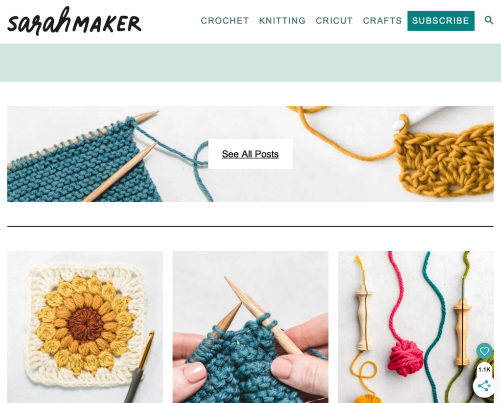
The website being evaluated is Sarah Maker. It is a crafting tutorial site for multiple mediums including crochet, knitting, punch needle, cricut, quilting, tie dye, and more. The website is organized by medium, and the tutorials are given in blog post format with photo examples vs. video.
- The Users
The users of the site will be people interested in crafting and be of various skill level. I can see anyone from beginners to advanced crafters using this site for their crafting needs. The users will be creative with artistic tastes/interests and will most likely respond well to visuals.
Our group persona is a social-media savvy young woman who is just starting her journey in crochet.
I did not have someone available who would fit this persona, so my user is a highly advanced tech male in his mid 30’s. He has a computer science degree and works in cyber security. While he is interested in creating – he dabbles in 3D printing and painting vs. the more fiber/yarn-based crafts on this website. I think this effected his choice of Christmas gift tutorial – he is way more practical minded and less “cutesy” when it comes to tastes, which may not be accurate for above persona.
- The User Test Method
The user test method utilized was the Think Aloud method. He sat at a computer while I sat at a chair next to him. I asked him to narrate his process as much as possible and took notes while he completed them. I chose this method because it was a great option as far as tools available went as well as created a relaxed environment for the user to narrate and complete the tasks. I was able to sit and closely observe their process.
- The Tasks
I stuck to the original tasks which were as follows:
Task 1: Find instructions for a complete crochet beginner who has no idea where to even start with the craft.
Task 2: Learn what different types of yarn and thread are good for different types of crafting.
Task 3: Find a beginning crochet project that would make a good holiday gift for friends or family.
- Analysis
Task 1
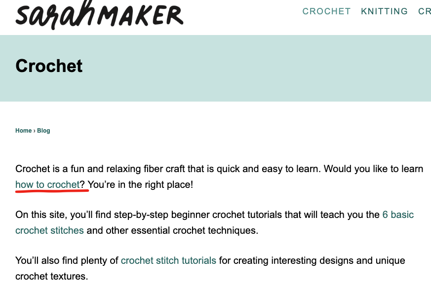
For Task 1 he started at the home page. First instinct was to click Crochet from navigation. This landing page is very wordy and he did not spend time reading it carefully and instead scanned the text, completely missing the paragraph about beginning to learn crochet. He noted that the links are way too close in color to the body text and were hard to see. He also noted that the visuals on this page were hard to differentiate from the advertisements. This caused him to glaze over the first few visuals/links at first:
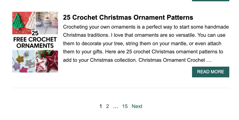
When he got to the bottom of the page he exclaimed quite exasperatedly “THERE ARE 15 PAGES?!”
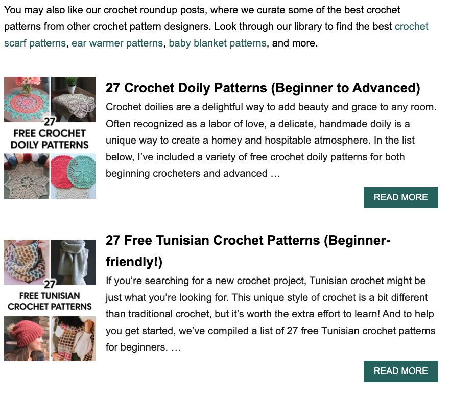
Once he realized that the images above are links and not ads he scrolled up and clicked “27 Free Tunisian Crochet Patterns”. I asked why he went with this one and he said it was because it mentioned “Beginner friendly” in the title whereas the others said “Beginner to Advanced” so he thought that would be the better option for him.
Here he scrolled down a bit and made note on how much text there was, while not reading any of it.
Clicked Tunisian hooks link under supplies and led him to Amazon. Said would buy this if starting.
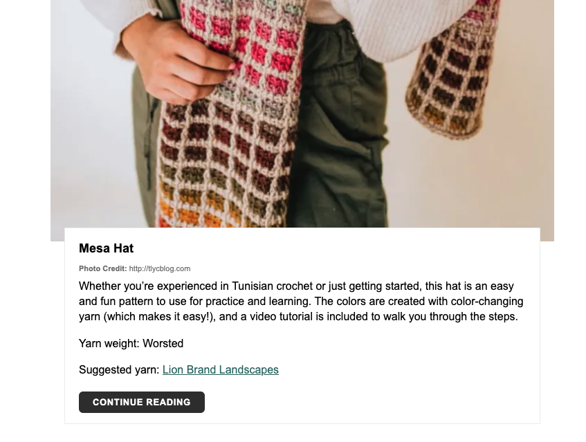
Went back to site and saw the first pattern – liked the look of it so he read the details. Noted he liked how clear this part is. Large image, brief description, suggested yarn, and clear link.
It leads to a tutorial on another site.
At this point I slightly led, because I think he was a little confused on task and getting away from himself. So, I said “if you didn’t even have a clue on how to read a pattern and were just looking for the extreme basics, like stitches and casting on. Where would you go?”
Went back to the crochet landing page from navigation and read the top content more closely. Finally found the small link to the Crochet for Beginners Guide mentioned in very first sentence.
On this page he mentions he likes the photos but would probably go to YouTube later for video tutorials.
Task 2
Starting again on the homepage, went to Crafts from navigation. Read list and decided that was not where he needed to be. Then clicked Knitting from navigation. Sat for a bit lost on where to go, then noticed the Search bar.
Using the search bar, he searched “Types of Yarn”. Made note that he had no idea what any of the terms meant, for example “Worsted”, “Yarn Weight”, etc. Because of this he decided not to click on any of the links and instead adjusted his search to “Best Types of Yarn” – this produced the same results. He clicked out of search and exclaimed that at this point he would give up and use google to find a different website.
Task 3
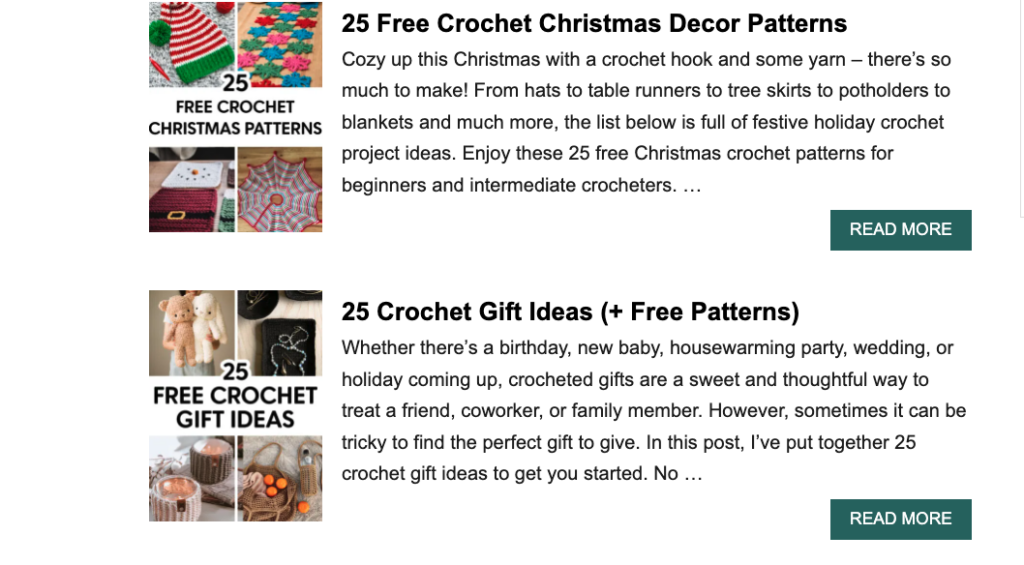
Again, started from the homepage and then went to the Crochet landing page from the top navigation. Scrolled down the long page and passed over the Christmas themed patterns and went to page 2 instead. When asked why he didn’t click those he said he thought they were a lame gift idea and wanted to go with something more practical, that people could use year-round.
Instead chose “25 Gift Ideas” link because the visual spoke to him.
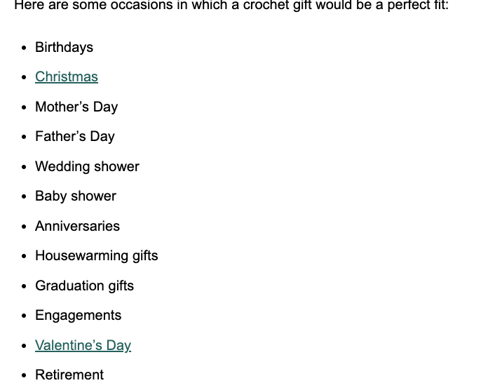
On this page he started to scroll down and stopped at the holiday list. He noted that he didn’t like that only Christmas and Valentine’s Day were links:
Kept scrolling and started reading a bit. Got annoyed when his reading was interrupted by the shadow effect that happens when you scroll over the email forms.
He also made note that it is annoying to have to scroll through each pattern one at a time instead of seeing them all at once to determine more quickly which one you would like to learn.
Had to scroll for a bit until he came to a project he liked: “Easy Crochet Can Cozy”
Clicked “Continue Reading” to learn this pattern. Started reading the pattern a bit and missed the links up top that would teach the 6 Basic Crochet Stitches for Beginners. Saw lower that he needed the Moss Stitch for this pattern, but that there wasn’t a clearly labeled link or tutorial for this stitch. Scrolled back up and clicked the stitch link. Used “Command F” to search “Moss Stitch” on this page. Then had to click another link to finally get to the moss stitch tutorial. Needed to navigate 3 pages just to find the stitch tutorial needed for this pattern.
- Design Suggestions
My design recommendations for this website would have the goal of reducing search time for the users. Each task in the analysis took quite a long time to complete. To do this I would do the following:
- Reducing scrolling needed by revaluating the architecture of the pages – this can be done by creating clear categories that can be seen before the fold of the homepage. Instead of placing important links in content blocks, move them out into clear CTA buttons and lastly placing the tutorials in a gallery format vs. one on top of the other.
- Navigation: the navigation can be organized more successfully by matching the categories linked on homepage: Crochet, Knitting, Punch Needle, Cricut, Quilting, Tie-Dye
Vs. having quite a few of the crafts hidden under the “Crafts” category
I would also place dropdowns underneath each of the top navigation links and would have a clear link for beginners guides underneath the navigation.
- Other suggestions: remove shading effect over email forms and create videos for users (to keep them on this site instead of competitors on youtube)