Individual Assignment #3
The website I’ve decided to analyze is IGN.com and my goal is to see if the end user can efficiently navigate the website as well as take note of any flaws or design errors in the site. IGN, like most websites in its genre, is a gaming website designed to give gamers a place to get information on all things gaming, entertainment, and comic related. Whether it’s an insider review on the highly anticipated Modern Warfare 2, an article on why Henry Cavill is leaving the Witcher series, or even a leak/gameplay of the newest God of War installment, this website is made with a specific user group in mind and tries to cater to their needs.
The chosen user is a 25-year-old male who has an intermediate to advanced skill level when it comes to computers. This user recently graduated college and is a full-time engineer and a hardcore gamer who regularly plays games such as Rocket League and prefers PC gaming. He has general knowledge of web browsers and uses it frequently to work and for personal use. Due to the user working in the tech industry, they have means of indulging in video games and plays during or after work each day.
The user testing method I’ve decided to go with was the Think Aloud method since it provides easier access to the user’s thoughts and gives me an idea of where they’re at mentally. This method allowed me to provide instructions as well as ask questions whenever the user was confused or stuck at a specific task. Because it’s impossible to read minds and predict what the user is thinking or going to do, this method was the best option to get the results that would be the most useful. The concurrent think aloud method is generally used when an instructor wants an end user to talk through a process or provide audible feedback to let the instructor know their thoughts. Because of this, the Think Aloud method made the most sense when examining our website.
The user was given three tasks to complete during our evaluation/analyzation of the IGN website. Each task served a purpose, and the main goal was to see if each task could be done without too much effort.
- Task 1: Locate and analyze the Game of the Year (2021) contestants and winners.
- The goal here is to get an idea of the games that were well received by the community and potential grabs for the end user
- Task 2: Look for any Demos or Walkthroughs for Legend of Zelda: Breath of the Wild
- The goal of this task is to see if this game is any good or would interest the end user. This gives the user an idea of what to look forward to and if the game will be a good investment
- Task 3: Find any reviews or news on the Game of the Year titles to see if they’re worth buying
- Like the tasks implies the goal for this scenario is to allow the user to assess all his options and see if any games are good or if any might’ve gone under the radar.
There wasn’t much change from the group’s original task and each assignment served a specific purpose in our analysis.
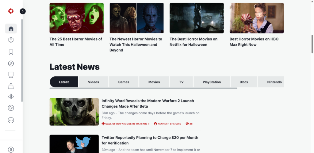
Because my user was very tech savvy and an avid gamer, we didn’t really have many issues regarding errors, but our experience was filled with a lot of frustration. The first task I had the user complete was locating the Game of the Year for 2021. We both went through the site and one of the first issues we encountered was the lack of a search bar. The user mentioned that while IGN seemed to have everything, it was missing an essential feature. He went to the side panel and looked through Discover, News, and Reviews but to no luck. After about 10 min and a lot of sighs from his end, he eventually just searched for the answer in his browser, and it was relatively easy to locate. After we found the list, he then tried to use the web URL to find the Game of the Year list from the home page but was still unable to and decided the list was almost impossible to find without a home search bar.
During our second task is where we found our breakthrough for the website. The task was to locate a Demo or gameplay for the Zelda game and thanks to his extensive exploration of the site during our first task, he was able to look up reviews for games using the Review tab. While looking at the reviews, he noticed a search icon next to a Playlist button and out of curiosity used it for our target game. He was a bit confused as to the placement of the icon but, it still managed to get the job done.
After completing the first two tasks, the last one was relatively straightforward due to them using the same tools/method. To find reviews on the Game of the Year titles, the user utilized the same page from task one and entered the titles found on that list to get reviews on all the titles listed.
Most of my users’ problems surfaced due to the placement of tools/icons on the website and the layout of the homepage. In terms of design, the website leaves a lot to be desired and could use a restructure to allow new users to be able to find what they’re looking for. My user had a hard time locating the search functions and had to resort to a 3rd party search engine to find resources on a separate site. Another problem I noticed is the confusion when the search icon was eventually located. The placement of tools is also something that could be changed so that users aren’t puzzled as to what different items are meant to do.
After analyzing this site, one of my first recommendations for IGN would be a redesigned homepage. When I first visited the site, one of the first things that caught my attention was the huge ads that took up a large portion of the dashboard. It doesn’t add much to the website and depending on the ad you get, won’t have anything to do with gaming or entertainment. I’d recommend shifting the middle section of the homepage to the top to give users a familiar feeling as far as navigation goes and to get more relevant information to them more effectively. Another suggestion I’d give would be to make searching for games or content more accessible to the end user. Currently, if a user wanted to search for a specific game, they’d have to jump through a few hoops to even find the search bar or button. My suggestions would be to add a search option to either the side menu or at the top of the page with our newly adjusted home menu. Another recommendation would be to move the news articles below the menu bar so that stories are less distracting to the user. During our initial test, the user didn’t know what some of the news articles were referring to or what gaming platform they addressed. Moving these News articles below the Menu bar would give more context as to what their telling as well as providing a smoother feel to the information flow. This also leads to the overall simplicity aspect of the website and the need to change the layout. Based on the user comments and their experience, they explained how the site had a lot of news and information to go through. This alone is why I’d suggest removing some of the panels of content to ease the user into the site. My recommendation would be to provide a simple design that would make navigation digestible and more straight forward. The user shouldn’t have to go above and beyond just to search for something or even find a game. My final recommendation would be to include a more interactive menu guide to give end users an easier time navigating the homepage. During our scenarios, the end user had a slightly difficult time hovering over the different options and understanding what the different symbols meant. What I’m suggesting is a feature that would make the icons or menu sections fly out when users hover over them giving more context to the page.