Individual Assignment 3 – Representative User Test for Healthcare Website JDS

Website: https://www.jeffdavishospital.org/

Introduction

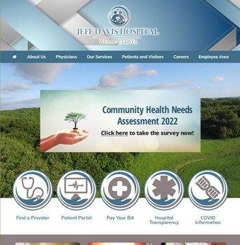
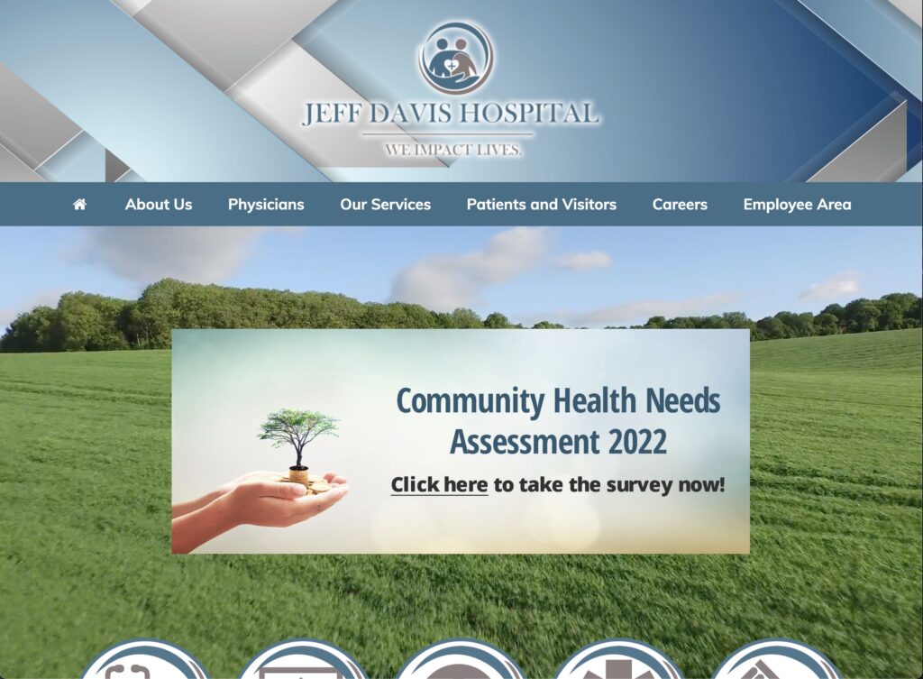
Jeff Davis Hospital (JDS) is a Hospital System located in Hazlehurst, GA that regionally serves patients affected by cardiovascular conditions. The Healthcare Group’s interest is to improve usability for users that leverage technology to coordinate their healthcare needs as this becomes a further need overtime with integrated networks and higher use of Healthcare Technology. In previous Heuristics Evaluations, the site presented violations around Consistency, Standards, error prevention, and minimalist design (Nielsen, 2020). The focus of user testing in the established representative tasks is to observe navigability on the site as a common problem of heuristics violations.

Figure 1. Homepage (Jeff davis hospital, 2022)

Persona and User Characteristics

In summary, the Healthcare Group opted for a User Persona representative of previously identified use cases of healthcare system websites. In summary, our persona is named Jennifer, an adult-child intending on transferring her father from a larger hospital to JDS to continue recovery and rehabilitation from a stroke closer to home. Jennifer is using the JDS website for the first time seeking transfer services and elderly-specific outpatient care coordination.

The user tester who volunteered was a 36-year old adult female (she/her) located in Florida. Similar to the persona, this user tester has experience with family members treated for post-operative cardiovascular care. Likewise, she resides regionally close to population areas serviced by JDS. The user tester was not prompted about prior personal or family healthcare history but disclosed the information during orientation with consent.

Testing Methods

Test Conduct and Materials are based on Rubin and Chiswell’s (2008) Methodologies and Guidelines, using “Think Aloud” Technique in observation with minimal tools. Concurrent Think Aloud (CTA) was primarily used with careful attention to apply impartiality with clarifying questions, resulting in qualitative user opinions and feedback of the website as user-generated data (Running a usability test, 2022). This method encourages the user to actively state how she is thinking through the task (Rubin & Chiswell, 2008).

Retrospective Scoping was used to collect quantitative data by form of a Likert Scale response with the following question and any feedback around it:

“On a scale of 1 to 5, how easy or difficult was it to complete this task? 1 being Extremely Easy, 5 being Extremely Difficult, and 3 being Neutral.”

In addition to the likert response, each task was timed to completion. Criterion for completion was to load the correct webpage according to the task and sitemap. Somewhat Difficult-4 or Extremely Difficult -5 scores indicate perceived effort in the task and time to completion provides a baseline to compare when re-designs are tested.

Materials used were the user’s iPad, a browsing application, a teleconferencing application, and a timer. Apple’s FaceTime was used to allow screen sharing of Google Chrome and screensharing virtually. Initially a desktop or laptop was requested, but an iPad was only available and was able to replicate the desktop website. Qualitative and quantitative measures were recorded using a Markdown Editor. Screenshots were collected from the active FaceTime Call or replicated from user actions. Audio or video recordings were not collected.

Orientation was conducted by first informing the user tester that a persona and three tasks would be provided and tested. She was encouraged to actively describe and comment as she completed each task. Measurements were disclosed and the user tester was reassured that results were solely for testing the website. Once orientation was complete, the persona was read as stated in Group Assignment 2 and each task was prompted to initiate testing.

Representative Tasks and Changes

  1. Find Information about symptoms and recommendations for Stroke as a healthcare topic on the Jeff Davis Hospital website.
  2. Find Patient Transfer Services for the hospital.
  3. Find information about Elderly Care Coordination.

Task 1 was expanded to include specific language about seeking information about stroke “symptoms and recommendations… as a healthcare topic on the Jeff Davis Hospital website” This change was recommended feedback by Dr. Paul Marty with Prototype Testing. Shorter task descriptions implied only general research on strokes, which more likely start with a search engine query. This change ensured tasks are logically linked and confined navigation to the tested website. All other tasks were unmodified.

Test Results and Analysis

TaskTime to CompleteLikert: Easiness-DifficultyFeedback Highlights
1 – Find Information About Stroke5 min 6 sec4Inconsistent Responsive Design, outdated site, too many external links, poor guides, and distrust with ad revenue
2 – Find Patient Transfer Services3 min 55 sec5“Swing-Bed” Non-standard terminology; lack of requirements and procedure information
3 – Find Elderly Care Coordination1 min 30 sec5Unclear differences between Rehab Options, Uncertainty being referred to another branded facility
Table 1. Summary Results and Highlights

Results from Task 1 – Find Information About Stroke

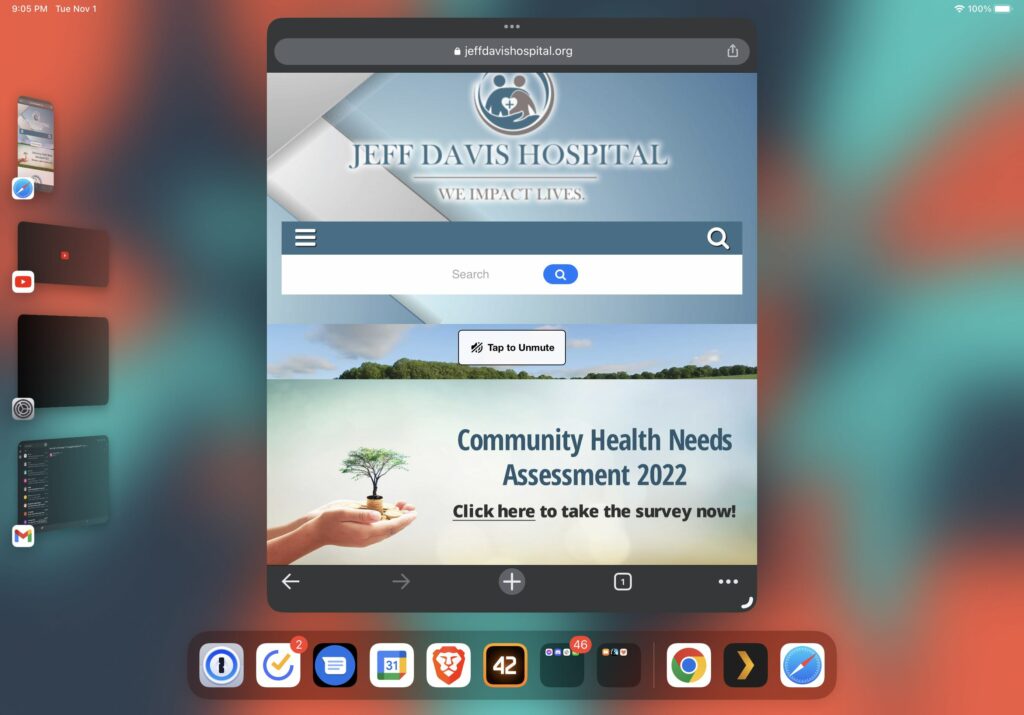
Completed in 5 minutes 6 seconds, Task 1 was perceived as 4 – Somewhat Difficult, with major issues around navigation and link redundancy. Previously unknown on the desktop browser, the user tester first failed the task by discovering a searchbar. With iPadOS 16.1 Stage Manger, the website opened as a mobile version, shown in Figure 2. Search results prompted advertisement hyperlinks followed by more accurate page results. However, the task was failed by the user not noticing the correct links. The user tester indicated distrust at this point with the perception that hospital sites should not collect ad revenue.

Figure 2. Search Bar in Mobile Homepage via iPadOS Stage Manager (Jeff davis hospital, 2022)

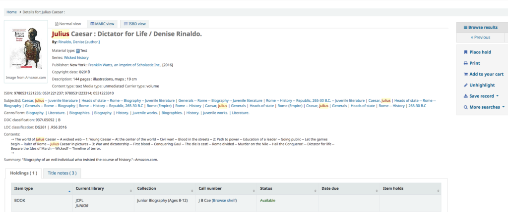
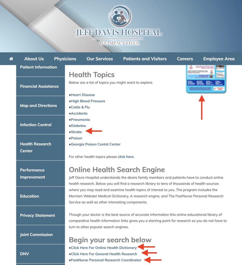
2 minutes into the task after restart, the user tester correctly identified the “Health Research Center” as the appropriate page through the Patient Services Menu and identified error prevention issues navigating disjointed links to the legacy FastHealth site. In addition to the links to “Stroke” and the FastHealth Image, the user tester discovered additional links under the Subsection “Online Health Search Engine” which further broke down more disparate links about stroke into the FastHealth Dictionary Link as a hosted copy of the Merriam-Webster Medical Dictionary, General Health Research Link as another redirect, and “FastNurse” Link which displayed another hyperlink to launch an email client for contacting a nurse; all shown in Figure 3. As predicted, the user tester was not satisfied that the site had portions of information about stroke located in separate pages that encouraged navigation to sites away from JDS.

Figure 3. Excessive Links to FastHealth (Jeff davis hospital, 2022).

Results from Task 2 – Find Patient Transfer Services

Completed in 3 minutes 55 seconds, Task 2 was perceived as 5 – Extremely Difficult, with major issues around terminology of the “Swing-Bed Program” and lack of information on the patient transfer process. At first, the user tester failed the task by navigating to the “Patient Information” Submenu Link under the “Patients and Visitors Menu.” The only actionable information identified was a phone number to Admitting/Registration Services.

On second attempt, the user tester resized the window to trigger the search bar and searched for “Patient Transfer Services,” prompting the Swing-Bed Program Link as the only non-advertisement search result from SEO. After guiding the user tester back to the main site menu, the Swing-Bed Program Link was revealed to be the obvious option under the Our Services Submenu. The user-tester read the webpage and observed over-explanation of the “Swing Bed” term to define it as patient transfers. She also cited lacked information on what she needs to collect in paperwork to start her father’s transfer and the maximum distance allowed.

Results from Task 3 – Find Elderly Care Coordination

Completed in 1 minute 30 seconds, Task 3 was perceived as 5 – Extremely Difficult, with major issues around the terminology and poor descriptions of different services offered at JDS. The user tester initially failed the task by identifying “Respite Care” under “Our Services.” After redirecting her to the main menu and clarifying the term “care coordination” as a comprehensive set of services, she opened new tabs for “Hospice” and “Harmony Center” and cross compared the specified services – as well as comparing Respite Care. Time to complete in this task was short despite the difficulty due to this multi-tab navigation behavior. After reviewing these rehab services, the user tester concluded Harmony Center as the best option. However, she indicated that her decision was based on the lack of information from the other web pages. The user tester also indicated an impression that the Harmony Center brand was not part of JDS and thought this was another instance of the website directing her to other healthcare providers.

Design Recommendations

User Testing confirms that re-design of the site navigation will need redrafting of both old and new site content under a clearer menu to reduce error prevention and promote minimalist design. Selecting a new on-brand template and migrating the FastHealth content into its own knowledgebase will help reduce the disjointed interfaces and external links experienced. Then, by mitigating or removing the brands from the webpage content and centering a well-written introduction of services, the user will be able to verify quicker in taking action on their care. Alternatively, clustering services into single webpages may help if they can be ordered by increasing acuity. Considering focus on cardiovascular servicing and expertise, content and navigation can also be centered around this specialty.

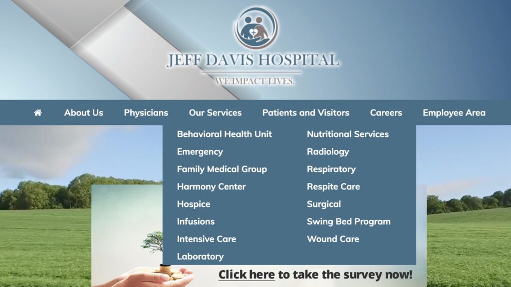
As observed with difficulties of the user tester finding Elderly Care Coordination as Harmony Center and Patient Transfer Services as Swing Bed Program, renaming and reorganizing the main site menu terms and structure will improve comprehension and navigability. Renaming the two brand names to their obvious titles or standardizing under a medical terminology schema is preferable, especially to be in parity with competing hospitals. As shown in Figure 4, simply breaking apart the 15 links for “Our Services” and 13 links for “Patients & Visitors” can help alleviate overload and confusion. “Our Services” can potentially be separated as “Departments” and “Special Services” due to half of links being specialty specific and the other half palliative or rehabilitative services. “Patients & Visitors” can break into “Patients” and “Visitors & Policies” to separate personal health versus corporate information.

Figure 4. Large Clustered Submenus (Jeff davis hospital, 2022).

Finally, if user responsive design continues under the new template with persistent search, better search engine optimization matched to revamped navigation and removal of advertisements will not only promote consistency but regain overall stakeholder trust in the site content. Incorporating knowledge articles into search will reduce completion time from topic to information action. As shown by the user tester, search was always preferable to menu navigation. If search becomes more frequent, advertisement exposure will be more frequent but cause similar critical errors as using the antiquated FastHealth site. If re-branding and re-design is implemented, removing advertisements is a necessary step to adopting changes.

Total Word Count: 1600

References

Jeff davis hospital. (2022). Jeff Davis Hospital. https://www.jeffdavishospital.org/

Jeff Davis Hospital/fasthealth corporation (Hazlehurst, Georgia – jeff davis county). (2022). Jeff Davis Hospital/FastHealth Corporation. http://www.jeffdavisfasthealth.com/

Nielsen, J. (2020, November 15). 10 usability heuristics for user interface design. Nielsen Norman Group. https://www.nngroup.com/articles/ten-usability-heuristics/

Planning a usability test. (2022). Usability.gov. https://www.usability.gov/how-to-and-tools/methods/planning-usability-testing.html

Rubin, J. & Chisnell, D. (2008). Handbook of usability testing: How to plan, design, and conduct effective tests (2nd edition). Wiley.

Running a usability test. (2022). Usability.gov. https://www.usability.gov/how-to-and-tools/methods/planning-usability-testing.html

Backlinks

Group Assignment 2 – User Scenarios and Representative Tasks

Group Assignment 1 – Group Topic Selection

Individual Assignment 3: Representative User Test

By Matthew Post

Subject Website: https://www.jeffdavishospital.org/

Jeff Davis Hospital, main landing page. Retrieved from: https://www.jeffdavishospital.org/

Website Description:

This website represents a small hospital located in Hazlehurst, Georgia, a small town about 100 miles west of Savannah. The website serves as its public-facing virtual hub for those seeking information relating to its services in patient care, employment opportunities, patient portal access, hospital and provider information, and health topic research resources. 

User Description:

The user is a 37-year-old woman with a graduate-level education and a profession in healthcare. She owns and operates a private clinical practice in the field of behavioral health, so she is very familiar with navigating various healthcare-related websites such as health insurance (payer) and government policy sites. She describes herself as “highly analytical, but easily frustrated” by poorly designed websites and portals, and “[doesn’t] understand why they make it so hard to use them”. She was concerned about the pacing of the user test, as she described preferring taking her to her time navigating a website and didn’t want to feel rushed into making mistakes or missing things.

Testing Methodology:

The user testing methods that I employed was Concurrent Think Aloud (CTA) and Retrospective Probing (RP). I chose a synthesis of these moderating techniques to maximize my data capture for testing by collecting in-the-moment thoughts from the tester, while also collecting information from their experience post-test with their complete attention and ability for more focused dialogue and feedback. During the testing, I had to ask the tester repeatedly to provide continuous feedback as they struggled to split their focus on the actions of their task and narrating their thoughts throughout as part of the CTA technique. Post-test RP allowed for a more deliberate description of their thoughts and actions during testing.

User Tasks:

I described the scenario as the following:

The user is an adult-child of an elderly father who has recently suffered a stroke at his home, outside the small town of Hazlehurst, GA. The father was initially seen at his local hospital, Jeff Davis Hospital, but was transferred to a larger, more comprehensive hospital in a city several hundred miles away to undergo surgery. The father has successfully completed the procedure and has asked the user to help him to be transferred back to Jeff Davis Hospital for recovery and rehabilitation, so that he can be closer to home and his elderly wife. The tester is using the Jeff Davis Hospital website for the first time to see if she can have her father transferred back to recover, learn more about stroke, and to see what elderly-specific outpatient care coordination is available after being discharged.

The user realizes that she knows very little about stroke. She listened her father’s care team describe his condition and treatment, but they used a lot of terms that she wasn’t familiar with and was too embarrassed to ask. She wants to learn more about stroke and its treatment, and since she is helping her father transfer back to Jeff Davis Hospital, she wants to know what information resources the website has available to research this topic. The first task is to leverage the website to learn more about stroke.

The user’s father was adamant about being transferred back to Jeff Davis Hospital. The staff at the hospital he is currently in said it was not uncommon for patients to be transferred to other hospitals, but they were not sure about this specific hospital. The next task is to use the website find out if Jeff Davis Hospital accepts patients for inpatient recovery and rehabilitation.

As part of the user’s concern for her father returning to the smaller hospital, she needs to investigate what resources are available to him after he goes home to further recover after his inpatient stay. The user wants to find out what outpatient services are available to him upon discharge to assist in managing his recovery and transition. The final task is for the tester to use the website to discover what elderly-specific care coordination programs are provided by the hospital.  

Testing Analysis:

  • The first task for the user was to use the website to research stroke. The user spent a few minutes orienting themself to the landing page and the available options. The user skimmed the top options by hovering over them one by one, revealing the drop-down menu of sub-option items for each option. The user spent a majority of their time on this page reading and re-reading through the “Our Services” menu options looking for a relevant selection for searching for medical conditions. The user noted the lack of a search bar field available on the landing page, as she indicated the desire to simply search for the keyword “stroke”.

The user eventually found the “Education” option under the “Patients and Visitors” main menu item. The user was initially confused with the addition of the left panel menu options, as it was a duplication to the already available and used top-center main menu sub-options; she scrolled through the list even though they were exactly the same as the options she already browsed to arrive on the “Education” page. She then scanned the limited content of the page and determined that this was not what she was searching for.  

The user then re-examined the options for some time before selecting the “Health Research Center” option. Upon loading the page, she immediately selected the image on the right side of the page representing the “FastHealth” search engine. After several minutes of laughter and questioning the authenticity of the displayed page, the user began to scan the available links presented in described “migraine-inducing color palette selection”. After several time-filling comments about the absurdity of the design of this page while continuing to scan, the user did locate the “stroke” option. The stroke page featured the same user described “terrible design” with “too many” options that provide no description of what they are. The user clicked through many of the available “Top Stroke Sites” options, finding a mixture of highly reputable medical research organizations and other healthcare sites that had “suspiciously generic” names that made the user question its authenticity or reputability. One source was from another country that recommended calling “999” if experiencing an emergency, which would not connect a caller in Hazlehurst, GA to the appropriate emergency response.

The “FastHealth” search engine informational page for stroke made available on the Jeff Davis Hospital website appears “crude, confusing, and frankly, assaulting to the visual senses” according to the user. The strange formatting of the content, too many options, the clashing visuals, and the lack of supplemental information describing the available links lends to an uncomfortable consumer experience, as the user feedback states.

  • The second task was for the user to investigate and determine whether Jeff Davis Hospital allows the transfer and in-patient stay of patients in recovery and rehabilitation after surgery. The user returned to the main landing page for the hospital website and began scanning the “Our Services” options. After spending some time going through the options, the user selected the “Respite Care” link; after reading the brief content on the following page, she determined that this was not the information she was seeking. The user then selected the “Surgical Services” option, read the page content, and asked if she had found the appropriate information; the user was minimally encouraged to continue searching. After another brief scan of the “Our Services” options, the user selected the “Swing Bed Program” option and found the information she was searching for.
  • The final task was to find elderly-specific outpatient care coordination for her father upon discharge from the hospital. The user again scanned the “Our Services” options, almost selected “Respite Care” again but opted for “Hospice Care”. Upon reading the words “terminally ill”, knowing this does not reflect her father’s status, returned to the “Our Services” options, scanned once again, and selected “Harmony Center”. Even upon reading the content of the page, the user was unsure if this was the desired information for the task – it was.

Design Recommendations:

  • Addition of a search bar on all website pages. With the addition of a functional search bar, users can simply search by keywords to find the website content they are searching for.
  • The addition of brief, descriptive, supplementary text to display, or appear after hovering, under each menu option selection. Users should have an idea of what the following page selection content provides without having to visit that page, especially if there are medical or non-standard language terms being used.
  • Remove the redundant display of sub-category options on the left panel; the duplicate display of these options only crowds the screen unnecessarily and confuses the user as they have already used the top center main option selection to reach a page that displays it.
  • Remove the image-link of the “FastHealth” search engine landing page from the “Healthcare Research Center” page. Present the available categories in text, in alphabetical order on the page.
  • Completely re-design the “FastHealth” search engine with a more modern, aesthetically appropriate design. Introduce improved Jeff Davis Hospital branding. Eliminate or better organize as many options as possible (i.e., consolidated options or sub-pages) to present a more streamlined and minimalist design. When presenting links to external resources, provide brief detail text describing the resource and its authority on the subject matter. If this is not possible, remove the “Health Research Center” page completely.

Individual Assignment 3: User Test

Website

The website for this user test was the Wilderness Coast Library website and secondarily the Jefferson County R.J. Brailer Public Library website. These websites are used by library patrons for the four libraries in the Wilderness Coast Library system. The website holds links to the different websites for the libraries in the system and also houses the combined library catalog, which is features in one of the tasks performed in the user test.

Wilderness Coast Library Website
Jefferson County R.J. Bailar Public Library Website

Persona/User

The persona that our group decided on was a high school age student working on a paper about the death of Julius Caesar. Unfortunately, my user did not match that description. My user was a man in his sixties who is tech-savvy in his work environment. I thought he would be a good user to watch as I did not think he has spent a lot of time on library websites like the one we were testing. I thought this user would have a similar approach as a high school student as they tend to be tech-savvy but encountering a website they have not used before could prove to be difficult. I told him that the subject would most likely be a high school student so he took that into account during the test.

User Testing Method

I used the Thinking Aloud method while performing the user test. I thought this would be the best way to understand what the user was doing and why they were doing it. I think the user speaking aloud can also affect their approach when they are trying to accomplish the tasks. My user occasionally told me what he would normally do, which would have been to Google something rather than stick to the website. I thought that was an interesting aspect of the Thinking Aloud method and made for some interesting data while the test was occurring.

Tasks

Task 1: Using the library system, the user must locate a book about the death of Julius Caesar, and figure out which library location the book is located.

Task 2: Now that the user found the book, the user needs to see what library it is as and the hours that the library is open for business.

Task 3: The user now knows what library the book is located so now the user must find the information for computer usage in that library. The user will also find the information on printing since the user would need to print out their paper for school.

Task 1

The user pulled up the website easily to start the task. While on the homepage he did scroll down to the bottom but pretty quickly scrolled back up and clicked on the “resources” tab. From the links on the resources tab he immediately clicked on the catalog page which took him to where he needed to be to find the book. I was surprised how easily he managed to find the catalog page. On the catalog page he pretty quickly found the search bar and typed in “Julius Ceaser.” I did not immediately realize that he misspelled Caesar until I looked at the amount of results that came up in the search. Normally, the search yields 31 results, when he spelled the last name wrong it limited the search to only 3 results. The results were two books and a DVD. The user did not realize the name was spelled wrong and was surprised that only three items came up. I had told the user the research paper for our high school persona was about Julius Caesar’s death so he decided to pick the book titled Julius Caesar: Dictator for Life. Since he managed to find the books and catalog pretty easily, I tacked on a secondary task which was to see how to put the book on hold. Again, he pretty quickly found the “place hold” button and clicked it. The link took him to a log in page for the library so he went back to the catalog for the next task.

Search Results with Spelling Error
Results with No Spelling Error

Task 2

The book that the user decided to locate was the Julius Caesar: Dictator for Life book. The website lists the book at “JCPL Junior.” The user went back to the homepage to find the correct library where the book was located. Because it just used JCPL, the user had a hard time figuring out which library that was. The user was also confused about the “junior” part of the location, but realized it meant that it would be located in the children’s department of the library. The user had to go back to the page a few times to try and remember JCPL. The actual name of the library is Jefferson County R.J. Bailar Public Library so the user assumed that was the correct library. The website shows all of the library names and the hours underneath so the user was able to locate the library hours pretty easily from the homepage of the catalog.

Book Listing with JCPL Junior as Library Location
Catalog Homepage with Library Locations and Hours

Task 3

I thought the user would go back to the main library page as one of the big icons on that page is for the “Member Libraries” but he went back to the catalog page. The catalog page shows all the library names and hours like the user saw in task two. Along with that there is a bar on the side that says “Links to Our Libraries,” and the user found that pretty quickly. He clicked on the Jefferson County R.J. Bailar Public Library link and was greeted by their homepage. There are not that many options on the JCPL website but the user was torn between clicking on “Get books & materials” and the “Discover library services” links. The user decided to click on “Discover library services” button. That page just lists bullet points with library information so the user found the information pretty quickly about computer usage and printing easily. The user was confused about the information he located as computer usage is not listed but the library states that they have “circulating Chromebook and hotspots.” The website does not state if they have desktop computers for customer use but the Chromebooks says that they can be checked out or used in the library. There is also a bullet point listed for “print and document services” so the user found that information easily. The user had a question about the printing as the website says that most printing services are free. He wanted to know if his printing would fall into the free category or if it would cost something. I added another task to the user test since he did the tasks pretty quickly. I told him to find the directions to the library. What the user noticed and what I did not notice was that there was a link right at the bottom of the library services page that took the user to Google Maps and he easily found the directions. The user did tell me that he normally would have just googled the directions instead but found that the link to the directions was easy to see and use.

Discover Library Services Page with Computer and Printing Information, Directions at Bottom

Design Recommendations

Watching this user test there were some things on the website that could be adapted for easier user use. In the first task, due to a misspelling, there was only three results when the user searched for books. I also did my own test and typed in “Julius Caesar” and nothing came up. I think misspellings should not limit the search by so much. If the user did not know they spelled something incorrectly, they might think that the library system has no materials on the subject they are looking for. In task two the user had a problem finding the correct library because the catalog used an acronym, JCPL, instead of the actual library name. Using the acronym is probably fine for veteran users of the site but it could, and did, cause problems for users. I also think the JCPL website could use some updates as most of the information on the site is written in bullet points and only shows little information. In task three the user needed to see how much printing would cost, it said most print jobs were free but some were not. For this test, a research paper that is a few pages would probably fit under the free category but they should list what would not.

Individual Assignment 2: Representative User Testing

Ginny Morris

The gamers group chose https://www.ign.com as the site we are evaluating for the Usability Analysis project. IGN provides information and news about video games, movies, and television shows. The website includes profiles for a great number of video games and includes information such as statistics on the amount of time it may take someone to complete the game and breaks that information up by the main story, side quests, and everything the game has to offer. Each profile also contains reviews, general information, and news stories about the game, as well as links to detailed game walkthroughs.

The user I chose for my usability test is a 36-year-old male who works full-time and plays video games in his free time. However, I explained to the user that I may ask him to put himself in the shoes of a college-age student who has a part-time job, which gives them the means to occasionally purchase video games.

Since I did not have access to a formal usability testing facility, I used the Think Aloud method while duplicating (casting) the user’s screen to a television screen. When think-aloud is used, a user is asked to perform a task while vocalizing their thoughts, no matter how inconsequential or seemingly unrelated to the task the thought may seem (Nielsen, 2012). According to the Nielsen Norman Group, think-aloud is used because it is cheap, robust, flexible, convincing, and easy to learn. I must agree that I chose this method because there was no cost, it is easy to learn and easy to explain, and from past experience, I tend to get good information from the think-aloud test.

I asked the user to perform the three tasks that we outlined in a previous group assignment. The first task was to find the 2021 Game of the Year (GOTY) award winners to determine what games are trending and popular. Another purpose of this task is to identify games the user may be interested in playing. The second task was to find the game profile page for The Legend of Zelda: Breath of the Wild to find a walkthrough and information on how long it takes to complete the game. The purpose of the task is to find information that will help make the decision on whether the game is worth purchasing. The third task depends on the first and could be counted as a subtask. The third task is to review the 2021 GOTY runners-up and contenders to identify additional games that may be fun to play with the purpose of deciding whether to purchase one or more of these games. I did not modify any of the tasks from our original write-up for the purposes of this user test.

I asked the user to find the 2021 GOTY awards winner to determine what games are trending and popular and to decide whether they are worth playing. The user started out on the IGN home page and started scrolling through to see if there were any quick links for the Game of the Year list. He reached the video game news section and clicked the Games button to focus the articles on games (as opposed to Videos, Television, etc). Not finding articles on the game of the year list there, he started looking for the webpage’s search feature. He expanded the fly-out menu on the left of the page and couldn’t find the search function. I saw it but didn’t bring attention to it. Since Dr. Marty had trouble finding the search function of the webpage in class, I was interested in finding out how long it may take the user to find the search. Not finding the search function in the fly-out menu, the user went back to scrolling through the home page. Not having any luck, he used the ‘find in page’ function of the browser to search for the term game of the year. That resulted in no hits, so he searched for awards. He then started looking for the search function again on the fly-out menu. Not finding it, he again started scrolling through the home page. He clicked an article in the top banner about a specific game to see if he was presented with information the home page wasn’t giving him. I could tell the user was starting to get frustrated and asked if he would have given up by now if he was a college-aged gamer. He said he didn’t know if it was part of the rules or not, so he refrained from going to Google to search for the information from the task. At this point, I decided the user could not complete the task due to the poor design of the website, so I advised him to use whatever means necessary to find the 2021 GOTY list. He then navigated to Google and searched for the IGN GOTY Awards. He clicked one of the top search results titled ‘IGN GOTY Winners’ and reached a page that listed many games. He clicked around but was confused because he knew these games to be older and not recent releases. He then discovered this page, titled IGN GOTY Winners, was a list of previous Game of the Year winners. He went back to the search results and located the correct link, which was the third search result.

Since the user was not able to locate the search function, I told him where it was located so that he was able to complete the second task. I had already determined that the website’s search function was not easily found and presented a user design flaw in the website. The search function is located on the left fly-out menu at the bottom of the main menu headings and is simply a dim magnifying glass. It does not stand out on the menu, as this user test displayed. The user was curious if he could locate the GOTY article with the search function and discovered he was only able to search for games and playlists, not articles. This is another user design and functionality issue with the website. If I had not coached the user on where the search function was, he would be unable to complete the second task without using Google again.

After the user explored the search function on the website, I redirected the user to the second task of searching for The Legend of Zelda: Breath of the Wild to decide whether to purchase the game based on time to play, walkthroughs and reviews. He started by launching the webpage’s search function and noticed the game was listed as a top result. He clicked on the game and quickly located the section detailing how much time it takes to complete the game. He said he likes Zelda games and would buy them based on the information. He is not a completionist and paid more attention to the time it takes to complete the main story. He was happy the number was over 50 hours and said if it was half that, it would change his mind about the game.

I asked the user to complete the third task of viewing the 2021 GOTY runners-up to make determinations on whether they are worth purchasing. The user navigated back to his Google search and located the 2021 GOTY list. He reviewed the list and looked at specific games. He said it would help him make decisions on what to buy or possibly whether to subscribe to a service to play the game. By this point, I believe he was more comfortable with the user design of the website and understood its flaws, therefore compensating for these user design issues without even realizing it.

I recommend redesigning and recoding the search function of the webpage to always display the search in the top right corner, where many websites typically place their search bar. The search should be a search bar instead of a button that grays out the screen and should search the entire webpage instead of only games and playlists. The user had a lot of difficulty finding the website’s search function and in fact, had to be led to the search. The current search function is located in the left menu fly-out and is only represented by a very hard-to-see magnifying glass.

I also recommend more clear links to content and a homepage redesign. The homepage includes links to articles and all types of content, making it difficult to locate the information the user is searching for. As mentioned above, the user would have abandoned their search and searched instead in Google in the time it was taking him to find the 2021 GOTY list. The user could not find the GOTY lists by searching the webpage or scrolling the homepage. A redesigned menu and simplified homepage may help users find content more easily.

References

Nielsen, J. (2012, January 15). Thinking Aloud: The #1 Usability Tool. The Nielsen Norman Group. https://www.nngroup.com/articles/thinking-aloud-the-1-usability-tool/.

Individual Assignment 3: Representative User Test for Sarah Maker

Arts and Crafts Group — Amy Feinstein

The Website

The Arts and Crafts group has chosen to evaluate sarahmaker.com, a website run by a woman named Sarah who describes herself as “collecting hobbies” – that is, she loves crafts and wants to share ideas, patterns, and instruction with the world. The main menu headings at the top of the page are Crochet, Knitting, Cricut, and Crafts (this last one has a drop-down menu leading to several other categories, including friendship bracelets, jewelry making, and tie dye). Since crochet is the first menu heading and the first craft she mentions in her bio, it is the craft our group chose to focus on most heavily for our user testing.

Sarah Maker Home Page

The User

Our persona is that of a social-media savvy young woman who wants to learn to crochet after being inspired on Pinterest. She has been wanting to start crocheting for years, but finally has the free time to begin the hobby. My actual user mirrors our chosen persona surprisingly well – when I described it to her, she said, “that’s practically me.” She is woman in her twenties who wants to explore many different crafts (including crochet!) but hasn’t found the time yet to do it. After going through the user tests on Sarah Maker, she felt even more inspired (but probably still doesn’t have time).

User Testing Method

I used the Think Aloud method to conduct my user test. Since I only had one user tester and no fancy monitoring equipment, I sat next to her while she was on her laptop and asked her to narrate her thoughts as she moved through the tasks and took notes as she did so, asking clarifying questions if she clicked on something without explaining why she did so. She was very good about walking me through her process and required very little prompting.

User Tasks – Overview

Our original tasks were as follows:

Task 1: Find instructions for a complete crochet beginner who has no idea where to even start with the craft.

Task 2: Learn what different types of yarn and thread are good for different types of crafting.

Task 3: Find a beginning crochet project that would make a good holiday gift for friends or family.

I presented the tasks to my user one at a time, using the same wording from the previous assignment.  However, I ended up giving them to her in a different order due to how she was exploring the site. As she was completing Task 1, she naturally flowed into Task 3 (with a brief comment that was related to Task 2). I let her continue exploring Task 3 before redirecting her back into Task 2.

User Tasks – Detailed Analysis

Task 1

For Task 1, I asked my user to find instructions for a complete beginner to learn to crochet. She immediately clicked on the Crochet menu at the top of the page. She started reading the descriptive text and missed the “how to crochet” link that was embedded in the first paragraph but noticed the “6 basic crochet stitches” link in the second paragraph and clicked on that (many of the embedded links on the site are difficult to see, as they are not in a highly contrasting color and don’t show an underline until you mouse over them). She scrolled down and noticed the bullet points of the different kinds of stitches (she either didn’t notice or didn’t mention that only four of the six stitches in the list had hyperlinks). However, just after that, she saw the embedded link for How to Crochet: A Complete Guide for Beginners, and clicked on that (she opened it in a new tab so that she would still have access to the stitch page). This took her to the same page that she would have gone to if she had clicked that first hidden “how to crochet” link.

Main Crochet Page on Sarah Maker

My user mentioned that she liked seeing the photos on the page as she continued to scroll down. She commented on each section as she read and clicked on the links that caught her interest, opening them in new tabs. The two she clicked on were the “crochet supplies for beginners,” where she appreciated the division of tools into “need to haves” and “nice to haves,” and the “worsted weight yarn” link because she was curious about what that was. (That was her brief foray into Task 2 before I introduced it to her.) When she got to the bottom of the supply list page, she noticed that she had already read two of the three related articles that were linked (the “how to crochet” guide and the “6 stitches” guide). The third one was a pattern for a beginner crochet scarf, but she didn’t click on that yet because she didn’t want to confuse herself. 

Even while saying that, she went back to the main Crochet page to find more information about basic crocheting and scrolled down, and was immediately drawn to the “27 Free Tunisian Crochet Patterns (Beginner-friendly!)” link. She said she was curious about them because the title drew her attention. She kept scrolling down the Crochet page to see if there was more beginner information, but only saw collections of different types of patterns. She wanted to see if there was any kind of FAQ at the bottom of the page, but there was not. (She didn’t click on the About link to see if that had anything.) She went back and clicked through the different pages of the crochet links, looking to see if anything was tagged as being appropriate for beginners, even before I introduced Task 3, which was to find a beginner project that she could make.

Task 3

Since she on her way toward Task 3 already, I formally introduced it by asking my user to find a beginner-friendly project that she could give as a holiday gift to friends or family. She remembered seeing a link for 25 Crochet Gift Ideas on page two of the crochet patterns, so she navigated there but realized that it didn’t have a beginner tag, so she returned to the Tunisian crochet patterns she had seen earlier. As she scrolled through them, she didn’t necessarily think they looked like beginner patterns, but she clicked on the instructions for the sunglasses case to see if it looked doable. The first thing she noticed was that she was taken to an external site. She scrolled down past the introduction and noticed that it provided a materials list, as well as links for tutorials to the different kinds of stitches and techniques that are required. When she read through the instructions, she knew she would have to refer back to not only these tutorials, but general crochet instructions so that she could follow all the abbreviations in the pattern. She decided she probably could create the project if she followed the instructions carefully.

Sunglasses Pattern on an External Site

Task 2

I then redirected my user back to Task 2, which asked her to learn about different kinds of yarn and thread for different kinds of crafting. Remembering the link about worsted weight yarn that she found in one of the crochet guides, she went back to the main Crochet page one more time and navigated to all the pages in hopes of finding an informational article about yarn. She only found links to collections of patterns, so she used the search function at the top of the page to search for “yarn.” That yielded 22 pages of results, including a general guide to yarn. (Interestingly, when I just searched for it now on my computer to recreate her journey for this blog, that article did not show up in the search results, but it did when I searched on my phone.) The article she found had a lot of good information, including a yarn weight chart and tips for determining yarn weight. It also had links to other yarn crafts at the end.

User Difficulties and Design Recommendations

Overall, my user moved smoothly through the tasks without too many difficulties, but there were a few areas where tweaks to the site could make it easier to navigate. In Task 1, where she had to learn the basics of crochet, she missed the first link to the crochet guide, but saw the next one about crochet stitches – which eventually gave her another way to link to the main crochet guide. It’s good that that guide is linked in so many different articles, but it should be more prominently displayed on the main Crochet page. If the hyperlinks were underlined or at least highlighted in a more contrasting color, they would be much easier to spot. The text could also be rewritten so it’s less like a conversational blog – bullet points would be easier to follow.

Similarly, the very long pages of text involve a lot of scrolling, and it’s easy to miss important information. Shorter pages and/or clearer section differentiation would make information easier to find. For example, when my user was trying to learn about different types of yarn, she wanted to have specific recommendations for each project, because she knew that using the wrong weight of yarn can make your project turn out very strangely. On one of the links she clicked, the 25 Gift Ideas, there is a whole section about choosing yarn for gifts, but because there is so much text, she scrolled right past it. Having a separate page or expandable/collapsible sections could alleviate that problem.

Searching for beginner-friendly projects was possible, but could also be streamlined for ease of use. My user kept referring to posts that were tagged as beginner, but there was no actual tag there, only a parenthetical note after the title of the post. Adding an actual tag, or adding a drop-down menu from the main crochet menu, could make different levels of projects easier to find. The drop-down menu could also include links to the yarn articles, since the only other way to find those appears to be through the search function. And since the search function seems to be inconsistent (an article that showed up on my friend’s computer and my phone did not show up on my computer), it doesn’t give me confidence that it will show me all the resources a user could need. An FAQ at the footer of the site with links to basic instructional and informational posts (which my user looked for at one point) would also be helpful.

My last main recommendation doesn’t strictly address usability, but I always prefer a site to tell me when I’m about to be redirected to an external site. My user was surprised when the pattern she clicked on took her to another site. If you are trying to learn a new craft, consistency in directions and style is important, and being taken to an entirely new set of instructions can be disconcerting. Linking to an external site is fine – it should just be noted in the link to the post so the user is prepared.  

Sarah Maker contains an amazing amount of information for beginning crocheters and other crafters. It is functional and navigable, but a few tweaks in format could make it an even better resource for beginners and advanced crafters alike.  

Individual Assignment #3: Representative User Test

Website: Trip Advisor

My group selected TripAdvisor, which is a travel information and booking site. It provides information, reviews, and photos on hotels and transportation from user-generated content. Users can book lodging, transportation and make reservations at restaurants. In addition to travel accommodation, it most popularly provides information on attractions and things to do on trips.  

The User

The user I have chosen for this scenario is a 29 year old woman who is currently 6 months pregnant. She is married to a service member and has moved 3 times in the last three years. She currently lives in the Raleigh-Durham area, however, travels frequently throughout the east coast to visit her family members. She has an undergraduate degree in biology and a doctorate of pharmacy from the University of Georgia. She loves to travel to tropical and adventurous destinations and has done so over four times this year. She wants to go on one final baby moon before it’s no longer safe for her to travel while pregnant. She wants to go to tropical location that is safe, luxurious, all-inclusive, and provides a “good” deal. She has used Trip advisor in the past to search for activity and destination reviews.

User Testing Method

The moderating technique I chose to utilize is the concurrent think aloud method. This method is designed to understand what the user is thinking as they interact with the website and talk aloud as they work through each one of the specified tasks. I chose this method because it encouraged my user to constantly think through every step/ process for each task and provided me with the most feedback possible.

User Tasks

a. The user’s first task is to identify the best all-inclusive resort in the Caribbean that she will be able to stay in within the next two months. She wants to identify a luxurious resort for her and her companion to stay at for five nights. They have a total travel budget of $6,000. I altered our group’s first task to fit the profile of my specific user, however maintains the same premise of selecting a location with a specific time range.  

b. The user’s second task is to find flights that accommodate her designated hotel dates. She prefers to fly with Delta airlines because she can use her mileage points, however isn’t dead set on Delta airlines. While this task differs from my group’s task #2, it shares a similar intent of having a user select a specific travel method and use the time ranges to find the best deals.  

c. The user’s third task is to identify three main attractions she will want to visit/ partake in either on or off the resort throughout the duration of her visit. This task mirrors my group’s task #3, which is to find different activities throughout the trip.

User Trial

a. The user’s first task is to identify the best all-inclusive resort in the Caribbean that she will be able to stay in within the next two months. She wants to identify a luxurious resort for her and her companion to stay at for five nights. They have a total travel budget of $6,000. I altered our group’s first task to fit the profile of my specific user, however maintains the same premise of selecting a location with a specific time range.  

My user immediately took to google and searched “best all-inclusive resorts- trip advisor”. The second link that popped up was, “The 10 BEST all inclusive Caribbean resorts- trip advisor.” She followed that link and immediately went to filter the dates to find reasonable prices within the time frame allotted by the task.

Upon selecting the dates she took to the filters to narrow down exactly what she was looking for. Knowing she has a strong budget and wanting to spend most of it on the resort, she selected all-inclusive, resorts, and hotel class 4/5 stars. After scrolling through ten or so resorts she found the one she liked the most based on the photos and reviews. Time to book it, but how? Knowing her second task she wanted some sort of package deal. After searching for about ten minutes the only link she could find was the one through the hotel. During those ten minutes I recorded her saying, “where do I book, i’m so confused by these prices, Trip advisor is the worst.” She gave up and booked through the resort website.

Hotel Booking Site

b. The user’s second task is to find flights that accommodate her designated hotel dates. She prefers to fly with Delta airlines because she can use her mileage points, however isn’t dead set on Delta airlines. While this task differs from my group’s task #2, it shares a similar intent of having a user select a specific travel method and use the time ranges to find the best deals.  

For the second task my user started on the trip advisor website, clicked on flights, selected RDU-PUJ, round trip, non-stop, 2x people, and search! Within a minute she had dozens of selections within her price range, but wait 11-hour layovers? She began sorting the selections by, “best value and duration,” which is where she started having issues. When she would attempt to remove some filters trip advisor would change her origin location. She started to feel defeated once that started to happen. As a 6-month pregnant woman her patience is already thin and trip advisor wasn’t making life easy. The comment, “this is why I use expedia” slipped out at this point and she gave up and went with the 11 hour flight (should only be 4 hours.)

Flight Portal

c. The user’s third task is to identify three main attractions she will want to visit/ partake in either on or off the resort throughout the duration of her visit. This task mirrors my group’s task #3, which is to find different activities throughout the trip.

The third and final task! My user thought this would be the easy portion, being Trip advisors bread and butter. She went to the trip advisor website, selected “things to do”, typed in Punta Cana, and let the search begin. She was immediately overwhelmed and this time there was no filter section to narrow down the choices. She backed out of the website, went to google, and searched, “Top things to do Punta Cana- Trip advisor,” which is where she found the top ten link (which really ended up being the top 30). After ten minutes of scrolling through the reviews and pictures, her decisions were made! The trip was complete. For this being a hypothetical trip, my user was exhausted.

Recommendations:

If Trip advisor truly wants to be competitive in the destination booking sphere they need to step their game up. Everyone wants steals and deals when they’re traveling and those usually come in the form of package prices. Trip advisor has a packages section, however the user has to dig. My user never found it, however having clicked on it on her behalf there were no deals offered for that time and location. Not true! When I did the same thing on Expedia I found plenty of deals. Trip advisor needs to instill confidence in the user that they’re getting the best deal possible, which clearly wasn’t the case in this scenario. The need to relook their “best deal” algorithm and highlight the package feature in their top display area.

The second feature my user had issues with was the filters. For some of the pages, ie the top ten things to do, there weren’t any additional filters she could select. I understand Trip advisor has created this pre-determined list, however let the user go as deep as they possibly can. By doing so, the site instills confidence that they’re making the best possible decision.

Word count: 1305

Individual Assignment 3

Logan Davis

Introduction

The website that I will be using for this assignment is Sarah Maker, a crafts website with a large selection of instructional articles that my group and I decided on for our overall group project. This site consists primarily of instructions relating to knitting, crocheting, and related techniques. Despite its large array of options, there are still many issues with this website, which I hope to gain some insight on through this assignment.

User

My user is a younger male with a college level education. He is very tech savvy and uses various forms of technology on a regular basis. He has a very basic knowledge of arts and crafts and has not recently used a website like the one being evaluated.

Method

The user testing method I employed is the think aloud protocol, in which the user interacting with the website describes their actions, thoughts, and what they’re seeing. I chose this method in order to get a better understanding of how the user perceived the website being evaluated. Through the think aloud method it is easy for the user to just say what they are thinking while in the process, and for me, the evaluator, to understand their process while they are doing it. This also allowed me to take easy notes on what the user was doing and why, which then allowed me to go back and analyze those notes afterwards.

Tasks

The first task that I had the user accomplish was finding instructions for someone who was completely new to crocheting to the point where they wouldn’t even know where to start. The second task that I had the user accomplish was learning what different kinds of yarn and thread are best for different kinds of crafts. The third and final task that I had the user accomplish was finding a beginner level crochet project that would make a good holiday gift for a friend or family member.

Analysis

For all three of the presented tasks, my user had little to no challenge completing the specified end goals. Each task was completed in a manner befit for someone who is regularly on the internet and technologically savvy. The first task was completed by clicking on the “Crochet” tab, and then selecting the “how to crochet” hyperlink. Because the first task required the user to find something crochet related, my user almost instantly turned to the “Crochet” tab, as he believed it most likely held what he was looking for. From there it was pretty straight forward, with the most obvious route being the aforementioned hyperlink, which was highlighted in blue, positioned toward the top of the page, and stated almost exactly what the user was looking for. For the second and third tasks, the user easily found what they needed to find with the use of the search bar. The second task found the user clicking through a few different articles before eventually finding the one they were looking for, though this did not take all that long nor did it deter or frustrate the user at all. The third task was much quicker, with the user simply looking through the different article thumbnails until they found a craft that was holiday related. Overall, I believe it to be relatively easy for the user to find specific things across the website, especially when using the search bar, when the user can quite literally search for exactly what they are looking for.

Recommendations

While there are plenty of flaws in the Sarah Maker website, none of them seemed to be an issue for my user, or even came up in the process of completing the provided tasks. With that being said, there is very little in the way of improvements that I can offer based off of this evaluation. What I can say though, is that those who are not as technologically savvy may have a bit of a harder time finding more specific things. To those less inclined individuals, it may not be so obvious to use the search bar. One suggestion I can offer is to implement a system that would allow you to apply a filter to the list of postings you are viewing. This could be implemented on the home page, on each separate page of postings, and even on the list generated by using the search bar. Such an implementation would allow for users to narrow down the list of posts to almost exactly what they want, while cutting out any unnecessary clutter in the process.

Individual Assignment 3: Representative User Test

Identify Website: Trip Advisor

The site for testing our group chose is Trip Advisor. Trip Advisor is a travel information and booking site that helps many users book their vacations and find accommodations. On the site, you can view hotels, flights restaurants, vacation rentals, things to do, rental cars, etc. This site is definitely used more to view different activities and sites to see on vacation rather than booking due to competitors such as Booking.com.

Tester Characteristics:

I could not find a direct match to our group’s tester characteristic of a 42-year-old female with three children in the Miami area; however, I did find a close enough match.

This tester is a 45-year-old female married with two children in college. The user is from the Miami/Fort Lauderdale area and is a very avid traveler. For work, she is an accountant for a doctor’s office and has been an accountant for over 10 years. With her birthday coming up she wants to travel to Spain for the first time. For this trip, it will be a family of 4 total for the whole trip. The user is very used to dealing with travel sites and enjoys them, but never books through them regularly. The user is looking to travel from Miami, FL on Friday, February 17th, and looking to be back on Sunday, February 26. The coming back is a hard set date that cannot be changed, but the flight for going can be semi-flexible but it will only be able to be on either Thursday, the 16th, or Friday, the 17th. She does not have any preferences on where to stay, but she would like a decent hotel with decent pricing. She does have recommendations from friends that have gone to Spain, so she will not be going completely blind, but it still will be the family’s first time traveling to Europe. The user would love to see different activities that the family can do and food options. One of her children is a bit selective of meals, so being able to view the menu beforehand in the different areas will help tremendously. The user is not the best in technology usage but has navigated through many travel sites before.

User Tester Method:

This testing was done using the Thinking Aloud approach. As I sat with the user, I watched what she did and told her to speak out loud about anything that comes to mind. With every step, I screenshotted and wrote down what was said about each step the user took. It was much easier being in the same room as the user since I could see the movements they would make. I observed their eyes, hands, and what reaction they would have when switching pages and reading about each entity.

Modification to Assigned Tasks:

Given the different scenarios for the user we created and this user, we had to modify a few of the tasks, but they will have overall the same objective. You will see below the original group task and the modified task.

Group Task 1: Find a cruise when the kids are on break from school and taking in consideration of hurricane season and to stay within the vacation budget.  

Modified Task 1: Find a flight round trip from Miami, FL to Madrid, Spain. User is open on budget, but would prefer a cheaper option if possible. The flight is preferred to be direct rather than layovers.

Group Task 2: Pick a cruise that stops in multiple ports.

Modified Task 2: Find transportation from Madrid to Barcelona, Barcelona to Valencia, and Valencia to Madrid.

Group Task 3: Find activities offered in each port stop.

Modified Task 3: Find hotels near Madrid (Feb. 18- 21), Barcelona (Feb. 21-23), and Valencia(Feb. 23- 26).

Group Task 4: N/A

Modified Task 4: Find activities/ excursion in each city.

Task Analysis:

Task 1: Find a flight round trip from Miami, FL to Madrid, Spain. User is open on budget, but would prefer a cheaper option if possible. The flight is preferred to be direct rather than layovers.

Once on the page, the user took about 30 seconds to just look over the page and see what was on it. They clicked on the “Where to” on the homepage and searched up Madrid, Spain. There was a drop down menu that showed up, but nothing of flights. The user was confused, and they tried to search up in other ways, such as “Spain”, “Flights to Madrid”, and nothing came up (Figure 1.1).

Figure 1.1

They exited out of the search and clicked on the “More” option on the homepage. The user thought aloud and wondered why a travel site did not have the flights option at least showing on the homepage. It took the user to a different Trip Advisor webpage where it shows flight information. A nice touch the user saw was when inputting the flight information, there was an option to also see compared prices with other travel sites such as Kayak, Cheap Flights, Wowfare, etc (Figure 1.2).

Figure 1.2

The results after searching up the depart for Friday, February 17 (Figure 1.3).

Figure 1.3

User decided to choose the first option to be able to land in Madrid, Spain by 7:45 am on Saturday, February 18. The user was also able to click the “View Deal” option and it showed her the full flight information with the exact times (Figure 1.4).

Figure 1.4

Task 2: Find transportation from Madrid to Barcelona, Barcelona to Valencia, and Valencia to Madrid.

The user is going to be traveling within Spain so she needs to find transportation for all the cities they will be visiting. The user saw the option of multi-city in the flights area so they inputted all the cities and dates. The user did not like how you can only put up to 4 cities that you want to travel (Figure 2.1).

Figure 2.1

The user had to write down the first flight since they were planning on staying in Madrid a few days. It worked out on her end after she realized she didn’t need the original flight, but she does believe it would be better with more flights just fro travel purposes. Once the user inputted all the flights and clicked the search button, only two flights showed up (Figure 2.2).

Figure 2.2

Task 3: Find hotels near Madrid (Feb. 18- 21), Barcelona (Feb. 21-23), and Valencia(Feb. 23- 26).

With every city the user visits, they need a hotel to stay in. The user is looking for a safe and comfortable place to be in while they are visiting Spain. Sinc etehy ar enot planning to be in the hotel until nighttime to sleep, the most precious and expensive hotel is not needed. The user clicked on the “Hotels” option they had was set up the same way as the flights. The user scanned the options you can use to filter out the choices, but decided to just view everything first before trying to narrow down on hotels. After viewing all the options, the user decided the most important options were free WIFI and free breakfast. One thing the user noticed was that it would take them to Booking.com,when viewing the hotel deals (Figure 3.1).

Figure 3.1

Task 4: Find activities/ excursion in each city.

After looking at the hotels, flights, and each city, the user wanted to look at what activities and site seeing places were near the hotel/city. The user is very big on adventure so this was very important to view them beforehand and see reviews. The user thought it was nice that in each city there was a drop down menu of different topics right off the bat (Figure 4.1).

Figure 4.1

The user clicked on “Things to Do in Barcelona” and a whole page of things popped up. They had it organized in different types of tours, what time of day, and the most popular. The user enjoyed how you can also view the standard price before you click on the activity (Figure 4.2).

Figure 4.2

Reccomendations

After al the tasks, I had the user tell me what recommendations they would want if they could change the site. The first one was to fix the main homepage drop downs. As seen in task 1, the site has a search button but when you search up flights it does not go through. The flights option was in the “More” tab. If the main options such as hotel, flights, things to do, and packages were the main feature of the webpage it would make much more sense. Users come to this travel site to view everything surrounding travel, and flights are a huge aspect of travel.

The next recommendation was that theuser would want more option when trying to book multi-city flights. It was snot a big problem for her, but for some users that needs to book multiple flights it would work out much better. There could be certain layovers that a user wants to have for a certain amount of days, and not having the actual opportunity to input them all loses time and user will go to other sites instead.

Word Count: 1530

Individual Assignment 3: Representative User Test

Norman Rockwell Museum, https://www.nrm.org/

The Norman Rockwell Museum website provides information about the artist, museum exhibits and events, and hosts the museum archive. The homepage has two menu bars, each with some distinct links as well as several overlapping links.  The green-blue menu bar at the very top of the page also has dropdown sub menus. The second menu bar is below the museum name banner and social media links. The remainder of the homepage features photographs on a loop. 

Not all pages within the website have titles or headers, several have menus on the left-hand side where two of the site’s pages have a link to the Rockwell Center for Visual Studies, URL rockwellcenter.org

The website also has embedded YouTube videos and uses a third-party popup window for ticket sales.

Users

Persona

Slightly modified from group assignment so it could be read to the user-testers and to include a starting location for directions: You are an undergraduate art history student at Bay Path University in Longmeadow, Massachusetts. Your are interested in Norman Rockwell’s works since Rockwell was a fellow Massachusetts native. One of your class projects includes Rockwell’s Pointing Hand. You are going to use the NRM website as a source for your project, but you are also interested in visiting the museum over break. Also, you will need an internship before you graduate and you will seek information about opportunities at the museum.

User-testers

The individual user-tester is an 18 year old male high school graduate, June 2022. He is taking a gap year before matriculating at George Mason University, Fall 2023.

The user-tester team consists of a 16 year old female junior high school student and a 23 year old male who recently graduated from the University of Mary Washington with an art history degree and a minor in math.

Testing Methods

Concurrent Think Aloud – This method makes it easy to evaluate the experience of the user: understand participants’ thoughts and elicit real time feedback.

Paired User Testing – an interesting twist on the above that is expected to require less prompting from the moderator.

Test Plan and Tasks

Test Purpose

To determine how quickly and easily an undergraduate student can navigate the website and use it for academic purposes.

Methods

The user characteristic description will be read to user-testers. They will then be asked to describe what information they need from the website in order to confirm their understanding of the scenario. 

The test moderator will provide encouragement if frustration levels become a roadblock. If all attempts of the moderator fail, the participant will be given a hint at the discretion of the moderator. 

Benchmarks & Metrics

Frustration level of participant and post task user review (subjective); error rates, task completion and time will be measured (qualitative)

Tasks

Plan a visit to the museum including getting directions from the university and purchasing a ticket. This represents a high frequency task for website users since many people who visit a museum website are planning to visit the museum itself. Or conversely, many who want to visit a museum will use the website to plan their visit.

Find out if the museum has any internship opportunities for undergraduate students and details about the internship, including how to apply. This is an important community engagement activity for the museum.

Find a specific work called Pointing Hand in the Norman Rockwell Museum’s digital collections. Finding artwork is a foundational concept for an art museum.

Addendum: Finding Pointing Hand did not present any significant navigational issues for the paired users. So for the individual user-tester, the artwork was changed to New Kids in the Neighborhood and the participant was asked to determine if the website had any narrative information about the work that might be useful in an art history project. 

Test Analysis

Paired User Test (PU) – all three tasks were completed in less than ten minutes with no real navigation difficulties. 

Think Aloud User Test (TA) – All tasks were completed in 11 minutes. There was difficulty in searching for information about the artwork and confusion with navigating between the NRM site and the Rockwell Center.org site (RC).

Benchmarks & MetricsFinding Artwork Planning Visit1 Internships
Task Completionyes2yesyes
Time
minute:second
Paired 2:15
Think Aloud 2:40
Paired 33
Think Aloud 5:49
Paired 4
Think Aloud 2:25
Error RateAll testers tried the main search bar before going to “Collections”→”Search the Collection”Paired – none; used “Visit” link
TA – none
Paired – none; typed “internships” in search bar
Frustration Level noneTA – confusion surrounding the need to choose a date before proceeding to checkoutTA – confusion between nrm.org and rockwellcenter.org
1. Both users declined to get directions from the website saying they would use google maps on their phones; they were able to display the website on their phones during the time of the test. 2. TA tester did not complete the subtask of finding narrative information about the artwork. He did not recognize a blog post which could be used in an art history project. This post was displayed when the tester searched “New Kids in the Neighborhood” in the main search bar, but the link for the post was between a grade K-5 lesson plan and two past museum events. 3. PU testers also briefly looked at the current exhibits advertised on the homepage while planning their visit.

User Review

The collection artworks are displayed in what I will describe as an archival view. None of the user-testers liked this display, nor the interactivity of the page. Works are displayed in shadowed boxes which highlight when the cursor hovers over them.

However, the cursor had to be directly over the image to display an enlarged version of the image, likewise the cursor had to be directly over the title of the work to display metadata for the work. None of the users found the metadata informative. They all expected to find narrative commentary displayed with the artwork image or for links to that information to be provided with the image. 

Users also found it inconvenient that the archive page had no back function. The users expected a left pointing bracket (<) that is above the images to act as a back arrow, but it has no functionality. Both users used browser back arrows from here even though the NRM name at the top acts as a homepage return.

When TA was searching for narrative commentary about New Kids on the Block, he got led to the Rockwell Center for Visual Arts. This has a different URL, it has the RC name in place of the NRM name, and a new menu bar, however there are enough similarities that tester was unaware that he was at a different website. The browser tabs for both sites contain red “NR” and both sites have the same menu bar at the very top of the page, although there is a slight color difference from blue-green to gray-blue.

Neither set of users found the popup window used when purchasing tickets bothersome. The 23 year old in the PU group opined that it might be a more secure site to enter his credit card information. And the PU testers happily noted the Trip Advisor ratings on the popup site. 

Design Recommendations

ViolationImprovement
Heuristic 1 – Use popup message when moving from nrm.org to rockwellcenter.org
Heuristic 2 – Add a breadcrumb trail to the top of each page
– Enlarge the very top blue-green-gray menu bar. 
– Keep the top menu bar pinned throughout both websites. 
– Highlight the “Internships” link by adding a colored field to improve visibility
and recognition that it is a button.
Heuristic 3 – Add a title or header to the top of each page

Discussion

Redesigning how images of artwork are displayed is only realistic if NRM wants to do a major overhaul of their site, however there are some smaller improvements that will improve the navigability of the site. 

Based on Nielsen’s first heuristic, visibility of system status, the user should clearly know when they are moving from nrm.org to rockwellcenter.org. A simple popup message that the user is leaving the original website would work. Additionally, clear instructions should be given within the popup window that the user needs to first choose a visit date before proceeding to checkout.

User control and freedom, heuristic #3, states that links should be easily discoverable, especially back and cancel. NRM website should add a “bread crumb” trail so that users know where they are in the website, improving their ability to make decisions about which link to use next. The website has two menu bars at the top  of the page, a blue-green bar at the very top, and semi-transparent one under the website name. This stays consistent between nrm.org and rockwellcenter.org with the exception of the slight color change in the top bar. Enlarging this top bar and pinning it so that it does not disappear with scrolling will also improve navigation. Also, the search for internship opportunities would be easier if the “internships” link at the top of the webpage included a colored field that changed color so that it is more obviously a link and not merely a heading. 

Find the “Internship” link

Finally, in accordance with the fourth heuristic of maintaining consistency with other websites, each page should contain a header so the user understands where they have landed and what content is found on that page. This would help others from feeling like they are looking at “another page with a bunch of random articles” as the think aloud user-tester described one page.   

Individual Assignment 3: Representative User Test

The Website

The Norman Rockwell Museum teaches and maintains the legacy of Norman Rockwell. Its website, nrm.org, is used by the museum for outreach, education and advertising. The site is heavily saturated with information regarding Rockwell art collections, related events, ways to visit the museum, and how to financially support the museum. The museum was founded in 1969 and resides in Stockbridge, Massachusetts. It’s home to the world’s largest collection of original Rockwell art.

Nrm.org Homepage

The User

The user is a father in his early thirties with a career in digital media production. While the user’s occupation is creative in nature, the user does not typically delve into classical arts. The user desires to visit the Norman Rockwell Museum for the first time with his two children and wife in an attempt to familiarize himself with traditional art. The user lives out of state from the museum and plans on flying.

The Method

The chosen method for studying the user’s behavior is the Think Aloud method. The user has stated that he normally thinks aloud in his everyday life, thus the user should feel comfortable participating in this method. The user has been advised not to filter their statements, but instead say what comes to their mind first. The moderator will attempt to keep questions and interruptions to a minimum so as to minimize their influence on the user’s experience.

Assigned Tasks

The first task is to figure out travel logistics. Our user will be flying into the nearest airport. He will have to figure out how to drive his rental car to the museum from the airport. The second task is to purchase a ticket to the museum. The user will navigate the interface in hopes of buying a ticket to visit on their selected date. The third task is for the user to find a specific work called “Pointing Hand” in the Norman Rockwell Museum’s digital collections. The user has a friend who is a fan of Normal Rockwell’s “Pointing Hand” and has suggested the user see it in person while they’re there.

The first and second task have been refined, as it was more geared to a student. It involved research on an assignment for school, however our new user is out of school. They wouldn’t have academic motivations.

Analysis of the User’s Interactions with Nrm.org

Task 1: Determine Travel Logistics

The user’s first reactions to the website were positive. The layout and quantity of content made the user feel “interested” and “confident.” For their first task, the user noticed two main menus, both containing the option “Visit”. Not sure of which one to pick, the user selected the option in the top menu, as it responded with a drop-down menu containing specific options. The user selected “Directions”. After selecting directions, the website automatically scrolled down to a section of the page. This was alarming for the user. It was unexpected that the website would exhibit this random bit of autonomy after displaying none thus far. Once in the directions section, the user chuckled. This is because the webpage advised the user to “notify their GPS provider” if the directions provided by the provider were wrong. They also provided some written instructions on how to get to the museum from the four major directions. The user typically uses Google Maps, so he eventually clicked on the displayed map.

Directions Section and Google Maps

This linked him to Google maps where he was able to input the nearest airport name (Pittsfield Municipal Airport) and obtain directions from Google. He was also able to determine that the museum has parking from Google maps, but was not able to find out if the museum charged for parking.

Task 1: Analysis

The user experienced problems on the homepage, the Visit page, and the directions section. The website displayed two menus with the same option, performed minor automatic functions after setting the different precedent, and displayed confusing information about GPS providers next to useful information. Ultimately, these flaws cost the user time and mental stamina.

Task 2: Buy a Ticket to Visit the Museum

The user located the “Buy Tickets” button easily. It is the first option you see on the homepage and it is in the header of every page. After clicking, the user was met with a pop-up like window displaying a different UI then what they have become accustomed to. The user stated they felt somewhat “skeptical”. The purchasing options were plentiful. The user commented that the photos being used to advertise each option were taking up a lot of space in the window. The user did not like having to scroll to only select from six basic options. The user chose Museum + Studio Tour on a date three days from today at 11:20am. The user took more time than predicted. The user commented that he wanted to make sure he was selecting the right kind of tickets for him, his wife, and children because the drop-down fields were very nondescript. The labels of the fields weren’t as obvious.

Tripadvisor Ticket Purchasing Widget, All Tickets Selected

Beneath the drop-down ticket selection area, there is a section to input discounts for the tickets selected. The user thought that he had to click the bright red X at the top of each window to decline the discounts, as no discounts applied to his family. Unfortunately, this removed the tickets completely. It even changed the value in the drop-down menu above. The user had to repeat the process. The user was allowed to move on to the next section to complete the payment.

Discount input affecting ticket Selection

Task 2: Analysis

The inconsistent UIs created uncertainty in the user, thus increasing the risk of deterring the user from engaging with the museum at all. But perhaps the most egregious UI flaw was the overabundance of ticket amount input fields. This third-party, ticket purchasing widget from Tripadvisor increases the risk of the user purchasing the wrong number of tickets because it offers multiple, different ways of purchasing and removing tickets. Not only that, but it combines this function with other functions. Why even have the red X to remove a ticket on the discount input function? This flawed UI is possibly the result of Tripadvisor attempting to create a one-size fits all widget for their clients.

Task 3: Finding “Pointing Hand”

The users first instinct was to use the search function in the top right corner of the homepage. This yielded one unrelated result. The user went back to the homepage to start over. The user decided to visit the “Research” page stating “I considered this to be my best bet because “Research” is broad and implies information and data and it’s most likely for art information, not the museum itself. The other options are more for the museum itself or merchandise.”

Unsuccessful Search

The user scrolled around and stumbled upon a large button displaying “SEARCH THE COLLECTION”. Based on his last experience, the user was incredulous, but still clicked the new search button. This led to a more robust search page where the user can input many more search terms. This page seemed more “deliberate” to the user.

SEARCH THE COLLECTION

The user typed “Pointing Hand” into the “Title” search field and the results yielded the correct painting.

Successful Search

Task 3: Analysis

It’s concerning that the art museum’s website search function on the homepage completely failed to find a standard painting. It also makes no sense that it wouldn’t simply link to whatever search page the user found on the “Research” page. The function on the homepage seems to produce articles related to the museum and museum’s events. This is misleading and it shouldn’t neglect the users looking for information related to the actual art at the museum.

Design Recommendations

Referring to Task 1, it’s advised that the information about inaccurate GPS provider data be completely removed. It’s confusing to the user, it’s distracting from the useful information (the map), and it demonstrates a misunderstanding of the relationship between GPS and internet service providers.

Referring to Task 2, it’s advised that nrm.org institute its own ticket purchasing feature to maintain consistency and to employ something more suited to their individuality and services. It’s clear that the Tripadvisor widget is designed to be a one-size-fits-all widget. While it seemingly allows for some customization, it’s leagues away from a proprietary purchasing widget or page specifically designed for the museum. At the very least, Tripadvisor should remove the excess information from the widget. The widget doesn’t need a giant photo for each purchasable item, it doesn’t need multiple ways to remove a ticket, it should reorganize the discount input fields, and it should modernize its layout. Currently, it’s reminiscent of a health provider’s new patient information form. It’s just a long list of input fields.

Referring to Task 3, there should only be one search function or page. All search features need to be combined. At the very least, when using the search function on the home page, one of the results yielded should be the search page for art work. Alternatively, a notification about the other search functions/pages should be displayed. It was pure happenstance that the user found the correct search page.