Arts and Crafts Group — Amy Feinstein
The Website
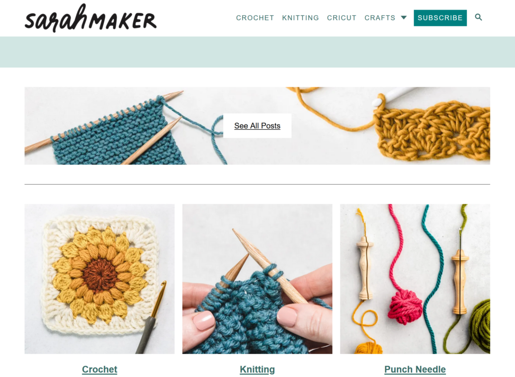
The Arts and Crafts group has chosen to evaluate sarahmaker.com, a website run by a woman named Sarah who describes herself as “collecting hobbies” – that is, she loves crafts and wants to share ideas, patterns, and instruction with the world. The main menu headings at the top of the page are Crochet, Knitting, Cricut, and Crafts (this last one has a drop-down menu leading to several other categories, including friendship bracelets, jewelry making, and tie dye). Since crochet is the first menu heading and the first craft she mentions in her bio, it is the craft our group chose to focus on most heavily for our user testing.

The User
Our persona is that of a social-media savvy young woman who wants to learn to crochet after being inspired on Pinterest. She has been wanting to start crocheting for years, but finally has the free time to begin the hobby. My actual user mirrors our chosen persona surprisingly well – when I described it to her, she said, “that’s practically me.” She is woman in her twenties who wants to explore many different crafts (including crochet!) but hasn’t found the time yet to do it. After going through the user tests on Sarah Maker, she felt even more inspired (but probably still doesn’t have time).
User Testing Method
I used the Think Aloud method to conduct my user test. Since I only had one user tester and no fancy monitoring equipment, I sat next to her while she was on her laptop and asked her to narrate her thoughts as she moved through the tasks and took notes as she did so, asking clarifying questions if she clicked on something without explaining why she did so. She was very good about walking me through her process and required very little prompting.
User Tasks – Overview
Our original tasks were as follows:
Task 1: Find instructions for a complete crochet beginner who has no idea where to even start with the craft.
Task 2: Learn what different types of yarn and thread are good for different types of crafting.
Task 3: Find a beginning crochet project that would make a good holiday gift for friends or family.
I presented the tasks to my user one at a time, using the same wording from the previous assignment. However, I ended up giving them to her in a different order due to how she was exploring the site. As she was completing Task 1, she naturally flowed into Task 3 (with a brief comment that was related to Task 2). I let her continue exploring Task 3 before redirecting her back into Task 2.
User Tasks – Detailed Analysis
Task 1
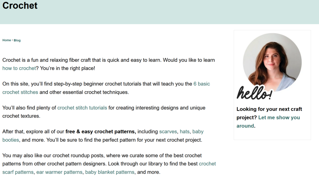
For Task 1, I asked my user to find instructions for a complete beginner to learn to crochet. She immediately clicked on the Crochet menu at the top of the page. She started reading the descriptive text and missed the “how to crochet” link that was embedded in the first paragraph but noticed the “6 basic crochet stitches” link in the second paragraph and clicked on that (many of the embedded links on the site are difficult to see, as they are not in a highly contrasting color and don’t show an underline until you mouse over them). She scrolled down and noticed the bullet points of the different kinds of stitches (she either didn’t notice or didn’t mention that only four of the six stitches in the list had hyperlinks). However, just after that, she saw the embedded link for How to Crochet: A Complete Guide for Beginners, and clicked on that (she opened it in a new tab so that she would still have access to the stitch page). This took her to the same page that she would have gone to if she had clicked that first hidden “how to crochet” link.

My user mentioned that she liked seeing the photos on the page as she continued to scroll down. She commented on each section as she read and clicked on the links that caught her interest, opening them in new tabs. The two she clicked on were the “crochet supplies for beginners,” where she appreciated the division of tools into “need to haves” and “nice to haves,” and the “worsted weight yarn” link because she was curious about what that was. (That was her brief foray into Task 2 before I introduced it to her.) When she got to the bottom of the supply list page, she noticed that she had already read two of the three related articles that were linked (the “how to crochet” guide and the “6 stitches” guide). The third one was a pattern for a beginner crochet scarf, but she didn’t click on that yet because she didn’t want to confuse herself.
Even while saying that, she went back to the main Crochet page to find more information about basic crocheting and scrolled down, and was immediately drawn to the “27 Free Tunisian Crochet Patterns (Beginner-friendly!)” link. She said she was curious about them because the title drew her attention. She kept scrolling down the Crochet page to see if there was more beginner information, but only saw collections of different types of patterns. She wanted to see if there was any kind of FAQ at the bottom of the page, but there was not. (She didn’t click on the About link to see if that had anything.) She went back and clicked through the different pages of the crochet links, looking to see if anything was tagged as being appropriate for beginners, even before I introduced Task 3, which was to find a beginner project that she could make.
Task 3
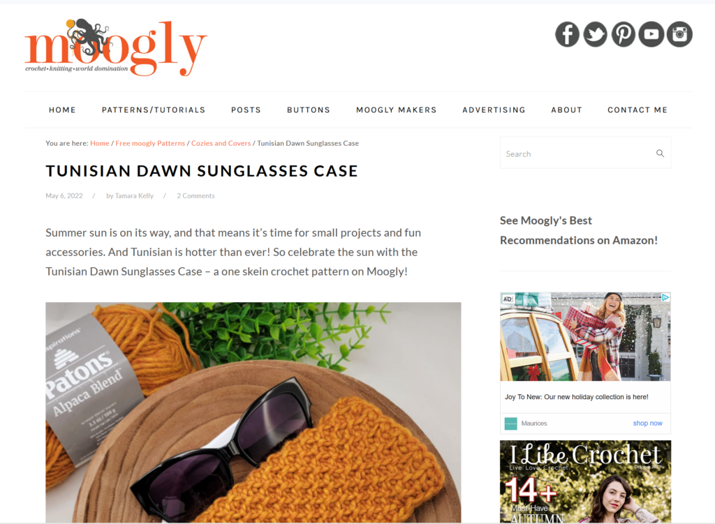
Since she on her way toward Task 3 already, I formally introduced it by asking my user to find a beginner-friendly project that she could give as a holiday gift to friends or family. She remembered seeing a link for 25 Crochet Gift Ideas on page two of the crochet patterns, so she navigated there but realized that it didn’t have a beginner tag, so she returned to the Tunisian crochet patterns she had seen earlier. As she scrolled through them, she didn’t necessarily think they looked like beginner patterns, but she clicked on the instructions for the sunglasses case to see if it looked doable. The first thing she noticed was that she was taken to an external site. She scrolled down past the introduction and noticed that it provided a materials list, as well as links for tutorials to the different kinds of stitches and techniques that are required. When she read through the instructions, she knew she would have to refer back to not only these tutorials, but general crochet instructions so that she could follow all the abbreviations in the pattern. She decided she probably could create the project if she followed the instructions carefully.

Task 2
I then redirected my user back to Task 2, which asked her to learn about different kinds of yarn and thread for different kinds of crafting. Remembering the link about worsted weight yarn that she found in one of the crochet guides, she went back to the main Crochet page one more time and navigated to all the pages in hopes of finding an informational article about yarn. She only found links to collections of patterns, so she used the search function at the top of the page to search for “yarn.” That yielded 22 pages of results, including a general guide to yarn. (Interestingly, when I just searched for it now on my computer to recreate her journey for this blog, that article did not show up in the search results, but it did when I searched on my phone.) The article she found had a lot of good information, including a yarn weight chart and tips for determining yarn weight. It also had links to other yarn crafts at the end.
User Difficulties and Design Recommendations
Overall, my user moved smoothly through the tasks without too many difficulties, but there were a few areas where tweaks to the site could make it easier to navigate. In Task 1, where she had to learn the basics of crochet, she missed the first link to the crochet guide, but saw the next one about crochet stitches – which eventually gave her another way to link to the main crochet guide. It’s good that that guide is linked in so many different articles, but it should be more prominently displayed on the main Crochet page. If the hyperlinks were underlined or at least highlighted in a more contrasting color, they would be much easier to spot. The text could also be rewritten so it’s less like a conversational blog – bullet points would be easier to follow.
Similarly, the very long pages of text involve a lot of scrolling, and it’s easy to miss important information. Shorter pages and/or clearer section differentiation would make information easier to find. For example, when my user was trying to learn about different types of yarn, she wanted to have specific recommendations for each project, because she knew that using the wrong weight of yarn can make your project turn out very strangely. On one of the links she clicked, the 25 Gift Ideas, there is a whole section about choosing yarn for gifts, but because there is so much text, she scrolled right past it. Having a separate page or expandable/collapsible sections could alleviate that problem.
Searching for beginner-friendly projects was possible, but could also be streamlined for ease of use. My user kept referring to posts that were tagged as beginner, but there was no actual tag there, only a parenthetical note after the title of the post. Adding an actual tag, or adding a drop-down menu from the main crochet menu, could make different levels of projects easier to find. The drop-down menu could also include links to the yarn articles, since the only other way to find those appears to be through the search function. And since the search function seems to be inconsistent (an article that showed up on my friend’s computer and my phone did not show up on my computer), it doesn’t give me confidence that it will show me all the resources a user could need. An FAQ at the footer of the site with links to basic instructional and informational posts (which my user looked for at one point) would also be helpful.
My last main recommendation doesn’t strictly address usability, but I always prefer a site to tell me when I’m about to be redirected to an external site. My user was surprised when the pattern she clicked on took her to another site. If you are trying to learn a new craft, consistency in directions and style is important, and being taken to an entirely new set of instructions can be disconcerting. Linking to an external site is fine – it should just be noted in the link to the post so the user is prepared.
Sarah Maker contains an amazing amount of information for beginning crocheters and other crafters. It is functional and navigable, but a few tweaks in format could make it an even better resource for beginners and advanced crafters alike.