Individual Assignment 3 – Representative User Test for Healthcare Website JDS

Website: https://www.jeffdavishospital.org/

Introduction

Jeff Davis Hospital (JDS) is a Hospital System located in Hazlehurst, GA that regionally serves patients affected by cardiovascular conditions. The Healthcare Group’s interest is to improve usability for users that leverage technology to coordinate their healthcare needs as this becomes a further need overtime with integrated networks and higher use of Healthcare Technology. In previous Heuristics Evaluations, the site presented violations around Consistency, Standards, error prevention, and minimalist design (Nielsen, 2020). The focus of user testing in the established representative tasks is to observe navigability on the site as a common problem of heuristics violations.
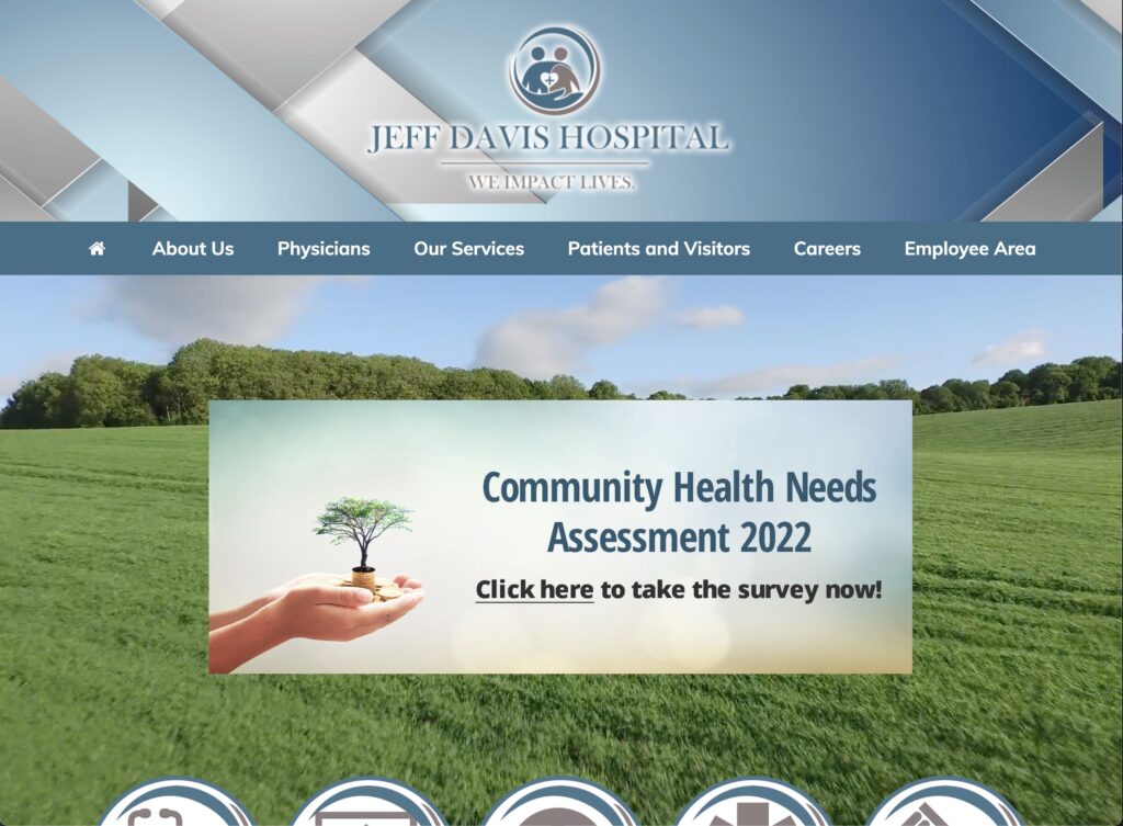
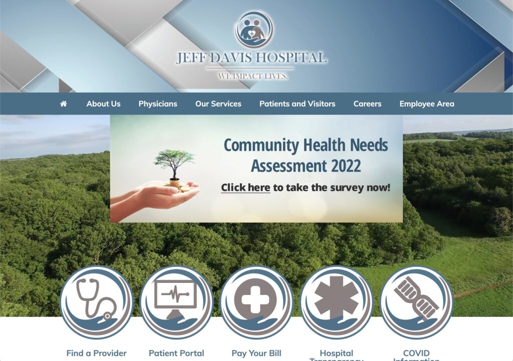
Figure 1. Homepage (Jeff davis hospital, 2022)

Persona and User Characteristics

In summary, the Healthcare Group opted for a User Persona representative of previously identified use cases of healthcare system websites. In summary, our persona is named Jennifer, an adult-child intending on transferring her father from a larger hospital to JDS to continue recovery and rehabilitation from a stroke closer to home. Jennifer is using the JDS website for the first time seeking transfer services and elderly-specific outpatient care coordination.

The user tester who volunteered was a 36-year old adult female (she/her) located in Florida. Similar to the persona, this user tester has experience with family members treated for post-operative cardiovascular care. Likewise, she resides regionally close to population areas serviced by JDS. The user tester was not prompted about prior personal or family healthcare history but disclosed the information during orientation with consent.

Testing Methods

Test Conduct and Materials are based on Rubin and Chiswell’s (2008) Methodologies and Guidelines, using “Think Aloud” Technique in observation with minimal tools. Concurrent Think Aloud (CTA) was primarily used with careful attention to apply impartiality with clarifying questions, resulting in qualitative user opinions and feedback of the website as user-generated data (Running a usability test, 2022). This method encourages the user to actively state how she is thinking through the task (Rubin & Chiswell, 2008).

Retrospective Scoping was used to collect quantitative data by form of a Likert Scale response with the following question and any feedback around it:

“On a scale of 1 to 5, how easy or difficult was it to complete this task? 1 being Extremely Easy, 5 being Extremely Difficult, and 3 being Neutral.”

In addition to the likert response, each task was timed to completion. Criterion for completion was to load the correct webpage according to the task and sitemap. Somewhat Difficult-4 or Extremely Difficult -5 scores indicate perceived effort in the task and time to completion provides a baseline to compare when re-designs are tested.

Materials used were the user’s iPad, a browsing application, a teleconferencing application, and a timer. Apple’s FaceTime was used to allow screen sharing of Google Chrome and screensharing virtually. Initially a desktop or laptop was requested, but an iPad was only available and was able to replicate the desktop website. Qualitative and quantitative measures were recorded using a Markdown Editor. Screenshots were collected from the active FaceTime Call or replicated from user actions. Audio or video recordings were not collected.

Orientation was conducted by first informing the user tester that a persona and three tasks would be provided and tested. She was encouraged to actively describe and comment as she completed each task. Measurements were disclosed and the user tester was reassured that results were solely for testing the website. Once orientation was complete, the persona was read as stated in Group Assignment 2 and each task was prompted to initiate testing.

Representative Tasks and Changes

  1. Find Information about symptoms and recommendations for Stroke as a healthcare topic on the Jeff Davis Hospital website.
  2. Find Patient Transfer Services for the hospital.
  3. Find information about Elderly Care Coordination.

Task 1 was expanded to include specific language about seeking information about stroke “symptoms and recommendations… as a healthcare topic on the Jeff Davis Hospital website” This change was recommended feedback by Dr. Paul Marty with Prototype Testing. Shorter task descriptions implied only general research on strokes, which more likely start with a search engine query. This change ensured tasks are logically linked and confined navigation to the tested website. All other tasks were unmodified.

Test Results and Analysis

TaskTime to CompleteLikert: Easiness-DifficultyFeedback Highlights
1 – Find Information About Stroke5 min 6 sec4Inconsistent Responsive Design, outdated site, too many external links, poor guides, and distrust with ad revenue
2 – Find Patient Transfer Services3 min 55 sec5“Swing-Bed” Non-standard terminology; lack of requirements and procedure information
3 – Find Elderly Care Coordination1 min 30 sec5Unclear differences between Rehab Options, Uncertainty being referred to another branded facility
Table 1. Summary Results and Highlights

Results from Task 1 – Find Information About Stroke

Completed in 5 minutes 6 seconds, Task 1 was perceived as 4 – Somewhat Difficult, with major issues around navigation and link redundancy. Previously unknown on the desktop browser, the user tester first failed the task by discovering a searchbar. With iPadOS 16.1 Stage Manger, the website opened as a mobile version, shown in Figure 2. Search results prompted advertisement hyperlinks followed by more accurate page results. However, the task was failed by the user not noticing the correct links. The user tester indicated distrust at this point with the perception that hospital sites should not collect ad revenue.
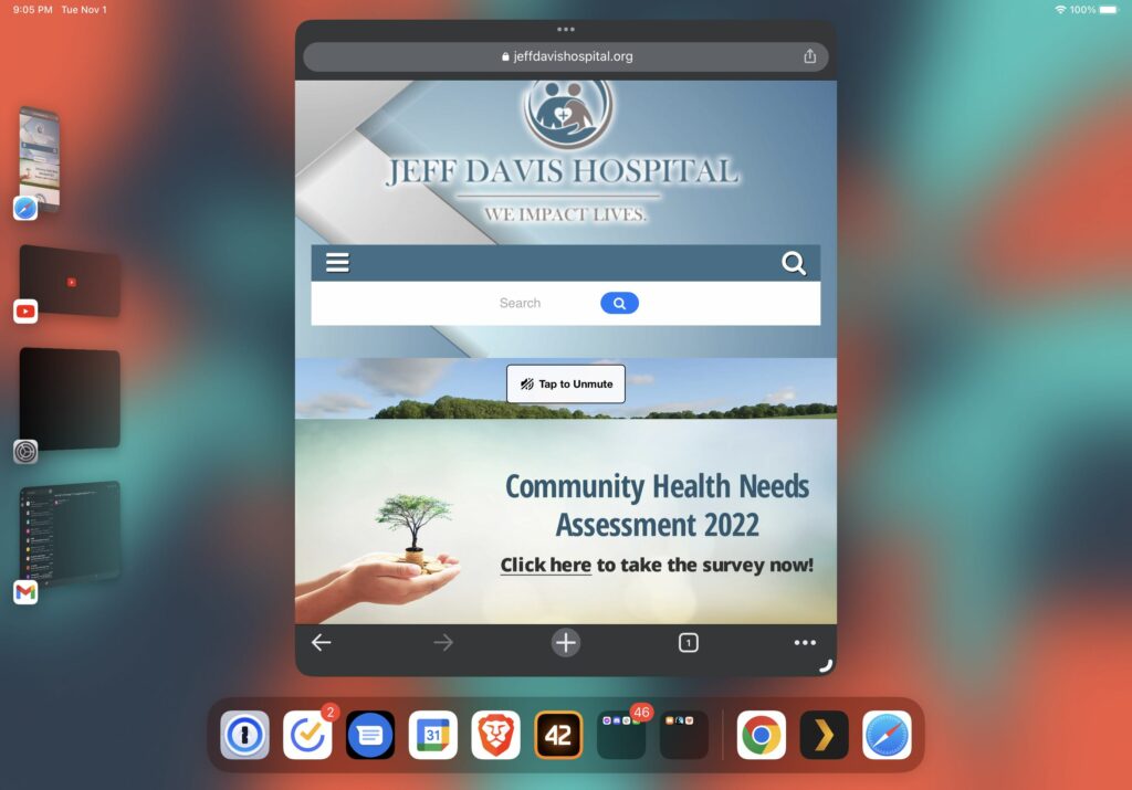
Figure 2. Search Bar in Mobile Homepage via iPadOS Stage Manager (Jeff davis hospital, 2022)

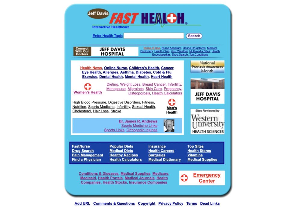
2 minutes into the task after restart, the user tester correctly identified the “Health Research Center” as the appropriate page through the Patient Services Menu and identified error prevention issues navigating disjointed links to the legacy FastHealth site. In addition to the links to “Stroke” and the FastHealth Image, the user tester discovered additional links under the Subsection “Online Health Search Engine” which further broke down more disparate links about stroke into the FastHealth Dictionary Link as a hosted copy of the Merriam-Webster Medical Dictionary, General Health Research Link as another redirect, and “FastNurse” Link which displayed another hyperlink to launch an email client for contacting a nurse; all shown in Figure 3. As predicted, the user tester was not satisfied that the site had portions of information about stroke located in separate pages that encouraged navigation to sites away from JDS.
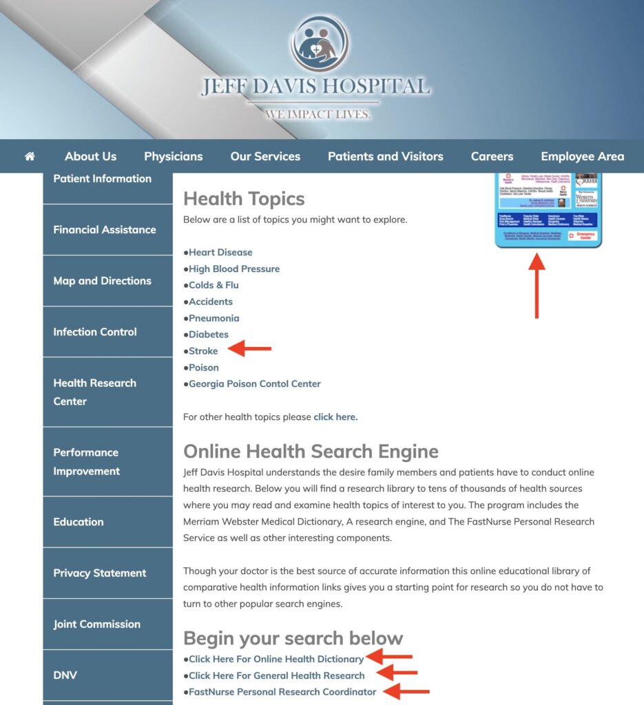
Figure 3. Excessive Links to FastHealth (Jeff davis hospital, 2022).

Results from Task 2 – Find Patient Transfer Services

Completed in 3 minutes 55 seconds, Task 2 was perceived as 5 – Extremely Difficult, with major issues around terminology of the “Swing-Bed Program” and lack of information on the patient transfer process. At first, the user tester failed the task by navigating to the “Patient Information” Submenu Link under the “Patients and Visitors Menu.” The only actionable information identified was a phone number to Admitting/Registration Services.

On second attempt, the user tester resized the window to trigger the search bar and searched for “Patient Transfer Services,” prompting the Swing-Bed Program Link as the only non-advertisement search result from SEO. After guiding the user tester back to the main site menu, the Swing-Bed Program Link was revealed to be the obvious option under the Our Services Submenu. The user-tester read the webpage and observed over-explanation of the “Swing Bed” term to define it as patient transfers. She also cited lacked information on what she needs to collect in paperwork to start her father’s transfer and the maximum distance allowed.

Results from Task 3 – Find Elderly Care Coordination

Completed in 1 minute 30 seconds, Task 3 was perceived as 5 – Extremely Difficult, with major issues around the terminology and poor descriptions of different services offered at JDS. The user tester initially failed the task by identifying “Respite Care” under “Our Services.” After redirecting her to the main menu and clarifying the term “care coordination” as a comprehensive set of services, she opened new tabs for “Hospice” and “Harmony Center” and cross compared the specified services – as well as comparing Respite Care. Time to complete in this task was short despite the difficulty due to this multi-tab navigation behavior. After reviewing these rehab services, the user tester concluded Harmony Center as the best option. However, she indicated that her decision was based on the lack of information from the other web pages. The user tester also indicated an impression that the Harmony Center brand was not part of JDS and thought this was another instance of the website directing her to other healthcare providers.

Design Recommendations

User Testing confirms that re-design of the site navigation will need redrafting of both old and new site content under a clearer menu to reduce error prevention and promote minimalist design. Selecting a new on-brand template and migrating the FastHealth content into its own knowledgebase will help reduce the disjointed interfaces and external links experienced. Then, by mitigating or removing the brands from the webpage content and centering a well-written introduction of services, the user will be able to verify quicker in taking action on their care. Alternatively, clustering services into single webpages may help if they can be ordered by increasing acuity. Considering focus on cardiovascular servicing and expertise, content and navigation can also be centered around this specialty.

As observed with difficulties of the user tester finding Elderly Care Coordination as Harmony Center and Patient Transfer Services as Swing Bed Program, renaming and reorganizing the main site menu terms and structure will improve comprehension and navigability. Renaming the two brand names to their obvious titles or standardizing under a medical terminology schema is preferable, especially to be in parity with competing hospitals. As shown in Figure 4, simply breaking apart the 15 links for “Our Services” and 13 links for “Patients & Visitors” can help alleviate overload and confusion. “Our Services” can potentially be separated as “Departments” and “Special Services” due to half of links being specialty specific and the other half palliative or rehabilitative services. “Patients & Visitors” can break into “Patients” and “Visitors & Policies” to separate personal health versus corporate information.
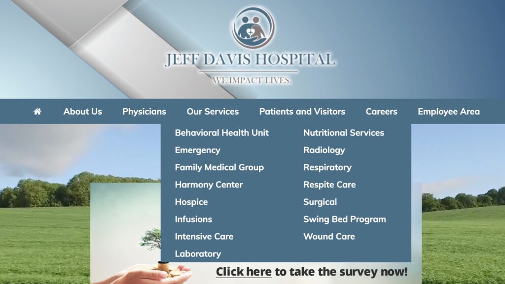
Figure 4. Large Clustered Submenus (Jeff davis hospital, 2022).

Finally, if user responsive design continues under the new template with persistent search, better search engine optimization matched to revamped navigation and removal of advertisements will not only promote consistency but regain overall stakeholder trust in the site content. Incorporating knowledge articles into search will reduce completion time from topic to information action. As shown by the user tester, search was always preferable to menu navigation. If search becomes more frequent, advertisement exposure will be more frequent but cause similar critical errors as using the antiquated FastHealth site. If re-branding and re-design is implemented, removing advertisements is a necessary step to adopting changes.

Total Word Count: 1600

References

Jeff davis hospital. (2022). Jeff Davis Hospital. https://www.jeffdavishospital.org/

Jeff Davis Hospital/fasthealth corporation (Hazlehurst, Georgia – jeff davis county). (2022). Jeff Davis Hospital/FastHealth Corporation. http://www.jeffdavisfasthealth.com/

Nielsen, J. (2020, November 15). 10 usability heuristics for user interface design. Nielsen Norman Group. https://www.nngroup.com/articles/ten-usability-heuristics/

Planning a usability test. (2022). Usability.gov. https://www.usability.gov/how-to-and-tools/methods/planning-usability-testing.html

Rubin, J. & Chisnell, D. (2008). Handbook of usability testing: How to plan, design, and conduct effective tests (2nd edition). Wiley.

Running a usability test. (2022). Usability.gov. https://www.usability.gov/how-to-and-tools/methods/planning-usability-testing.html

Backlinks

Group Assignment 2 – User Scenarios and Representative Tasks
Group Assignment 1 – Group Topic Selection

Group Assignment 2: Healthcare – User Scenarios and Representative Tasks
Website: https://www.jeffdavishospital.org/

Introduction

The Healthcare Group is testing and re-designing the Jeff Davis Hospital (JDH) website, shown in Figure 1, JDH is a hospital system located in Hazlehurst, GA that serves patients and families affected by cardiovascular accidents such as strokes. Our interest is to observe and accommodate users who leverage technology to find more information and actions about their personal or family’s healthcare needs. Within healthcare alone technology can be frustrating but especially trying to navigate care for a loved one affected by a stroke which delays elderly care. This will be further exasperated when the demand for care exceeds provider capacity. However, digital strategies will promote efficiency and better outcomes (Haddad et al., 2022). Contrasting widely known healthcare systems like Mayo Clinic or Cleveland Clinic, Jeff Davis Hospital services a smaller population regionally and accentuates most heuristics issues previously violated around consistency, standards, error prevention, efficiency, and minimalist design (Nielsen, 2020).

Figure 1. Homepage (Jeff davis hospital, 2022)

In reviewing previous heuristics evaluations, the JDH site mainly displays inconsistency and rigidity by using uncommon semantics and disjointed site navigation. Notably, as shown in Figure 2, numerous medical knowledge articles directing users to learn about symptoms or conditions link externally to its antiquated Fast Health site with no backward navigation. Likewise, observing SEO results, many remnants of the old site designs remain in the top 10 results. This disjointed navigation will be reflected in our representative tasks while observing usability flaws identified by our target user group.

Figure 2. Legacy Page (Jeff Davis Hospital/Fast Health corporation (Hazlehurst, Georgia – Jeff Davis County, 2022)

User Persona and Scenario

Jennifer is a 53-year-old resident of St. Augustine, FL, and is the adult-child of an 82-year-old father that has recently suffered a stroke. Jennifer’s father lives outside of a rural, small town in Georgia called Hazelhurst, however, he was transferred from his local hospital, Jeff Davis Hospital, to a larger hospital for emergency surgery in Jacksonville, FL.

Jennifer’s father has completed his surgery and is recovering well; he has requested to be transferred back to his local hospital to complete recovery and rehabilitation so that he can be closer to his elderly wife and home.

Jennifer is using the Jeff Davis Hospital website for the first time to see if she can have her father transferred back to recover, learn more about stroke, and see what elderly-specific outpatient care coordination is available after being discharged.

Representative Tasks

1. Finding Information About Strokes on the Site

Our target user group is most interested in retrieving health-related information from Jeff Davis’s Fast Health interface. Namely, researching elderly strokes considering the high likelihood of such an event (Brain basics: Preventing stroke, n.d.). Our target users will review this information to make better decisions for the welfare of those impacted by such health issues.

This representative task of our target user group seeks to establish Fast Health’s trustworthiness and usability for its target audience. Namely, we are interested in testing how well Fast Health can satisfy the target user’s needs based on our given scenario for reviewing health information related to strokes. Additionally, we seek to document usability discrepancies identified while conducting Nielsen’s (2020) heuristics evaluations.

2. Find Patient Transfer Services for the Hospital

Patient transfer services are often needed for the elderly for several reasons. Namely, when the patient is transitioning from post-surgery to physical rehabilitation. Such services are imperative to the safety and well-being of the patient, which aids in their recovery. Our target user group will seek information related to this task through Jeff Davis’s website.

We are most interested in testing the website’s usability in carrying out this task. Specifically, matching real-world vocabulary to the system. That is, considering if the website has strong information scent for locating such services based on the user’s understanding.

3. Find Information About Elderly Care Coordination

Outpatient services provided to the elderly serve as a strong pillar for any medical facility. Our target user group will search for such services on the Jeff Davis website to help the elderly in their care. This task addresses similar usability issues identified in locating patient transfer services. Additionally, we are interested in testing usability flaws regarding the context and content provided by this section of the website. Namely, we are testing website consistency and standards regarding its naming conventions and brevity.

Conclusion

The Centers for Disease Control (CDC) found that within the United States (U.S) every forty seconds someone has a stroke while more than 795,000 people (about half the population of Idaho) in the U.S experience a stroke annually (CDC, 2022). With the high probability of stroke that affects people in the U.S every year, having a plan of action and care plan for loved ones affected by stroke is imperative thus why effective navigation and usability of hospital sites like the JDH website is needed. In our presented usability analysis scenario is an 82-year-old stroke victim who received care in Jacksonville. Jennifer is attempting to access information on transferring her father from Jacksonville, FL to Hazelhurst, GA where JDH is located so that he may be closer to his elderly wife and home. The representative tasks include three steps which are as follows; Find information about strokes on the JDH website, Find Patient Transfer Services for the Hospital, and Find Information About Elderly Care Coordination. With these representative tasks, Jennifer could use the information found to make informed decisions to successfully transfer her father from Jacksonville, FL to Jeff Davis Hospital.

Total Word Count: 846

References

Brain basics: Preventing stroke. (n.d.). National Institute of Neurological Disorders and Stroke. https://www.ninds.nih.gov/health-information/public-education/brain-basics/brain-basics-preventing-stroke 

Haddad, L.M., Annamaraju, P., & Toney-Butler, T.J. (2022). Nursing Shortage. StatPearls Publishinghttps://www.ncbi.nlm.nih.gov/books/NBK493175/  

Jeff davis hospital. (2022). Jeff Davis Hospital. https://www.jeffdavishospital.org/

Jeff Davis Hospital/fasthealth corporation (Hazlehurst, Georgia – jeff davis county). (2022). Jeff Davis Hospital/FastHealth Corporation. http://www.jeffdavisfasthealth.com/

Nielsen, J. (2020, November 15). 10 usability heuristics for user interface design. Nielsen Norman Group. https://www.nngroup.com/articles/ten-usability-heuristics/

Stroke facts. (2022, April 5). Centers for Disease Control and Prevention. https://www.cdc.gov/stroke/facts.htm

Backlinks

Group Assignment 1 – Healthcare

Individual Assignment 2 – Healthcare and my.clevelandclinic.org

Website

The website selected for this Heuristics Evaluation intended for the Healthcare Group is the Cleveland Clinic Healthcare System at https://my.clevelandclinic.org/. The website represents a medium-to-large services and resource oriented healthcare organization situated nationally with locations primarily in Ohio and Florida. The site serves as an integrated public-facing portal for individuals seeking health form a trusted source – learning further about Cleveland Clinic’s services, access to patient-specific info, and navigating conceptual medical or pharmaceutical info.

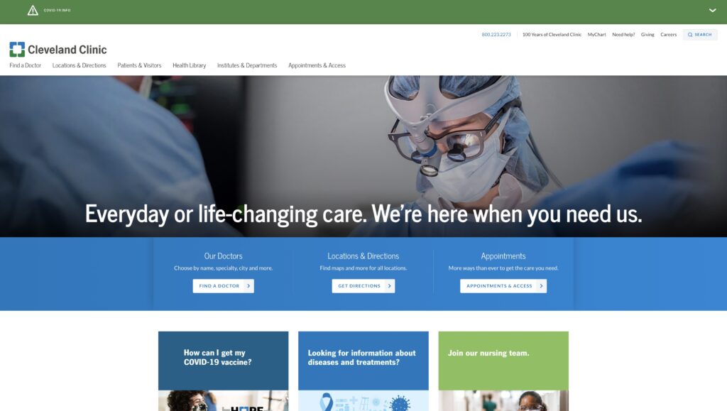
Figure 1. Cleveland Clinic Homepage (Cleveland Clinic, 2020)

User Scenario

Prefaced in our group interest, our user seeks a central destination to fulfill information needs in terms of their healthcare, fulfillment either to gain more knowledge or to further take action with a medical professional. With this in mind, the ideal scenario is to connect all those needs with a user that is a new patient seeking to alleviate a medical condition by discovering more about the condition itself, related symptoms, and concluding the search by making an appointment with a healthcare provider.

Defining the scenario with helpful attributes, our situated user seeks to find more about the treatment solutions for his or her chest pain. With Heart Disease as the highest in mortality and common care, it is most appropriate symptom to simulate (Centers for Disease Control and Prevention, 2022). Our user has already decided to seek an appointment with a medical professional, understanding the intent of visiting Cleveland Clinic as a point of care in addition to a knowledge center as intuitively defined by the organization’s name.

In emulating this scenario, the following steps were accomplished with the current UI:

  1. Select “Looking for information about diseases and treatments?” in body.
  2. Search “Chest Pain” in the search box and select the first result.
  3. Select “Appointments & Locations” as the orange primary button.

Flaws and Heuristics Analysis

In this analysis, Jakob Nielsen’s 10 Usability Heuristics were used as the most universally applicable in testing Cleveland Clinic’s site usability with the specified scenario. With each flaw, inadequate heuristics were identified for improvements. Overall, the flaws identified center around Cleveland Clinic’s lack of contextualizing user needs upon entering the website.

The first flaw, in site navigation, is the lack of context for our user to identify where they can navigate to cardiology specific information. On the homepage in Figure 1, the site only provides two links to enter the “Health Library” to make a search for conditions and symptoms or to select the link stating “Looking for information about diseases and treatments?” in the middle of the page. In terms of heuristics, this issue primarily violates Flexibility and Efficiency of Use, where the site needs to tailor to expert users but also quickly prompt accelerative actions for new users (Nielsen, 2020). The site accomplishes this well with COVID-19 and monkeypox specific links, but fails to address even considering the more common CDC Diseases. Likewise, Recognition Rather Than Recall is lacking for the same reasons and Help and Documentation is initially lacking with

The second flaw, back to navigation, is the over-redundancy of the generic links. While this can aid on other heuristics, it is against Aesthetic and Minimalist Design with more distracting text. Use of light text in primary headers and bold texts in secondary links clash in aiding where to select on conditions or seeking a medical professional. Non-actionable text hidden in headers like “100 Years of Cleveland Clinic” are also present. Dual use of the same links for “Find a Doctor,” “Locations & Directions,” and “Appointments” add to the confusion, only separated by a large middle picture heading. All three links eventually conclude with the ability to make an appointment, but add extraneous details to specialize more on the action steps rather than the care needs.

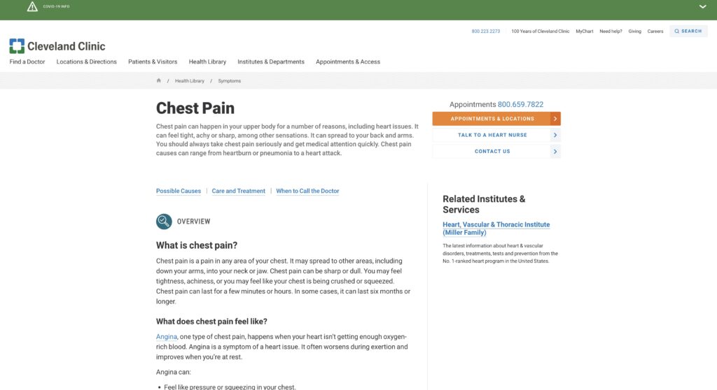
When selecting “Health Library” the user ideally would enter “chest pain” into the search box centrally located as seen in Figure 2, which delivers an article that has the ideal step highlighted with an orange button to make an appointment, superseded by the 800-number. At this concluding task, this setup, especially when considering “chest pain,” fails the heuristic of Match between System and Real World with the context of the site content (Nielsen, 2020). The knowledge article mentions in paragraph multiple times to reach a medical professional immediately for this symptom due to high concerns of more serious heart disease. However, the buttons remain static in all knowledge articles. With multiple pathways, all steps encourage calling the main number even though there are other options that are buried in the body.

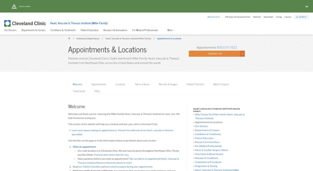
Concluding the scenario, as shown in Figure 3, the user is given an extensive standard operating procedure to make an appointment to visit the Main Ohio Campus, with repetitive calling options and buried action links. This extensive text once again violates Aesthetic and Minimalist Design but also violates Error Prevention and Diagnosis to Recover from Errors (Nielsen, 2020). By expanding contact options less clearly and branching multiple hyperlinks for the purpose of making an appointment, the site risks making the user more lost and reverting back and forward between pages.

Figure 2. Chest Pain Result in Health Library Search (Cleveland Clinic, 2022).
Figure 3. SOP to Make an Appointment (Cleveland Clinic, 2022).

Design Recommendations

To address the homepage, the simplest step is to reduce redundancy of main navigation links in the header to aid in Aesthetic and Minimalist Design. By removing duplicated links, making the remaining ones more bold or accented, and reducing the length of the picture heading, the site is more visible to body content below the heading.

In place of the secondary redundant links, using icons and titles for different specialty areas such as “Heart,” “Cancer,” “Respiratory” and “Infections” can contextualize the user’s search in the Health Library for more information about their condition. By using more generic terms for the specialties, the user understands the topics better to drill down.

When presented the knowledge article for “Chest Pain” like in Figure 2, there should be more more call to action buttons with the common one to “Call to Make an Appointment.” Primarily for this article, flagging certain ones as high risk can have a button to “Call 911 for Emergency” in red to highlight if the user is experiencing the symptom. These can hyperlink to a phone call in-browser or on the mobile device. More importantly, the semantics of the buttons apply intent more in line with real world and the system.

Lastly, to avoid errors and provide clarity with less clutter with the end page shown in Figure 3, content can be reduced with the inclusion of action buttons mentioned previously and simplifying the step-by-step article only about what the user expects after they make the appointment. Selecting the action button can also prompt the user with a new load page saying “thank you for reaching out” and then provide the guide below. This facilitates feedback and lets the user diagnose what occurred when they placed the call.

Future Considerations and Conclusion

Architecturally, it is apparent that the initial design elements of Cleveland Clinic’s site are mainly to alleviate a less sophisticated appointment management platform. The requirement to be a MyChart account holder as a current patient or use a 1-2 day delayed web form are poor substitutes compared to a direct phone number. With the careful design of a linear oriented new patient appointment system on-site, many of the flaws listed can be alleviated. Likewise, approaching linearly aids in successful steps in the scenario by curating actionable steps from condition to appointment scheduling.

Word Count: 1,198

References

Access anytime anywhere. Cleveland Clinic. (2022). Retrieved September 26, 2022, from https://my.clevelandclinic.org/

Centers for Disease Control and Prevention. (2022, September 6). FASTSTATS – leading causes of death. Centers for Disease Control and Prevention. Retrieved September 27, 2022, from https://www.cdc.gov/nchs/fastats/leading-causes-of-death.htm

Nielsen, J. (2020, November 15). 10 usability heuristics for user interface design. Nielsen Norman Group. Retrieved September 19, 2022, from https://www.nngroup.com/articles/ten-usability-heuristics/

Backlinks

Group Assignment 1 – Healthcare

Individual Assignment 1 – Novice Users and Lancasterarchery.com

Overview of Website and User Profile

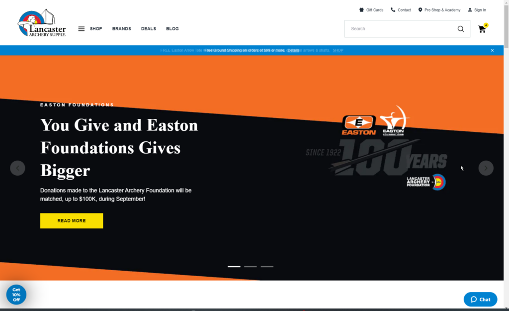
Lancasterarchery.com, shown in Figure 1, is a shopping portal specifically for archery equipment and supplies. In 2021, eHouse Studio redesigned the site due to previously poor usability and an aging theme (Maas, 2021)(Lancaster Archery Supply Case Study, 2022). Similar to Amazon, Lancaster Archery Supply earns margin on sales by selling and shipping products. Also, educational media and tournaments at their headquarters are provided as a service. In the sport community, the company is considered the leading website to buy archery equipment within the United States.

Figure 1. Homepage. From Lancaster Archery Supply, 2022. Retrieved from https://lancasterarchery.com/

Lancaster Archery’s site was selected to contrast usability opinion of a novice user with someone like myself as an expert user that practices target archery and bought equipment there. The site was presented virtually through a desktop web browser to a novice user pseudonym named “Jess,” who is female (identified as she/her), 35 years old, White-Caucasian, married with children, and resides in Florida. Jess understood the idea of archery and considered it as a hobby for her daughter, but never attempted the sport or shopped for equipment. She is educated as a UX/UI Designer through a professional bootcamp, which did aid in describing the website design elements. Ideally, Jess represents a Guardian User Persona of a parent looking to buy equipment for their child as a beginner archer.

Task and Action Observations – Finding a Bow

Jess as a novice user was asked to view the homepage to gather initial opinion and then complete a task to find a bow to purchase for her 7-year old daughter. Reflecting on the homepage, she commented how the site content itself felt oversized, intimidating, and did not provide any articles on starting the sport. Jess hovered over the top left menu and noted a hamburger menu for “Shop” but no content to see what “Brands,” “Deals,” and “Blog” sections offer to help learn more about the sport. Generally, she noticed that many of the products showcased were for bowhunting and that there was very little diversity of the people pictured. As an expert user, I normally ignore the homepage unless there are upcoming events or podcasts in the center, which are very infrequent throughout the year. Confirmed in a 2012 survey by the Archery Trade Association reported by Archery360, 55% of archers ages 18 or older in the United States practiced both target archery and bowhunting or bowhunting exclusively, making up the largest demographic of consumers. (18.9 million Americans participate in archery, 2013).

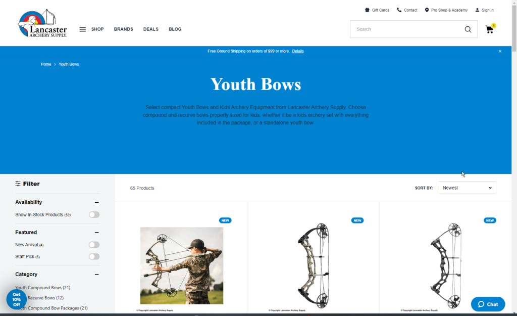
To find a bow for her daughter, Jess began the task by typing in “kid’s bows” into the homepage search bar. As an expert user, I first generally define the type of bow, like “Compound” or “Recurve” and then browse through the “Shop” Hamburger menu to navigate to Bows and then Youth Bows or the more specific bow type categories. When Jess viewed the search results, only two products displayed with only one being a bow based on SEO interpreting product titles with the word “kid.” Since both seemed undesirable, she selected the “Youth Bows” Category in the Hamburger menu, which offered more results. Looking at results page, shown in Figure 2, the left filter menu seemed well organized but lacked any context its attributes like “Draw Weight” and “Speed.” As a previous user, the site filters are a utility if the context is known, but less desirable in practice since sometimes filters hide products that are not configured properly for metadata. When Jess selected “Galaxy Bullseye 54 Takedown Recurve Bow,” the product page included configuration items, some she assumed correctly like handedness with others like Limb Weight and “Nok Set” unknown.

Figure 2. Youth Bows Results Page. From Lancaster Archery Supply, 2022. Retrieved from https://lancasterarchery.com/collections/youth-bows

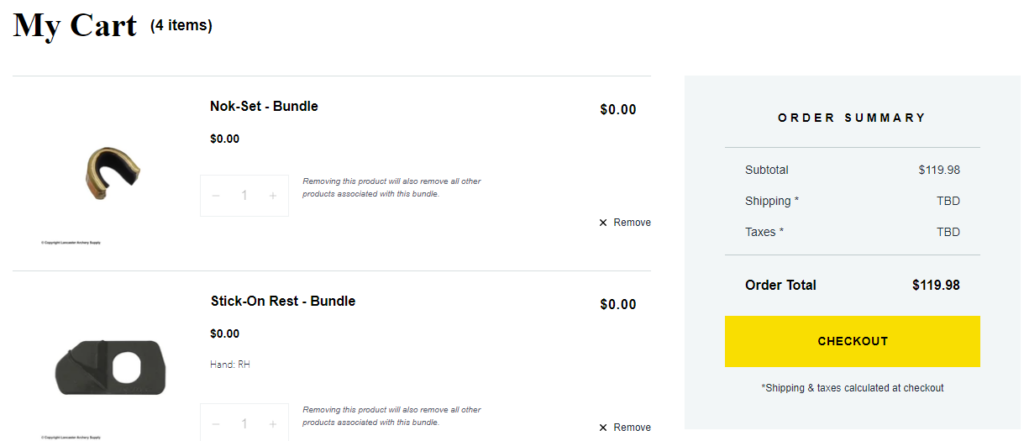
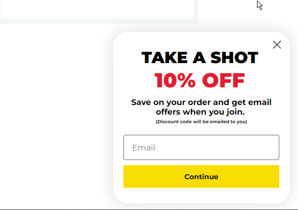
Finishing the purchase when the bow was configured and added to cart, Jess noticed how the bundled items were separated but equaled the total, showing a gray warning about removing them, as shown in Figure 3. As an expert user, I also found this behavior confusing especially if the exact individualized products are added from the catalog as spare parts. Jess was generally uncertain about the checkout process and did not feel confident in buying a bow based on these culminating issues. Overtime her experience was less desirable as a guest user when she kept being prompted a 10% Off Button for an email sign-up and a pop-up to donate to the Lancaster Archery Foundation non-profit, as shown in Figures 4 and 5.

Figure 3. Cart and Bundled Items Warning. From Lancaster Archery Supply, 2022. Retrieved from https://lancasterarchery.com/cart
Figure 4. Pop-Up for 10% Off. From Lancaster Archery Supply, 2022. Retrieved from https://lancasterarchery.com/
Figure 5. Pop-Up for Donation Pre-Checkout. From Lancaster Archery Supply, 2022. Retrieved from https://lancasterarchery.com/cart

UX Considerations: Expert v. Novice

Evidently, lancasterarchery.com, even with its 2021 redesign, favors more experienced users but has the potential to make enhancements by observing novice users like Jess. Despite a slim-majority consumer demographic, the company has an incentive to attract new and younger generations to archery. In comparing to my experience as the expert user, prior knowledge of filter terms and understanding the site’s disjointed queries led to multiple attempts with browsing, chaining, and differentiating akin to the Ellis Model of Information Behavior (Case & Given, 2016, p. 151). While this model is robust, a more linear approach may be better suited for novice users that need a directed interface. This can be accomplished by developing a guide or questionnaire that aids in deciding a bow, perhaps displaying it on the homepage. Jess also suggested adding YouTube Videos of product category guides similar to reviews on product records already created by Lancaster staff. Likewise, tooltips with definitions in the filter menu or more curated filters per category can help define attributes. In general, SEO and the product metadata need improvements to include more accurate search results.

Word Count: 874

References

18.9 million Americans participate in archery. Archery 360. (2013, August 9). Retrieved September 6, 2022, from https://archery360.com/2013/08/09/18-9-million-americans-participate-in-archery/#:~:text=Of 235 million total Americans,participated in archery and bowhunting

Case, D. O., & Given, L. M. (2016). Looking for information : A survey of research on information seeking, needs, and behavior. Emerald Publishing Limited.

Lancaster Archery Supply Case Study. eHouse Studio. (2022). Retrieved September 5, 2022, from https://www.ehousestudio.com/work/lancaster-archery-supply-1

Lancaster Archery Supply. (2022). Homepage. Lancaster Archery Supply. Retrieved September 6, 2022, from https://lancasterarchery.com/

Lancaster Archery Supply. (2022). Your Shopping Cart. Lancaster Archery Supply. Retrieved September 6, 2022, from https://lancasterarchery.com/collections/youth-bows

Lancaster Archery Supply. (2022). Youth bows. Lancaster Archery Supply. Retrieved September 6, 2022, from https://lancasterarchery.com/collections/youth-bows

Maas, D. (2021, November 24). Lancaster archery supply launches New Dealer Website. Archery Business. Retrieved September 5, 2022, from https://www.archerybusiness.com/lancaster-archery-supply-launches-new-dealer-website