Website: IGN (https://www.ign.com)
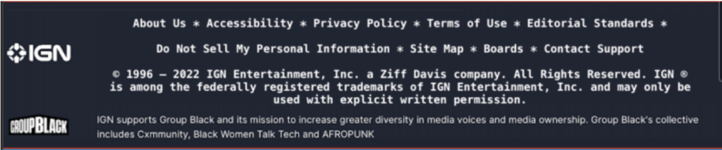
In the second iteration of the page design, we moved some of the information that was buried in the abstract “More” section of the left-hand navigation menu and made it part of the footer. This gives access to these functions from every page and increased visibility to these elements. As mentioned in the first iteration, the original “footer” was lost under an ever-extending page as the user scrolled down. This caused the information in the footer to be lost down the proverbial well
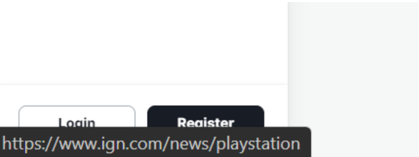
The login and register buttons were moved to the header alongside the search bar for additional visibility. The original location was the bottom left corner of the page where it tended to get lost behind the URL notifications as the user passes over a hyperlink. This change enhances the user experience by giving them a much easier time accessing or creating their IGN account.
We’ve also decided to move the playlist to the user account/profile menu to free up space in the menu section giving users less to deal with. With this move, once a user creates or logs into their account, they’ll have the ability to customize and control their own playlist of games, reviews, and other preferred content.
One of our initial tasks we wanted the end users to accomplish in our earlier scenarios was finding an article that contained different titles in the Game of the Year catalog for 2021. Due to the limited search functionality of the IGN website, most tests and scenarios ended with an overall negative experience for our experimental group. While the user task differed slightly from our login/registration placement, the scenario brings to light the importance of widget placement and how a simple change could have a huge impact on usability. With this new placement, the user now has the ability to save specific games to their playlist making it easier and more efficient to locate games of interest and relevant information such as articles and game details.
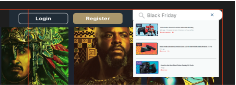
In the first iteration of our proposed design, we moved the search function and added functionality to the pop-out search. In the second iteration, we removed the pop-out search and added functionality to the search bar. Users are now able to search the entire website using the search bar, instead of having to choose a filtered category to search. However, users are still able to filter the results when the search results are displayed. The search location and functionality change makes it much easier for the end user to find relevant content.
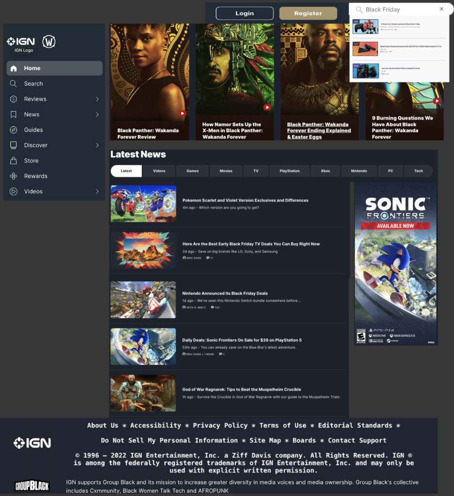
Our final revision includes a cleaner look that doesn’t bombard the end user with too much information and allows them to see the main content of the page with the option to navigate elsewhere when effortlessly. They have the ability to effortlessly search for content, log into their account, as well as save content to their personal game playlist. Our updated homepage also includes the addition of a footer that grabbed some of the contents from the “More” section and gave it more relevance by including functions that were often overlooked. Also, with the removal of the continuously loading content as the user scrolls the page, we feel the revisions will make content searching more efficient and improve overall usability.