Website: IGN (https://www.ign.com)
Group: Gaming Group
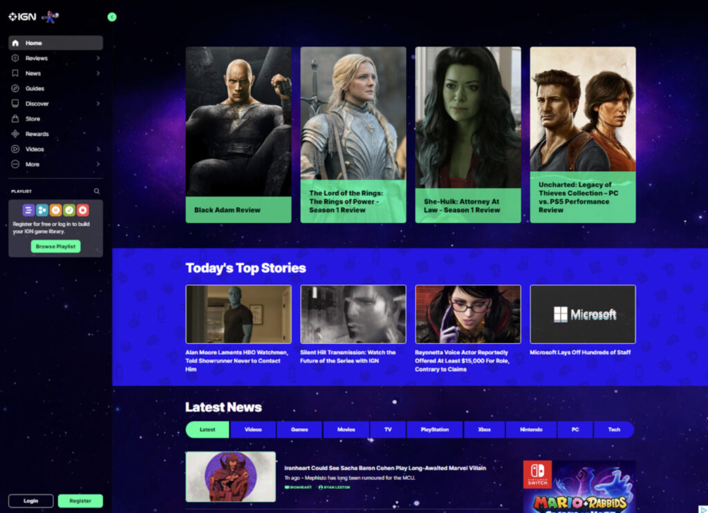
During our group’s individual heuristic analyses (and again in user testing), the most glaring shortcoming on the site was the lack of an obvious search function. There is a natural inclination to look for a search bar or a magnifying glass when trying to locate specific bits of information. At the time of our initial testing neither option existed, as shown in the screen capture below:
This change was to be our initial iterative change. This change would help the website create a much needed “match between system and real world” as years of using search bars has created an instinctive draw to the search bar and the magnifying glass icon. Since the time of our initial user testing, the website has added a search option. In the earlier screen capture of the website, the column on the left side only showed a magnifying glass icon beside the playlist option. This only allowed for searching of game titles and precompiled “playlists” of articles and reviews.
One of the drawbacks this has on end users is the ability to resurface older content and articles that might be of interest. One of our initial tasks we wanted the end users to complete was finding an article that contained different titles in the Game of the Year catalog for 2021. Due to the limited search functionality of the IGN website, most test and scenarios ended with an overall negative experience for our experimental group due to it being difficult to find the search features, only returning individual games, or returning irrelevant results causing the users to look elsewhere. The site did not really have a way to look through its resources and return specific entities even though we knew it was there. This is one of the main reasons we decided to change the layout and make it easier for users to find the search bar as well as navigate IGN.
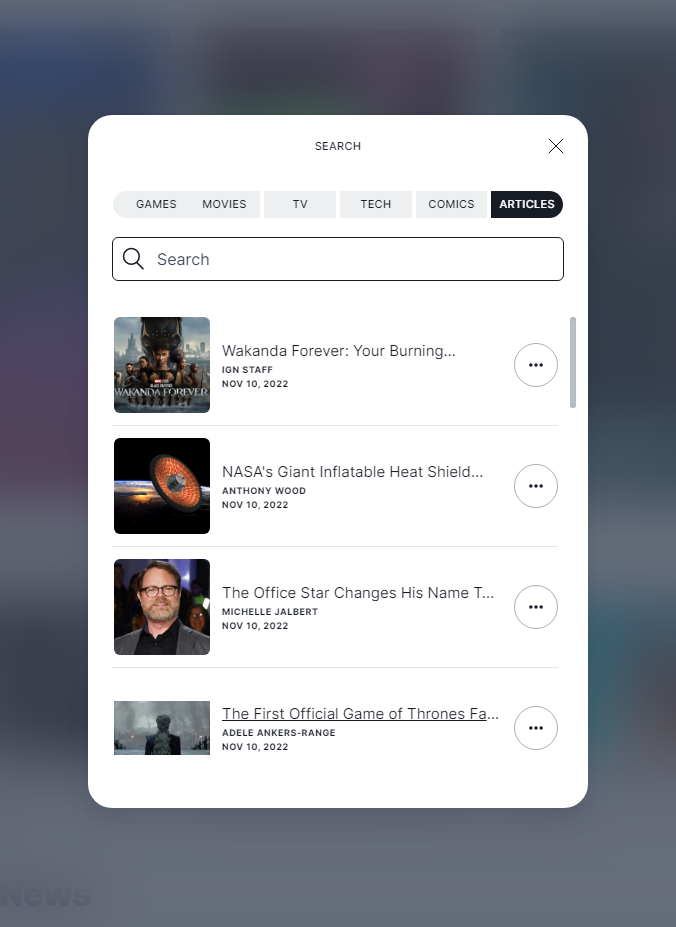
The next screen capture shows the search option after you select it from the main page menu. It offers increased flexibility by allowing the user to search for their keyword in the context of the more popular segments of the page.
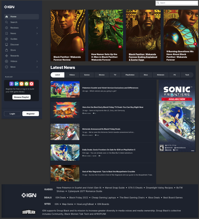
Not only have we updated our navigation features, but we’ve also cleaned up the homepage and the cluttering of content. Previously the homepage contained a lot of randomly placed ads that were sometimes inconsistent with the layout of the page, those things such as large images that took up most of the screen. In our revision, we’ve decided to give the site a cleaner look that doesn’t bombard the end user with too much information and allows them to see the main content of the page with the option to navigate elsewhere when effortlessly. This cleaner look also includes the addition of a footer to the home page and the removal of the continuously loading content as the user scrolls the page. We feel the revisions help the user find content and reduces confusion caused by the current site.
The website’s recent addition of a search capability shows that our group was on the right track and that the change was an obvious and glaring deficiency in the site’s design.