Individual Assignment 1: Designing for Users

Website and User Background

The website that I invited my user to test was TechCrunch.com. The user regularly interacts with news sites and forums but not with TechCrunch specifically. The user is someone I consider technically savvy, regularly interacting with technology and websites. The user and I are both a part of the same age group and have had similar experiences with technology and its evolution.

A screen capture of the Home Screen of TechCrunch's website.
TechCrunch home screen

User Interaction

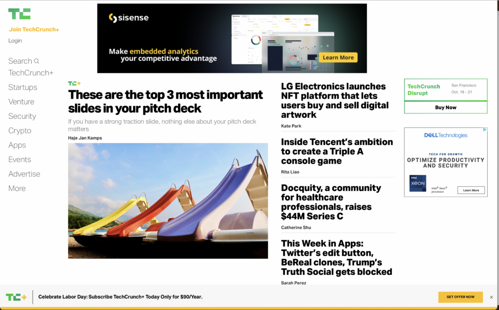
The user was initially confused with the format of TechCrunch. There was no prominent title for the homepage so because my user is not familiar with TechCrunch they immediately asked for the name of the site. They scrolled through the main page of the site and noticed that the pictures were stock photos mostly but still managed to be relevant to the articles. One major thing that the user pointed out was the monotony of the website. Items that were sponsored content and even ads were hard to decipher from regular content. The same was said about the navigation menu; the Search bar and even the More tab seamlessly blends in with the other navigation options. The user scrolled down and noticed an article discussing Instagram recently being fined by the EU for violating children’s data privacy rights. A nice feature of TechCrunch is that as you’re scrolling through the website’s desktop version, there’s a circular meter tracking your progress through the article. Initially, the user clicked the circular meter because it contained an X within a circle and they added that “normally buttons with X’s close items.” That was an interesting point and something that I hadn’t considered before.

Site Suggestions

TechCrunch has one of the more straightforward UIs than a large portion of news sites and forums that exist today. Using what I know about websites I know that that can be both a good and bad thing. In today’s climate, ads are virtually omnipresent. Every app has the ability to track your activity to show ads they think you’d want to see along with decades-old methods or magazine and billboard advertising. A website without too many loud and distracting ads is hard to find. At the same time, the search bar, an extremely helpful tool, is lost in the interface because of the minimalist approach that the website takes. Once you actually use the search bar, the website almost becomes unidentifiable again with only the green TC (TechCrunch logo) in the upper right corner to let you know where you are. I don’t think the user experience level justifies any of these particular challenges. They are simply poor design choices. TechCrunch’s TC logo doesn’t stand out on the web pages, not even on the homepage. If the designers want to use the abbreviated logo throughout the site, I think it’d be best that they introduce the logo a little larger on the home page and include the full name of the website somewhere accompanying the abbreviation, it’d be more recognizable. The website owners can make certain features pop out to the eye without sacrificing their minimalist theme by using their accent color, lime green, to show separation.

Individual Assignment 1: Designing for Users

The website and the user:

   For this assignment, I chose RockAuto.com (https://www.rockauto.com/) and challenged a 40-something male coworker to find a part that I know he needed to fix his driver side door. With just that information provided, I watched as he went to the site. This is not someone with any real mechanical experience, just enough to jumpstart a car, and has never done his own oil change. When he needs something from the parts store, he asks the clerk behind the counter. He does have experience in IT, so navigating a website should not be a challenge.

The interaction:

  He went straight to the list of car makes on the left side of the screen, but thought it was odd that the list didn’t have a title, like “Make” or “Manufacturer”. After finding “Kia” he clicked it and it expanded to all the model years, where he selected 2013. It showed two engine types (but three existed for that year). At this point there was some digging because he could not figure out what to call the part, which was the part that holds the door open, but it was not the hinge.

  After about five minutes of searching various sections for door parts, he gave up and went looking for an exploded view of the door to try to find out what the part was called. It looked like it was called a door check, but when he went back to the RockAuto site, a search for door check for his model only showed some pins and some rubber straps. At that point he gave up on the site.

The findings:

   The experience went south once he realized he didn’t have a correct name for the part, then could not find a way to identify the part. The site would have benefited from exploded views of the car that could be referenced for part names. In this case, he had to refer to diagrams from other sites, only to come back to RockAuto and still not find what he needed.

   Had he been a true “car guy” or expert mechanic, he might have been able to properly identify the part and get by without the drawings. As a novice user, having a way to pick the part from a drawing and have the part identified would be a great advantage. The site may be missing out on sales for that simple reason. If you end up having to go to another site to identify the part, you run the risk of losing the sale to that other site.

Individual Assignment 1: Designing for Users

A Usability Analysis by Matthew Post

  1. Target Website:

URL: https://www.beckershospitalreview.com/

Website Description: Becker’s Hospital Review is one of the leading healthcare industry-specific news and information sources in North America.

Screenshot:

Main landing page of Becker’s Hospital Review website (https://www.beckershospitalreview.com/).

Tester: The tester is a mid-30’s aged Licensed Mental Health Counselor in private practice. This individual has a high level of digital literacy as someone who is very comfortable using an Electronic Medical Record (EMR) system, navigating government and payer websites, leverages an internet-based marketing strategy, and uses the internet to follow news and trends relating to their practice/industry. This user is familiar with some other healthcare-related publications like Psychology Today and ADDitude but has not used Becker’s Hospital Review before.

  • User Action:

I asked the user the perform the following task: use the website to find and download the whitepaper on “integrated virtual care”. The user immediately described being overwhelmed by the UI and the amount of options, text, and banners on the screen. The user hovered over the main Whitepaper directory option in the upper-center area of the landing page and selected “Current Whitepapers”. I have never selected that option in my years of using this website, nor do I believe I have ever noticed it. I expected the user to click the upper-right banner that displayed “Health IT Whitepapers – Download”, use the search bar to enter a query, or to select directory option listed “Health IT Whitepapers” under the “Featured Learning Opportunities” list on the middle-right of the page.  

On the following whitepapers page, the user quickly located the “Health IT” category line item and hovered over its “click here” option, hesitated, appeared confused, and decided not to use this option because it had text “to download all” after “click here”. The user then typed “integrated virtual care” into the search bar.

On the following page with the search results listed, the user browsed the list of results by scrolling down, did not notice the “Featured Learning Opportunities” menu with the direct link to “Health IT Whitepapers” on the right side of the page, and instead selected a search result that had “Virtual Care” in its title. On the following page with the article content, the user selected the option to print to PDF the page.

I redirected the user back to the whitepapers page and asked the user to select the “click here” option for “Health IT”, despite their reluctance. On the following page (https://go.beckershospitalreview.com/becker-s-healthcare-choose-your-hit-topics), the user scrolled through the check box list of Health IT whitepapers, checked the box for the “integrated virtual care” item, and scrolled further down the page. The user unchecked the box for receiving the “E-Weekly” emails and selected “Download Now”. The page displayed red text informing the user to enter the required fields for “First Name”, “Last Name”, “Email”, “Job Title”, “Company”, “State”, and “What type of institution are you employed by?”. The user exasperatedly entered placeholder text into these fields and again selected “Download Now”. Red text displayed again, asking the user to complete the required fields, which after some scanning of the options turned out to be the acknowledgement checkbox for the site’s privacy policy; the user checked this box and selected “Download Now” to begin downloading the document.

  • Expert-Novice Differential:

The Becker’s Hospital Review website user interface has several issues that likely make it difficult to navigate and use by those unfamiliar with it. The first issue is that the site has some scaling problems on desktop; depending on how much the screen is being used by the browser (i.e., half the screen versus full screen), the site prioritizes and displays its modules and menu options differently. This produces a user experience that is highly dependent on how many windows are open and sharing the device screen simultaneously. Additionally, the test user and I found that the default 100% zoom of the page in the browser to be sub-optimal for navigation, with agreement that 25% zoom was far more usable.

Main landing page viewed at 100% zoom (https://www.beckershospitalreview.com/).
Main landing page viewed at 25% zoom (https://www.beckershospitalreview.com/).

Another issue that effected usability for the novice user was the formatting of information on the main page. The main page has three tiers of menu options, two are separated by an advertisement banner, and the second row of options present more option drop downs when hovered over that overlay the third row of options; the test user found this design choice to be confusing to navigate. Additionally, the main page has information organized into five different lists that feel cramped in their spacing and seems to reduce their intended accessibility by inundating the user with information.

Screenshot of the many listed menu options at the top of the page (https://www.beckershospitalreview.com/).

When selecting most of the content from these areas, the website requests registration information which, based on the test user feedback, comes off as pushy and makes the user question the legitimacy of the site or how the information would be used. The webpage would benefit novice users by reducing the amount of information presented on the screen, applying a more consolidated menu organization, and presenting less required registration information fields when accessing content.

The most impactful usability issue from the user test was the design choice of displaying the following text to navigate to the Health IT Whitepapers page: “Health IT – click here to download all” (https://www.beckershospitalreview.com/whitepapers/current-whitepapers.html ). The inclusion of the text “to download all” pushed the user to seek another method of reaching the page (despite their not being another method), as they were concerned that the selection of that “click here” would instantly begin downloading an unknown quantity of documents in an unknown format. Feedback from testing suggests that the navigational design of this list of whitepaper categories would be greatly improved by simply eliminating the text “to download all” as the following page allows the user to select which documents they actually want to download.

Whitepaper category list with confusing “download all” text (https://www.beckershospitalreview.com/whitepapers/current-whitepapers.html).

Individual Assignment 1: Designing for Users

WORD COUNT: 948

1. Website and User Profile

Website

https://its.fsu.edu/service-catalog/communication-collaboration/office-365/microsoft-office-365-proplus

Information Technology Services (ITS) published brief instructions for downloading and installing Microsoft Office 365 ProPlus on a Windows operating system. Multiple problems arise as the user attempts to follow the instructions due to a mixture of poor user-centered design practices by FSU’s Office website and ITS’s verbiage.

User

The target user is a student attending Florida State University in pursuit of a Bachelor of Science in Biology degree at Florida State University (FSU). Their technical aptitude in information systems would be considered average. They utilize the Internet, are familiarized with software applications and are avid social media users. Particularly, the user is familiar with navigating the FSU interface but lacks proficiency in more advanced navigation tasks with the website as will be demonstrated in this case.

2. User Navigation Actions

App Launcher Icon Issue

Upon instructing the user to follow ITS installation instructions, they experienced their first issue at the third step; that is, selecting the App Launcher icon. The issue stemmed from the user’s lack of technical knowledge in knowing what an App Launcher icon looks like. They hesitated at this step and began making assumptions as to what the instructions were conveying. The user looked at the far-left side of the page where the bulk of the application icons were to no avail. They then re-read the instructions noticing that the icon would be in the top-left corner of the page. However, they did not know specifically what the instruction meant about “top left corner”. They reasoned that there were multiple top-left corners of the page depending on where they looked. It wasn’t until they accidentally hovered their mouse over what looked to be an icon with nine dots that they discovered where it was.

Choosing Office 365 Issue

Selecting the App Launcher icon displays another panel for the user to make additional choices. Step Four of the instructions makes it quite clear that ITS wanted the user to select Office 365. However, the new panel does not show this exact wording. This wording confused the user and again caused them to scan the panel for any indication of Office 365. After a few seconds of frustration and verbal complaint, the user clicked on the closest wording choice, which was Office, directing them to another page to download Office 365.

Installing Office Issue

The last issue the user experienced pertained to finding the Install Office drop-down box. They noted how it was difficult to find the location because it was not clearly identifiable on the page. Nor did ITS dictate the drop-down box’s location as they did for the instructions in Step Three. The drop-down box design blended too well into the background which prompted the user to look to the left of the page again because of the coloration of the application icons.

3. Novice/Expert User Observations

App Launcher Icon

The issues identified above with the selected user also demonstrate a stark contrast compared to my expertise with said issues. As an IT administrator, I have high proficiency in knowing where to look and what to download concerning Office 365 applications. The App Launcher icon is common wording for displaying a nine-point icon (as shown above) to reflect a collection of other applications. It hadn’t occurred to me that users would not explicitly know this information considering they do not regularly work with information systems.

Selecting Office 365 and ‘Install Office‘ Drop-Down Box

As noted earlier, the user struggled with ITS verbiage (or lack thereof) when identifying and selecting the right links to download Office 365. However, being an expert user myself, I have worked so much with installing Office 365 for other users I can understand why ITS would skip certain information. While it may have been clear to me, I did not follow ITS instructions exactly; glazing over the general idea of what they were instructing me to do. The user, who is not an expert with Office 365, did not act this way. They followed ITS’s instructions carefully and were still confused at certain steps along the way.

For instance, the user did not know where the Install Office drop-down box was located on the page. As mentioned earlier, they scanned the page looking at the colored icons on the left-hand side. They re-read the ITS instructions and could find nothing indicating the general area of where said drop-down box could be. For me, this was interesting because I didn’t need the instructions to know where it was located considering I had performed this action so many times before. The first time I installed Office I just pressed ‘ctrl + F’ on my keyboard typing in the search term and found it immediately. That is something the user was not aware of.

4. Design Recommendations

Include Pictures In ITS Instructions

ITS should re-assess some of the steps in their Windows instructions. The App Launcher is a simple fix where ITS need only to include a graphic displaying what the icon looks like. The same holds true with a user looking for Office 365 in Step Four. Non-expert users would benefit greatly from IT-specific terminologies by equating a picture with the term. While this recommendation does not improve the website design per se, confusion and wasted time spent interpreting ITS instructions would enhance the user’s experience navigating the website.

Install Office‘ needs to be clearly identified

FSU’s Office website for students displays the drop-down box in an unappealing way as mentioned earlier. From a user-centered design perspective, visibility for the item needs to improve. One design improvement for this drop-down box to be more noticeable is to change the FSU background to accentuate the Install Office drop-down box’s white background.

Individual Assignment 1: Designing for Users

The Goodreads website home page

Website and User Tester Selections

The website I proclaim to be an expert with, just by virtue of having used it since I was in high school, is Goodreads, a social cataloging site for books. The first thing the user I asked to help me with this project said was, “I’m not a technology person at all.” She has a bachelor’s degree and an advanced degree in learning disabilities and currently works in the special education department at a school. If she has to use a new website or device, she says it’s typically for work, and even then, she is trained by someone. She does not use websites like Goodreads when looking for books; she prefers to go “old school” and visit brick and mortar stores like Barnes and Noble. She is also a religious individual.

Navigating the Site

I pulled up the site’s home page and asked my user to conduct a search for a book, and she immediately asked me how, as, shown in the image at the beginning of this post, there was no search bar at the top of the page like one typically finds when browsing websites. Instead, from the home page, one must scroll down to find the search bar, which my user did.

The search bar is located towards the middle of the Goodreads home page when one is not logged in

When she entered a book to search and hit enter, the results page loaded, and then a pop-up appeared, prompting the user to create an account or sign in. My user looked at it for a moment before asking me if she needed to create an account, which she did not want to do, to continue. I may have contaminated the process by pointing out that she could exit out of the pop-up.

The pop-up that appears when one conducts a search while not logged in

Back on track, she found the book she was looking for and clicked it. It was at this point she wanted to search for an author, and instead of using the search bar on the site, two of which were now visible at the top like one would typically see on a website, she clicked in the address bar and began typing in her query.

Two search bars are now clearly visible for the user, one in the typical location in a navigation panel at the top

This was another instance where I may have contaminated the results, as I told her she could use the search bar on the site. She did, and when she began typing in the topmost search bar, it showed auto-filled suggestions, which she thought was a cool feature, and she found a book by the author she was looking up. She scrolled through the book’s page and was a bit scandalized by some of the reviews and comments she skimmed over that the users of the site posted (this reaction, coupled with the knowledge that she is fairly religious, made me realize that is probably why she is “not a technology person”).

Suggestions for Design Improvements

Search bar

The search bar on the home page was an obvious initial hindrance with the site. People are accustomed to search bars being immediately visible, usually at the top of the screen in a navigation panel. I’m not sure why, when one is not logged in, the search bar is towards the middle of the home page. If one logs in, it is visible at the top, and it is also visible at the top if one searches a book and clicks on the link to Goodreads via a search engine query, despite not being logged in. I’m not sure about this design choice, besides the fact that it seems to try to induce people to create an account if they somehow come to the website by the home page. On the page, the biggest buttons suggest users create an account or continue with other login credentials to get the most out of the site. 

I purposely did not log in to my account because I wanted to see what my user would do when I asked her to search for a book from the home page. As expected, she asked me how she was supposed to, because there was no visible search bar where one expects it to be. If a casual user were looking for information about a book, they would most likely just perform a search in a search engine and access the Goodreads page directly from a link there rather than go through the process of typing in the Goodreads URL in the address bar and then searching on the website. That appeared to be what my user was doing at one point, when she wanted to look up an author and began searching in the address bar rather than the search bar on the site. That decision led me to believe that is how she typically conducts searches on sites – if she doesn’t find what she’s looking for, she will just click the address bar, which doubles as a search engine, do another search, and look through links to pick one that may be more helpful. If she had happened to come across the Goodreads home page herself and not taken the time to scroll and find the search bar, she probably would have left the site to continue conducting her search elsewhere.

Pop-up

Something else of note was her hesitation when the pop-up appeared. Typically, I will click outside of the pop-up area to dismiss them, and when that does not work, I will read it to see what I need to click on to dismiss it if there is not an X in the corner. My user missed that she could exit out of the pop-up by clicking the X, but her reaction made me wonder if this pop-up is a beneficial or even necessary addition. She came to the results page from the home page, where the biggest buttons want one to create an account or sign in through other log in credentials – she chose to do neither of those, but the site throws up a pop-up anyway in an effort to get a new user. For those who don’t have the patience for pop-ups, or do not think they can close out of them, as some sites will not allow you to continue further unless you register or sign in, they could have the opposite effect of causing people to leave rather than stick around, especially if they just went through the ordeal of searching for a search bar.

Usability Test of a Website (Individual Assignment 1)

Written by Megan Kosove

Introduction

The selected website is called Novel Updates (https://www.novelupdates.com/). Novel Updates is a database of online literature that a person is able to use in order to find novels to read online. It provides a forum, a filtration system, and a search function to help its users. In order to test its usability, a participant has been chosen. The user tester selected is an adult woman with no experience with the site in question. Because she also has no experience with the content of the site, she has been chosen as a way to see whether someone with no user experience and/or general knowledge of the subject matter would be able to navigate this site.

Figure 1. Screenshot of the homepage of Novel Updates
Note. Link: https://www.novelupdates.com/

Results

The user was given three tasks throughout the test, two of which she had no issue with but one of which she was unable to complete. The first two tasks, to find out how to register and to find a specific forum regarding users’ original fictions, were completed in under five minutes. The user was able to find the register button immediately after being asked and had no problems filling out the form before being told she did not have to actually register (https://www.novelupdates.com/register/).

Figure 2. Screenshot of the “Register” page on Novel Updates
Note. Link: https://www.novelupdates.com/register/

The second task to find a specific forum was similarly easy save for the last part; she was able to locate the general forums page under a minute but found trouble in figuring out which forum suited the task as a few pages could have potentially applied (https://forum.novelupdates.com/). However, the correct forum was chosen after around two minutes of deliberation.

Figure 3. Screenshot of the forum homepage on Novel Updates
Note. Link: https://forum.novelupdates.com/
Figure 4. Screenshot of the section holding the correct forum (“Community Fictions”) for the second task
Note. Link: https://forum.novelupdates.com/

The results of the first two tasks were not surprising as the links were fairly obvious and in conspicuous places. Furthermore, as the language was clear, it is not surprising that the correct links were chosen. Although, for the second task, I did not expect that the forum labels would be vague to an inexperienced user. As someone with extensive experience, I am able to understand the nuances of the different terms, so I did not realize that someone else might not be able to.

The third task was to find the least popular action series of all time. She was able to locate the link to the “Series Ranking” page without issue and knew to click on the filter button immediately, but the actual filtration system gave her difficulty (https://www.novelupdates.com/series-ranking/).

Figure 5. Screenshot of the “Series Ranking” page on Novel Updates
Note. Link: https://www.novelupdates.com/series-ranking/

Finding the genre section took a few moments, and when applying filters, she accidentally chose an option that took her to the general search page instead of the ranking page. Because she was unable to figure out how to get back, she went all the way back to the homepage to start again. However, even when only filtering for the genre, she did not realize that the tab labelled “popularity,” actually meant “highest reviews” instead of the general meaning of the term, and she did not realize that she needed to select the tab that would provide an all-time selection.

Figure 6. Screenshot of the filtration system on the “Series Ranking” page on Novel Updates
Note. Page zoomed out to 50% in screenshot. Link: https://www.novelupdates.com/series-ranking/

The third task was given as to be of higher difficulty than the first two, so it makes sense that this one would be a bit harder to complete. I was rather surprised that she was able to click an option that took her to a whole different search page as I had no idea that a user could even do that beforehand. Even after watching her screen throughout the test, I am unable to replicate what she had done on my own. This is probably due to random clicking brought on by confusion as I do not understand how she managed to get there. The setup for advanced filtration can be difficult to figure out even for an expert user, so I expected a lot of trial and error here. However, I did not realize until she was unable to find the answer that the website uses the wrong term for its popularity filtration system. Furthermore, as someone who has a lot of experience using filtration systems, I was surprised that she did not notice the extra tabs she needed to click in order to change what kind of ranking she wanted to use.

Discussion

Overall, the site’s most glaring issue in regard to usability is its vague, sometimes inaccurate, word choice. During this test, I was able to learn that, to someone unfamiliar with the general terms, a lot of the wording is difficult to understand. Nuances can go over the head of someone reading text without a deeper understanding of its individual words. Clearer labelling would allow for greater accessibility on this front, and this website would definitely benefit from editing that would get rid of inaccurate labels like the “Popularity” versus “Activity” tabs on the “Series Ranking” page (https://www.novelupdates.com/series-ranking/). Furthermore, this website would benefit from a more straightforward filtration system where the user can use one section to search for what they are looking for rather than having to set up filtration settings then change to a specific tab on a whole different menu. In all, Novel Updates is generally accessible so long as specific tasks given regarding finding a particular novel through the filtration system is not given. An inexperienced user may be generally able to get to the correct page that they may need without issue, but the usage of its database system has an experience requirement in order to use properly. Previous knowledge/experience is required for more nuanced/specific tasks which brings this website’s overall usability down, but as a starting point, this website is functional for even an inexperienced user.

Individual – Designing for Users

  1. Identify Website

MyFSU

As a Florida State University student, the MyFSU website is one that I use at least once a day. The user I showed the website to has never been on this website nor are they that technologically advanced. They are able to figure out their own way; however, they do suffer when it comes to technology. I thought this website would compensate as a tricky website but its usability is easier for someone who knows how to use it.

2. User’s Actions

When I showed the user the site, I let them just look around before they clicked on any icon. I then told them to find where to choose classes on your schedule. This si where the user was very distraught. Th remain homepage has a 3-line pull out but there are no sections on there. A s a novice, this would be the first place to look which is exactly what the user did. The user was very confused because even under an Academics tab it was not there. Experienced users know exactly where to go, and speaking from experience it was hard to navigate to this section without prior knowledge or instructions. In the end the user did process of elimination by choosing each icon before they found the correct one.

3. Explanation On Site

The interface hindered the ability of a novice user because the layout was not like most sites. To get to the most basic functions, you have to go through “Student Central” to get there. As an expert, this would be easy and common since we have been using it for years. A way FSU can fix this is by making it more user friendly with setting clear headings. They have a pull out where most information will go in the subheadings; however, in this site it is just a log out and settings option.

The three lines in the corner, andthis is what happens when you press on it.

Individual Assignment 1

Logan Davis
http://dnd5e.wikidot.com/
  1. The website I have chosen is the Dungeons and dragons 5th Edition Wikidot page. This page is not run by Wizards of the Coast (the creators of D&D), but is instead a publicly created and editable wiki-based website. My user tester for this assignment is fairly used to using technology on a regular basis, and engages in technological activities in both professional and recreational manners. I would consider my test user to be moderately experienced in using technology with a less than firm grasp on using more modern or advanced technologies. In regard to websites similar to the one I have chosen, my chosen test user has very little experience. The closest comparison would be minor usage of Wikipedia, which shares similar aspects to my chosen website, though it has a slightly different layout.
  2. The test user navigated the website with relative ease and found very few snags. They made great use of embedded hyperlinks that connected the user to new pages. While these hyperlinks do provide useful in connecting to the user to relevant pages, I found that my test user quickly fell down a rabbit hole. Each page could direct the user to an entirely new set of pages almost infinitely through the use of hyperlinks, to the point where my test user simply returned to the home page using the “home” button, rather than traversing back through the pages they had previously viewed. Another issue that was uncovered involved the use of the menu buttons toward the top of the page. Each section that the button would redirect the user too is on the main page, and clicking the corresponding button simply brought the user to that section on the home page. However, when clicked the button displays the are directly above the corresponding section, which proved to be initially confusing for my test user who had no experience with the site or even the content within the site.
  3. The setup of my chosen site can definitely prove to be a bit of a hinderance for novice users. As I had mentioned previously, the two issues my test user had uncovered could be easily avoided with better user-centered design. In regard to the hyperlink issue, the website should have a button that is always available that would simply redirect the user back to the page they had previously viewed. This would greatly assist with any navigational issues and would make it much easier for novice users to backtrack if necessary. The other issue involving home page navigation, I feel could be solved in one of two ways. Obviously, the simple fix would be to have the buttons direct the user to their exact correlative spot on the home page, rather than slightly above where the user would intend to be redirected. A slightly more complicated fix could be to give each section that has a correlating button on the home page its own individual page. That way instead of just sending the user further down the page it would direct them to a page solely dedicated to what they were looking for, which may shed any excess confusion.