A Usability Analysis by Matthew Post
- Target Website:
URL: https://www.beckershospitalreview.com/
Website Description: Becker’s Hospital Review is one of the leading healthcare industry-specific news and information sources in North America.
Screenshot:

Tester: The tester is a mid-30’s aged Licensed Mental Health Counselor in private practice. This individual has a high level of digital literacy as someone who is very comfortable using an Electronic Medical Record (EMR) system, navigating government and payer websites, leverages an internet-based marketing strategy, and uses the internet to follow news and trends relating to their practice/industry. This user is familiar with some other healthcare-related publications like Psychology Today and ADDitude but has not used Becker’s Hospital Review before.
- User Action:
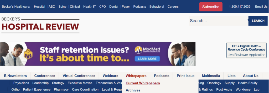
I asked the user the perform the following task: use the website to find and download the whitepaper on “integrated virtual care”. The user immediately described being overwhelmed by the UI and the amount of options, text, and banners on the screen. The user hovered over the main Whitepaper directory option in the upper-center area of the landing page and selected “Current Whitepapers”. I have never selected that option in my years of using this website, nor do I believe I have ever noticed it. I expected the user to click the upper-right banner that displayed “Health IT Whitepapers – Download”, use the search bar to enter a query, or to select directory option listed “Health IT Whitepapers” under the “Featured Learning Opportunities” list on the middle-right of the page.
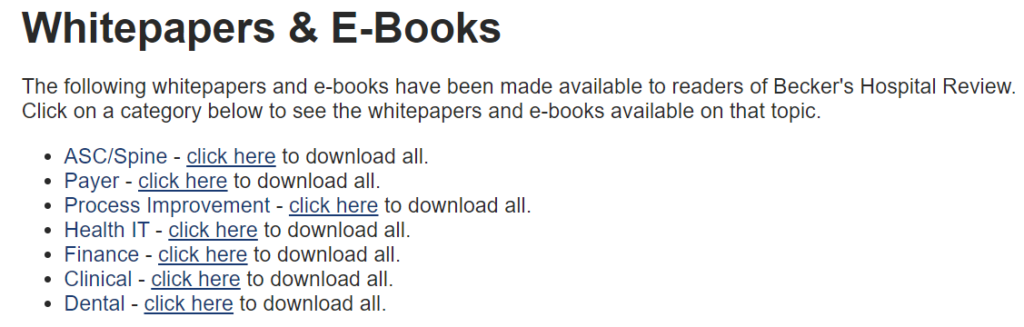
On the following whitepapers page, the user quickly located the “Health IT” category line item and hovered over its “click here” option, hesitated, appeared confused, and decided not to use this option because it had text “to download all” after “click here”. The user then typed “integrated virtual care” into the search bar.
On the following page with the search results listed, the user browsed the list of results by scrolling down, did not notice the “Featured Learning Opportunities” menu with the direct link to “Health IT Whitepapers” on the right side of the page, and instead selected a search result that had “Virtual Care” in its title. On the following page with the article content, the user selected the option to print to PDF the page.
I redirected the user back to the whitepapers page and asked the user to select the “click here” option for “Health IT”, despite their reluctance. On the following page (https://go.beckershospitalreview.com/becker-s-healthcare-choose-your-hit-topics), the user scrolled through the check box list of Health IT whitepapers, checked the box for the “integrated virtual care” item, and scrolled further down the page. The user unchecked the box for receiving the “E-Weekly” emails and selected “Download Now”. The page displayed red text informing the user to enter the required fields for “First Name”, “Last Name”, “Email”, “Job Title”, “Company”, “State”, and “What type of institution are you employed by?”. The user exasperatedly entered placeholder text into these fields and again selected “Download Now”. Red text displayed again, asking the user to complete the required fields, which after some scanning of the options turned out to be the acknowledgement checkbox for the site’s privacy policy; the user checked this box and selected “Download Now” to begin downloading the document.
- Expert-Novice Differential:
The Becker’s Hospital Review website user interface has several issues that likely make it difficult to navigate and use by those unfamiliar with it. The first issue is that the site has some scaling problems on desktop; depending on how much the screen is being used by the browser (i.e., half the screen versus full screen), the site prioritizes and displays its modules and menu options differently. This produces a user experience that is highly dependent on how many windows are open and sharing the device screen simultaneously. Additionally, the test user and I found that the default 100% zoom of the page in the browser to be sub-optimal for navigation, with agreement that 25% zoom was far more usable.


Another issue that effected usability for the novice user was the formatting of information on the main page. The main page has three tiers of menu options, two are separated by an advertisement banner, and the second row of options present more option drop downs when hovered over that overlay the third row of options; the test user found this design choice to be confusing to navigate. Additionally, the main page has information organized into five different lists that feel cramped in their spacing and seems to reduce their intended accessibility by inundating the user with information.
When selecting most of the content from these areas, the website requests registration information which, based on the test user feedback, comes off as pushy and makes the user question the legitimacy of the site or how the information would be used. The webpage would benefit novice users by reducing the amount of information presented on the screen, applying a more consolidated menu organization, and presenting less required registration information fields when accessing content.
The most impactful usability issue from the user test was the design choice of displaying the following text to navigate to the Health IT Whitepapers page: “Health IT – click here to download all” (https://www.beckershospitalreview.com/whitepapers/current-whitepapers.html ). The inclusion of the text “to download all” pushed the user to seek another method of reaching the page (despite their not being another method), as they were concerned that the selection of that “click here” would instantly begin downloading an unknown quantity of documents in an unknown format. Feedback from testing suggests that the navigational design of this list of whitepaper categories would be greatly improved by simply eliminating the text “to download all” as the following page allows the user to select which documents they actually want to download.