WORD COUNT: 948
1. Website and User Profile
Website
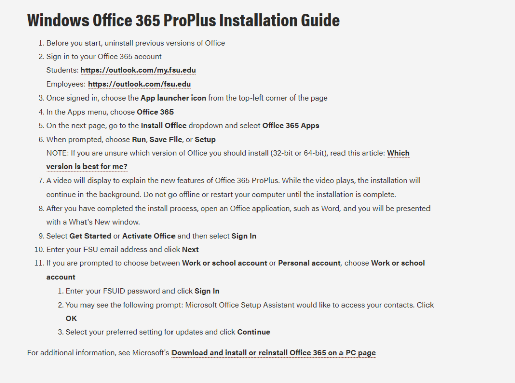
Information Technology Services (ITS) published brief instructions for downloading and installing Microsoft Office 365 ProPlus on a Windows operating system. Multiple problems arise as the user attempts to follow the instructions due to a mixture of poor user-centered design practices by FSU’s Office website and ITS’s verbiage.
User
The target user is a student attending Florida State University in pursuit of a Bachelor of Science in Biology degree at Florida State University (FSU). Their technical aptitude in information systems would be considered average. They utilize the Internet, are familiarized with software applications and are avid social media users. Particularly, the user is familiar with navigating the FSU interface but lacks proficiency in more advanced navigation tasks with the website as will be demonstrated in this case.
2. User Navigation Actions
App Launcher Icon Issue
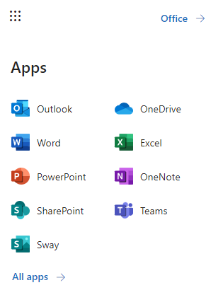
Upon instructing the user to follow ITS installation instructions, they experienced their first issue at the third step; that is, selecting the App Launcher icon. The issue stemmed from the user’s lack of technical knowledge in knowing what an App Launcher icon looks like. They hesitated at this step and began making assumptions as to what the instructions were conveying. The user looked at the far-left side of the page where the bulk of the application icons were to no avail. They then re-read the instructions noticing that the icon would be in the top-left corner of the page. However, they did not know specifically what the instruction meant about “top left corner”. They reasoned that there were multiple top-left corners of the page depending on where they looked. It wasn’t until they accidentally hovered their mouse over what looked to be an icon with nine dots that they discovered where it was.
Choosing Office 365 Issue
Selecting the App Launcher icon displays another panel for the user to make additional choices. Step Four of the instructions makes it quite clear that ITS wanted the user to select Office 365. However, the new panel does not show this exact wording. This wording confused the user and again caused them to scan the panel for any indication of Office 365. After a few seconds of frustration and verbal complaint, the user clicked on the closest wording choice, which was Office, directing them to another page to download Office 365.
Installing Office Issue
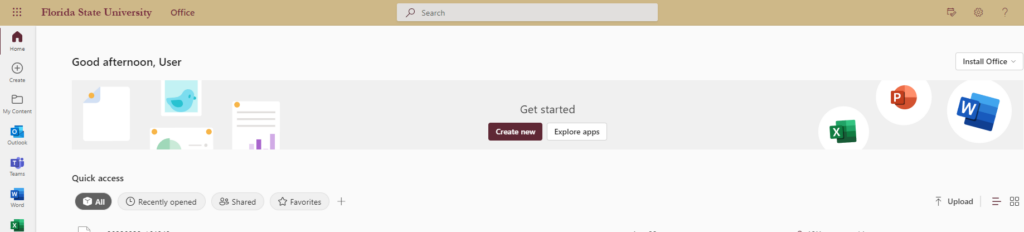
The last issue the user experienced pertained to finding the Install Office drop-down box. They noted how it was difficult to find the location because it was not clearly identifiable on the page. Nor did ITS dictate the drop-down box’s location as they did for the instructions in Step Three. The drop-down box design blended too well into the background which prompted the user to look to the left of the page again because of the coloration of the application icons.
3. Novice/Expert User Observations
App Launcher Icon
The issues identified above with the selected user also demonstrate a stark contrast compared to my expertise with said issues. As an IT administrator, I have high proficiency in knowing where to look and what to download concerning Office 365 applications. The App Launcher icon is common wording for displaying a nine-point icon (as shown above) to reflect a collection of other applications. It hadn’t occurred to me that users would not explicitly know this information considering they do not regularly work with information systems.
Selecting Office 365 and ‘Install Office‘ Drop-Down Box
As noted earlier, the user struggled with ITS verbiage (or lack thereof) when identifying and selecting the right links to download Office 365. However, being an expert user myself, I have worked so much with installing Office 365 for other users I can understand why ITS would skip certain information. While it may have been clear to me, I did not follow ITS instructions exactly; glazing over the general idea of what they were instructing me to do. The user, who is not an expert with Office 365, did not act this way. They followed ITS’s instructions carefully and were still confused at certain steps along the way.
For instance, the user did not know where the Install Office drop-down box was located on the page. As mentioned earlier, they scanned the page looking at the colored icons on the left-hand side. They re-read the ITS instructions and could find nothing indicating the general area of where said drop-down box could be. For me, this was interesting because I didn’t need the instructions to know where it was located considering I had performed this action so many times before. The first time I installed Office I just pressed ‘ctrl + F’ on my keyboard typing in the search term and found it immediately. That is something the user was not aware of.
4. Design Recommendations
Include Pictures In ITS Instructions
ITS should re-assess some of the steps in their Windows instructions. The App Launcher is a simple fix where ITS need only to include a graphic displaying what the icon looks like. The same holds true with a user looking for Office 365 in Step Four. Non-expert users would benefit greatly from IT-specific terminologies by equating a picture with the term. While this recommendation does not improve the website design per se, confusion and wasted time spent interpreting ITS instructions would enhance the user’s experience navigating the website.
‘Install Office‘ needs to be clearly identified
FSU’s Office website for students displays the drop-down box in an unappealing way as mentioned earlier. From a user-centered design perspective, visibility for the item needs to improve. One design improvement for this drop-down box to be more noticeable is to change the FSU background to accentuate the Install Office drop-down box’s white background.