- Identify Website
MyFSU
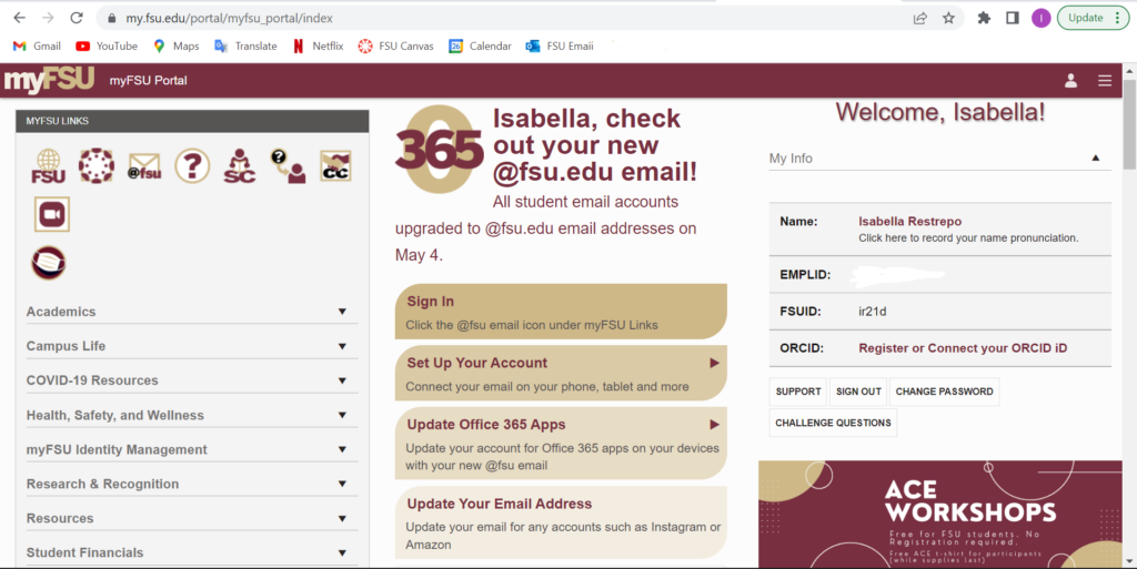
As a Florida State University student, the MyFSU website is one that I use at least once a day. The user I showed the website to has never been on this website nor are they that technologically advanced. They are able to figure out their own way; however, they do suffer when it comes to technology. I thought this website would compensate as a tricky website but its usability is easier for someone who knows how to use it.
2. User’s Actions
When I showed the user the site, I let them just look around before they clicked on any icon. I then told them to find where to choose classes on your schedule. This si where the user was very distraught. Th remain homepage has a 3-line pull out but there are no sections on there. A s a novice, this would be the first place to look which is exactly what the user did. The user was very confused because even under an Academics tab it was not there. Experienced users know exactly where to go, and speaking from experience it was hard to navigate to this section without prior knowledge or instructions. In the end the user did process of elimination by choosing each icon before they found the correct one.
3. Explanation On Site
The interface hindered the ability of a novice user because the layout was not like most sites. To get to the most basic functions, you have to go through “Student Central” to get there. As an expert, this would be easy and common since we have been using it for years. A way FSU can fix this is by making it more user friendly with setting clear headings. They have a pull out where most information will go in the subheadings; however, in this site it is just a log out and settings option.
