Website and User Tester Selections
The website I proclaim to be an expert with, just by virtue of having used it since I was in high school, is Goodreads, a social cataloging site for books. The first thing the user I asked to help me with this project said was, “I’m not a technology person at all.” She has a bachelor’s degree and an advanced degree in learning disabilities and currently works in the special education department at a school. If she has to use a new website or device, she says it’s typically for work, and even then, she is trained by someone. She does not use websites like Goodreads when looking for books; she prefers to go “old school” and visit brick and mortar stores like Barnes and Noble. She is also a religious individual.
Navigating the Site
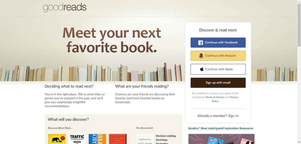
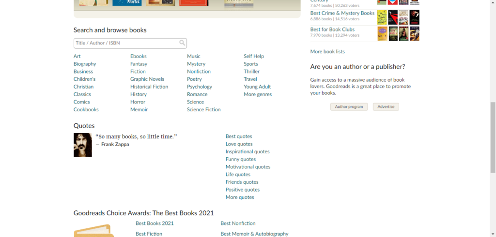
I pulled up the site’s home page and asked my user to conduct a search for a book, and she immediately asked me how, as, shown in the image at the beginning of this post, there was no search bar at the top of the page like one typically finds when browsing websites. Instead, from the home page, one must scroll down to find the search bar, which my user did.

When she entered a book to search and hit enter, the results page loaded, and then a pop-up appeared, prompting the user to create an account or sign in. My user looked at it for a moment before asking me if she needed to create an account, which she did not want to do, to continue. I may have contaminated the process by pointing out that she could exit out of the pop-up.

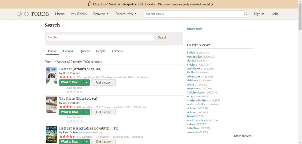
Back on track, she found the book she was looking for and clicked it. It was at this point she wanted to search for an author, and instead of using the search bar on the site, two of which were now visible at the top like one would typically see on a website, she clicked in the address bar and began typing in her query.

This was another instance where I may have contaminated the results, as I told her she could use the search bar on the site. She did, and when she began typing in the topmost search bar, it showed auto-filled suggestions, which she thought was a cool feature, and she found a book by the author she was looking up. She scrolled through the book’s page and was a bit scandalized by some of the reviews and comments she skimmed over that the users of the site posted (this reaction, coupled with the knowledge that she is fairly religious, made me realize that is probably why she is “not a technology person”).
Suggestions for Design Improvements
Search bar
The search bar on the home page was an obvious initial hindrance with the site. People are accustomed to search bars being immediately visible, usually at the top of the screen in a navigation panel. I’m not sure why, when one is not logged in, the search bar is towards the middle of the home page. If one logs in, it is visible at the top, and it is also visible at the top if one searches a book and clicks on the link to Goodreads via a search engine query, despite not being logged in. I’m not sure about this design choice, besides the fact that it seems to try to induce people to create an account if they somehow come to the website by the home page. On the page, the biggest buttons suggest users create an account or continue with other login credentials to get the most out of the site.
I purposely did not log in to my account because I wanted to see what my user would do when I asked her to search for a book from the home page. As expected, she asked me how she was supposed to, because there was no visible search bar where one expects it to be. If a casual user were looking for information about a book, they would most likely just perform a search in a search engine and access the Goodreads page directly from a link there rather than go through the process of typing in the Goodreads URL in the address bar and then searching on the website. That appeared to be what my user was doing at one point, when she wanted to look up an author and began searching in the address bar rather than the search bar on the site. That decision led me to believe that is how she typically conducts searches on sites – if she doesn’t find what she’s looking for, she will just click the address bar, which doubles as a search engine, do another search, and look through links to pick one that may be more helpful. If she had happened to come across the Goodreads home page herself and not taken the time to scroll and find the search bar, she probably would have left the site to continue conducting her search elsewhere.
Pop-up
Something else of note was her hesitation when the pop-up appeared. Typically, I will click outside of the pop-up area to dismiss them, and when that does not work, I will read it to see what I need to click on to dismiss it if there is not an X in the corner. My user missed that she could exit out of the pop-up by clicking the X, but her reaction made me wonder if this pop-up is a beneficial or even necessary addition. She came to the results page from the home page, where the biggest buttons want one to create an account or sign in through other log in credentials – she chose to do neither of those, but the site throws up a pop-up anyway in an effort to get a new user. For those who don’t have the patience for pop-ups, or do not think they can close out of them, as some sites will not allow you to continue further unless you register or sign in, they could have the opposite effect of causing people to leave rather than stick around, especially if they just went through the ordeal of searching for a search bar.