GROUP ASSIGNMENT 3: ITERATIVE DESIGN 2

Website: IGN (https://www.ign.com)

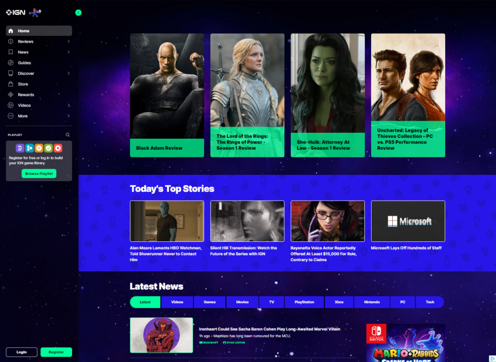
In the second iteration of the page design, we moved some of the information that was buried in the abstract “More” section of the left-hand navigation menu and made it part of the footer. This gives access to these functions from every page and increased visibility to these elements. As mentioned in the first iteration, the original “footer” was lost under an ever-extending page as the user scrolled down. This caused the information in the footer to be lost down the proverbial well

Figure 1: Revised footer to contain elements lost in the “More” menu.

The login and register buttons were moved to the header alongside the search bar for additional visibility. The original location was the bottom left corner of the page where it tended to get lost behind the URL notifications as the user passes over a hyperlink. This change enhances the user experience by giving them a much easier time accessing or creating their IGN account.

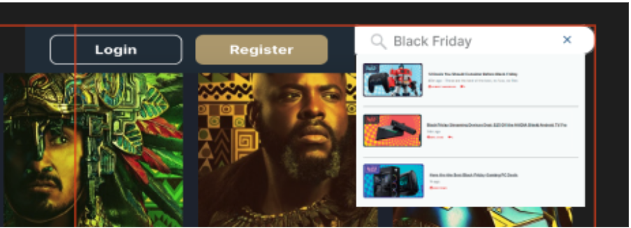
Figure 2: The old Login/Register buttons were obscured by status notifications from the browser

Figure 3: New revised search and Login/Register button now have prime locations in the top right of the page

We’ve also decided to move the playlist to the user account/profile menu to free up space in the menu section giving users less to deal with. With this move, once a user creates or logs into their account, they’ll have the ability to customize and control their own playlist of games, reviews, and other preferred content.

One of our initial tasks we wanted the end users to accomplish in our earlier scenarios was finding an article that contained different titles in the Game of the Year catalog for 2021. Due to the limited search functionality of the IGN website, most tests and scenarios ended with an overall negative experience for our experimental group. While the user task differed slightly from our login/registration placement, the scenario brings to light the importance of widget placement and how a simple change could have a huge impact on usability. With this new placement, the user now has the ability to save specific games to their playlist making it easier and more efficient to locate games of interest and relevant information such as articles and game details.

In the first iteration of our proposed design, we moved the search function and added functionality to the pop-out search. In the second iteration, we removed the pop-out search and added functionality to the search bar. Users are now able to search the entire website using the search bar, instead of having to choose a filtered category to search. However, users are still able to filter the results when the search results are displayed. The search location and functionality change makes it much easier for the end user to find relevant content.
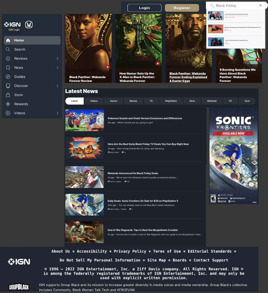
Figure 4: Gaming group’s second iteration of the IGN website

Our final revision includes a cleaner look that doesn’t bombard the end user with too much information and allows them to see the main content of the page with the option to navigate elsewhere when effortlessly. They have the ability to effortlessly search for content, log into their account, as well as save content to their personal game playlist. Our updated homepage also includes the addition of a footer that grabbed some of the contents from the “More” section and gave it more relevance by including functions that were often overlooked. Also, with the removal of the continuously loading content as the user scrolls the page, we feel the revisions will make content searching more efficient and improve overall usability.   

INDIVIDUAL ASSIGNMENT 3: REPRESENTATIVE USER TEST

• The Website

The website for this test is IGN (https://www.ign.com). The site hosts a wide variety of content related to video games and entertainment. The layout of the site is designed around a sidebar style menu setup that can be condensed to the far left of the screen to have more room for main page content.

The User

The user for this test is a mid-30’s black male that enjoys gaming on his days off. Raised by an Army father, and with a bachelor’s degree, he is very well spoken, well-mannered, and respected by his peers and his customers. He almost exclusively games on a PlayStation 4. He is in the IT field, with over 15 years of experience, so there should be no issues with “normal” website navigation.

The Testing Method

In the test, the “think aloud” method was used, simply due to it’s cost effectiveness. In a conference room setting, the user was provided a printed list of the three tasks to accomplish and a laptop that was open to the IGN website. The user was read the following script to help set the “motivations” behind the provide tasking:

You are just out of high school and have your first job. You enjoy gaming and are looking to purchase a game with your hard-earned money, but you want to get a good game that you can use to pass the time. The idea of spending $60 on a game that you will complete in a few hours seems like a waste of money. With this in mind, you will visit the IGN website on the laptop and perform the three tasks listed on the provided list.

The Tasks

Task #1:
Since you are looking for a good game to buy, start by finding the site’s “best games” from 2021.


Task #2:
You are looking for a game that will take some time to play through, so tale a look at Zelda: Breath of the Wild and see how long it would take to complete.


Task # 3:
Look through the 2021 best games list and check out the reviews to pick out a game that you would want to play.

How the test went

Task #1


The testing was in line with what was found during the original group discussion about the website. The first words out of his mouth were “I’m looking for a search bar.”


Some of the following conversation:


I see a magnifying glass, so I am clicking that to see if I can use that to search the site.”


This points to the real-world expectation of using the magnifying glass icon for searching.


“When I click on it, it shows games and playlists, and since I’m not trying to find a specific game, I’m checking the only other option which is Playlists. Since it shows stuff other that games, I’ll search for 2021 and see what comes up.”


This leans more to a lack of other options instead of having a choice that makes sense to the user.


“There’s a lot of stuff just called 2021, so I’ll keep scrolling. I see different ‘Favorites of 2021’ and various writers’ best of 2021, but no “IGN best of” list. Nothing shows up for ‘2021 Game of the Year’. I’m going back to the home page now.”


Already some frustration from the user, as the closest thing to a search doesn’t give him anything usable for this task.


“I’m looking under Reviews, Game Reviews…. Why does it have Movies, TV, and other stuff under Game reviews?”


Looking at what he was talking about shows that there are issues with the Reviews section. Selecting Game Reviews in the left navigation pane highlights the words ‘Game Review’ which shows an attempt to keep the user informed of where they are, but in reality, all reviews are on the same page. They filter by type by using the side navigation buttons, or the bar in the middle of the page that shows the same subjects. Oddly enough the Comics reviews option is not shown in the left-hand navigation.

Task #2


“The Playlist let me search for games, so I’ll try that. Zelda shows up on the list and I click there and go to the page and there’s the How Long to Beat on the page.”


Lessons learned from the first task were applied but may have been a more natural flow with a simple search option as well.

Task #3


“Since I couldn’t find a IGN 2021 Games of the year list, I’ll just try to find a game I might like.”


He clicks Discover and finds a IGN Best Picks section and starts there. For the sake of time, he picks Call of Duty: Modern Warfare 2. As he looks through all the reviews, he comments on the lack of pictures by each.

The Recommendations

The absolute first change that the website needs is a well-defined search function that the user cannot miss. In the testing, an uncomfortable amount of time passed as the test user scrolled and clicked through various menu options, until he finally gave up and clicked on the only thing with a magnifying glass by it. This shows that the symbol of a magnifying glass is universally understood to be associated with some form of search functionality. Having a search bar with the magnifying glass icon by it would create the match between system and real-world expectations.


A second change would be in the best Games list. It should have had a small picture by each review, just for consistency. Some reviews did, but they were in the minority. That may just have been the author’s poor layout, not indicative of the entire site.


Another note is the Login/Register buttons at the bottom left of the page. There should be some addition call to action for these, such as “Click here to subscribe to our weekly email with the latest reviews and special content”. If this is connected to some website metric, it would generate additional interest form site visitors.

GROUP ASSIGNMENT 2: USER SCENARIOS AND REPRESENTATIVE TASKS – GAMING GROUP

Information about the Website: 

https://www.ign.com

IGN Entertainment hosts a wide variety of content related to video games and entertainment on its website. The IGN acronym is commonly used as shorthand for “In Game Name” which refers to a player’s character name in the video game world. The site provides a variety of resources to gamers by way of game reviews, top entertainment news, social media content, game walkthroughs and more. IGN.com has earned its popularity among gamers and has developed a reputation as a “go to” site for gamers.

Persona:

The persona the Gaming group chose to focus on is 17- to 23-year-old gamers who enjoy playing many genres of games, from role-playing, first-person shooters, and multiplayer online battle arena to puzzle, action adventure, and survival/horror. These individuals are middle class, attend some type of school (high-school, college, or trade) and have at least a part-time job to give them the means to purchase video games. Their experience level with gaming ranges from beginner to expert since IGN has a wide variety of content available ranging from reviews to walkthroughs.

Scenario:

A typical user in the 17 – 23yr/old range visits the IGN website to get information on the newest games soon to be released and updates in the gaming industry. This can range from insider news on game features and development to public beta releases of games such as Overwatch and occasionally, news on the entertainment sector such as Netflix or HBO announcements. In our scenario, the user wants to find out information on the popular game Legend of Zelda: Breath of the Wild. They want to know if the game has any cool features and game modes as well as any updates on the new open-world gameplay. Also, due to the user’s demographic and income, they’d like to know if there are any advantages to purchasing the game on a disk or a digital copy as well as any in-game mechanical changes such as movement that might play an important role in the overall experience. This is also a special year because this holiday season is when multiple 1st party developers are also releasing a bunch of AAA games such as God of War. Because of this, our user not only wants to see reviews on Legend of Zelda, but also other games so that he/she can see which ones are worth investing time and money in.

User Tasks:

  • We chose the specific task of accessing the Game of the Year awards for 2021 because the user is particularly interested in what’s trending in the gaming world. This user does not have a specific genre in mind for the games they would like beyond Legend of Zelda.  
  • Find a walkthrough for Legend of Zelda: Breath of the Wild to get an idea of how long the adventure will take to complete. With today’s top games at almost $60 each, many gamers do not want a game they can complete in a few hours. Gamers like to feel that they are getting their money’s worth. 
  • Look for reviews of the other Game of the Year contenders and see if any of their reviews are intriguing enough to warrant purchasing a different game.  

These tasks should provide an idea of how easy (or hard) navigating the site is as well as how useful the search feature is.

Individual Assignment 2 – Heuristic Analysis

Gaming group

The Site:

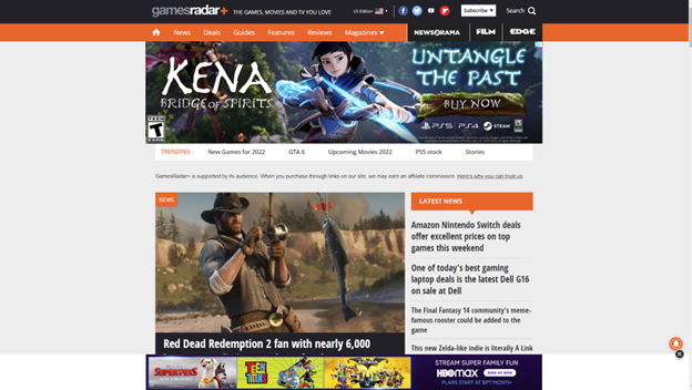
Gamesradar+ (https://gamesradar.com)

   Gamesradar+ is a gaming site that covers games from all platforms, from PC to all the various video game consoles on the market. The plus is the additional coverage of topics many gamers also enjoy, such as movies and the world of comic books.

The Scenario:

   The review of this site is done through the eyes of the fellow gamer that needs to find a gift for a friend’s child. As video gaming has been around for decades, this group covers a large range of potential ages. In this evaluation, we will be looking at finding a gift for a pre-teen boy that his parents will not object to. In this case, that means nothing with foul language, shooting games, or other conduct they may consider inappropriate for his age. This task will be considered a success if it results in a game recommendation, and if it points to a good deal on the game, that would be a bonus.

The Analysis:

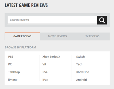
   In the search for information about games, I selected the Reviews tab:

Since I am looking for a game, the Latest Game Reviews tab makes sense. At this point, the site navigation makes sense. What did not make sense was the word Tech under the BROWSE BY PLATFORM section. Curiosity drives you to look at that one, which takes you off to reviews of televisions, personal tech, and streaming hardware. This fails as a Match Between System and Real World.

   In navigating the site, I notice that the Reviews tab does not stay colored in black, which would keep the Visibility of the System Status if implemented. Since the friend’s kid only has a Nintendo Switch, an Android tablet, and an Android phone, I select Android looking for game reviews and again get let down as that section takes me to a page full of phones and Android game controllers. There isn’t a review of an Android game until you get to the second page. As I look further, I realize that the newest review on an actual Android game is from March 1st, 2019.  This once again fails at the Match Between System and Real World and the idea of Consistency and Standards. A game review section should only have reviews of games, and reviews of physical devices should be kept separately, and a website about gaming should be kept current. The idea of not having a review of games during the entire pandemic (when people were stuck at home with little else to do) is just unheard of.

   In a pleasant surprise, returning to the Reviews section and going to the Switch section showed reviews as recently as 12 days ago. There were plenty of options to choose from for games, but it also had hardware reviews for platforms not related to the Switch such as the Steam Deck. Once again, another Consistency letdown.

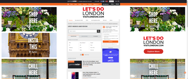
   A user can understand the need for a website to be supported by advertising dollars, but this site crosses into the ‘annoying’ category with the excessive screen real estate devoted to unrelated ads. The following screenshot is what happens when you full screen the site on a widescreen monitor:

In this violation of Aesthetic and Minimalist design, the idea of a gaming site is lost in a flurry of advertisements about London. Less than a third of the page is the actual site content.

The Recommendations:

The adjustments to the site would be straightforward:

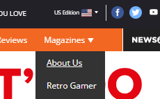
  • Adjust the header at the top of the site to keep the current location highlighted to keep the user informed of their location in the site (Visibility of System Status). The header is a good method to show this, but it needs to be fixed. The header also had some other flaws, such as the “About Us” section being hidden under the “Magazines” section:

  • Game reviews should be nothing but game reviews. Either put reviews of hardware in their own section or combine the hardware and games into sections by platform and label them as such. This would give the user the Consistency and Standards as well as a Match Between System and Real World.
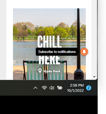
  • There is this one little icon that floats on the page, and when you hover over it, it reveals itself to be a “Subscribe to Notifications” option. This needs to be moved into the header with a label. While it could be a highlight for Flexibility and Efficiency of Use, as a shortcut that more experienced users would rely on, I fell that not knowing what it was shows a fault in Visibility of System Status.  
  • Advertising must be limited to less than a third of the site, and ideally should be something remotely linked to gaming. The current layout is pulling from the focus of the site, which is to promote and discuss gaming. Limiting the percentages of screen real estate to advertising will allow users to stay focused on the task at hand.

Group Assignment 1 – Topic Selection

Group Name: Gaming 

Members:  

  • Ginny Morris 
  • Ryan Thomas 
  • Emanuel Strachan 
  • Jasmyn Collier 
  • Steven Howard 

Type of Site: Video Game Reviews, Walkthroughs, and Collaboration 

Examples:  

Why this type of site?  

We chose this type of site because it is a form of entertainment that we all enjoy, and it was more interesting to us than the other topics presented, such as health care or museums. It covers a wide spectrum, going from online card games and e-sports to long quests that you can take by yourself, or with a group of friends. 

Many gamers rely on video game reviews to choose the games they purchase and play. There are a vast number of websites that provide this type of information, and each gamer has a personal favorite. The articles and videos on these sites have multiple authors, and many of these sites allow for gamers to submit their own walkthroughs, reviews, and comments about games. Users of these sites are looking to gather information about video games that interest them.  

Many times, users of these sites find there is a lack of quality control due to the vast amount of content being shared on the site each day. Other sites can make it difficult to find information about a specific game. Useful information may be lost within a cluttered or disjointed website design. Users may become irritated at large distracting advertisements and unwanted pop ups asking for permission to push notifications or to create accounts. 

Exploring the usability of these types of sites can begin to shine light on what problems exist within these websites themselves but also can give insight to what is happening in the video game from a user’s perspective.  

Ensuring that the site is effective and user friendly is an important start for games and gamers alike. These types of sites not only can determine the success of many gaming titles but also play a factor in how different video games are perceived in the gaming community. Games such as The Quarry and Cyberpunk sometimes don’t reach the mainstream public, so they rely on reviews and word of mouth to spread. These gaming sites give users a place to look at new releases, play demos, look at previews and much more which they might normally be exposed to. From there, news starts to spread, and streamers start taking an interest and ultimately others start taking notice and the games eventually take off. It all starts with a great layout that’s easy to understand and use while also keeping the end user engaged. 

Individual Assignment 1: Designing for Users

The website and the user:

   For this assignment, I chose RockAuto.com (https://www.rockauto.com/) and challenged a 40-something male coworker to find a part that I know he needed to fix his driver side door. With just that information provided, I watched as he went to the site. This is not someone with any real mechanical experience, just enough to jumpstart a car, and has never done his own oil change. When he needs something from the parts store, he asks the clerk behind the counter. He does have experience in IT, so navigating a website should not be a challenge.

The interaction:

  He went straight to the list of car makes on the left side of the screen, but thought it was odd that the list didn’t have a title, like “Make” or “Manufacturer”. After finding “Kia” he clicked it and it expanded to all the model years, where he selected 2013. It showed two engine types (but three existed for that year). At this point there was some digging because he could not figure out what to call the part, which was the part that holds the door open, but it was not the hinge.

  After about five minutes of searching various sections for door parts, he gave up and went looking for an exploded view of the door to try to find out what the part was called. It looked like it was called a door check, but when he went back to the RockAuto site, a search for door check for his model only showed some pins and some rubber straps. At that point he gave up on the site.

The findings:

   The experience went south once he realized he didn’t have a correct name for the part, then could not find a way to identify the part. The site would have benefited from exploded views of the car that could be referenced for part names. In this case, he had to refer to diagrams from other sites, only to come back to RockAuto and still not find what he needed.

   Had he been a true “car guy” or expert mechanic, he might have been able to properly identify the part and get by without the drawings. As a novice user, having a way to pick the part from a drawing and have the part identified would be a great advantage. The site may be missing out on sales for that simple reason. If you end up having to go to another site to identify the part, you run the risk of losing the sale to that other site.