Identify Website: Trip Advisor
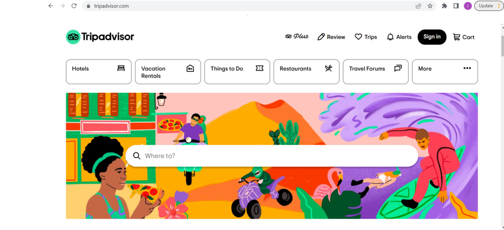
The site for testing our group chose is Trip Advisor. Trip Advisor is a travel information and booking site that helps many users book their vacations and find accommodations. On the site, you can view hotels, flights restaurants, vacation rentals, things to do, rental cars, etc. This site is definitely used more to view different activities and sites to see on vacation rather than booking due to competitors such as Booking.com.
Tester Characteristics:
I could not find a direct match to our group’s tester characteristic of a 42-year-old female with three children in the Miami area; however, I did find a close enough match.
This tester is a 45-year-old female married with two children in college. The user is from the Miami/Fort Lauderdale area and is a very avid traveler. For work, she is an accountant for a doctor’s office and has been an accountant for over 10 years. With her birthday coming up she wants to travel to Spain for the first time. For this trip, it will be a family of 4 total for the whole trip. The user is very used to dealing with travel sites and enjoys them, but never books through them regularly. The user is looking to travel from Miami, FL on Friday, February 17th, and looking to be back on Sunday, February 26. The coming back is a hard set date that cannot be changed, but the flight for going can be semi-flexible but it will only be able to be on either Thursday, the 16th, or Friday, the 17th. She does not have any preferences on where to stay, but she would like a decent hotel with decent pricing. She does have recommendations from friends that have gone to Spain, so she will not be going completely blind, but it still will be the family’s first time traveling to Europe. The user would love to see different activities that the family can do and food options. One of her children is a bit selective of meals, so being able to view the menu beforehand in the different areas will help tremendously. The user is not the best in technology usage but has navigated through many travel sites before.
User Tester Method:
This testing was done using the Thinking Aloud approach. As I sat with the user, I watched what she did and told her to speak out loud about anything that comes to mind. With every step, I screenshotted and wrote down what was said about each step the user took. It was much easier being in the same room as the user since I could see the movements they would make. I observed their eyes, hands, and what reaction they would have when switching pages and reading about each entity.
Modification to Assigned Tasks:
Given the different scenarios for the user we created and this user, we had to modify a few of the tasks, but they will have overall the same objective. You will see below the original group task and the modified task.
Group Task 1: Find a cruise when the kids are on break from school and taking in consideration of hurricane season and to stay within the vacation budget.
Modified Task 1: Find a flight round trip from Miami, FL to Madrid, Spain. User is open on budget, but would prefer a cheaper option if possible. The flight is preferred to be direct rather than layovers.
Group Task 2: Pick a cruise that stops in multiple ports.
Modified Task 2: Find transportation from Madrid to Barcelona, Barcelona to Valencia, and Valencia to Madrid.
Group Task 3: Find activities offered in each port stop.
Modified Task 3: Find hotels near Madrid (Feb. 18- 21), Barcelona (Feb. 21-23), and Valencia(Feb. 23- 26).
Group Task 4: N/A
Modified Task 4: Find activities/ excursion in each city.
Task Analysis:
Task 1: Find a flight round trip from Miami, FL to Madrid, Spain. User is open on budget, but would prefer a cheaper option if possible. The flight is preferred to be direct rather than layovers.
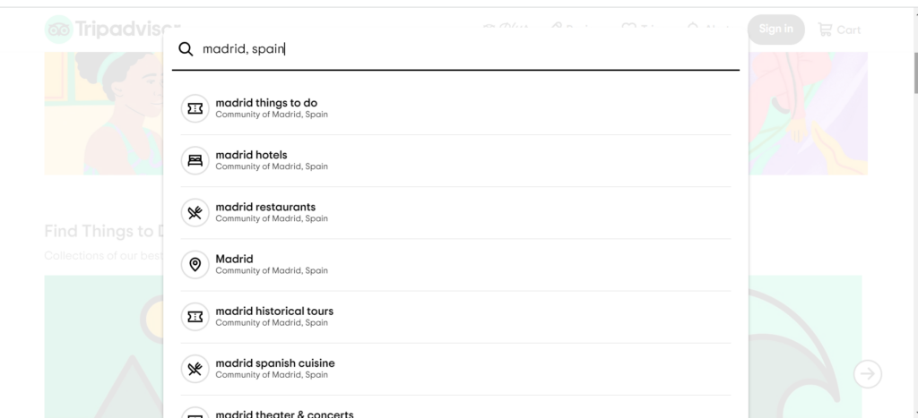
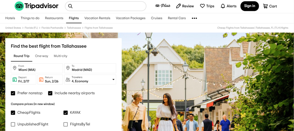
Once on the page, the user took about 30 seconds to just look over the page and see what was on it. They clicked on the “Where to” on the homepage and searched up Madrid, Spain. There was a drop down menu that showed up, but nothing of flights. The user was confused, and they tried to search up in other ways, such as “Spain”, “Flights to Madrid”, and nothing came up (Figure 1.1).
They exited out of the search and clicked on the “More” option on the homepage. The user thought aloud and wondered why a travel site did not have the flights option at least showing on the homepage. It took the user to a different Trip Advisor webpage where it shows flight information. A nice touch the user saw was when inputting the flight information, there was an option to also see compared prices with other travel sites such as Kayak, Cheap Flights, Wowfare, etc (Figure 1.2).
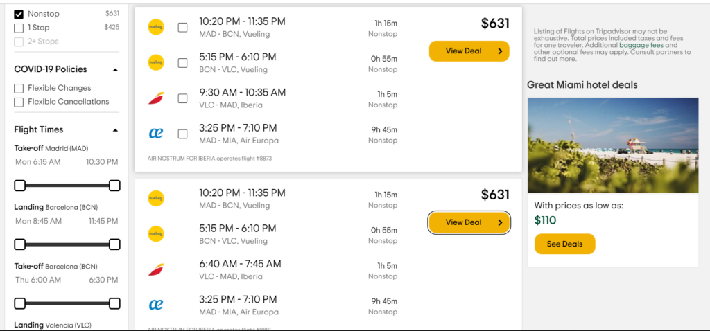
The results after searching up the depart for Friday, February 17 (Figure 1.3).
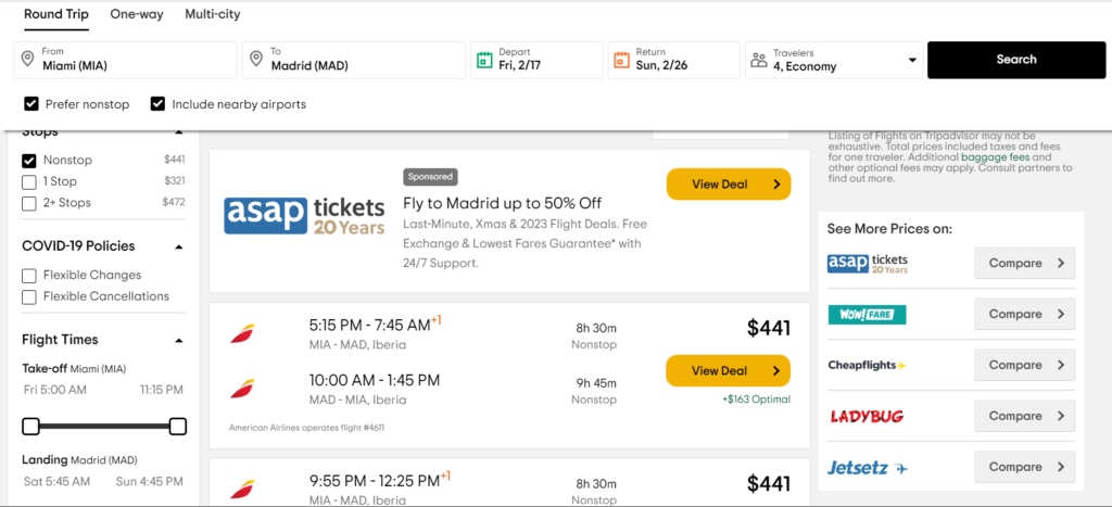
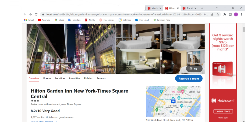
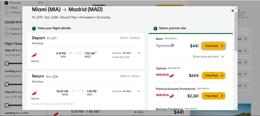
User decided to choose the first option to be able to land in Madrid, Spain by 7:45 am on Saturday, February 18. The user was also able to click the “View Deal” option and it showed her the full flight information with the exact times (Figure 1.4).
Task 2: Find transportation from Madrid to Barcelona, Barcelona to Valencia, and Valencia to Madrid.
The user is going to be traveling within Spain so she needs to find transportation for all the cities they will be visiting. The user saw the option of multi-city in the flights area so they inputted all the cities and dates. The user did not like how you can only put up to 4 cities that you want to travel (Figure 2.1).
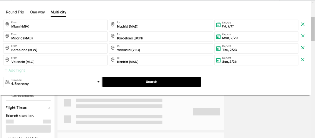
The user had to write down the first flight since they were planning on staying in Madrid a few days. It worked out on her end after she realized she didn’t need the original flight, but she does believe it would be better with more flights just fro travel purposes. Once the user inputted all the flights and clicked the search button, only two flights showed up (Figure 2.2).
Task 3: Find hotels near Madrid (Feb. 18- 21), Barcelona (Feb. 21-23), and Valencia(Feb. 23- 26).
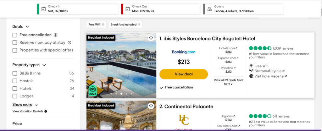
With every city the user visits, they need a hotel to stay in. The user is looking for a safe and comfortable place to be in while they are visiting Spain. Sinc etehy ar enot planning to be in the hotel until nighttime to sleep, the most precious and expensive hotel is not needed. The user clicked on the “Hotels” option they had was set up the same way as the flights. The user scanned the options you can use to filter out the choices, but decided to just view everything first before trying to narrow down on hotels. After viewing all the options, the user decided the most important options were free WIFI and free breakfast. One thing the user noticed was that it would take them to Booking.com,when viewing the hotel deals (Figure 3.1).
Task 4: Find activities/ excursion in each city.
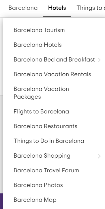
After looking at the hotels, flights, and each city, the user wanted to look at what activities and site seeing places were near the hotel/city. The user is very big on adventure so this was very important to view them beforehand and see reviews. The user thought it was nice that in each city there was a drop down menu of different topics right off the bat (Figure 4.1).
The user clicked on “Things to Do in Barcelona” and a whole page of things popped up. They had it organized in different types of tours, what time of day, and the most popular. The user enjoyed how you can also view the standard price before you click on the activity (Figure 4.2).

Reccomendations
After al the tasks, I had the user tell me what recommendations they would want if they could change the site. The first one was to fix the main homepage drop downs. As seen in task 1, the site has a search button but when you search up flights it does not go through. The flights option was in the “More” tab. If the main options such as hotel, flights, things to do, and packages were the main feature of the webpage it would make much more sense. Users come to this travel site to view everything surrounding travel, and flights are a huge aspect of travel.
The next recommendation was that theuser would want more option when trying to book multi-city flights. It was snot a big problem for her, but for some users that needs to book multiple flights it would work out much better. There could be certain layovers that a user wants to have for a certain amount of days, and not having the actual opportunity to input them all loses time and user will go to other sites instead.
Word Count: 1530