(917 words)
The Website
The website I chose for this assignment is HappyCow.com, which is a search tool to help find vegan restaurants based on location. This can be used by tourists in a city they are unfamiliar with.

Evaluation
The scenario I am in when navigating this website is that I have a vegan diet and am visiting Queens, New York. I am trying to find a restaurant that offers vegan food but still has other options because I am traveling with my boyfriend who is a carnivore. He respects my dietary needs but since we both have not been to New York it is worth trying to find food we can both enjoy.
On the homepage of HappyCow there is a large search bar where you can find a location by city, address, or zip code. There is little text or ‘noise’ around the search bar which keeps the layout simple and points me to the direction I wanted to go in. By meeting my expectations as to how I would start my search in looking for places to eat, this fulfills the Consistency and Standards heuristic.
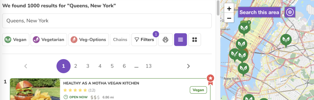
Once I type in the address that we are staying at and hit enter I am brought to the search results. On the right pane is a map with pins on all the food locations and on the left is the list of them. Above the list are the filters so you can sort through the restaurants in a specific way.
One thing I appreciate about the filters is that you can click through them and mess around without updating the results. The only way the results will be updated is if you select the ‘apply’ button at the top of this section. You also have the option to select ‘cancel’ which would not apply any changes to the current results or select ‘rest’ which out clear the filters already applied.
This feature allows the user to back out of the changes they were going to make. Utilizing the User Control and Freedom Heuristic, this provides an emergency exit and does not commit to any changes they were attempting to make.
Usability Flaws
The first usability flaw that I came across was going down the filter options. At the top selection to filter by was vegan or vegetarian food establishments, or places with vegan options. In the next section below, you can then filter by the type of food establishment, such as coffee shops, bakeries, and food trucks. As you go down the list the options became more nuanced including health stores, market vendors, organizations, and professionals. Then In the next category below were types of food which included breakfast, buffet, fast food, and bakery (again). I was confused why these sections were separated and why these chose to filter by these categories.
This failed the Consistency and Standards of Use heuristic by confusing the user with too many irrelevant options. There is no way to distinguish the use of filtering bakery from the first set of categories from the second use of bakery in the subsequent category. This leaves users wondering what these filters could mean by selecting them.

The second usability failure I was tied up on was assessing the food establishments in my results. After adding filters and sorting through the results you can select a restaurant and see more information about it. HappyCow provides reviews, ratings, and photos all provided by other users. On the right pane of the page is contact information, operating hours, and hyperlinks to the restaurant’s website and social media. This is useful information, but the major factor in how I was going to choose a restaurant would be what was on the menu. So now when I click on a restaurant for more information I must click on another link, be brought to a new website and sort through the menu then return to the HappyCow’s page on that restaurant and then return to the search results to move on to the next option.
This multi-step process violates the recognition rather than recall heuristic by forcing the user to stretch out to the restaurant’s actual website to recall the food menu. If the user was then deciding between two restaurants, they would have to jump back and forth between websites to weigh their options.
Design Recommendations
My recommendation for remediating the Consistency and standards of user heuristic is for the creators to do extensive user testing on what people want to filter through and know about a restaurant. These current category options aren’t clear and don’t feel relevant for the everyday person. By knowing what is most important for users to find, the design can then list those categories by most popular. For more experienced vegans, they should have a shortcut to the more nuanced categories so the site can meet both needs for novice and knowledgeable users.
For the violation of recognition rather than recall, I recommend adding a pane on the side of the reviews that shows the menu. Users can scroll through this on the HappyCow page of the restaurants as they also browse through reviews. This way the user won’t have to jump to different sites and recall the menu information.
HappyCow should also have a feature where users can save different restaurants and review them side by side so they can compare their options. This would also free the user so they can evaluate the different food establishments without having to remember the menu of each one.