Individual Assignment 3: Representative User Test

Website

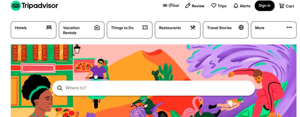
The website my team has selected to do our user testing on is TripAdvisor, which is a travel information site that offers information and booking assistance on transportation, lodging, and entertainment for vacations.

Homepage of TripAdvisor

User Characteristics

The user is a man in his 70’s with a wife and three children, all over the age of 30. He is savvy when it comes to electronics but takes longer to navigate websites. He spends less time intuitively navigating sites and more reading all the text on the page.

Testing Method

We used the think aloud testing method as we had to do the test through Zoom. My user was able to share their screen with me and verbalize their thought process as they navigated the site. By thinking out loud I was also able to note what they paid attention to on the page even if they didn’t select certain buttons.

Tasks

I provided context for the user and relayed the scenario my team drafted up where their goal is to select a cruise that fits the budget of $400 per person for their family of five that departs from Florida.

The three tasks my group drafted were:

  1. Find a cruise when the kids are on break from school and taking in consideration of hurricane season and to stay within the vacation budget.
  2. Pick a cruise that stops in multiple ports.
  3. Figure out what activities are offered at the different cruise stops.

My user was able to address the first and third. However, the user couldn’t explore the second task because they already found a cruise that fit their budget and schedule. By default, the cruise was already going to stop in multiple ports. I omitted this task as most of the time spent was on the first task and we had a time limit.

Task 1 

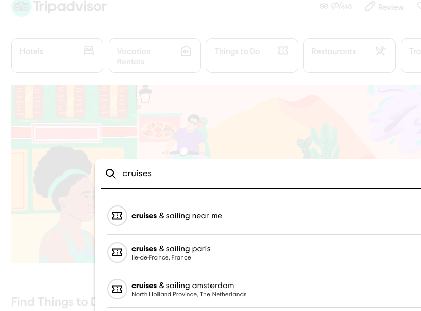
For the first task, the user went straight to the ‘Where to?’ search bar. They started to type in ‘cruise’ and was given a list of suggestions to autofill the search. They selected the first option ‘cruises & sailing’. They got a pop up about sharing their location, but they ignored it and typed in ‘cruises & sailing near Miami’. 

This only provided results for local activities in Miami, so the user refined the search to ‘Sailing & Cruises Caribbean’. The user made three other attempts at nomenclature to get any search results of cruises including: ‘cruises & sailing port’, ‘cruises & sailing Fort Lauderdale’, and finally just plain ‘cruises’. 

Recommended searches

For this last search the user was finally brought to the official cruise information page. On this page, they had difficulty finding information on the ports and where to depart from. They browsed through the destination options, which still did not provide information on departure locations.  

Content on the main page for cruises

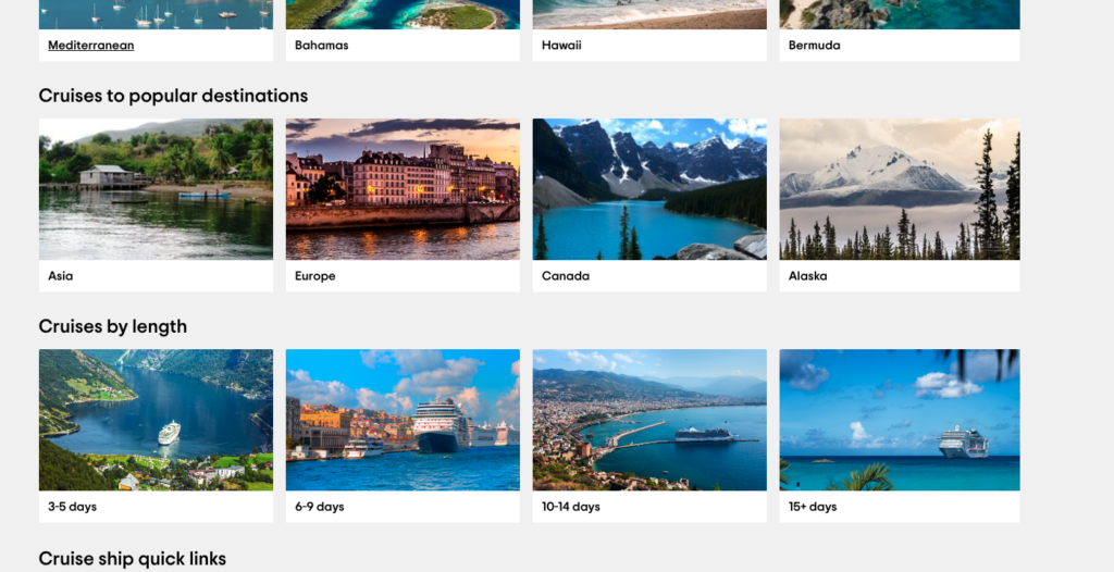
The user then selected the 6-9 days option and was happy to see their first detailed list of cruise lines. This page had a list of cruises and, in small font, information of length, destination, and departure port.  

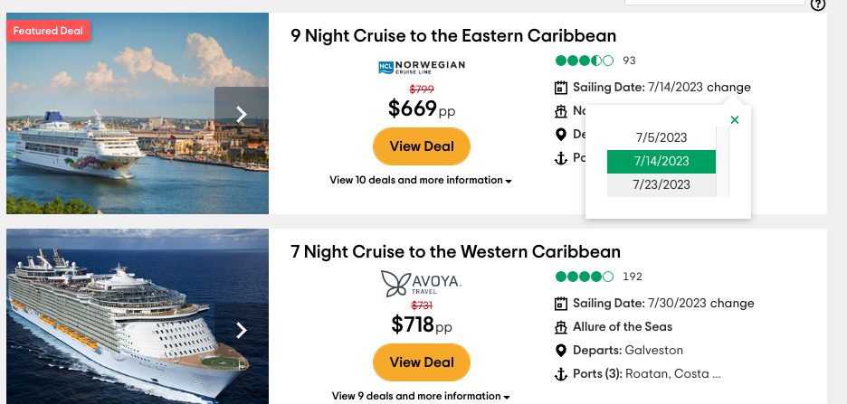
The user selected a Norwegian Cruise that had a price per person within the budget and departed from Port Canaveral. When they selected the ‘book now’ button they were brought to the official Norwegian Cruises site. Here, they were first presented with a calendar to select the departure date. This is when they realized that the price for the specific date they wanted (that was on TripAdvisor) went up and the rest of the options on the calendar were too pricey. They then went back to TripAdvisor to look at other options and ended up selecting a cruise that was $200 per person, which is significantly lower than the $400 per person budget.  

Just as before, they were brought to the Norwegian Cruise line site. Again, they were given a variety of pricing that didn’t match what they originally saw. They looked at the calendar and decided to click into a cruise that was around Thanksgiving for $441 per person. It turned out that this cruise came with terms and conditions where the third and fourth guests are free. Therefore, the user will pay for three guests at $441 per person (Guest one, two and five) which means their family of five would cost approximately $264 per person.  

Norwegian Cruise Website User was redirected to

The user then remembered that the cruise would need to accommodate their three kids, so they went back to TripAdvisor and in the search, bar typed in the Norwegian Cruise ship, Norwegian Bliss. Even though the results showed different dates and destinations from the one they chose, the user assumed that the Norwegian Bliss was the same across the board. They then scrolled down to where the amenities are listed. They found that the cruise offers a kid’s aqua park, splash academy, game shows, laser tag, a video arcade, and a movie theatre. This is enough information for the user and they were sold.  

Task 3 

For the third task, the user was asked to figure out what activities were offered at the different cruise stops. For this they searched for each destination in the search bar. The results had a list of activities and a price point for each. The user scrolled through the list and rationalized that they could probably do the more expensive activities since they are saving a significant amount of money on the actual cruise tickets.  

Analysis 

What I learned from this process is that the user didn’t select the filters. They depended more on the search bar and liked scrolling through the results and weighing their options there. They were given the most useful information when they searched for the broadest term ‘cruises’. Because of this, I can see why they wouldn’t want to mess with filters since they know it could point them in the wrong direction just as the autofill ‘cruises & sailing’ did.  

The most frustrating thing the user faced was finding out the information on TripAdvisor was false or came with terms and conditions and they only found this out by going to the actual Norwegian Cruise website. They became less trusting of information from TripAdvisor. I think this is because TripAdvisor’s results behaved more like advertisements and less of an information tool. The search results only provided the most appealing cruises but somehow were least accommodating to the user. It was obvious that TripAdvisors’ goal was to get users to go to the Norwegian Cruise website from TripAdvisor and sort out the details there.  

Design Improvement 

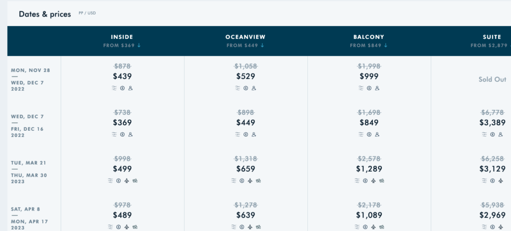
I discovered that you could view different prices and cruise dates if you click on the date of a search result. From there, you can scroll through the different date options and when a new date is selected the price is updated. This means that TripAdvisor has information on how pricing changes based on dates and should offer this upfront. They can show it in a calendar view, like Norwegian Cruise, for users to better visualize their options. They shouldn’t have users jump back and forth between TripAdvisor and the actual booking site to compare different dates, prices, and availability. 

Useful information that TripAdvisor doesn’t showcase

The most frustrating obstacle was starting a search for ‘cruises’ and being recommended to search ‘cruises & sailing’ which according to TripAdvisor is a category for aquatic-related activities. To improve this, they may need to reconsider the jargon and categorization of activities that users would search by.  

Could be replaced with more useful information to book a cruise

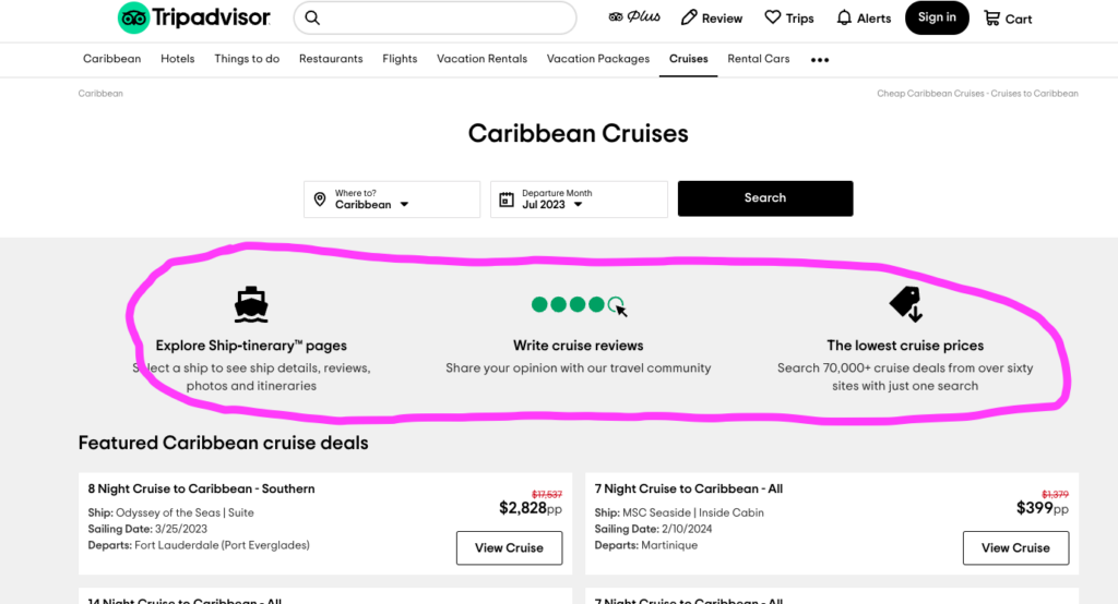
My last design recommendation is to replace the information near the top of the cruise page with more vital details of trip planning. In the above example, the ‘Explore Ship-itinerary pages’ only brings the user to the bottom of the page to a drop-down list of cruises. I don’t think a user would want to write a cruise review first-thing when they are looking to plan a trip. Lastly, ‘The lowest cruise prices’ isn’t hyper-linked. These are the first things you see on the cruise page, yet these points take up a lot of space without helping much. These parts can be replaced with starting points of a user’s search such as departure ports, specific dates, and pricing options. It should allow the user to be more in control of their search instead of a target for advertisements.  

Individual Assignment 2: HappyCow.net

(917 words)

The Website 

The website I chose for this assignment is HappyCow.com, which is a search tool to help find vegan restaurants based on location. This can be used by tourists in a city they are unfamiliar with.  

Evaluation 

The scenario I am in when navigating this website is that I have a vegan diet and am visiting Queens, New York. I am trying to find a restaurant that offers vegan food but still has other options because I am traveling with my boyfriend who is a carnivore. He respects my dietary needs but since we both have not been to New York it is worth trying to find food we can both enjoy.  

On the homepage of HappyCow there is a large search bar where you can find a location by city, address, or zip code. There is little text or ‘noise’ around the search bar which keeps the layout simple and points me to the direction I wanted to go in. By meeting my expectations as to how I would start my search in looking for places to eat, this fulfills the Consistency and Standards heuristic.  

Once I type in the address that we are staying at and hit enter I am brought to the search results. On the right pane is a map with pins on all the food locations and on the left is the list of them. Above the list are the filters so you can sort through the restaurants in a specific way.  

One thing I appreciate about the filters is that you can click through them and mess around without updating the results. The only way the results will be updated is if you select the ‘apply’ button at the top of this section. You also have the option to select ‘cancel’ which would not apply any changes to the current results or select ‘rest’ which out clear the filters already applied.  

This feature allows the user to back out of the changes they were going to make. Utilizing the User Control and Freedom Heuristic, this provides an emergency exit and does not commit to any changes they were attempting to make.  

Usability Flaws 

The first usability flaw that I came across was going down the filter options. At the top selection to filter by was vegan or vegetarian food establishments, or places with vegan options. In the next section below, you can then filter by the type of food establishment, such as coffee shops, bakeries, and food trucks. As you go down the list the options became more nuanced including health stores, market vendors, organizations, and professionals. Then In the next category below were types of food which included breakfast, buffet, fast food, and bakery (again). I was confused why these sections were separated and why these chose to filter by these categories.  

This failed the Consistency and Standards of Use heuristic by confusing the user with too many irrelevant options. There is no way to distinguish the use of filtering bakery from the first set of categories from the second use of bakery in the subsequent category. This leaves users wondering what these filters could mean by selecting them.  

The second usability failure I was tied up on was assessing the food establishments in my results. After adding filters and sorting through the results you can select a restaurant and see more information about it. HappyCow provides reviews, ratings, and photos all provided by other users. On the right pane of the page is contact information, operating hours, and hyperlinks to the restaurant’s website and social media. This is useful information, but the major factor in how I was going to choose a restaurant would be what was on the menu. So now when I click on a restaurant for more information I must click on another link, be brought to a new website and sort through the menu then return to the HappyCow’s page on that restaurant and then return to the search results to move on to the next option.  

This multi-step process violates the recognition rather than recall heuristic by forcing the user to stretch out to the restaurant’s actual website to recall the food menu. If the user was then deciding between two restaurants, they would have to jump back and forth between websites to weigh their options.  

Design Recommendations 

My recommendation for remediating the Consistency and standards of user heuristic is for the creators to do extensive user testing on what people want to filter through and know about a restaurant. These current category options aren’t clear and don’t feel relevant for the everyday person. By knowing what is most important for users to find, the design can then list those categories by most popular. For more experienced vegans, they should have a shortcut to the more nuanced categories so the site can meet both needs for novice and knowledgeable users.  

For the violation of recognition rather than recall, I recommend adding a pane on the side of the reviews that shows the menu. Users can scroll through this on the HappyCow page of the restaurants as they also browse through reviews. This way the user won’t have to jump to different sites and recall the menu information. 

HappyCow should also have a feature where users can save different restaurants and review them side by side so they can compare their options. This would also free the user so they can evaluate the different food establishments without having to remember the menu of each one.  

Individual Assignment 1 – Designing for Users

User Profile and Site

I selected the City of Richmond’s property assessment website for the user to explore. The user does not go on the City’s website ever. They live in a household where someone else pays the utility bills and they are a tenant so there is no reason for them to go on it.  

The user is 29 years old and resourceful on the internet when it comes to online shopping, instructions on home improvement, and online forums for their interests: biking and music. They are good at researching comparable items for music gear and bike gear, but they have never had to look up the value of homes to pay real estate taxes. Their experience with the City of Richmond’s website is novice. 

User Tasks

The user’s first task was to find the assessed value of the house they currently live in. The user first went to the homepage for the City of Richmond which is rva.gov.  

They were able to quickly find the assessment of the house, accessing this is straightforward. In a sea of categories to select from on the main menu, ‘real estate’ pops out. They then had the option to select ‘property search’ and search by address. There were other fields to search under including parcel ID, property class, zoning and census tract, but address was one of the main fields to search under.

This was surprising because I thought they would get confused or tied up on the number of ways to search by. These are typical categories I search for properties based on my job as a real estate analyst. I thought that navigating those fields would confuse the user, however, searching by address is one of the main fields to select and the other fields are under ‘search by other information’.

The second task was for the user to find their property on a plat map which outlines their property lines contingent to the legal description of the property. I knew this would be confusing because all city and county websites with these maps have them under ‘GIS Mapping’. GIS records are important for many people involved with studying the layout, geography and environment of a city. Such experts include builders, facility managers, and environmentalists. This information is available in datasets compatible with GIS software so users can download that information. However, for a novice user, it is not that easy to get to a map where they can search by address.  

Under this task, the user went to the GIS Mapping page and only found brief descriptions about the data sets and not the actual maps. They then went back to the homepage thinking they went to the wrong section. I anticipated this type of confusion because GIS Mapping is a specific tool on city sites. However, it is still public information that all users should be able to access. It is only organized for experts and this is obvious by the jargon used (ex GIS Dashboards just means maps).

The user was able to get to the plat map after I gave them some hints, but we counted, and it took them four pages to navigate through before getting there and none of the pages were. 

Page 3 trying to get to the parcel map.
On the 4th page trying to find the parcel map.

Expert VS Novice Users  

The interface helped the user find their property assessment by using basic keywords in the layout of the site. It was easy to select the ‘real estate’ section because that entails buildings and maps. It was also easy to find a property by the address because that is the most recognized way to look up a building. I believe by prioritizing these keywords and making them the main selections pointed the user in the right direction.  

The GIS tool provided a lot of roadblocks and that is because it prioritized jargon for expert users. The user tried to navigate the main GIS/mapping page, but it only had descriptions of the GIS process. None of this information helped the user get to the actual map.  

The site should use common keywords as headers to help users identify which section is best for them. The current layout assumes the user wants to run through the descriptions and methodology of the GIS maps before going to the map. This isn’t straightforward and concise to the point where the user assumed they were on the wrong page.