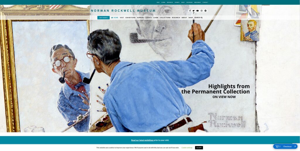
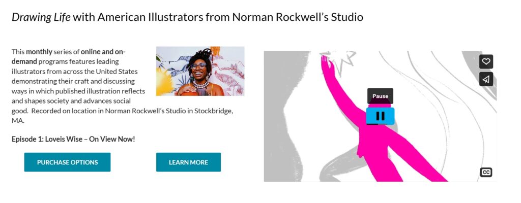
The Website
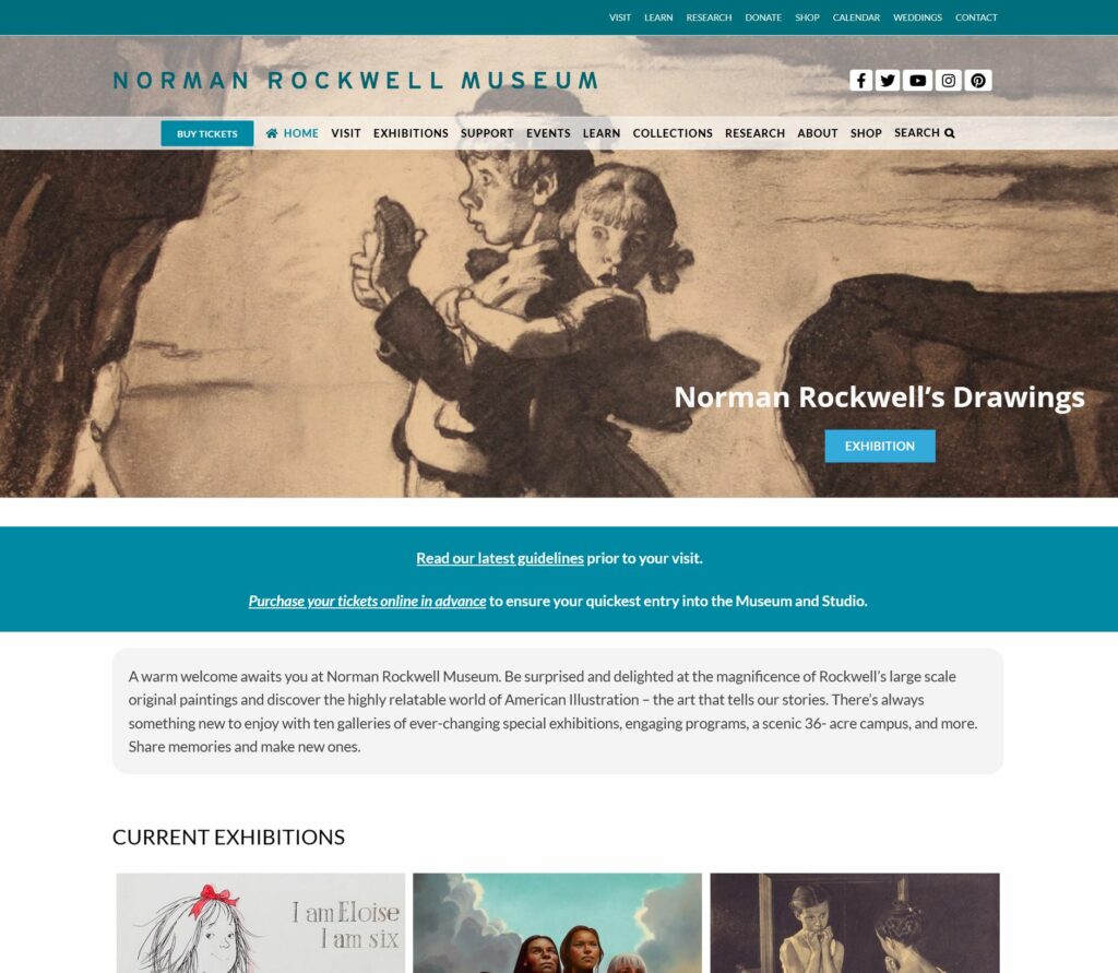
The Norman Rockwell Museum teaches and maintains the legacy of Norman Rockwell. Its website, nrm.org, is used by the museum for outreach, education and advertising. The site is heavily saturated with information regarding Rockwell art collections, related events, ways to visit the museum, and how to financially support the museum. The museum was founded in 1969 and resides in Stockbridge, Massachusetts. It’s home to the world’s largest collection of original Rockwell art.
The User
The user is a father in his early thirties with a career in digital media production. While the user’s occupation is creative in nature, the user does not typically delve into classical arts. The user desires to visit the Norman Rockwell Museum for the first time with his two children and wife in an attempt to familiarize himself with traditional art. The user lives out of state from the museum and plans on flying.
The Method
The chosen method for studying the user’s behavior is the Think Aloud method. The user has stated that he normally thinks aloud in his everyday life, thus the user should feel comfortable participating in this method. The user has been advised not to filter their statements, but instead say what comes to their mind first. The moderator will attempt to keep questions and interruptions to a minimum so as to minimize their influence on the user’s experience.
Assigned Tasks
The first task is to figure out travel logistics. Our user will be flying into the nearest airport. He will have to figure out how to drive his rental car to the museum from the airport. The second task is to purchase a ticket to the museum. The user will navigate the interface in hopes of buying a ticket to visit on their selected date. The third task is for the user to find a specific work called “Pointing Hand” in the Norman Rockwell Museum’s digital collections. The user has a friend who is a fan of Normal Rockwell’s “Pointing Hand” and has suggested the user see it in person while they’re there.
The first and second task have been refined, as it was more geared to a student. It involved research on an assignment for school, however our new user is out of school. They wouldn’t have academic motivations.
Analysis of the User’s Interactions with Nrm.org
Task 1: Determine Travel Logistics
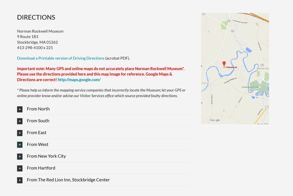
The user’s first reactions to the website were positive. The layout and quantity of content made the user feel “interested” and “confident.” For their first task, the user noticed two main menus, both containing the option “Visit”. Not sure of which one to pick, the user selected the option in the top menu, as it responded with a drop-down menu containing specific options. The user selected “Directions”. After selecting directions, the website automatically scrolled down to a section of the page. This was alarming for the user. It was unexpected that the website would exhibit this random bit of autonomy after displaying none thus far. Once in the directions section, the user chuckled. This is because the webpage advised the user to “notify their GPS provider” if the directions provided by the provider were wrong. They also provided some written instructions on how to get to the museum from the four major directions. The user typically uses Google Maps, so he eventually clicked on the displayed map.
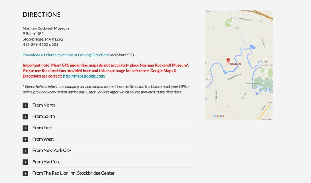
This linked him to Google maps where he was able to input the nearest airport name (Pittsfield Municipal Airport) and obtain directions from Google. He was also able to determine that the museum has parking from Google maps, but was not able to find out if the museum charged for parking.
Task 1: Analysis
The user experienced problems on the homepage, the Visit page, and the directions section. The website displayed two menus with the same option, performed minor automatic functions after setting the different precedent, and displayed confusing information about GPS providers next to useful information. Ultimately, these flaws cost the user time and mental stamina.
Task 2: Buy a Ticket to Visit the Museum
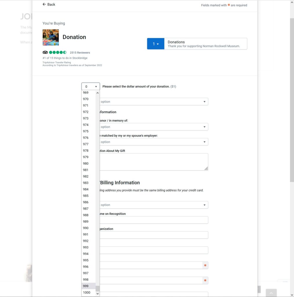
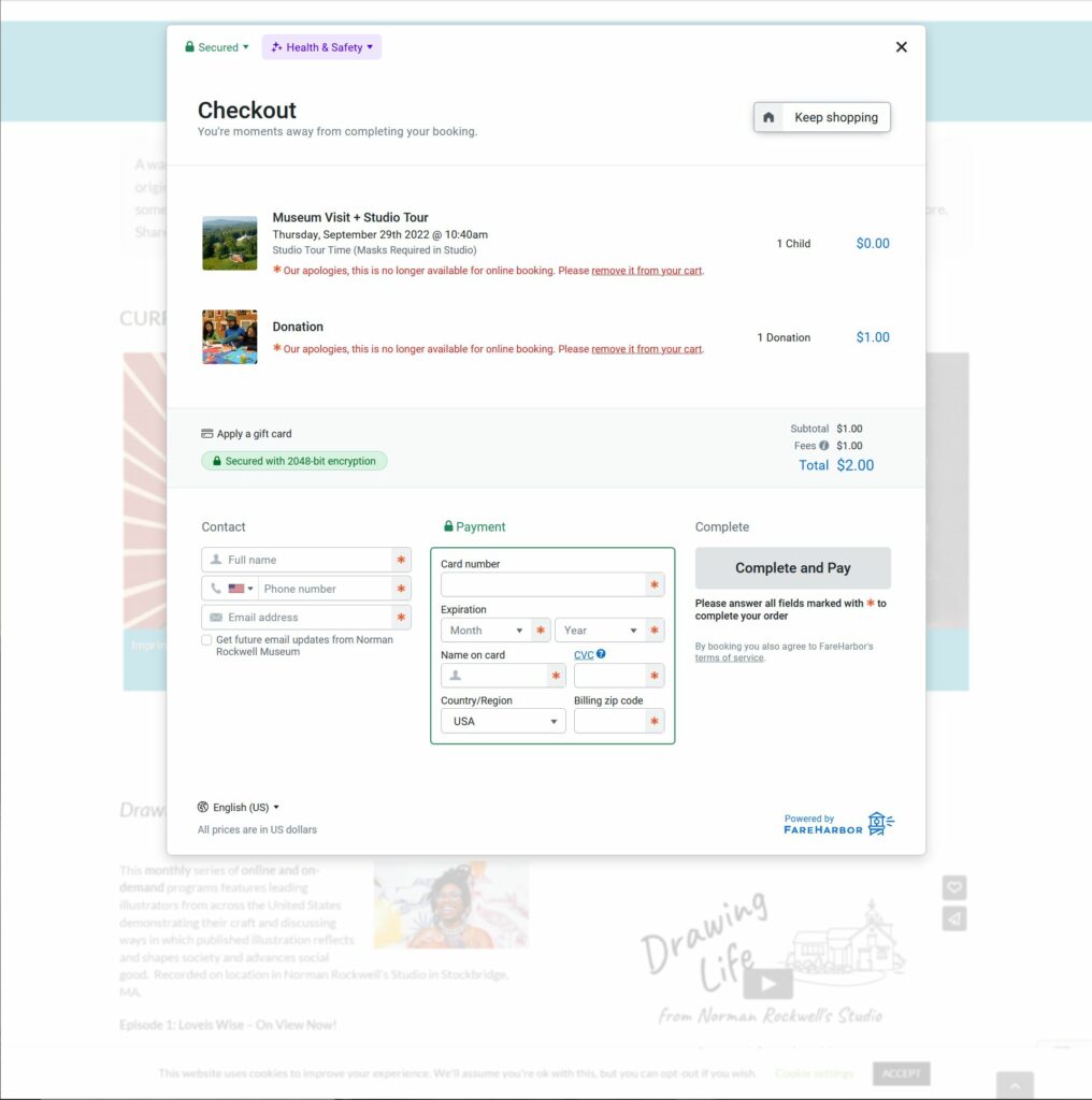
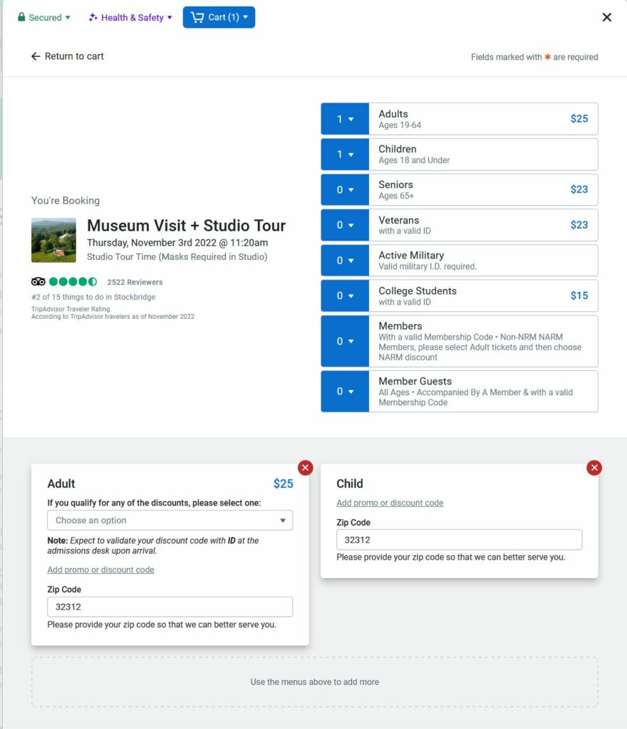
The user located the “Buy Tickets” button easily. It is the first option you see on the homepage and it is in the header of every page. After clicking, the user was met with a pop-up like window displaying a different UI then what they have become accustomed to. The user stated they felt somewhat “skeptical”. The purchasing options were plentiful. The user commented that the photos being used to advertise each option were taking up a lot of space in the window. The user did not like having to scroll to only select from six basic options. The user chose Museum + Studio Tour on a date three days from today at 11:20am. The user took more time than predicted. The user commented that he wanted to make sure he was selecting the right kind of tickets for him, his wife, and children because the drop-down fields were very nondescript. The labels of the fields weren’t as obvious.
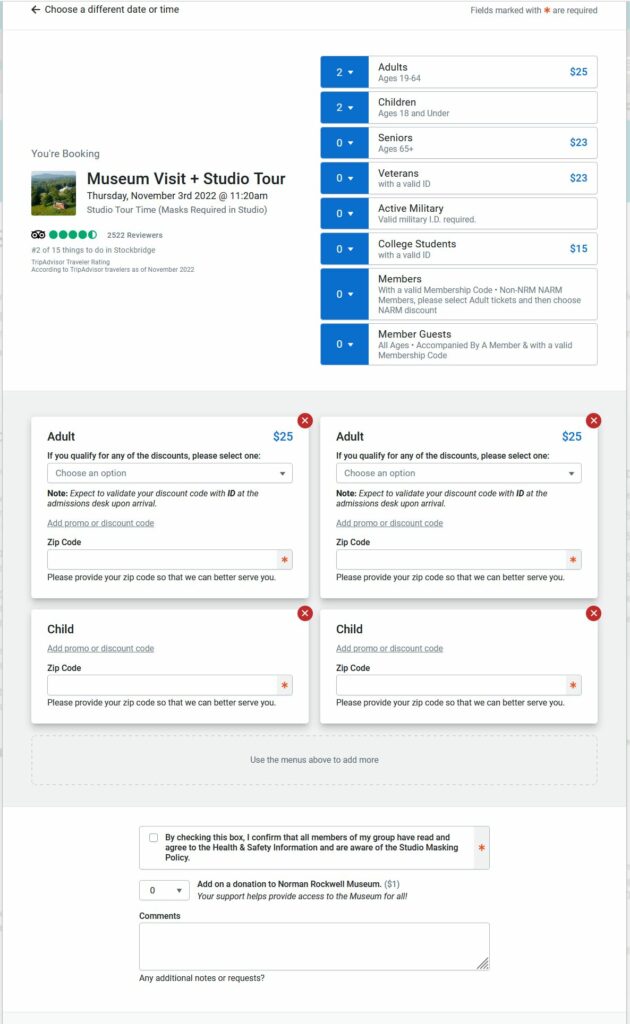
Beneath the drop-down ticket selection area, there is a section to input discounts for the tickets selected. The user thought that he had to click the bright red X at the top of each window to decline the discounts, as no discounts applied to his family. Unfortunately, this removed the tickets completely. It even changed the value in the drop-down menu above. The user had to repeat the process. The user was allowed to move on to the next section to complete the payment.
Task 2: Analysis
The inconsistent UIs created uncertainty in the user, thus increasing the risk of deterring the user from engaging with the museum at all. But perhaps the most egregious UI flaw was the overabundance of ticket amount input fields. This third-party, ticket purchasing widget from Tripadvisor increases the risk of the user purchasing the wrong number of tickets because it offers multiple, different ways of purchasing and removing tickets. Not only that, but it combines this function with other functions. Why even have the red X to remove a ticket on the discount input function? This flawed UI is possibly the result of Tripadvisor attempting to create a one-size fits all widget for their clients.
Task 3: Finding “Pointing Hand”
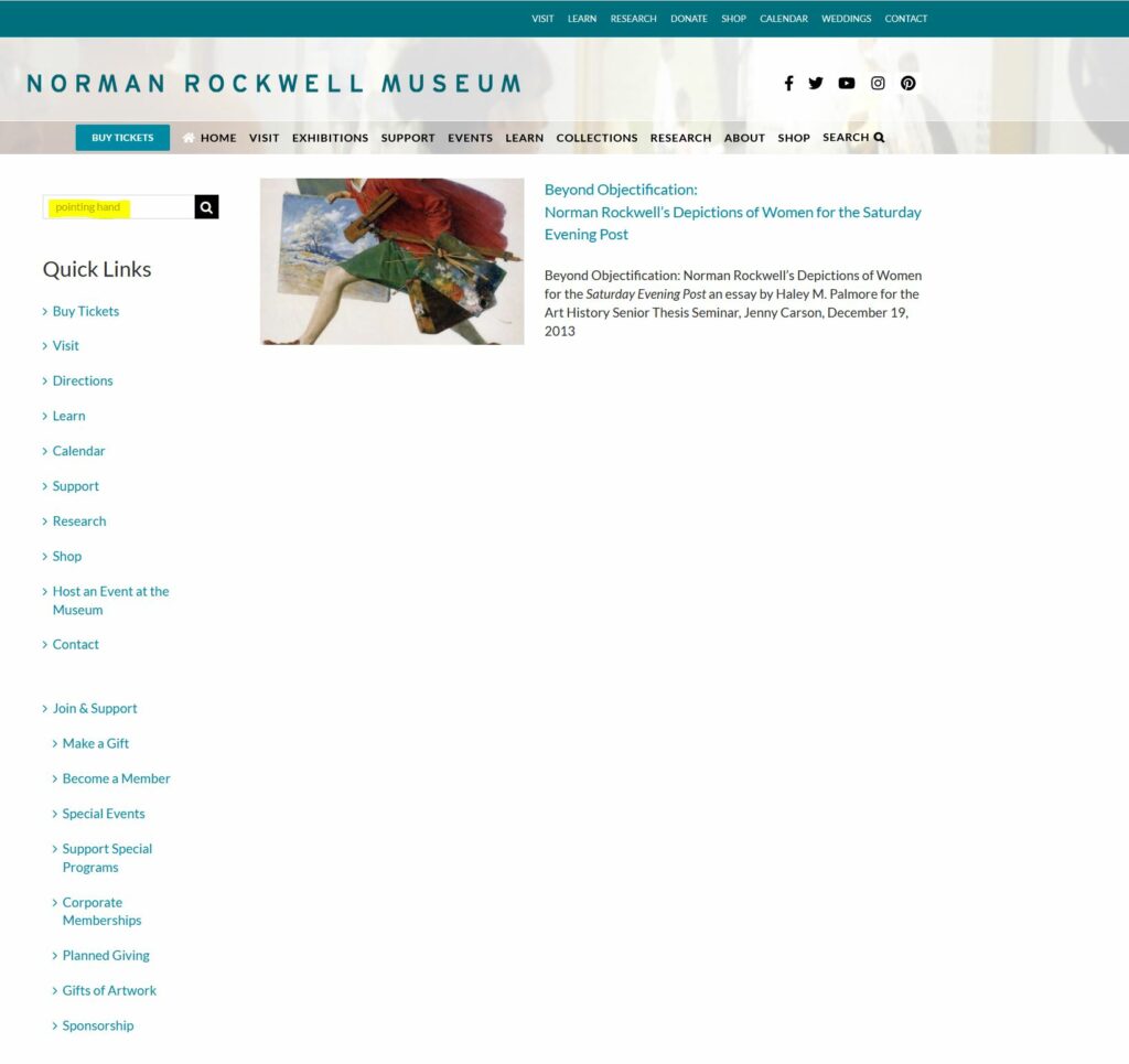
The users first instinct was to use the search function in the top right corner of the homepage. This yielded one unrelated result. The user went back to the homepage to start over. The user decided to visit the “Research” page stating “I considered this to be my best bet because “Research” is broad and implies information and data and it’s most likely for art information, not the museum itself. The other options are more for the museum itself or merchandise.”
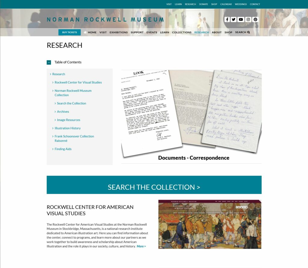
The user scrolled around and stumbled upon a large button displaying “SEARCH THE COLLECTION”. Based on his last experience, the user was incredulous, but still clicked the new search button. This led to a more robust search page where the user can input many more search terms. This page seemed more “deliberate” to the user.
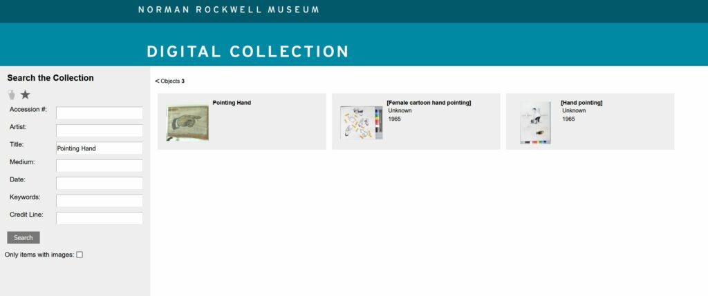
The user typed “Pointing Hand” into the “Title” search field and the results yielded the correct painting.
Task 3: Analysis
It’s concerning that the art museum’s website search function on the homepage completely failed to find a standard painting. It also makes no sense that it wouldn’t simply link to whatever search page the user found on the “Research” page. The function on the homepage seems to produce articles related to the museum and museum’s events. This is misleading and it shouldn’t neglect the users looking for information related to the actual art at the museum.
Design Recommendations
Referring to Task 1, it’s advised that the information about inaccurate GPS provider data be completely removed. It’s confusing to the user, it’s distracting from the useful information (the map), and it demonstrates a misunderstanding of the relationship between GPS and internet service providers.
Referring to Task 2, it’s advised that nrm.org institute its own ticket purchasing feature to maintain consistency and to employ something more suited to their individuality and services. It’s clear that the Tripadvisor widget is designed to be a one-size-fits-all widget. While it seemingly allows for some customization, it’s leagues away from a proprietary purchasing widget or page specifically designed for the museum. At the very least, Tripadvisor should remove the excess information from the widget. The widget doesn’t need a giant photo for each purchasable item, it doesn’t need multiple ways to remove a ticket, it should reorganize the discount input fields, and it should modernize its layout. Currently, it’s reminiscent of a health provider’s new patient information form. It’s just a long list of input fields.
Referring to Task 3, there should only be one search function or page. All search features need to be combined. At the very least, when using the search function on the home page, one of the results yielded should be the search page for art work. Alternatively, a notification about the other search functions/pages should be displayed. It was pure happenstance that the user found the correct search page.