The Website
The Norman Rockwell Museum is located in Stockbridge, Massachusetts. The website contains resources about the materials contained within the collection, information on visiting the museum, an ecommerce shop, a method to purchase tickets to visit the museum, and additional resources regarding the institution itself and ways in which a user can donate or contribute to the museum.
The User
The user I utilized for my representative user testing is female, aged 27-35, with moderate to advanced computer skills. They are employed as a graphic designer, and are familiar with concepts surrounding images such as dimensions, formats, and copyright licensing. They were also previously employed in a library so they are vaguely familiar with cataloging and organizational concepts surrounding large collections.
The Method
The method utilized for this representative user testing was the concurrent think-aloud (CTA) protocol. The user was instructed to perform their given task while stating their thoughts and reactions to the website with which they were interacting. Care was taken to ensure the tasks were not leading, while eliciting interaction with the elements of the website that required further examination.
This method was chosen based on available resources and time. It provides a cost-effective means of user testing requiring little more than a computer, a user, and a notepad. Despite its relative simplicity, CTA provides ample insight into issues users might encounter on a given website. While the verbal dialogue may be disruptive to the task being performed, it allows for greater insight into the users mindset and thinking when navigating to and using features on a given website.
The Tasks
Three tasks were given to the user to perform. They are as follows:
- The user was instructed to purchase tickets to visit the museum. This represents arguably the most important task for the website, which is to facilitate paid visits to the museum. The user was informed that they would qualify for a college student discount, and were attempting to purchase a ticket one week away from the day they were participating in testing.
- The user was instructed to find out more information about internships at the Norman Rockwell Museum, and if available, apply to one. This task is representative of the student persona created in our previous group assignment.
- The user was instructed to obtain a high quality scan of a painting for use in a project. This task again represents our group persona, a college student. This task was refined from the initial task (to look up a painting) to better induce navigation to less visited areas of the site and interaction with more complicated information present on the site.
The Analysis
Task 1: Purchasing Tickets
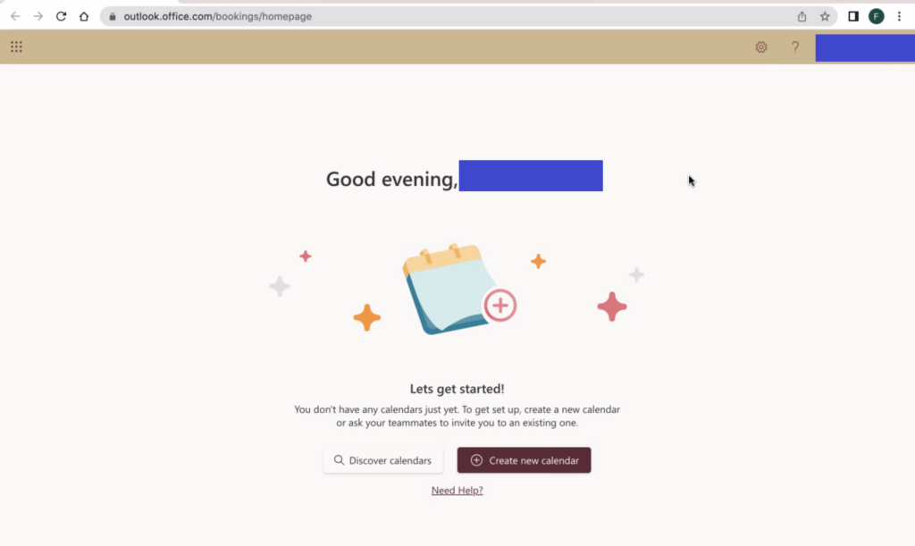
The user is initially tasked with purchasing tickets for one week from the current day to visit the museum. She is initially drawn to the ‘Buy Tickets’ call to action in the main navigation menu beneath the title of the page. She is temporarily distracted by another “Buy Tickets” button on the carousel image in the center of the page, but as this is set on a timer to rotate, the link to buy tickets on the carousel image disappeared before she was able to click the link. She resorts to clicking the main “Buy Tickets” button on the navigational menu. It is worth noting that on the mobile version of the website, this menu and button becomes hidden, requiring the user to click the menu toggle in the top right to access the ticketing interface.
The user then selects the museum visit option from the pop-up booking window, after some time spent determining the proper link to click. The user notes that this interface is very resource intensive for her laptop, causing it to slow down her computer and web browser.

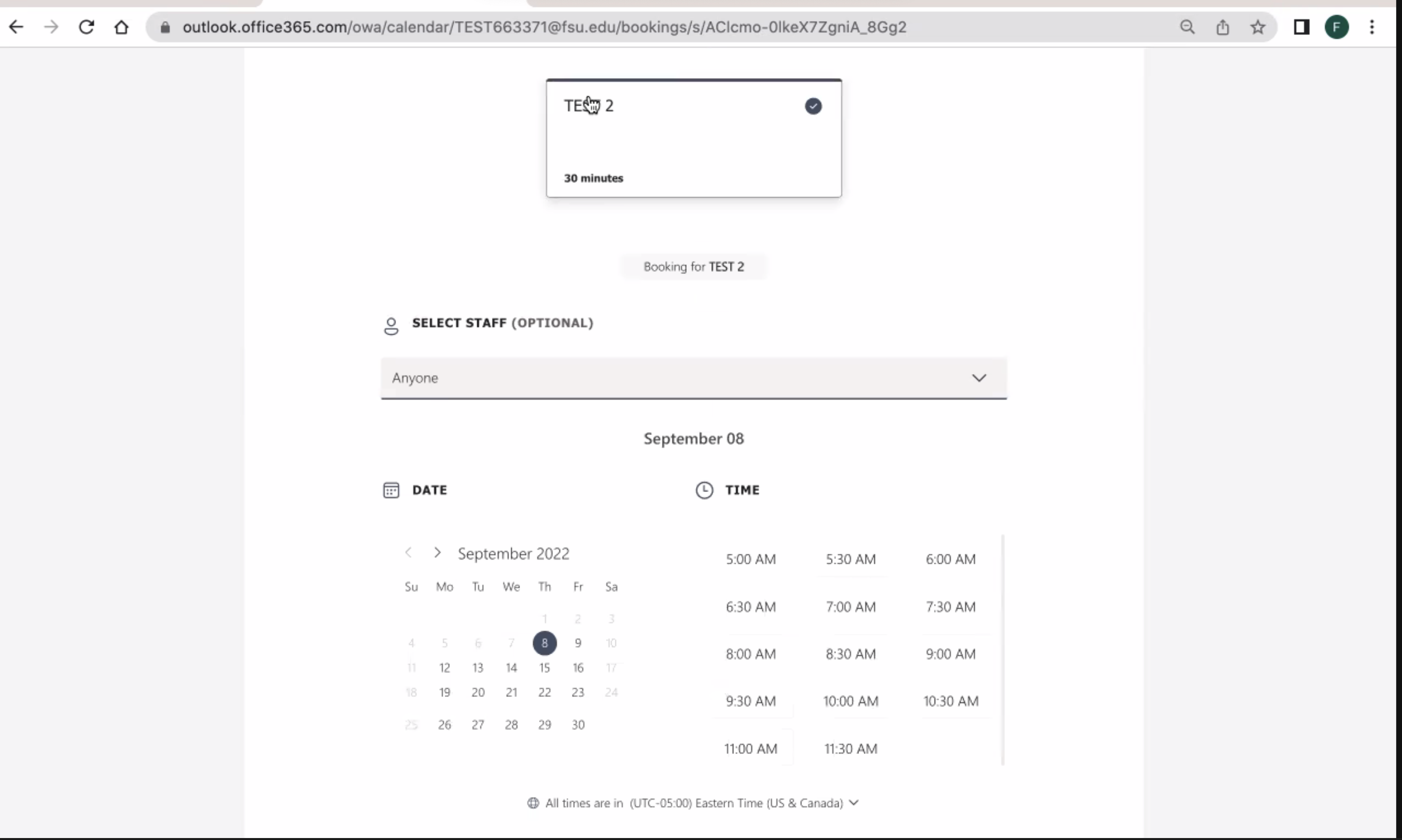
On the date and time selection page for the museum visit the user selects her date but is confused by where to proceed. There is not a clear button highlighted to proceed to purchasing, instead the user scrolls the page looking for a “purchase tickets” option. Eventually she realizes that the only clickable element (besides Covid-19 guidelines and images) is the box beneath the calendar. She clicks the box, and proceeds to the next page.
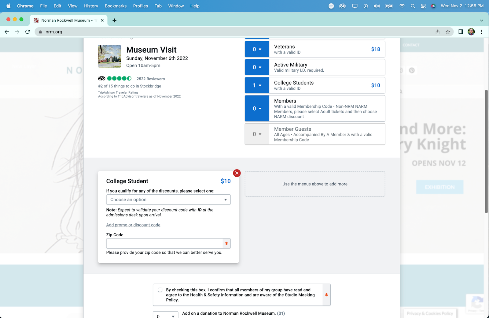
On this page, the user easily selects one ticket for a college student in the initial ticket options, but she is confused momentarily by an additional drop down for discounts after selecting her initial ticket type. This likely stems from having two separate places to define your discounts, both initially in the top ticket type menu, and a secondary menu for other discounts (such as EBT or local resident discounts). Additionally, on this page she notices a required zip code box and fills it out, stating that “its weird they ask for a zip code when they will get my address”.
She then proceeds to bypass the donation and comments section of the page as they are unnecessary for her purposes. She then states that she is surprised by the addition of a $1 fee for the ticket, and wonders why that isn’t just included in the initial ticket price. She then clicks the add to cart button and proceeds to the checkout page. Upon reaching the checkout page, which contains a relatively standard form for credit card information, she concludes her first task.
Task 2: Researching Internships
The user is now tasked with researching information about internships at the Norman Rockwell Museum, and applying to one if applicable. Her initial response is to quickly scroll to the footer of the home page looking for a link to “careers” or similar. Upon finding nothing along these lines, she returns to the main navigation menu above the banner image. Here she attempts to hover over the menu items looking for something similar to “careers” as before. She then attempts the same process on the secondary menu on the very top of the page. Upon discovering there are no drop-down or hover menus here either she proceeds to choose another location, the “Learn” link in the menu. She reviews this page and determines it does not contain the information she is looking for. She now clicks the “About” menu item, which is the page that contains her desired information.
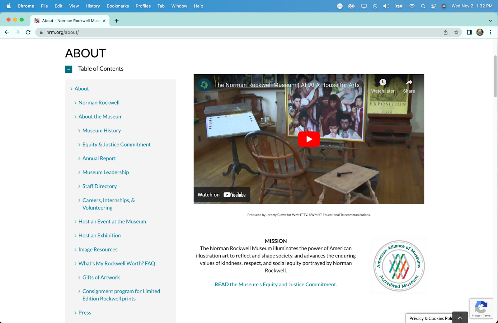
On this page she quickly locates the link to more information on internships in the table of contents. This link brings her to a new page that retains the table of contents from the main “About” page. On this page, she scrolls down past other available positions (including full job descriptions) to find the internship section of the page.

She notes that this section doesn’t have any anchor links like the full employment section above does. After scrolling through descriptions of all possible internships (some of which are closed) she finds a short “how to apply” section that applies to all internships.

At this point she clicks the first bullet point, only to realize that it is an anchor link to where she is already located on the website. She proceeds to read the instructions and download the linked pdf from the button in this section. With an application form secured, and process understood, she has completed this task.
Task 3: Obtaining a Scan
For the third and final task, our user must start the process for obtaining a high-quality scan or print of a piece of art in the Norman Rockwell Museum collection. She is provided with a specific piece, “Santa’s Lap” and told to disregard cost. She correctly navigates to the “research” menu item in the secondary menu at the very top of the page. On this new page she finds “image resources” in the table contents, which is the correct section for image licensing and purchasing information, and clicks the link taking her to a new page.

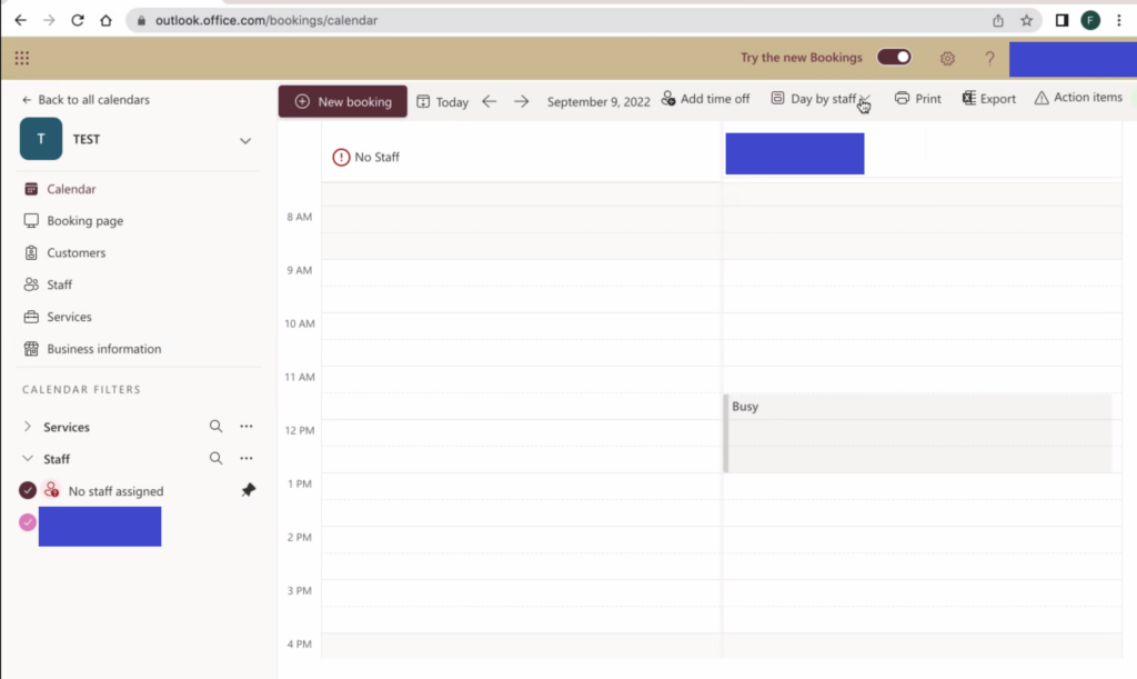
At this point she reads the paragraphs at the top of the page and begins to scroll down to find more information. Here she discovers a button that takes her to the “online image order form” that is an anchor link to further down the page, as shown below.
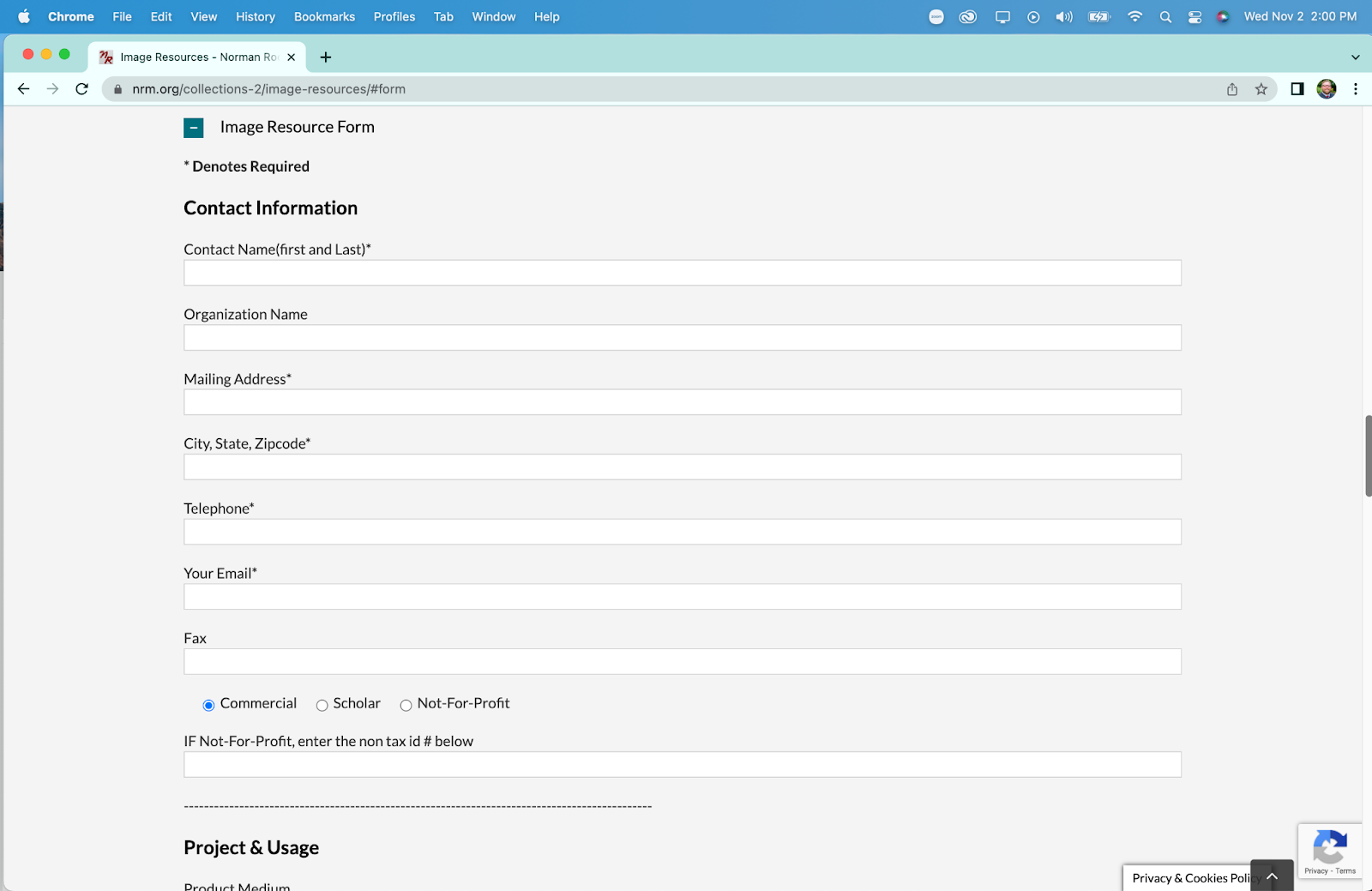
She begins to read the form section in preparation for completing her task, but notices that they do not mention any prices for obtaining a scan. She begins to scroll back up the page to look for the pricing information in a linked pdf, located just above the anchor link. Upon viewing the pdf she continues to inspect the form for additional elements she might need to provide.
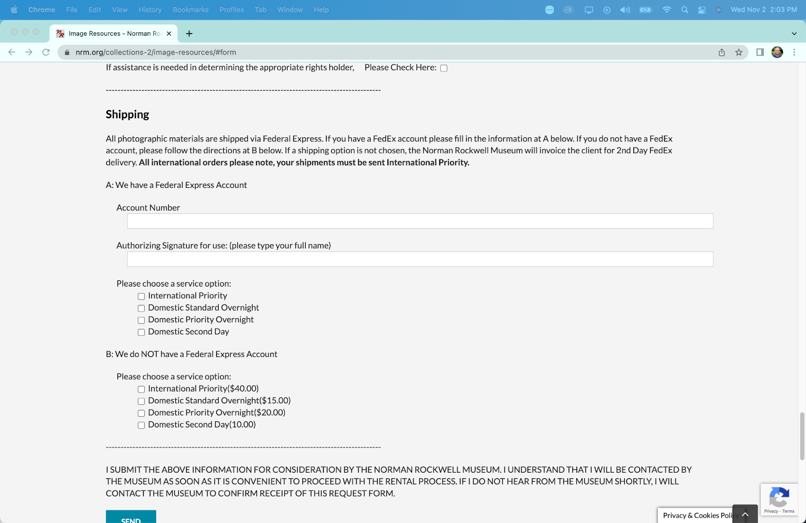
In the shipping section she notes that “it’s weird” that they ask for an account number. Upon further inspection she determines she simply needs to select an option lower in the shipping area to receive standard shipping. She also notes that there is no section for payment information, or to add anything to a cart. This form acts as a “request” form more than an “order” form, necessitating further interaction with museum staff to obtain a print or scan. After determining that she has the information and links required to obtain a scan of a painting, she has completed her third task.
The Recommendations
Upon completion, and reflection on, this representative user test, I can offer XXXX main recommendations to improve the usability of the Norman Rockwell Museum website.
#1 – Consolidate Menus
The museum website has at minimum two navigation menus at all times (up to three if you are on a page with a table of contents). The links often do not match each other in content, despite being titled the same in the menu. The two main menus should be combined to create a unified navigational menu that reduces overlap and increases information scent for the user. Additionally and related, elements of the menu that are more related the organization itself (such as “careers” and “staff directory”) should be placed in the footer of the website, to allow for quick navigation by users actively seeking that specialized information.
#2 – Add Anchor Links
Many pages on the site contain large amounts of information on a page, necessitating a large amount of scrolling by the user, leading them to become lost and fatigued. While creating dynamic pages that display the information requests (such as drop downs for the type of employment you are looking for) would be the optimal solution, a much more cost effective solution would be to enrich informational pages with anchor links. This would allow users to quickly navigate to their desired information, without having to scroll through information they do not need. A list of these anchor links should replace the “Table of Contents” present on many of the pages as that is the standard location for them.
#3 – Better Integrate Image Scanning
The system to request and purchase scans or prints of images is not integrated well into the rest of the website. If one were to find a painting they would like a scan of, they would need to manually copy the information for the painting, navigate to the image order form, and then manually enter the information themselves. This could be made markedly more efficient by creating a link on a link on a painting’s information page to purchase a scan or print that leads to a pre-populated form with the painting’s information. This would allow the website to remove multiple tasks for a user requesting a print, while not necessitating creation of a secondary purchasing system.
#4 – Simplify Ticket Purchasing
The ticket purchasing system and process offers ample opportunity for improvement. As many ticket purchasing systems exist for quick implementation, this section of the site can be streamlined with minimal associated cost. Some specific recommendations for this section are to reduce the process to two pages, one where users select their tickets, dates, and additions, and a second page where they checkout and pay. Beyond being more efficient, reducing the pages removes the issues with the forward/backward navigation in the purchasing system. Additionally, the removal of low frequency ticket options (such as “memberships” and “donation” and specific events) will streamline the process for users, directing them to the two most common ticket types “Museum Visit” and “Museum Visit + Tour”.
###