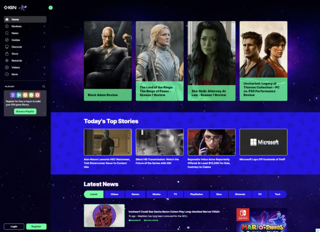
During our group’s individual heuristic analyses (and again in user testing), the most glaring shortcoming on the site was the lack of an obvious search function. There is a natural inclination to look for a search bar or a magnifying glass when trying to locate specific bits of information. At the time of our initial testing neither option existed, as shown in the screen capture below:
Figure 1 – Screen capture from October 18, 2022, prior to Search function being added
This change was to be our initial iterative change. This change would help the website create a much needed “match between system and real world” as years of using search bars has created an instinctive draw to the search bar and the magnifying glass icon. Since the time of our initial user testing, the website has added a search option. In the earlier screen capture of the website, the column on the left side only showed a magnifying glass icon beside the playlist option. This only allowed for searching of game titles and precompiled “playlists” of articles and reviews.
One of the drawbacks this has on end users is the ability to resurface older content and articles that might be of interest. One of our initial tasks we wanted the end users to complete was finding an article that contained different titles in the Game of the Year catalog for 2021. Due to the limited search functionality of the IGN website, most test and scenarios ended with an overall negative experience for our experimental group due to it being difficult to find the search features, only returning individual games, or returning irrelevant results causing the users to look elsewhere. The site did not really have a way to look through its resources and return specific entities even though we knew it was there. This is one of the main reasons we decided to change the layout and make it easier for users to find the search bar as well as navigate IGN.
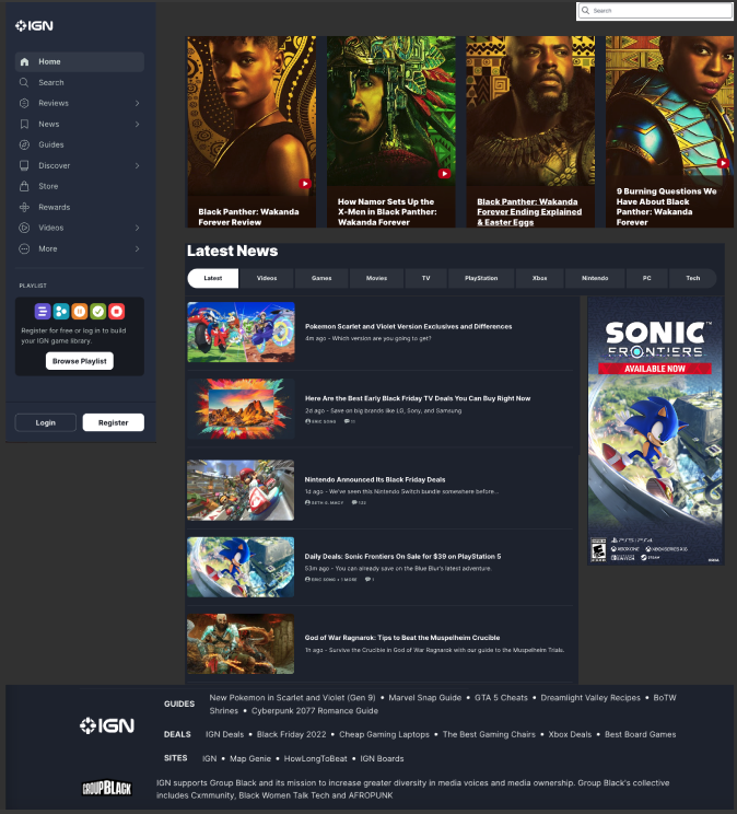
Figure 2: Screen capture showing added search option in left hand column (added by website) and a search bar option in the top right (group recommended change)
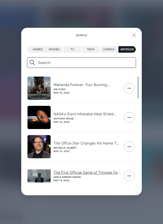
The next screen capture shows the search option after you select it from the main page menu. It offers increased flexibility by allowing the user to search for their keyword in the context of the more popular segments of the page.
Not only have we updated our navigation features, but we’ve also cleaned up the homepage and the cluttering of content. Previously the homepage contained a lot of randomly placed ads that were sometimes inconsistent with the layout of the page, those things such as large images that took up most of the screen. In our revision, we’ve decided to give the site a cleaner look that doesn’t bombard the end user with too much information and allows them to see the main content of the page with the option to navigate elsewhere when effortlessly. This cleaner look also includes the addition of a footer to the home page and the removal of the continuously loading content as the user scrolls the page. We feel the revisions help the user find content and reduces confusion caused by the current site.
Figure 3: Website’s search option, continued.
The website’s recent addition of a search capability shows that our group was on the right track and that the change was an obvious and glaring deficiency in the site’s design.
The gamers group chose https://www.ign.com as the site we are evaluating for the Usability Analysis project. IGN provides information and news about video games, movies, and television shows. The website includes profiles for a great number of video games and includes information such as statistics on the amount of time it may take someone to complete the game and breaks that information up by the main story, side quests, and everything the game has to offer. Each profile also contains reviews, general information, and news stories about the game, as well as links to detailed game walkthroughs.
The user I chose for my usability test is a 36-year-old male who works full-time and plays video games in his free time. However, I explained to the user that I may ask him to put himself in the shoes of a college-age student who has a part-time job, which gives them the means to occasionally purchase video games.
Since I did not have access to a formal usability testing facility, I used the Think Aloud method while duplicating (casting) the user’s screen to a television screen. When think-aloud is used, a user is asked to perform a task while vocalizing their thoughts, no matter how inconsequential or seemingly unrelated to the task the thought may seem (Nielsen, 2012). According to the Nielsen Norman Group, think-aloud is used because it is cheap, robust, flexible, convincing, and easy to learn. I must agree that I chose this method because there was no cost, it is easy to learn and easy to explain, and from past experience, I tend to get good information from the think-aloud test.
I asked the user to perform the three tasks that we outlined in a previous group assignment. The first task was to find the 2021 Game of the Year (GOTY) award winners to determine what games are trending and popular. Another purpose of this task is to identify games the user may be interested in playing. The second task was to find the game profile page for The Legend of Zelda: Breath of the Wild to find a walkthrough and information on how long it takes to complete the game. The purpose of the task is to find information that will help make the decision on whether the game is worth purchasing. The third task depends on the first and could be counted as a subtask. The third task is to review the 2021 GOTY runners-up and contenders to identify additional games that may be fun to play with the purpose of deciding whether to purchase one or more of these games. I did not modify any of the tasks from our original write-up for the purposes of this user test.
I asked the user to find the 2021 GOTY awards winner to determine what games are trending and popular and to decide whether they are worth playing. The user started out on the IGN home page and started scrolling through to see if there were any quick links for the Game of the Year list. He reached the video game news section and clicked the Games button to focus the articles on games (as opposed to Videos, Television, etc). Not finding articles on the game of the year list there, he started looking for the webpage’s search feature. He expanded the fly-out menu on the left of the page and couldn’t find the search function. I saw it but didn’t bring attention to it. Since Dr. Marty had trouble finding the search function of the webpage in class, I was interested in finding out how long it may take the user to find the search. Not finding the search function in the fly-out menu, the user went back to scrolling through the home page. Not having any luck, he used the ‘find in page’ function of the browser to search for the term game of the year. That resulted in no hits, so he searched for awards. He then started looking for the search function again on the fly-out menu. Not finding it, he again started scrolling through the home page. He clicked an article in the top banner about a specific game to see if he was presented with information the home page wasn’t giving him. I could tell the user was starting to get frustrated and asked if he would have given up by now if he was a college-aged gamer. He said he didn’t know if it was part of the rules or not, so he refrained from going to Google to search for the information from the task. At this point, I decided the user could not complete the task due to the poor design of the website, so I advised him to use whatever means necessary to find the 2021 GOTY list. He then navigated to Google and searched for the IGN GOTY Awards. He clicked one of the top search results titled ‘IGN GOTY Winners’ and reached a page that listed many games. He clicked around but was confused because he knew these games to be older and not recent releases. He then discovered this page, titled IGN GOTY Winners, was a list of previous Game of the Year winners. He went back to the search results and located the correct link, which was the third search result.
Since the user was not able to locate the search function, I told him where it was located so that he was able to complete the second task. I had already determined that the website’s search function was not easily found and presented a user design flaw in the website. The search function is located on the left fly-out menu at the bottom of the main menu headings and is simply a dim magnifying glass. It does not stand out on the menu, as this user test displayed. The user was curious if he could locate the GOTY article with the search function and discovered he was only able to search for games and playlists, not articles. This is another user design and functionality issue with the website. If I had not coached the user on where the search function was, he would be unable to complete the second task without using Google again.
After the user explored the search function on the website, I redirected the user to the second task of searching for The Legend of Zelda: Breath of the Wild to decide whether to purchase the game based on time to play, walkthroughs and reviews. He started by launching the webpage’s search function and noticed the game was listed as a top result. He clicked on the game and quickly located the section detailing how much time it takes to complete the game. He said he likes Zelda games and would buy them based on the information. He is not a completionist and paid more attention to the time it takes to complete the main story. He was happy the number was over 50 hours and said if it was half that, it would change his mind about the game.
I asked the user to complete the third task of viewing the 2021 GOTY runners-up to make determinations on whether they are worth purchasing. The user navigated back to his Google search and located the 2021 GOTY list. He reviewed the list and looked at specific games. He said it would help him make decisions on what to buy or possibly whether to subscribe to a service to play the game. By this point, I believe he was more comfortable with the user design of the website and understood its flaws, therefore compensating for these user design issues without even realizing it.
I recommend redesigning and recoding the search function of the webpage to always display the search in the top right corner, where many websites typically place their search bar. The search should be a search bar instead of a button that grays out the screen and should search the entire webpage instead of only games and playlists. The user had a lot of difficulty finding the website’s search function and in fact, had to be led to the search. The current search function is located in the left menu fly-out and is only represented by a very hard-to-see magnifying glass.
I also recommend more clear links to content and a homepage redesign. The homepage includes links to articles and all types of content, making it difficult to locate the information the user is searching for. As mentioned above, the user would have abandoned their search and searched instead in Google in the time it was taking him to find the 2021 GOTY list. The user could not find the GOTY lists by searching the webpage or scrolling the homepage. A redesigned menu and simplified homepage may help users find content more easily.
Navigate to the IGN website and search for a specific game. Locate information about the game such as game statistics and the game walkthrough guide.
I started by opening the web browser on my computer and navigated to the IGN website. When the website loaded, the first thing I noticed was the home page was very busy. There were videos and links to articles about video games. There was also a top navigation menu. When I scrolled down the page, I noticed the page loaded more content. The top navigation menu contained a search function, which I used to search for a specific game: in this case Watch Dogs: Legion. The search function popped up a box in the middle of the screen and grayed out the content of the website. When I started typing the name of the game, the site presented me with options, trying to guess what game for which I was looking. I selected the correct game and was taken to the game profile page.
The game profile page contained information about the game at the top of the page including an image of the cover art for the game, release date, developer, rating, score, platforms, a highlighted button entitled ‘change status’, a wish list button, and a button with three dots. The button with the three dots contained two menu items: ‘go to guide’ and ‘share game’. Similar to the search function, this menu is also displayed in the middle of the screen and grayed out the rest of the website. Below this was a game rating (thumbs up or thumbs down), information on how long it takes to beat the game, community ratings, links to the walkthrough and tips, screenshots, reviews, summary, then news. The news section continues to load when scrolling down the page and doesn’t seem to end.
I located the game walkthrough, which I have used for other games, and I found it to be very organized. The left-hand side of the screen contains a menu with hyperlinks to specific chapters/missions, and each link contains a detailed walkthrough including videos and text. I found this part of the website very easy to navigate and use.
Analysis
Aesthetic and Minimalist Design Violations
Home page: The home page is very busy with videos, top stories, and news articles, and it never ended. I couldn’t reach the bottom of the home page. More content kept loading as I scrolled. I glimpsed the footer a couple of times, but the content loaded, and I couldn’t read what the footer said. I also think there are too many menu options in the top navigation menu.
Game Profile Page: the game profile page has a lot of wasted space, dedicating part of the first viewable area to thumbs up and thumbs down game rating options. Other space is wasted dedicating room to statistics and data on how long it takes to beat the game. Near the top of the game profile page is a button containing three dots. When clicked, the page is grayed out and two additional menu items are displayed: go to guide and share game.
Help and Documentation Violations
In the top navigation menu, there is an option labeled more. The more menu contains a lot of information and I feel the help or support options are missing or buried. The more menu has choices for the website theme, region, accessibility, ad choices, contact support, terms of use, standards, site map, privacy policy, and personal information opt-outs. Since this is listed under ‘more’, I feel many people will miss the information.
Design Recommendations
Aesthetics and Minimalist Design Recommendations
On the home page, I recommend using menu drop down/hover over to consolidate some of the menu options. A menu option called Media can contain news, videos, and playlist. Also, the login and register buttons can be combined to allow the person to register for an account if they do not have a login for the site. I also recommend having a set amount of content for the page instead of continuously loading content as you scroll. Website footers can be used to contain valuable information, and I cannot locate one on the home page.
On the game profile page, a lot of room is taken up unnecessarily, causing other information to be consolidated. My suggestion is to consolidate the ‘rate this game’, ‘how long to beat’ data, and ‘community ratings’ into the panel at the top. I also recommend creating a button for the guide link to be displayed along with ‘change status’ and wish list and using the universal share icon. This prevents a separate menu that grays out the rest of the page from popping up for two menu items. These minor changes will shift some more relevant content to the top of the page under the pertinent game information.
On both pages, and wherever else it is applicable, I recommend implementing a blog post type format for news articles and videos. The newest videos and articles should be viewable with the option to view older posts. This helps implement the other recommendation of including a viewable footer.
Help and Documentation Design Recommendations
On the home page, I again recommend including a viewable ‘footer’ that contains the support information, privacy policy link, terms of use, and accessibility information. I also recommend clearly labeling a support menu, possibly under a contact us page.
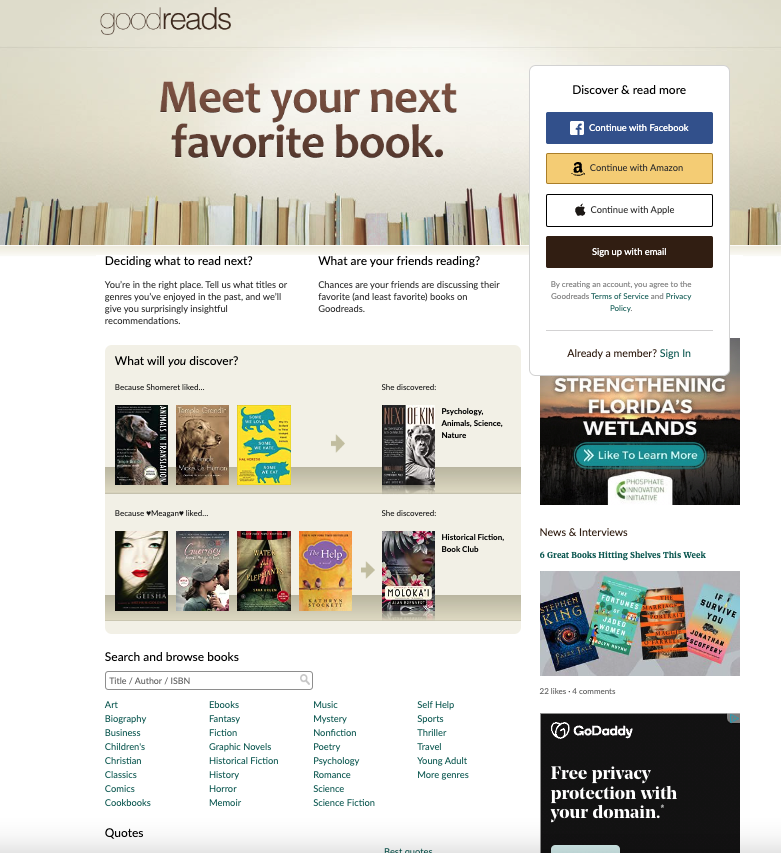
The website I chose for this assignment is Goodreads.com. I read a lot of books and use this website primarily for reading user reviews of books. Goodreads is likely classified as a social networking site because users can view the books their friends are reading and create lists of “the books you’re reading, have read, and want to read” (Goodreads.com, 2022). The website also has an algorithm that recommends books to the user.
Figure 1
User Profile:
The person I asked to view the site is skilled with computers and technology, has a bachelor’s degree in Communication and Information from FSU, and works in the finance field. Although he has never used the Goodreads website, he is familiar with researching product reviews on online shopping websites. The user listens to audiobooks using a subscription service and occasionally reads electronic books but prefers audiobooks.
User Actions:
I asked the user to navigate to the goodreads.com website and search for something he would like to read (or listen to). The user’s first observation was that Goodreads wants you to log in, and he said he thought he would need to create an account to look at books. He scrolled down and found a way to search the website lower on the page. It is important to note that the user is viewing the Goodreads website on a laptop computer using the Google Chrome web browser. I normally use a mobile device to view the website and while the login options are still prominently displayed on the website, the search functions are easier to locate on the mobile version of the website (see Figure 2).
Figure 2
He found the search function easy to use and was able to find the specific book for which he was looking. He also found the search was only difficult to locate on the Goodreads homepage. The menu bar on all other pages includes a search bar and site navigation options (Figure 3).
Figure 3
Overall, he found the information provided about the book helpful and said he would be able to decide on whether to read the book based on the book’s profile.
Expert User vs Novice User
The user had a background in technology and because of this did not have issues utilizing the site. The primary issue he experienced was not being able to locate the search when first navigating to the site. Since I was more familiar with the mobile version of the site, I navigated to the site on a web browser on my laptop and had to zoom out to 67% to see the search when first navigating to the site. I can understand the frustration of being unable to locate the search when first navigating to the site on a computer.
Recommended Improvements:
My primary recommendation to improve the usability of the site is to include the site navigation/menu bar on the homepage. This provides options to sign in, join, browse, and search without frustrating a novice user. If this is not a possibility, I recommend adding a search bar to the right side of the home page opposite the Goodreads logo.
My second recommendation to improve the usability of the site is to remove the distracting login options on the right side of the home page in Figure 1 and prominently displayed them in the middle of Figure 2. Adding a sign-in and join button, as mentioned above, still allows users to log in using one of these options while making the site more useful to novice users.