GROUP ASSIGNMENT 3A: FIRST ITERATIVE DESIGN

Introduction

Target Website: https://www.jeffdavishospital.org/

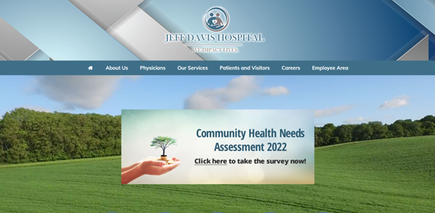
The Healthcare Group user tested the Jeff Davis Hospital (JDH) website, shown in Figure 1, through a comprehensive scenario of an individual seeking healthcare services for their family member. Violating major heuristics issues around consistency, standards, error prevention, efficiency and minimalist design, this site needed major redesign in content organization to merge its disjointed brand or legacy sites (Nielsen, 2020). In our group’s first redesign, we approached the site’s navigation by restructuring the site map, reimplementing search, and visualizing a native implementation of their Health Research Center. Wireframes were assembled in Figma Design and Figjam using Estefanía Montaña’s (n.d.) Easy-Peasy Wireframe Kit and colors matching JDH’s theme.  
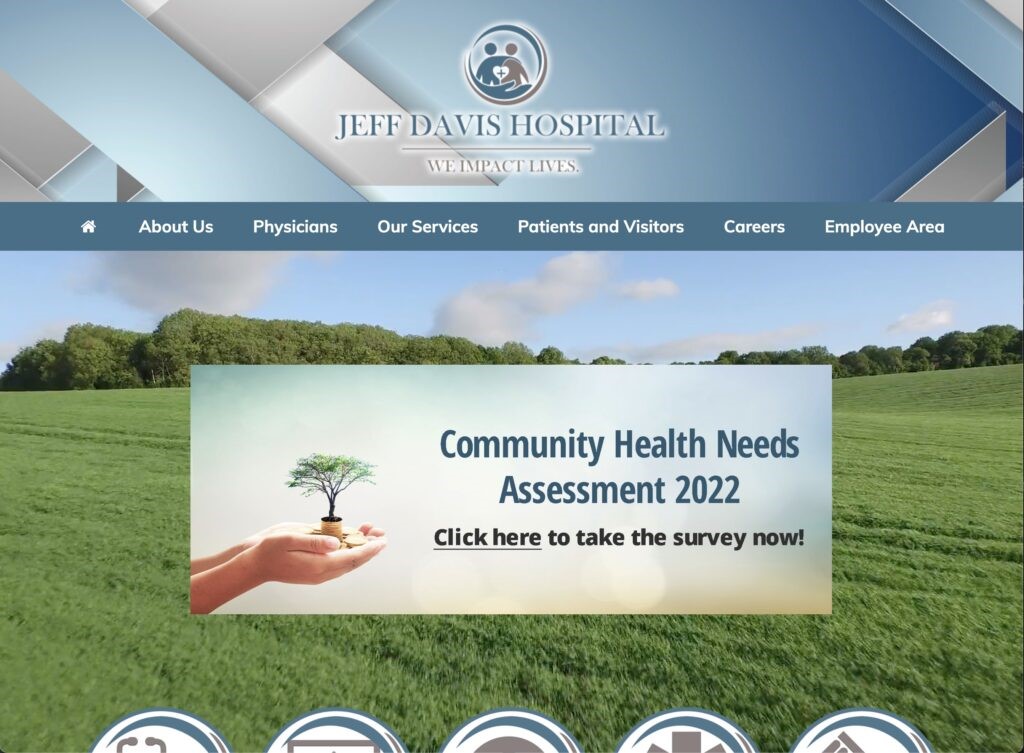
Figure 1. Production Homepage (Jeff Davis Hospital, 2022) 

Proposed Re-design#1: Sitemap, Homepage, and Persistent Search 

  • Logo is home page link.
  • Sitemap is reorganized to focus on logical pathways to complete the user tasks. Sections like About Uss, Employees, and Policies were moved to the footer to deprioritize them. 
  • Note that we will perform card sorting internally or with the class in the second iteration to improve the navigation. 
  • Search bar is persistent and references Services, Health Research Articles, and External Links as separate sections in results 
  • Homepage – Static interface because users didn’t like moving images or menus  
  • Homepage – Partnership links to brands so that they are visible but separate from the Navigation terminology  
  • See Nielsen’s Menu Design Article by Whitenton in References as a citation use.
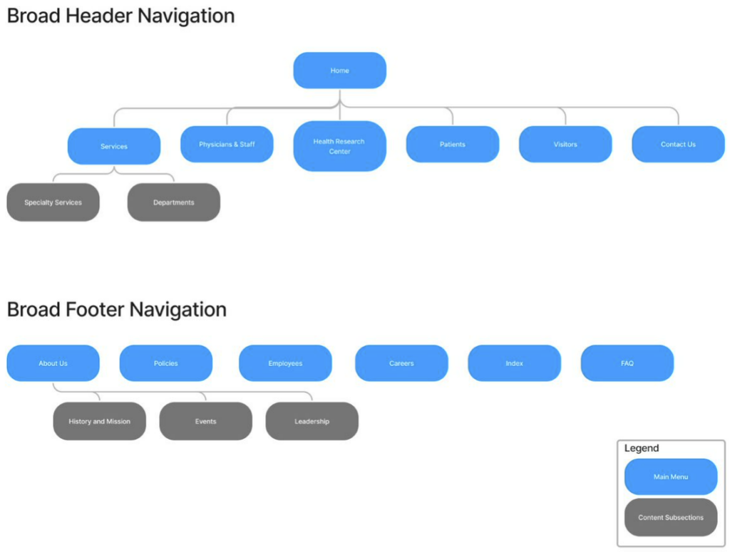
Figure 2. Sitemap 
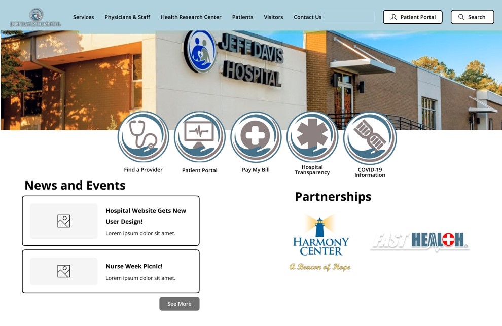
Figure 3. Homepage 
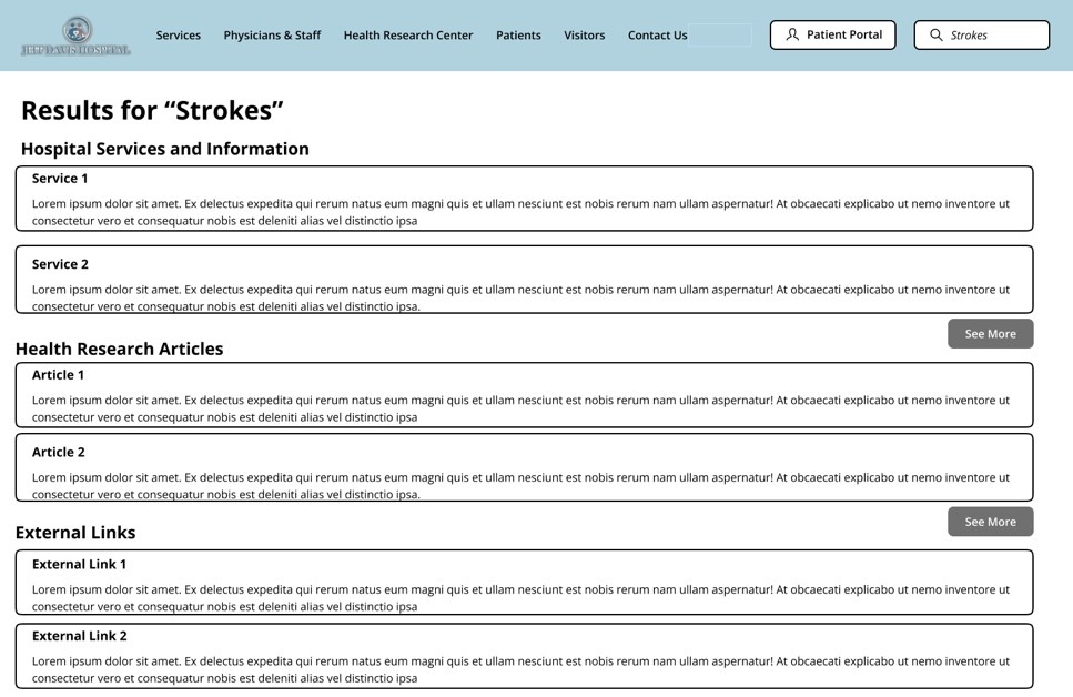
Figure 4. Search Results Page 

Design Rationale

Sitemap

As a crucial part of our group’s iterative redesign of the JDH website, our focus immediately began with the landing page of the site to address numerous navigational and content organization issues that plagued our users during testing. As stated previously, the current website design violates numerous usability heuristics, and the landing page contains more than its fair share. Our group completely re-hauled the design through embracing a more minimalist aesthetic by eliminating unnecessary duplications of navigational options for content that presented no descriptive text and nonstandard language, while maintaining highly visible navigational links to the most used features of the website. We removed unnecessary imagery, the motion sickness-inducing video background, and outdated and unorganized content links.

Homepage

Additionally, our group made significant modifications to how the menu options and content are organized. We split the patient and visitor options, while combining physicians and employees. We moved some content and options to a separate footer option bar. Our group also removed the drop-down menu options and replaced them with subpages that allow for an improved navigational and information seeking experience by presenting options with supplemental descriptive text and images to avoid confusion over terminology or naming conventions by providing the user with the context they need to understand the option before they select it. By implementing a logical sitemap navigational architecture with meaningfully organized options and content, many of the design failures of the current website that we identified during testing can be corrected.

Persistent Search

Another major redesign element we introduced is the persistent search bar in the top right corner of every page on the website. Currently, a search bar is available on the site, but only if you scale the page just right; even then, selecting the magnifying glass icon only opens another search bar with another icon next to it. We have resolved this glaring issue by anchoring the search bar in a fixed location regardless of scale. What’s more, our group optimized the search results page by removing advertisements and externally promoted content and presented results in an organized precedence that will greatly improve the user experience of this feature

Proposed Re-design#2: Services Page

  • Reorganized into respective Special Services (involving more than one department) and Department Sections as their own separate tabs instead of dropdown submenus. This helps with User responsive design too. 
  •  Services named by their function rather than by brands like Swing-Bed and Harmony Center 
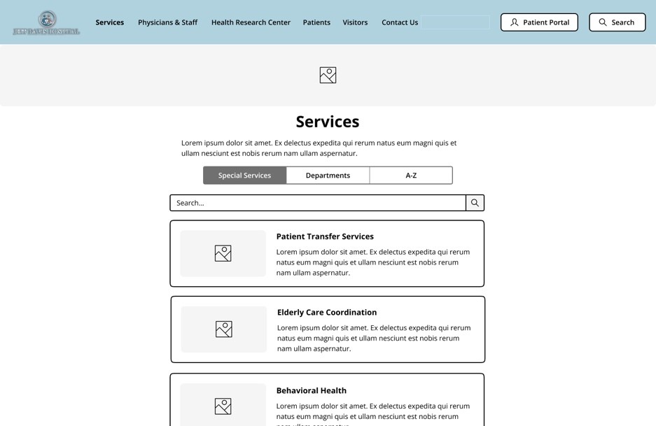
Figure 5. Services Webpage 

Design Rationale

The original design of the Jeff Davis Hospital site displays a conjunction of listed services under the “Our services” widget. The services listed under “Our services” displays all the care teams and departments offered by the Jeff Davis Hospital, the issue found with this interface design includes the inaccessibility of design for users. When users are attempting to select a service on the site the pop up of the widget does not withstand longer than a few seconds which presents a design that is not as simple or efficient to use for users which thus inhibits the goals of effective user design. To experiment with improving the JDH site’s current design we removed the service list from the main page drop down menu, footer options, and on the main page tiles. We replaced the service list drop down with a subpage directory for all services provided available with search bar, department organizational listing, and listed them alphabetically by service name. On the iterative design we are recommending, the services are listed with descriptive text and imagery to avoid confusion over terminology or naming conventions while also aiming to make finding Patient Transfer Services and Elderly Care Coordination simpler and more efficient. The information shown on each respective services page would be transferred to the respected services that they currently fall under on the JDH site as it is because the information listed helps in remaining informed on the services, but the formatting if the information presented would list the contact personnel first and at the end of the page. The information would be formatted in the middle of the page.

Proposed Re-design#3: Incorporated Health Research Center Knowledgebase

  • User Observation – Unappealing and Confusing FastHealth Site  
  • User Observation – Confusing Linkage to External Sites and FastNurse Branding 
  • Cite Cleveland Clinic as a derived example of the knowledgebase – See their Health Library 
  • Content stays on the website and stays consistent with the Jeff Davis Theme  
  • Adding external links to the bottom keeps the reputable resources from FastHealth
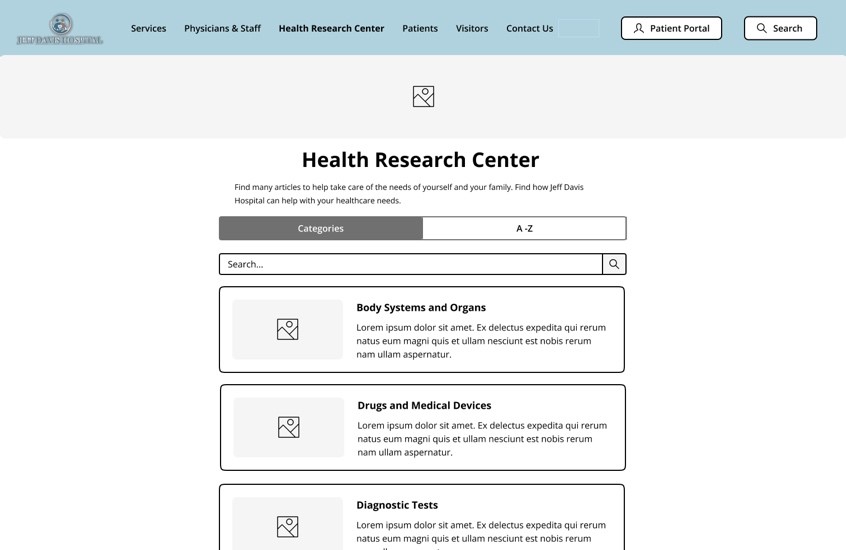
Figure 6. Health Research Center 
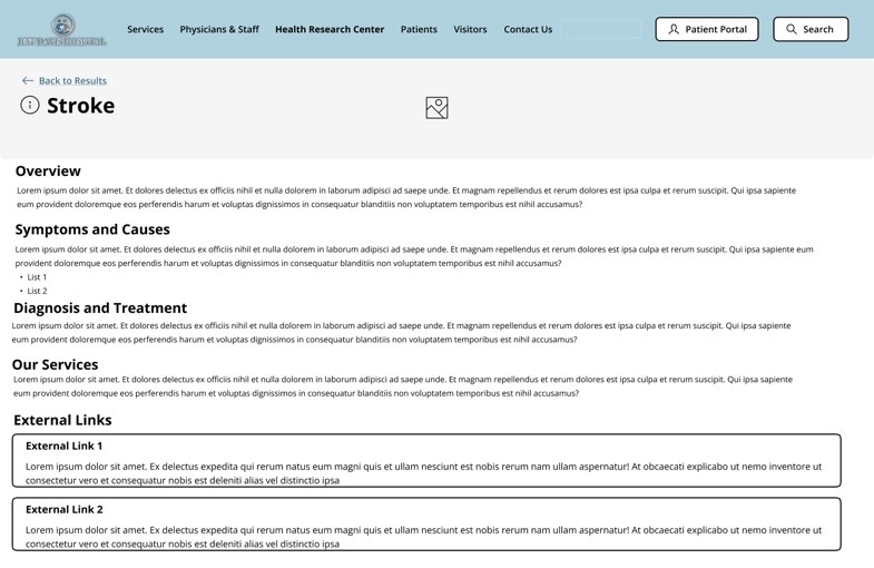
Figure 7. Health Research Article – Stroke 

Design Rationale

Health Research Center

As referenced in our group’s representative user tasks, FastHealth stroke-related information proved a difficult endeavor for our users to successfully navigate. Therefore, we are proposing incorporating FastHealth’s interface into the JDH ‘Health Research Center’ webpage like Figure 6. We conducted benchmark tests and found that Cleveland Clinic is suitable to emulate a portion of its health center knowledgebase interface for this re-designed webpage. Namely, sectioning the webpage’s ‘Search‘ and “Browse A-Z‘ components. However, our re-design will swap “Search” for “Categories” since the naming convention and its presented components in Figure 6 will make searching for relevant health information better structured. This re-design will include a search bar to address additional users’ preferences for information searches. These solutions make it easier for users to quickly retrieve relevant health information.

Health Research Article

Additionally, our representative user tests identified usability flaws with efficiently researching stroke-related information concerning FastHealth’s presentation of its links. To address these flaws, JDH health research articles (as shown in Figure 7) will be re-designed so that content can remain on the JDH website without disorienting users, staying consistent with the JDH minimalistic aesthetic. The articles will provide key sections that efficiently address our user’s health information needs. Relevant external links found on FastHealth regarding chosen health-related information will be included on this webpage as well. These proposed changes will reduce usability flaws related to the current site’s lack of consistency, confusing navigation, and abundance of information noise.

References 

Health Library. Cleveland Clinic. (n.d.). Retrieved November 15, 2022, from https://my.clevelandclinic.org/health

Jeff Davis Hospital. (2022). Jeff Davis Hospital.https://www.jeffdavishospital.org/ 

Jeff Davis Hospital/fasthealth corporation (Hazlehurst, Georgia – jeff davis county). (2022). Jeff Davis Hospital/FastHealth Corporation.http://www.jeffdavisfasthealth.com/ 

Montaña, E. (n.d.). Easy-Peasy Wireframe Kit. Figma. https://www.figma.com/community/file/989274600796773962 

Nielsen, J. (2020, November 15). 10 usability heuristics for user interface design. Nielsen Norman Group. https://www.nngroup.com/articles/ten-usability-heuristics/ 

Whitenton, K. (2015, November 29). Menu design: Checklist of 15 UX Guidelines to Help Users. Nielsen Norman Group. https://www.nngroup.com/articles/menu-design/  

External Links 

Group Assignment 2 – User Scenarios and Representative Tasks 

Group Assignment 1 – Group Topic Selection 

Total Word Count:  1245
Individual Assignment 3: Representative User Test

Target Website

https://www.jeffdavishospital.org/

The Jeff Davis Hospital (JDH) website serves communities located within Hazlehurst, GA. Our primary concern is to observe the website’s usability through representative user testing.

Representative User

The target user responsible for carrying out the subsequent usability tasks for certain sections of the JDH website is a 22-year-old pre-medical student attending Florida State University (FSU). They are familiar with various information systems, particularly regarding healthcare websites considering their academic background. Their objective will be to simulate the role of a family member seeking healthcare services concerning the welfare of their grandparent, namely having a stroke.

Testing Method

Empirical research consisting of forty participants conducted by Alhadreti demonstrated that the Think Aloud (TA) method is highly suitable for usability testing (Alhadreti, 2020). They show that TA requires the involvement of one user, which reduces cost constraints and other project complexities, while effectively yielding major usability problems concerning the website.

However, the TA method is not without certain limitations. Computer science and information researchers Fan et al. argue that TA tests require a heavy time commitment to analyzing users’ voicings (Fan et al, 2020). Interestingly, their research seeks to automate TA sessions through machine learning models. Therefore, while cost-effective, TA tests should be limited to as few participants as possible to benefit from such testing without heavy time commitments. In this representative user test, one individual for evaluating the usability of JDH’s website will suffice.

Representative User Tasks

Assigned user tasks in this representative user test of the JDH website include:

Representative TaskDescription
Locate General Information About Strokes  Reviews information to make better decisions for the welfare of those impacted by such health issues. Tests website information scent, relevance, and reliability.
Locate Patient Transfer Services  When the patient is transitioning from post-surgery to physical rehabilitation. Such services are imperative to the safety and well-being of the patient, which aids in their recovery. Tests matching real-world vocabulary to the system.
Find Information About Elderly Care CoordinationFinding elderly care services offered by the JDH outpatient clinic. Tests website consistency and standards regarding its naming conventions and brevity.

Usability Analysis of Tasks

Locate General Information About Strokes

Using the TA method, the user accessed JDH’s website using their laptop on a Windows 10 OS. They made multiple remarks about the cleanliness and aesthetics of the homepage. When assigned the first task of locating general stroke-related information, they started with the section “Our Services” in the navigation panel. They reasoned that of the healthcare services that JDH provided, managing strokes should be one. With each link selected, the user would quickly scan the webpages using ‘CTRL+F’ with “Stroke” as the search criteria. However, they could not locate the information. Of those links, they selected “Emergency” after considering that a person experiencing a stroke would most likely look at this section. But the emergency services provided were not granular.

They then reasoned that their vocabulary regarding strokes needed to match a more formal, medical term. But a quick Google search did not yield relevant information about navigating JDH’s website. This search behavior continued over to the “Patients and Visitors” section which yielded similar dead ends that the user provided their reasoning for initially clicking. Of particular interest, the subsection “Education” did not provide the user with any information related to learning about strokes. They mentioned expecting to see such information on this webpage but were disappointed.

After a few more minutes of continuing navigation through trial and error, the user selected the subsection “Health Research Center” to finally locate stroke-related information. They expressed frustration that such information would exist in on this webpage but not in the “Education” section. They also thought the FastHealth graphic was “ugly” and intentionally did not click on the picture for that reason. They added that the graphic did not fit the rest of the web page’s aesthetic presentation.

Selecting the “Stroke” link directed the user to another section of the JDH website called FastHealth. The user mentioned that if they had accessed this website outside of JDH, they would have been highly skeptical of FastHealth because of its antiquated interface. They pointed out that the orientation of the links was arranged in alphabetical order. This frustrated the user because they could not tell which information was most important based on how they navigate webpages in general. They explained that they will typically click on the first link directly under a section on the navigation panel thinking that the first link is the most relevant to that section. FastHealth’s approach to the mere organization of links based on lettering did not sufficiently consider their users’ needs. This threw the user off to good information scent (since it was lacking) because they ended up clicking on all the links to discover that most of them don’t adequately define what a stroke is but explain procedures for managing a stroke. Additionally, the user needed stroke-related links that were relevant and reliable and presented in chronological order rather than alphabetical.

Locate Patient Transfer Services

For the second representative user task, the user’s behavior with navigating the JDH website became more apparent. For this task, they selected the section “Patients and Visitors” stating that such services would most likely reside here. The user continued by selecting the “Patient Portal” subsection expecting to find information related to the task simply because it was the first link immediately under the section header. The webpage did not provide them with relevant information. They then reverted to the main section, scanning the remaining links to no avail.

At some point, the user realized that patient transfer services could also be found under the “Our Services” section and hovered over the subsection links. They mentioned various links that could house such information but directed their attention to the ‘Swing Bed Program”. This wasn’t too surprising considering their background with healthcare websites. However, they couldn’t make sense of the selected webpage. It took them a few minutes in attempting to discover if JDH did offer such services. There were no clear indicators on the webpage that catered to patient transfers. The reason for the user’s confused behavior most likely stems from JDH’s vocabulary not matching real-world situations. The user was looking for transfer services, which the webpage offered, but was inundated with additional services concerning the exhaustiveness of their ‘Swing Bed’ program.

Find Information About Elderly Care Coordination

The final representative task involved the user locating a JDH outpatient clinic related to elderly care. The user began this task with said consistent behaviors in navigating the JDH website links. They selected the “Our Services” section, also stating that the first link, “Behavioral Health Unit” would be the “most relevant”. This reasoning led them across several various links as they kept running into irrelevant information. They voiced their confusion about how difficult it was to find the JDH outpatient clinic related to elderly care.

This confusion was further corroborated by their thinking that the JDH outpatient clinic was the Family Medical Group (FMG). This confusion is understandable considering the FMG offered “quality care for a broad range of illnesses” that included DOT physicals. This was an easy mistake to make since FMG was using ambiguous language in defining their “quality care”. The user voiced this concern by asking questions, “What are wellness visits?” or “Patient education?” However, the user determined that the JDH outpatient clinic for elderly care was not to be found at FMG.

After realizing that FMG wasn’t suitable for accomplishing this task, they simply selected the link below FMG, “Harmony Center”. It took them about a minute to accomplish this task since the vocabulary on this webpage matched the task requirements for receiving elderly care from a JDH outpatient clinic. They voiced several terms that corroborated their reasoning that the Harmony Center was the right webpage for such services. Such terms included, “loved one”, “seniors”, and “declining physical ability”. However, the time it took for the user to accomplish this task was unacceptable due to the JDH’s website’s naming conventions from the “Our Services” section. The Harmony Center doesn’t provide any context as to what that webpage will provide. Additionally, for Family Medical Group to offer DOT physicals is also misleading for services whose clinic name concerns family care. The user’s expressed frustration is noted.

Design Recommendations

Chronologically oriented stroke-related links

Currently, FastHealth alphabetically organizes its educational links for all its healthcare topics. While this satisfies some form of organization it is not considering the audience that would utilize this information. Based on the findings of the TA session, the user was frustrated with not knowing which stroke-related link was most relevant to the scenario described to them. Their understanding of how to research strokes was chronologically oriented to the task requirement. That is, they wanted information about the different stages of a stroke with the respective medical care administered at each stage. By considering the audience, that is, users most likely to navigate this website, chronologically orienting healthcare links will increase website information scent, relevancy, and reliability thereby improving its usability.

Re-design the FastHealth user interface

The user noted their dislike of FastHealth’s antiquated interface. While it didn’t prevent them from navigating the website, it did invoke feelings of distrust for satisfying their information needs. The user reasoned that if it weren’t for accessing FastHealth from the JDH website, they would not have taken it seriously. Based on these findings, re-designing the FastHealth user interface to match the JDH website interface will promote a better experience for users and enhance its usability.

Match real-world vocabulary to the system

The user experienced frustration when seeking patient transfer services because of the terminologies utilized by JDH’s website. Namely, the “Swing Bed Program” webpage. While that term might have made sense to some, it was clear that the term was not universally understood. Thus, when matching real-world vocabulary to JDH’s “Swing Bed Program” webpage, its audience must be considered. The TA session proved this reality when the user struggled with understanding what “Swing Bed” meant even with their pre-medical background. Therefore, one solution is to consider what their audience would most likely understand and search for. That is, instead of “swing bed”, use plain vocabulary like, “patient transfer services”. This solution demonstrates empathy for its users that speaks their natural language since these words are familiar to them (Nielsen, 2020).

Re-design contextual navigation system using card-sorting

For all tasks, the user found it difficult to track down task requirements through JDH’s website navigation system. This hurt the website’s usability since the user could not reconcile their understanding of patient transfer services or seeking outpatient elderly care with system terminology like “Swing Bed” or “Harmony House”. The user voiced several times about clicking on links that seemed “right” but were not at all relevant to their representative tasks. One solution is to conduct a card-sorting exercise where users organize topics into categories that make sense to them, which can help improve the JDH website contextual navigation system’s logical ordering to better reflect website usability.

Citations

Alhadreti, O. (2020). Comparing Two Methods Of Usability Testing In Saudi Arabia: Concurrent Think-Aloud Vs. Co-Discovery. International Journal Of Human-Computer InteractionAhead-Of-Print(Ahead-Of-Print), 1–13. Https://Doi.Org/10.1080/10447318.2020.1809152

Fan, Li, Y., & Truong, K. (2020). Automatic Detection Of Usability Problem Encounters In Think-Aloud Sessions. ACM Transactions On Interactive Intelligent Systems10(2), 1–24. Https://Doi.Org/10.1145/3385732

Nielsen, J. (2020, November 15). 10 usability heuristics for user interface design. Nielsen Norman Group. https://www.nngroup.com/articles/ten-usability-heuristics/

WORD COUNT: 1905

Individual Assignment 2

Target Website

https://www.gmha.org/

Guam Memorial Hospital Authority (GMHA) is the largest medical facility that serves the general population of Guam and the surrounding Micronesian islands.

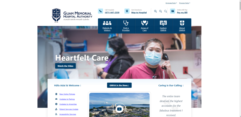
Scenario – Acquire contact information about a GMHA Facility

In this analysis of the GMHA’s website usability, the most likely scenario involves a stakeholder (in this case, the user) searching for contact information about services offered at a GMHA facility. Such services can include radiological, urgent care, laboratory, physical therapy, and so forth. This scenario also considers how a user might approach navigating GMHA to reach their intended information through the various healthcare providers regarding said services.

Heuristic violations based on the scenario

In consideration of the suggested scenario, utilizing Jakob Nielson’s 10 usability heuristics is most applicable in testing GMHA’s website usability. The scenario aids in this heuristic evaluation by detailing the steps that a user would likely perform based on their information needs. For instance, a user’s health concerns would prompt them to seek out medical services from the largest healthcare facility in Guam. The first step a user would take is to browse GMHA’s website seeking relevant contact information regarding their health concerns with a specific medical facility at GMHA. On the homepage, they would seek any icons, links, or directories hinting at where they could locate such information. This approach should provide them with the relevant information from GMHA that would allow them to contact the appropriate healthcare facility. However, these steps are difficult to accomplish based on the identified usability flaws. Following is a brief overview of those usability flaws with their associated heuristic violation based on the said scenario:

#LocationUsability Flaw ExplanationHeuristic Violated
1HomepageA cluttered homepage disorients the user. Phone directory poorly placed#8: Aesthetic and minimalist design
2Areas of CareAll links lead to the same location confusing the user#1: Visibility of system status
3Areas of CareComplicated menu design hinders the user#8: Aesthetic and minimalist design
4Areas of CareNo contact information for any medical facility shows little concern for the user#2: Match between system and the real world
5Find a ProviderNo clear feedback that a provider could not be found. No user recovery#1: Visibility of system status
#9: Help users recognize, diagnose, and recover from errors

1. Homepage: Cluttered information

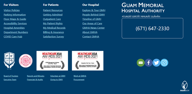
Based on the selected scenario, a user would be most interested in locating contact information for a GMHA medical facility. However, this information is difficult to find on the homepage. GMHA hosts a multitude of information on its homepage that can quickly disorient the representative user. Namely, there are too many links and action commands that populate the user’s screen making it needlessly difficult to locate relevant information to continue. What’s more, if the user scrolls down the page they could find the contact information but it’s too easy to skip over the link since it’s objectively dull. In its current state, GMHA’s homepage provides low information utility thereby reducing its website usability and information scent. These usability flaws directly violate Nielsen’s eighth heuristic for aesthetic and minimalist design.

2. Areas of Care: Burdensome Drop-Down Menu

Following the next logical step in the scenario, the user scans the homepage looking for whatever link most likely directs them to a specific medical department. They click on ‘Areas of Care’ and a drop-down menu displays links to various GMHA healthcare facilities. This menu makes it difficult for the user to locate the appropriate GMHA healthcare facility. The most obvious way is to click on the right-facing angle bracket to scroll for additional medical areas. However, if the user needed to locate the ‘Radiology’ department, it would take much longer because of clicking multiple times with the current alphabetized menu design.

This usability flaw directly violates Nielson’s eighth heuristic on aesthetics and minimalist design. The menu forces the user to navigate through irrelevant information until they can find what they wanted initially. Namely, the interface has too many unnecessary elements that hinder users from quickly finding relevant information thereby increasing its ‘noise’.

3. Areas of Care: Poor System Status Visibility

Continuing the scenario, the user will have selected the desired healthcare department and be directed to another webpage. The user expects to find information about that specific department. However, the webpage does not direct the user to the right department. Rather, the user is directed to all the GMHA medical departments along with brief descriptions and pictures of each. Given this unfortunate usability flaw, the user that painstakingly clicked through multiple departments to select ‘Radiology’ could have clicked on ‘Care Units & CIF’ and been directed to the same webpage. Added to that frustration, the user would at this point realize that they didn’t need to select the right department because it was all located on the same webpage, to begin with. This feature was only intended to search for the desired facility on this webpage to make it ‘easier’ for the user to locate it sooner. However, pictures in the drop-down menu behave inconsistently which may or may not indicate system failure. For instance, while clicking ‘Pediatrics’, the system will function as intended. Yet, other links like ‘Radiology’ will break the system which resorts back to the ‘Areas of Care’ page confusing the user as to what happened. Therefore, this usability flaw violates Nielsen’s heuristics of system visibility since it erodes the user’s trust because of little feedback as to what the system is doing.

4. Areas of Care: Medical Facilities Lack Expected Information

This last step in the scenario is the largest disappointment to the user. Locating their desired GMHA medical facility yields little information about it. A user in this scenario would expect at least the department’s contact information but to no avail. This usability flaw is a blatant disregard for user empathy in showing that GMHA cares about its stakeholders by simply providing highly relevant contact information under a webpage that explicitly states, ‘Area of Care’. While this information could be found on GMHA’s homepage, it’s obscurely placed amongst a plethora of similar-looking links making it unnecessarily difficult to locate this information.

As a result, this lack of contact information directly violates Nielsen’s heuristic of matching between the system and the real world. By not providing contact information, such as phone numbers, emails, or GMHA building locations, for this specific webpage, there exists a mismatch in expectations between GMHA’s website and its stakeholders. Such information should appear virtually on GMHA’s website as it does on contact cards, brochures, and other reading material in the real world.

5. Find a Provider: Results show blank white space

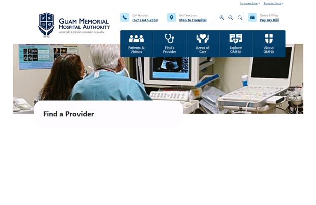
While this scenario differs slightly in its steps, the objective remains the same for the user. That is, they need to acquire contact information through a GMHA provider instead of a medical facility. Taking these steps, the user would click on ‘Find a Provider’ from the homepage. Another drop-down menu will display prompting the user to search for their provider through various means. The usability flaw arises when the user types in the last name, ‘Flores’ into the search box and selects ‘Search’. They are directed to a screen with GMHA header information and blank white space underneath ‘Find a Provider’. There is no indication or message that the system could not find a provider based on ‘Flores’.

This usability flaw directly violates Nielsen’s heuristic for users recognizing, diagnosing, and recovering from input errors. That is, the system should use plain language to notify the user of not being able to find a medical provider with that last name. Additionally, the system did not provide any solutions (or any indication) for recovering from said search criteria. Added to these usability flaws, the system’s lack of communication (feedback) to the user erodes their confidence in it. This demonstrates another heuristic violated–poor system visibility for the user.

Recommended Design Improvements

1. Re-work homepage design layout to better reflect the ‘essentials’

Reducing action commands on the homepage such as “GMHA in the News” and “Watch the Video” will improve readability by reducing ‘noise’. This will also keep users focused on locating essential information from the homepage. Additionally, the GMHA facilities phone directory must be clearly identified without requiring users to scroll down the page. Providing this directory in an easily identifiable way on the homepage greatly improves its aesthetics without frustrating users’ experience.

2. Minimalize the drop-down menu interface

The current menu layout does not present all the “essentials” that users need to make informed decisions. Therefore, it must be minimalized. Namely, removing all pictures, which can be considered ‘noise’. Additionally, presenting all GMHA medical facility directories immediately on the same menu with clear visibility (not at all like the homepage footer link arrangement). There will be an aesthetic element added to draw user’s attention to the medical facility directories. By implementing these two solutions, users will have better information scent that will keep the content and visual design of the menu layout simple.

3. Re-work programming logic to function as intended

The Area of Care webpage displays a long list of every GMHA medical facility. This webpage already has programming logic that will locate the appropriate facility based on the user’s selection from the drop-down menu. However, most selected facilities do not direct the user to their respective information on the webpage. If the user selects, “Pediatrics”, then the system will function as intended. Re-working the programming logic to function as it does for “Pediatrics” will tremendously improve webpage usability as it will improve system communication and user trust. Currently, the system simply resorts back to the top of the webpage (or anywhere else depending on the selected facility) with no clear feedback as to what happened, which leaves users confused and frustrated.

4. Provide contact information

Following real-world etiquette, providing contact information on the webpage matches GMHA’s interface with it. That is, users will know that GMHA is empathetic to their needs by displaying each medical facility’s contact information. Such information includes phone numbers, email addresses, and building locations. This approach solidifies expectations in the system with the user thereby improving website usability.

5. Provide system feedback and allow the user to recover from their search results.

Use plain language that clearly indicates the provider was not found based on the user’s search criteria. Additionally, the system must provide a link directing them back to the prior webpage. Providing immediate feedback for search tasks allows users to quickly assess their search results to make better decisions thereby improving system visibility. If the system could not find a provider, displaying a link that directs the user back to their search helps them recover from errors sooner in acquiring the right medical provider.

WORD COUNT: 1784

Individual Assignment 1: Designing for Users

WORD COUNT: 948

1. Website and User Profile

Website

https://its.fsu.edu/service-catalog/communication-collaboration/office-365/microsoft-office-365-proplus

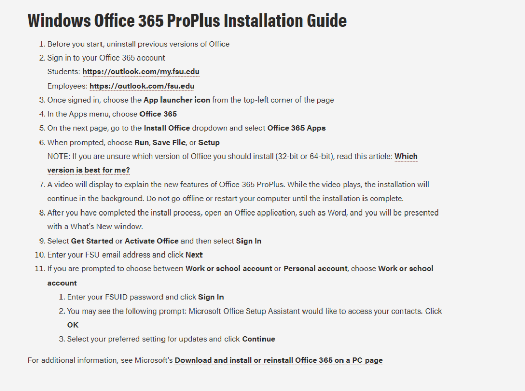
Information Technology Services (ITS) published brief instructions for downloading and installing Microsoft Office 365 ProPlus on a Windows operating system. Multiple problems arise as the user attempts to follow the instructions due to a mixture of poor user-centered design practices by FSU’s Office website and ITS’s verbiage.

User

The target user is a student attending Florida State University in pursuit of a Bachelor of Science in Biology degree at Florida State University (FSU). Their technical aptitude in information systems would be considered average. They utilize the Internet, are familiarized with software applications and are avid social media users. Particularly, the user is familiar with navigating the FSU interface but lacks proficiency in more advanced navigation tasks with the website as will be demonstrated in this case.

2. User Navigation Actions

App Launcher Icon Issue

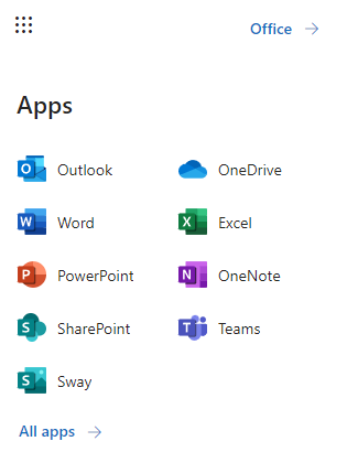
Upon instructing the user to follow ITS installation instructions, they experienced their first issue at the third step; that is, selecting the App Launcher icon. The issue stemmed from the user’s lack of technical knowledge in knowing what an App Launcher icon looks like. They hesitated at this step and began making assumptions as to what the instructions were conveying. The user looked at the far-left side of the page where the bulk of the application icons were to no avail. They then re-read the instructions noticing that the icon would be in the top-left corner of the page. However, they did not know specifically what the instruction meant about “top left corner”. They reasoned that there were multiple top-left corners of the page depending on where they looked. It wasn’t until they accidentally hovered their mouse over what looked to be an icon with nine dots that they discovered where it was.

Choosing Office 365 Issue

Selecting the App Launcher icon displays another panel for the user to make additional choices. Step Four of the instructions makes it quite clear that ITS wanted the user to select Office 365. However, the new panel does not show this exact wording. This wording confused the user and again caused them to scan the panel for any indication of Office 365. After a few seconds of frustration and verbal complaint, the user clicked on the closest wording choice, which was Office, directing them to another page to download Office 365.

Installing Office Issue

The last issue the user experienced pertained to finding the Install Office drop-down box. They noted how it was difficult to find the location because it was not clearly identifiable on the page. Nor did ITS dictate the drop-down box’s location as they did for the instructions in Step Three. The drop-down box design blended too well into the background which prompted the user to look to the left of the page again because of the coloration of the application icons.

3. Novice/Expert User Observations

App Launcher Icon

The issues identified above with the selected user also demonstrate a stark contrast compared to my expertise with said issues. As an IT administrator, I have high proficiency in knowing where to look and what to download concerning Office 365 applications. The App Launcher icon is common wording for displaying a nine-point icon (as shown above) to reflect a collection of other applications. It hadn’t occurred to me that users would not explicitly know this information considering they do not regularly work with information systems.

Selecting Office 365 and ‘Install Office‘ Drop-Down Box

As noted earlier, the user struggled with ITS verbiage (or lack thereof) when identifying and selecting the right links to download Office 365. However, being an expert user myself, I have worked so much with installing Office 365 for other users I can understand why ITS would skip certain information. While it may have been clear to me, I did not follow ITS instructions exactly; glazing over the general idea of what they were instructing me to do. The user, who is not an expert with Office 365, did not act this way. They followed ITS’s instructions carefully and were still confused at certain steps along the way.

For instance, the user did not know where the Install Office drop-down box was located on the page. As mentioned earlier, they scanned the page looking at the colored icons on the left-hand side. They re-read the ITS instructions and could find nothing indicating the general area of where said drop-down box could be. For me, this was interesting because I didn’t need the instructions to know where it was located considering I had performed this action so many times before. The first time I installed Office I just pressed ‘ctrl + F’ on my keyboard typing in the search term and found it immediately. That is something the user was not aware of.

4. Design Recommendations

Include Pictures In ITS Instructions

ITS should re-assess some of the steps in their Windows instructions. The App Launcher is a simple fix where ITS need only to include a graphic displaying what the icon looks like. The same holds true with a user looking for Office 365 in Step Four. Non-expert users would benefit greatly from IT-specific terminologies by equating a picture with the term. While this recommendation does not improve the website design per se, confusion and wasted time spent interpreting ITS instructions would enhance the user’s experience navigating the website.

Install Office‘ needs to be clearly identified

FSU’s Office website for students displays the drop-down box in an unappealing way as mentioned earlier. From a user-centered design perspective, visibility for the item needs to improve. One design improvement for this drop-down box to be more noticeable is to change the FSU background to accentuate the Install Office drop-down box’s white background.